JUST IN
by Louis Bofferding
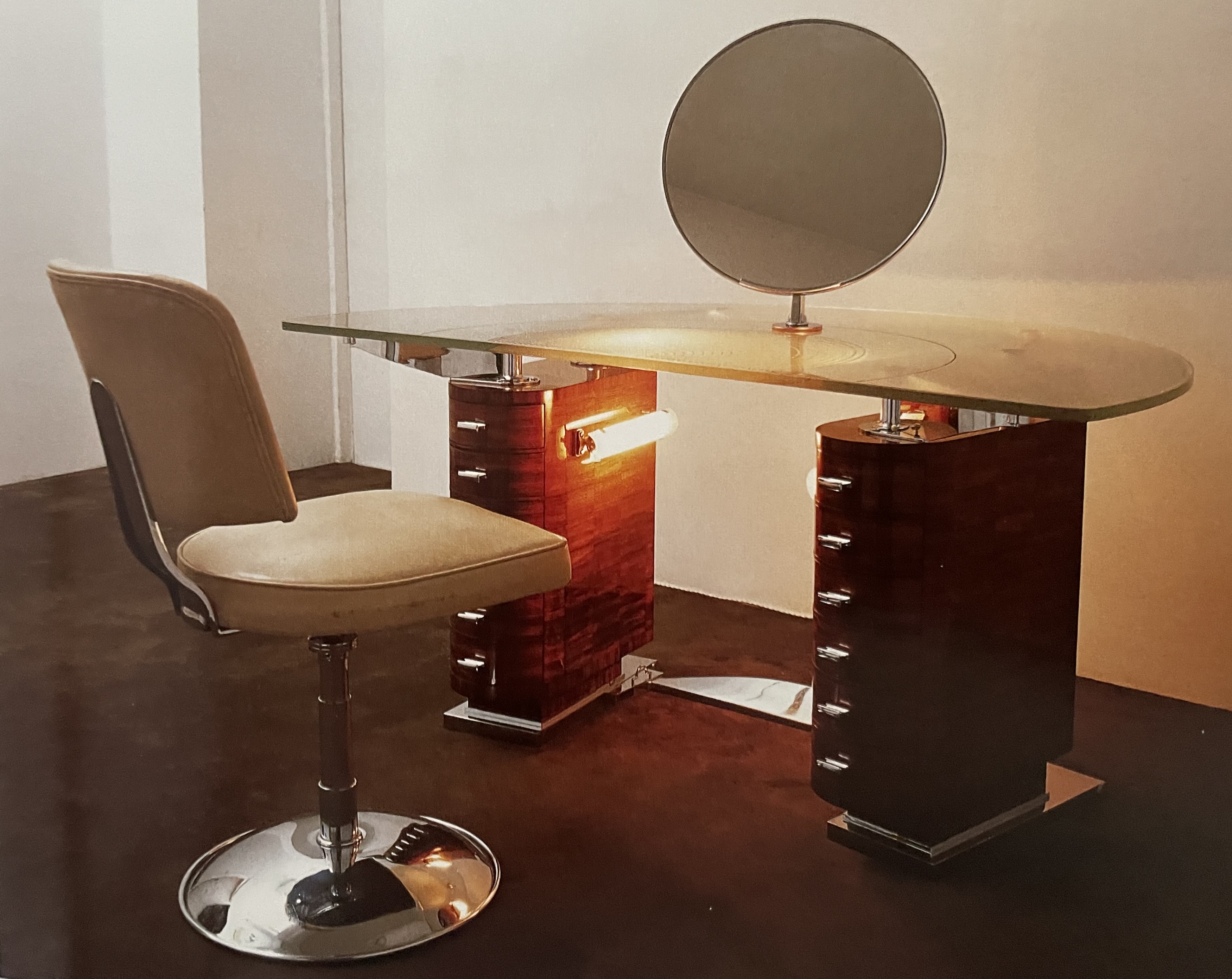
SAMUEL MARX DRESSING TABLE
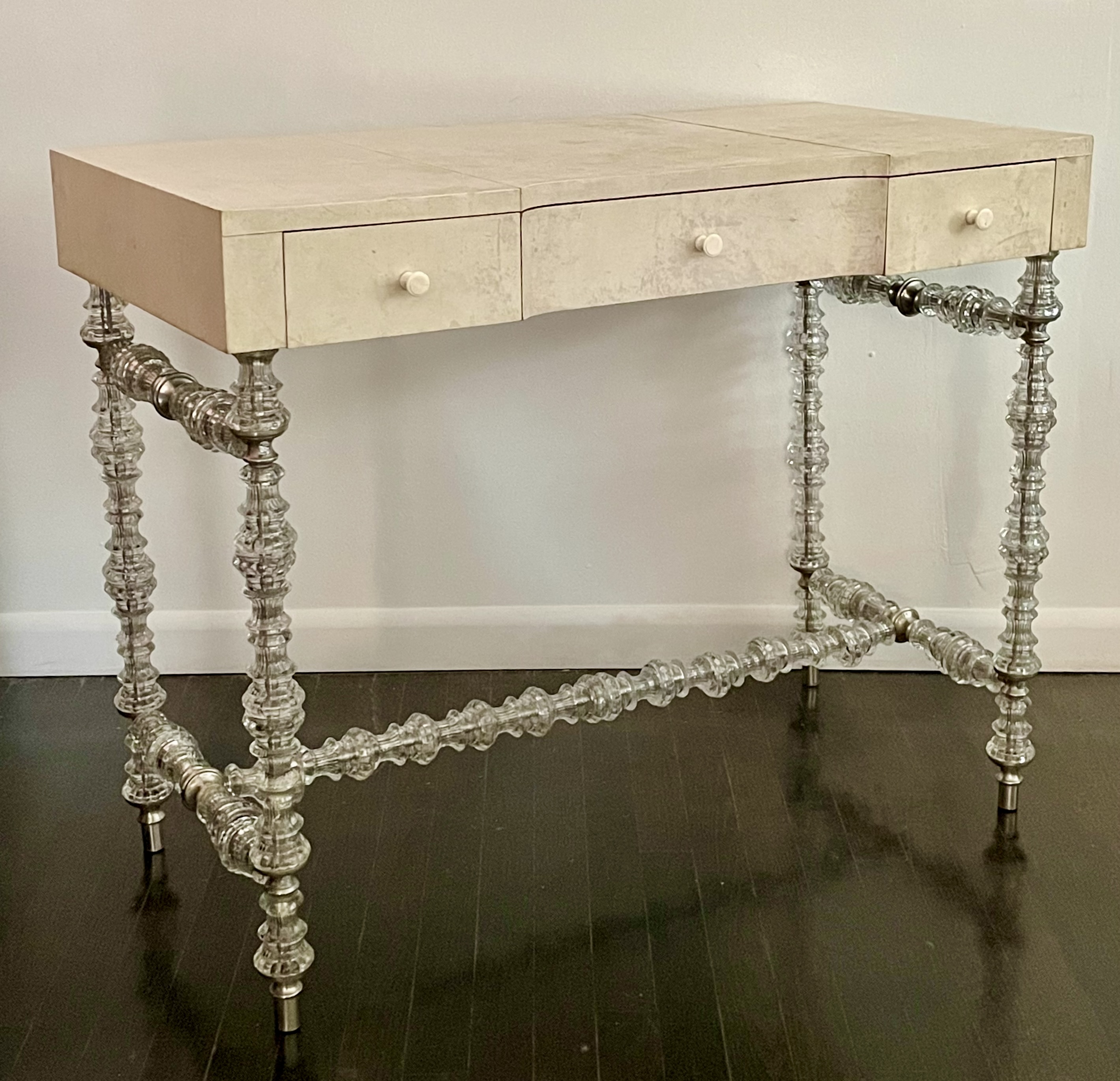
Samuel Marx (1885-1964) dressing or writing table, 1930s, stamped Quigley (Chicago maker). Parchment, glass, metal, wood. H: 30” W: 37 1/4” D: 18”. Sold
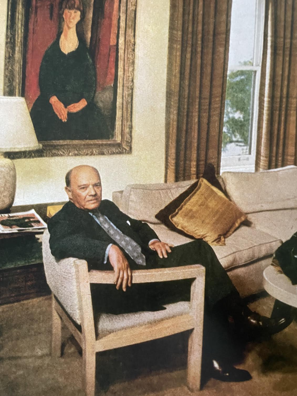
Trained at the Ecole des Beaux-Arts in Paris, Natchez-born, Chicago-based architect and designer Sam Marx worked from 1910s to the 1950s in the geographical triangle defined by New Orleans, New York, and Los Angeles. Today, Marx is celebrated for his modern furniture and interiors that were often inflected with historical references. He’s also known for having assembled with his third wife Florine May, a department store heiress, an art collection of masterworks by Picasso, Braque, Matisse, and Brancusi, among others, which was divided after her death between The Metropolitan Museum and The Museum of Modern Art [Marx seen with their Modigliani below left].
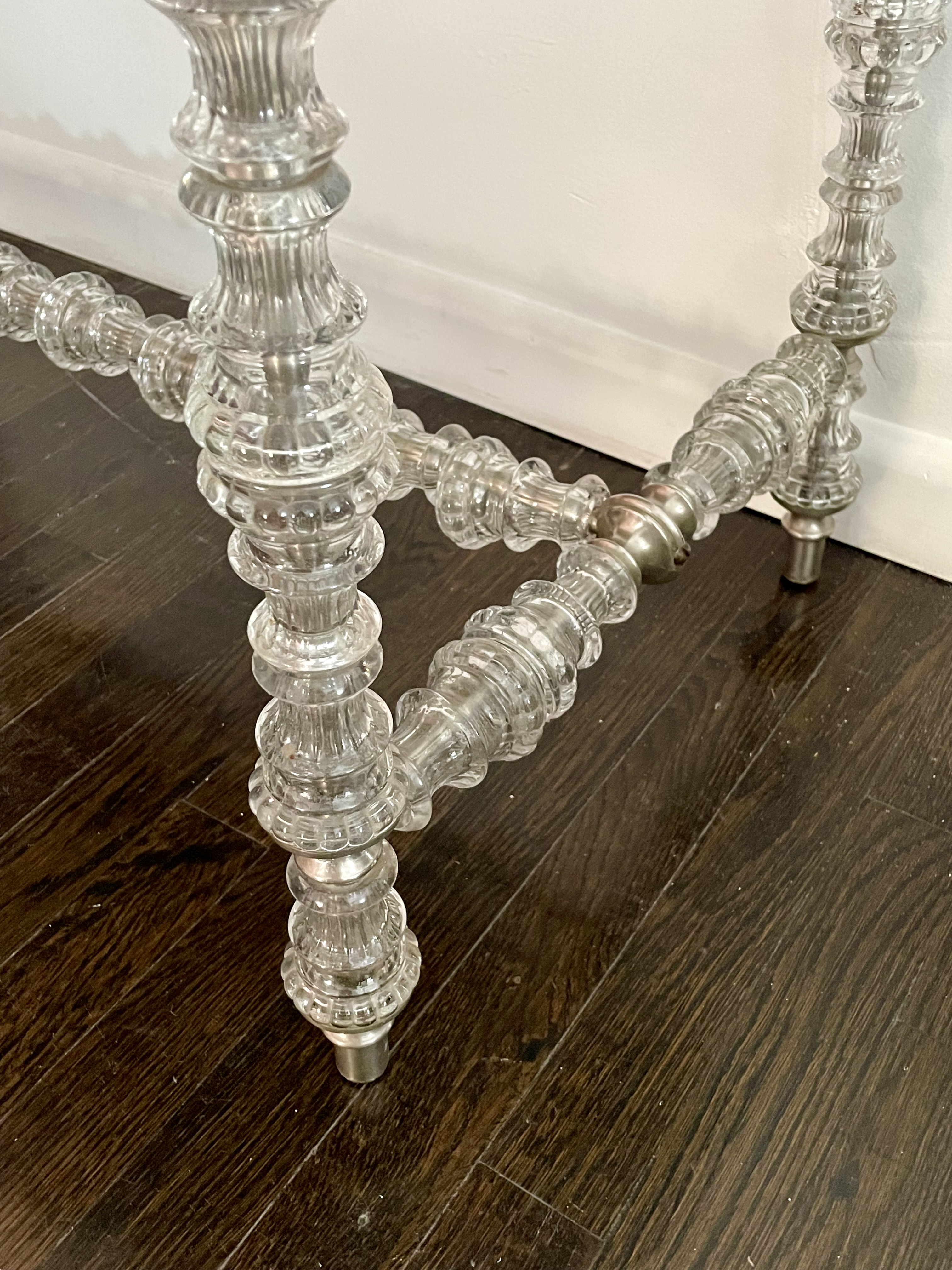
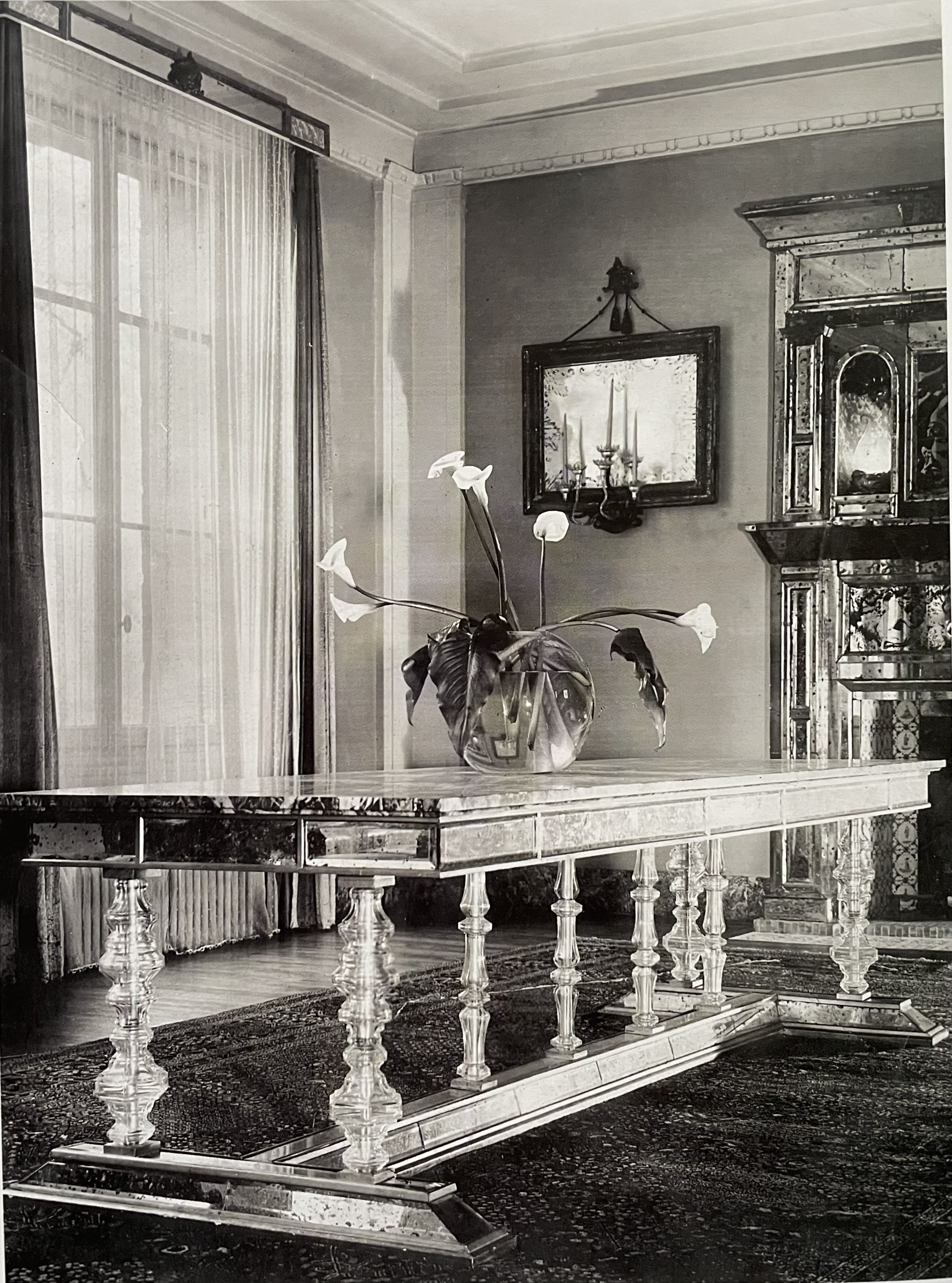
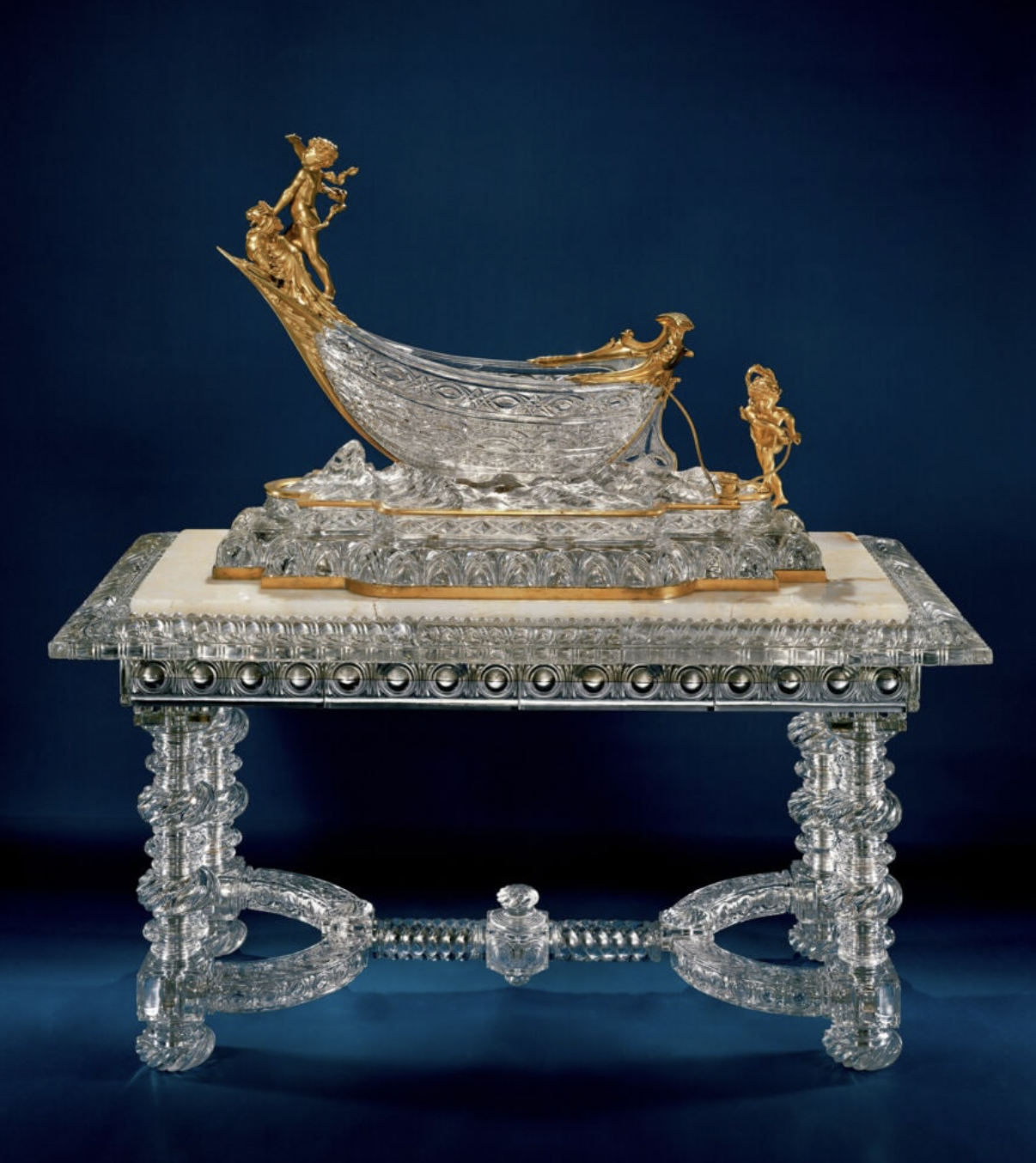
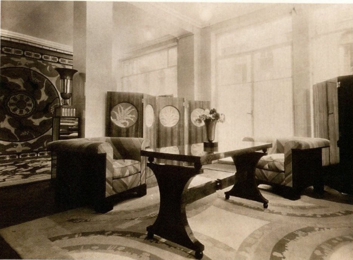
In designing furniture, Marx often riffed on the work of his Paris contemporaries, particularly Jean-Michel Frank and Serge Roche. This table has a top veneered with parchment, a favored material of Frank, resting on legs that are shish-kabobs of glass elements [above right], a favored device of Roche [below left]. All’s fair in love, war, and design, however, for Roch, who was then all the rage, had, after all, lifted the idea from the glass furniture popularized by Baccarat in the 19th century, as seen in a table they presented at the 1900 Paris Exposition Universelle [below right]. Our table bears the stamp of William J. Quigley, the Chicago firm that executed most of Marx’s designs, as well as those of his contemporary David Adler.
PAIR OF BAGUES SCONCES
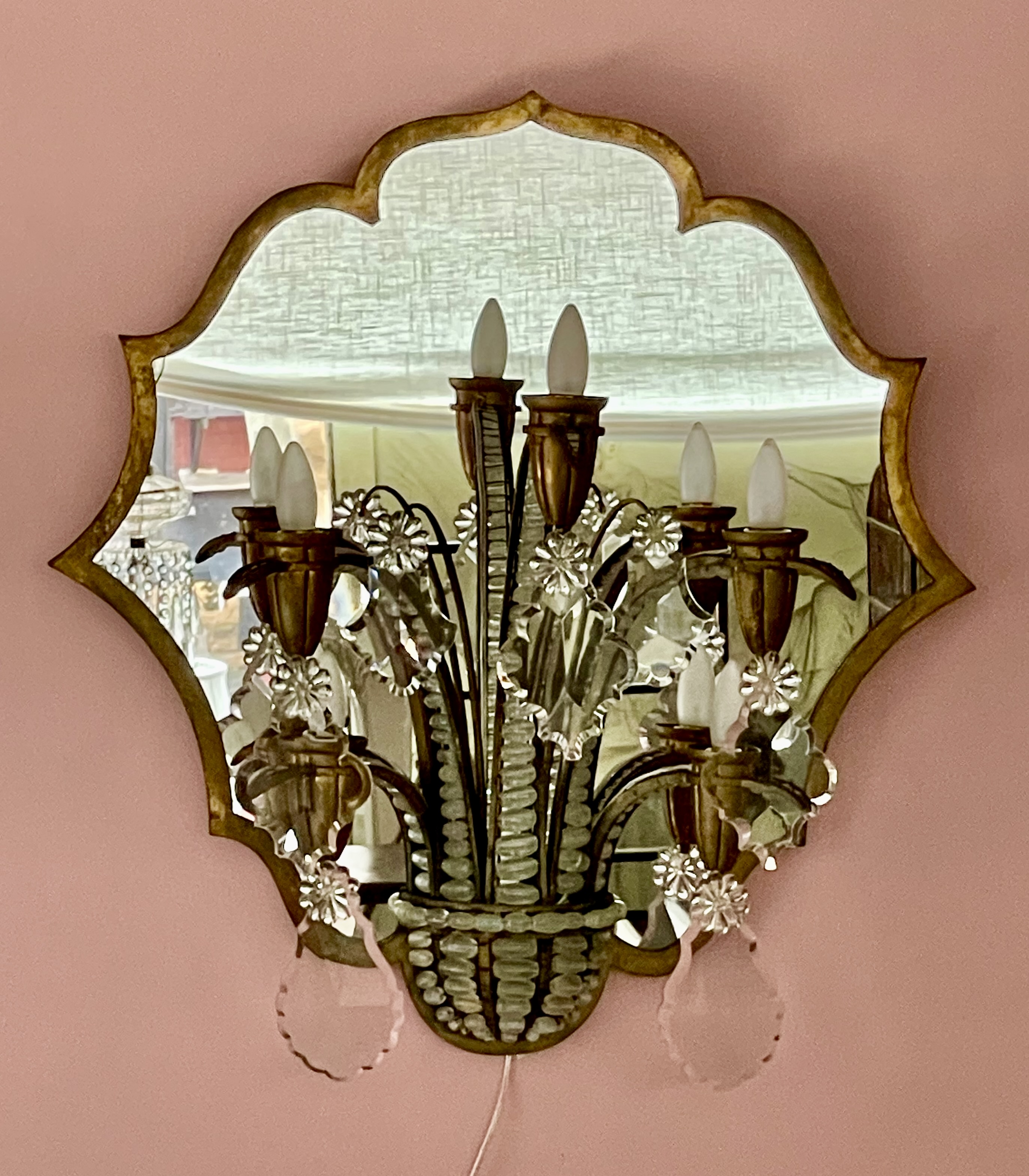
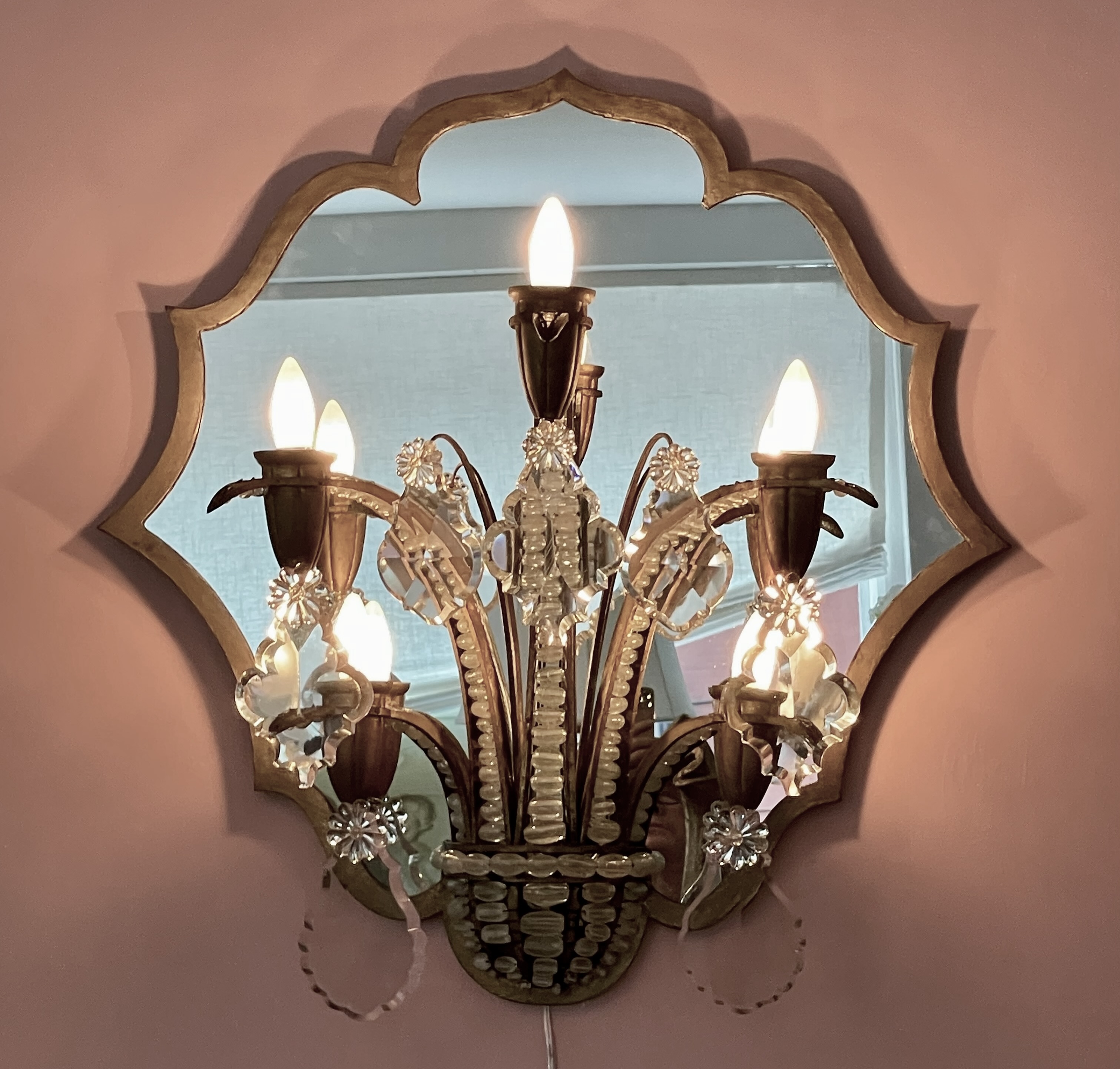

Pair of sconces by Baguès (Paris maker), circa 1927. Gilt-brass, mirror, glass (cut, cast, blown), mahogany backing. H: 30” W: 29 ¼” D: 15”. Provenance: Thierry Despont (1948-2023). $25,000
This monumental pair of Art Deco sconces are nearly three-feet in diameter, and were made by Baguès, the Paris bronzier celebrated for their lighting fixtures. If best known today for stylish riffs on 18th-century forms, the firm’s work ran the gamut from Louis-Louis reproductions to original Art Deco creations, drafted by in-house designers and outside ones too, including Armand Rateau. Like most reproductions, those by Baguès aren’t of great interest, in spite of their quality. But their Art Deco designs, like this pair of sconces, show the firm at its best — as do those aforementioned stylish riffs, like the two pairs of lamps, and another pair of sconces we attribute to Rateau, that are all in our inventory [one of each shown below].
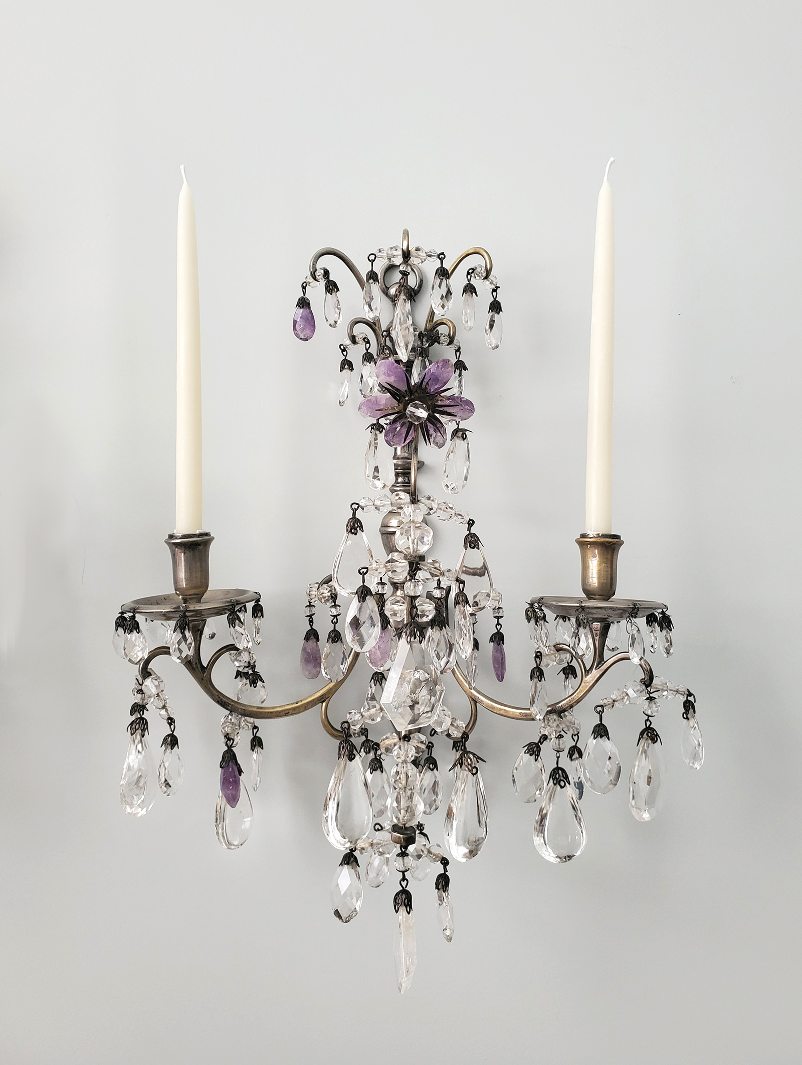
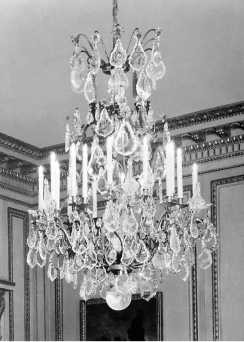
These monumental sconces have bronze-trimmed mirror plates in a cusped-and-lobbed shape that harks back to the Baroque period, which also influenced Josef Hoffmann in Vienna [below left, the dining room doors of his 1910s Berl house]. Mounted at the bottom of each sconce is a half bowl, from which spring five arms that resemble spiky fronds, also outlined in bronze, and filled in with webs of air-bubbled-glass beads gradated in size [below center]. Hanging from each arm, and the pair of antennae tucked amongst them, are massive table-cut-crystal pendants — a witty nod to those that appear in 18th-century chandeliers [below right, one at the Metropolitan Museum].
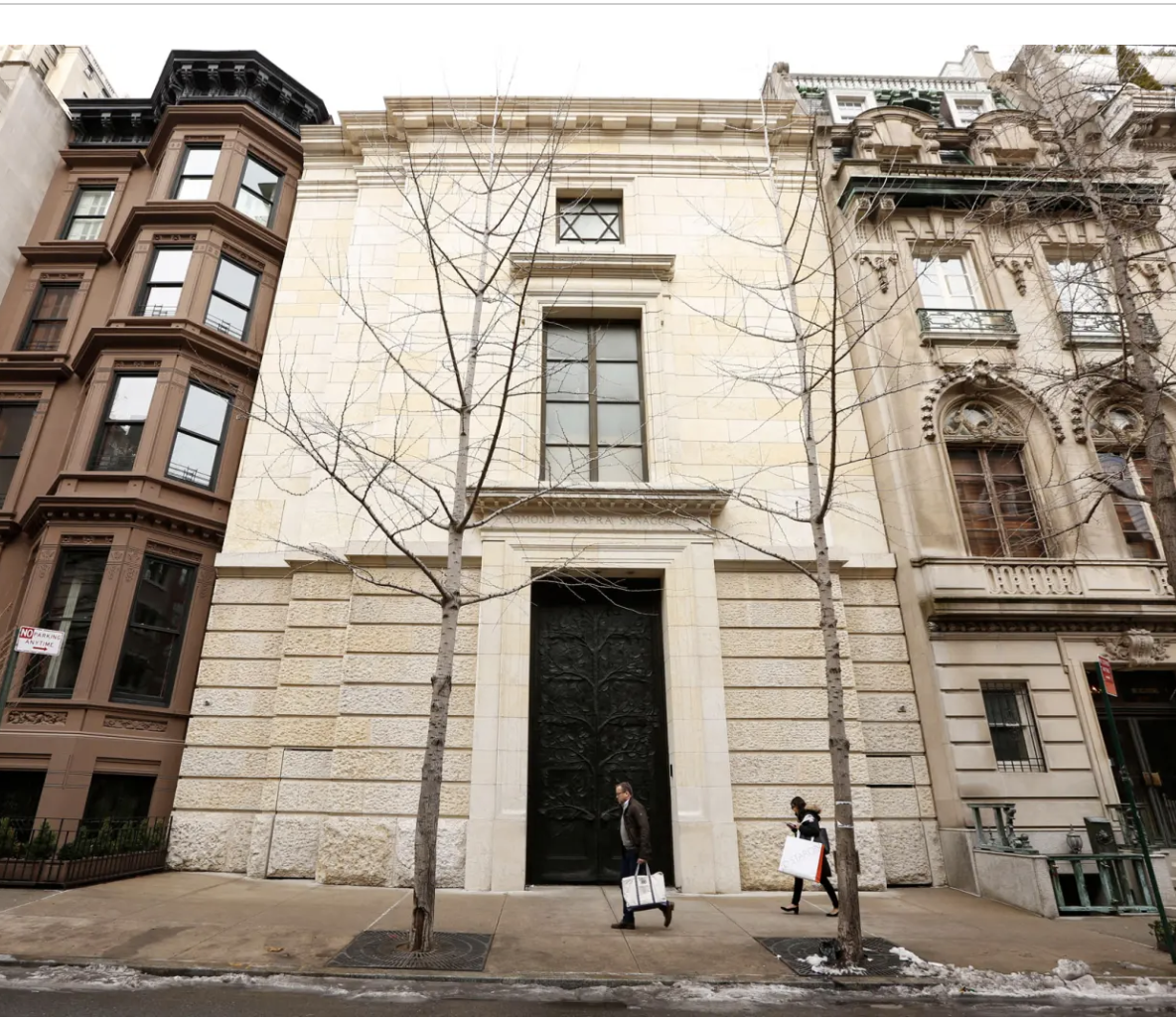
The sconces previous owner was Thierry Despont (1948-2023), the celebrated international architect-designer who studied at the Ecole des Beaux-Arts in Paris, and then urban planning at Harvard University [below left]. Over the course of his spectacularly successful career, this larger-than-life, Paris-born New York-based jack of all visual trades (he painted too), restored the Statue of Liberty, and Clayton (the Frick mansion and museum in Pittsburgh), converted Manhattan’s historic Woolworth Tower (once the world’s tallest building) into residences, installed the French period rooms at the Getty Museum, and built palatial houses from scratch for Bill Gates and Calvin Klein, as well as an Upper East Side synagogue for Lilly Safra [below right]. Whether designing buildings, interiors, or furniture, Despont was deeply influenced by the grand svelteness of the last gasp of Art Deco style in the 1930s.

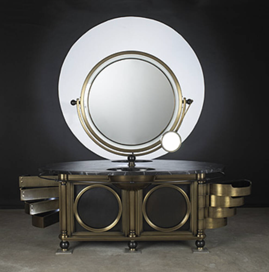
This influence was evident in a 1994 Manhattan showhouse where he transformed a two-story studio into a dressing room of sublime monumentality, for which he designed an over-scaled dressing table of steel, bronze, and marble [below left] that channels the spirit of Jacque-Emile Ruhlmann’s 1930 dressing table of nickel-plated steel, mahogany, and glass. And so it should come as no surprise that our handsome pair of sconces caught Despont’s refined eye, prompting him to pull out his checkbook, and sign on the dotted line.
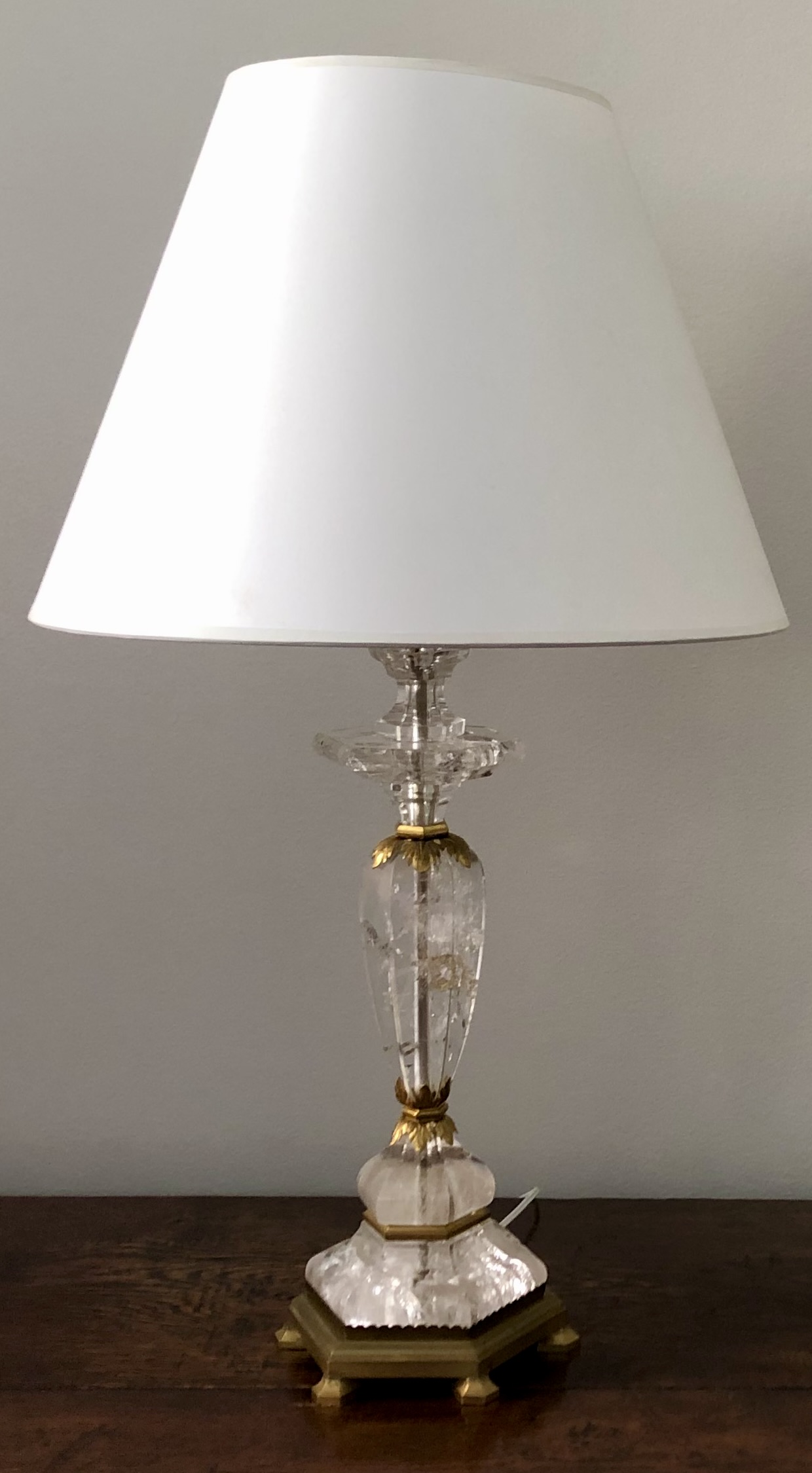
1940s ITALIAN ALABASTER LAMP
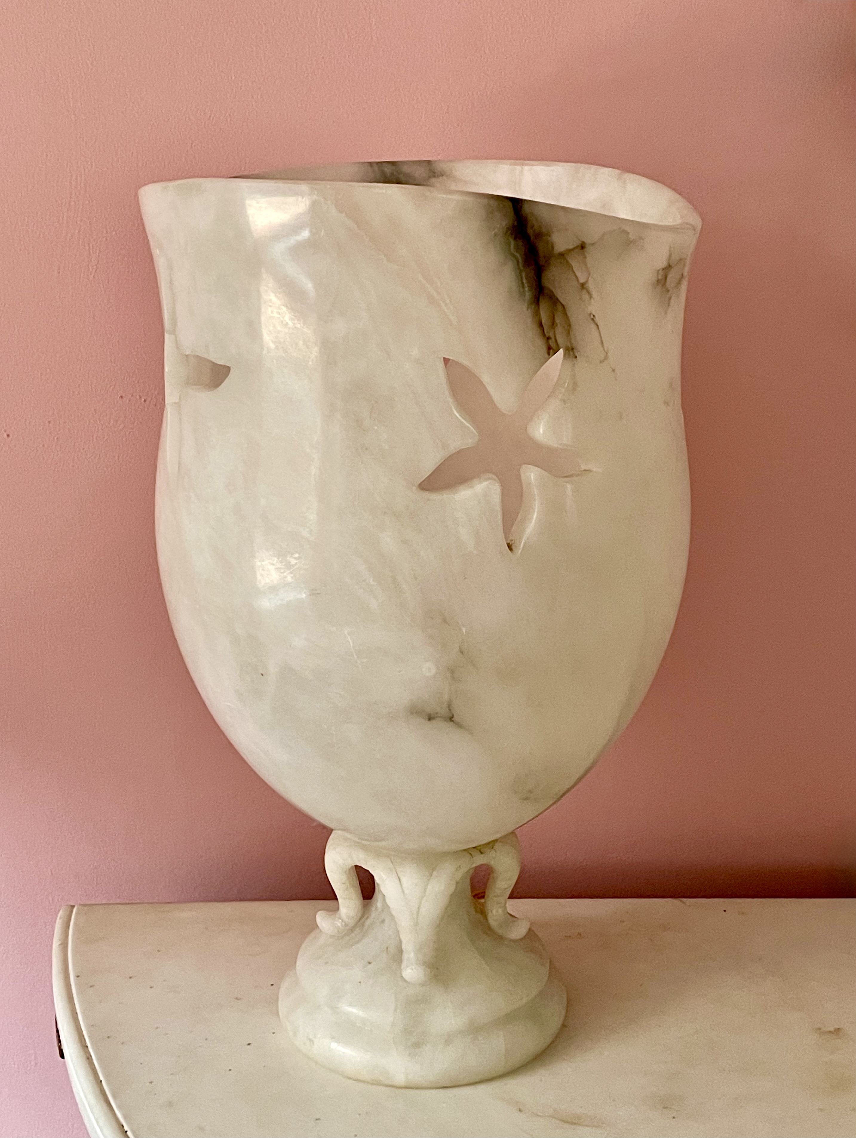
Italian urn-form lamp retailed by the Cooperativa Artieri Alabastro, Volterra, 1940s. Alabaster. H:15″ Dia: 9 1/2″. Sold
This 1940s urn-form alabaster lamp was inspired by the starfish, with silhouettes of three cut from the urn’s sides, and a fourth curling up en pointe to support it. Given the fragility of alabaster, the lamp’s large scale is unusual, and the openwork carving, and the translucency of the stone, create a dramatic effect when illuminated. The naturalistic forms, and the biomorphically undulating rim, make the lamp as much of a sculpture as a lighting fixture. As such, it represents a sophisticated and amusing Italian take on the Midcentury Modern style.
The lamp was sold through the Cooperativa Artieri Alabastro, or the Cooperative of Alabaster Craftsmen, which was founded in 1895, and was based in Voltera, the picturesque Tuscan town known for its alabaster quarries. The Cooperative was established in 1895 by the local artisans who carved sculptures, vases, lamps, and decorative objects from the locally-mined stone. They took a percentage from the sales of members’ creations to maintain a salesroom, archive, and grant scholarships to young artisans to attend the regional art academy.
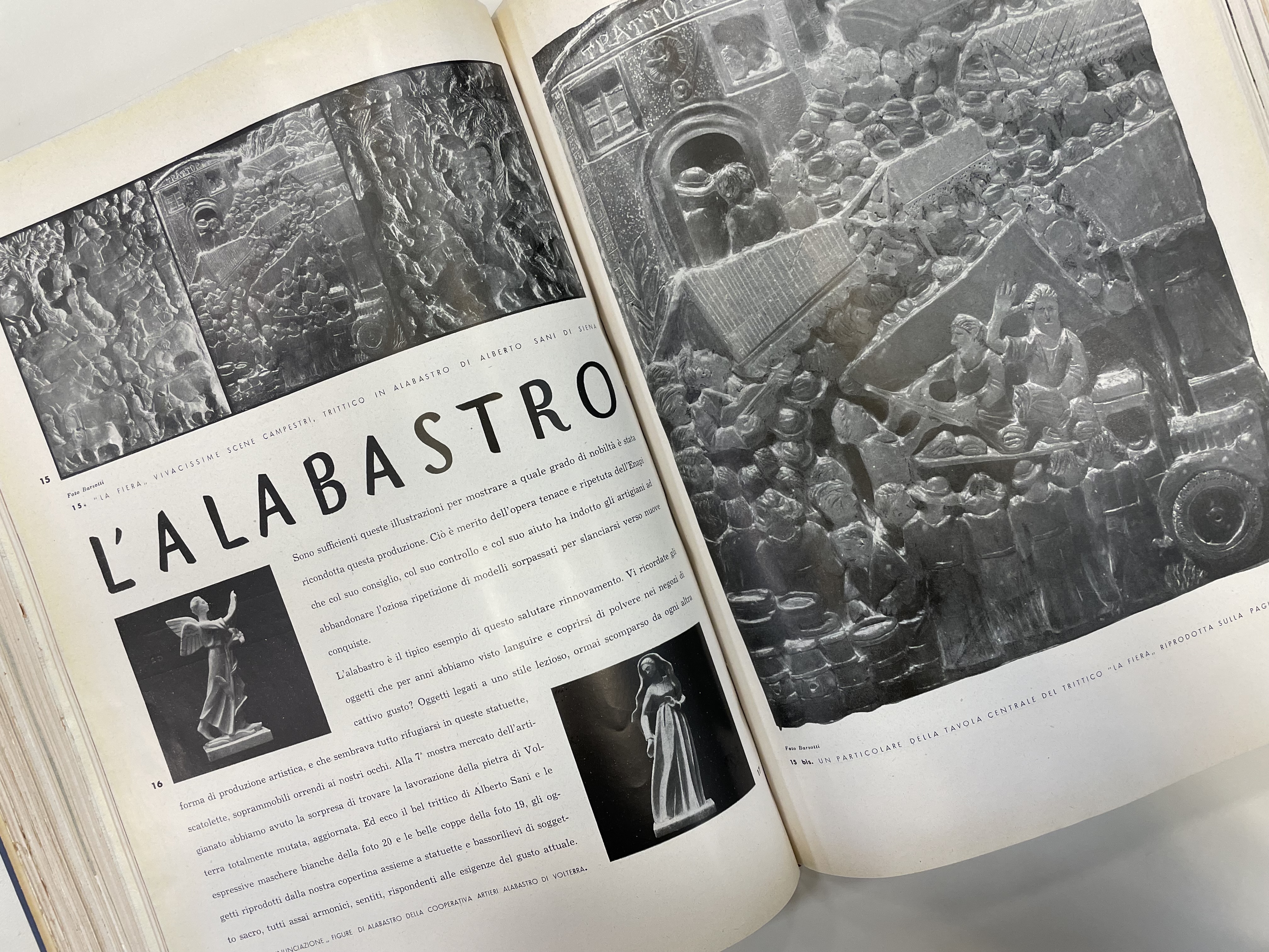
The design skills and craftsmanship of the Cooperative’s members were acclaimed internationally. They showed their work in the Paris 1925 exhibition of modern decorative arts, and won the admiration of Gio Ponti, Italy’s most important 20th-century architect and designer. He was also the founding editor of Domus, the monthly design magazine, where he published an article on the Cooperative in July 1936 [above left], and another the following July [above right]. At the time, Cooperative’s artistic director was Umberto Borgna, a graduate of the Florence art academy, who updated the product line by soliciting designs from such prominent modern artists, architects, and designers as Ponti himself and Franco Albini. After the war, aided by the United States government’s Marshall Plan, the Italian government refinanced the design industry, spurring on the second so-called “Italian Renaissance.” This allowed the Cooperative to resume participating in international exhibitions, most notably Italy at Work, which travelled to twelve American museums in 1950, and prompted the distribution of their products worldwide, including Macy’s in New York, Marshall Fields in Chicago, and, closer to home, La Rinascente in Milan.
FRENCH 18TH-CENTURY BAROMETER
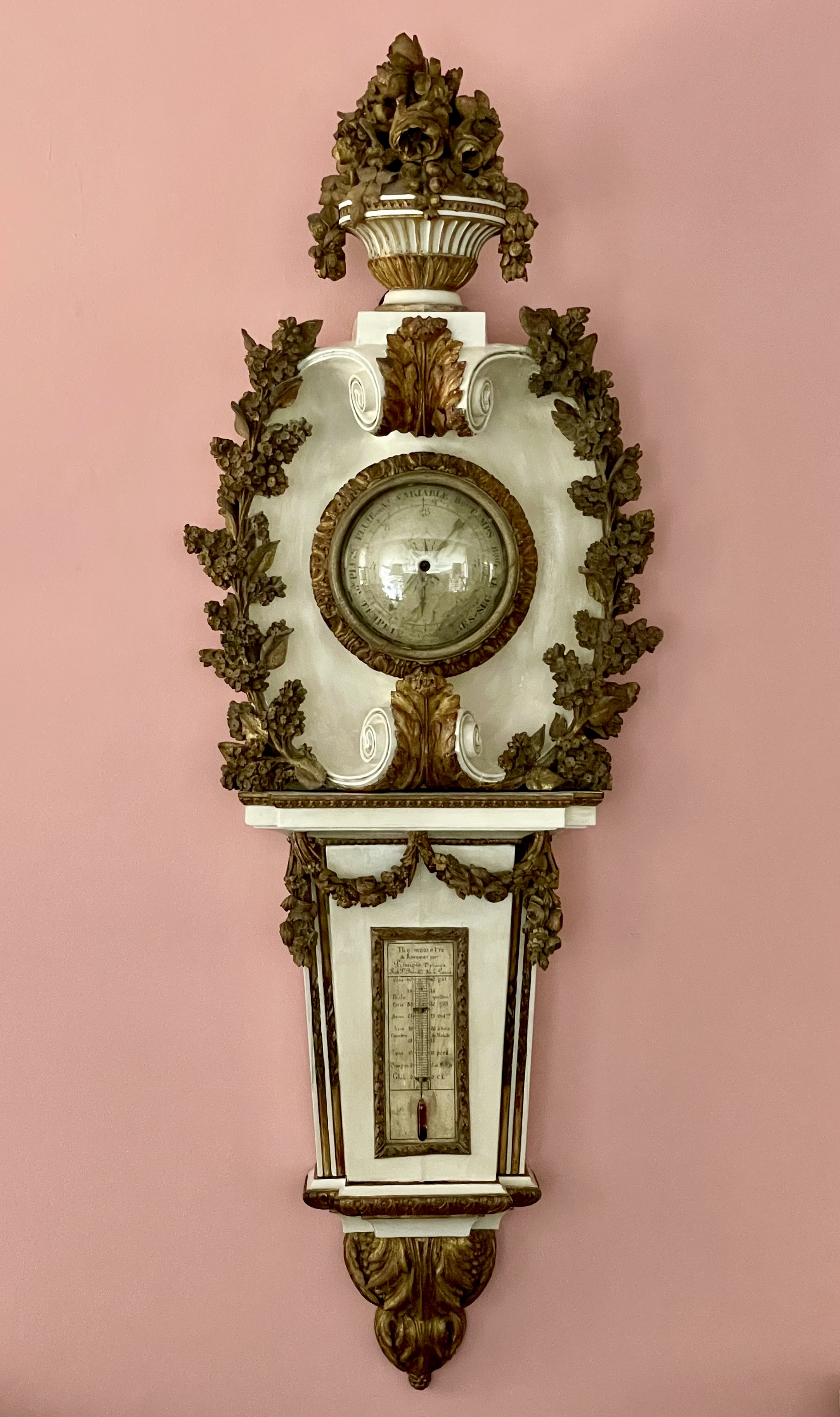
French barometer, circa 1780, with works marked “Primois Optician / Rue St. Benoit, 36 / à Paris.”. Painted & gilded carved wood, glass, metal fittings. H: 60 ½” W: 20“ D: 10“. Provenance: Provence Antiques, New York; Private collection, Lake Forest, IL.. Sold
This massive, weighty, and handsome 18th-century French barometer no longer works. But today, with a weather app on every iPhone, who cares? Besides, what makes this barometer so covetable is its sculptural quality and beautiful carving. As for the works themselves, there is, under a glass dome [below left] a circular instrument to indicate if the weather is rainy (“pluie”), or dry (“sec”), and a rectangular one noting the air pressure [below right]. The latter is marked by the maker and retailer “Primois Opticien,” at number 36 Rue St. Benoit in Paris, since this was an age when an optometrist supplied not only eyeglasses, but other scientific instruments, clocks included.
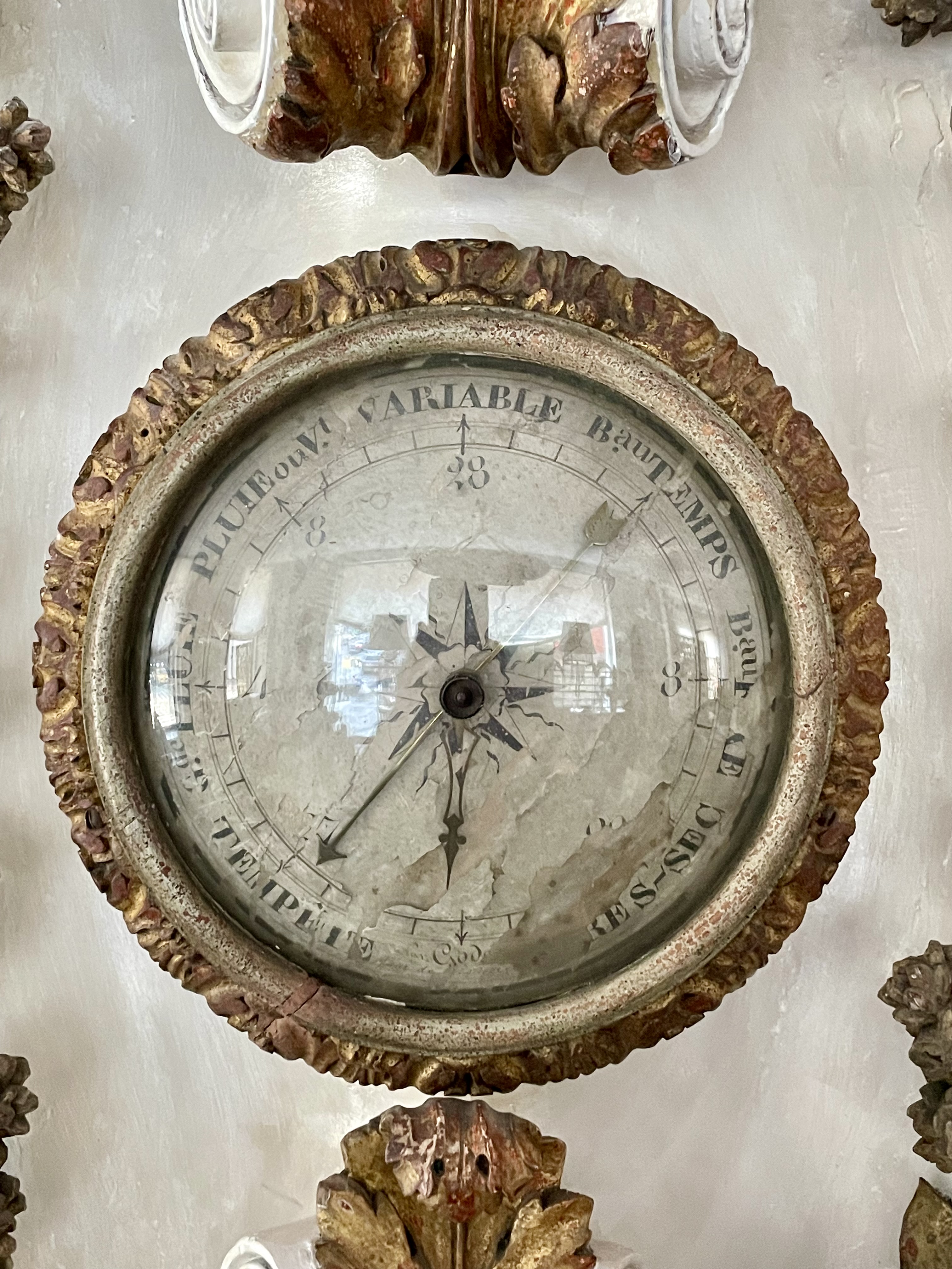
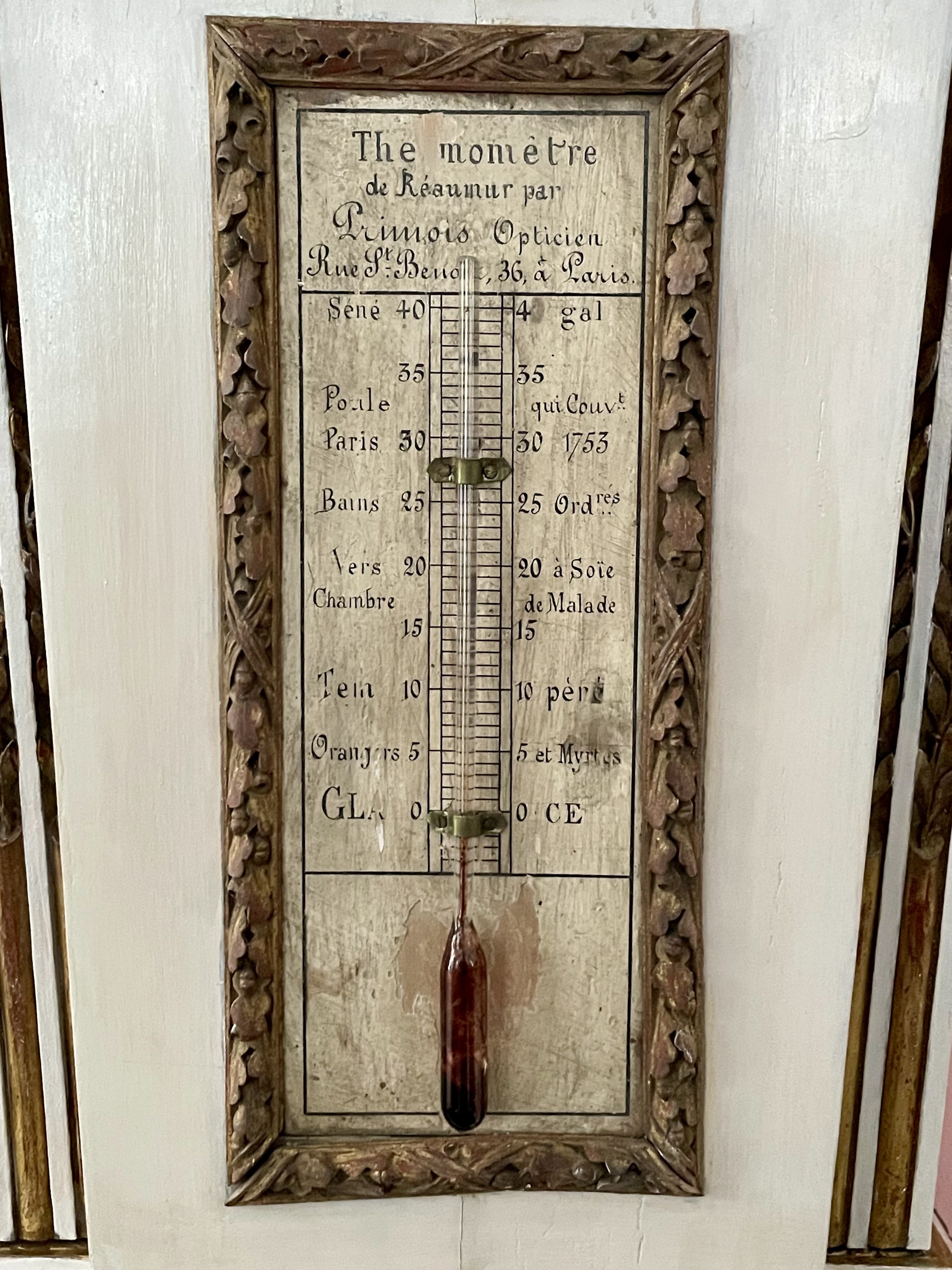
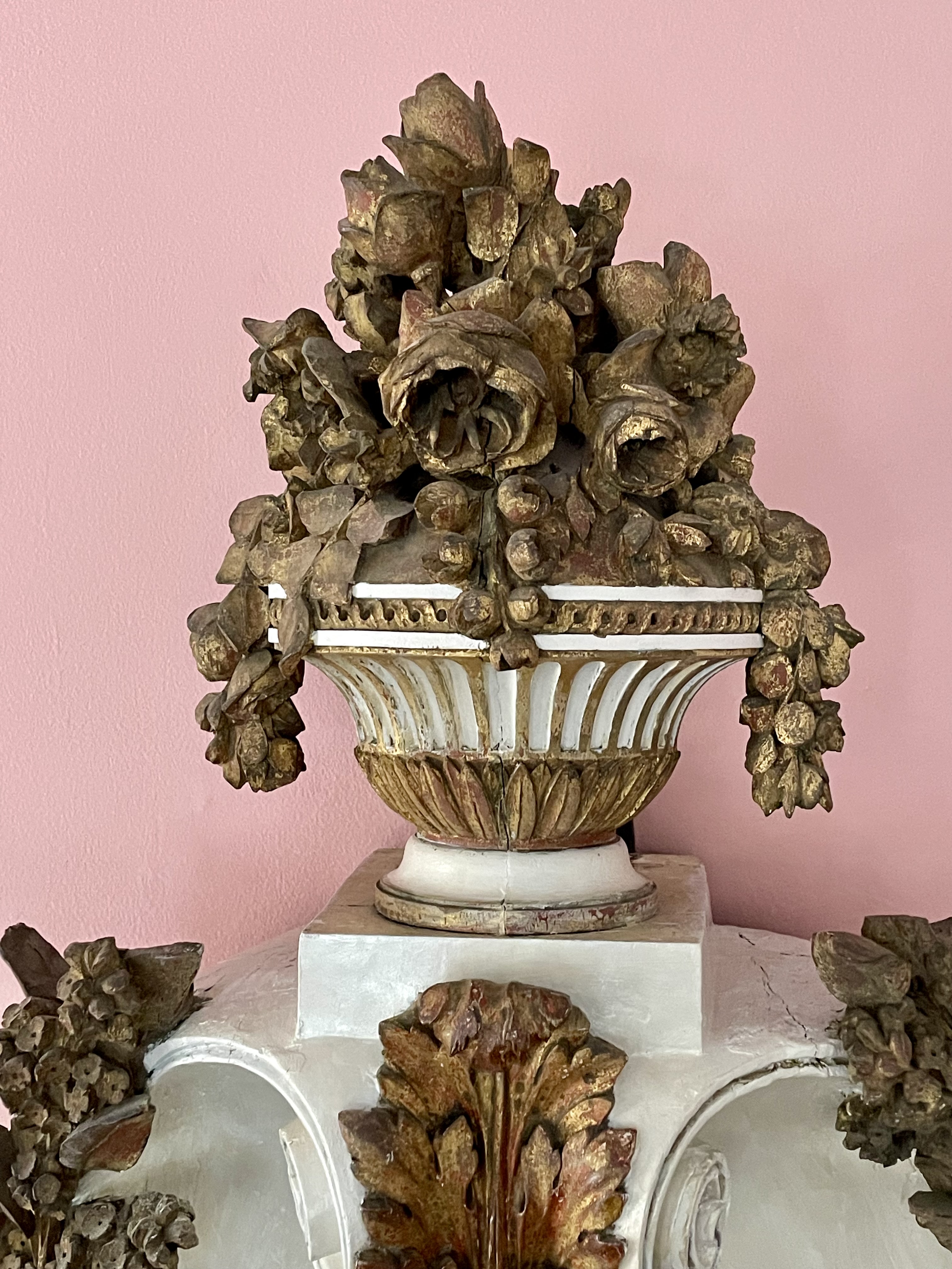
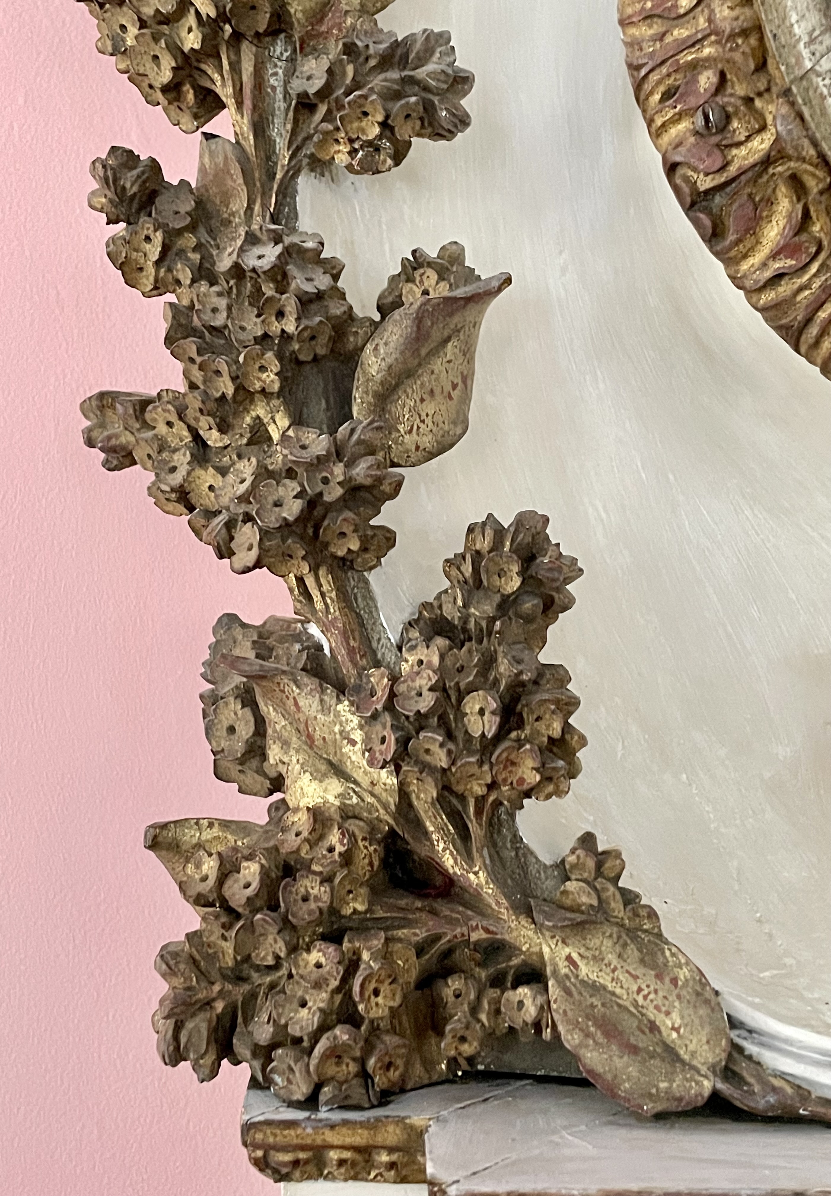
Primois would not, however, have made the wonderfully carved wooden casing that still very much works, esthetically speaking. The circular instrument rests in a bold oval cartouche that curls inwards at the top and bottom, seemingly in the grip of two large acanthus leaves. It’s flanked by lilac boughs topped off with a fluted vase that overflows with roses [below right]. Below, the rectangular instrument, framed by oak leaves and acorns bound together with crossed ribbons, is embedded in a panel beneath and behind two free-standing flowered swags. And at the very bottom, a bracket of acanthus leaves appears to prop the works up. Overall, the barometer’s Neo-Classical design and carving couldn’t be more sophisticated, and they’re made all the more so with the gilding.
We don’t know where this barometer spent its first two centuries, but in the 1980s it found itself in New York at Provence Antiques, a well-known purveyor of 18th-century French antiques, located just to the left of the 76th Street entrance of the Carlyle Hotel. We know this because the barometer arrived on our premises still bearing their discrete adhesive label noting an $18,000 price (saying something about transitory values in the antiques trade). From there, the barometer went to Lake Forest, where it hung on the sculpted-plaster wall of the stairwell at Suffield House, the 1934 residence David Adler designed for Mrs. J. Ogden Armour, who was better known to her friends as Lolita.
LOUIS XIV ARMCHAIR
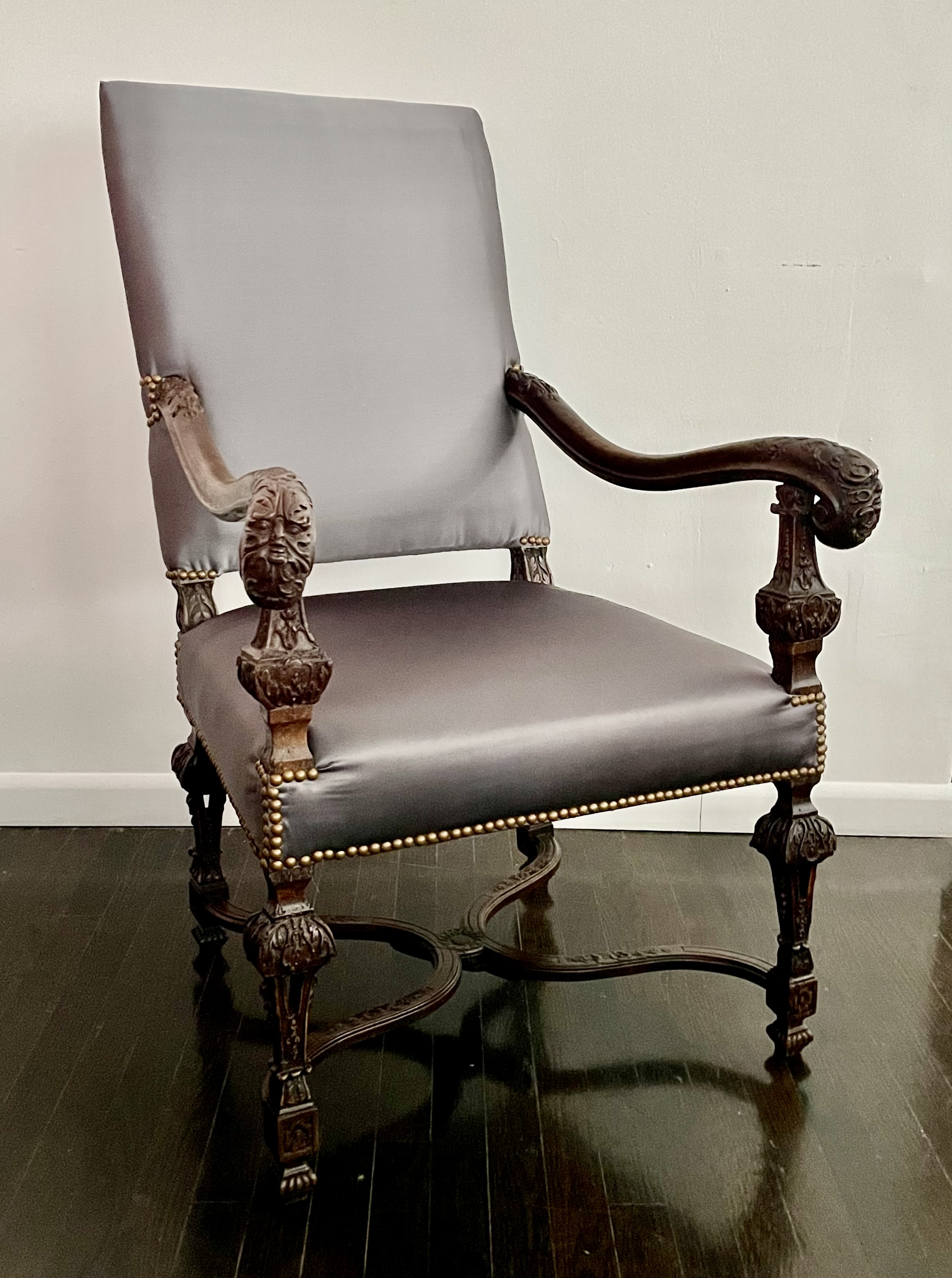
French armchair, circa 1680. Carved walnut, upholstered. H: 42“ W: 26 ¾ ” D: 30“. Provenance: Dalva Brothers, New York. $10,000
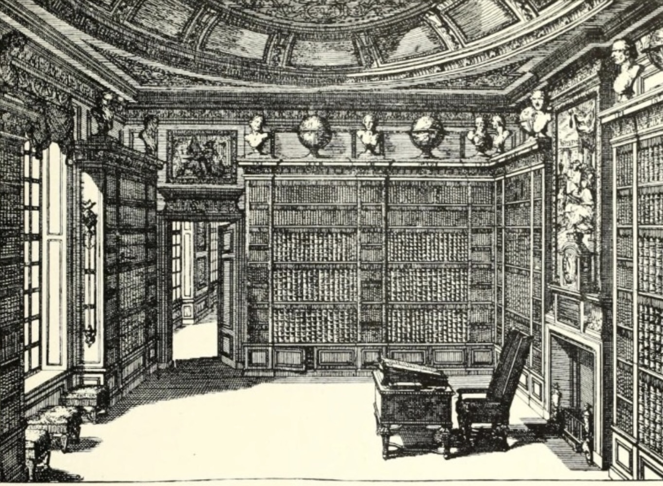
This imposing 17th-century walnut armchair is French and dates to the reign of Louis XIV. The chair’s grand proportions are typical of that grandiose period, and were probably in scale with the room where it was destined to be placed, one like the library engraved after a design by Daniel Marot [below left]. These over-scaled proportions may also reflect the status of the original owner, rather than their actual physique, since people were smaller in an age that predates vitamin supplements.
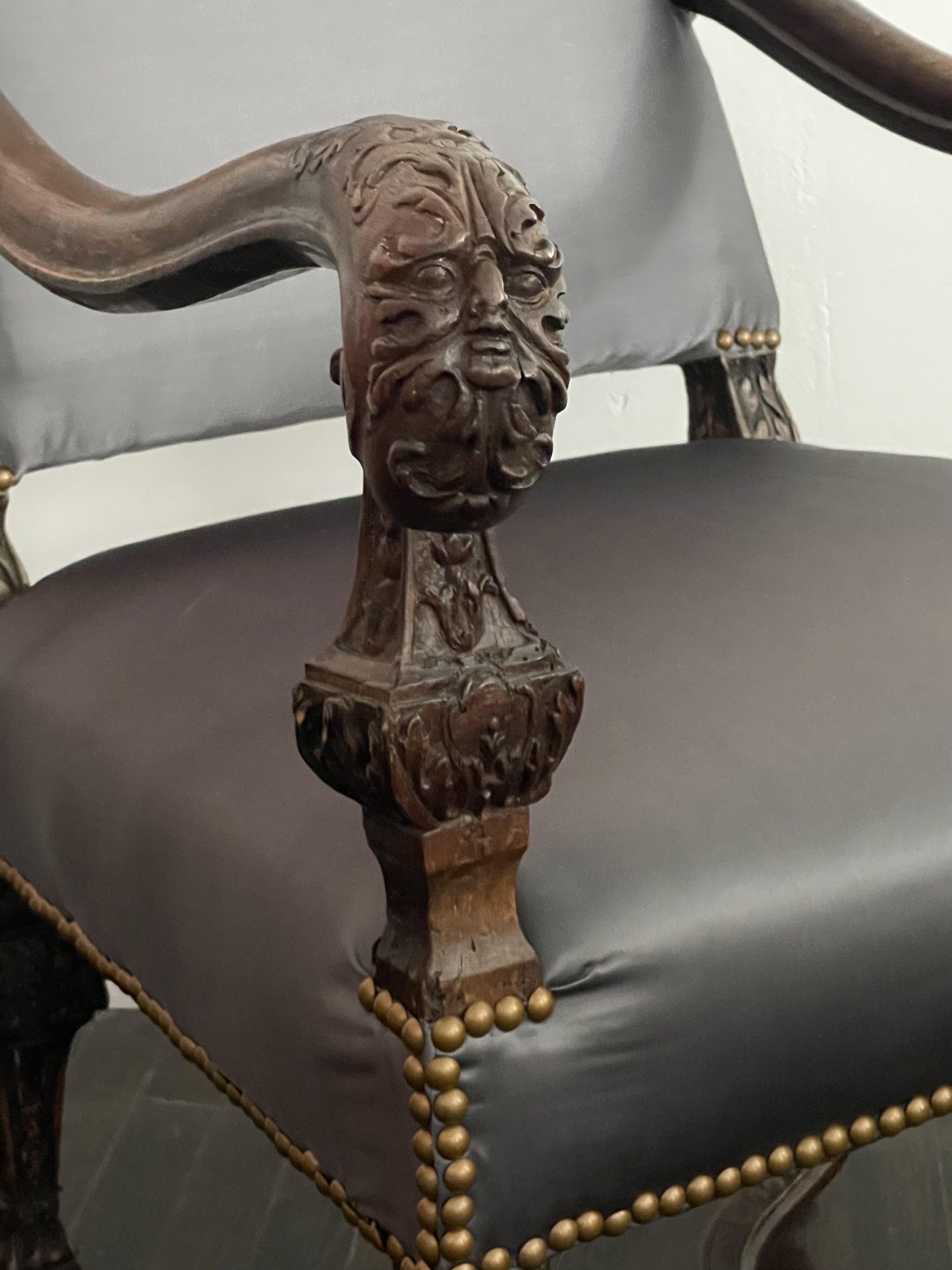
Among the chairs many finely carved details are the masquerons of wild-men emerging from the leaves that terminate the armrests [above right], the baluster-form arm and leg supports, and the sunflower at the juncture of the stretcher [below left]. This sunflower references Louis XIV himself, the self-styled “Sun King,” since they pivot to follow the sun’s progress across the sky, just as the court and citizenry were expected to pivot as required to fulfill the king’s commands, needs and whims.
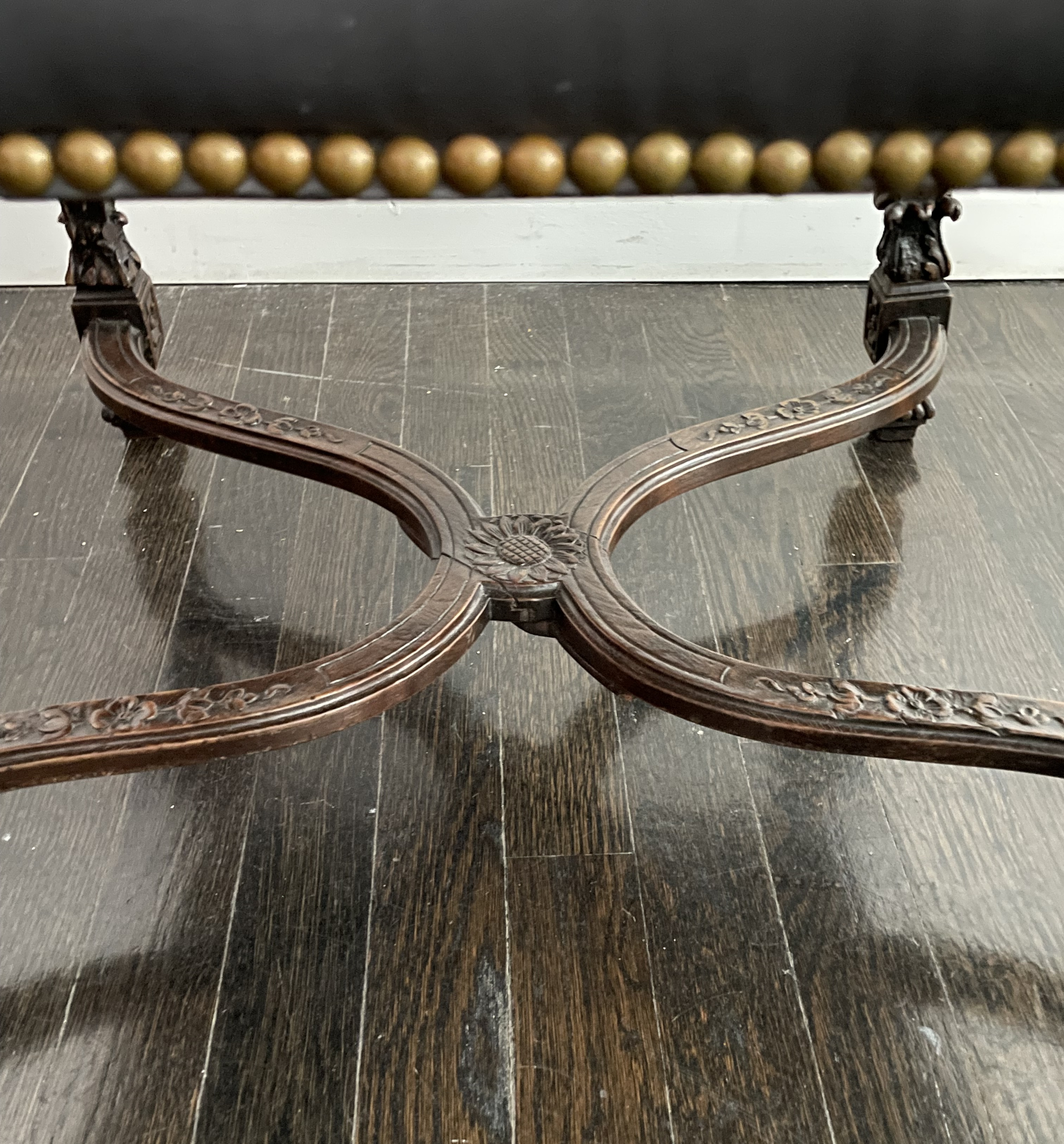
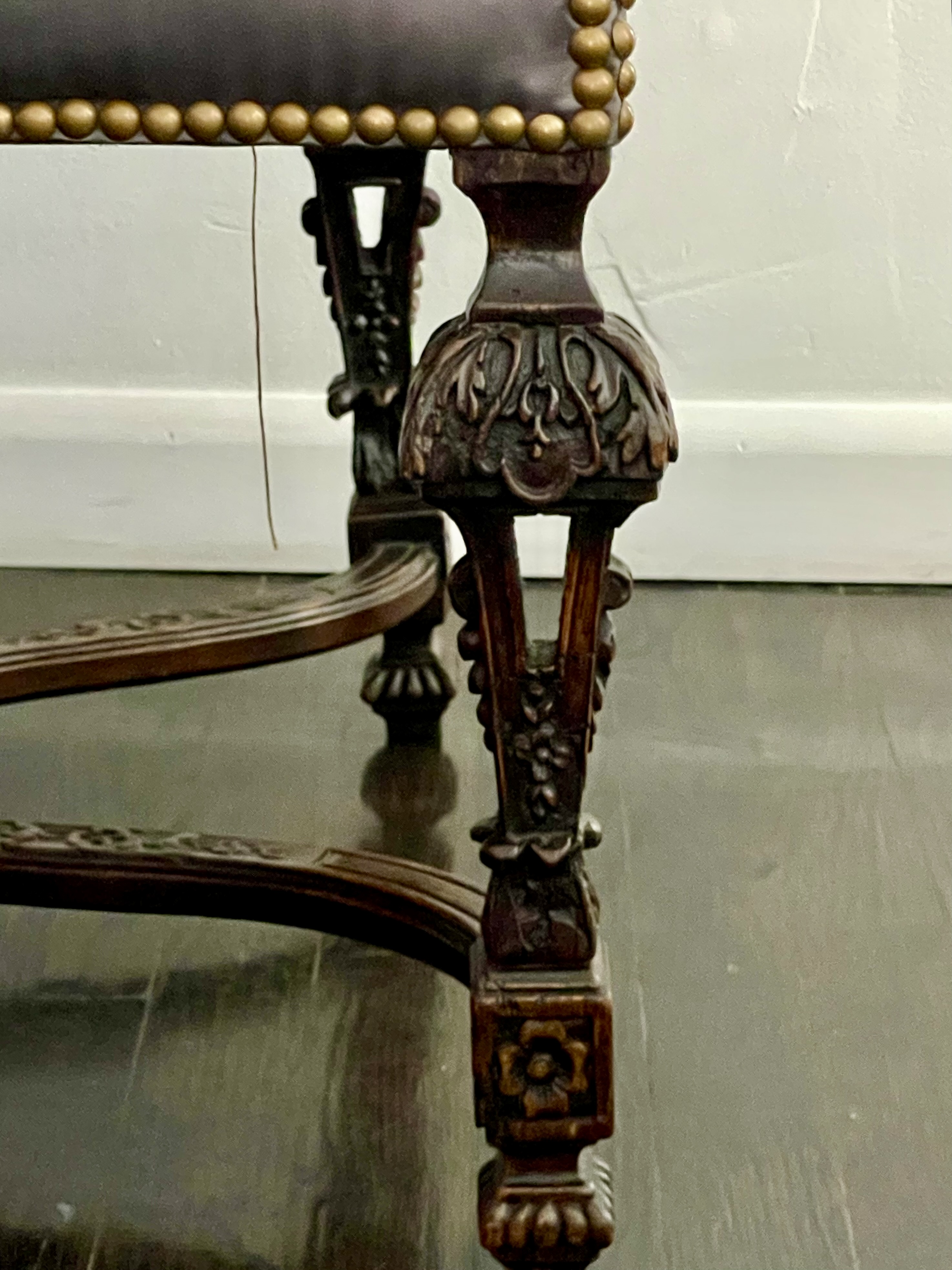
The chair’s most striking detail, however, is a structural one: the openwork carving on the front and back legs [above right]. Occasionally found on the legs of tables from this and later periods, it’s rarely found on chairs. In any case, originally, our chair would have been covered in needlepoint or velvet, but we’ve taken the liberty of upholstering it in duchesse-silk satin. The application of brass nails, however, is very much à l’ époque.
PAIR OF LOUIS XVI VOYEUSE
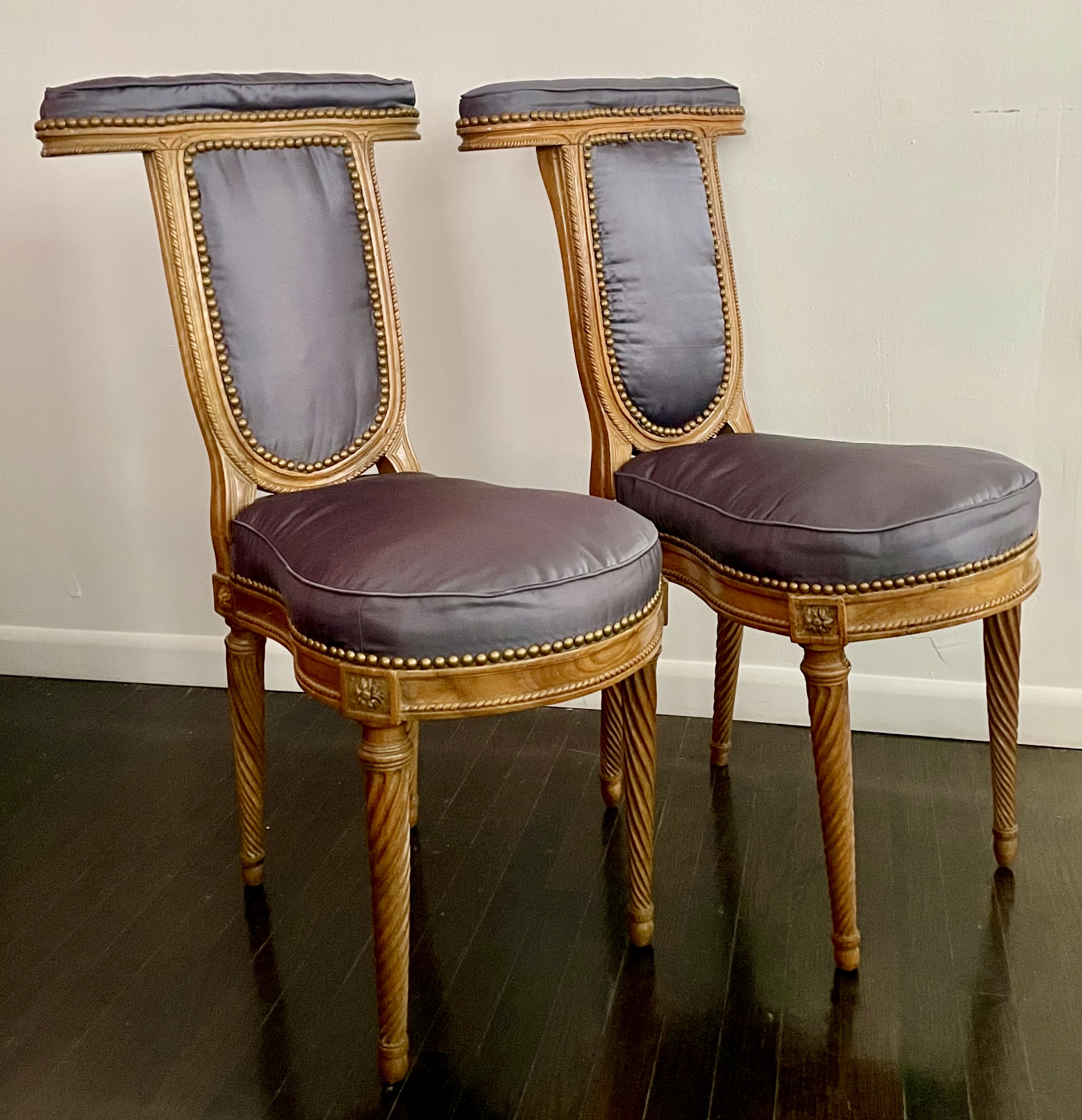
Pair of French voyeuse, circa 1780. Walnut, upholstered in silk satin. H: 37“ W: 17 ½“ D: 23“ seat height: 19”, each. Provenance: Dalva Brothers. $10,000
The voyeuse takes its name from the French verb voir, to see. Its purpose was to provide a seat for a person, and a pad for another to rest their elbows on while observing whatever the sitter was doing. As such, this type of chair was often pulled up to a games table, and fostered intimacy, if not flirtation. This can be seen in a watercolor by Louis de Carmontelle [below left], depicting the Marquis de Flavigny elegantly sprawled on a similar chair to better observe an embroidering woman, with only one of her hands and skirt visible. Our comparison is inexact, since this chair with a lower seat is closer to a prie-dieu, used for kneeling and praying (which makes the flirtatious scene all the more delicious for its transgressiveness).
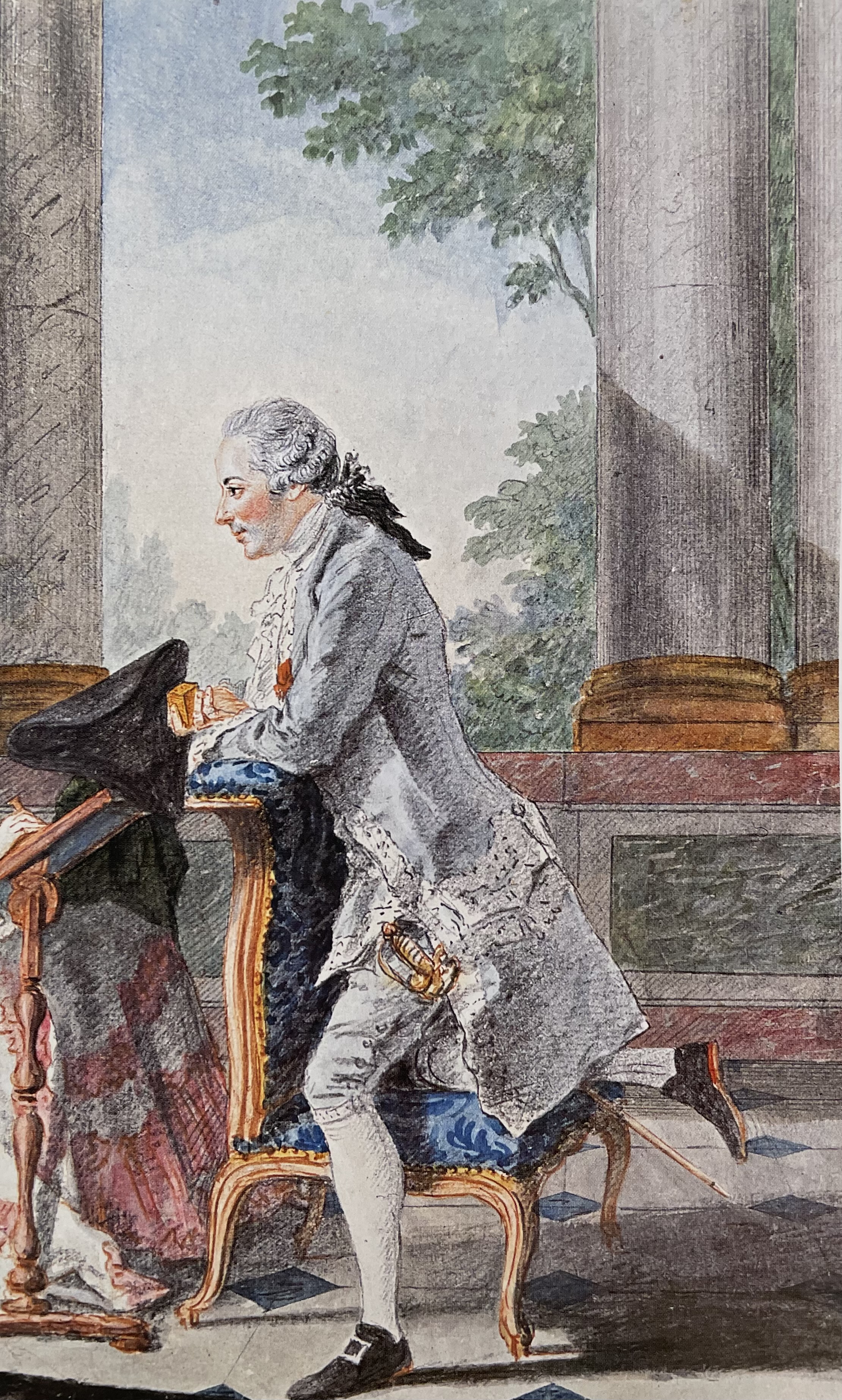
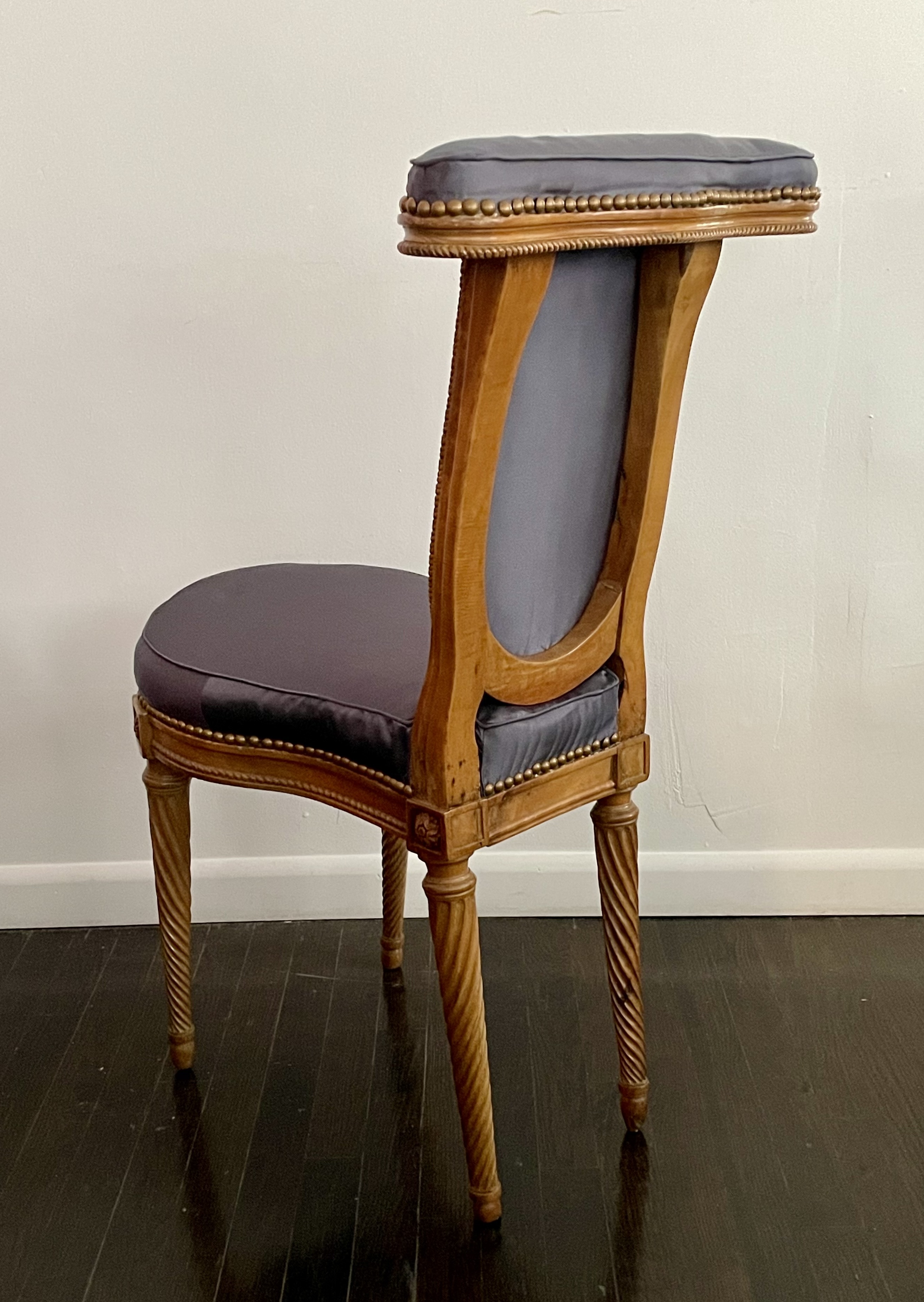
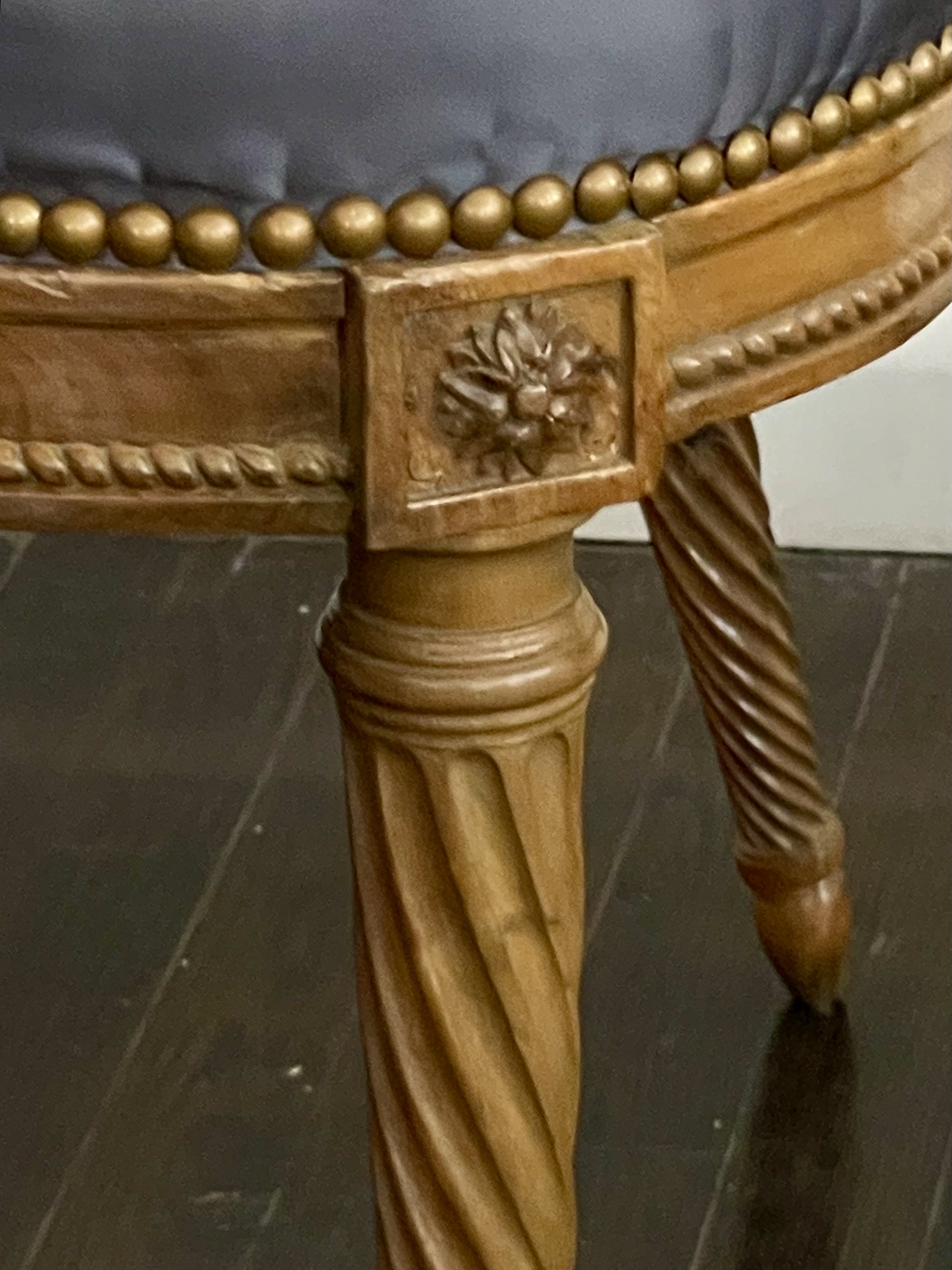
The form of our voyeuse has a poetry to it [above center]. Made around 1780, it is charmingly detailed with spiral fluting twisting around the legs [above right], and a carved-rope motif trimming the seat rails, and the upholstered panels on the front of the backs.
The French embrace of l’art de vivre is evident in the stunning variety of furniture types that were invented there in the 18th century. In the category of chairs alone, besides the voyeuse and the prie-dieu, there was the chauffeuse, confident, confessionanl, turquoise, and veilleuse – and that’s just for starters. This variety of furniture types speaks to the refinement of aristocrats, and, by extension, their obliviousness to the plight of the toiling masses who made do with the three-legged stools. When the glittering edifice of the ancien régime came tumbling down in 1789, many of these types were embraced by the upper classes throughout Europe. Fast forward to the standardized present, when many of them, including the voyeuse, are extinct, except in the antique form that is still coveted by collectors and connoisseurs. And so it seems that the rich, somewhat to the relief of antiques dealers, will always be with us.
ASHANTI CHAIR
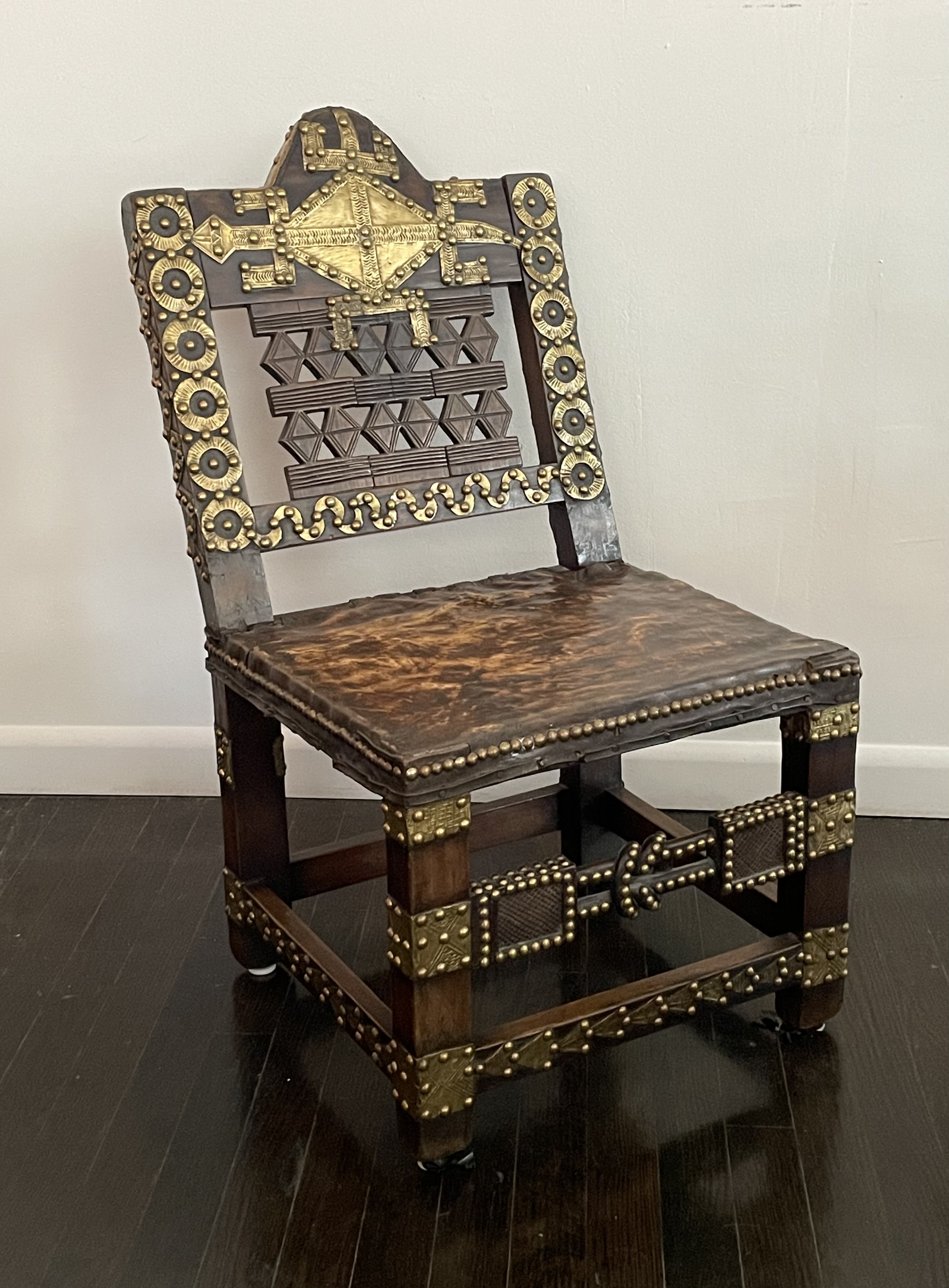
Ashanti people. Ghana, early 20th century. Royal chair (“Asipim”). Hardwood, brass plaques & nails, leather. H:31 1/2” W: 17 1/2” D: 20 1/2” Seat height: 14 1/2“. Provenance: Private collection, New York. $6,000
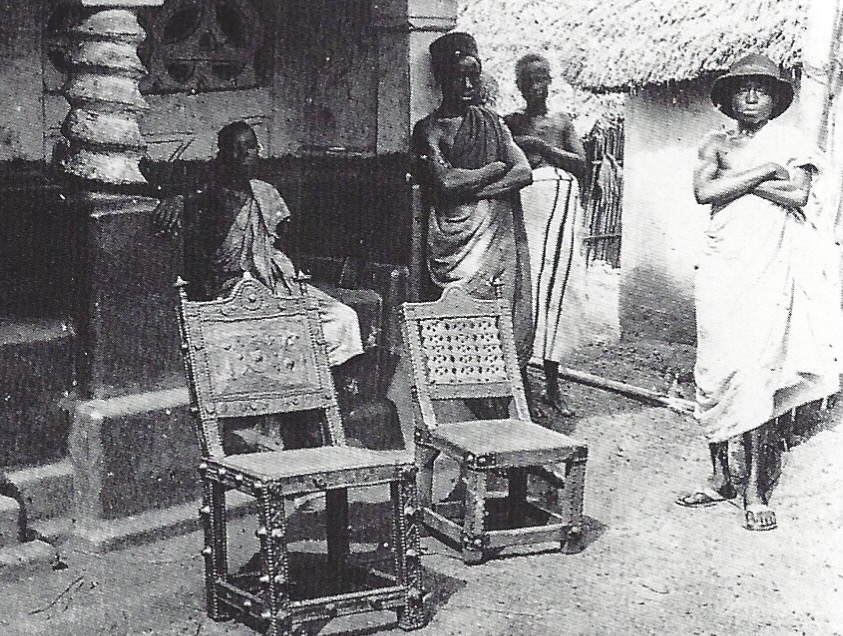
This type of chair was made for Ashanti royalty and the ruling class in present day Ghana, where the chairs are known as asipim – which translates from the local dialect as “I stand firm.” They are a local interpretation of western chairs, which were imported for the use of European military officers and traders posted there. As such, asipim were associated with power and prestige, and used as seating in official ceremonies [below right], unlike stools, which were associated with ancestral spirits and never used.
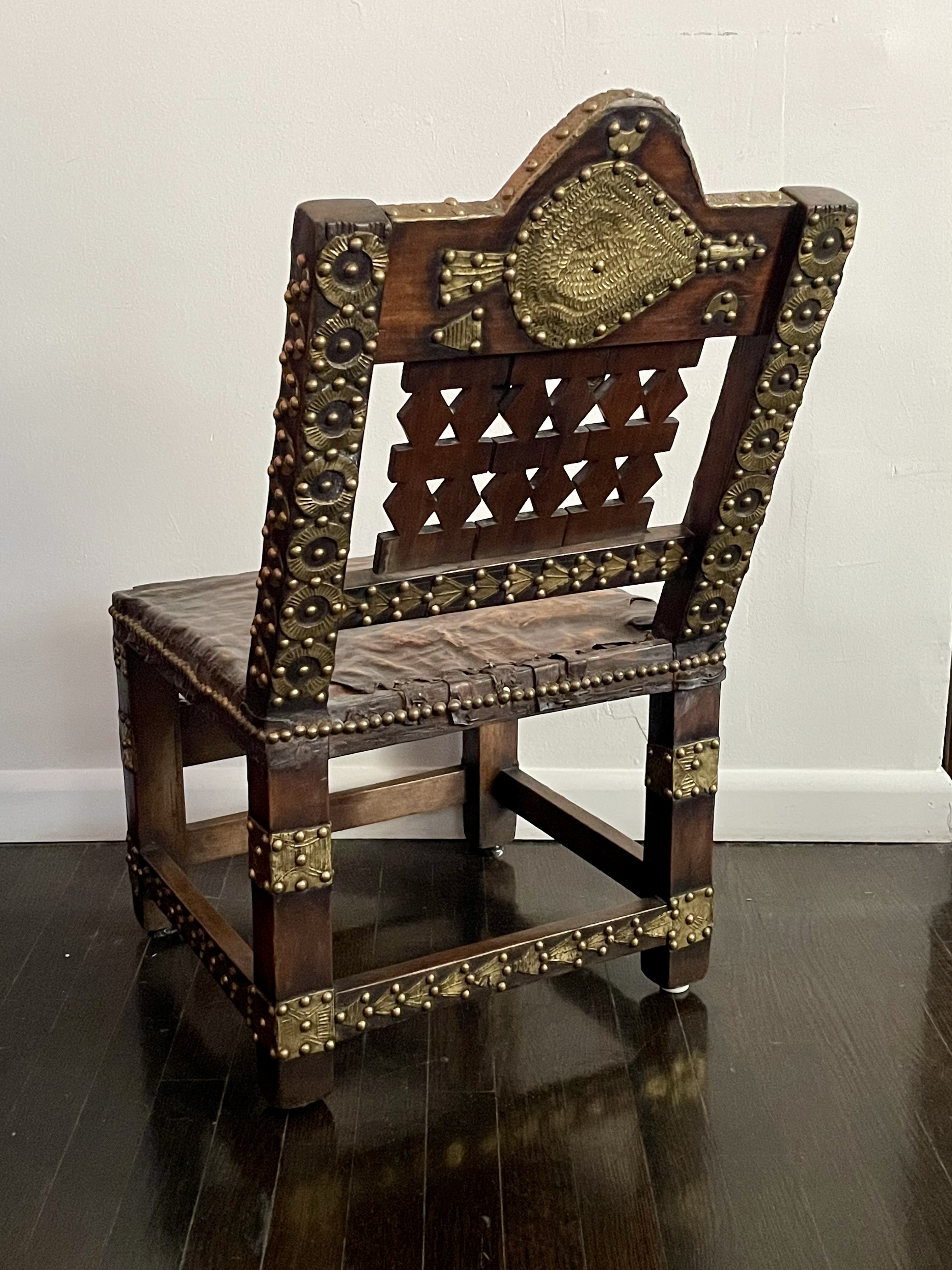
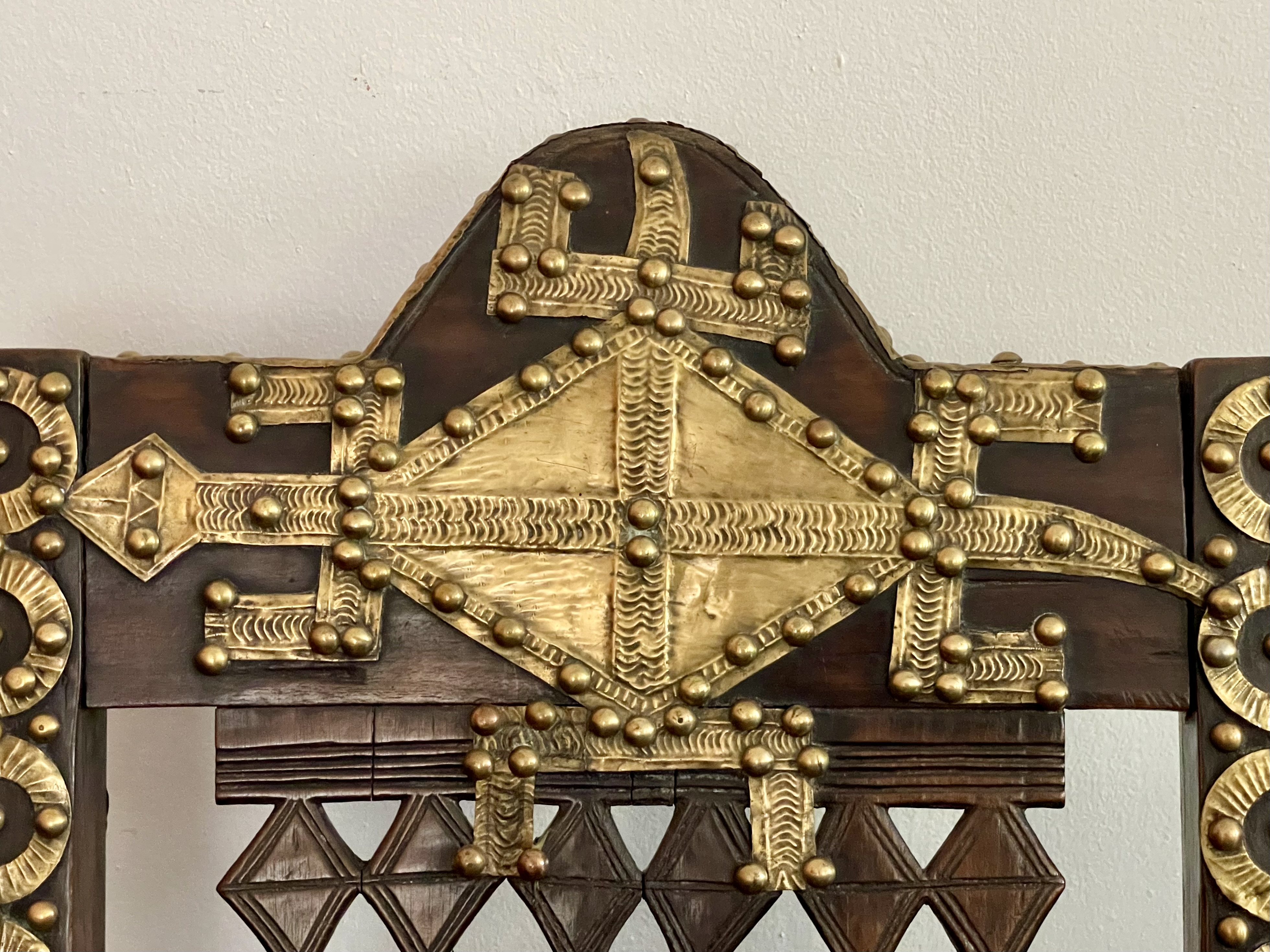
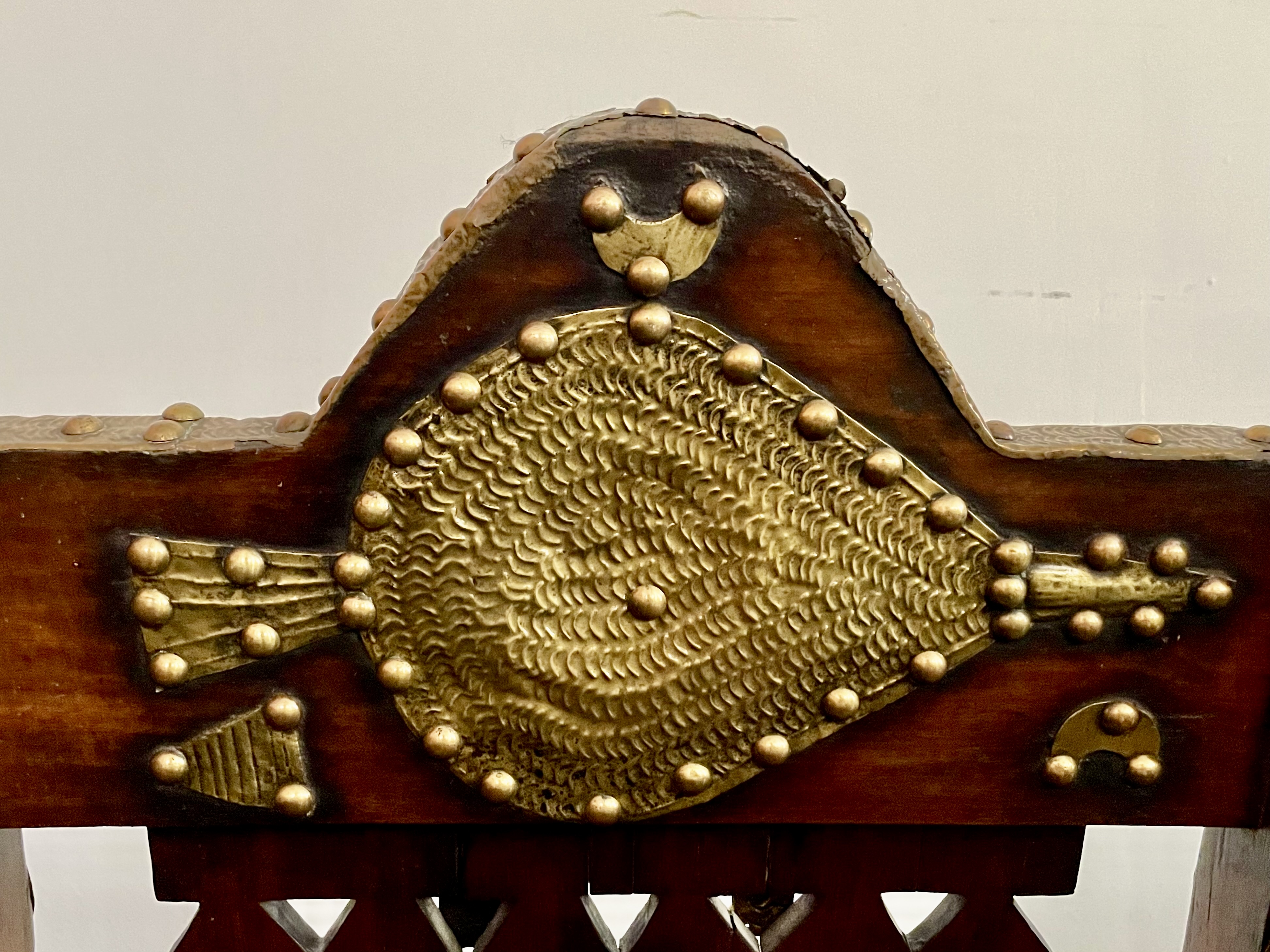
Asipim are of mortise-and-tenon construction, and were made from the locally available hardwoods that withstand the damp climate, and are impervious to insects. Their seats were upholstered in leather, like ours, leopard hide, and kente cloth. But their glory is the fetishistic encrustations of nails, which were imported from the West, and brass plaques, which were cut by local craftsmen. These plaques took the form of symbols and animals. On the front cresting of our chair is an alligator [below left], signaling fierceness, and on the back a bellows [below right], used for kindling fires — a life force in all cultures, tribal and otherwise.
We acquired the chair from a New York collector who was a product and interior designer. He did something that’s anathema to museum curators and some collectors: he replaced the missing nails and polished the brasses. This didn’t diminish the chair’s appeal for us, any more than French polishing and replacing the missing veneers on an 18th-century commode. Rather, it amplified its appeal by restoring the original bling-like effect, which, after all, made it desirable at the time and in the place of its making.
18th CENTURY GILT-BRONZE FURNITURE MOUNT
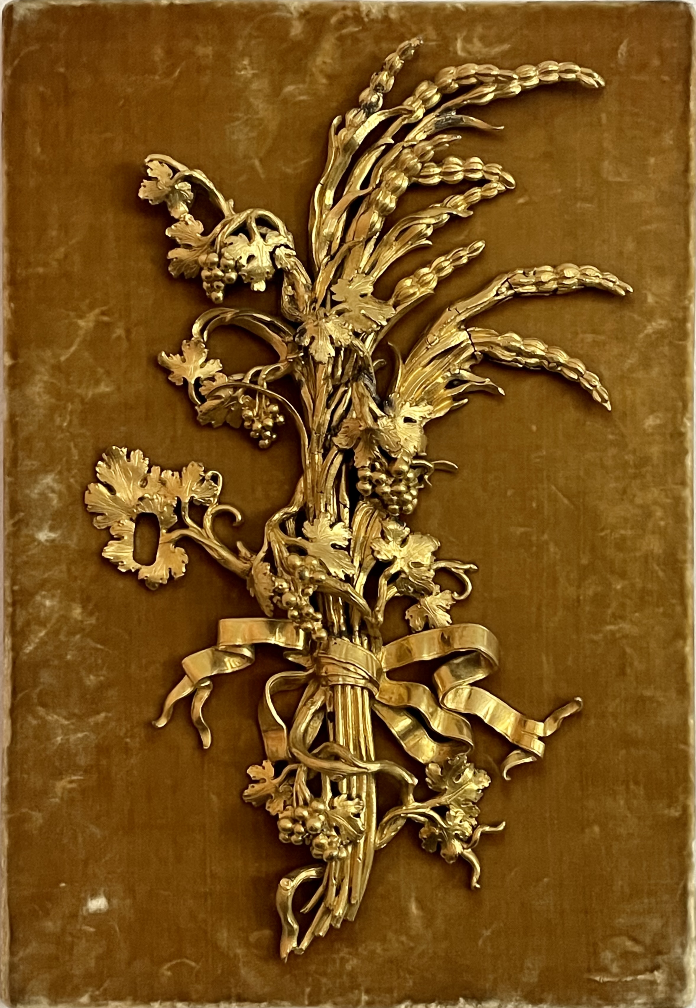
Italian, 18th century furniture mount, circa 1780. Gilt bronze on a silk-velvet-upholstered board. Mount: 12 ¼” x 7 ¼” x 1 ¼” / board: 13 ½” x 9 ¼”. Provenance: Dalva Brothers, New York. $5,000
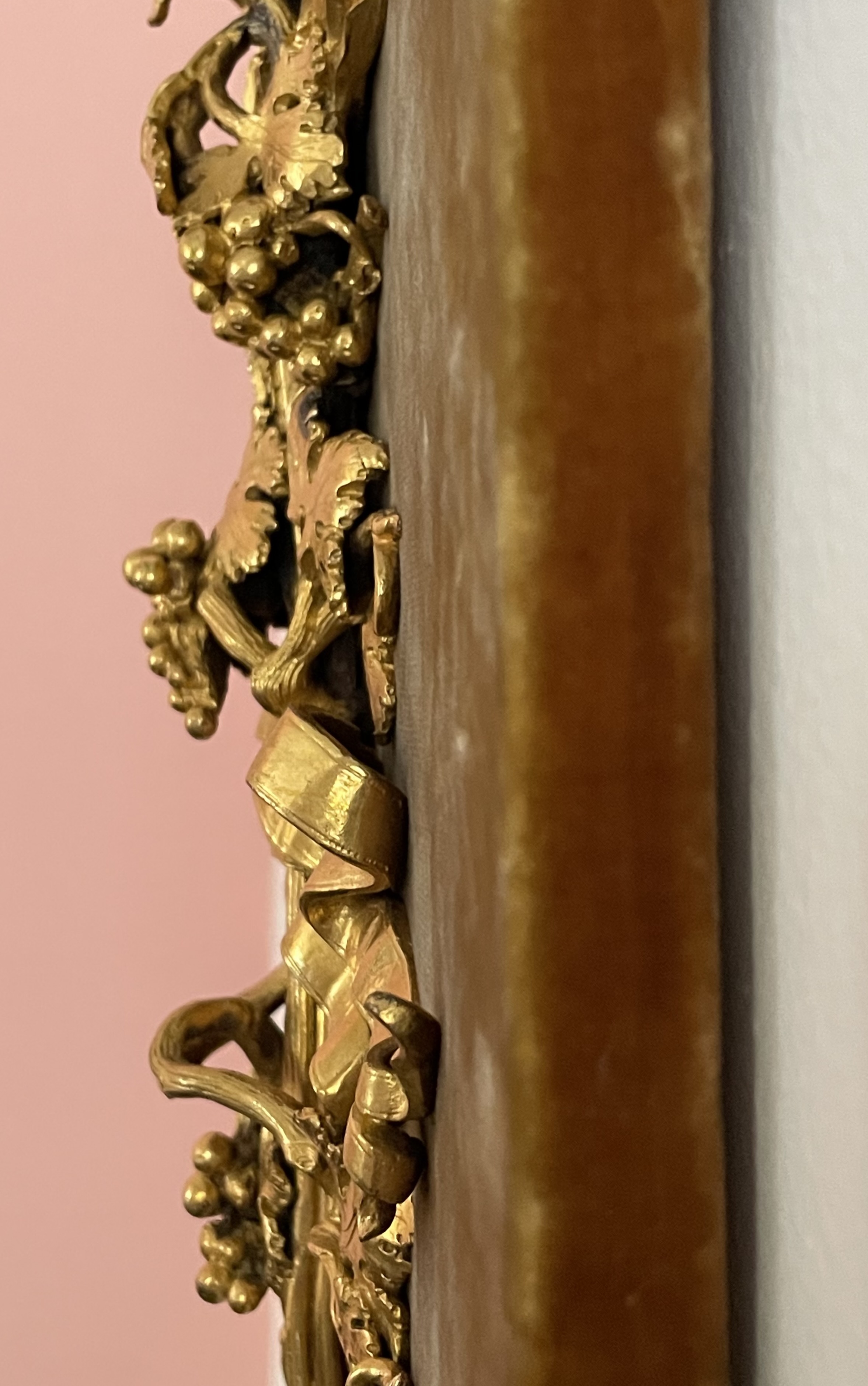
This late 18th-century gilt-bronze mount was made to embellish a piece of furniture, judging from the keyhole on the left. It probably had a mate with its form in reverse, and together they would have embellish a pair of doors on a cabinet, or a pair of single-doored cabinets. We can’t say what happened to that cabinet or pair of cabinets, which may have been altered or damaged beyond repair — assuming it or they came to be completed in the first place.
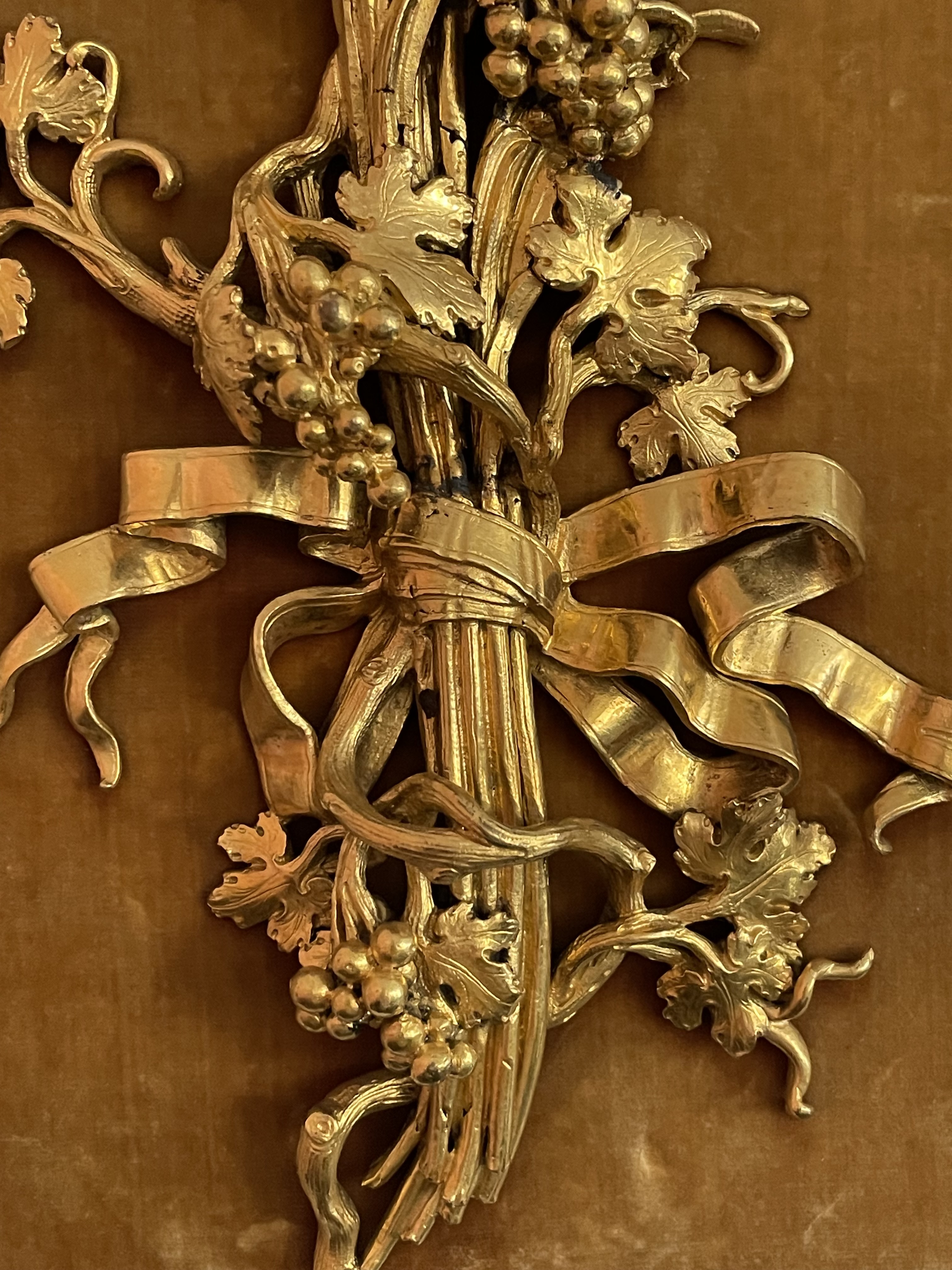
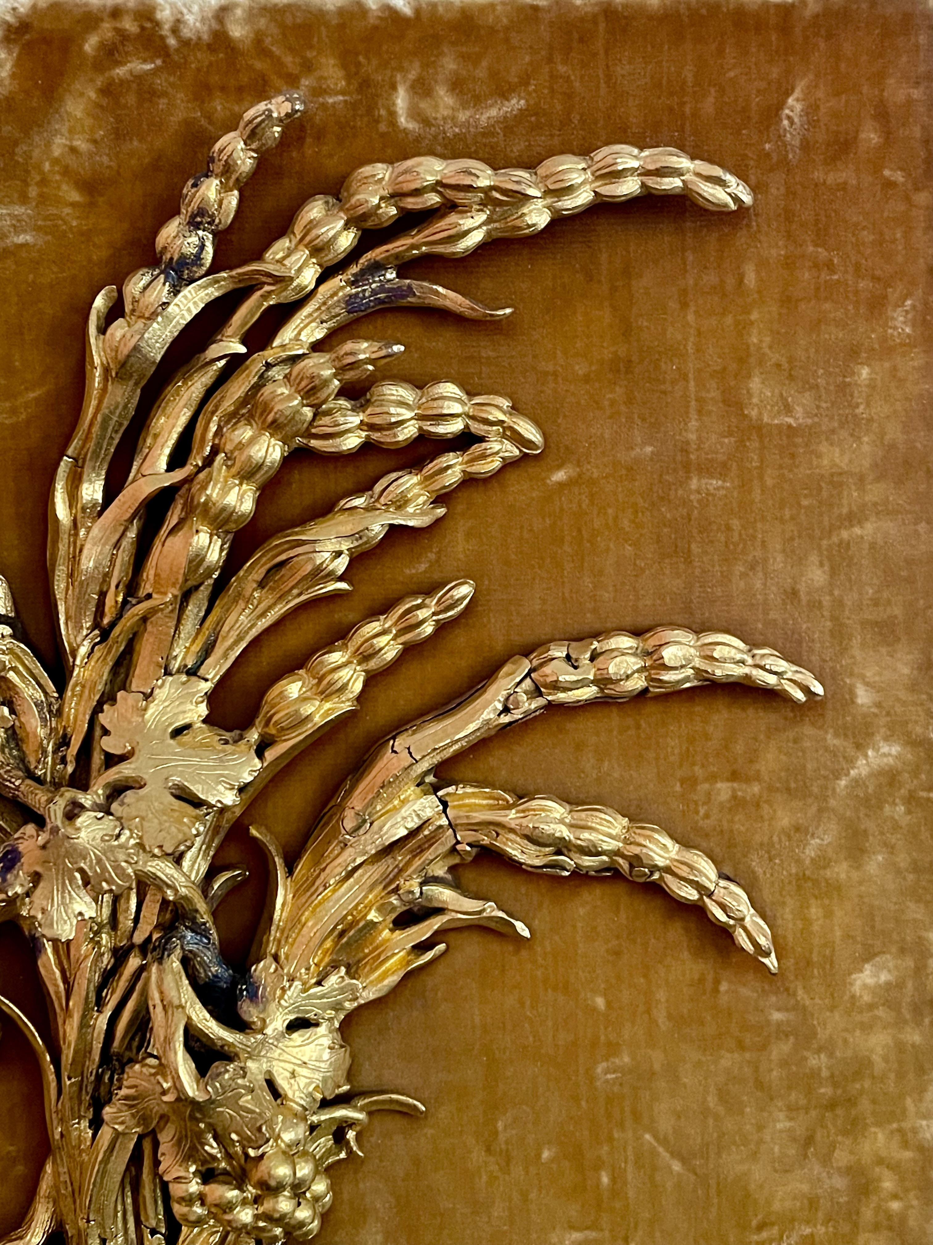
Our bronze mount assumes the form of sprays of wheat and grapevines that are tied together with a ribbon [above left and center]. Splayed, whispy, and deeply modelled [above right], it would have been difficult to cast, accounting for a few minor breaks and fissures. It was then mercury-gilded, a technique that has a richness of effect unequalled by other kinds of gilding. This effect came at a high price, however, in more ways than one, since the use of mercury to fix gold on bronze exposed craftsmen to chemical poisoning and early death. No wonder, then, that when this became known in the early 19th century, the technique ceased to be practiced.
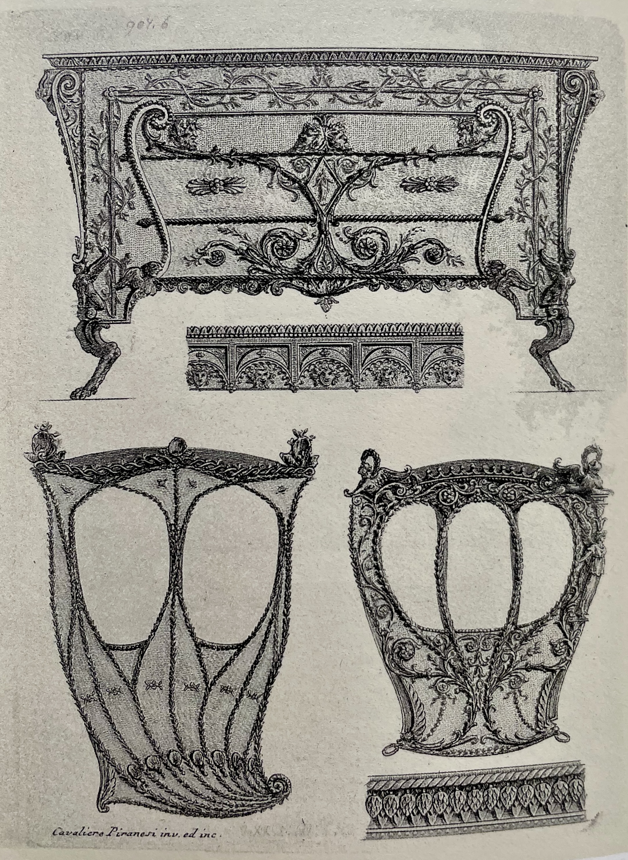
The florid and animated style suggests it was made in late 18th-century Italy. It may be compared to the fantastic ornamental designs proposed for a commode and two carriages [below left] by Giovanni Battista Piranesi in his 1769 print portfolio Diverse Maniere d’Adornare i Cammini ed Ogni Altra Parte degli Edifizi, which translates as Diverse Ways of Ornamenting Chimneypieces and All Other parts of Houses. While our mount is more naturalistic and less Neo-Classical than his designs, they share an Italianate, offbeat whimsicality and elegance.
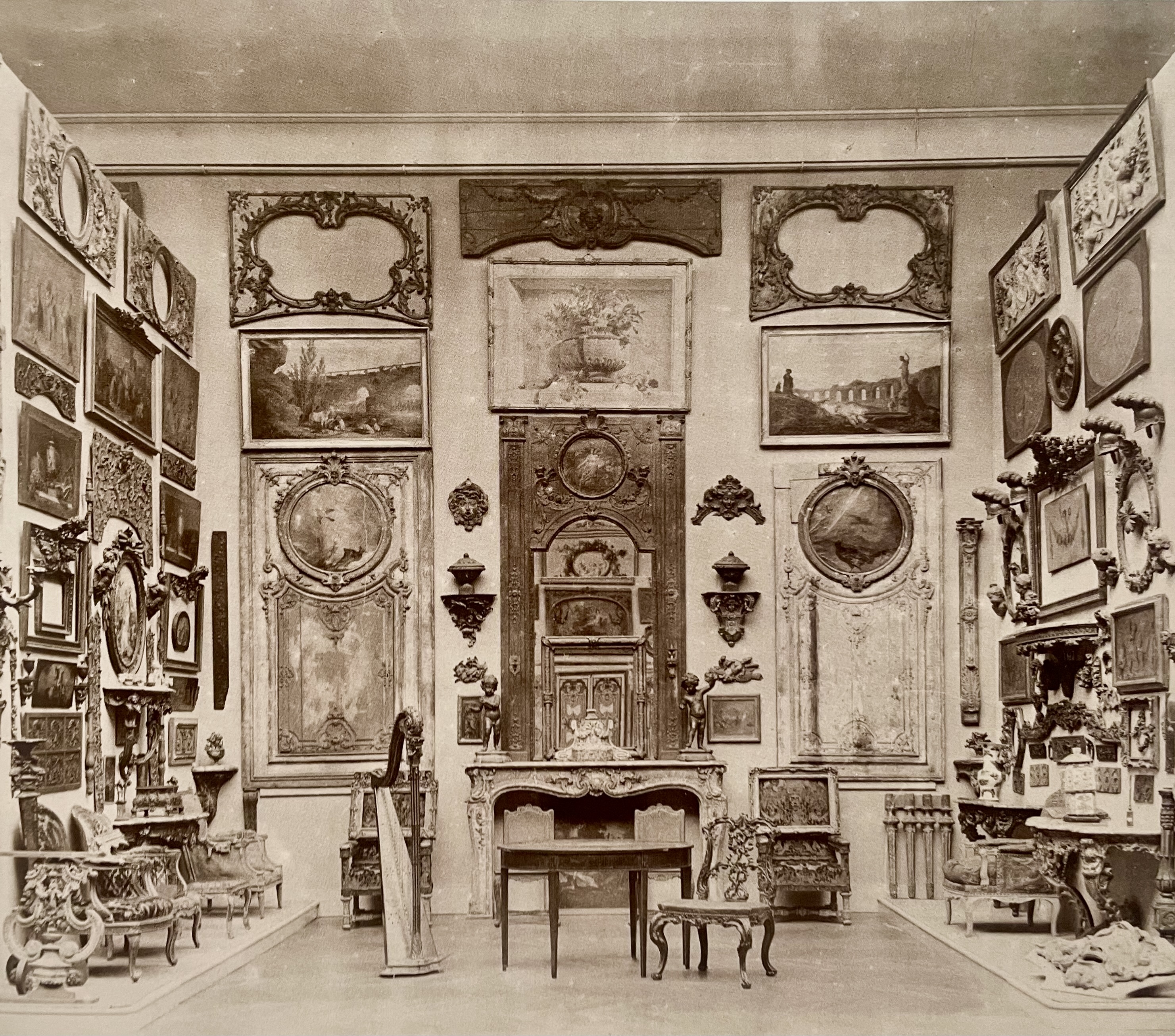
Circumstances, whatever they may have been, left our mount an orphan. Unused bronze was typically melted down to be recast as something else, but this mount was presumably deemed sufficiently beautiful to warrant preservation. At the turn of the 20th century, exquisite fragments of a lost world were highly valued and avidly collected. This can be seen in a view of the Paris quarters of Georges Hoentschel [above left], who hung his fine 18th-century carved-wood fragments on the walls along with his paintings. This photograph was taken around 1906, when Hoentschel, an interior decorator who amassed a huge collection of fragments that served as models for his own designs, sold it lock, stock, and barrel, to J. P. Morgan who, in turn, gave it to the Metropolitan Museum. Then, collectors also coveted bits of old embroidery, shoe buckles, and fans, among other things, which were framed, and encased in gold-tooled leather boxes, or, as in the case of our mount, displayed on beds of precious old fabrics, like our mount that is affixed to a silk-velvet-covered wood panel.
GLASS MEDALLION OF ZEUS
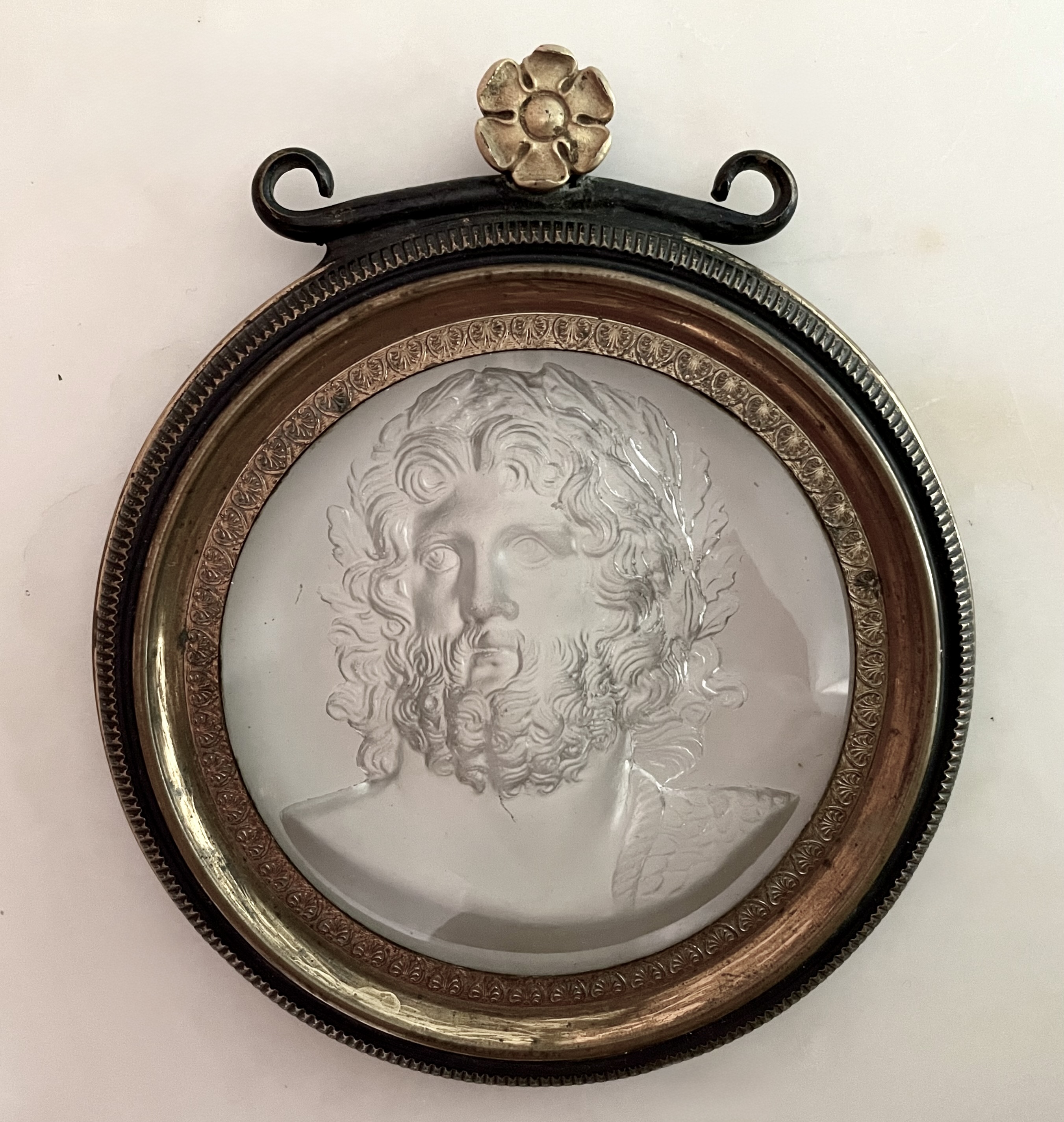
French or English. Medallion of Zeus, circa 1825. Cast glass, bronze, partially gilt. Glass diameter (sight): 2 ¾”, Frame diameter: 4” H: 4 ¾”. $3,000
The mythological king of the gods — Zeus in Greece, Jupiter in Rome – is shown here in bust form, crowned with laurel leaves symbolizing victory. Set in a gilt-bronze frame as handsome as the god himself, this glass medallion presents a conundrum: since the bas-relief image was cast in glass and sealed under glass (indicated by barely perceptible flow lines radiating from the center), what prevented the image from melting when smothered under more molten glass?
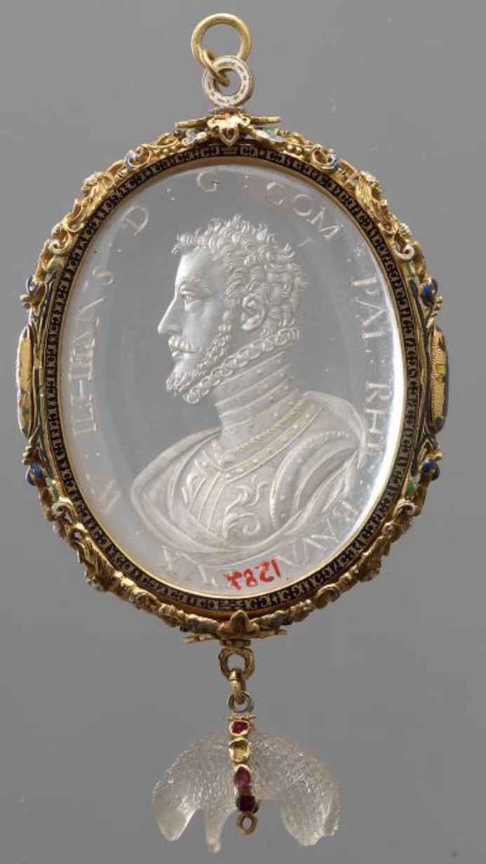
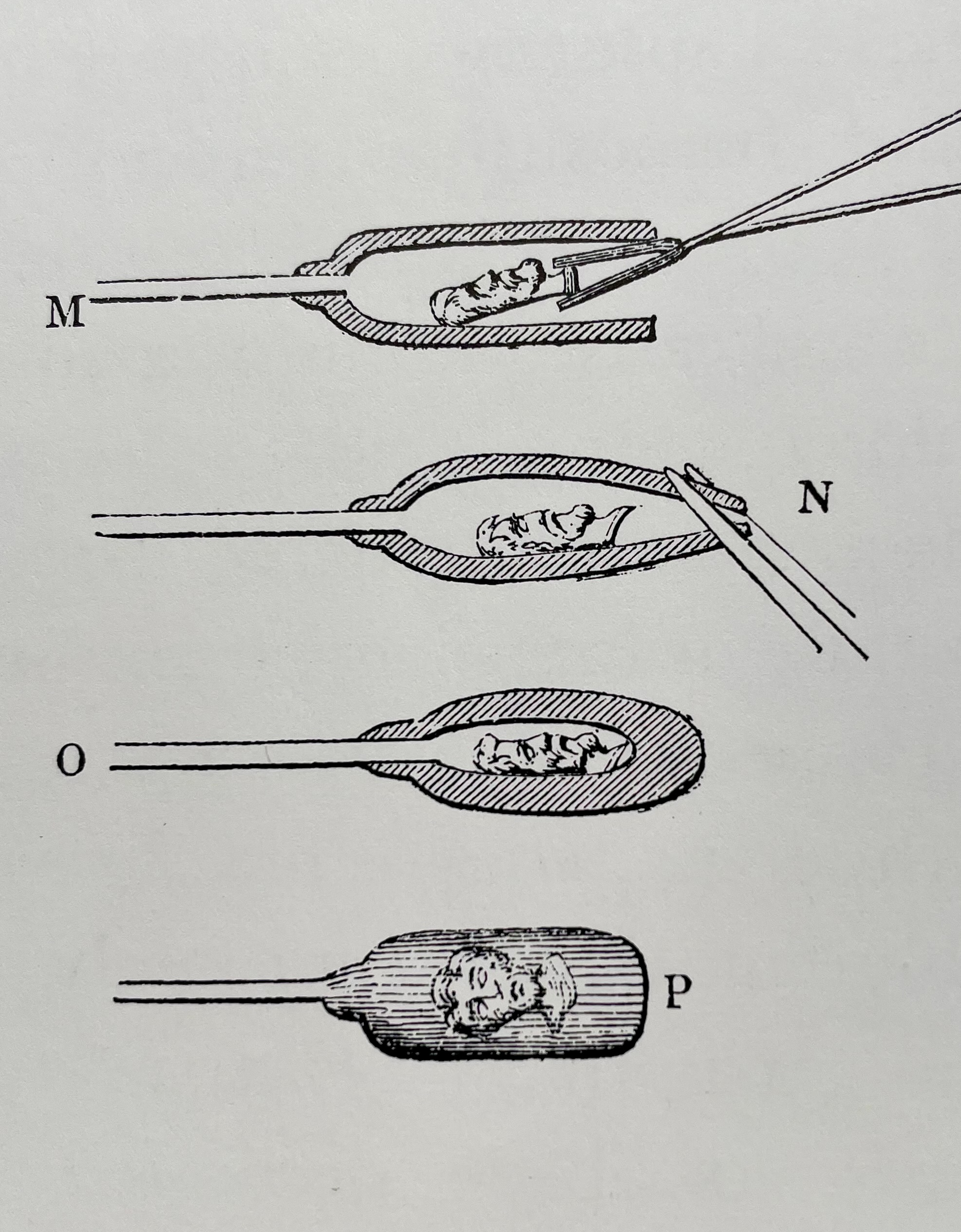
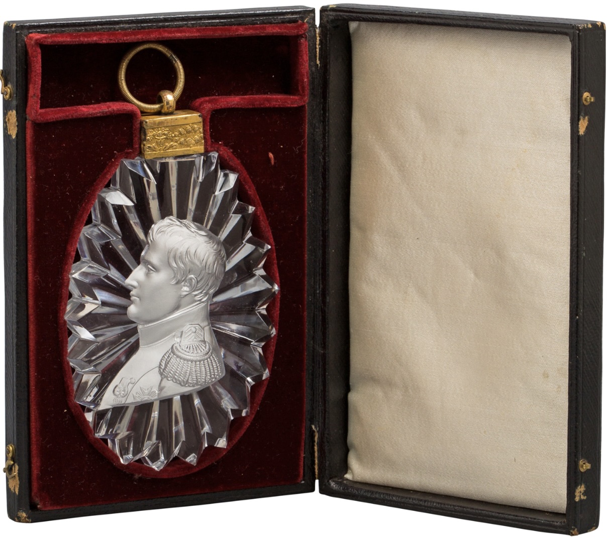
In the 18th century, European artisans were trying to create glass-medallion portraits in series, of royalty, aristocrats, and military leaders. They took inspiration from ancient and Renaissance carved rock-crystal medallions, like the 1585 one of Duke Wilhelm V of Bavaria of [above left]. In nearby Bohemia, a hotbed of glassmaking, artisans devised a method for glass-encasing bas-relief-portrait ceramics [above center], which fires at a higher temperature. The results, however, appeared to be made entirely of glass because, when encased, infinitesimally small air bubbles cluster on the ceramic surface to create the appearance of inner silvering, as seen in an 1810 medallion of Napoleon executed in Sèvres porcelain encased in Baccarat glass [above right], which still in it’s original leather case.
These glass-encased ceramics are known as sulphides, due to the presence of sulfur in the ceramic molds that were used to make them. Sulphides were difficult to produce, which resulted in a high failure rate, much experimentation, and the filing of many patents in England and France for various techniques in making them. At first glance, our medallion appears to be a sulphide, but since it’s entirely of glass, it isn’t. This prompts the conundrum of how it was made. It may have been the result of the fusion of two slightly different types of glass – the one with relief having a slightly higher melting temperature than the glass that encases it. As we’ve seen no similar all-glass medallions, it may have been an experiment that proved to be too difficult and expensive to put into production.
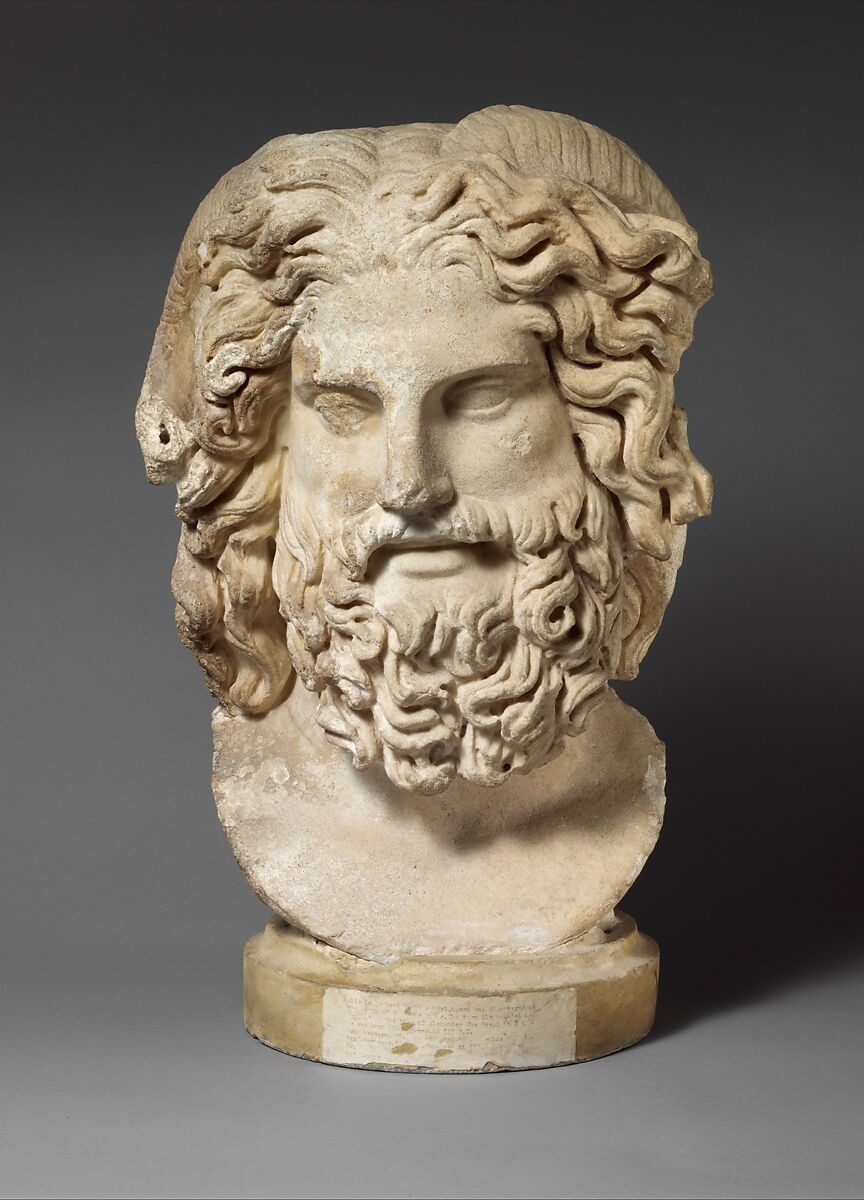

Our rather butch-looking Zeus appears to have been modeled after the head of a statue sculpted by Phidias in the 5th century BC for a temple at Olympia, Greece, which was 43 feet tall, and numbered among the Seven Wonders of the Ancient World, before it vanished millennia ago. Its head is known from ancient copies, like the 2nd century AD Roman marble bust at the Metropolitan Museum [above left]. But in the late 18th century, shortly before our medallion was made, a large ancient replica of the full figure was unearthed at Emperor Domitian’s villa in the Alban Hills. It was promptly sold by Thomas Jenkins, an enterprising English dealer based in Rome, and then reemerged in 1861, heavily-restored with gilded plaster [above right]. Sold to Emperor Alexander II of Russia, he sent it directly to the Hermitage in St. Petersburg. We mention this because the head of Zeus in our medallion appears to be seen from below, suggesting it was modeled after a large full-length statue, or a smaller bust on a pedestal.
ENGLISH REGENCY GILTWOOD HIPPOCAMPUS
English bas-relief of a hippocampus, circa 1820. Carved & gilded wood, traces of glitter. H: 15 ½“ W: 21” D:5” . Provenance: Kenneth Partridge and Derek Granger, London. $8,000
The purpose of this curious if beautiful giltwood bas-relief of a hippocampus rearing from a seashell, is unknown — assuming it had one beyond embellishing a wall. Intriguingly, there’re small bits of ground glass glittering in the crevices of wings, scales, and shell [below left], which are original to the piece, that would have sparkled to fantastical if not vulgar effect when new, although they’ve since aged to a sedate glimmer. Glitziness, robust form, realistically carved details (to the extent a mythical creature has them), and provenance, suggest our hippocampus was created in England during the reign of the Prince Regent, who became King George IV, which is to say sometime between 1811 to 1830. Then, court taste veered towards the sumptuously flashy to be in line with his sybaritic inclinations.
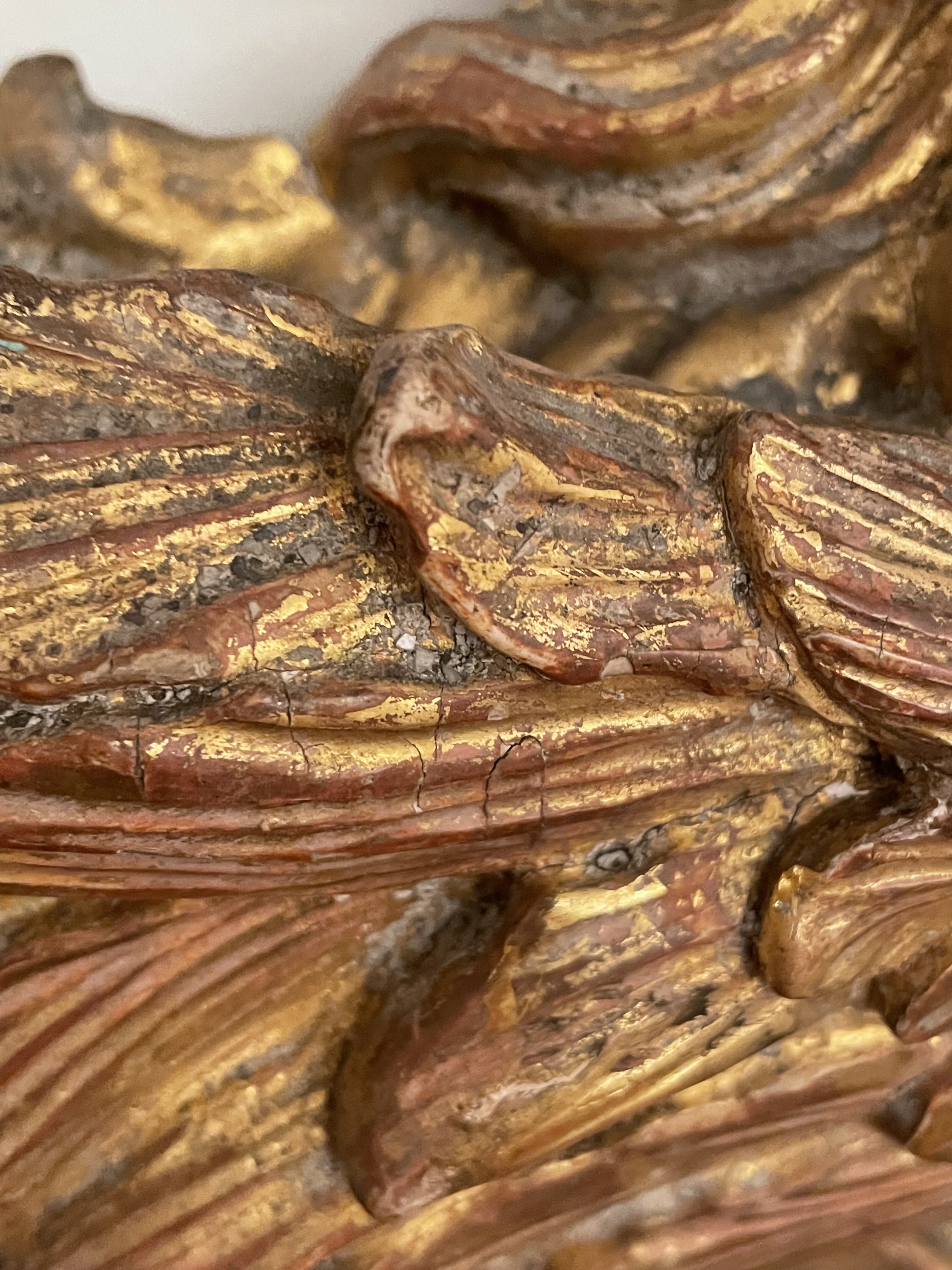
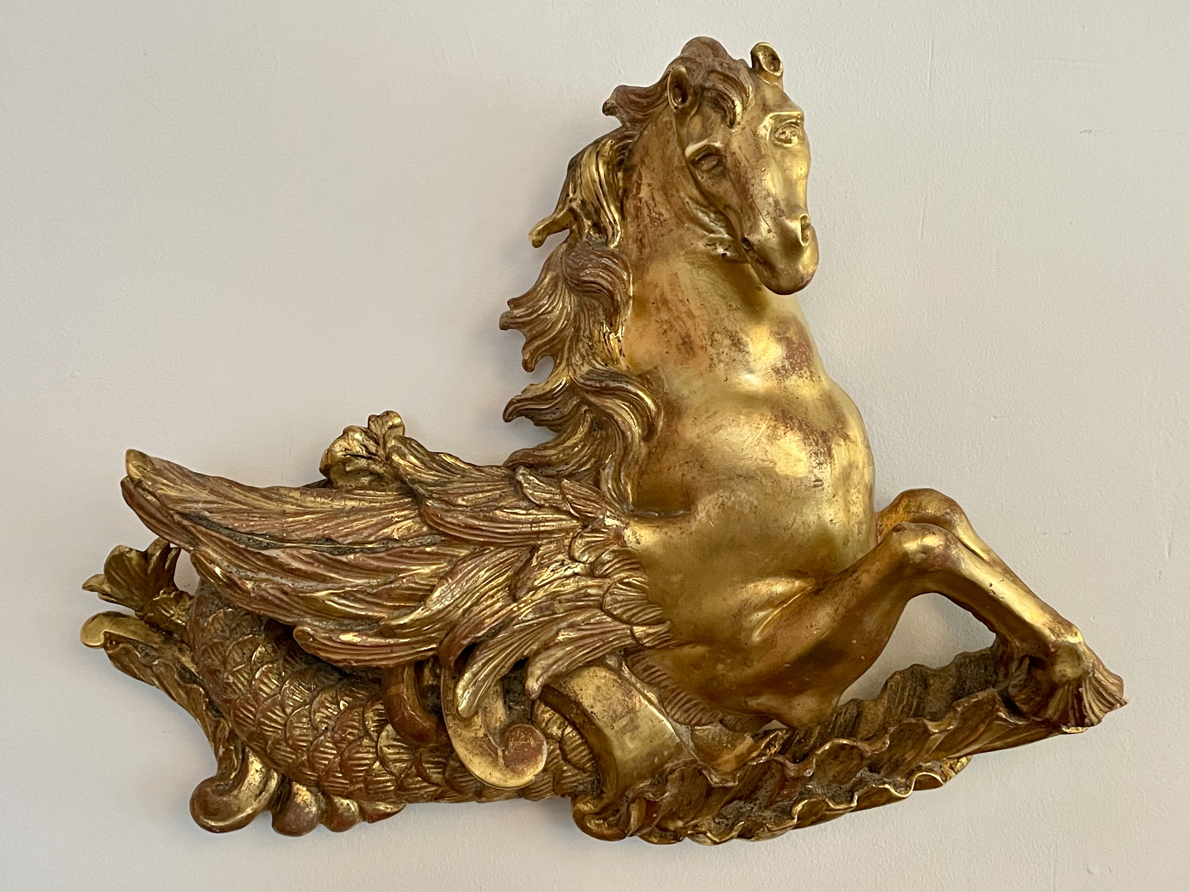
The hippocampus is a mythical sea creature with the body of a horse and the tail of a fish. In artworks, from antiquity to the Renaissance and beyond, they’re depicted, along with tritons and nereids, cavorting amongst the waves and pulling Neptune’s chariot across the sea. Our hippocampus can be compared stylistically to a contemporary monumental English triton cast in bronze by William Theed the Elder that is equally robust [above right, now in the Metropolitan Museum]. This triton guides a shell carrying Thetis to her son Achilles, along with the suit of armor that he’ll wear when meeting his end in the Trojan war.

Judging from timber mounted to the back of our giltwood hippocampus, it was likely part of a larger decorative composition, which may have ornamented the wall of a room or a royal barge. In any case, it suits the era of the pleasure-loving future king who built his over-the-top seaside pleasure dome at Brighton. It’s an improbable mixture of Moorish and Southeast Asian styles, with a strong dose of chinoiserie inside [exterior and interior above].
As for the provenance of our hippocampus, it belonged to Kenneth Partridge, a flamboyant London decorator [below left], and his partner Derek Granger, a prominent film and television producer. As a young man living in dreary post-war London, Partridge decorated windows for the department store Simpson’s of Piccadilly, the Elizabeth Arden salon, and the couture houses of Norman Hartnell and Hardy Amies. After confecting a party décor for the Beatles, he decorated Apple, their short-lived Baker Street shop [below right], John Lennon’s Surrey country house, and Ringo Starr’s London flat, all in a psychedelic style that one journalist identified as “mock-absolutely-everything-you-can-think-of” (something the Prince Regent would have liked). In their London townhouse and, not incidentally, their Brighton getaway, Partridge and Granger hung their collection of contemporary paintings by John Piper, Graham Sutherland, Frank Auerbach, and a slew of Martin Battersbys (a few of which are now in our inventory), where they entertained friends who included everyone who was anyone, from Claudette Colbert to Quentin Crisp.
SMALL PAINTING BY PIERRE JACQUEMON
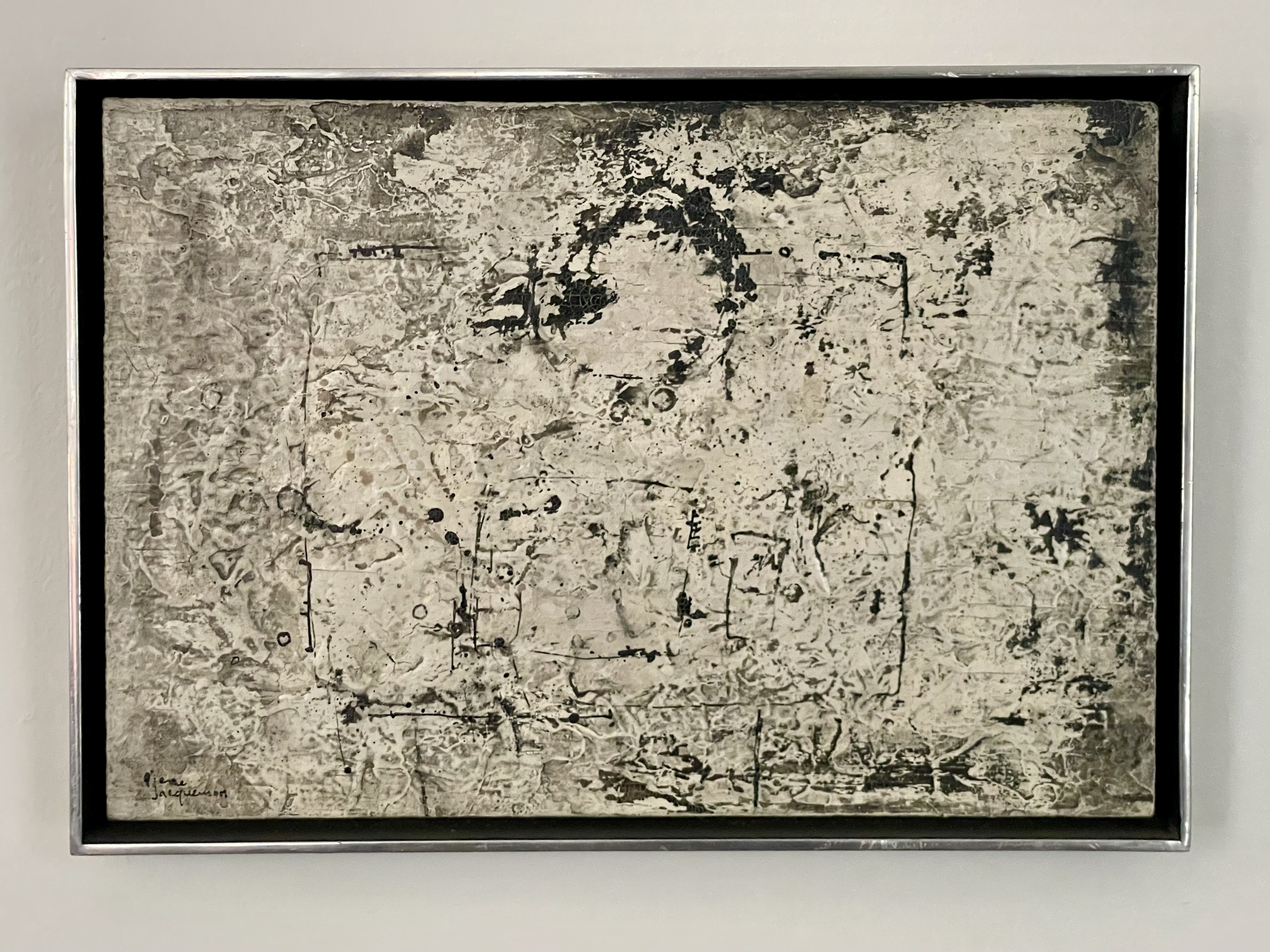
Pierre Jacquemon (1936-2001), Untitled, ca. 1963, signed. Acrylic on board, in original Kulicke stainless-steel frame. Board: 10 ½” x 7 ¼” Frame: 11 ¼” x 7 ¾” x 1 ¼”. $3,750
This puny painting by Pierre Jacquemon dates to the early 1960s, and punches far above its weight, or rather it’s size, measuring in just shy of eight by eleven by two inches, and that’s with the frame. Yet the painting transcends its specifics by being somehow both immaterial and monumental – “a painting is never just paint on canvas,” the artist once said. And as one might expect of a hunk of the cosmos that it resembles, it’s indifferent as to being hung on a wall or placed like an object on a tabletop.
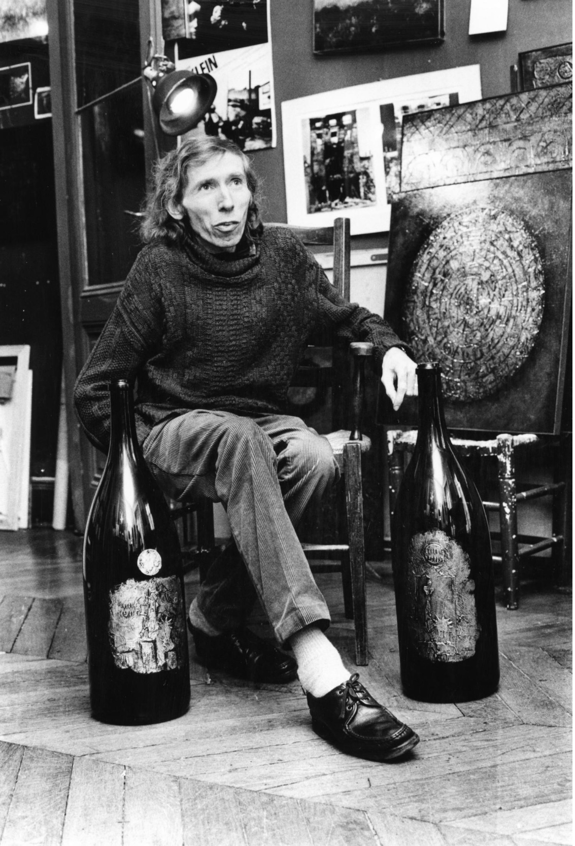
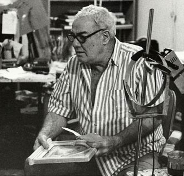
Jacquemon [below left] was in his late twenties when he painted it. A native of Lyon, he wanted to be a doctor, and he was, in fact, studying medicine when struck by polio. This may account for what appears to be his skeletal deformity, and early death at sixty-five, possibly from post-polio syndrome. In any case, that life-defining diagnosis resulted in his decision to become an artist. As a painter, he came to work under the radar and set little store by art-world success. Yet, over the course of his career, he exhibited to favorable reviews in Lyon, Paris, London, and New York.
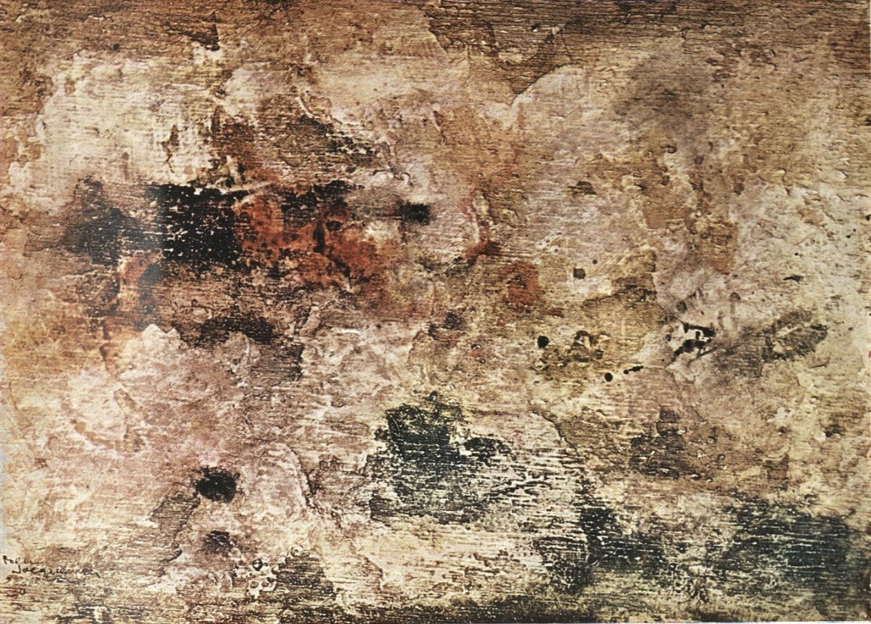
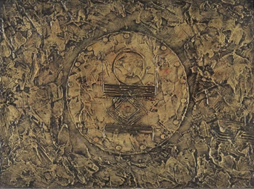
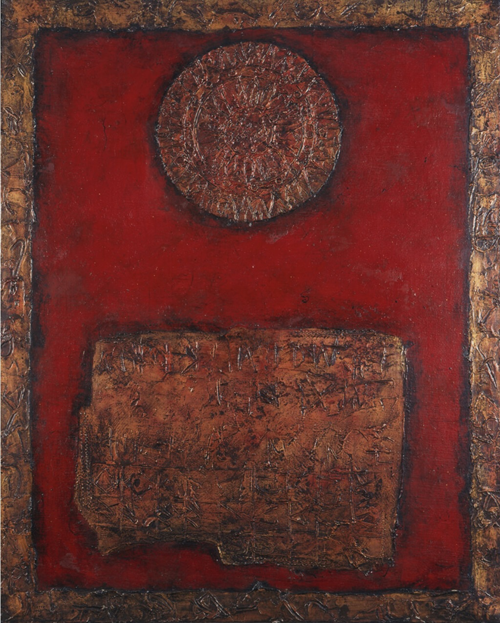
His early work dating to the 1950s is characterized by an impasto of congealing masses that look like the universe in formation, or destruction [above right]. In 1959 he had his first one-man gallery show in Lyon, which resulted in a purchase by the Lyon Musée des Beaux-Arts, and a review by a Paris critic. In 1960 he was included in Antagonismes, a contemporary art exhibition at the Louvre. The following year he lived briefly in London, where he took note of the J. M. W. Turner paintings in museums, and had a gallery show that was reviewed in Apollo. Around this time his paintings acquired the fugitive markings that emerge from miasmas of black-and-white, as in our painting, or silver or gold [below left]. They were influenced by prehistoric cave paintings, and the so-called “outsider art” know in France as Art Brut, as well as the work of Jean Dubuffet. Much later, in the 1980s, the circle and square that are barely perceptible in our painting come to dominate and pulsate with color [below right].
Around 1962, and in the years that followed, Jacquemon, and his wife Claudine, lived half the year in Lyon and the other half in Manhattan’s Lower East Side. He showed with Paul Bianchini, an important if now forgotten dealer, with galleries in New York and Paris, who was among the first to show Claes Oldenburg, Jasper Johns, Andy Warhol, and Roy Lichtenstein (who met his second wife Dorothy when she worked at the New York gallery). Around that time, perhaps to Bianchini’s consternation, Jacquemon told one reviewer that “painting is not natural for me, it is violent, I force myself to work, and I never get what I want,” surprisingly adding, “I would be inclined to discourage people from buying.” Such potentially deal-breaking words echo the angst of Abstract Expressionism, which was then being replaced by the ironic cool of Pop Art.
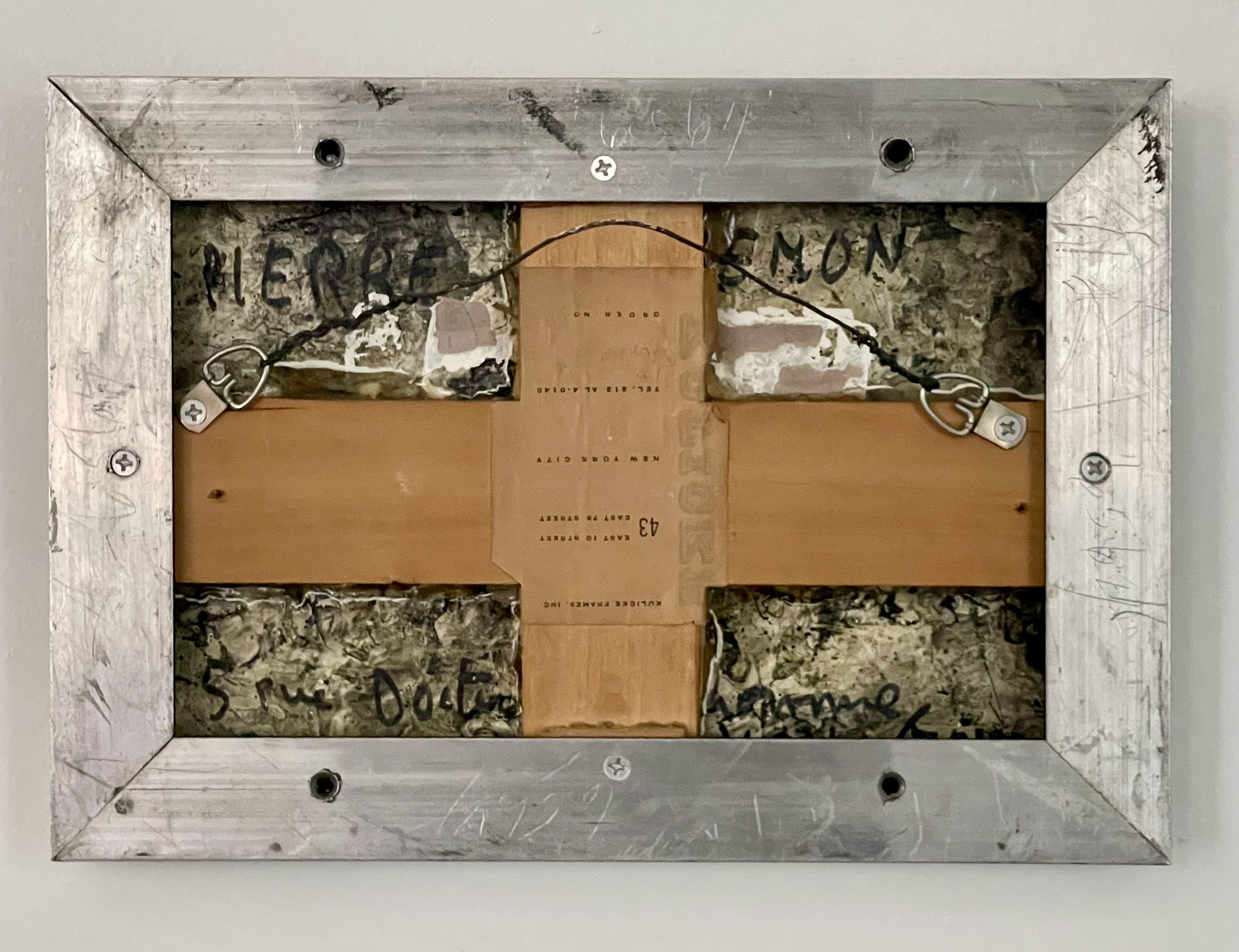
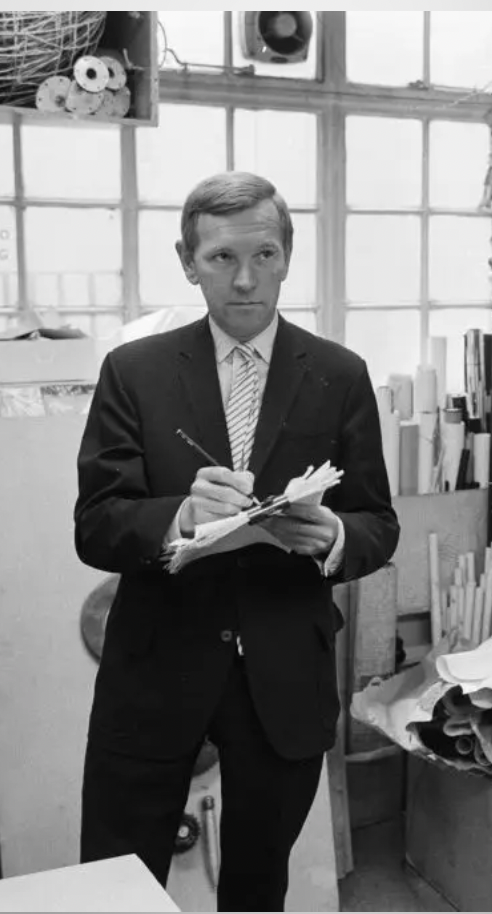
Jacquemon boldly painted his name on our painting’s heavily-painted verso, along with his Lyon address, 5 Rue de Bourbonne above left]. He also scrawled his miniscule signature on the recto. Being painted on board on both sides, and set in a very deep frame, the work has an object-like quality. The frame itself was designed and made by Robert Kulick [above right], an inventive framer who would also become a noted still-life painter. This streamlined steel frame with welded joints is polished on the front and brushed on the sides — a design that was inventive at the time, if commonplace today.
FOUR MORE TROMPE L’OEIL PICTURES BY MARTIN BATTERSBY
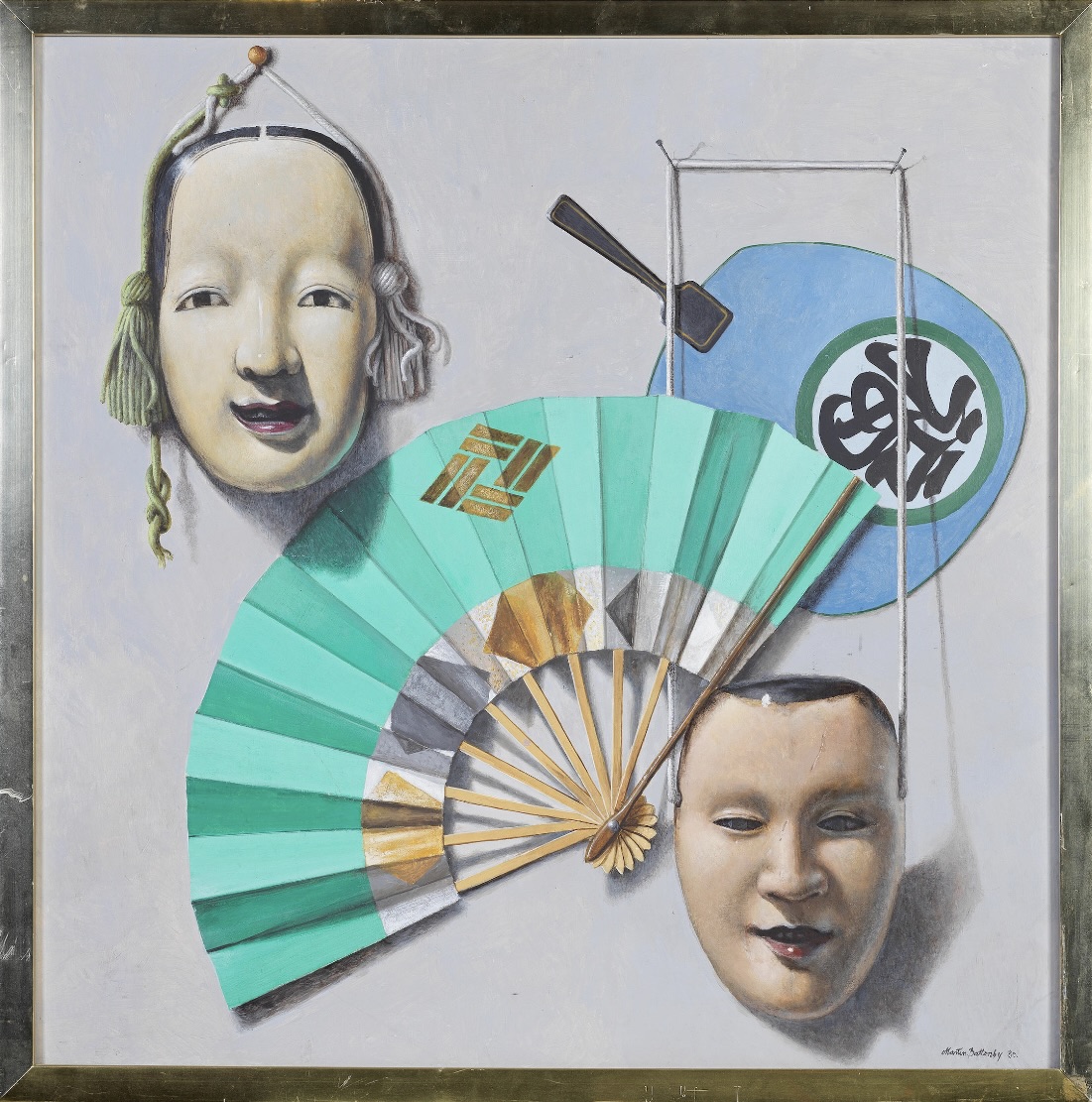
Martin Battersby (1914 – 1982) Still Life with Japanese Masks and Fans, 1980. Oil on Masonite. 24” x 24” / framed 25 ¼” x 25 ¼”. Provenance: Christie’s; Kenneth Partridge, London. $8,000
These four works by Martin Battersby, along with a fifth that we acquired last year, are a summation of his career as a painter. A jack of many artistic trades, Battersby [below left] was also a jewelry and textile designer, an antiques dealer, and a writer on the fine and decorative arts (not to mention a celebrated party giver in swinging ‘60s London). Although he studied acting at The Royal Academy of Dramatic Arts, he never trod the boards, but he did paint stage-sets, first for a 1938 production of Shakespeare’s Hamlet staring Laurence Olivier, and later John Geilgud’s 1945 revival of Oscar Wilde’s Lady Windemere’s Fan, done in collaboration with Cecil Beaton, a mentor and frenemy. Shortly thereafter, Battersby taught himself the difficult art of trompe l’oeil painting, landing commissions from high society, the intelligentsia, and politicos alike, including Enid Countess of Kenmare, Daisy Fellowes, Evelyn Waugh, and the Duff Coopers. Having mastered the brush, Battersby’s charm and good looks propelled his career – “he is now the fashion” wrote Chips Channon, the socialite, Parliament member, and one-time Nazi sympathizer, in a 1951 diary entry.
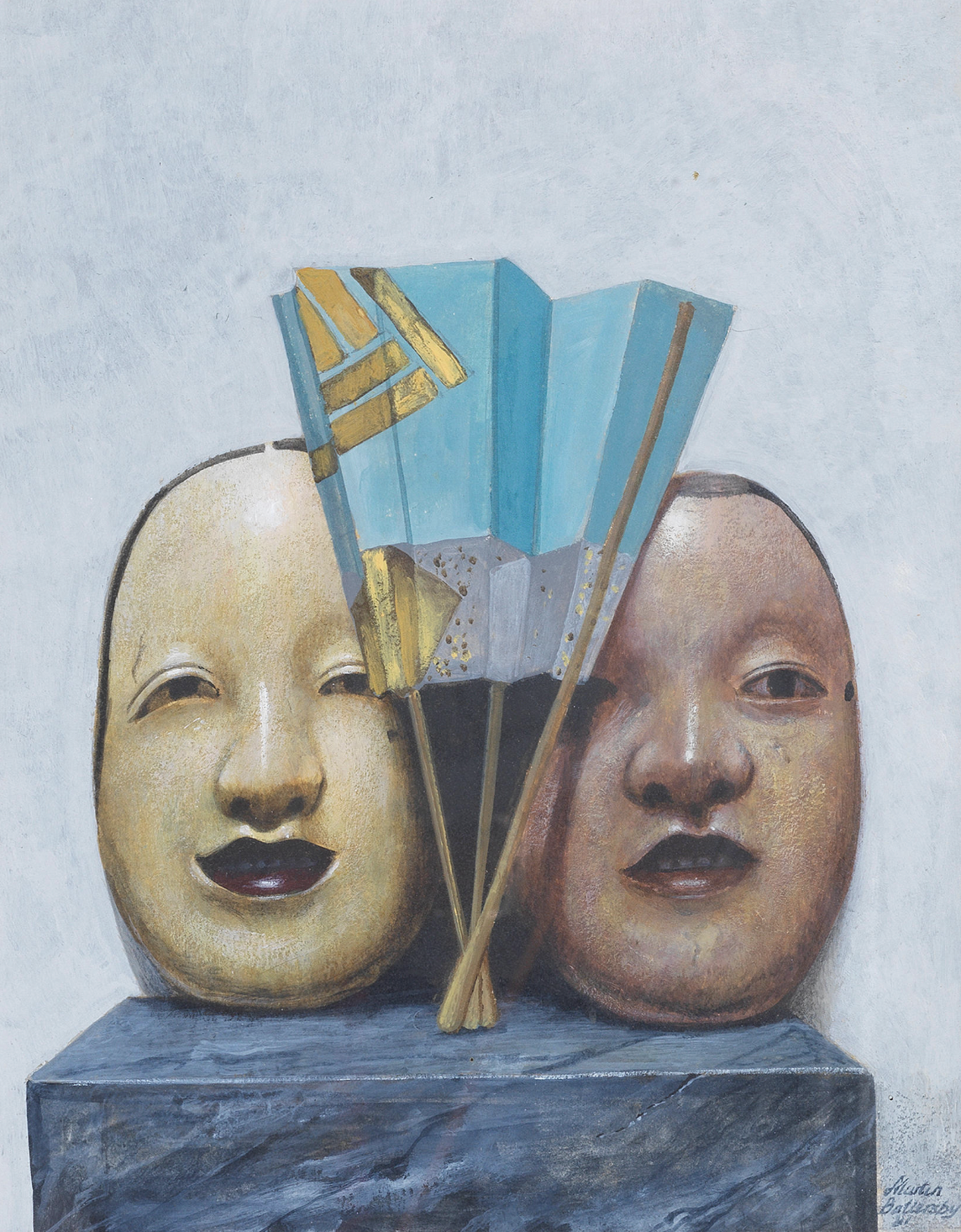
The star of our new Battersbys is this 1980 Still Life with Japanese Masks and Fans. It depicts two Noh masks and two fans, none of any importance, as Battersby would have known as a dealer, collector, and connoisseur. As an artist, however, the merit of the subjects wasn’t necessarily important, but his reuse of the masks and one of the fans in another painting [above right] suggests they struck a chord. Perhaps it’s because he had once lived in Amsterdam, near Ostend where James Ensor had obsessively painted carnival masks not so very long before. Like Ensor’s, Battersby’s Noh masks seem strangely alive, having a cheery mein in our painting, and a sullen one in the other.
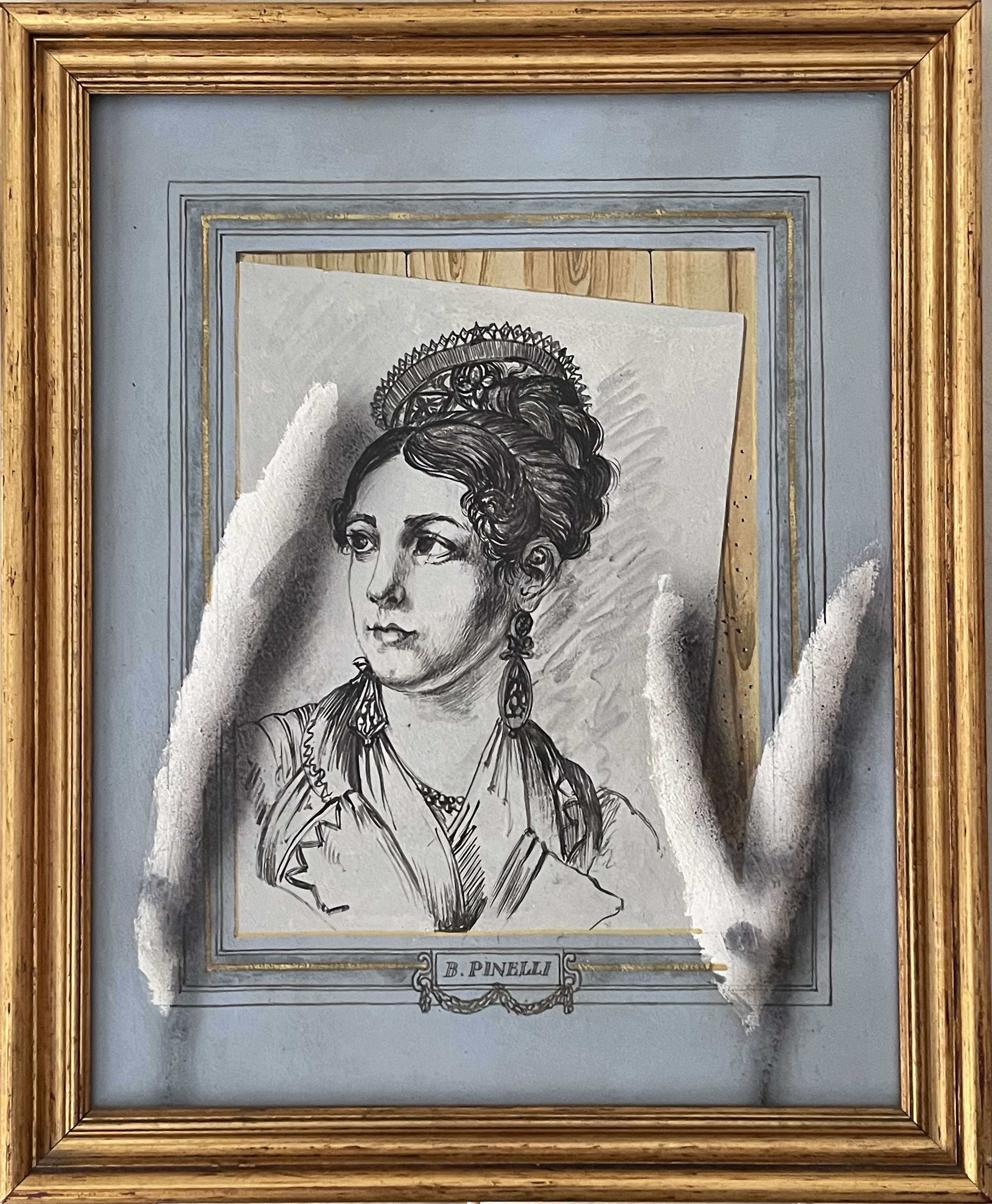
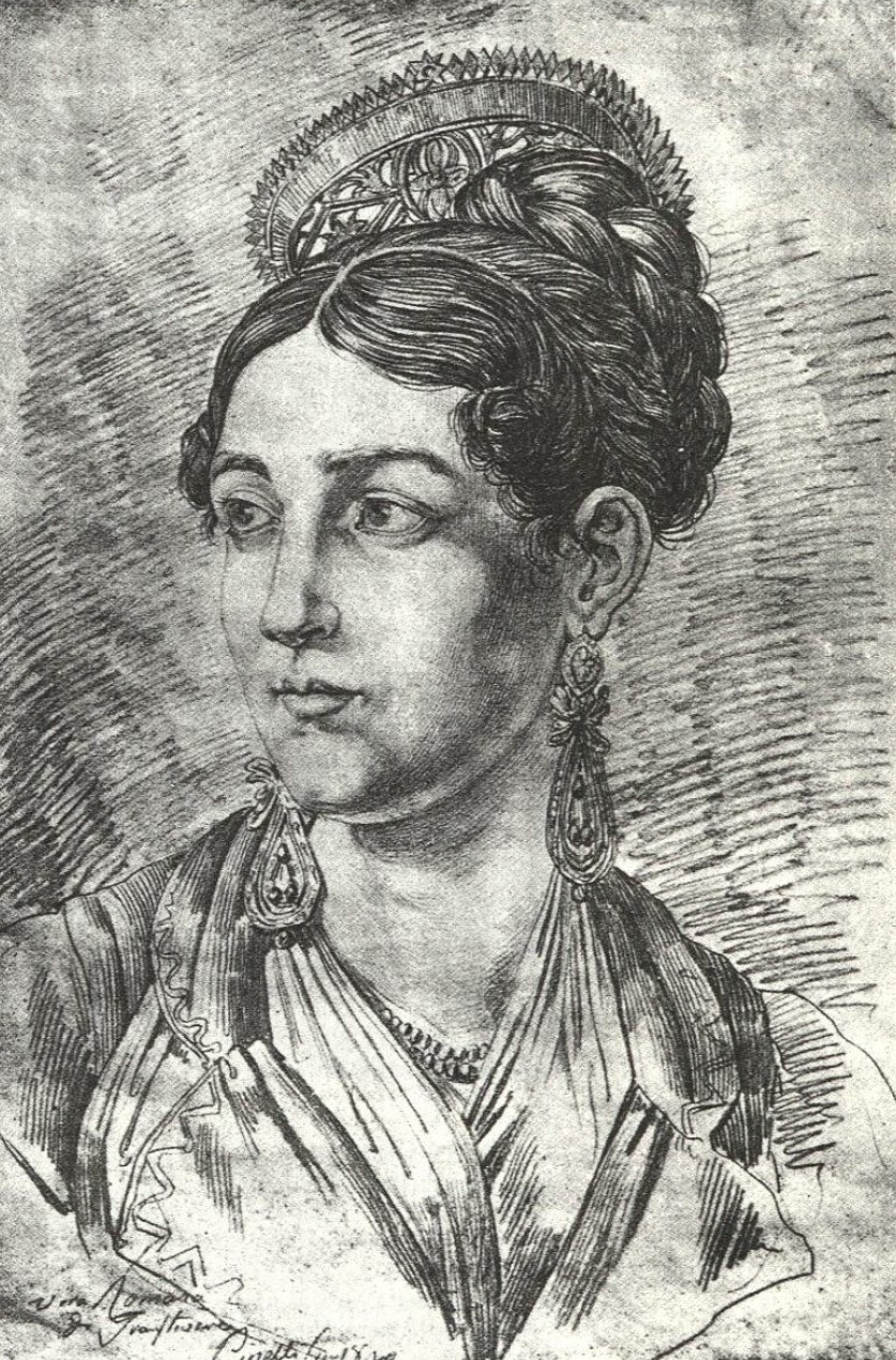
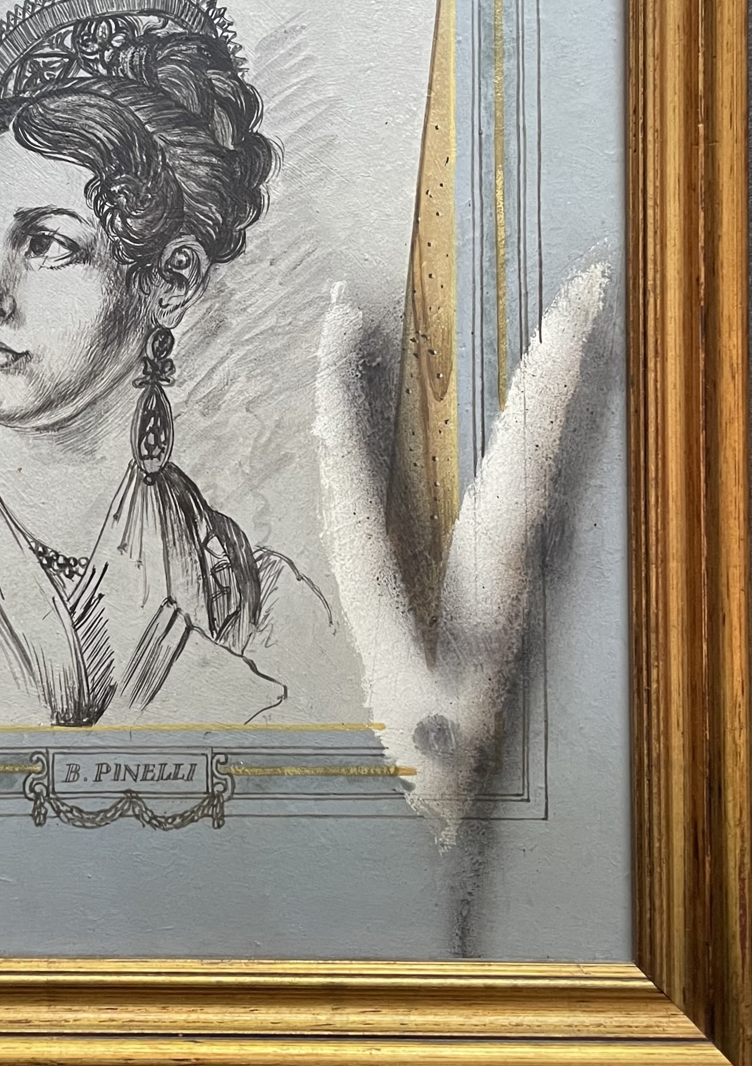
Martin Battersby (1914 – 1982) Trompe l’Oeil after Bartolomeo Pinelli, circa 1975. Oil & mixed media on Masonite. 14 ¾” x 8” / framed 16 ¾” x14”. Provenance: Christie’s; Kenneth Partridge, London. $4,000
As an art historian sans diplôme, it’s not surprising that Battersby knew the work of Bartolomeo Pinelli, a fascinating but obscure early 19th-century Roman artist. Here, Battersby copied a Pinelli drawing of a woman in folkloric costume [below left], but adds a twist by showing it slipping askew between its window mat and wood-grain backing, with two tufts of cotton, used by artists to create tonalities, that are smudged from use [below right]. The presence of the tufts suggest that Pinelli is still in the process of creating the drawing — which is contradicted by its presentation in the original giltwood frame under glass.
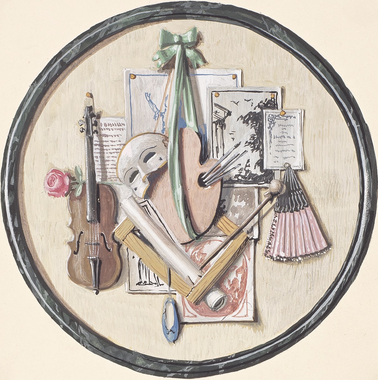
Martin Battersby (1914 – 1982) Trompe l’Oeil Trophy, circa 1955 (Notation:“Preliminary design for Hobson panel”). Gouache on paper. Dia: 5 ¾” Sheet: 7 1/2” x 7 ½”. Provenance: Christie’s; Kenneth Partridge, London. $3,750
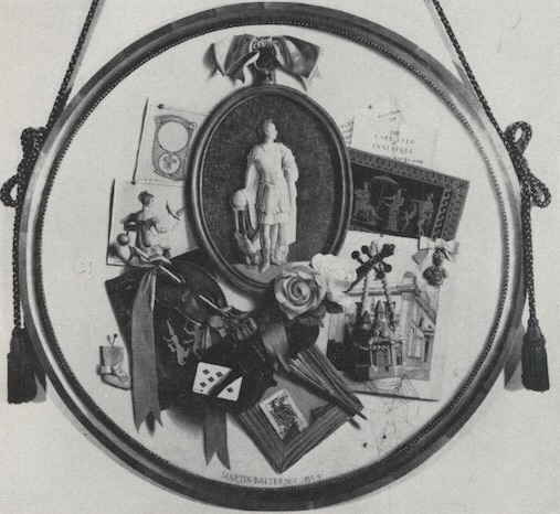
This charming trophy of the arts a study for a tondo. It includes a comedia dell’arte mask, a lone ballet slipper, a violin, a rose, a fan, a painter’s palate with brushes hanging from a ribbon, and push-pinned ephemera. It’s mounted on a sheet of paper inscribed “Preliminary design for Hobson panel.” Hobson was Valerie Hobson, a leading British actress who studied at The Royal College of the Dramatic Arts shortly before Battersby did himself. As an ingénue in 1930s Hollywood, she appeared in Bride of Frankenstein and The Werewolf of London. In 1940s London she starred in Ealing Studios’ Great Expectations and Kind Hearts and Coronets. Her most notable stage appearance was in the 1953 London hit production of Rodgers and Hammerstein’s The King and I. She retired from show biz the next year following her second marriage. As a newlywed she commissioned Battersby to decorate the foyer and stairway of her new marital home with trompe l’oeil murals and one or more framed tondi hung from tasseled cords. In 1960, Harpers Bazaar ran a shot of the foyer and one of a tondo [below left], which either represents a revision of our study, or a different tondo from the same commission.
Hobson’s husband was John Profumo, a Conservative member of Parliament and the Minister of State for Foreign Affairs. Not all of his affairs, however, were ministerial in nature. At the height of the Cold War in 1963, British Intelligence and the American FBI uncovered his affair with Christine Keeler, a model who also shared her favors with Yevgeny Ivanov, a naval attaché to the Soviet embassy. “The Profumo affair,” as it came to be known, ended Profumo’s career, forced Prime Minister Harold Macmillan to resign, brought down the Conservative government, and prompted the suicide of the society doctor who had introduced them. Nevertheless, in the decades that followed, Valerie stuck by her man [above right], and together they went on to support charitable causes.
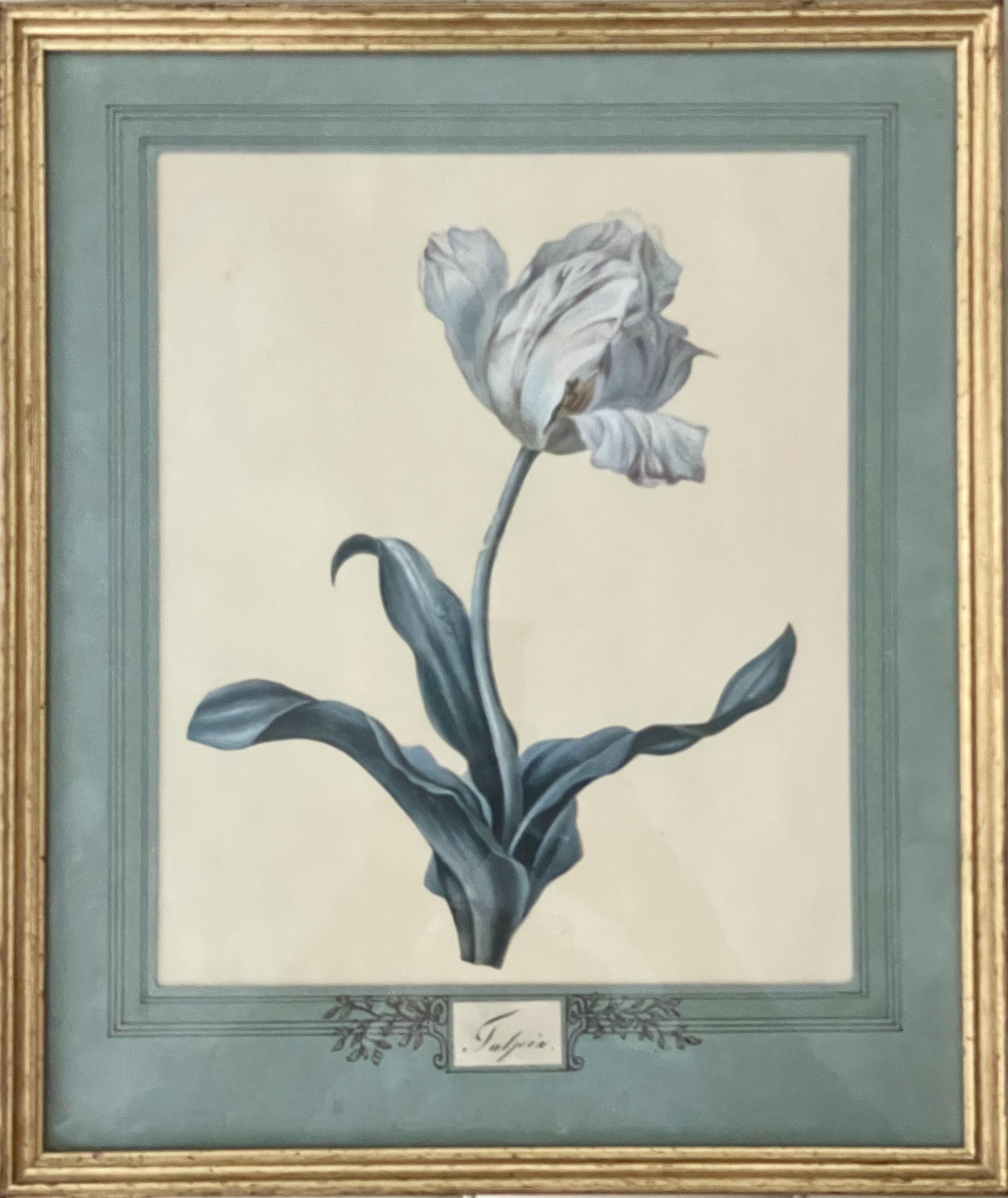
Martin Battersby (1914 – 1982). Tulipia, circa 1950. Cutout watercolor on paper, in a French mat, circa 1950. 15 ½” x 13” including mat; framed 16 ¾” x 14”. Provenance: Christie’s; Kenneth Partridge, London. Bibliography.: Vogue (English edition), 1950. $3,000
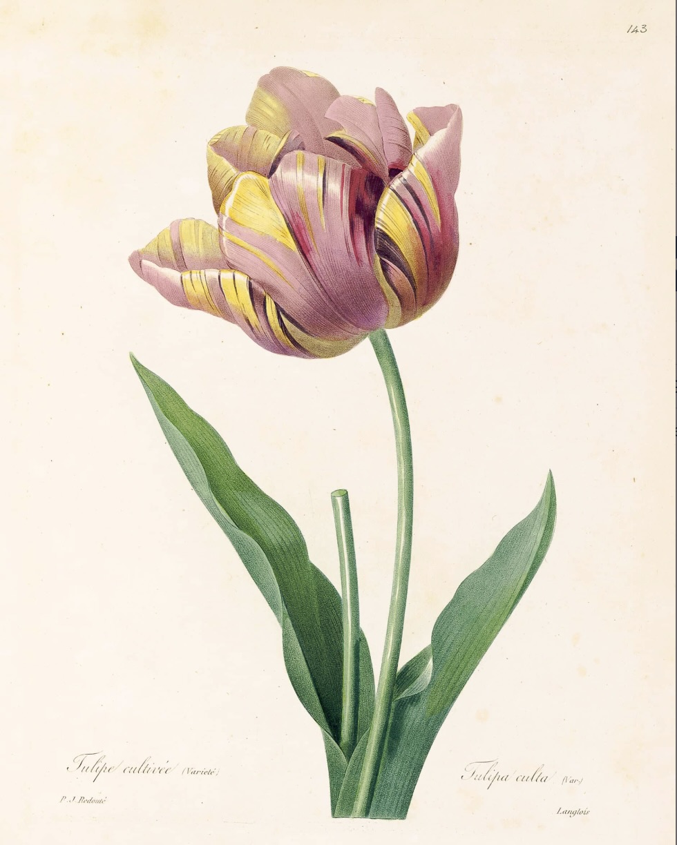
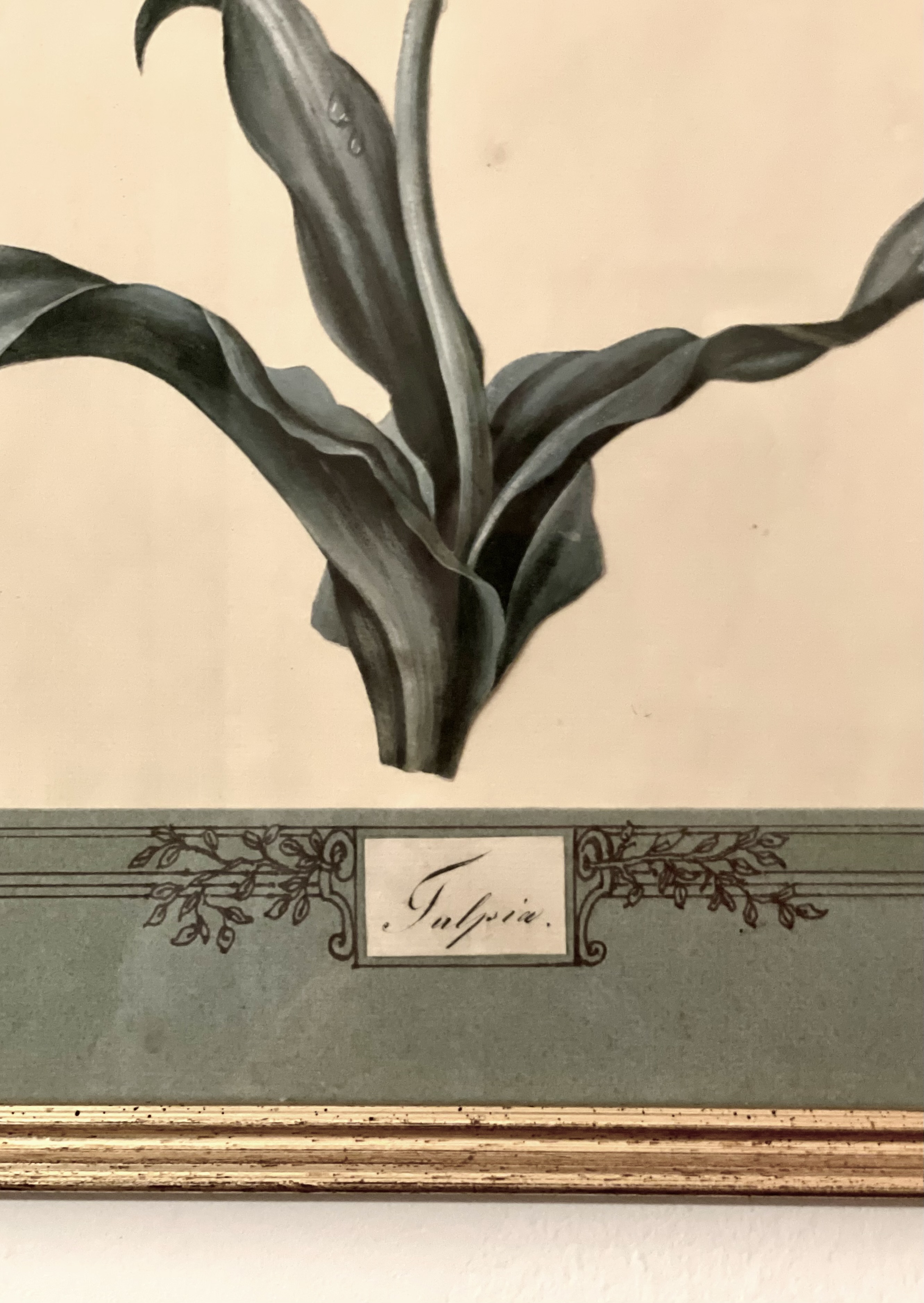
This watercolor of a tulip is a bit of trompe l’oeil foolery that skirts forgery. Battersby renders the tulip, a member of the lily family, in the style of Pierre-Joseph Redouté, the celebrated painter of roses and lilies who was employed by Queen Marie-Antoinette, and later Empress Josephine. Battersby’s tulip isn’t a copy of a known and priceless Redouté drawing [below left], but it could easily be mistaken for the real deal. In fact, Battersby owned three Redoutés, which he lent to a 1955 trompe l’oeil exhibition at the Royal Museum in Brighton. In any case, Battersby watercolored our tulip on paper, cut it out, glued it to another sheet, and mounted them in an actual blue mat he decorated to look old, and inscribed it “Tulpia,” which sounds like the Latin word for tulip, but isn’t.
Battersby’s intention in making his own a Redouté was nothing more sinister, however, than filling in a blank spot of a wall of pictures in his London sitting room — the others works were, presumably but not assuredly, authentic. Our tulip is seen in a 1955 Vogue fashion shoot [below], hanging above the knees of a model en déshabillé. Judging from this photograph, Battersby, who was far from rich, lived in considerable style, with a giltwood Louis XVI canape upholstered in leopardskin, a 1930s Syrie Maugham table and magazine stand, and a large Piat-Joseph Sauvage trompe l’oeil painting of a stone bas-relief with cavorting putti. Thus proving that taste, style, and a nose for quality, trumps a fat checkbook.

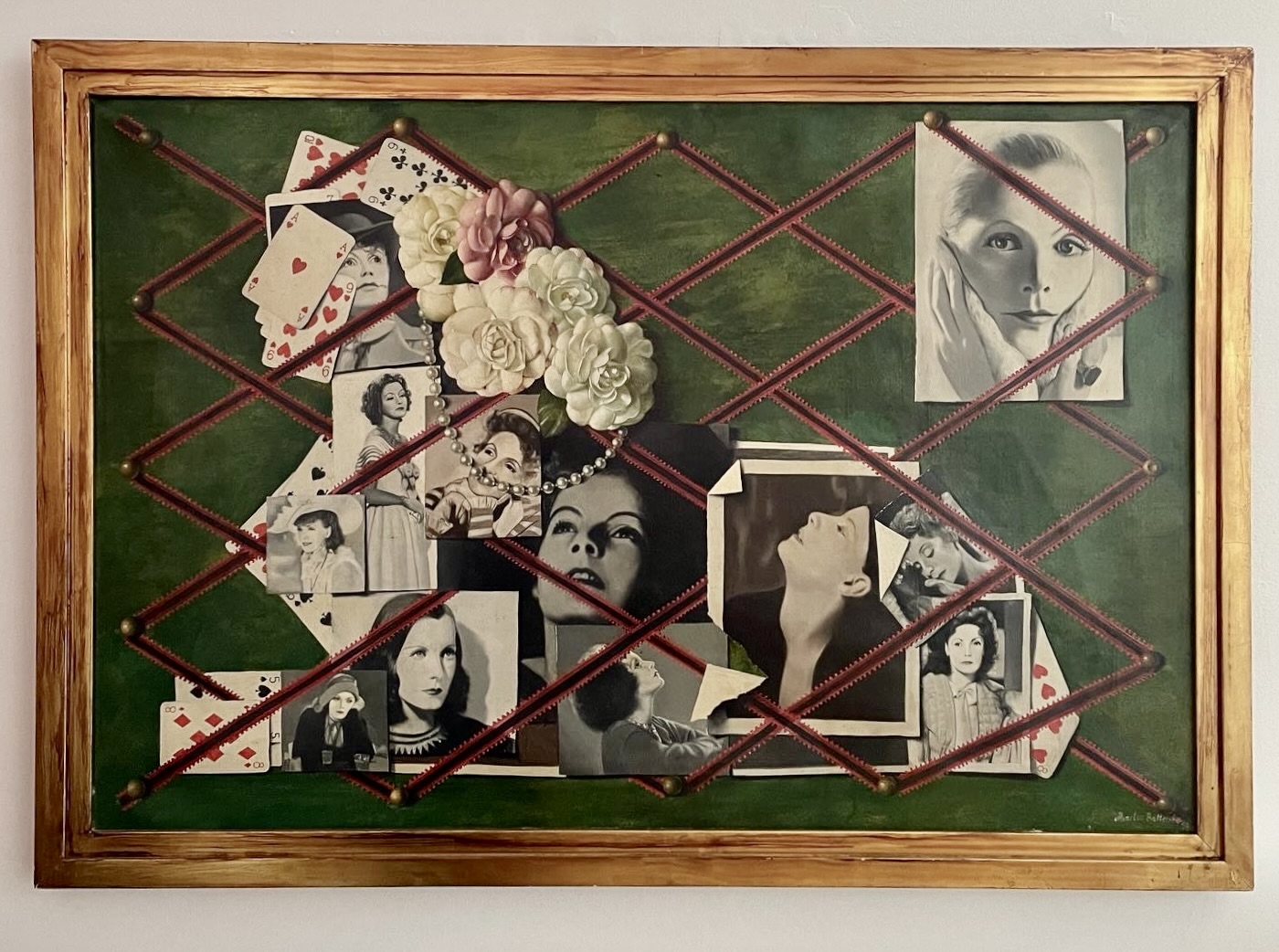
Martin Battersby (1914 – 1982). Garbo Sphinx, 1958. Oil on canvas, signed & dated. 23 ¾” x 35 ½” / framed 27 ½” x 39”. Provenance: Grosvenor Gallery, London; Michael Clancy, New York. $12,500
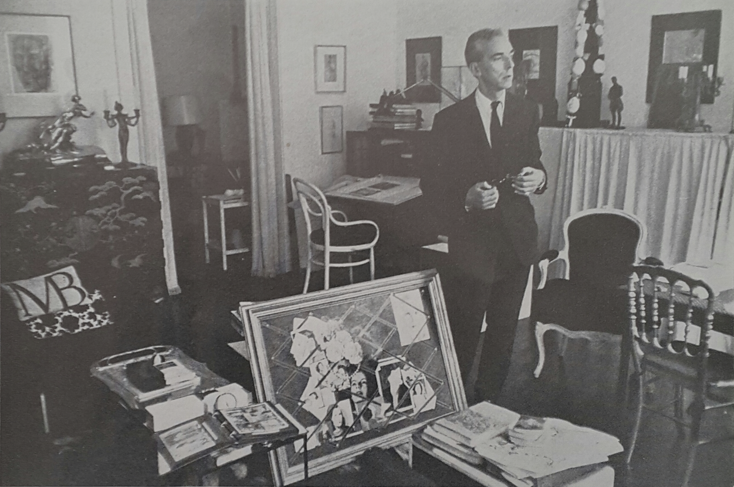
Among our five Battersbys, the most significant is the first one that we acquired last year, Garbo Sphinx, a 1958 painting in a stepped and gold-leafed frame that he designed. It’s a tribute to the silver-screen goddess Greta Garbo, known as “the Swedish sphinx,” whom the artist likely met around 1950 when living in New York, as she then was too. At the time she was having an improbable affair with Cecil Beaton, Battersby’s mentor. Battersby depicts her glamorous essence in the flotsam and jetsam of vintage photographs, camelias evoking her signature role as Camille, a favorite pearl necklace, and cards referencing her fondness for playing gin rummy, bridge, and hearts. They’re tucked into a grid of thumb-tacked ribbons, and coalesce into the profile of a sphinx. We noticed this only on seeing the painting in a black-and-white photograph, showing the composition more starkly, of the artist’s home studio [below]. And there it appears with the besuited artist, amongst the flotsam and jetsam of his own life, which includes a lacquered Chinese commode, an Art Nouveau candlestick, antique chairs, sundry pictures and statuary, and a pillow embroidered with his monogram.
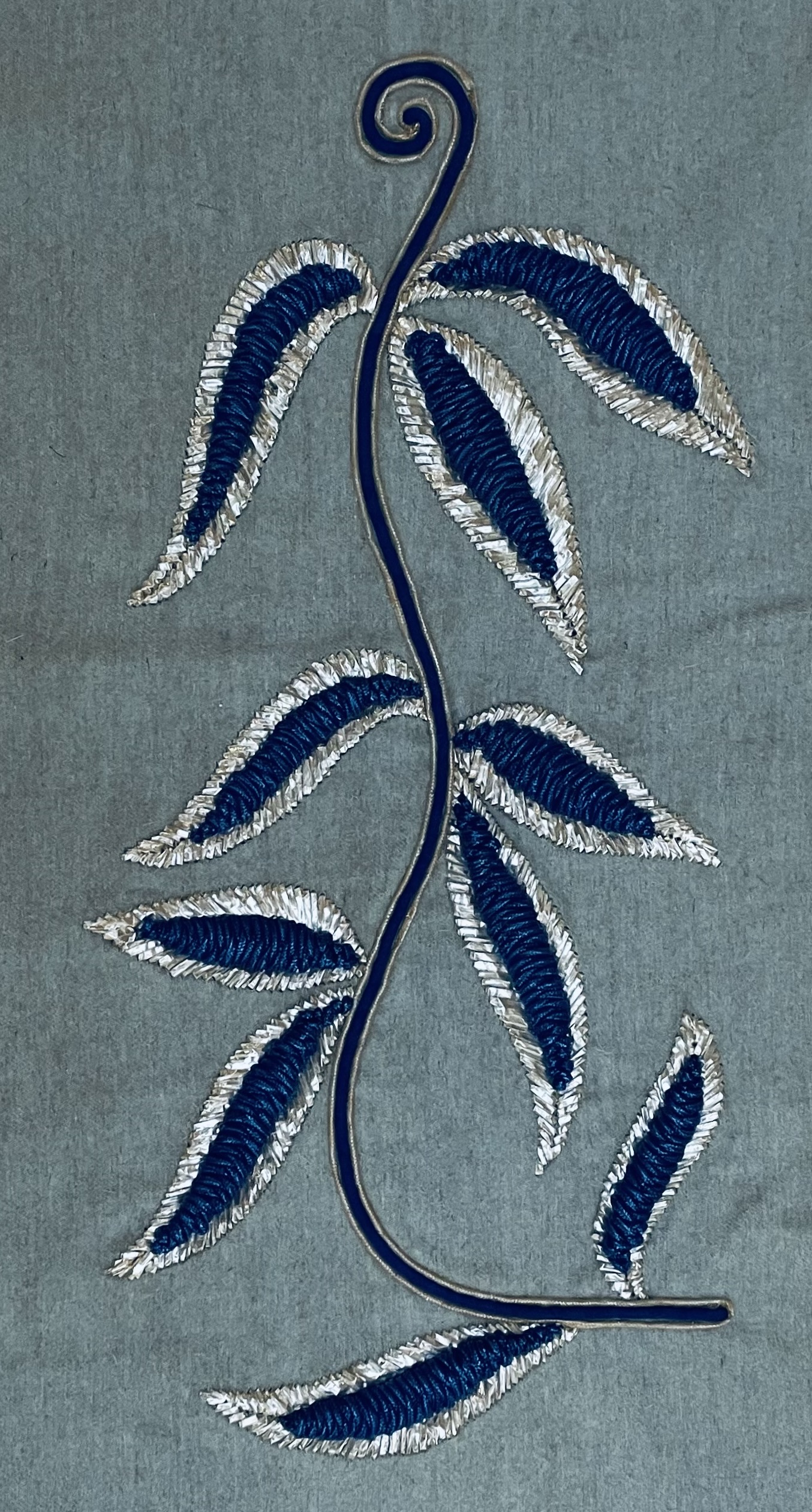
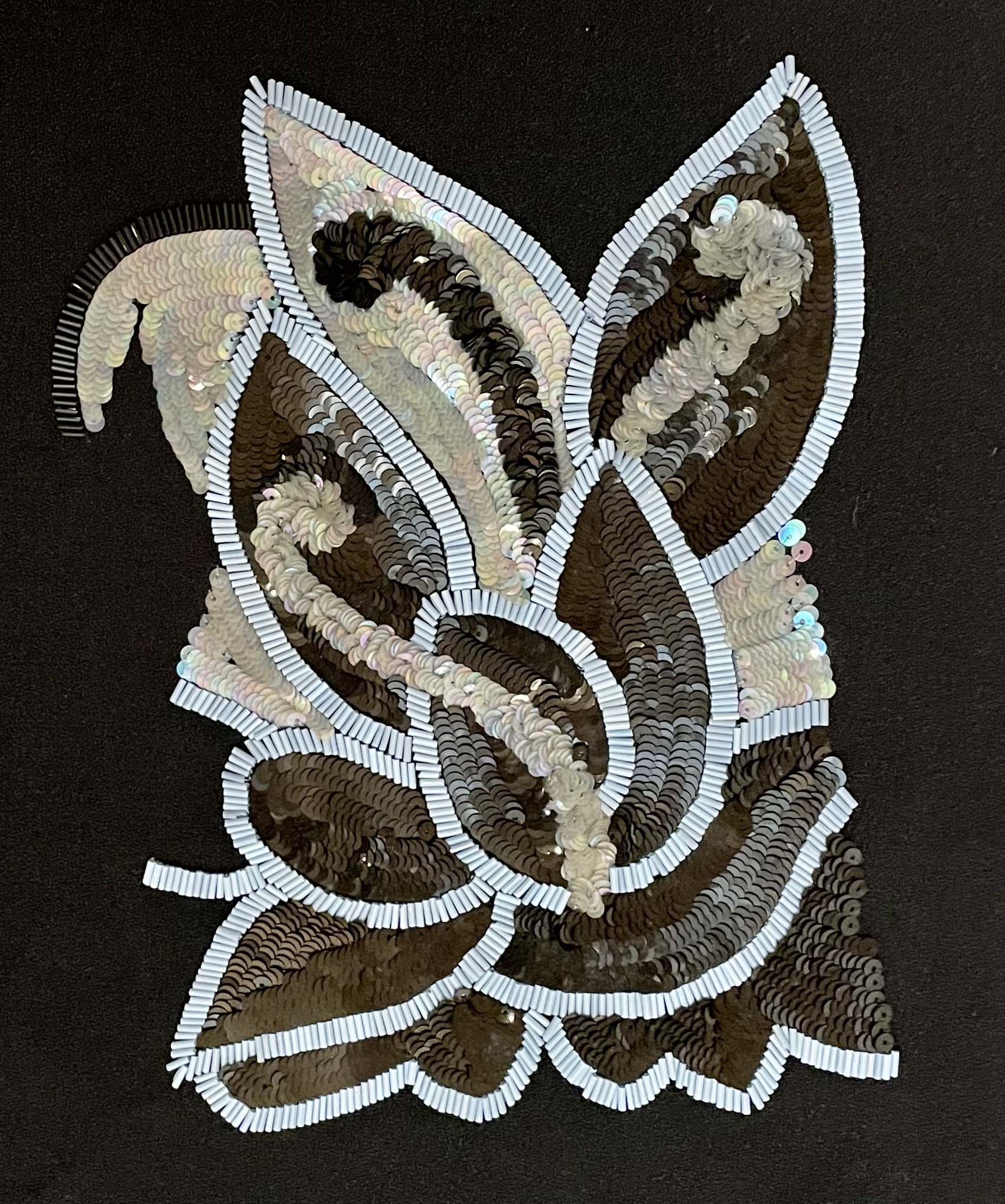
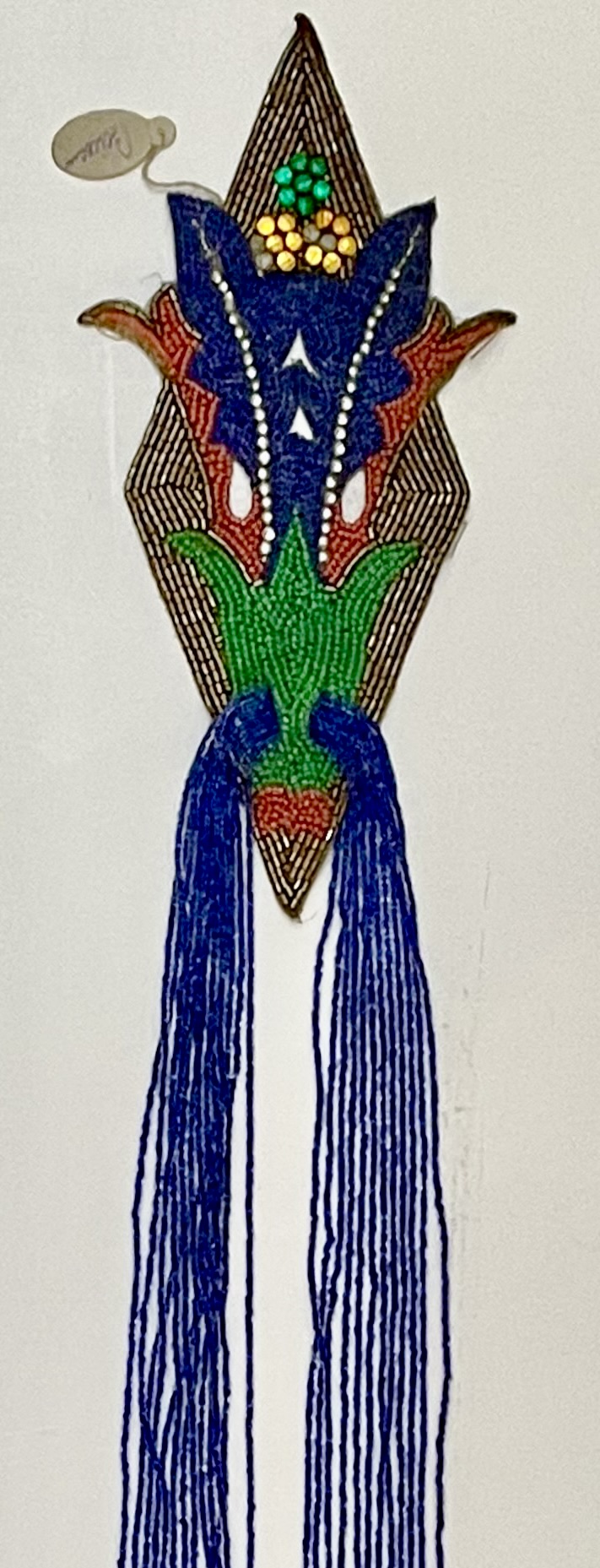
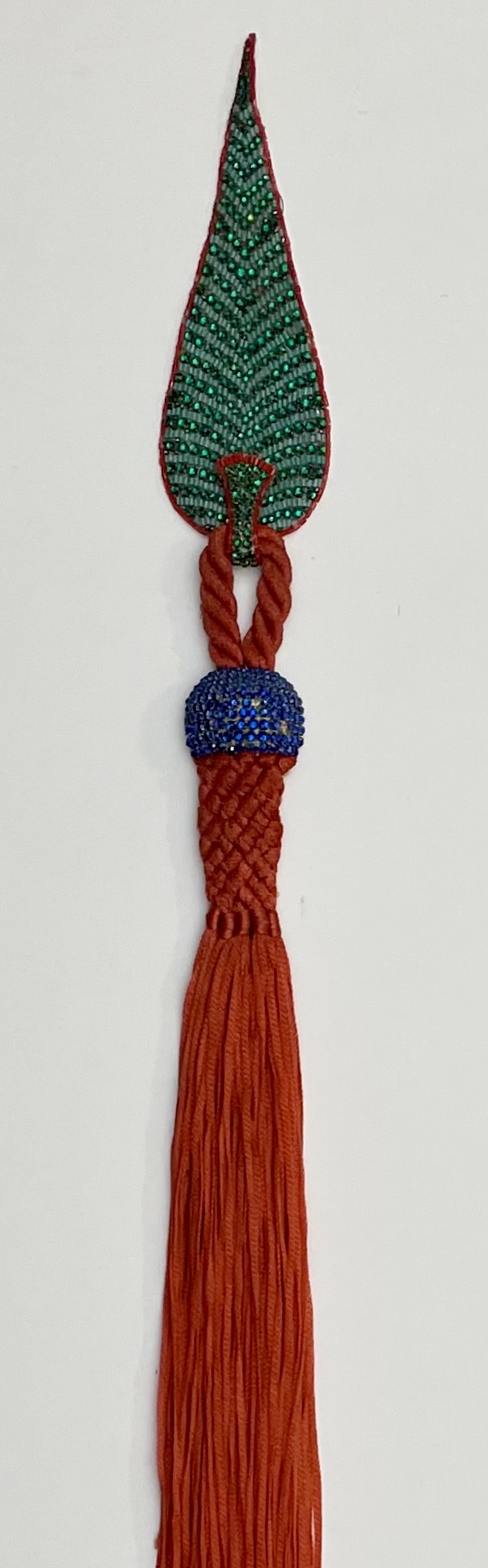
AN ADDITION DOZEN EMBROIDERIES BY ERNEST BOICEAU
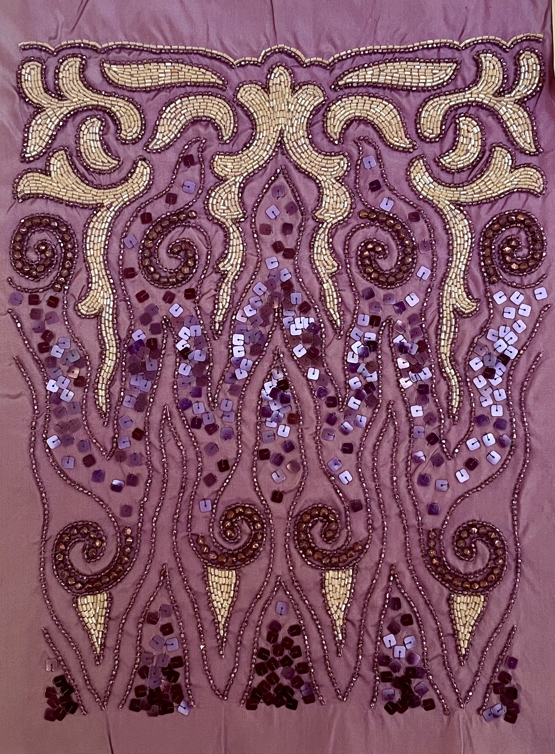
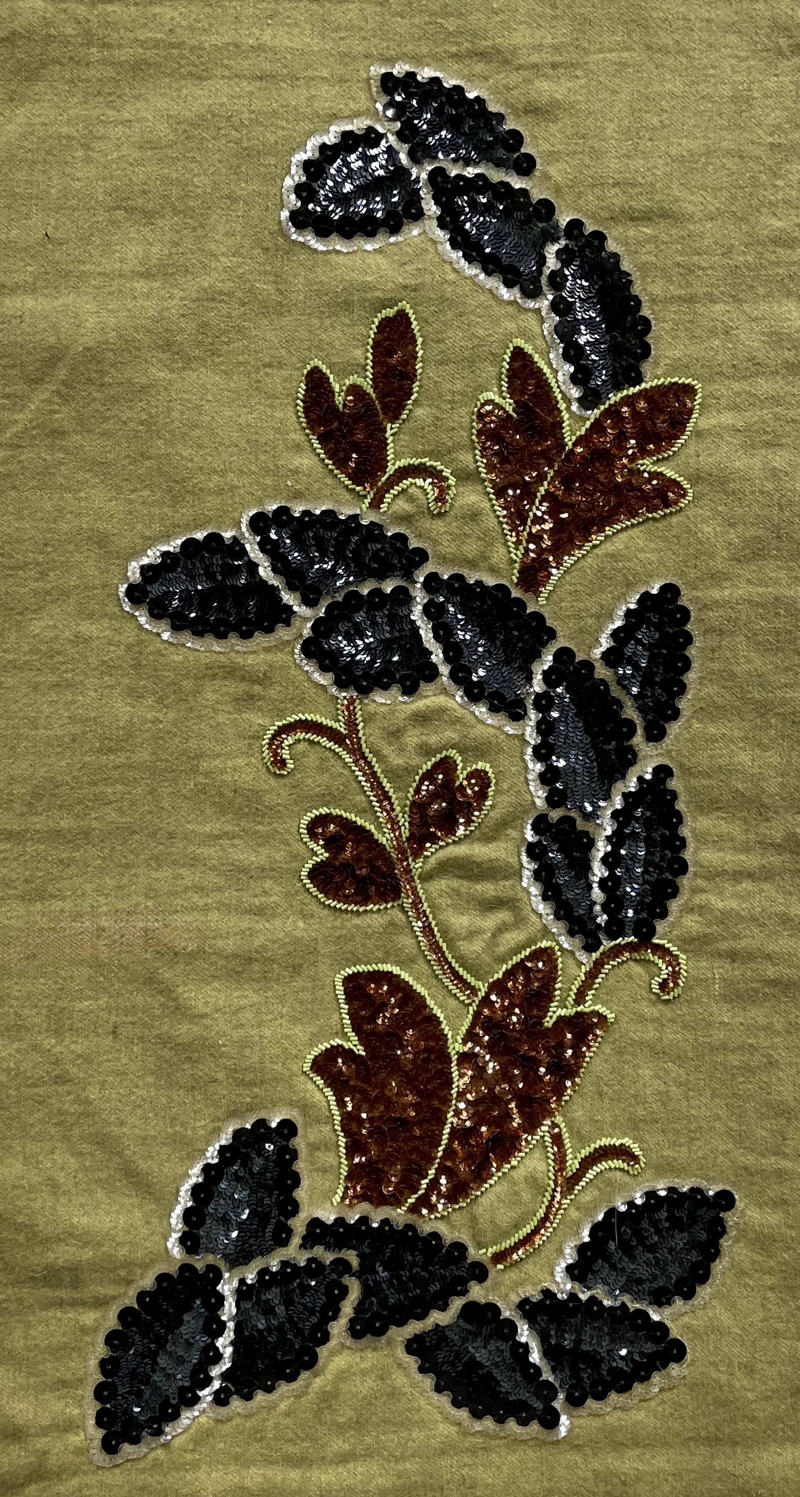
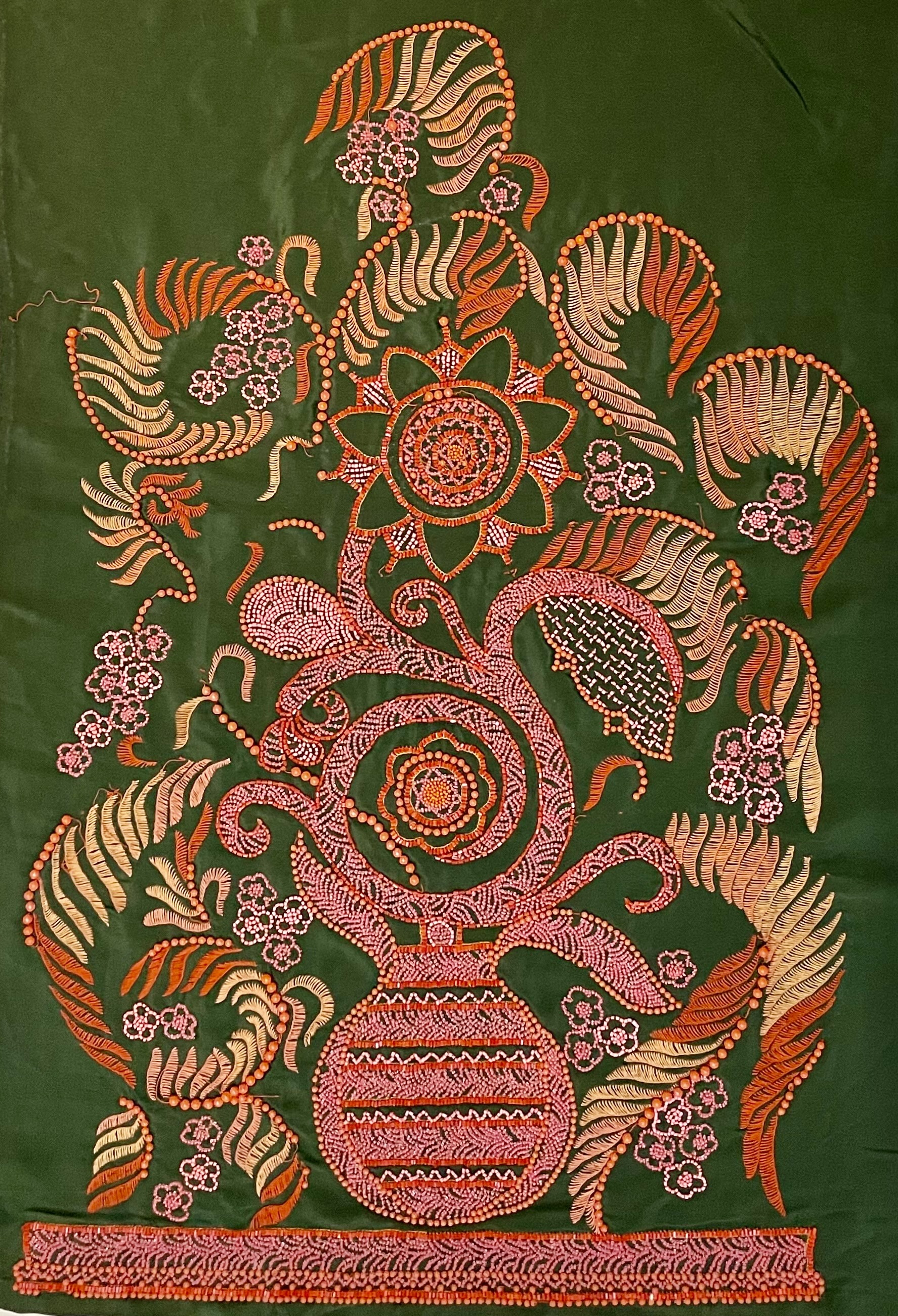
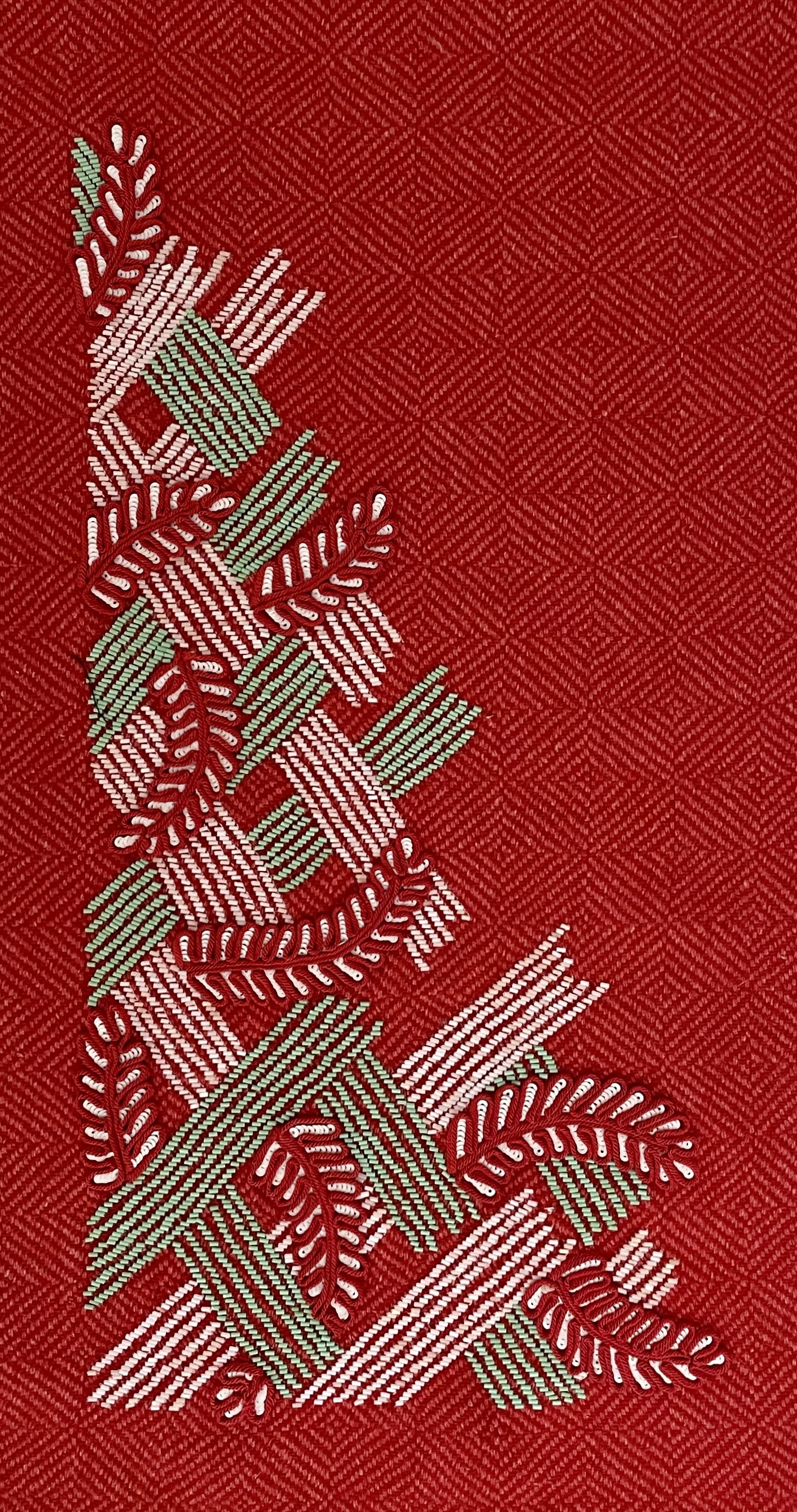
Ernest Boiceau (Swiss/French 1881-1950). 46 fabric panels and 9 tassels. Panel size range from 9 ½” to 46”by 4 ½” to 24”; tassels range from 16“ to 32“. Bibliography: “Sew Chic,” The World of Interiors, October 2022, pp. 296 – 299. Available individually, unframed from $750 to $6,500 framed.
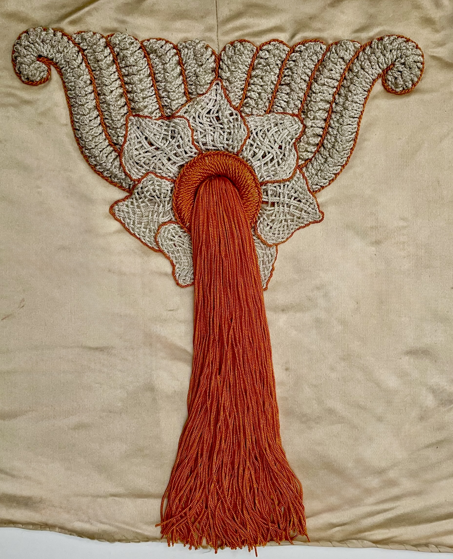
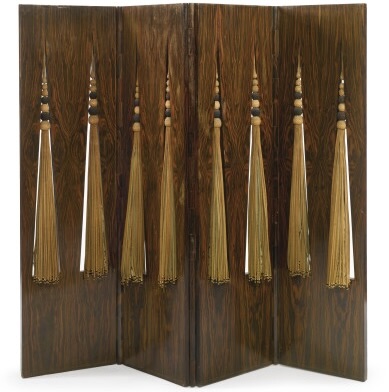
Ernest Boiceau became, in succession, an embroiderer, a couturier, and a furniture and interior designer. Born in Lausanne in 1881, he settled in Paris in 1910, and remained in France until his death in 1950. Descended from French Huguenots who settled in Switzerland, his family was prominent in business, law, diplomacy, and the protestant church. Ernest, however, chose to study art and architecture at the École des Beaux-Arts in Paris and the Academy of Fine Arts in Munich. In 1900 he embarked on a decade of European travel, on which he painted landscapes and portraits. In 1910 he returned to Paris, and became a partner of John Jacobson, an artist who had recently established a fabric studio. Together, they made extravagant costumes for the Follies Bergères, the Comédie-Française, and their biggest client for embroideries and tassels [below], the fashion house of Worth.
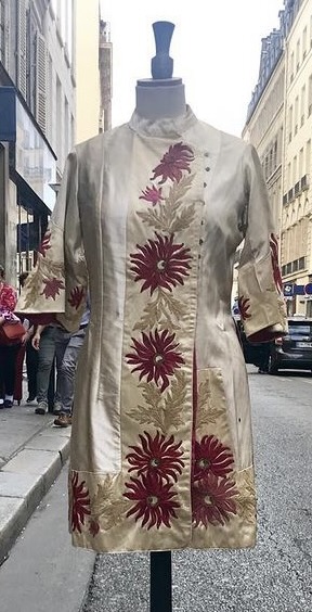
By the early 1920s, Boiceau was working in his own showroom on the Rue Desmoulins, just off the Avenue de l’Opéra. He soon moved it to the Avenue de l’Opéra itself, and branched out into couture. Judging from a tunic, the sole example of his couture known to us [below left], he emphasized simple forms that highlighted the sumptuous embroidery. But around 1933, as the Great Depression raged, Boiceau closed the couture salon, spun off the embroidery workshop to his former staff, and focused on rugs, furniture, and interior design, prompting yet another and final move to the tony Avenue Matignon [below right].
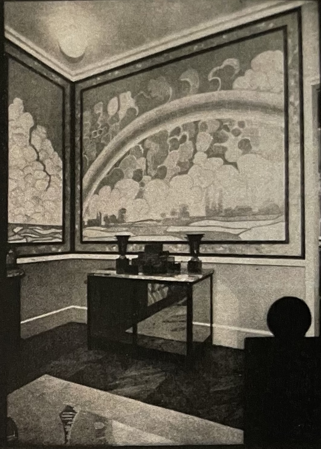
The embroidery workshop continued to operate under the direction of Félix Bigot, a designer who had begun working for Boiceau when Jacobson was still in the picture. Boiceau likely remained a client of his former firm, since he used embroidery to realize some of his unusual furnishings, like his screen inset with tassel-embedded panels [below left], and interior design schemes, like his showroom at the 1929 Salon d’Autumn, which had mural-sized embroidered fabric panels[below right]. Around 1935, as the Depression lingered and clients’ budgets tanked, necessitating the design simplicity that became the fashion, Boiceau closed up shop and retired to the countryside.
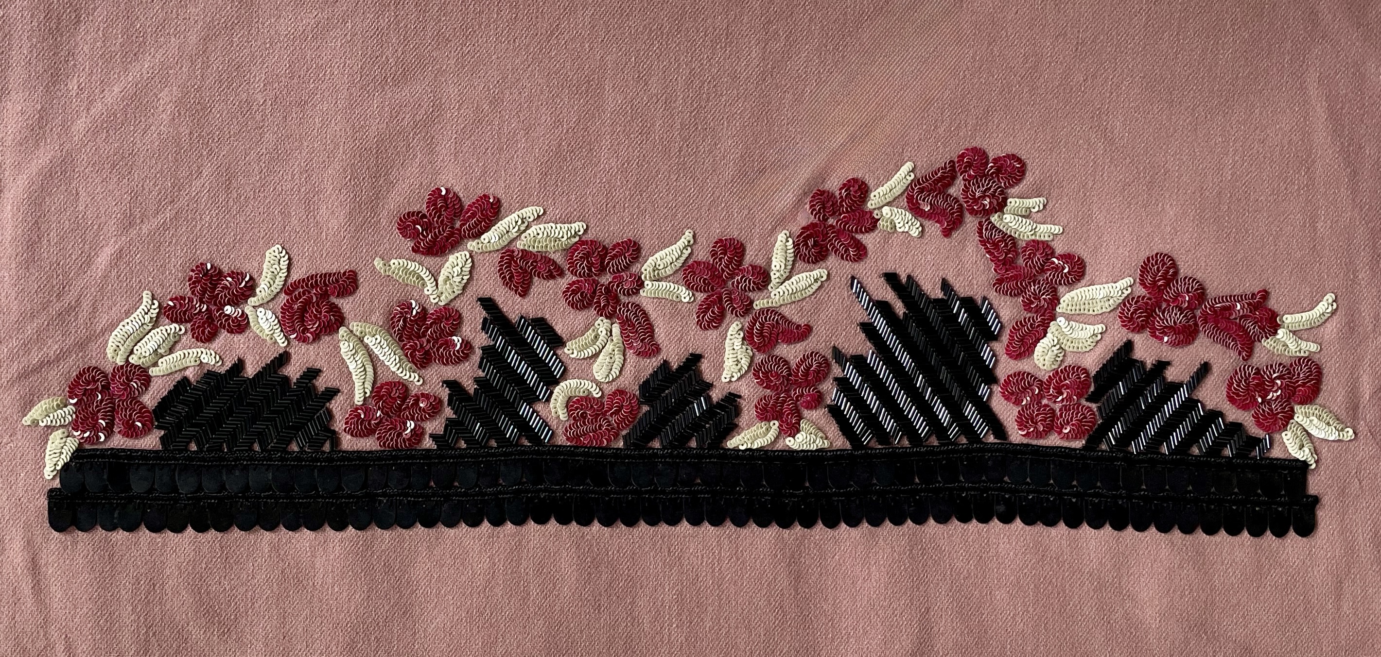
Our recently augmented Boiceau collection now consists of 46 embroidered-fabric panels and 9 tassels. They present the full range, chronologically and artistically, of Boiceau’s work as an embroidery designer. They’re executed in leather, suede, stumpwork, paste jewels, baroque pearls, sequins of many forms and finishes, synthetic flossing, and beads of faceted-glass, metal, and jade. They’re applied on silk, satin, velvet, cashmere, wool, felt, tweed, suede, tulle, net, and gazar. The results are superb in workmanship, breathtaking in color, and inventive in design. And when seen together it becomes apparent that they are pictures — representational and abstract — rather than patterns.
AND A FEW OTHER THINGS….
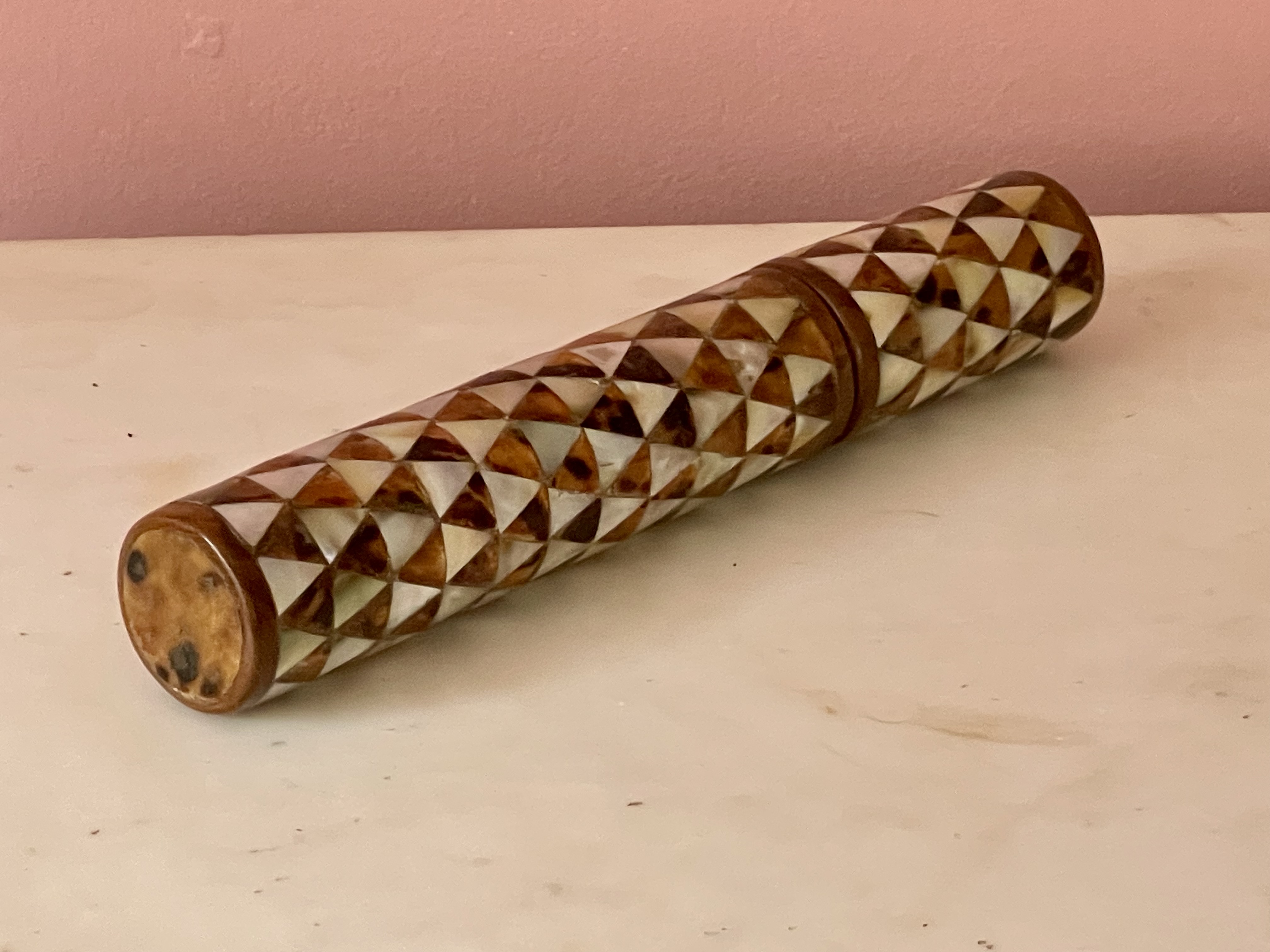
Turkish 19th century pen box, circa 1900. Mother-of-pearl, tortoiseshell, wood, paper. L: 11″ Dia: 2″. Sold
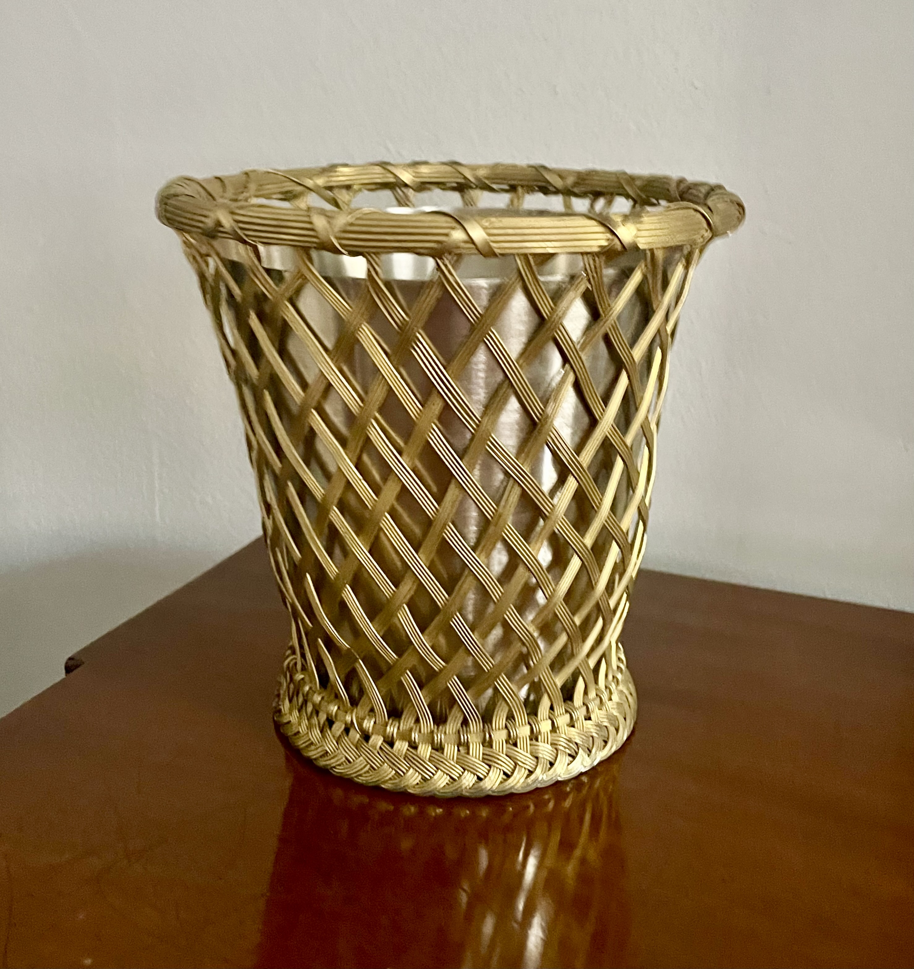
American, 20th century ice bucket. Brass, steel. H: 6 1/4″ Dia: 6 1/4″. Sold
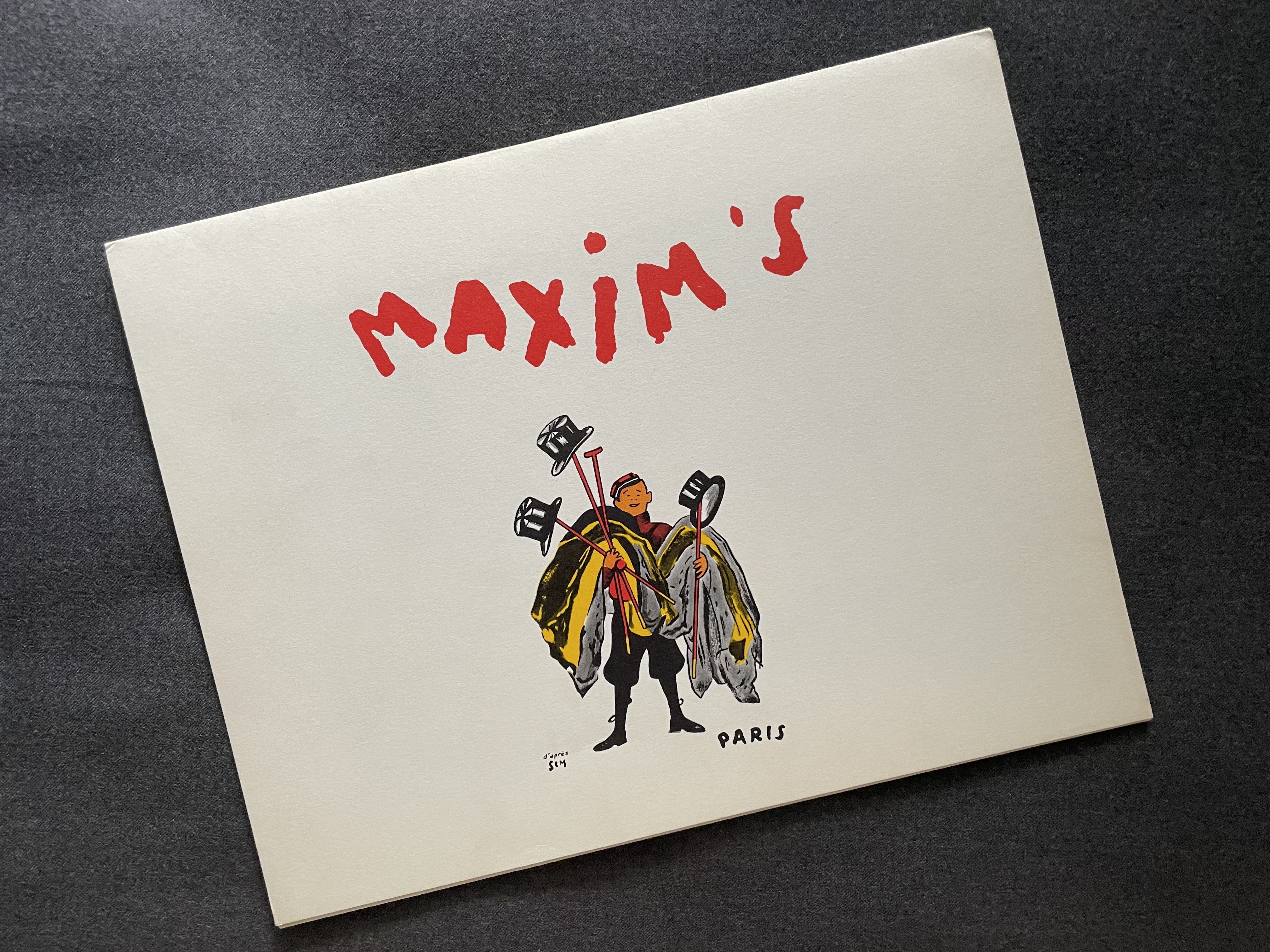
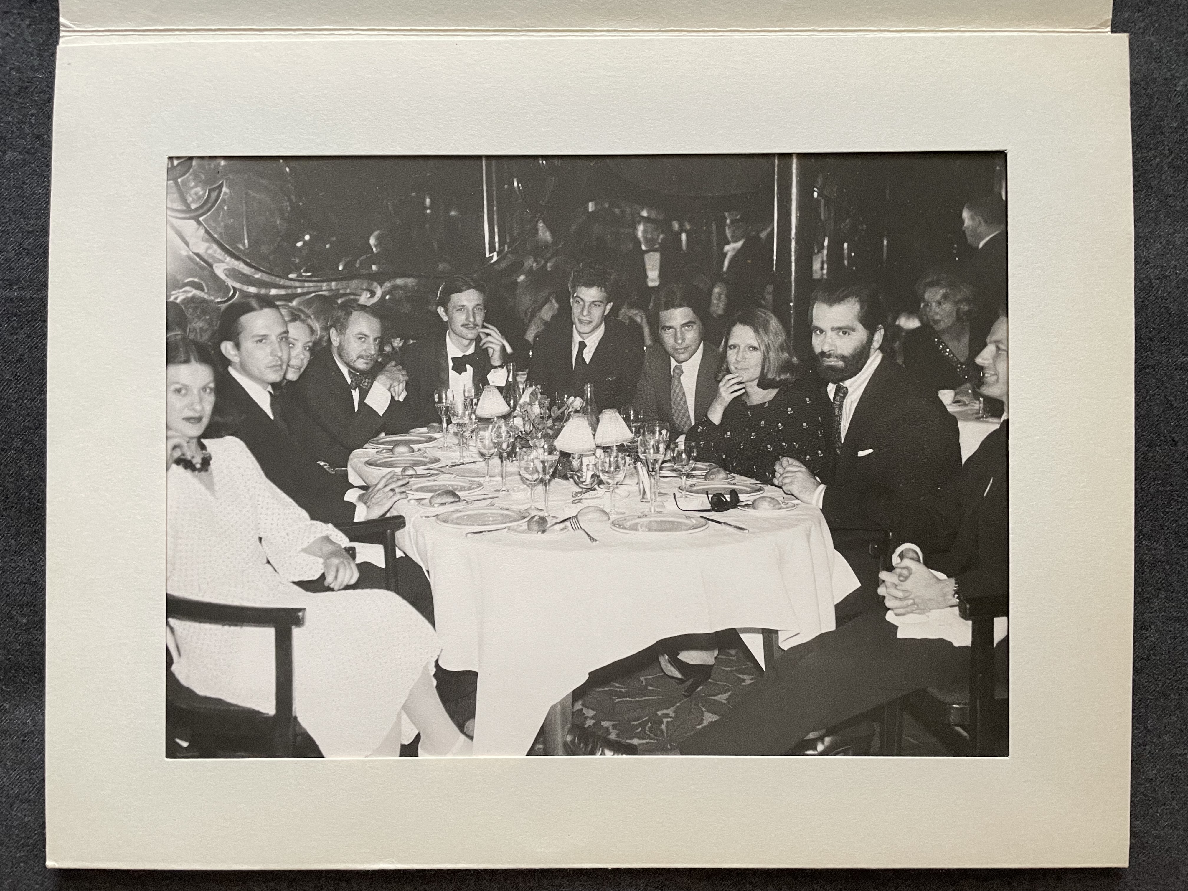
Jacques Sabrou photograph of a dinner at Maxim’s, Paris, early 1970s, in a paper folder showing, left to right: Paloma Picasso, Fred Hughes, Carol Rochas, Pierre Bergé, Jacques de Bascher, Thadée Klossowski de Rola, François Rochas, Clara Saint, Karl Lagerfeld, Vincint Fourcade. Photo: 7” x 9 ½”; 7”, folder: 8 ¼” x 10 ½”. Sold
Other recent arrivals can be seen at FEATURED INVENTORY
R. LOUIS BOFFERDING FINE & DECORATIVE ART
BY APPOINTMENT
141 EAST 62ND STREET NEW YORK NY 10065
(917)572-5041
