SOLD INVENTORY
by Louis Bofferding
Below are the backstories of some of the items that were in our inventory. Go to JUST IN to read those on our most recent arrivals.
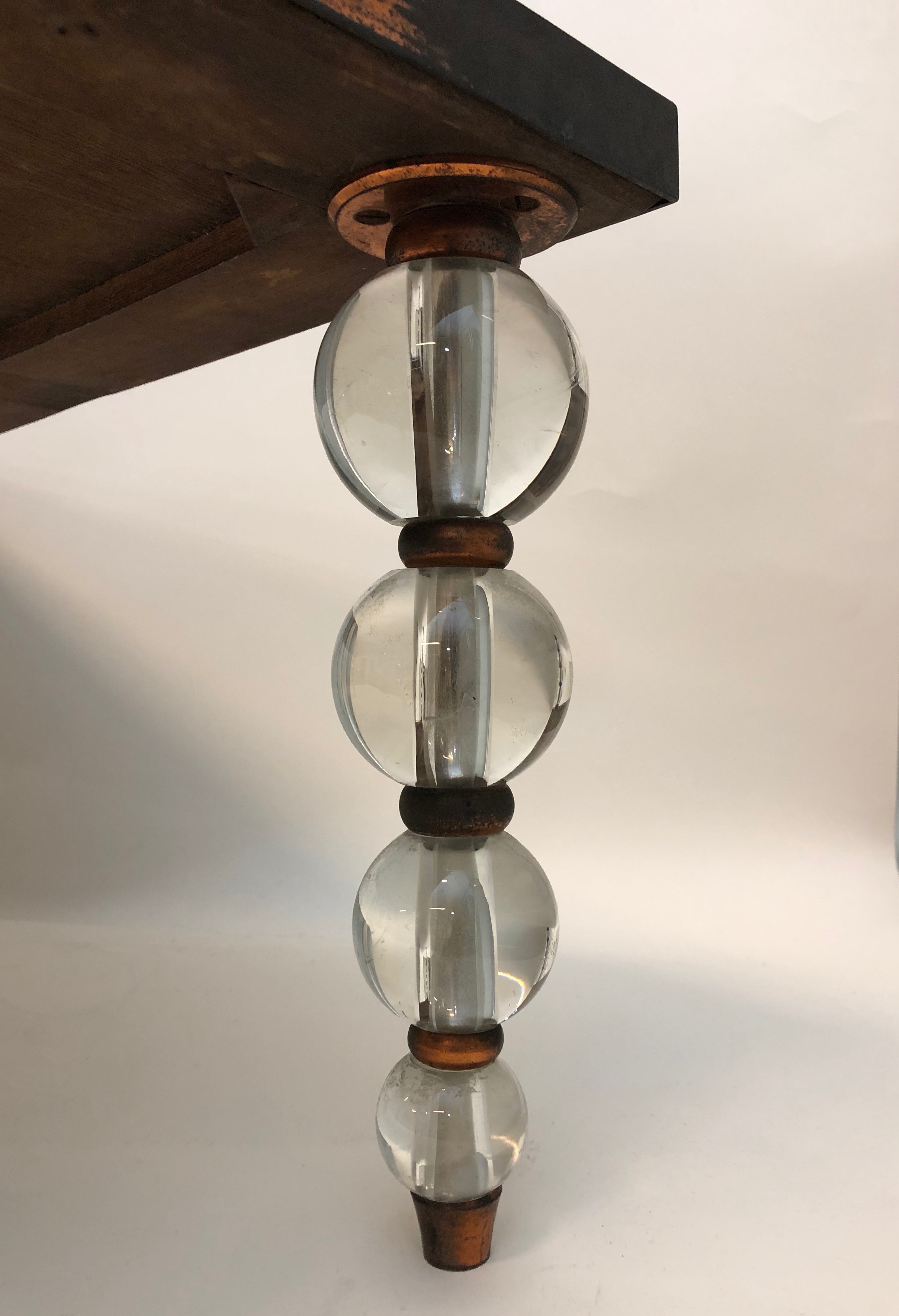
PAIR OF 1920s FRENCH SCONCES

French, 20th century, attributed to Mildé (Charles Mildé et Fils, Paris). Pair of sconces, 1920s. Cut & blown clear, amethyst, pink, and amber glass, silvered steel & sheet metal. H: 31″W: 19″ D: 9″ (each) Sold
Madcap, whimsical, spritely, over-the-top — these are just a few of the adjectives that spring to mind in describing this stylish pair of 1920s French sconces. Their steel frames are silvered, strewn with crystal prisms, and cut- and blown-glass beads, most of them clear but some of amethyst, amber, and pink. The sconces are attenuated to the point of excess, with fronds springing from vase-like bases equipped with lightbulb sockets, screened by glass-bead trelliswork, and embedded with tiny on-and-off switches. They are similar in design to the work of the well-known Paris firm Baguès, but some of the parts, like the tear-shaped pink glass pendants and silvered-metal leaves, don’t correspond with those they’re known to have used. That said, their delicate forms and whispy beaded sprays can be found in the fixtures of a less-well-known Paris firm, Mildé et Fils, also known as Charles Mildé et Cie., which was featured in a 1926 issue of Art et Industrie.


1930s ITALIAN ALABASTER LAMP
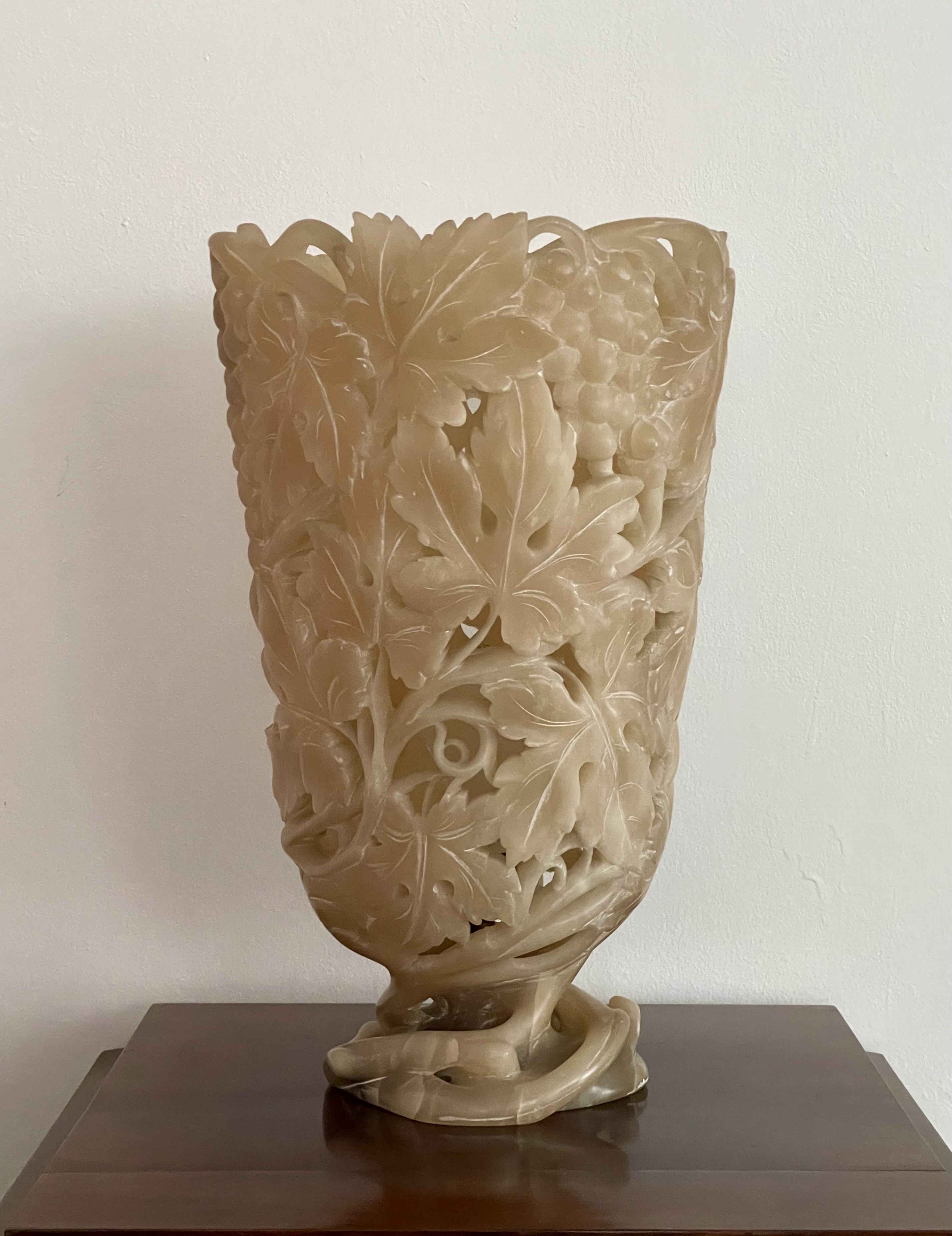
Alabaster lamp made by the Cooperativa Artieri Alabastro, Volterra, late 1930s. H:15″ Dia: 9 1/2″. $8,000
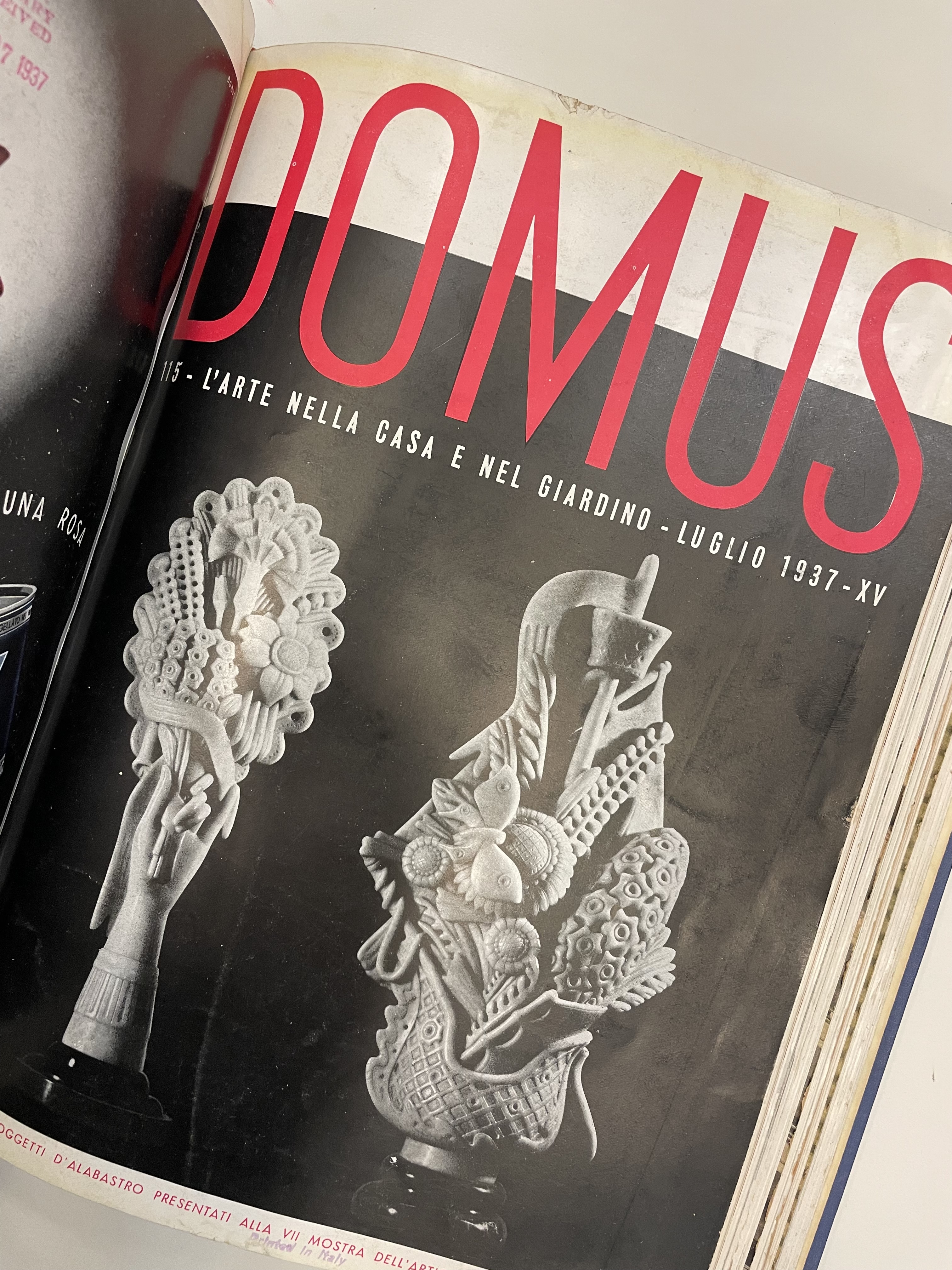
This 1930s urn-form lamp, hewn from a solid block of alabaster, is masterfully and realistically carved with grapes, leaves, tendrils, and roots. The stone’s translucency and openwork carving create a spectacular effect when illuminated. The lamp was sold through the Cooperativa Artieri Alabastro,or the Alabaster Craftsmen’s Cooperative of Volterra, a picturesque Tuscan town celebrated for its alabaster quarries. The Cooperative was established in 1895 by local carvers of alabaster vases, lamps, decorative objects, and sculptures. It kept a percentage of the profits to maintain a salesroom and an archive, and grant scholarships to promising young designers and sculptors to the local art academy. In the 1930s, works by the Cooperative’s members gained the admiration of modernist architect-designer Gio Ponti, who, in 1928, established Domus, the monthly design magazine that’s still being published today. And there, in the July 1937 issue, he published an article on their work, illustrating a lamp in the form of a cornucopia, which we also happen have in our inventory as a pair.
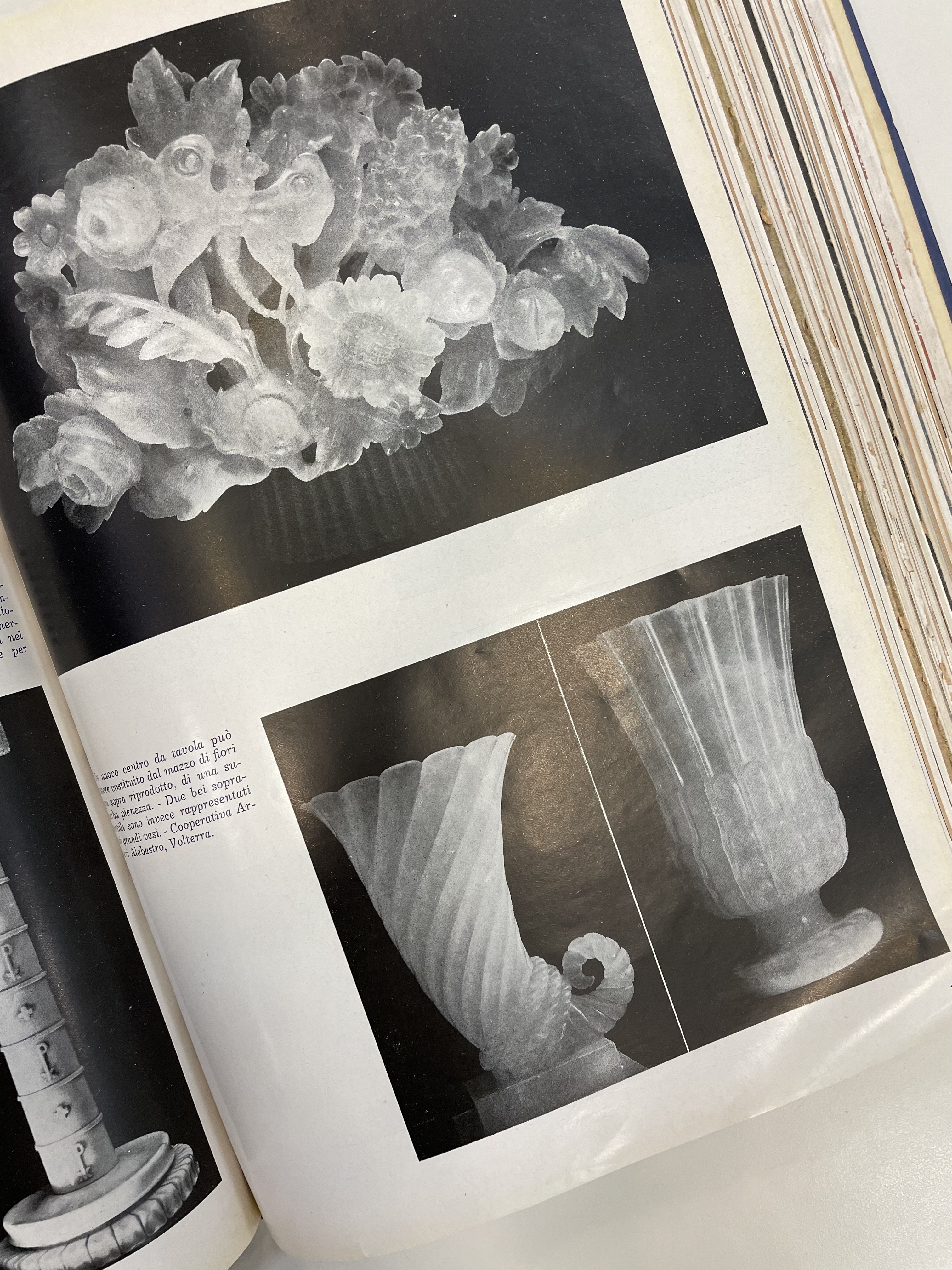

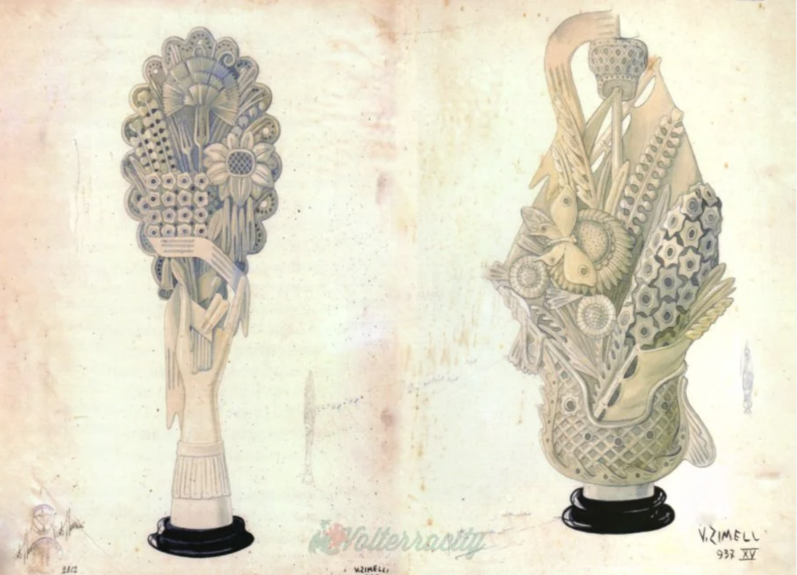
The following July Ponti published another article on their work, and put a pair of tabletop objects by Umberto Zimelli on the cover. His interest was due to the appointment of Umberto Borgna, a graduate of the Florence art academy, as the Cooperative’s artistic director. Previously, they favored white alabaster, and occasionally made even whiter by subjecting it to intense heat. But under Borgna they began working with the brownish alabaster that had irregular ash inclusions, giving it character, and when backlit, a moody mystery. Borgna also solicited modern designs from architects, artists and designers, among them Ponti himself, Franco Albini, and Umberto Zimelli who submitted designs for whimsical table-top objects. And so, as the Great Depression raged on, the Cooperative entered its golden age, exhibiting at design fairs, and sending work to prominent retailers, ranging from La Rinascente in Milan to Macy’s and Marshall Fields in the States.
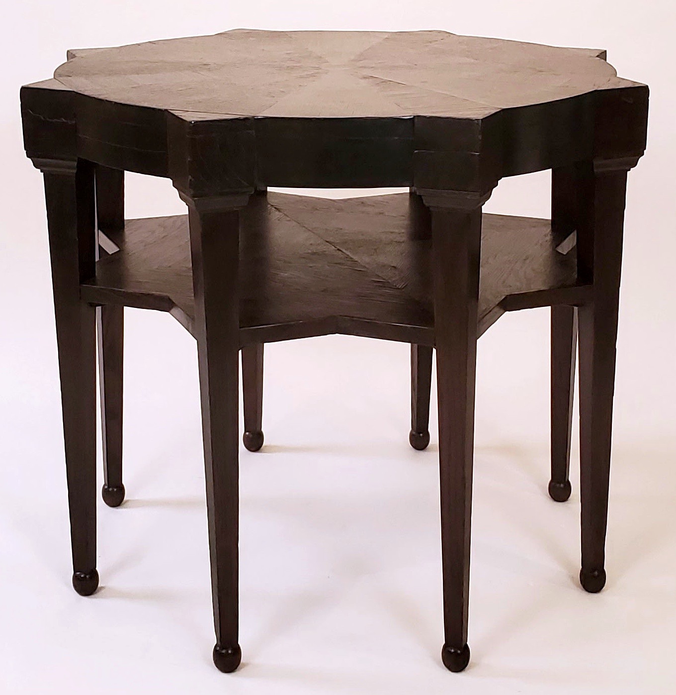
1920s BRUNO PAUL MAHOGANY CABINET
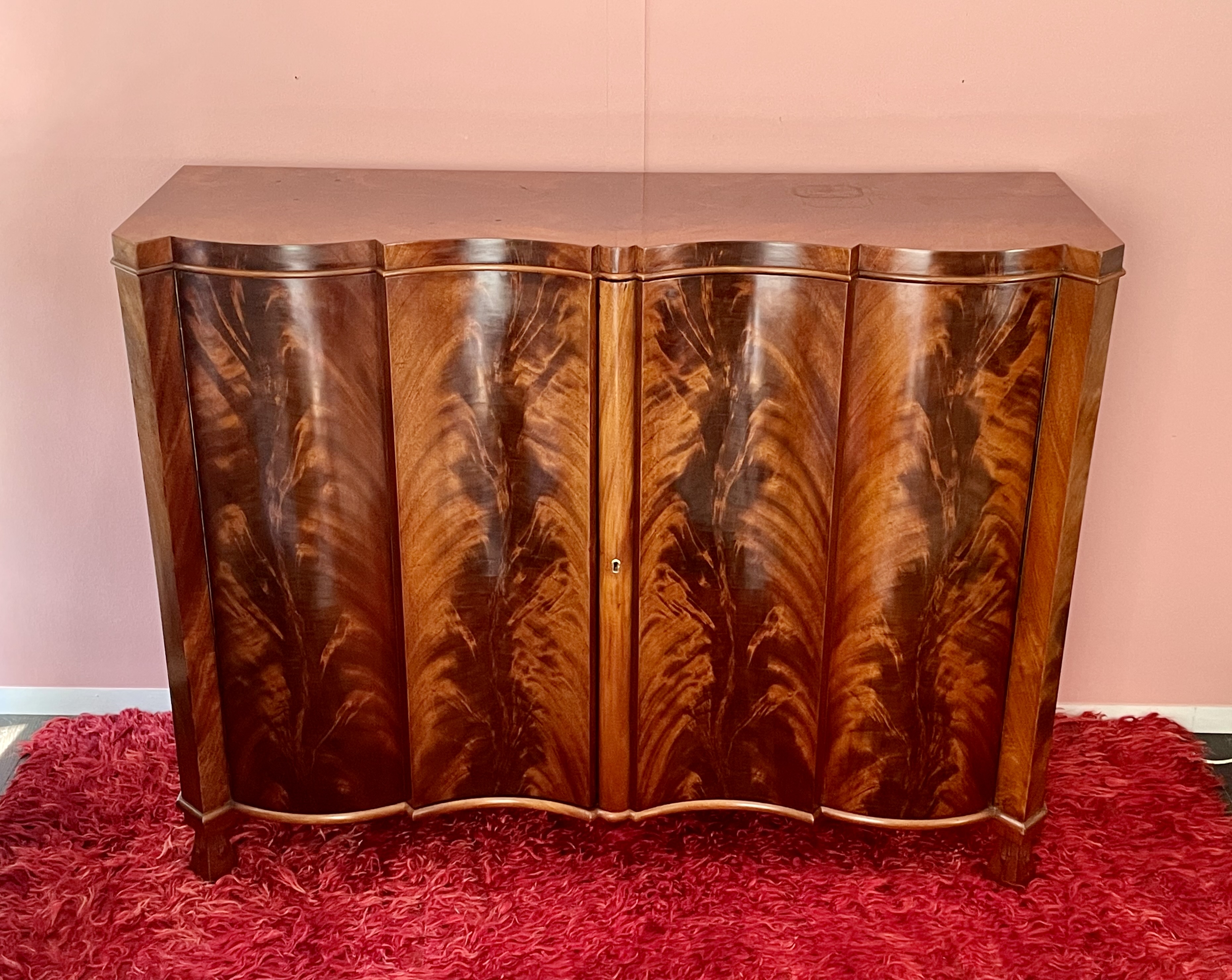
Bruno Paul (1874-1968) cabinet, made by the Zoo Werkstatten Berlin, circa 1923. Flame mahogany veneer on mahogany, brass lock and fittings. H: 41 1/4″ L: 54″ D: 17 1/2″ Sold
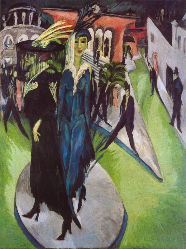
This circa 1924 mahogany-veneered cabinet with an undulating front is by Bruno Paul, the German architect and designer. The sculptural conceit, which dates back to the Baroque period if not before, is a hallmark of Mitteleuropean furniture. Paul employed these undulations both vertically and horizontally in his furniture and building facades, as did his Viennese colleague Josef Hoffman. By stripping off the additional decorations applied in previous centuries, modernists repurposed form in a pure and architectonic manner. Our cabinet is veneered in the highly-figured African “pyramid mahogany” found between the tree’s trunk and branch. Early 20th-century German designers often employed this feathered zigzaging veneer, with graining that brings to mind the brushworks of German Expressionist painters like Ernst Ludwig Kirchner and Max Beckmann. Also Expressionist are the cabinet’s inverted pyramidal feet carved with three spiky rays on each side.

ENOCH WOOD CERAMIC SCULPTURE
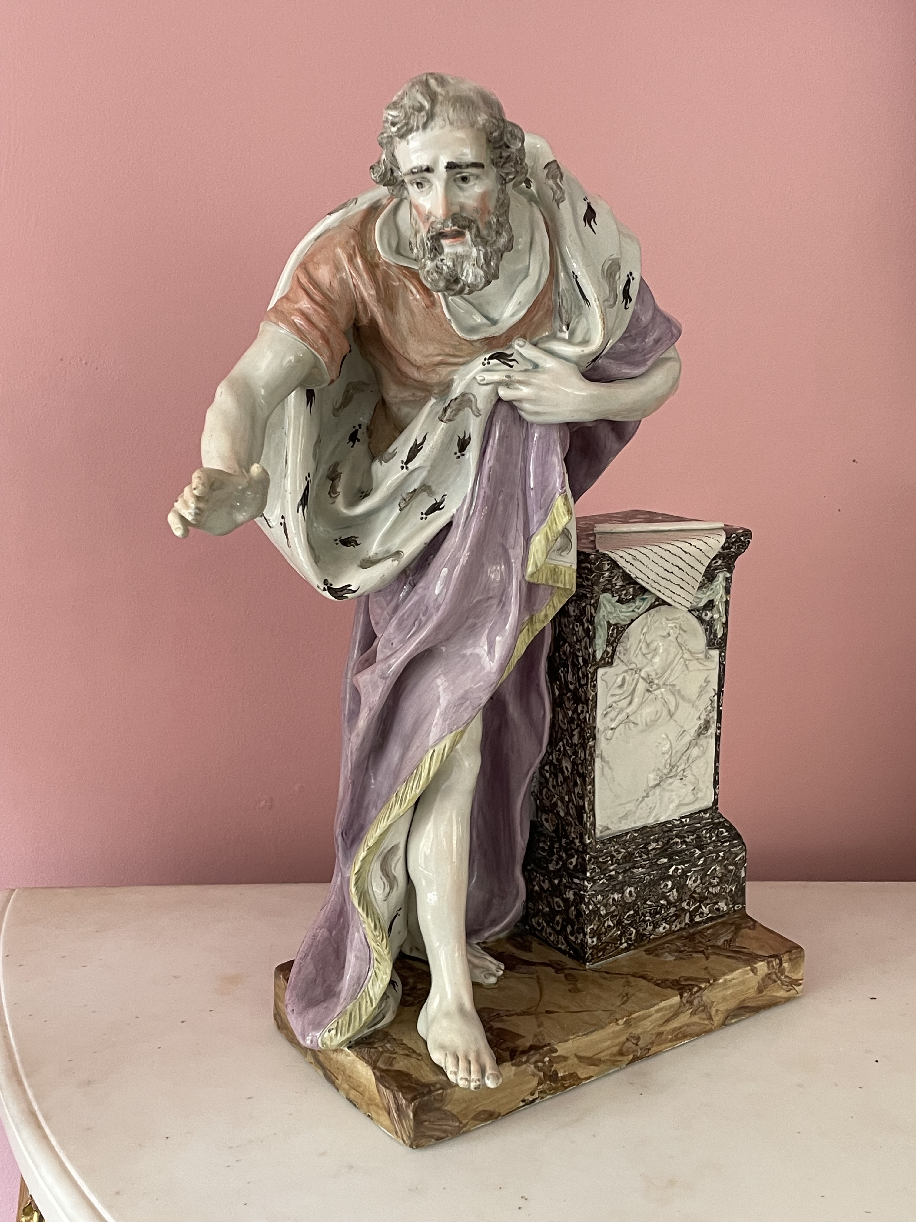
Enoch Wood (English 1759-1840). Staffordshire figure of Demosthenes, circa 1800. Ceramic, painted. H: 19″. Sold
This ceramic sculpture was made in England around 1800, and is unusually large for the material. It is perhaps the most celebrated work of Enoch Wood, a successful ceramics entrepreneur and the most important modeller at Staffordshire. In 1790 he established Wood & Caldwell, and in 1818 its successor Enoch Wood & Sons. He cast a small number of Demosthenes figures, and painted them differently, but to our eye this coloration is as good as it gets. If the delicate pastel hues don’t jibe with our notions of sun-bleached antiquity, it’s very much in line with late Georgian taste.

The ceramic depicts Demosthenes, a brilliant orator, lawyer, statesman, and speechwriter for hire. He lived in 5th century BC Greece, and as an orphaned child he successfully argued in court to receive his inheritance early. As an adult he became famous for his silver-tongued persuasiveness, which is why he’s still venerated by debate teams today. This skill, however, was also his undoing, for after rousing Athenians to revolt in a failed coup against Alexander the Great, he was compelled to take his own life.
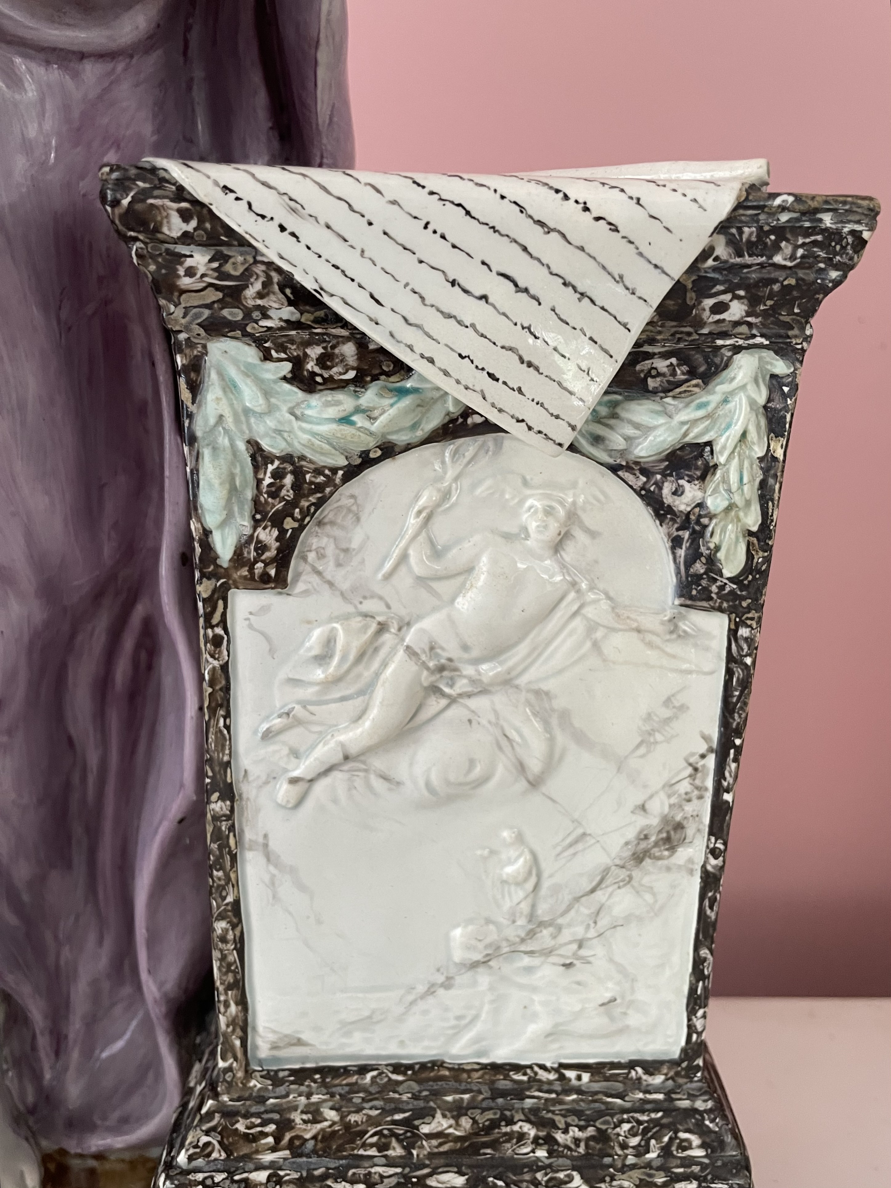
He’s seen here in mid-sentence, leaning against a marble pedestal, his written speech folded over it, and a quill at hand for revisions. On the front of the pedestal, beneath a victor’s swag of laurel, is a bas-relief depicting Mercury, god of eloquence and communication, sweeping down from Mount Olympus to inspire Demosthenes as he practices his speechifying in the wilderness.
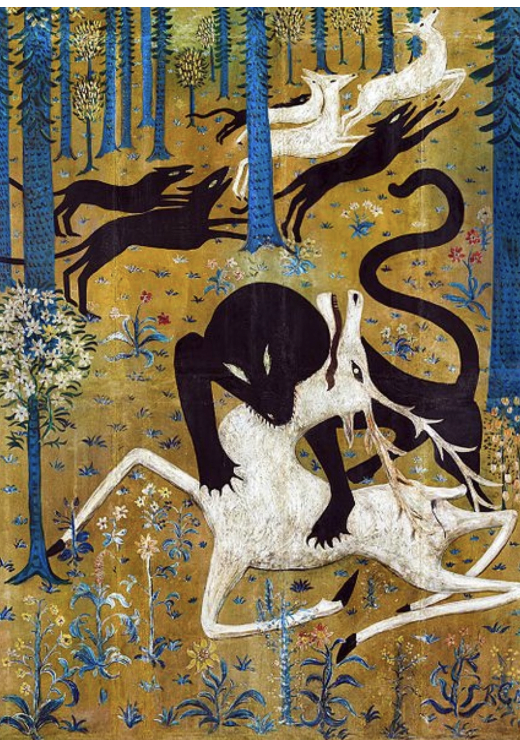
1024 ROBERT CHANLER PAINTING
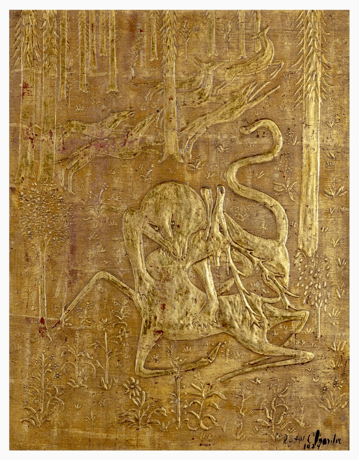
Robert Winthrop Chanler (American, 1872-1930). Stag Attacked by Dogs. Gilding & gesso on wood panel. 21″ x 16″. Provenance: Private collection, Paris. Sold
Beauty and brutality merge in this compelling 1924 painting by Robert Winthrop Chanler, one of the most interesting and overlooked 20th-century American artists. He invented his own technique of gold-relief painting, and frequently depicted scenes of animal and human carnage. Another Chanleresque dichotomy is balancing the glamorous and the primitive. The former appealed to his patrician collectors, and the later to his Modernist colleagues. Chanler’s oeuvre includes an earlier version of this composition that appeared in the groundbreaking 1913 New York Armory Show, along with works by Duchamp and Brancusi. Yet his subject of dogs attacking a stag derives from Medieval hunting scenes, as the flat decorative background does from millefleurs tapestries of the same period.
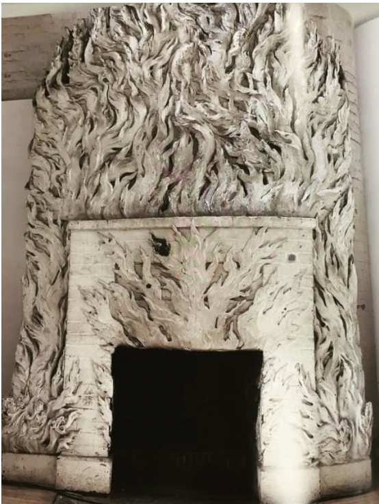
A descendant of Stuyvesants and Astors, Chanler inherited vast landholdings in Manhattan and the Hudson River Valley. In his personal life he burned the candle at both ends. His extravagant East 19th Street townhouse, known as The House of Fantasy, so enchanted Gertrude Vanderbilt Whitney, artist and museum founder, that she she asked him to decorate her Greenwich Village studio, which he transformed into a hellish roomscape of sculpted flames. Originally, it was painted in hot phosphorescent yellows and reds that were cooled by stained-glass windows in blues and greens depicting deep-sea life. By then, Chanler had gained notoriety and headlines in The New York Times by marrying Lina Cavalieri, the legendary opera diva, professional beauty, and gold-digger. Chanler impetuously signed his fortune over to her during their whirlwind romance, prompting his insane brother to cable from the asylum “Who’s looney now?” The marriage crumbled during the honeymoon, and ended in divorce, followed by years of litigation. Chanler’s posthumous revenge came during World War II when Cavalieri was felled by a bomb as she dashed home from a shelter to retrieve the jewelry that he had given her. The servants who remained behind lived to tell the tale.
MODERN FIREPLACE SCREEN
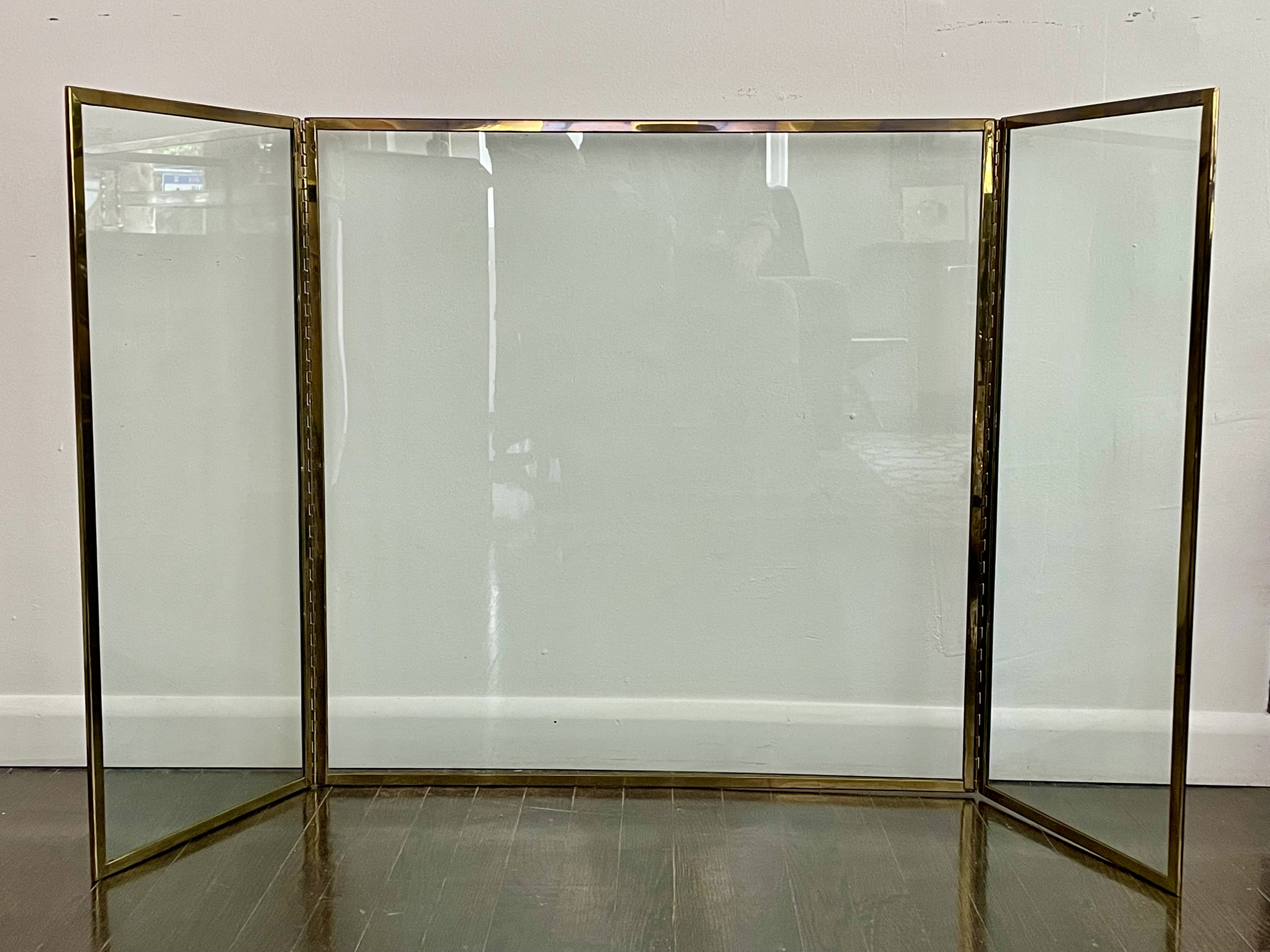
American or French, 20th century. Fireplace screen, 1990s. Glass, brass. H: 30 1/4″ W: 2 leaves at 13 1/4″, 1 at 30 1/4″. Sold
Elegantly spare and beautifully crafted, this fireplace screen consists of nothing more than three brass-trimmed glass panels that pivot on two piano hinges, and folds up into next to nothing. It’s unlike the typical modern screens of metal-mesh, and traditional ones of wood with fabric-inset panels. Fire screens are increasingly rare in our day of fake fireplaces, with gas-fueled flames sealed behind sliding glass doors. They may be efficient and clean, but their uniform flames lack the romance of those that flare up, crackle, smolder, and release the scent of the forest. This screen isn’t all that old, and probably dates to the 1990s, as the tempered-safety glass bears the mark of Falconer, a Pennsylvania firm that opened in 1991 and closed in 2006. We purchased it at an auction house that didn’t identify the consignor, although they did supply their address. It was 820 Fifth Avenue, where Mrs. Charles (Jayne) Wrightsman, the great collector, lived until her death in 2019. Since then, her estate sold off what she didn’t leave to the Metropolitan Museum in a single-owner sale at Christie’s, and then anonymously piecemeal in other auctions. We suspect our screen belonged to her, and that it was either designed by, or purchased by Henri Samuel, her Paris decorator who, over the years and between Concorde flights, perfected the apartment, after Stephane Boudin of Jansen, her previous decorator, retired in 1966.
BILLY BALDWIN SLIPPER CHAIR
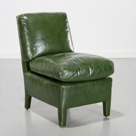
Billy Baldwin (1903-1983) slipper chair, circa 1970. Green leather upholstery, wood frame. H: 30 ½ W: 19” D: 25.” Sold
“Small women and football linebackers find it equally comfortable,” wrote Billy Baldwin about his design for this slipper chair in his 1972 book Billy Baldwin Decorates. And if a linebacker has yet to publicly attest to Baldwin’s claim, the chair does suit my six-foot frame, as it did the diminutive ones of Truman Capote’s swans. After all, Babe Paley was a Baldwin client, as was Jackie Kennedy, and her sister Lee Radziwill too of a sort, since much to his chagrin he never saw the color of her money, although she picked his brain relentlessly before becoming a decorator herself.
The comfortable, all-upholstered slipper chair was hardly Baldwin’s invention, for it dates back to the early 18th-century France. And his own take on it bears more than a passing resemblance to the over-scaled, box-pleated ones that were a standard feature in the rooms of his mentor and former employer Ruby Ross Wood. Nevertheless, he pared down and resculpted that chair until he made it his own – to the point that the “slipper chair” is now identified with him, just as the Parsons table is with Jean-Michel Frank.
Baldwin’s chair would launch a thousand imitations by those who sought to cash in on his flawless design without paying him royalties. So one may well ask if this leather-upholstered slipper chair is an actual Baldwin. Unfortunately, we don’t know its provenance but it conforms to the very inch in dimensions and upholstery details to a pair we once had that was supplied by Baldwin. Besides, magnolia-leaf green was perhaps his favorite color (lifted from Elsie de Wolfe’s 1940s Hollywood years), which is why it was used on the walls of his first Manhattan apartment in Amster Yard, and then years later in the Park Avenue bedroom he decorated for S. I. Newhouse, Jr., which just happened to have an identical black-leather slipper chair placed below the Kenneth Noland painting.
ENGLISH WINE CELLARETTE ACQUIRED BY DAVID ADLER

English 18th century. Queen Anne wine cellarette, circa 1710. Walnut veneered and solid, brass. From the collection of Dr. & Mrs. Egil Boeckmann (daughter of James J. Hill), St. Paul. Sold
During the depths of the Great Depression, David Adler, the celebrated Chicago architect, went on a shopping spree for antiques in New York and London. His clients, Dr. & Mrs. Egil Boeckmann of St. Paul, were sitting pretty thanks to Rachel Boeckmann’s vast inheritance from her father, the railroad tycoon James J. Hill. Their refined red brick mansion, located just a few doors down from her parents granite pile on Summit Avenue, was designed by Adler, and furnished by him with an embarrassment of fine English antiques.
Among the pieces that Adler bought for his clients was this walnut-veneered wine cellarette. We bought it with the original 1930 bill of sale from Lenygon & Morant, the eminent London antiques dealership that had a New York branch on Madison Avenue. Since twentieth-century wine bottles are taller than their eighteenth-century ancestors, the Boeckmann’s staff would have had to position them horizontally to fit, rather than vertically. That, and Prohibition, which wasn’t revoked until 1933, makes us wonder if this handsome, sculptural cellaret might have served as an end table in the library, rather than for storing contraband in the dining room.


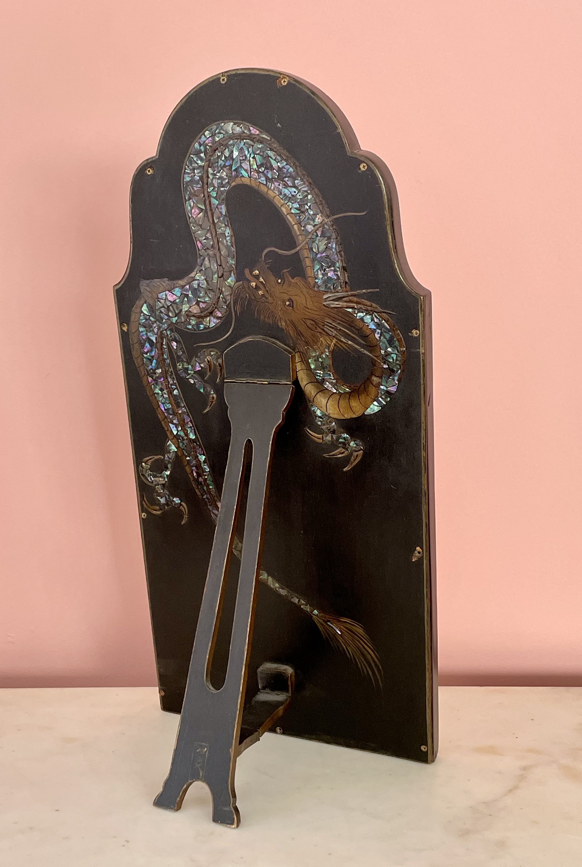
ASIAN TABLETOP MIRROR FOR THE WESTERN MARKET
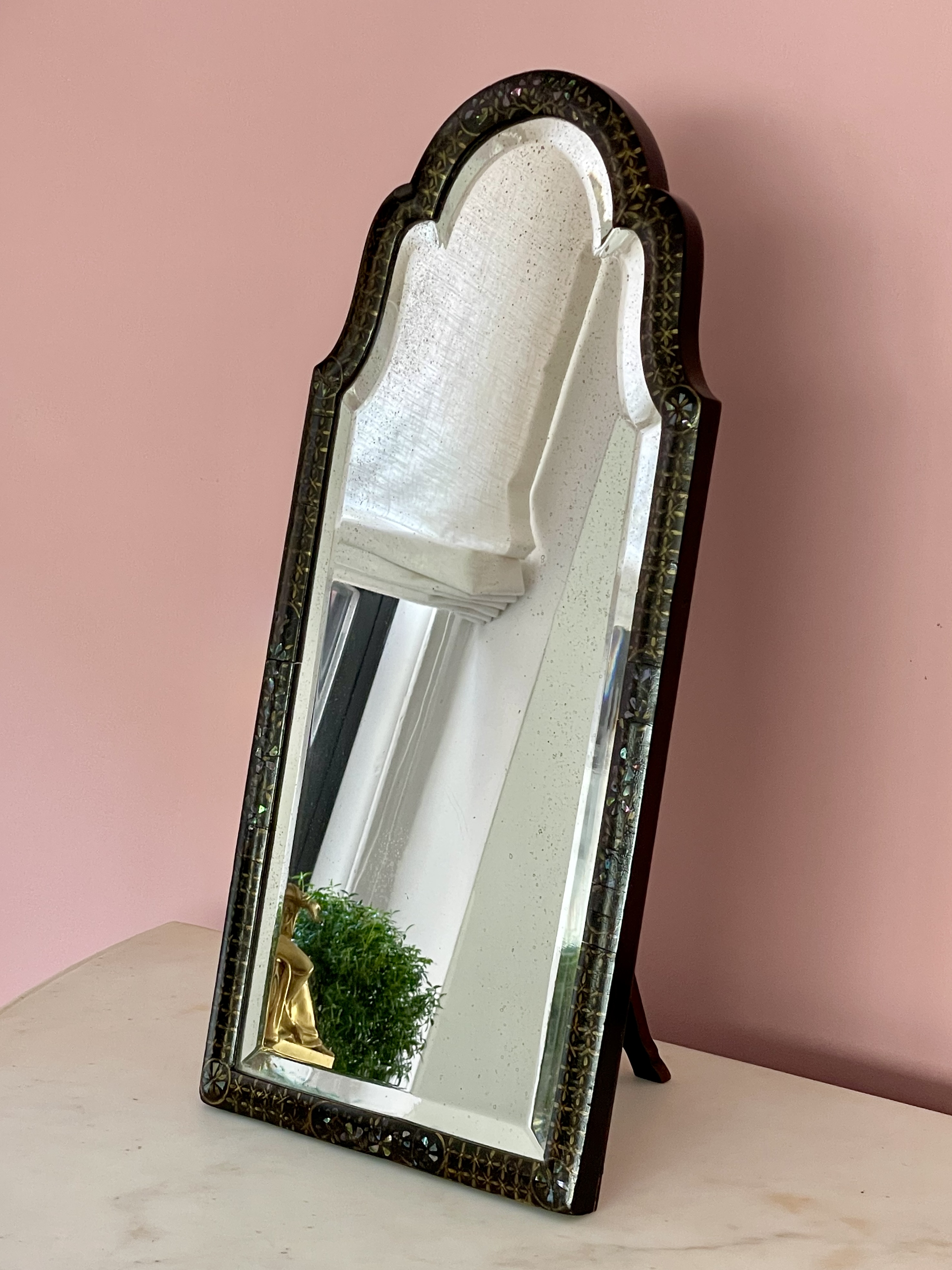
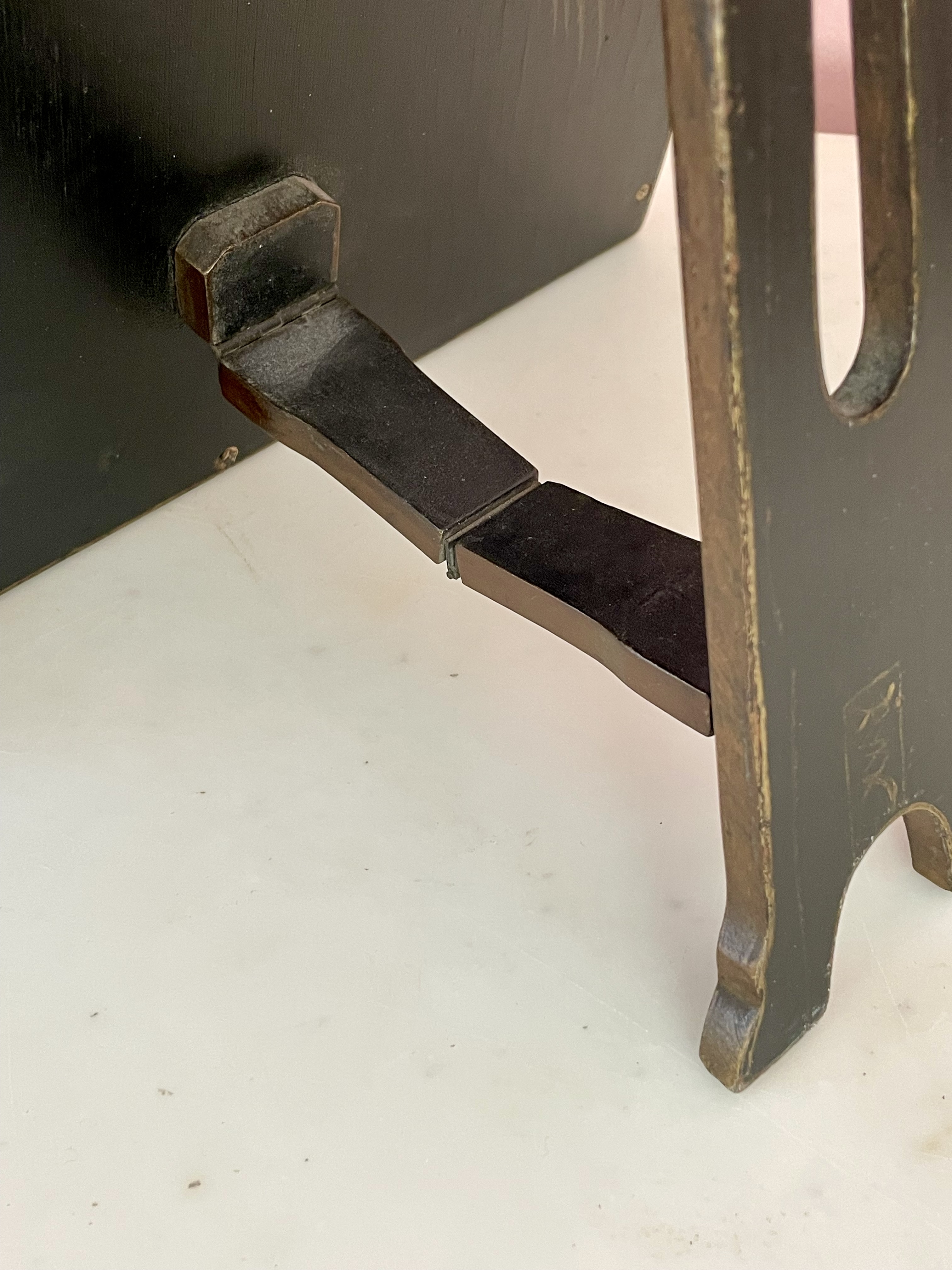
Asian, probably Japanese, table-top mirror for the export market, circa 1900, indistinctly signed by maker. Lacquered wood, gold decorations, mother-of-pear inlay. H: 25 ¼ W: 11 ½ D: 9
Provenance: Richard A. Lee, Ardmore PA. Sold
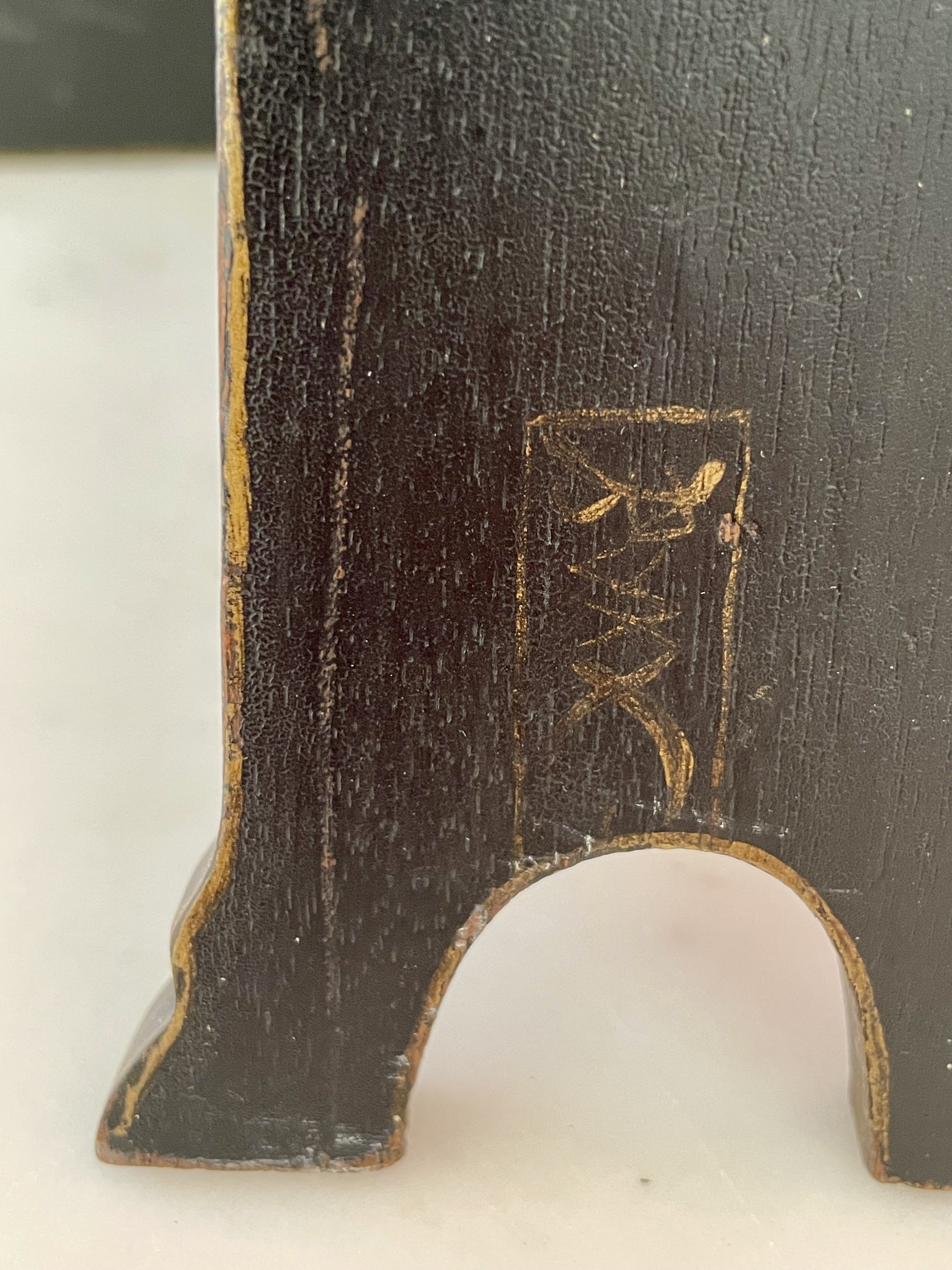
This elegant table-top mirror was made around 1900 in Asia for the Western market. There, lacquerwares with mother-of-pearl inlays had been prized for centuries, to the profit of Asian craftsmen and Western retailers. This mirror represents an amalgam of the two continents, with its decidedly Asian lacquer work and the mother-of-pearl-scaled dragon, and the scalloped top and elongated shape of the Queen Anne and William-and-Mary styles, which prevailed in England and the American colonies around 1700. Those styles were being revived in England and the States just before 1900, just when japonisme was also very much in vogue. While the mirror’s Western form and its indistinct maker’s mark, which appears on the hinged back support, make it difficult to pinpoint a Chinese or Japanese origin, we’re placing our bets on Japan.
TWO SAMUEL MARX TABLES
Samuel Marx (American, 1885-1964). Desk, and a double-sided display table, 1933. Leather, burled-elm veneer, nickel-plated metal. Desk H: 29″ L: 60 D: 30″; Display table H: 29″ L: 75″ D: 33″. Provenance: Mr. & Mrs. Edward Sonnenschein, Glencoe, Illinois; Art Institute of Chicago. Sold
This Samuel Marx display table and desk were made, along with a pair of stools which are still available, for the “jade room” in the house of Edward and Louise Sonnenschein outside Chicago. Unlike the stools, the tables aren’t a true pair, since the display table is larger. Both have black leather-wrapped tops, burled-elm-veneered legs, and drawer pulls of silver metal inset with leather. In addition to being an important collector of jade, Mr. Sonnenschein was a founder of the leading Chicago corporate law firm Sonnenschein Nath & Rosenthal that represented Sears Roebuck, among other notable clients. In 1950 his jade collection, and the furniture in the jade room, were donated to the Art Institute of Chicago. Recently, the museum deaccessioned the furniture.
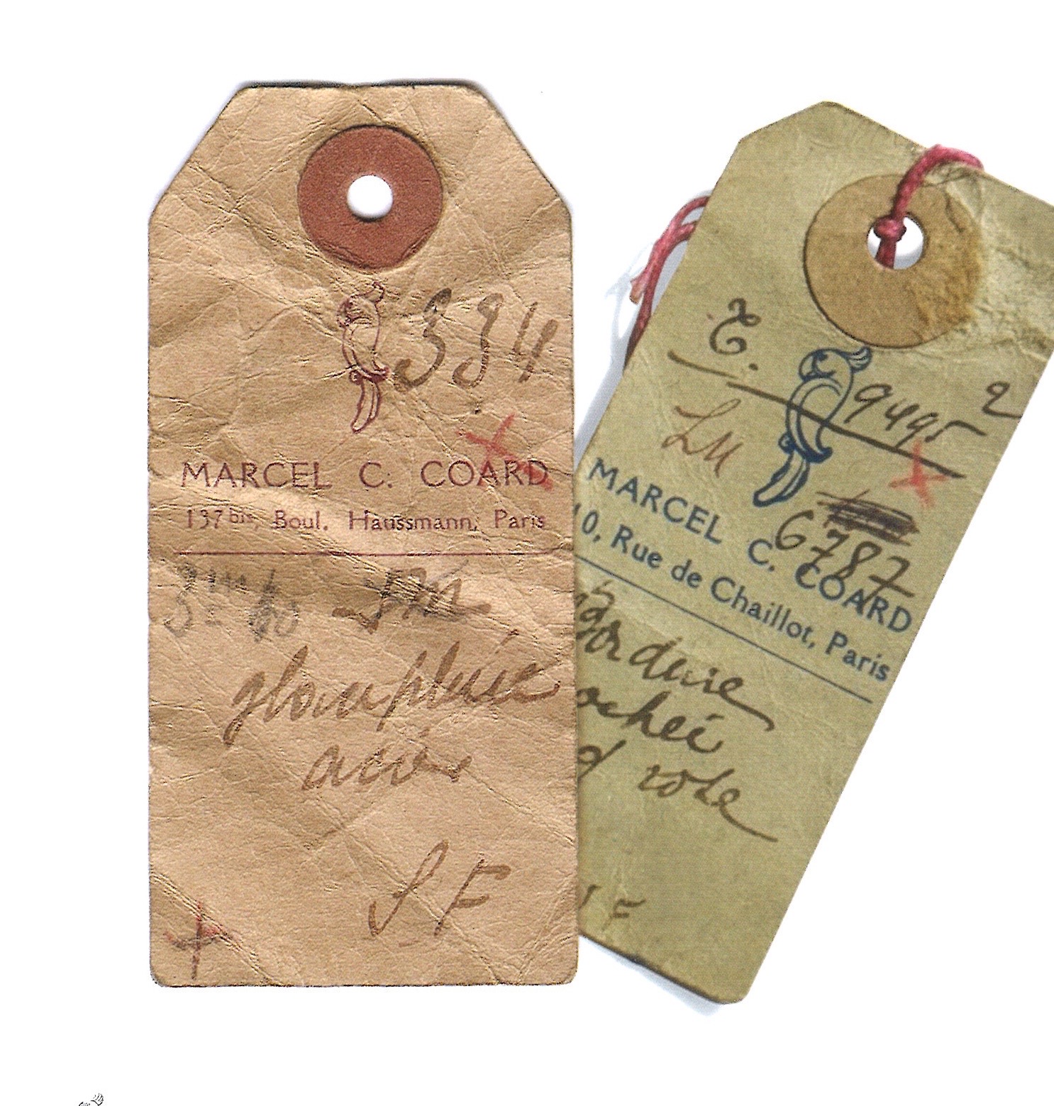
SMALL TABLE ATTRIBUTED TO MARCEL COARD
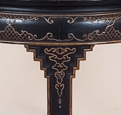
Attributed to Marcel Coard (1889-1974). Side table, circa 1930. Oak, shagreen. H: 21 ¾” L: 11” W: 11”. Provenance: Pierre Le-Tan. Sold
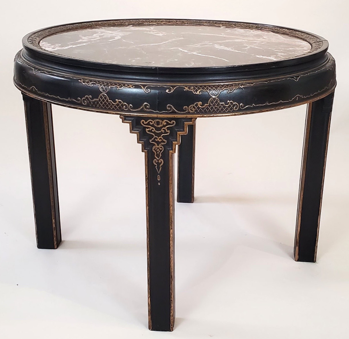
This small side table was made from two materials that are rarely combined: red oak, which is commonplace and humble, and shagreen, which is exotic and rare. Shagreen is the hide of the stingray, which is leather-like, but more interesting-looking, with a natural patterning of tiny circular denticles. For use, it’s sanded down to a smoothness, and then tinted a color, in this case green. Today, stingrays are commercially farmed in Southeast Asia, although those have hard and coarse hides, with large denticles, unlike those fished naturally in Northern European waters. In 18th-century Europe, shagreen was used to make cases for spectacles, scientific instruments, sewing implements, and cosmetics. It fell out of fashion during the 19th century, only to become all the rage once again in 1910s and 20s Paris, when it was used for luxurious, one-of-a-kind furnishings by Paul Iribe, Andre Groult, Pierre Legrain, Jean-Michel Frank, and Marcel Coard [below left].

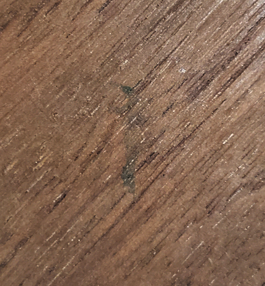
This table’s simplicity, geometrical form, attenuated proportions, fine joinery, and uncommon combination of materials, are characteristics of the work of Marcel Coard, as seen in his 1921 table of blackened oak with a string of inlaid ivory around the top [above right]. On the underside of our table is a smudged green stamp [below left] that may be the ghost of his parrot stamp [below right], which harked back to the only pet he was allowed to have as a boy — a parrot he named Coco that was given to him by family friends.
The Coards were rich Jewish bankers. In France, traditionally, sons took up their fathers’ professions, but in the early 20th century it wasn’t unusual for a young man to strike out on his own path. Marcel may have chosen to study architecture at the prestigious Ecole des Beaux-Arts, rather than furniture making, at the Ecole Boulle, to appease his parents over his career choice. Nevertheless, in 1913 he signed a shop lease, and hung out his shingle as a decorator. He kept an inventory of antiques, and designed one-of-a-kind furnishings marked by a deep understanding of materials and craft. The following year he received the first of several commissions from Jacques Doucet, the important collector and patron of modern art and design. But the largest commission of his career came in 1928 from Paul Cocteau, the stockbroker brother of Jean, the famous writer, artist, and filmmaker.
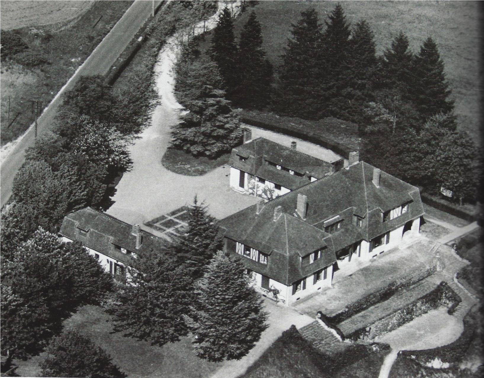
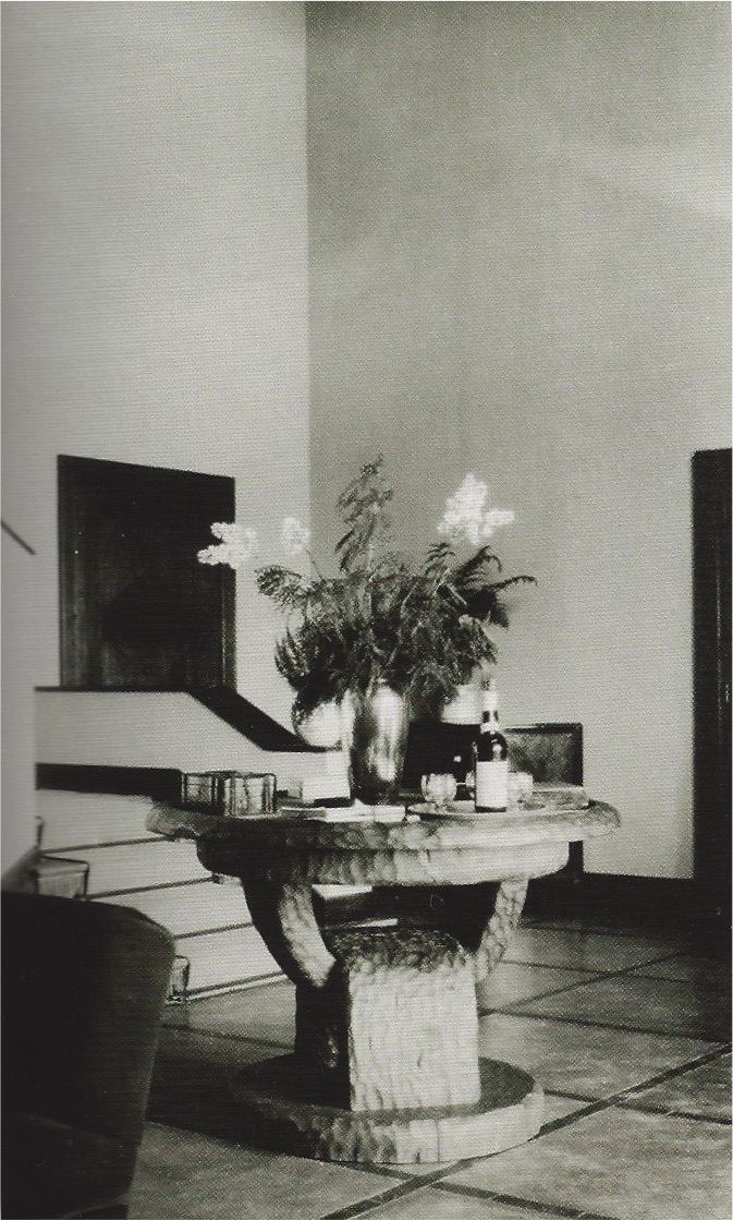
In the late 1920s, Cocteau and his wife Marcelle commissioned Coard to fully furnish the vast country house [above left] that they built, a job that would take him years to complete. What was notable about the results, aside from the high quality and sheer number of pieces, was the variety. They ranged from the soigné to the rustic, as did the materials, from precious to commonplace, as seen in a macassar ebony commode inlaid with lapis lazuli and mother-of-pearl, and an African-inspired table hewn from a solid hunk of oak, and topped with black-glass [above right]. On the spectrum from precious to commonplace, the materials used in our shagreen and oak table, if it is indeed by Coard as we suspect, fall somewhere between these two poles.
1920s GERMAN CHINOISERIE TABLE
Attributed to Peter Baumann. Chinoiserie table, circa 1925. Japanned wood with raised gilt-gesso decorations, Bohemian Breccia marble top. H: 25 ¾” Dia: 31 ½”. Bibliography: Innendekoration, 1925, pp. 286-7. Sold
When one culture discovers another, the discoverer and the discovered find the other exotic, and a mutual fascination ensues. This has been the case with Europe and Asia since Marco Polo ventured eastward in the 13th century. In the 18th century that mutual fascination took form in King Frederick the Great of Prussia’s Asian-style pagoda outside Berlin [below left], and the Qianlong Emperor’s European-style summer palace outside Peking [reconstruction below right]. Neither ruler, nor their designers, however, had set foot on the other’s continent, so their knowledge was rudimentary at best. And so their two pleasure domes reflect fantasies rather than realities, and come off looking remarkably alike in style.

In 18th-century Europe, only aristocrats, and the odd filthy-rich banker, could afford Asian goods or the European interpretations of them known as chinoiserie. But in the 20th century, by which time capitalism had replaced the divine right of kings, a taste for the exotic had trickled down to the middle classes everywhere, from San Francisco to Berlin. And it was in Berlin, in the early 1920s, that the interior design studio of Hermann Gerson, a high-end department store, proposed to their clients a chinoiserie dining room with red-lacquered paneling and furnishings, and porcelains that may or may not have been Chinese [below left].

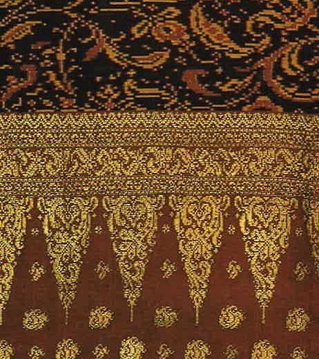
We attribute our 1920s German chinoiserie table to Peter Baumann, based on a nearly identical table seen in a winter garden he designed for a residence in Cologne. That room, published in Innendekoration in 1925 [above right], was filled with the potted palms native to Asia, and sparingly appointed with Art Deco furniture given an Asian twist with stepped spandrels, black japanning (a European painted finish imitating Asian lacquer), and raised decorations picked out in gold [below left]. Those decorations appear to have been based on Indonesian motifs that can be found in textiles [below right]. No doubt, many made their way to Germany when it seized a large chunk of Papua New Guinea, one of Indonesia’s largest islands, in 1885, and renamed it Kaiser-Wilhelmsland.
Germany’s improbably named colony was seized by Britain at the outbreak of World War I, and then by Japan during World War II. Following liberation in 1945, Indonesia finally achieved independence, as would the other Asian colonies of Britain, France, and Holland, in the years that followed. In spite of this, Western designers, collectors, and consumers, became ever more familiar with Asian art and its regional characteristics, thanks to global tourism, art historical scholarship, and museum attendance. Yet even today, the lure of chinoiserie – that fantasy land of pagodas, palms, and lacquerware – persists in the Western imagination.
COMPAGNIE DES ARTS FRANCAIS COCKTAIL TABLE
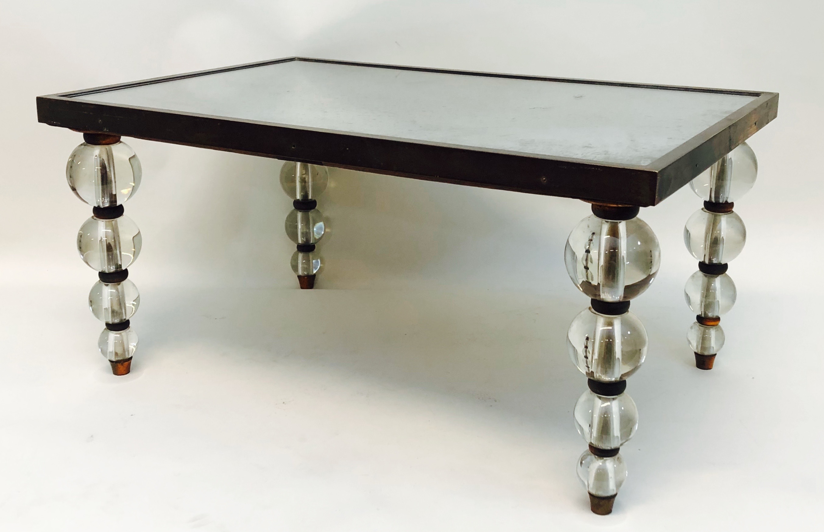
French, 20th century. Attributed to the Compagnie des Arts Français. Cocktail table, circa 1928. Glass, mirror, nickel-plated steel and copper. H: 11 ½” L: 23 ¾” D: 15 ¾” Sold
This glittering cocktail table of glass, mirror, and nickel-plated metal is the quintessence of 1930s glamour, and so finely made it could be compared to diamond-mounted platinum jewelry. It was sold to us as the work of Jacques Adnet [below left], who, in 1928, took charge of the Compagnie des Arts Français, a design studio and retail store established by Louis Süe and Andre Mare in 1919. Those designers collaborated with a small team of like-minded artists and craftsmen, establishing a tradition that continued under Adnet.

In 1928, the retail mogul Théophile Bader added the Compagnie to his collection of luxury-brand firms, which included, among others, the Galeries Lafayette department store, the house of Vionnet, and d’Orsay perfumes (decades later Francois Pinault and Bernard Arnault would make their own headlines assembling similar luxury conglomerates). In short order Süe resigned, and Maurice Dufresne gave the showroom a flashy new look [above right]. Since 1920 Dufresne kept busy running La Maîtrise, the Galerie Layfayette’s interior decoration studio and high-end furniture line, which probably accounts for his turning the Compagnie over to Adnet, his 28-year-old protégé.
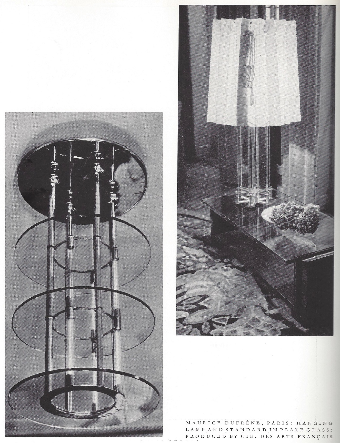
Adnet would pivot the firm from an Art Deco grace to an au courant modernity, realized in glass, mirror, metal, and the occasional unembellished rare-wood veneer. Dufresne, however, must have been involved since he designed some furnishings for the Compagnie. Among them were a chandelier, lamp, and table published in Modern Glass [above right], a 1931 book by Guillaume Janneau that included only one chandelier by Adnet. Given this, Dufresne’s years of experience, his redo of the showroom, an in with the owner, and his appointing Adnet as director (acording to an Adnet interview), must have been an éminence grise at the firm in those transitional years.
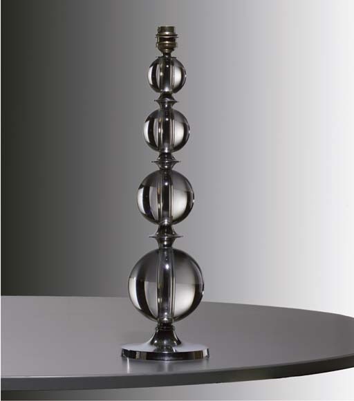
When the Compagnie’s glass pieces appear on the market today, however, they’re invariably credited to Adnet. This isn’t surprising, since in the 1930s and 40s Adnet designed the firm’s popular line of leather-wrapped furnishings, ran the Compagnie until its 1959 closing, and outlived Dufresne by fourteen years, dying in 1984. As for our table, its glass-globe legs [above right] do indeed match the lamp bases credited to Adnet [above left], but around the same time, Dufresne was designing furniture with glass-ball feet under his own name. So the question is who influenced whom, or to what degree did they collaborate? In any case, shish kabobs of glass balls became a global design trope in the 1930s, as can still be seen in the balustrades of the Rainbow Room at Rockefeller Center. But until more is known about each man’s design contribution, we’ll play it safe, and stake no authorship for our table beyond the Compagnie itself.
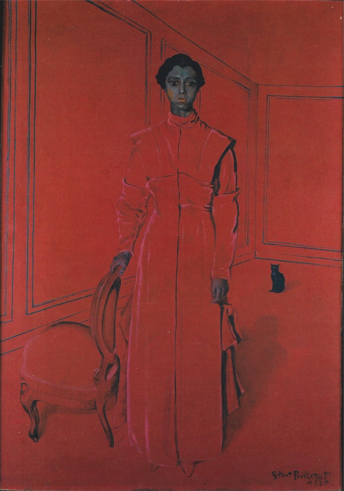
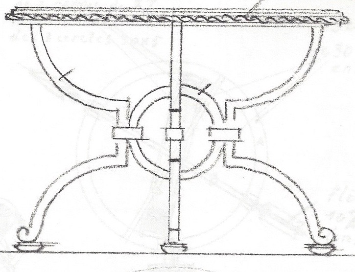
GILBERT POILLERAT TABLE
Gilbert Poillerat (1902-1988). Center table, circa 1950. Gilded wrought iron, lacquered wood. H: 28” Dia: 51 “. Provenance: Mario Buatta; presumably Gregory Smith, New York. Sold
Gilbert Poillerat was the premier metalworker of his generation – and after Edgar Brandt, of the century itself. As a young man, on moving to Paris from the provinces, his humble background prompted him to pursue a craft at the Ecole Boulle, rather than his first love, painting, at the Ecole des Beaux-Arts. In the years that followed he continued to paint for his own satisfaction, yet that thwarted ambition may account for his having pushed craft to the very brink of art, and his becoming the master of the forge.
On leaving the Ecole in 1922, Poillerat went to work for Brandt, who entrusted him with the design and execution of several showstoppers at the 1925 Paris exposition. When there he married the secretary of the boss, Rosette Belleli [his painting of her below right], who went to work when her Egyptian-banker father declared bankruptcy. A few years later, Poillerat worked briefly for a firm that made architectural metalwork, including, among other things, “artistic” elevator cages. He soon left to establish his own studio [below left], and rose slowly but surely to prominence, in spite of the Depression and a World War. Along the way he landed commissions for the ocean liner Normandie, the Ministry of Finance, the Elysées Palace, and the Louvre museum. He also collaborated with the decorators Serge Roche, André Arbus, and Jean Royère, as well as the decorating firms of Ramsay and the Compagnie des Arts Français.
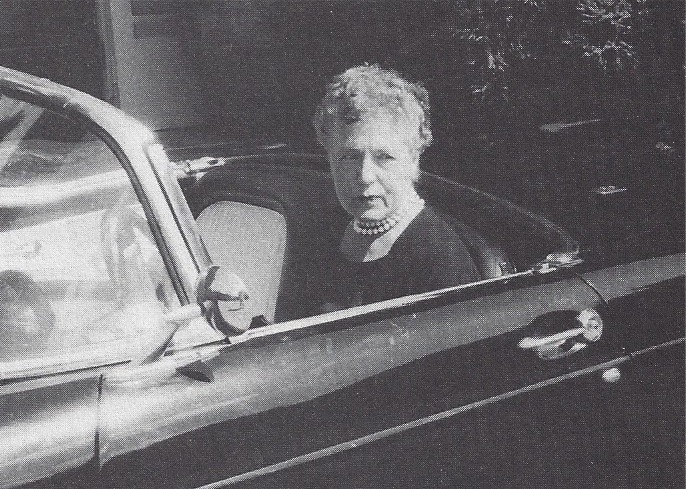
After the war, the New York decorating firm of McMillen became Poillerat’s biggest client. It was established in 1924 by Mrs. Drury McMillen, who, after her second marriage, ran it as Mrs. Archibald Brown [seen in a Thunderbird and pearls below left]. Eleanor Brown would remain involved in the firm until her death at 100 in 1991, by which time she had sold it to Mrs. Virgil (Betty) Sherrill, her former assistant, who had by then become a full associate. Mrs. Sherrill’s daughter Ann Pyne (Mrs. John Sloan Pyne) runs it today. Not incidentally, all of these women are to be found in The Social Register of their respective days, alongside their socially prominent clients.
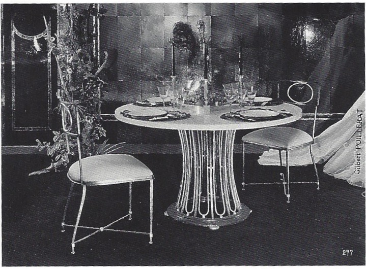
Mrs. Brown and her associate Grace Fakes began buying Poillerat’s work around 1950. They may have been introduced to it by Van Day Truex, who was then running their alma mater, the Parsons School of Design in New York, after having run its Paris branch in the 30s. They may also have seen it in the French design magazines and books sold at the Librairie Française in Rockefeller Center, a few blocks from their East 55th Street office and showroom. And when shopping in Paris, Mrs. van Akker, their Paris agent, may have suggested a studio visit. In any case, they would have seen his work at the Paris design salons where he exhibited regularly. Among them was Les Arts de la Table of 1951, where he may have shown the room documented in a McMillen archive photograph [above right]. In it, a table identical in design to our own is seen against a backdrop of mirrored paneling by Max Ingrand.
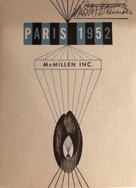
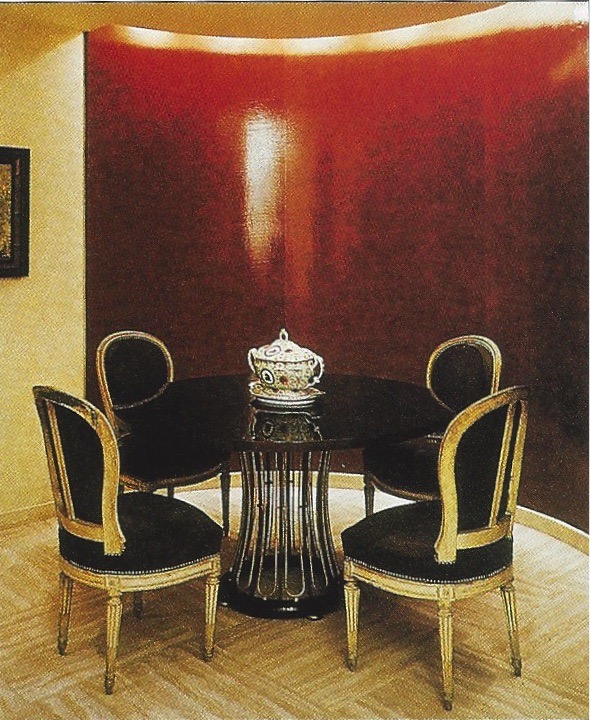
McMillen organized Paris 1952, a salon-like exhibition in their own showroom that very year. It featured modern French furnishings by Poillerat, Ingrand, Jacques Adnet, and Georges Jouve, among others [catalog cover above left]. According to Ann Pyne, it included a Poillerat table and a set of four chairs matching those in the photograph. McMillen sold the table and chairs to Mrs. Marshall Field. Another table of the same design was sold to Henry Ford, II. And some years later, they sold a pair of these table bases with a large green-lacquered top to the Oklahoma oilman George Coleman. They also sold yet another table base of this design with a black lacquered top, which is probably our own table [above right], to Mr. Gregory Smith, for whom McMillen came to decorate twelve residences over the years. Interestingly, McMillen shipped Poillerat table bases from Paris and had the tops made in New York, presumably to save shipping costs and import duties. Confusingly, they resold many, since their client relationships were ongoing. And so the five table bases that we cite do not necessarily represent five different ones.
Fast forward to 2010 when we purchased an unidentified bed [above left], knowing it was by Poillerat, and acquired by McMillen for their 1952 exhibition (it was saved for a subsequent exhibition they presented in 1954). When Mario Buatta saw it in our shop, he asked who made it, since he was sure he had in storage a table by the very same hand, which he had purchased unidentified from a dealer years before. Since Mario was the Prince of Chintz, and celebrated for his English country house style, we were more surprised that he bought something modern than his being unable to place it at home or with a client. And so, over the years, it hibernated in storage, and emerged only last spring when his hidden hoard was dispersed in four auctions. Passing unidentified once again, it was knocked down to us as “A Lacquer and Wrought-iron Center Table Attributed to Karl Springer.”
PAIR OF POILLERAT SIDE TABLES

Gilbert Poillerat (1902-1988) for Ramsay (Paris decorating firm). Pair of small cocktail tables, circa 1950. Gilt wrought iron, glass. H: 18 ½” L: 33” D: 15 ½” Sold
Around 1900, firms like Jansen in Paris, White Allom & Company in London, and Herter Brothers in New York, dominated the field of high-end interior decoration. Then, in the 1920s, freelance decorators like Elsie de Wolfe, Syrie Maugham, and Jean-Michel Frank muscled their way into the picture. Yet many of those firms continued to prosper, despite the expense of employing armies of designers, producing their own furniture lines, and maintaining retail premises stocked with antiques. Following the 1929 stock market crash, however, that infrastructure became a heavy lift. Nevertheless, in 1931 the financier Louis Sée and the antiques dealer André Hammel launched Ramsay, the last of the great decorating firms.
The name Ramsay was drawn out of thin air. It evoked the England that the gratin associated with fine Savile Row tailoring, exclusive Pall Mall clubs, and the arcane rituals of the hunt. Reassuringly, it was a nation unbloodied by revolution, where an aristocracy still called the shots, even if, at that very moment, the Prime Minister Ramsay McDonald leaned to the left. No wonder, then, that Ramsay the firm took premises opposite the British Embassy at 54 rue du Faubourg Saint-Honoré.
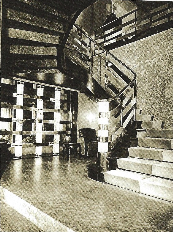
Initially, Ramsay’s rooms were luxurious if staid, with antique paneling and masses of antique furnishings upholstered à l’époque. But by the late 1930s they streamlined the interior architecture, and furnished with just a few choice antique pieces offset by monochrome satins, as seen in their 1937 exhibition room at the Salon des Arts Ménagers [above left]. Ramsay’s new look, and that exhibition room, was probably the work of Jacques Franck, a young man-about-town who came on board as a designer around that time A few years later, when the Nazis occupied Paris, Ramsay was able to soldier on because Sée, who was Jewish like Franck, and Hammel, a Protestant involved with the Resistance, Aryanize the firm by transferring ownership.
After the war, when the coast was clear, Sée and Hammel resurfaced with Franck to grasp the reins once again. Then, they brought in as decorators two society figures, who also brought in clients. They were Princess Georges Chavchavadze and Louise de Vilmorin [above right]. Both were tastemakers, yet neither was a professional. In the years that followed, Ramsay’s decorating threesome landed many prestigious jobs, including the French Embassy in London (Franck and Chavchavadze), the Palais-Royal flat of André Malraux, Minister of Culture (Franck and Vilmorin who was his mistress), and the fashion house of Lanvin (Vilmorin). All the while, Franck moonlighted as a party decorator, setting the scene for legendary entertainments, including one that was thrown in 1950 at the Hôtel Lambert by its then tenants, Princess Ladislas Czartoryska, Mrs. Harrison Williams, and the Duke and Duchess of Windsor.
Around that time, Gilbert Poillerat, the finest metalworker of his day, began supplying Ramsay with a line of gilded-wrought-iron tables and standing lamps. Poillerat was then working in an updated Baroque style, characterized by bold curves and counter curves. His version of it can be seen in his drawing for a center table [above left], and a cocktail table that is nearly identical to our own, which he supplied to the Compagnie des Arts Français [above right], then under the direction of Jacques Adnet.
Today, the triumverate that put Ramsay on the map is largely forgotten, at least when it comes to decoration. Yet each is remembered for something else: Vilmorin as the novelist who wrote Madame de (filmed by Max Ophuls as The Earings of Madame de…), Chavchavadze as a glamorous international socialite, and Franck as the event planner who elevated the ephemeral to an art. In 1968, however, that second career of his would come to a halt with student protests in France, and race riots in America, particularly in Detroit where Franck had recently staged the coming out for one of Henry Ford II’s daughters. That very year Franck confessed to a reporter, “I love frivolity and I’m sorry it’s on the way out.” A fitting epitaph for an out-of-touch elite that achieved an apogee of refinement we’re unlikely to see again.
FRENCH 1950s SIDE TABLE
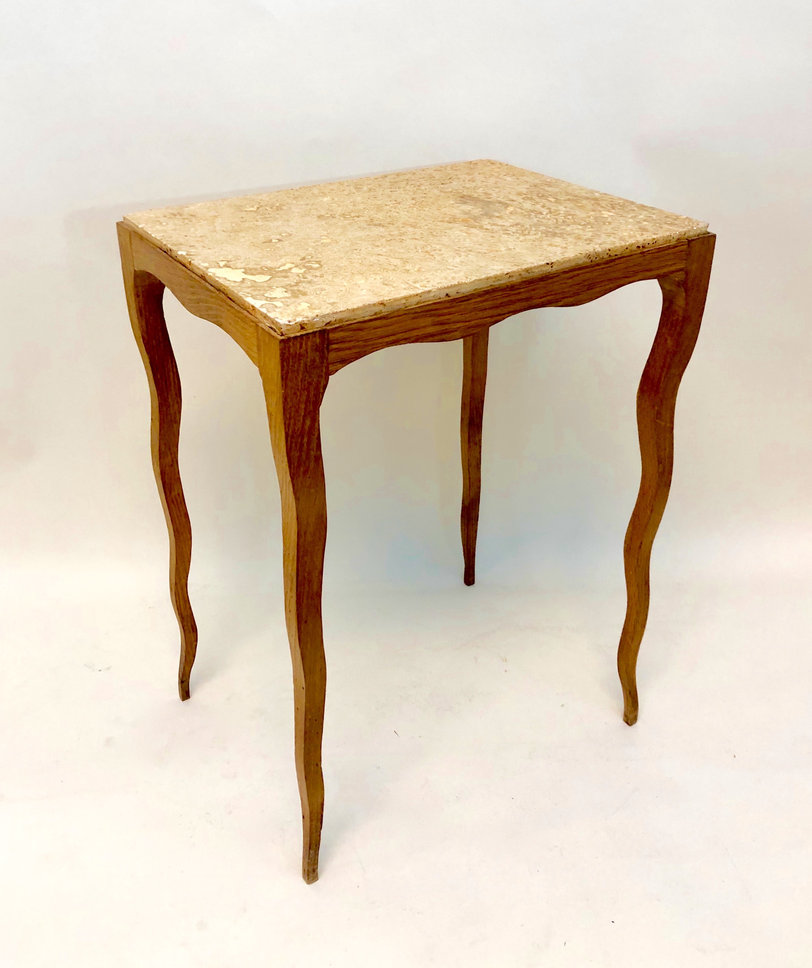
French side table, circa 1950. Limed oak, limestone. H: 19” L: 13 ¾” D: 10 ¼” Sold
This insouciant little table from the 1950s is one of our favorite recent acquisitions, even though the designer is unknown, and we make no claim for its importance. In conception and materials — a limed oak frame with a limestone top – the table is simple yet elegant. But as any good carpenter can tell you, a simple design isn’t necessarily easy to make. Certainly these curvaceous legs wouldn’t have been, since they start out thin and taper down precariously, through subtle undulations, to a ballerina’s en pointe.

These curving legs can be traced back to French 18th-century joinery and cabinetmaking. In the 1770s Joseph Canabas made a fancy mahogany-and-brass tiered table that the English call a “whatnot” [above left]. Compare it to the humble French provincial side table Frances Elkins, the decorator, placed in the otherwise swanky 1930s living room of the Albert Laskers on Chicago’s North Shore [above right]. Both of these tables have curvy legs, but they curve inward to secure shelves, whereas ours curve whimsically for aesthetic effect. And so this soignée model, which to our knowledge is unique, has all the originality and sass that characterize the best in sophisticated Midcentury Modern French design.
GERMAN EXPRESSIONIST TABLE
German 20th century, attributed to Hans Heinrich Müller (1879-1951). Expressionist table, circa 1920. Solid and oak veneer, dark stain. H: 28” Dia: 27” Sold
A square or rectangular table has four legs, but a round one can get by with three, even if most have four. But this round table has eight. To call that overkill is an understatement. Their proliferation, however, constitutes an artistic expression an artist might call art. For us it’s design at its most interesting. In any case this table, made in Berlin around 1920, is a rare surviving example of German Expressionist furniture.
After Germany’s 1918 defeat in “the war to end all wars” (sic), precious little furniture, Expressionist or otherwise, was made or sold. And no wonder, since the government had collapsed, territory was lost, war reparations were being levied, and an incalculable number of young men had been killed in battle. When Kaiser Wilhelm fled into exile the leftist Weimar Republic came into being, to the unease of the upper classes. Political power grabs and assassinations ensued, turning streets into battlefields where branches of the disaffected military fought Communists and rightists, as well as each other. Germany wouldn’t regain a semblance of equilibrium until the mid 1920s.
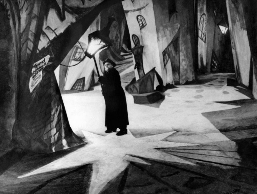
In the fields of painting, film, architecture, and design, a collective angst found expression in Expressionism. It took root in the 1910s, when the avant-garde bristled at Wilhelmine philistinism and militarism. In the 1920s it metastasized among the general population that had come to realize “the system” had been haywire all along. That attitude became form in Ernst Ludwig Kirchner’s 1914 Potsdamer Platz, which depicts prostitutes on a roundabout in a Berlin public square [above left]. The exaggerated and spiky forms add up to a disturbing grotesquerie. Its cinematic equivalent can be seen in the sets for the 1920 film The Cabinet of Dr. Caligari, which tells the sinister tale of an insane doctor who hypnotizes a man to commit murder. In one scene a lamplighter goes about his business in a town square, and a lamp casts a pool of light in the form of a lopsided star. That star form is regularized in our table’s top.
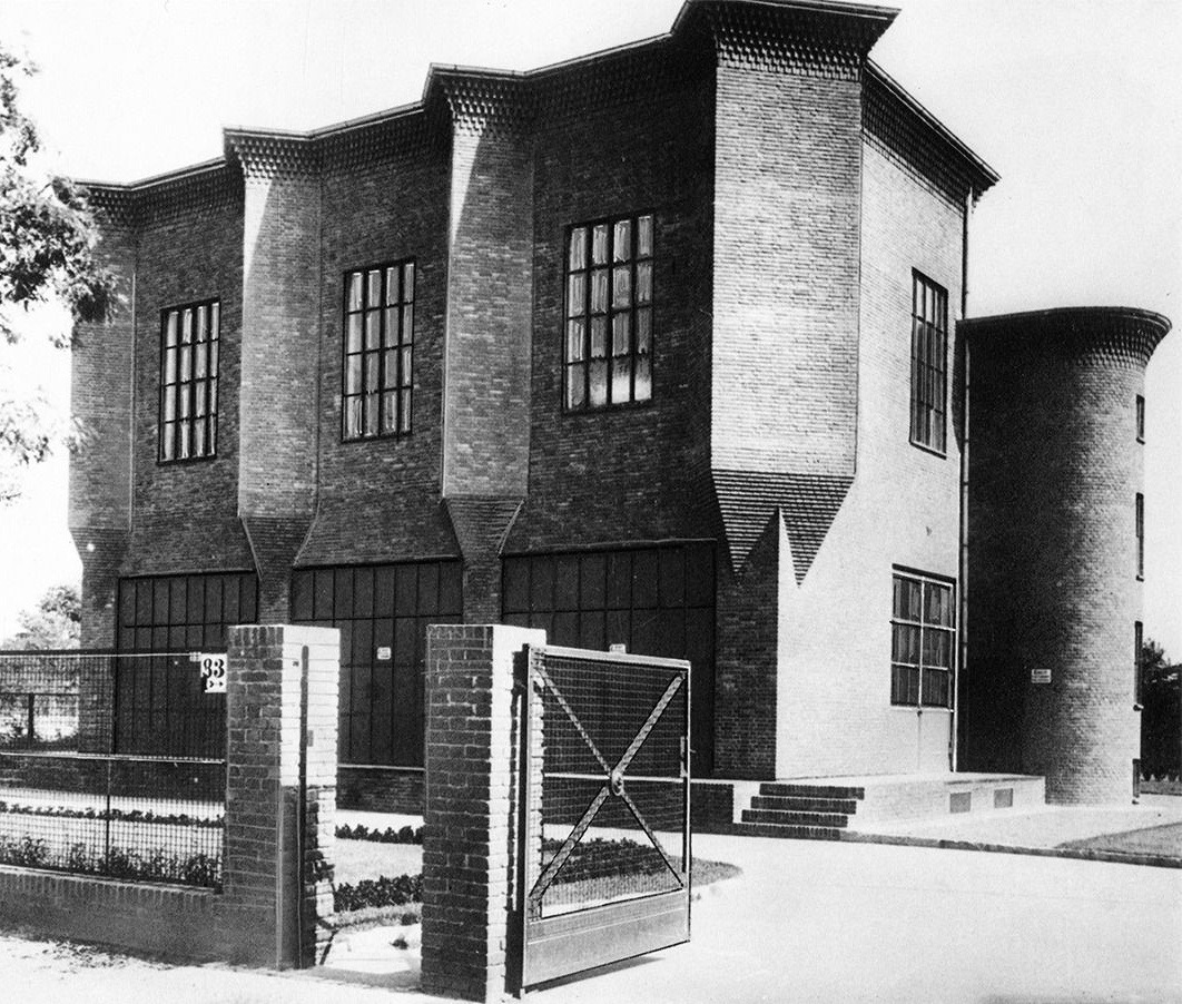
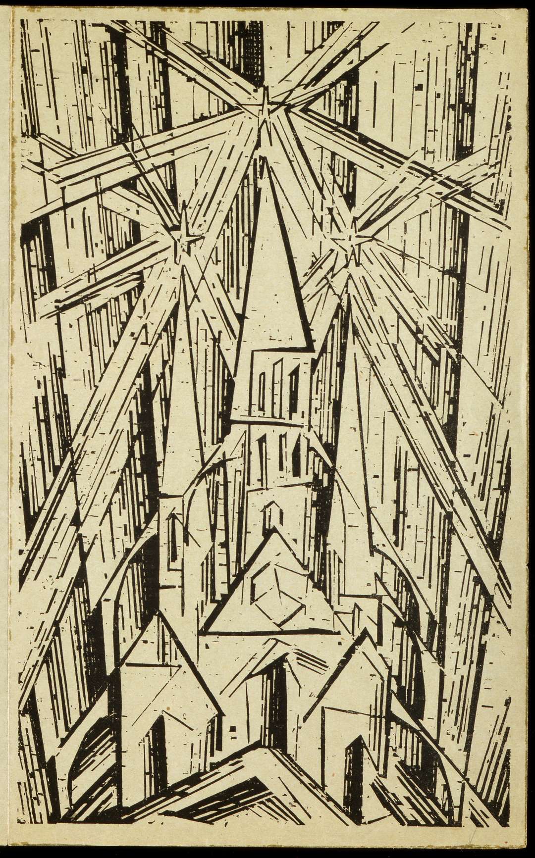
We attribute the table to Hans Heinrich Müller, a Berlin architect and designer. In the 1920s he was lucky to find work designing electrical power stations for the Städtische Elektrizitätswerke Aktiengesellschaft. This being Germany, utility companies functioned reliably amidst political chaos, and craftsmen upheld their high standards under financial constraint. Müller’s solidly built stations, as seen in one he designed in 1928 [above left], are characterized by spiky sculptural forms of rudimentary dark brick. That fine workmanship, and those formal characteristics, are found in our table made of rudimentary oak, dark-stained, with a top finely veneered with rays emanating from a disk.
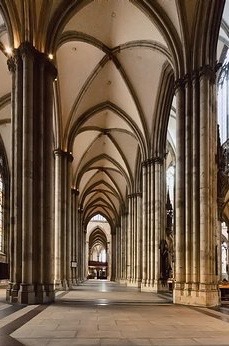
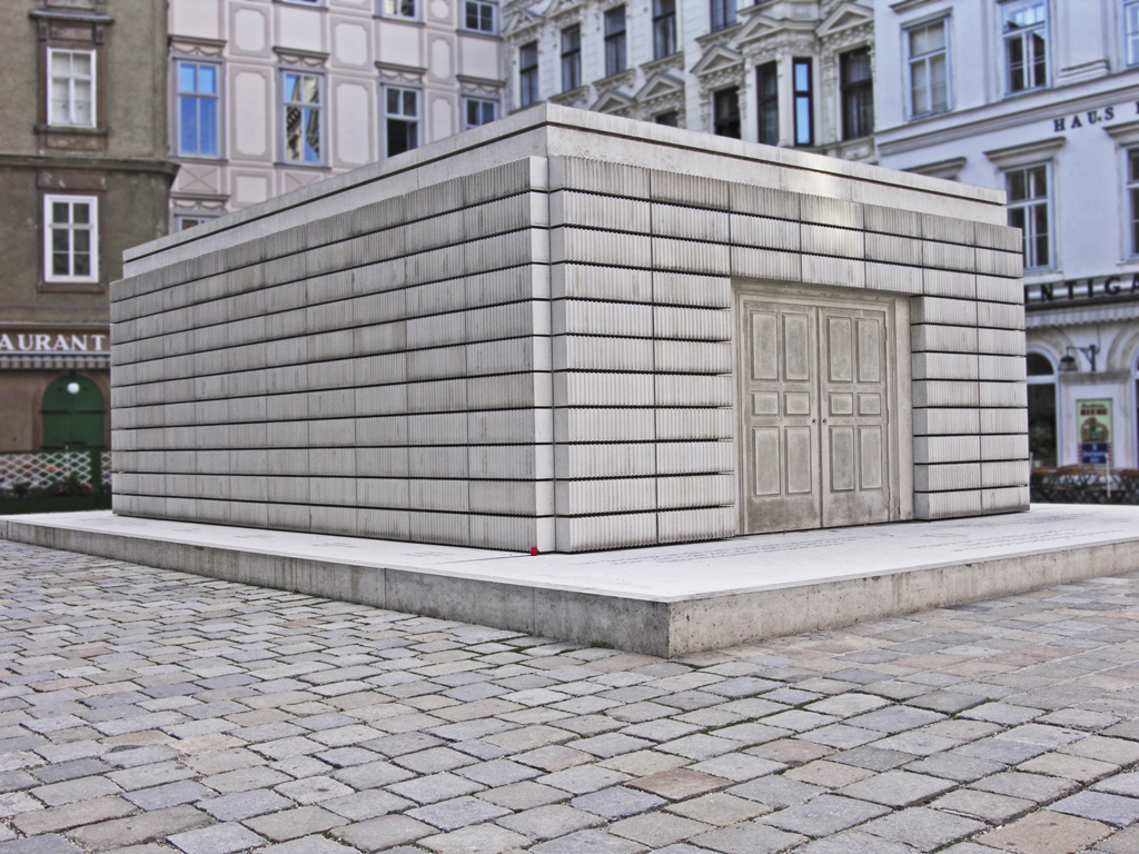
Today, Expressionist form looks less modern than the cool geometry associated with the Bauhaus, the German design school that was founded by Walter Gropius in 1919, around the time our table was made. But Gropius and the Bauhaus then worked in the Expressionist idiom, as seen in the school’s 1919 program cover by Lyonel Feininger [above right], which depicts a spiky Gothic cathedral. As noted at the time, the stylistic roots of Expressionism are found in the German iteration of the Gothic, a style that achieved full expression in the cathedral. Carved on their portals were figures that exude earthly suffering and spiritual anguish, as would the Berlin prostitutes that were painted much later by Kirchner. Inside those cathedrals is the pointy austerity [Cologne below left] that also marks our table, if you translate void into solid in the manner of Rachel Whiteread, the contemporary English sculptor. Her Holocaust Memorial in Vienna represents the interior void of a book-lined room [below right], and makes space, and a sense of loss, disturbingly palpable.
GROTTO CHAIR
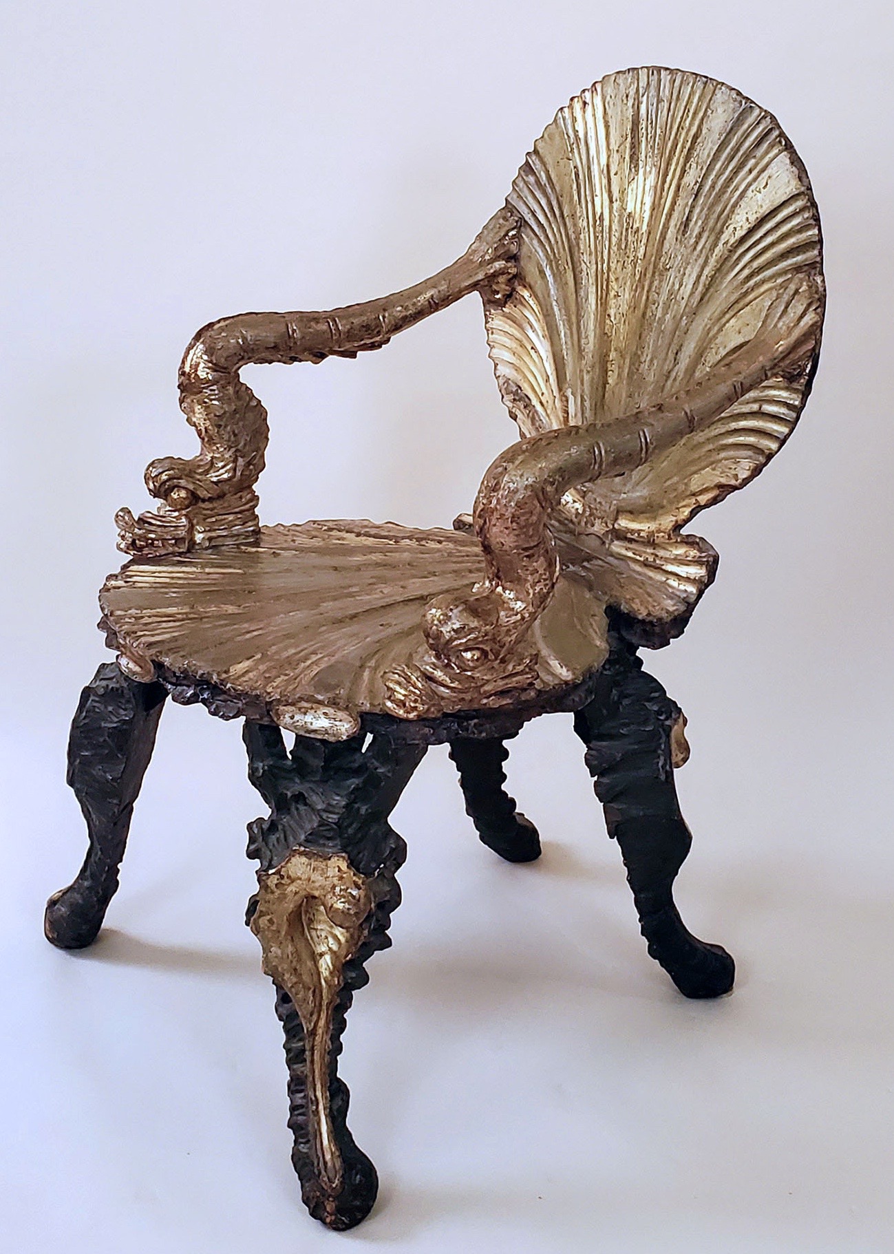
Pauly et Compagnie, Italian (Venice), early 20th century. Grotto chair. Gilded and silvered wood, paint. H: 35 ½”W: 23” D: 23”. Sold
In 16th century Italy, on hot summer days, princes and popes sought refuge in the cool grottos of their country estates. Inspired by naturally occurring grottos, like the famous Blue Grotto of Capri, man-made ones, like that of the Visconti Borromeo family outside Milan [below left], were even more fantastical. They opened onto formal gardens, had walls sculpted to imitate dripping moss, were encrusted with shells, and equipped with fountains. Presumably the chairs placed in them went with the setting. And while it’s been said they incorporated shell motifs, no surviving chairs with shell forms have yet been identified with a known grotto.
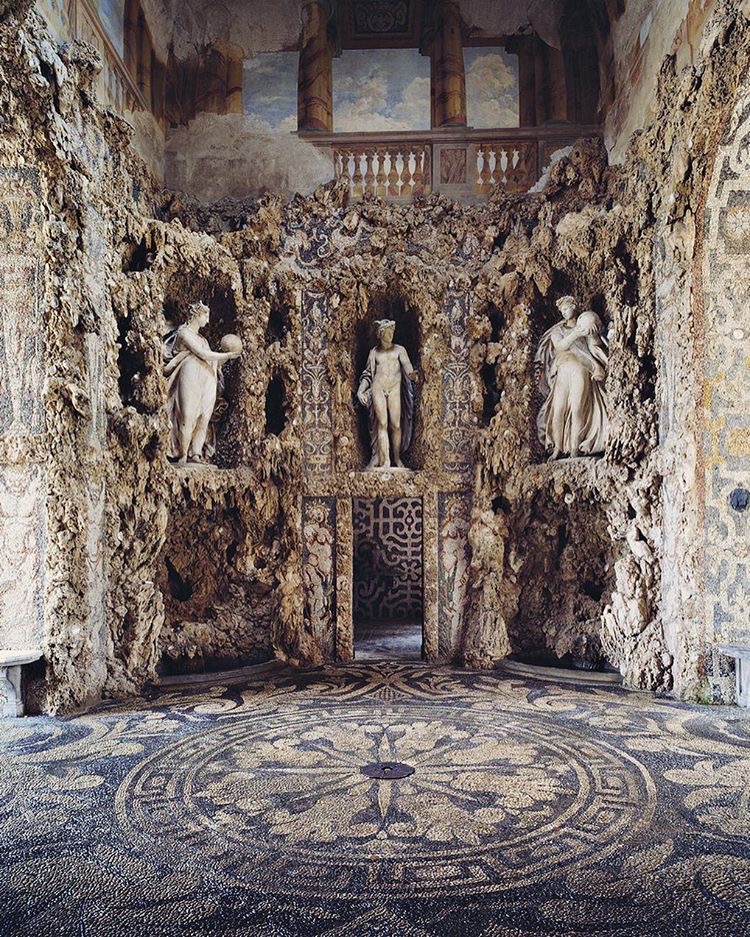
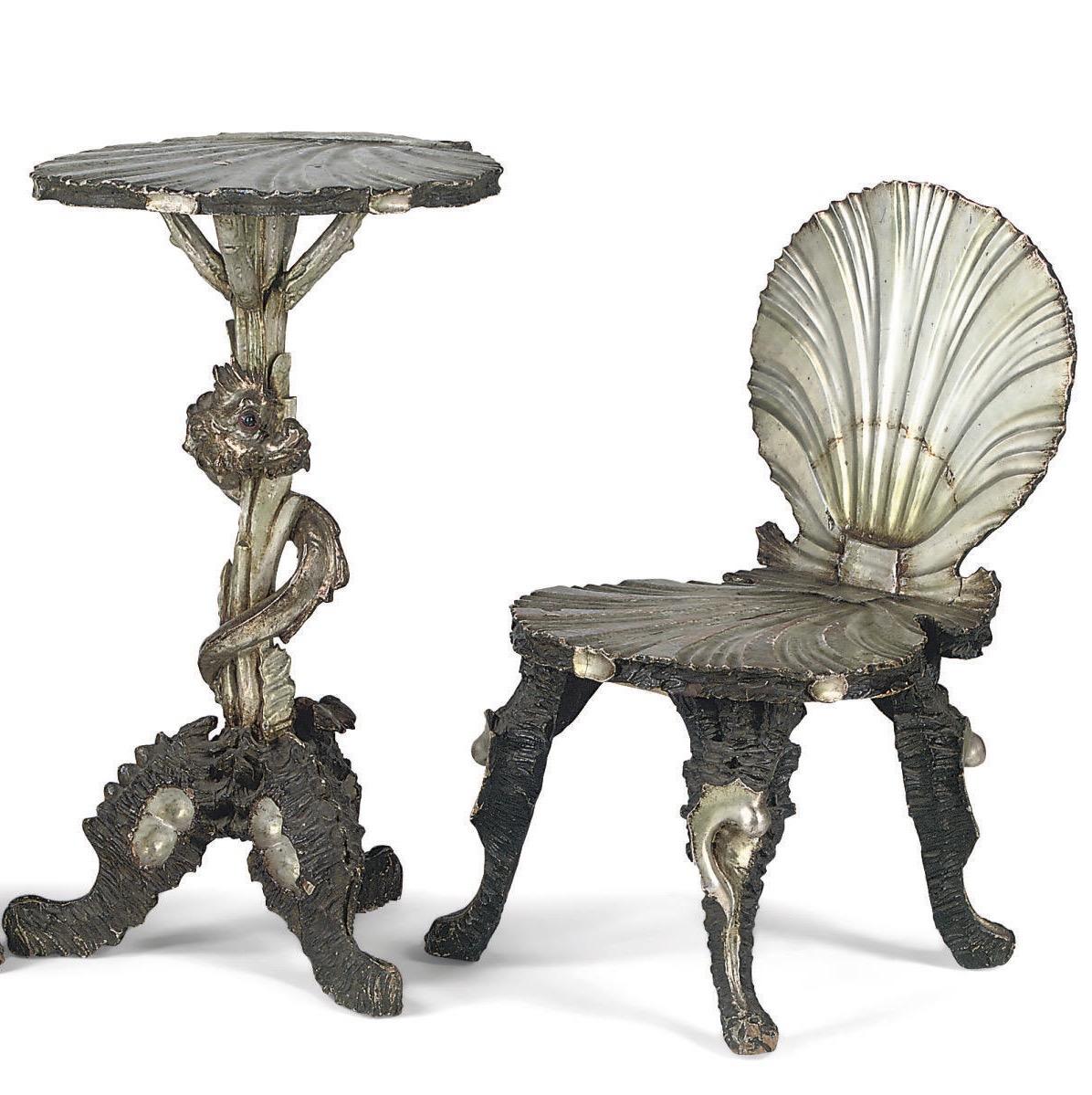
The so-called grotto chair, made from clusters of shell-form elements, was introduced in the 1880s by one Signor Pauly of Venice. At the time, in an increasingly industrialized world, factory-made furniture of interchangeable parts was replacing the hand-made furniture of craftsmen. Pauly’s furniture combined both production methods, being hand-made from interchangeable parts that were assembled as arm- and side-chairs, tables [above right], stools, and vitrines. After assembly the results were silver-leafed, and then highlighted with translucent gold varnishes that gave them the nacreous sheen of seashells. The final effect was magical. And Pauly’s timing was perfect. He launched his furniture line when Venice was just beginning to become a playground for rich and sophisticated international tourists. No wonder he took a showroom just off the Piazza San Marco.
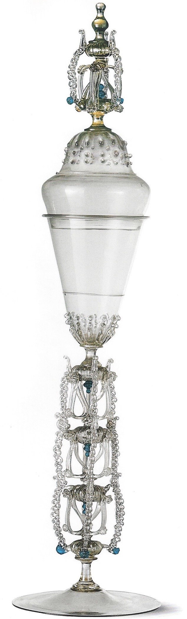
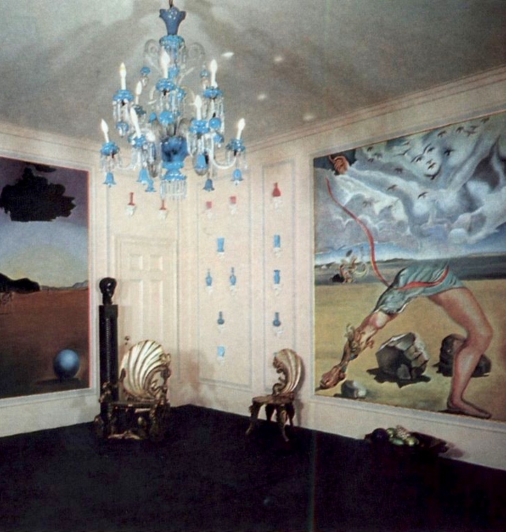
In 1902 Pauly’s firm merged with the distinguished glassworks that was formerly known as Salviati. We haven’t yet found a period photograph of their showroom, but the juxtaposition of iridescent shell-form furniture, with delicate hand-blown glassware [above left] must have been enchanting. Nevertheless, with the onslaught of the Great Depression in the 1930s, Pauly discontinued the furniture line. In the years that followed, local craftsmen continued to fill a diminished need with inferior copies for a less discerning clientele. But if fashion moved on to other fads by then, the whimsical theatricality of grotto furniture had since become a touchstone among a bohemian elite. In her Park Avenue penthouse, for example, the cosmetics mogul Helena Rubinstein aptly paired grotto chairs with four Surrealist murals she commissioned from Salvador Dali [above right].
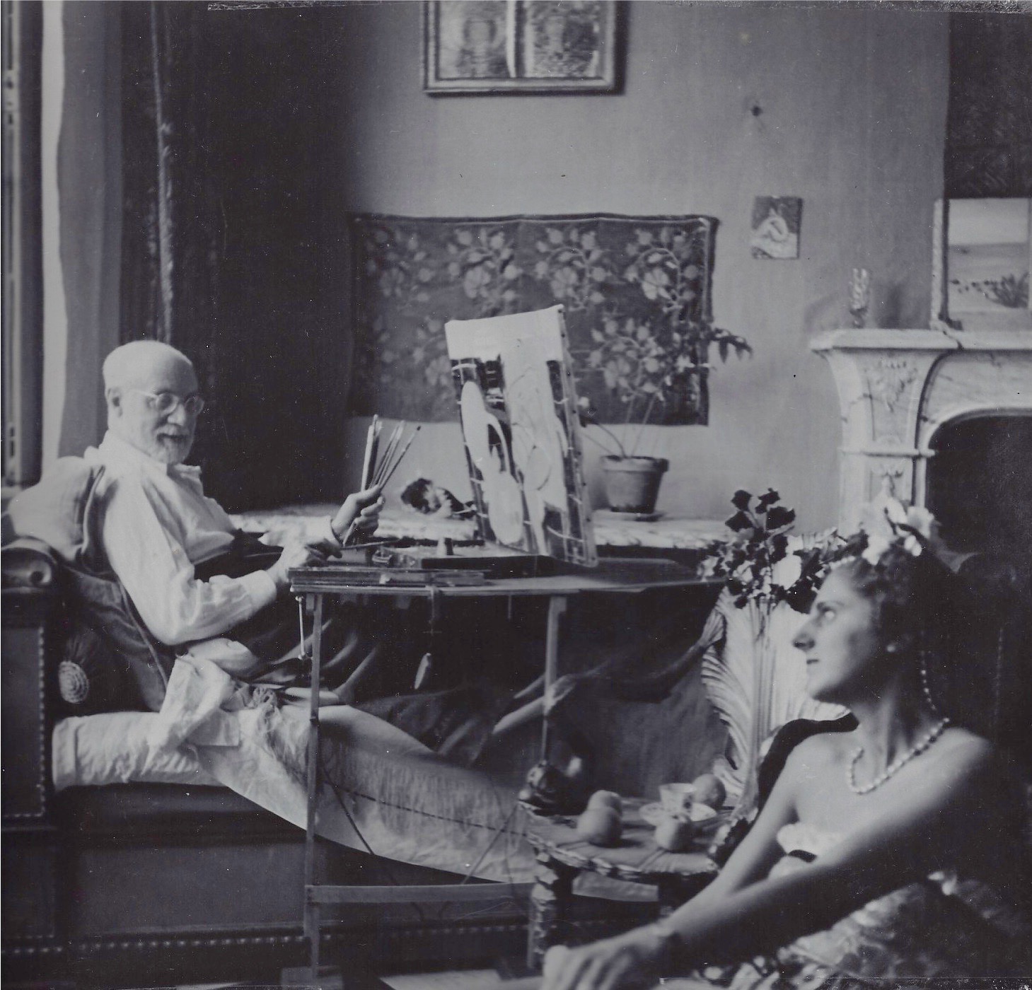
On the Cote d’Azur, a more circumspect Henri Matisse owned a grotto chair that was kept in his studio at the Hôtel Régina in Nice. There it is seen behind the posed model in our photograph of him [see VINTAGE PHOTOGRAPHY] that was shot by Georgette Chadourne in the 1930s [above left]. This chair appeared often in many of his paintings, including Chaise Rocaille, which translates into English as Rococo Chair. This title, however, is a misnomer. It should be titled Chaise de Grotte, or Grotto Chair.
BOUILLOTTE LAMP WITH A PIERRE LE-TAN PAINTED SHADE
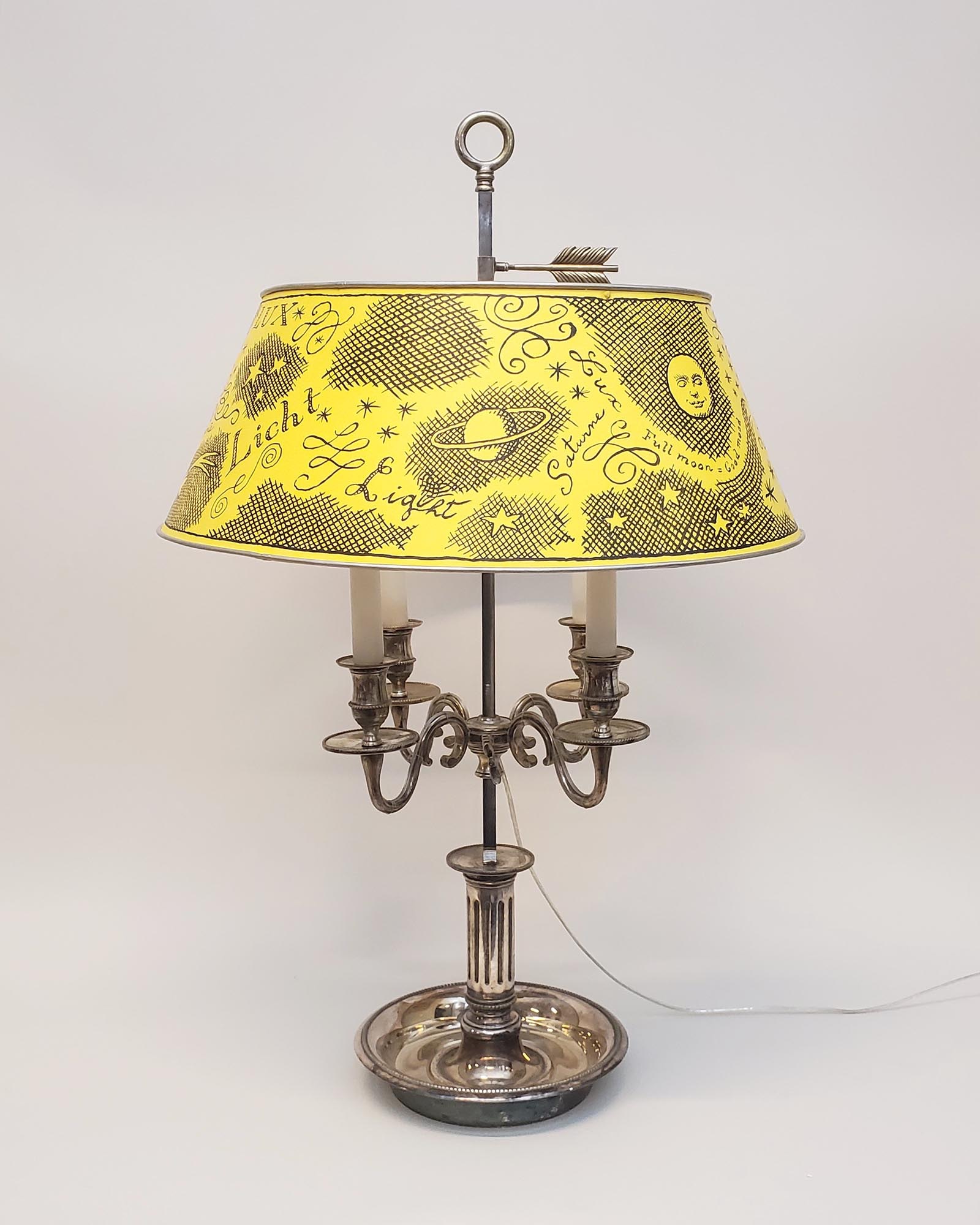
Antique bouillotte lamp with a Pierre Le-Tan (1950-2019) painted shade. Painted sheet-metal shade 2019, silvered-brass bouillotte lamp circa 1920. H: 33 ½” Dia: 22” Sold
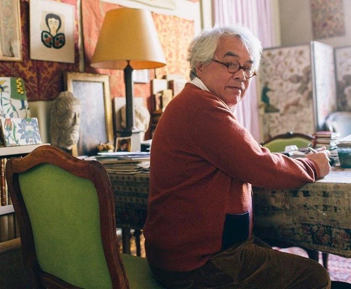
Early last year, the artist Pierre Le-Tan painted the shade of this antique lamp with words for light — lumière, lux, luce, licht — in English, French, Latin, Italian, and German. A cosmopolite, Pierre was fluent in French and English, and could get by in a few other languages too. When I first met him in the 1980s, he boarded planes at the drop of a hat, ricocheting from his home in Paris to New York, London, Milan, and Tangier. He was also attracted to offbeat destinations like Cairo, São Paulo, Portmeirion in Wales, and Macao, China. Pierre chronicled his travels in Album [below right], a livre d’artiste published in 1990. But in recent years, just getting him across the Seine to see a museum exhibition was like pulling crab meat from its shell. Pierre [below left] had come to the sad conclusion that venturing afield was no longer worth the effort, with globalization and commercialization making the world ever more uniform and vulgar.
Not that Pierre became a hermit. He made a second marriage, had two more children, and continued to meet friends not only at neighborhood restaurants, but those on the other side of town as well, so long as the décor and atmosphere were de l’époque (and that époque wasn’t the present one). Nor was there an important or interesting antiques shop that he didn’t frequent. In one of them he came across this massive, silvered-bronze bouillotte lamp. Like all bouillotte lamps it has a metal shade that can be raised or lowered in order to adjust light for the playing of bouillotte, a popular card game in the 18th and early 19th centuries, which evolved into modern-day poker. This particular lamp, however, is in the Empire style, and dates to the early 20th century. That didn’t put Pierre off, since it was handsome, and came with a shade that presented a blank field for him to decorate. He chose to paint it an astringent yellow, with contrasting black-painted words, arabesques, and pictograms, in his signature crosshatching style [below].
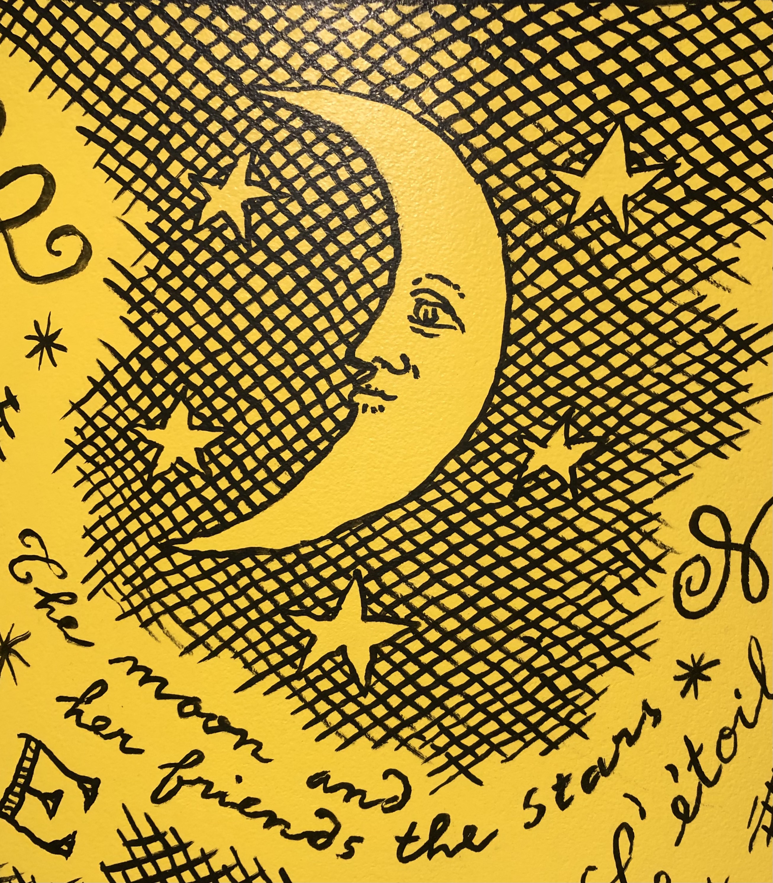
Amongst those pictograms and words are a few English phrases — “Stars do shine if you ask them gently”, “Full moon = good mood,” “The moon and her friends the stars” – and French ones too — “L’ étoile filante” (Shooting star), “L’oeil lumineux” (The luminous eye), “Lumiere d’ici et de là” (Light here and there). When Pierre stood back to observe his work he was pleased, yet he came to find that this over-scaled lamp didn’t suit the intimately-scaled rooms of his much-photographed and published apartment on the Place du Palais-Bourbon. And so he telephoned me to say, in his ever so slightly British-accented English, that he had decided to sell something that he thought I might like. Knowing that everything Pierre did was special, before signing off I bought the lamp sight unseen, without discussing the price.
BARON FOULD-SPRANGER’S GLASS CANDLESTICK

English 19th-century. Glass candlestick. Provenance: Baron Max Fould-Springer, Palais abbatiale de Royaumont; by descent Lilane de Rothschild. H: 14” high. Sold
For centuries, the glassblowers on the island of Murano in the Venetian lagoon had inspired their counterparts throughout Europe and beyond. Among them, it would seem, was the Englishman who, around 1800, created the bold spiral stem of this candlestick by fusing flattened blue-and-white glass canes back to back, and twisting them into a column of clear molten glass.
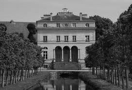
This stunning candlestick was owned by Baron Eugene Fould-Springer, the heir to a small French fortune, who married the heiress to a large Austrian one. So conjoined, he was in a position to indulge his pitch-perfect taste, and restore Royaumont, a small 18th-century palace just outside Paris, to its former ancien regime splendor. He then went on to furnish it superbly. In the 1970s, his handsome son Max (seen below) inherited the house and its contents, which he, in turn, left to his sister, the arbiter of Paris high society at the time, Liliane, Baroness de Rothschild.
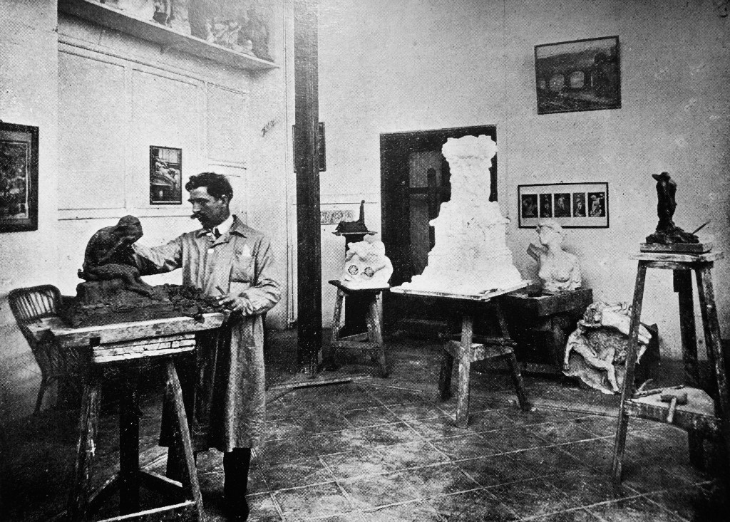
GIOVANNI NICOLINI 1920s MARBLE HEAD OF A WOMAN
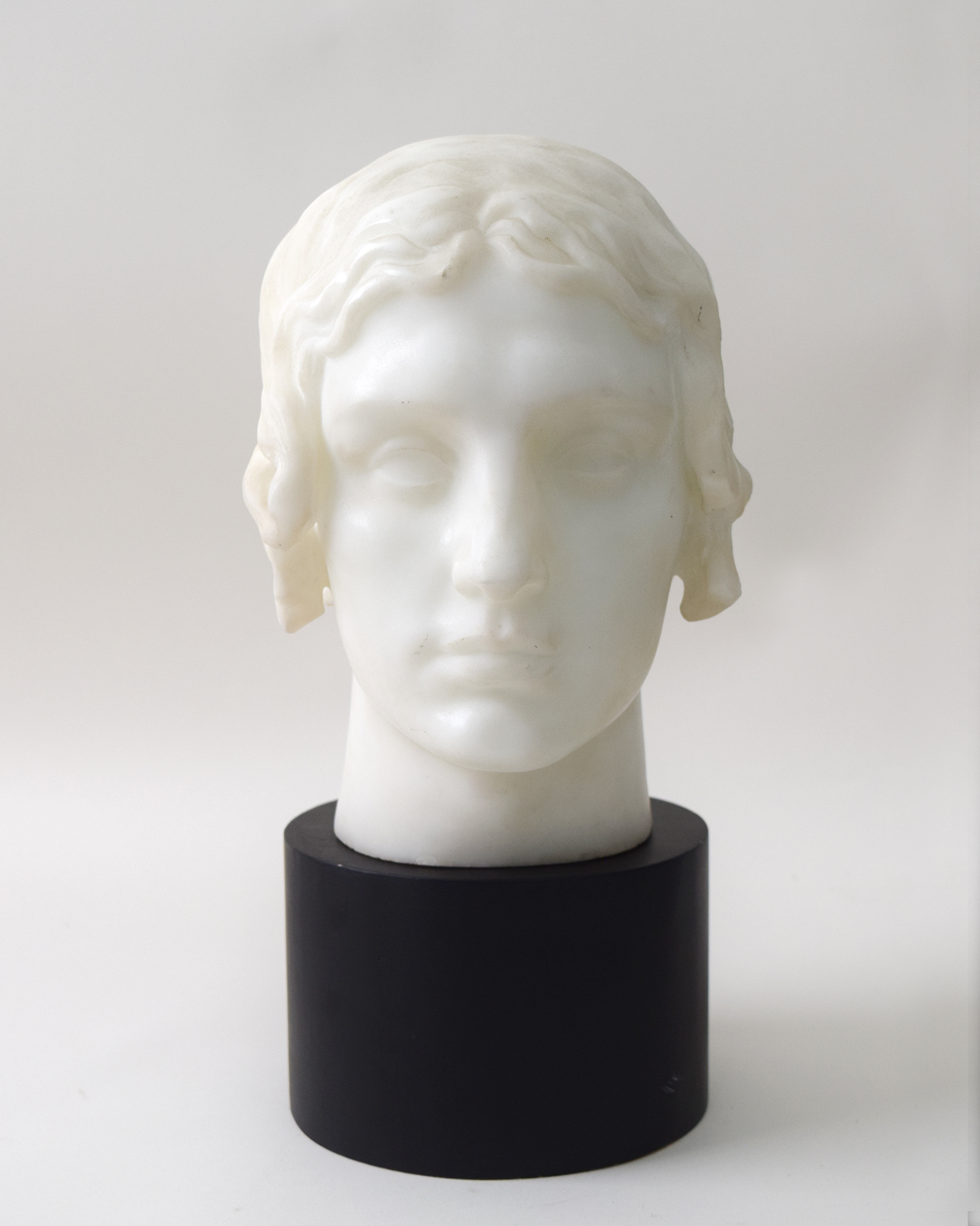
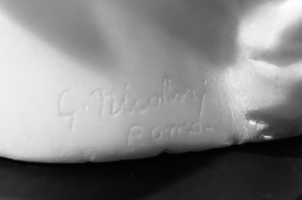
Giovanni Nicolini (Italian 1872-1956). Head of a woman, circa 1920. Marble. H: 10 ½” W: 7 ½” D: 9 ½” Sold
The sculptor Giovanni Nicolini won sufficient fame and fortune to keeep two studios humming in Rome and Palermo, from the 1910s until his death in the 1950s. He exhibited at the Venice Biennale, and was later compared by Primo Levi (no less) to the great Michelangelo (no less again), who had been the architect of St. Peter’s in Rome, where Nicolini’s over-life-size marble of St. Eufrasia surveys the nave. Nicolini also made his mark in Havana, with an enormous monument to General Jose Miguel Gomez, who helped Cuba win independence from Spain. On a smaller scale, he sculpted portraits of great composers, poets, and the statesmen of his day, including Verdi, d’Annuzio, Mussolini, and Victor Emanuel II, King of Italy. The identity, however, of our Roman beauty – signed “G. Nicolini Roma” – is a mystery.
NEWLY DISCOVERED CUBIST FRESCOES BY EYRE DE LANUX
Eyre de Lanux (American/French 1894-1996). Pair of still lives, late 1920s. Incised composite, origianal oak frames. 15 3/4“ x 22 1/2“ each. Provenance: Mr. & Mrs. Kenneth Farrand Simpson, Paris and New York; by descent Mr. & Mrs. William Kelly Simpson. Sold
Madonna, whore, muse, vamp – in the annals of art history, these stock female roles fill the biographical interstices of great male artists. No wonder, then, the artistic achievements of women like Hilma af Klint, Lee Miller, and Louise Bourgeois, have emerged only recently from relative and unwarranted obscurity. Among their number is the artist, furniture and interior designer Eyre de Lanux, who resurfaced after a decades-long hiatus in 1989, seven years before she breathed her last in New York at the age of 102. Since then, her work and its significance have come into focus. And that work, along with her beauty, chic, and many love affairs with celebrated men and women, have made her a cult figure today.
Lanux led a high profile life in Paris and New York during the interwar years, so her contemporaries were long gone when a Cubist table she designed in the 1920s resurfaced at Sotheby’s in 1989 [below left]. It sold for $72,500, an astonishingly high price at the time for an unknown designer. That prompted Rita Reif to interview Lanux for a New York Times profile. In 1997, shortly after she died, the art and furniture that she lived with herself was hammered down at Christie’s for multiples of the estimates. Then, in 2013, she was the subject of an exhibition in Paris at Galerie Willy Hubrechts, and an accompanying book by Louis-Géraud Castor. And two years before that, Nick Mauss, the contemporary art world darling, had included a large group of her Sapphic pen-and-ink doodles in his 2011 Whitney Biennial installation.
Born Elizabeth Eyre, Lanux hailed from a distinguished Philadelphia family [above right]. In New York she studied painting at the Art Students’ League under Robert Henri. In 1918, as the Great War drew to a close, she was working at the Foreign Press Bureau where she caught the eye of Pierre de Lanux, a handsome French poet, writer, and diplomat. Before the year was out, the Armistice was signed, wedding bells rang, and two one-way passages to France were booked. Theirs would be an open marriage, yet, as their letters attest, they remained very much in love and faithful in their fashion.
Lanux wasn’t the only member of the Lost Generation who found herself, literally and figuratively, in Paris. There, in the crucible of modernism, she crafted a new identity, taking her maiden name as her first to become Eyre de Lanux (although she continued to be known as Lise among intimates). She bobbed her hair, wore the geometrically patterned clothes of Sonia Delaunay, and studied under the sculptor Constantin Brancusi (in 1979 she would donate a group of his rare photographs, which he presumably gave her, to the Museum of Modern Art). Known as a beauty, she posed for the camera of Man Ray [above ribh], and was painted as an Amazon in animal skins [above right] by the American ex-patriot Romaine Brooks, the lover of the beautiful and celebrated poet and salonnière Natalie Cliffort Barney, who hailed from Dayton, Ohio. Lanux had a fling with Barney too (they lived in the same rue Jacob building, conveniently), and at her salon Lanux encountered such avatars of the modern as Jean Cocteau, Colette, Ezra Pound, Isadora Duncan, Eric Satie, Anais Nin, and T. S. Elliot.
If a bohemian lifestyle is a necessary ingredient for cult figure status (think Jean-Michel Basquiat), so too is talent. As an artist, Lanux mastered portrait drawing, painting on canvas and wood panel, and etching and lithography. But it was fresco painting that she returned to time and again over the course of her life. She showed hers in Paris at the Galerie des Quatre Chemins in 1937, and in New York at the galleries of Peggy Guggenheim in 1943, and Alexander Iolas in 1951. Fresco, however, is something of a misnomer, since they are painted in wet plaster, whereas Lanux incised, or modeled in bas-relief, from a concrete-like mixture that she painted when dry.
The lines incised in our panels can be compared to those chiseled in stone by Brancusi in The Kiss [below left], which Lanux would surely have known. But her compositions can be compared to those of Picasso in his Synthetic Cubist period, when the multiple shards that characterized Early and Analytic Cubism coalesced into recognizable forms, as seen in his 1921 Still Life with Guitar [below right]. Not coincidentally, Lanux and Picasso were friends. Much later, around 1950, the photographer Brassaï would capture them deep in conversation at the Café de Flore. And a few years after that, back in New York, Lanux rented an apartment in a new East 58th Street building that was named The Picasso, where three large works after his originals still decorate the lobby. No doubt she was the only tenant there who was on a first name basis with the namesake.

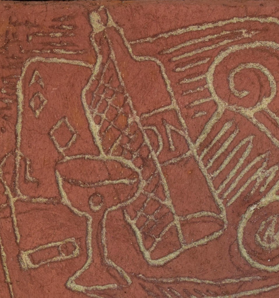
One of our Lanux still lives depicts a bottle of Gordon’s Gin, a martini with an olive, a pipe, a smoldering cigar, an ace of diamonds, an Ionic capital, and a mask, piled on top of newspapers with stars hovering above. The other depicts a bottle of VO Whisky, a seltzer bottle, a cut-glass tumbler, a lemon for a twist, an ace of hearts, dice, and a ukulele, that Jazz Age musical favorite, piled on top of books.
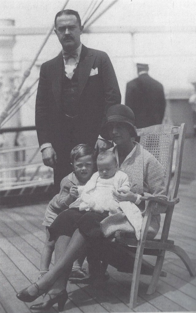
The panels belonged to Mr. and Mrs. Kenneth Farrand Simpson of New York [seen below left on a transatlantic crossing with their children]. In 1925 they married at St. James’s on Madison Avenue, and embarked on a Paris honeymoon. When there, they took a long-term lease on a Left Bank pied-a-terre overlooking the Seine. Both were ardent Francophiles. Helen, a Knickerbacker on her mother’s side, wore Paris couture, and had served as a nurse in France during the World War I. Kenneth was a Yale man who went on to study law at Harvard. As a lawyer he represented the French Line, the passenger steamship company, and Madame Coty of Paris perfume fame. Just before his death he was elected to Congress on the Republican ticket. A Social Register couple, they were attracted to la vie bohème, befriending Gertrude Stein, her companion Alice Toklas, and the notorious Harry and Caresse Crosby. The Simpsons also collected modern art, including works by Modigliani, Picasso, Matisse, Giorgio de Chirico, and Joan Miró, among others.
These panels call for a biographical reading. Kenneth was a chain smoker, a heavy drinker, an avid poker player, and a political writer, who, like Helen, was drawn to the arts, traditionally symbolized by a column capital. And so our frescoes conjure up their life together and their interests — and, by extension, an evening chez eux. When the stars came out, newspapers and books would be put aside, cocktails were poured, and cigarettes lit. Presumably, jazz tunes were strummed, and, it should also be noted, in 1920s and 30s Paris masked balls were all the rage.
Many years later, when Lanux jotted down her life’s chronology, she noted in ink: “Helen: 1st order.” Around 1927 she asked Lanux to decorate their Left Bank apartment at 1 rue Git-le-Cour (in translation, Here Lies the Heart). Other tenants — Americans all — were Sara and Gerald Murphy, E. E. Cummings, Gilbert Seldes (a public intellectual and father of actress Marian Seldes), and Alice De Lamar, the lesbian patron of the arts whose apartment was a crash pad for her artistic friends, including Dolly Wilde (Oscar’s niece), painter Eugene Berman, and his actress-wife Ona Munson (who played Belle Watling in Gone with the Wind). Some thirty years later, Lamar would step up to the plate for Lanux, whose means had by then dwindled, to cover the rent on that apartment in The Picasso.
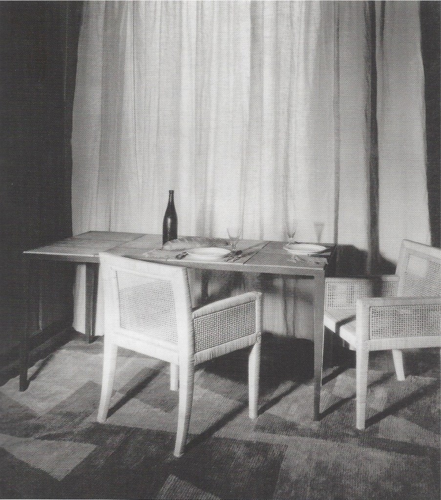
Lanux had the Simpson dining room painted terracotta [below left], designed a steel table with an actual terracotta top, purchased chairs from Jean-Michel Frank, and collaborated on a rug design with weaver Evelyn Wyld, her new love interest, who had recently broken up with architect-designer Eileen Gray, her previous collaborator and lover. Lanux transformed an alcove [below right] into a wet bar by installing a sink and a zinc countertop. She mirrored the backsplash and lower cabinets, positioned an African tribal mask, and laid down another Wyld rug. Our terracotta-colored panels match the room’s color scheme, and may have been made to hang there, or in the adjoining white living room. They may also have been a house-warming gift from Lanux.
Lanux was best known in the 1920s as an artist, although she was also publishing art criticism, poetry, and fiction. By 1930 she had become even better known as a furniture and interior designer. But in the mid 1930s she ran off to Rome, abruptly abandoning her fledgling design career. At the outbreak of war she repaired to New York. In the post-war years, she ricocheted among Paris, New York, and Rome, where she took on a much younger man as a lover. All the while she painted frescoes, illustrated books, experimented with photography, and published her fiction regularly in The New Yorker. In an age of specialization she branched out. In her day, women of her class were discouraged from having a career and achieving professional success. Lanux took it on the chin. The incarnation of freedom, hers was a life fulfilled.
18th-CENTURY ITALIAN FLOWERING URN
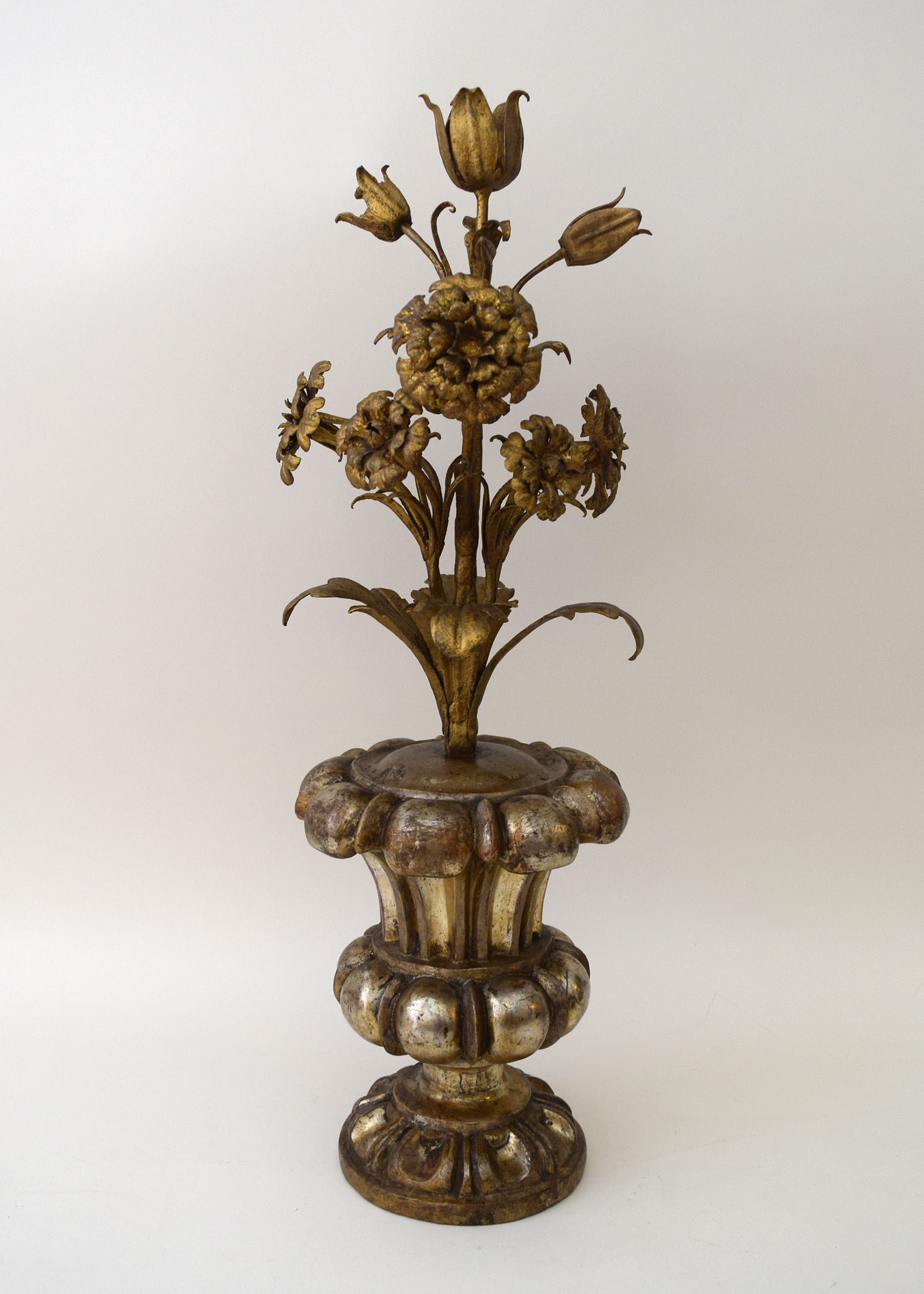
Italian (possibly Genoese) 18th century. Flowering urn, circa 1720. Gilt cut metal, gessoed and silvered wood. Height 24” Sold
This flowering urn of gilded-metal flowers in a silvered-wood vase was probably made in Genoa in the early 18th century. If the flowers are lilies, symbol of the Immaculate Conception, and carnations, symbol of the Virgin’s love, it may have been one of a pair that was made for a church altar [see below]. But if those lilies are actually tulips, which don’t symbolize much of anything, it may have been made to decorate a private house. Flowering urns on altars were seen frontally, and therefore typically one-sided, whereas ours was sculpted in the round, suggesting domestic use. But whether destined for a sacred or secular setting, the sophistication of form, fine workmanship, and costly gilding, point to a prominent studio, and a patron of note.
1928 BRUNO PAUL SIDEBOARD
Bruno Paul (German 1874-1968), made by the Vereinigte Zoo-Werkstätten, Berlin. Sideboard 1928. Stained birch veneer on pine, mahogany interior, silvered brass. H: 38” L: 102” long D: 25” Sold
Before the spotlight came to focus on the Bauhaus in the late 1920s, the most prominent modern German designers were Peter Behrens and Bruno Paul. Both began their careers in the 1890s as Jugendstil illustrators and graphic designers. In the 1900s they both became architect designers without the benefit of technical training. And in 1907 they were among the forward-looking founders of the Werkbund that was launched by Hermann Muthesius “to express architectonically the dignity and calm endeavor of a new and confident national German spirit.”
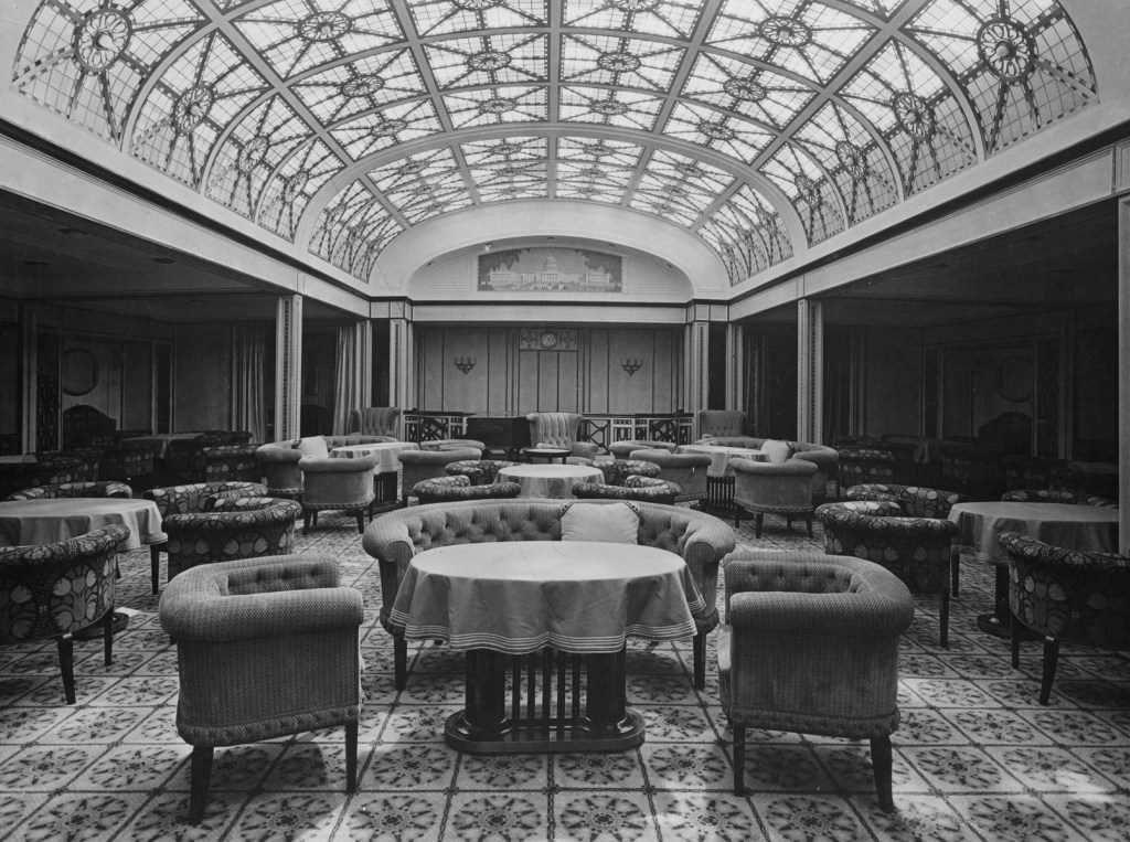
By then, Paul [above left], like Behrens, was becoming internationally known. His work was being published in professional journals, exhibited in museums, and shown at design exhibitions and world’s fairs, including Paris in 1900 and St. Louis in 1904. In 1905 he designed the waiting room of the Frankfurt train station. In 1906 he was made principal of the Royal Berlin School of Arts and Crafts. And in 1907 he received the first of many commissions for the first-class interiors of transatlantic ocean liners of the North German Lloyd [above right, the solarium on the George Washington]. According to a company brochure, the firm took “the advanced step of inviting the leading architects for interiors,” among whom “Prof. Bruno Paul easily established his supremacy.” Yet in 1914 this modernist designer furnished his own large apartment on the school’s top floor in an updated neo-classical, or Biedermeier style [below left].

By then, after having applied modern design principles to all building and furniture types, Paul, like Behrens and many of their colleagues, had come to view modern design as better suited to factories and places of business than civic buildings and residences. And so they occasionally pivoted to modern interpretations of the historical styles that they had reacted against decades before, and to the Biedermeier style in particular.
The Biedermeier style took root in the German states and Austria around 1800, and petered out before 1871 when those states united to form the German nation. The style was characterized by sculptural form and restrained ornamentation, and geared to utility and comfort [above right, a chair in the Residenz, Stuttgart]. This appealed to the modernists who gravitated to geometrical forms suited to mass production, regarded ornament with suspicion, and preached the gospel of functionality. Not coincidentally, this style, and their updated version of it, known as “zwischen Biedermeier,” or second Biedermeier, bolstered an increasingly belligerent Wilhelmine Germany‘s sense of identity as it girded for war. Following defeat in 1918, the Kaiser’s abdication, territorial loss, war reparations, run-away inflation, widespread poverty, and the establishment of a leftist Weimar Republic, the Biedermeier revival lost none of its appeal, evoking as it did a seemingly serene past. And so, when streamlined for a new age, it continued to pass as modern.

In those dire times, as a cost cutting measure, the state merged the applied-arts and the fine-art schools to create the United State Schools for Fine and Applied Arts, and Paul was made its director. Under his leadership, this important institution was favorably compared to the Bauhaus by progressives (in the 1930s he would loose this and all other official positions by refusing to join, unlike Behrens, the National Socialist party). Thanks to his stature, Paul continued to land commissions for the few luxurious villas that were then still being built, like the 1921 Fraenkel house in Hamburg [above left], and furnished with pieces like the 1925 nightstand for the Kuhn house in Leipzig [above right]. Shrewdly, he also set his sights on the booming American market. In 1928 he sailed to New York and installed two fully furnished rooms in a Macy’s design exhibition. Other rooms were contributed by Josef Hoffmann, Gio Ponti, William Lescaze, and Kem Weber, a former Paul student then living in Los Angeles. Welcomed with much fanfare, Paul was hailed by Vogue as “the leader of the modern movement in Germany,” and The New York Times as “the dean of the German contemporary art movement…who has more to do than perhaps anyone else with developing in Europe the style we know as ‘modern’.”
On returning to Berlin, Paul sat down at his drafting board to complete plans for Germany’s first built skyscraper, and design a line of furniture inspired by and named for New York. That line was fabricated by the United Zoo Workshops, located near the famous Berlin Zoo. It represents his rekindled interest in the typenmöbel, or furniture types, he had first designed in 1908. Both lines were made in series, but unlike the first, the luxurious and finely crafted New York line couldn’t be mass-produced. It was shown and photographed in mock rooms, including a dining room with two sideboards that match our own [below]. To launch a furniture line in Germany at this time would have been folly, had Paul not been able to place elements of it in his projects, and send others off to be sold in America.
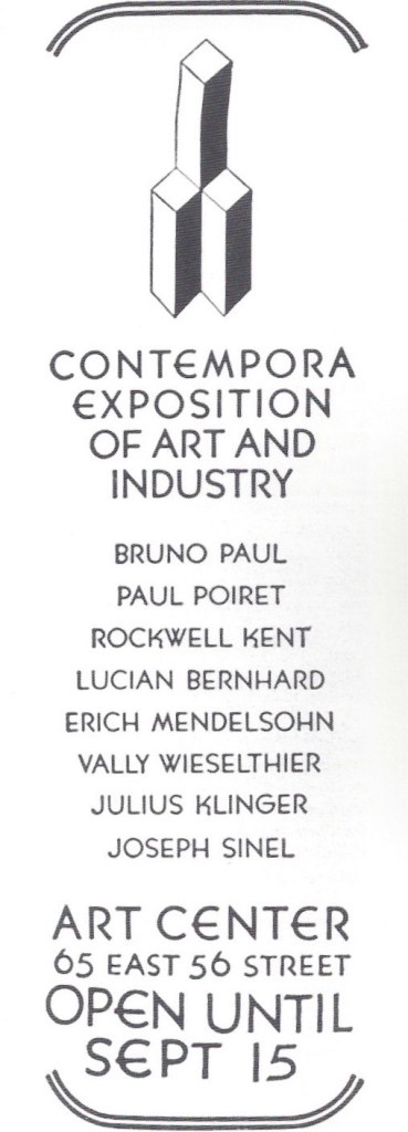
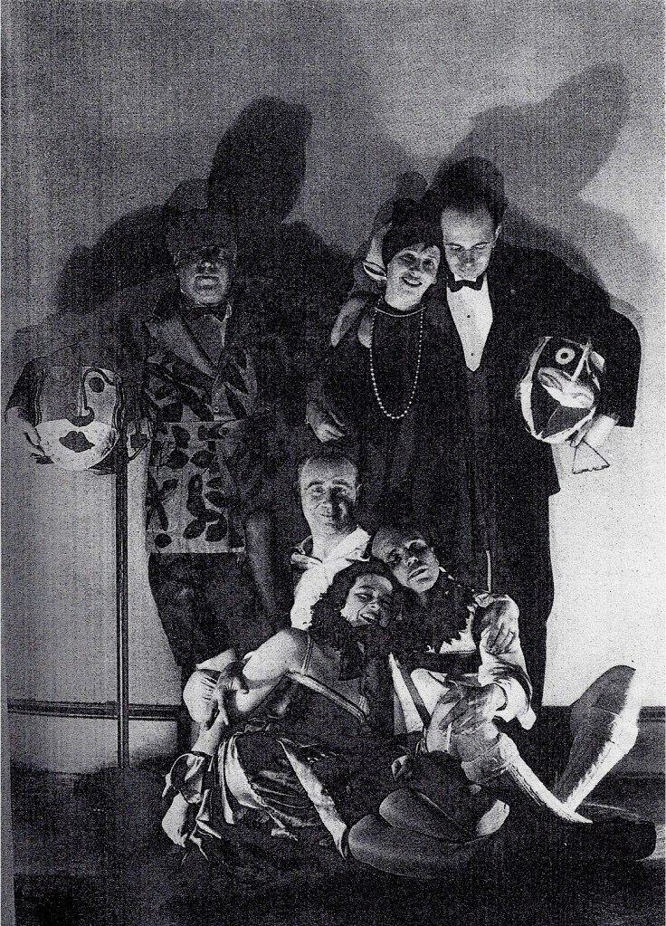
In 1929 Paul and Lucian Bernhard, a former Werkbund member who had moved to New York, established Contempora, a design showroom on East 56th Street [below left, an advertisement from Arts & Decoration]. Paul sent three rooms to the inaugural exhibition. They were shown with others by Kem Weber, the New York artist Rockwell Kent, and the Atelier Martine, the interior design studio of Paris couturier Paul Poiret. Also on view were ceramics by Wally Wieseltier of Vienna, and an exhibition of the work of Berlin architect Erich Mendelsohn. Contempora threw a fancy-dress party to celebrate and promote their venture. A photograph of some of the exhibiting designers in costume was published in Deutsche Kunst und Dekoration [below right], showing Poiret and Wieseltier standing on the left, Bernhard kneeling center, and Kent seated on the right. A few years later Contempora would close, a casualty of the Depression.
Since our sideboard was acquired in Germany, it presumably never made it to New York until now. Its sculptural, horizontal layering is characteristic of Paul’s 1920s work, although it’s less whimsical than the Kuhn house nightstand, and, ironically, more architectonic than the Fraenkel house facade. Being severely geometrical, it falls into line stylistically with Bauhaus precepts, but fine craftsmanship was, just then, coming to be seen as antithetical to modernism. This notion had begun to take root in 1928 with the founding of the Congrès Internationaux d’Architecture Moderne (CIAM), and was reinforced by the 1932 Museum of Modern Art exhibition Modern Architecture, which launched the term “International Style.” Paul, who was not included in that exhibition, practiced a different international style — one that was made by hand, not on a production line. But, like the other one, Paul’s was, in his own words, “the style of modern man, whose airplanes have conquered the distance between the continents, whose audible and comprehensible voices echo around the globe, and whose thoughts and feelings transcend the confines of international boundaries.”
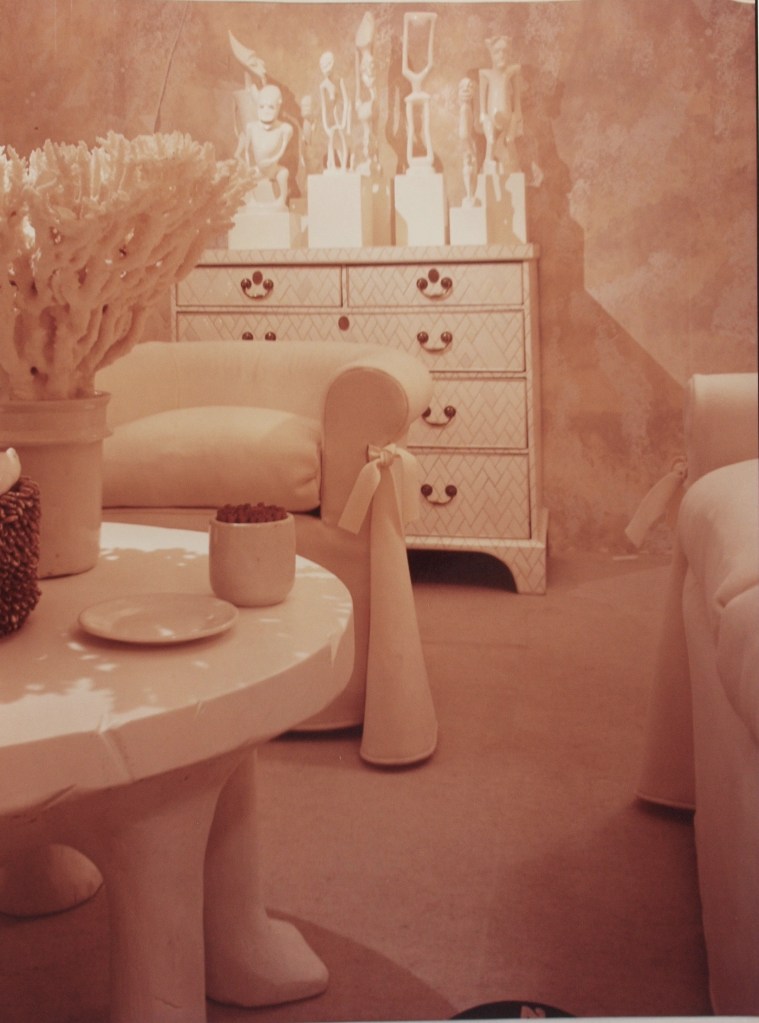
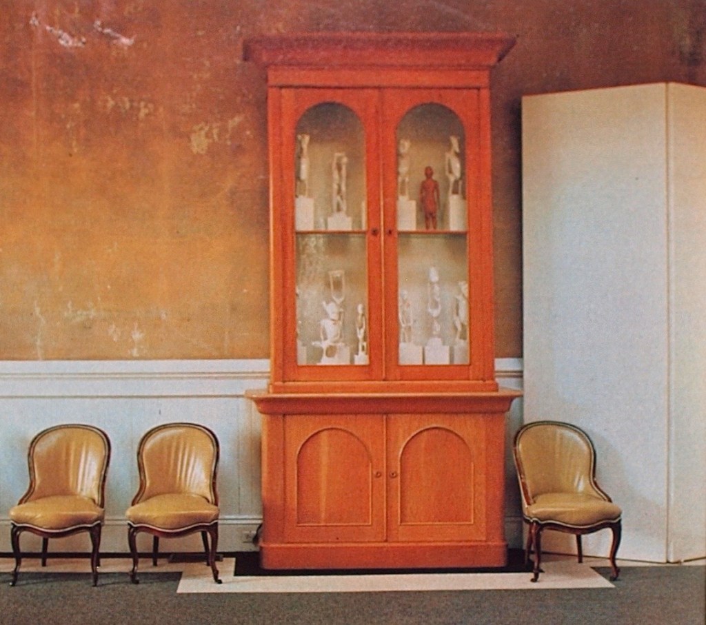
JOHN DICKINSON FETISHES
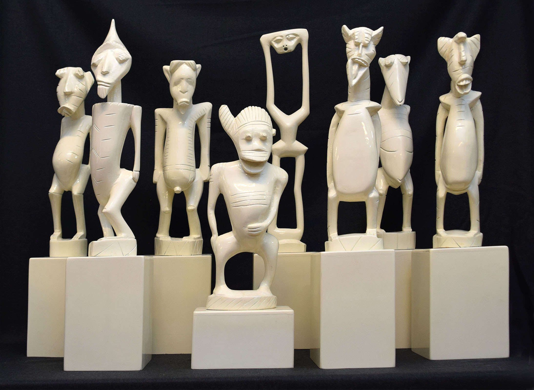
John Dickinson (1919-1982), American. Set of 8 sculptures, circa 1970. Wood sprayed with automobile paint. H: 20“ to 27“. Provenance: John Dickinson; Carlene Safdie. Sold
In the early 1970s, John Dickinson, the San Francisco furniture and interior designer, bought a group of new, hand-made, yet mass-produced African figures at Cost Plus, a local import store. He mounted them on bull-nosed bases and sprayed the works with glossy white automobile paint. Then, he put them on a chest in a room he created for a 1974 showhouse benefit for the San Francisco Museum of Modern Art [below left]. When it closed he took them home, and put them in a towering Victorian cabinet he customized to meet his high if offbeat aesthetic standards [below right].
Dickinson’s methodology prefigures that of the New York appropriation artists of the 1980s, like Richard Prince who re-photographed cigarette ads, and Sherrie Levine who painted watercolors after modernist masterpieces by famous male artists. Their work critiques sexism, the media, and the art world, whereas Dickinson’s transformation of African crafts into first-world commodities critiques the design world and its fetishes.
Dickinson’s clients got the point of his conflation of design and art. But he, and they, were oblivious to the colonialist implications that we find inescapable now. Yet, among contemporary art collectors and museum curators today, it’s this very freighted edginess of his work that accounts for its appeal,.
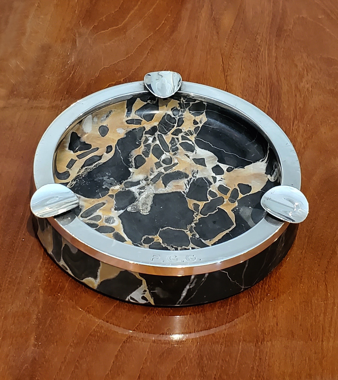
1930s TIFFANY DESK SET
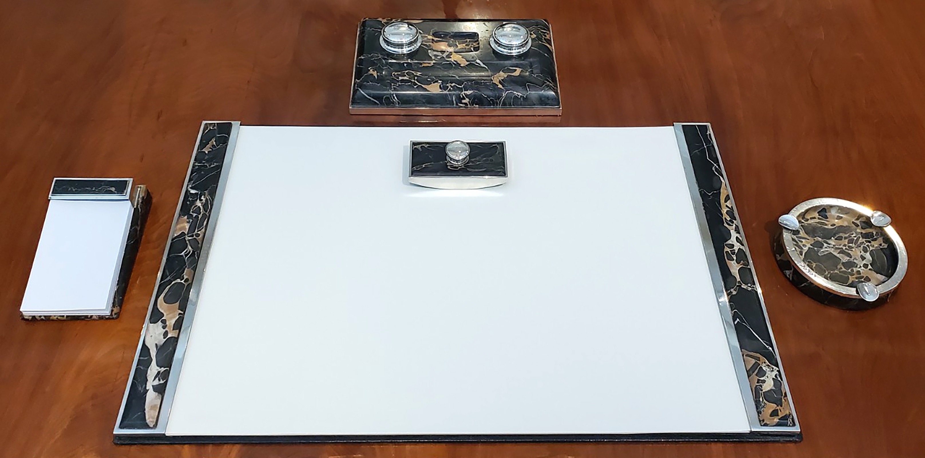
Tiffany & Company. Desk set, 1930s. Sterling Silver, Portor marble, leather. Blotter container size 30 1/4“ x 19 1/4“. Provenance: Philip Green Gossler, New York; Marion “Oatsie” Charles, Newport, RI. Sold
On March 14th, 1938, Mrs. Georgia Whiting Saffold Oates — a former southern belle and a recent divorcee — plighted her troth with Mr. Philip Green Gossler [below left], then on his third marriage. If he was, as they used to say, “a caution,” he was also a man of substance. A utilities magnet, he was “one of fifty-nine men who rule America,” according to his 1945 obituary in The New York Times. This 1930s Tiffany desk set belonged to him, and his initials “P.G.G.” are engraved all over it [below right], except on the notepad holder that didn’t have a blank field large enough to accommodate them.

Born in Columbia, Pennsylvania, Gossler attended the local university before studying electrical engineering at Columbia University. Making a name for himself at Edison General Electric, he went on to Royal Electric in Montreal. Returning to New York, he rose through the ranks of Columbia Gas & Electric, becoming chairman, and, along the way, orchestrated the mergers and acquisitions that made it one of the largest utility cartels in the world, with thirty-four companies in eight states. Appointed a director of the Guaranty Trust Company, he was clubbable enough to be admitted in the Metropolitan, University, and Piping Rock clubs, as well as the Royal Nassau Sailing Club, which came in handy when wintering on Hog Island where he had an estate.
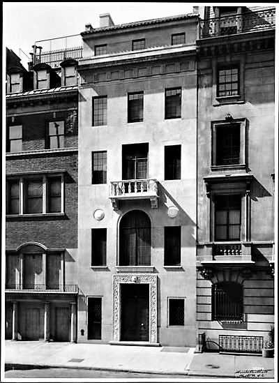
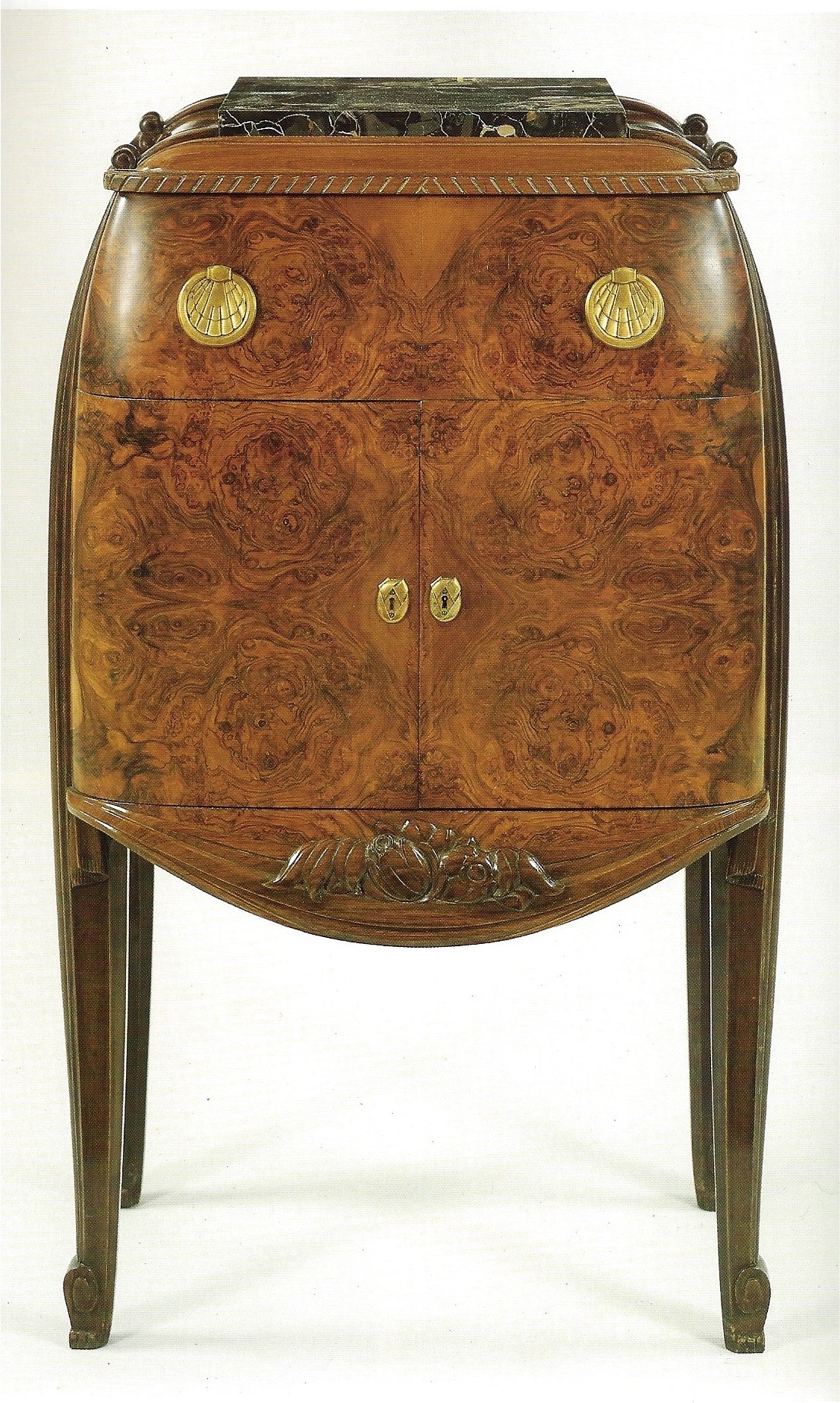
We don’t know if Gossler kept this desk set at the office or in his East 65th Street townhouse [below left], designed by William Welles Bosworth, architect of the skyscraping AT & T headquarters on lower Broadway, and Kykuit, the Rockefeller family manse on the Hudson River. In any case, Tiffany forged it from sterling-silver-mounted Portor marble, which is known in Italy, where it is mined, as Portoro. The French, however, most favored the marble, especially for topping off commodes and cabinets from the 17th century on. Its striking coloration of black, yellow, and white, complimented rich woods and gilt bronze, as seen on (if only just barely) a precious Art Deco bar cabinet designed by Süe et Mare [below right].
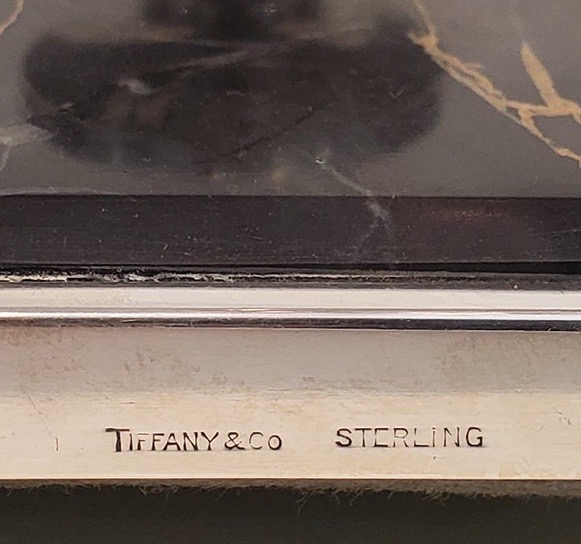
It isn’t just the Portor marble that makes us believe this 1930s desk set was made for Tiffany in Paris, and not Tiffany in New York. For one thing, it bears the Tiffany hallmark [below left] but not the so-called maker’s mark found on all Tiffany New York silver. For another, its au courant design is in line with the work of the Paris masters of Art Deco, but not the more traditional New York designers. Among the Paris ones who had worked for Tiffany were André Groult and Armand Rateau, who designed Tiffany’s showroom on the Avenue de l’Opera some years before. This isn’t to say that Gossler’s desk set had necessarily been purchased there, since Paris-made luxury goods were commissioned and shipped to New York, where they caught the eyes of the discerning few, who still had the wherewithal to buy them as the Depression closed in.
On Gossler’s 1945 demise, the desk set presumably passed to his widow, and when she breathed her last, to her beautiful daughter Marion, who would expire in 2018 at the age ninety-nine [above]. That Marion had bothered to keep it says more about her love of the beautiful than her fondness for her stepfather, whom she didn’t much like. This, in spite of his having footed the bill for her extravagant 1938 coming out at his townhouse, and the St. Regis rooftop supper dance that followed. She, too, as it turned out, was “a caution,” painting her fingernails black, which matched her dark moods, and earning her the sobriquet ‘Black Marion.’ Back then, her name was Marion Oates, which changed on her marriage to Thomas Leiter, a Marshall Field & Company heir, and once again following a divorce, and remarriage to Robert H. Charles, Assistant Secretary of the Air force. Those marriages gave her the wherewithal to become Washington, D.C.’s most celebrated hostess, ‘Oatsie’ Charles (a sobriquet bestowed by her by fellow debutante Brenda Frazier). There, she regularly hung out a ham for the likes of Jack and Jackie Kennedy, Ian Fleming, Truman Capote, Gore Vidal, and Deeda Blair, among others. Summertime, she was doyenne of Newport society, living in Land’s End, Edith Wharton’s former “cottage,” and chairing the Newport Restoration Foundation. Fashionable to the bitter end, she enchanted, impressed, and intimidated more than a few. According to her admiring grandson, “children were terrified of her — so were most adults.”
MARIO BUATTA’S TIFFANY PINEAPPLE
Van Day Truex (American 1904-1979). Pineapple sculpture, circa 1960. Sterling and gilded silver. H: 9 ½” Provenance: Mario Buatta. Sold
Pineapples, native to South America, began trickling into Europe one by precious one in the late 16th century. There, the lust for them prompted kings and aristocrats to build greenhouses for their cultivation. Then, they were proudly displayed on dining tables — and, on rare occasion, even eaten. That is how they came to signify hospitality, which led to their being carved in stone as finials for welcoming gateposts, and cast in bronze as ornaments for dining rooms, like the French 18th-century pair at the Musée des Arts Decoratifs in Paris [below left]. Around that time, at the height of the pineapple craze across the Channel, a garden folly was even built in the form of the fruit on the grounds of Dunmore House [below right].

Fast forward to 1955 when Van Day Truex was appointed design director at Tiffany’s. By then, the firm’s Gilded Age glory days were long gone, but Truex made them fashionable once again. A mere three years later, Truman Capote made the Fifth Avenue store the refuge of Holly Golightly, the stylish heroine of Breakfast at Tiffany’s. And three years after that, the film version, starring Audrey Hepburn in her defining role, positioned Tiffany’s as the apogee of American chic.


Previously, Truex directed the Parsons School where he told his students “mother nature is our best teacher.” Taking his own words to heart, he designed five sterling-silver objects for Tiffany’s. Four of them — a seedpod, a gourd, a pinecone, and a cabbage — were nominally boxes, but the fifth, a pineapple, was a sculpture pure and simple. Of them, only the pineapple was partly gilded to distinguish form – fruit and rockwork silver, fronds silver-gilt. Ours belonged to Mario Buatta, who, some years ago, had purchased the seedpod from us to complete his collection of this series of objects. Back then, he said, the pineapple was the rarest of them all, which accounts for our not having seen one before, or another one since.
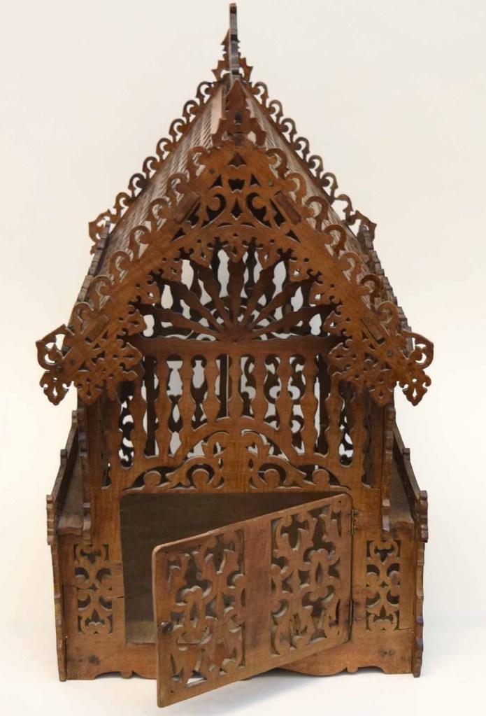
FRENCH 19th-CENTURY BIRDHOUSE
French (Landres), 19th century. Birdcage, circa 1850. Walnut with metal fittings. H: 20 ½” L: 17” W: 11 ½”. Sold
In Pre-Columbian America, the Aztecs bred colorful parrots and kept them in temples. Around the same time in Europe, peasants hung perforated pots on trees for the birds to take roost. Later, in the 18th-century, birds were kept as pets in cages by gentlefolk [below left]. Our charming 19th-century French birdcage is a fanciful rendition of an actual house. Cut with a coping saw in lace-like patterns from sheets of walnut, this cage has a double gate at one end, and a single gate at the other. According to the old certificate of a Paris antiquaire (one Monsieur Parenti by name, who had a shop off the Étoile of the Champs-Élysées) our birdcage was made in the Landres region of northeastern France. There, it would have graced a manor house, and housed a songbird, to the delight of the children.
JOHN VESEY DINING TABLE
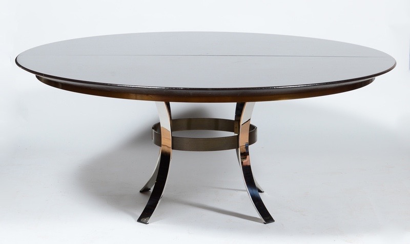
John Vesey (1924-1992), American. Dining table with two leaves, circa 1970. Chromed steel, patinated brass, brown-lacquered linen-wrapped top. H: 29 ½”; Dia: 72”; with both 22″ wide leaves in place overall length 116” (9’ 6”). Provenance: Mrs. Gardner (Jan) Cowles. Sold
“Merveilleux” was Hubert de Givenchy’s pronouncement on John Vesey’s furniture as quoted in Vogue. “Opulent modern” was how Bill Cunningham characterized it in a Vesey profile he wrote for the Chicago Tribune, years before documenting fashionable passersby with his camera. A “status item in many of the best-dressed rooms,” proclaimed Eugenia Sheppard of Women’s Wear Daily, where another columnist, challenged by the French language, signed off with “VIVE LA VESEY!” (“le” would have been the correct article). The enthusiasm of the press was due in part to the “staggering list of celebrities” who bought his furniture, which included, besides Givenchy, the Duke and Duchess of Windsor, Cecil Beaton, Babe Paley, and Baby Jane Holzer.
Vesey, in his bespoke suits, fit into their milieu as seamlessly as his expensive furniture fit into their homes. There, among the pricey antiques, his beautifully handcrafted metal designs held their own, in a way that the manufactured plywood and Formica designs of Ray and Charles Eames simply could not. Having studied art history at Harvard, Vesey became a Manhattan antiques dealer, and sent the occasional antique to a Bronx metalworking studio, where it would be copied in steel and brass. The stylish results were such a hit that he consigned his entire inventory to Parke-Bernet for auction, and spent the proceeds on having his own designs fabricated.
Yet Vesey continued to be inspired by antiques. This dining table, with a chromed-steel and brass base, a brown-lacquered linen top, and two matching leaves, was based on English Regency mahogany examples [above right]. Our unique table was the result of a special commission from Jan Cowles [above left], the glamorous third wife of Gardiner Cowles, scion of a newspaper publishing family, who had launched Look magazine. Previously, she had been married to James M. Cox, Jr., of Cox Communications (media moguls, apparently, were her type).
Belying Vesey’s elegance and charm was his dark side. His kink was S & M, which landed him in a courtroom, where he received the jail sentence that ended his career. He was hardly the first creative type to do dreadful things. Consider Benvenuto Cellini, the 16th-century goldsmith, who bragged in his memoirs of rape, maiming, and killing. This may not have been a deal breaker in the Renaissance, but it was by Vesey’s day. Since his death in 1992, however, the sulfurous odor of his work had lifted somewhat, leading to a reappraisal, a price surge, and a head-spinning bidding frenzy. in the auction room. One could call it a succès de scandale.
1930s FRENCH CHANDELIER
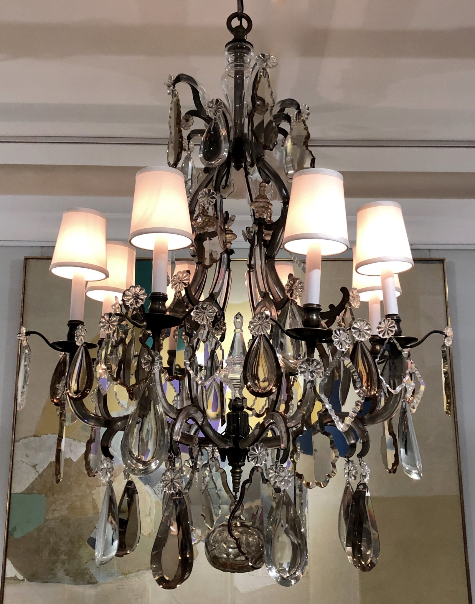
French, 20th century. Baguès, circa 1935. Clear and bronze cut crystal, cast elements, on steel frame. H: 44”; Dia: 30” Sold
This 1930s French chandelier adapts ancien régime form to café society taste. That involved attenuating proportions, making the frame in steel rather than ormolu, plating the arms with cut-crystal arabesque plaques, and festooning it with prisms cut from thick slabs of clear and bronze crystal. Those plaques are typical of Austrian, not French, chandeliers. But in 1930s Paris, the Rococo style, as practiced in Mitteleuropa, was all the rage, prompting the designer of our chandelier to rise to the occasion.
AMERICAN CAST-IRON BIRDHOUSE
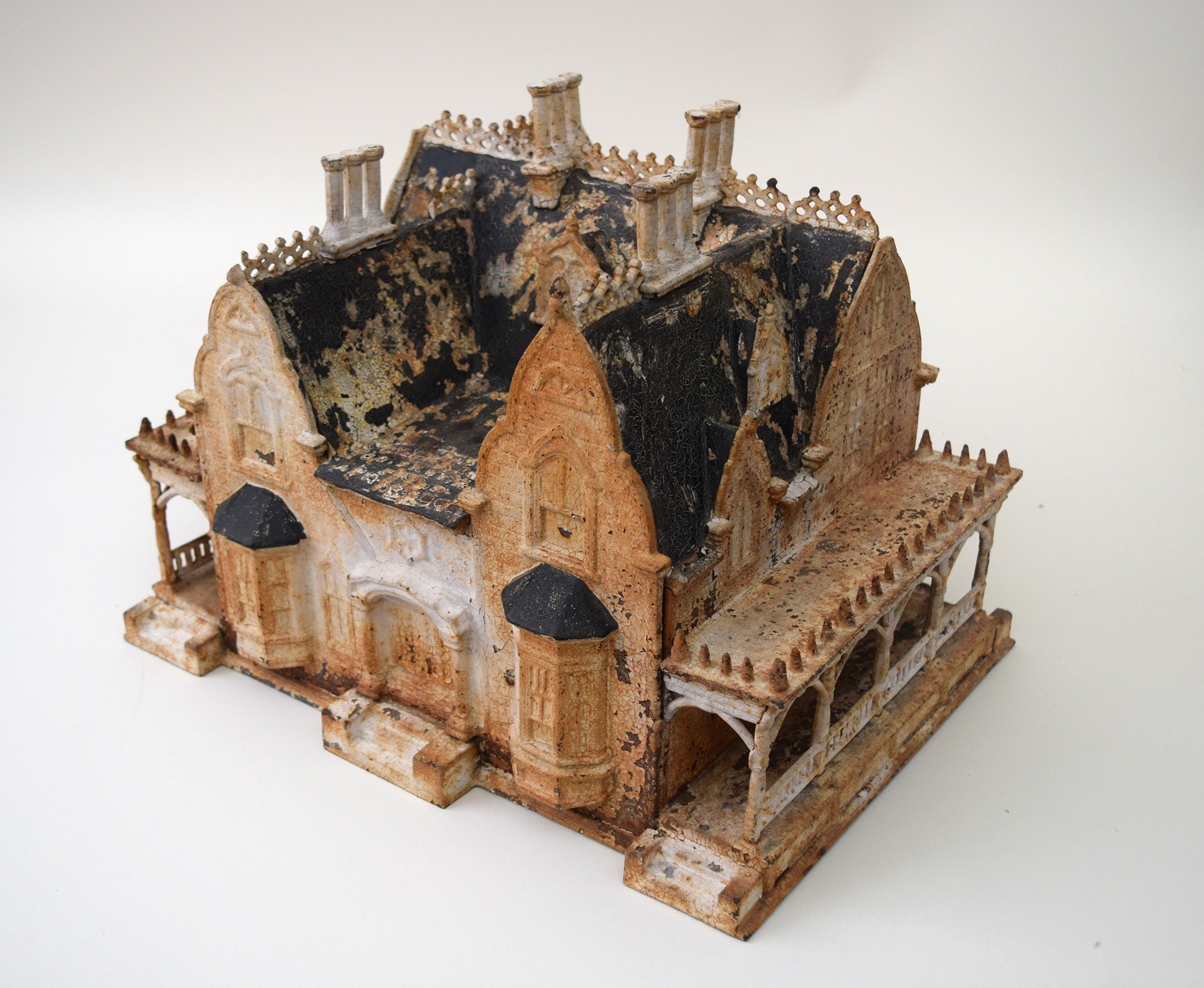
American, 19th century. Miller Iron Company, Providence, RI. Birdhouse, 1868. Painted cast iron. H: 11” L: 10 ½” D: 14 ½” Provenance: George Schoellkopf. Sold
This charming 19th-century Victorian birdhouse is a miniature version of the Neo-Gothic mansions that were then being built for well-to-do families. And those very families were the potential buyers of this birdhouse, which was cast by the Miller Iron Company of Providence, Rhode Island. Dated 1868, and marked with the name of its maker, our birdhouse retains the original and pleasingly distressed painted finish. An identical birdhouse was shown and published in the catalog of the Houston museum’s 1976 exhibition, The Gothic Revival Style in America 1830 to 1870, a 1976 [below right].
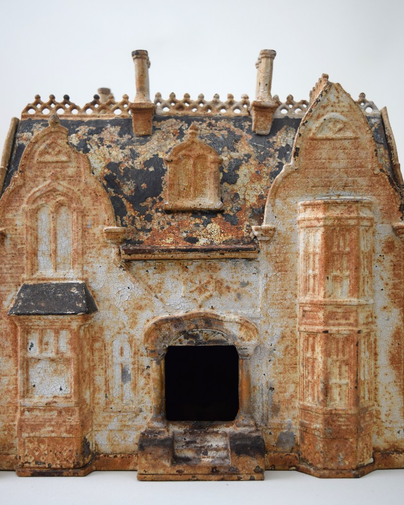
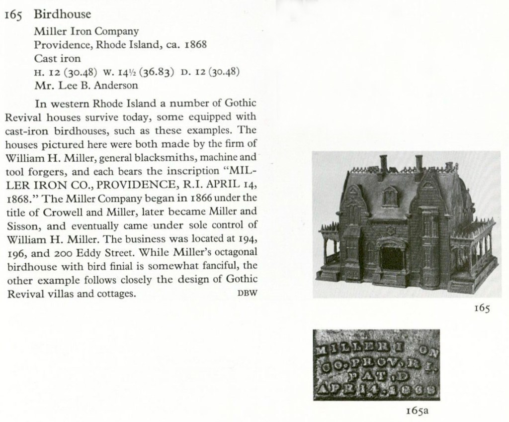
MODERNIST GLASS STANDING LAMP
Attributed to Jacques Adnet (1901-1984). Adjustable floor lamp, circa 1935. Glass, mirror, chrome-plated fittings, painted wood. Maximum height 70″. Provenance: Doris Duke, Duke Farms, Hillsborough, New Jersey. Sold
This glass-and-metal floor lamp may be by Jacques Adnet, who, in Paris around 1930, was designing similar ones [below left] for the Companie des Arts Français. Then again, it may have been designed under his influence by someone at McMillen, the New York decorating firm. In either case, it was owned by Doris Duke [below right], the heiress, socialite, philanthropist, hortological patron, and noted art collector. She had recently engaged the decorator Eleanor Brown, who had been Mrs. McMillen during her first marriage, to redecorate Duke Farms, the vast estate she inherited from her father, James B. Duke, the tobacco tycoon. There, the lamp graced the modernist black-painted bar adjacent to the Olympic-sized indoor swimming pool.
OSLER OF BIRMINGHAM CUT-GLASS LAMP
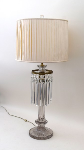
Attributed to F. & C. Osler (Birmingham, England). Oil lamp, now electrified, circa 1860. Cut lead crystal, gilt brass. H: 38 1/2“ (as shown, shade adjustable) Sold
In the 19th-century, when the Industrial Revolution allowed Britannia to rule, the Birmingham firm of F. & C. Osler was celebrated for innovative and artistic glassware. Their stylish product line included chandeliers and sconces, which had previously been made of glass, but also fountains and oil lamps, which had not. No wonder they were invited to exhibit at every world’s fair, where they caught the eyes of rich English lords, Indian maharajas, and an Egyptian king. The design of this large, spectacular glass lamp, held together with a minimum of gilt-metal-fittings, took full advantage of the material’s refractive properties.
SET OF 6 MODERNE GLASS SCONCES
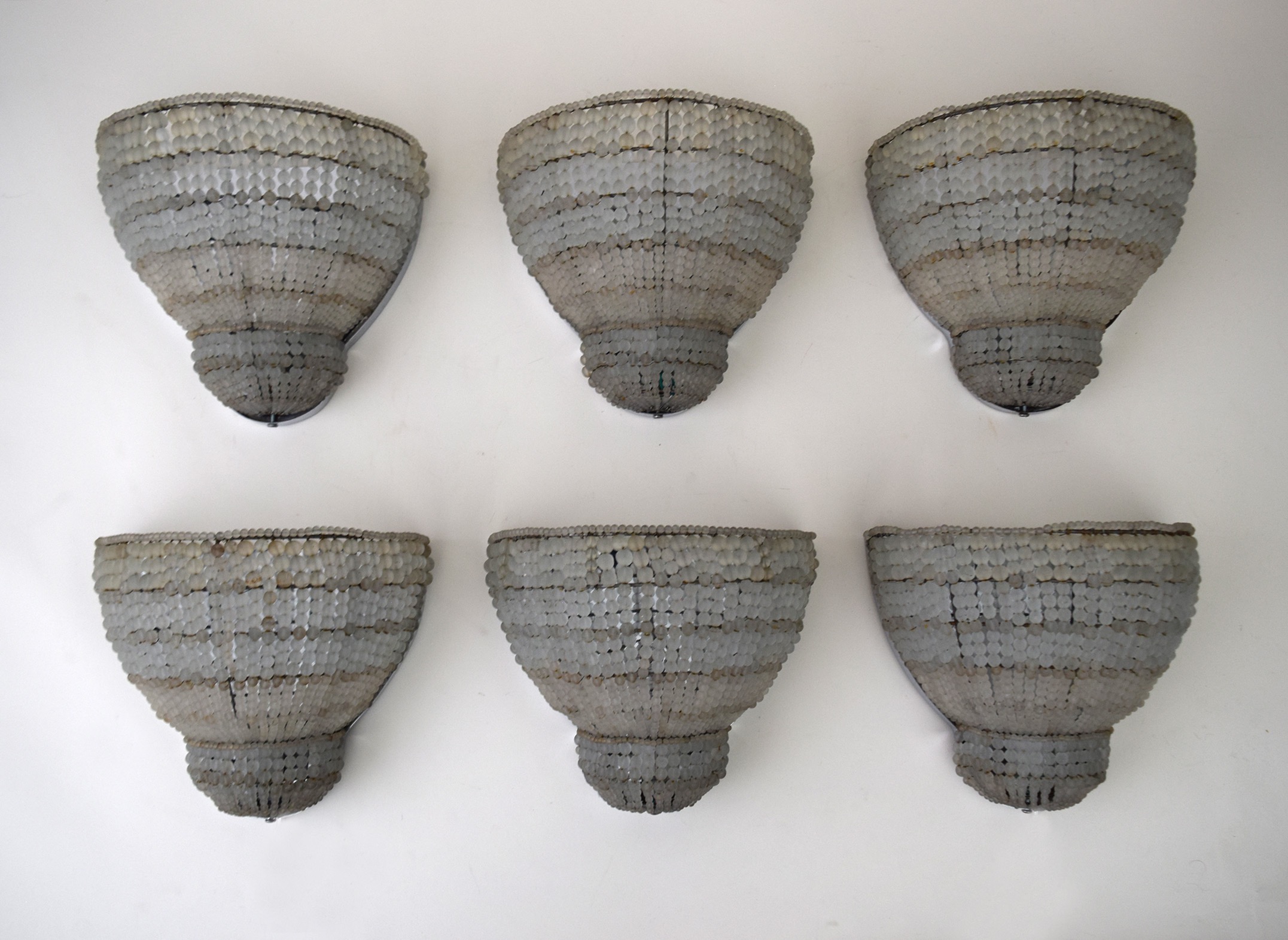
American, 20th century. Set of 6 sconces, 1930s. Chromed metal, and acid-etched glass beads. H: 9” W: 10 ½” Depth 6” Sold
In the 1930s, the fanciful geometry of the 1920s Art Deco style softened to a Streamlined Moderne sleekness. Then, industrial designers were just beginning to study drag on airplanes, cars, trains, and ships, by testing models of them in wind tunnels [below left]. And, judging from the aerodynamic contours of stationary furnishings, it would seem that designers did too, even if they had not. This set of six streamlined sconces have chromed back plates to amplify light, and walls of acid-etched pearls to diffuse it. The effect would have flattered the platinum goddesses of that age, as it would the more naturally coiffed ones of our own.
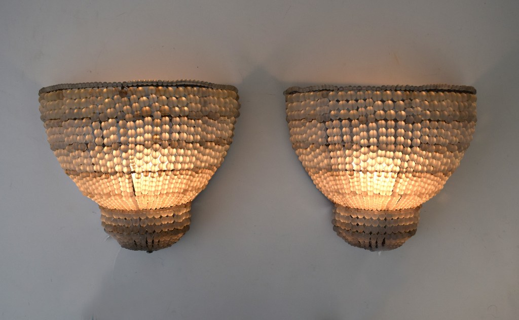
LINE VAUTRAIN CLIP
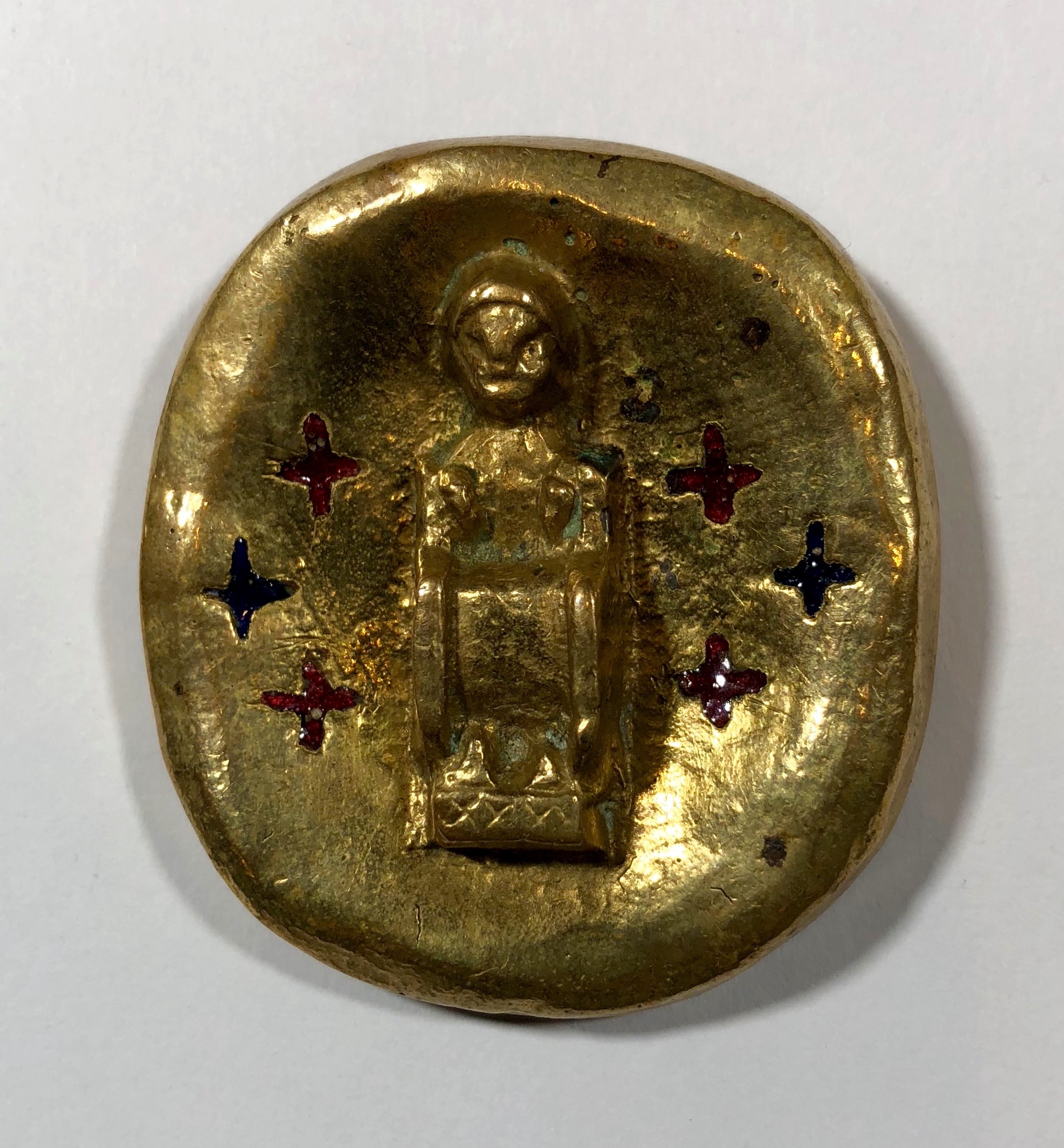
Line Vautrin (1913-1997), French. ‘Sainte Foi’ clip, circa 1950. Enameled gilt bronze. 1 ¾” Sold
Line Vautrin launched her career in the late 1930s with a jewelry collection for Elsa Schiaparelli. Then, after the war, she also began to make the sunburst mirrors that sell for fortunes today. By the 1980s, however, she had fallen into obscurity. Then, she was rediscovered by Pierre Le-Tan, the Paris artist and tastemaker, which led to a commission from Rei Kawakubo to design jewelry for her Comme des Garcons label. A good Catholic girl, Vautrin occasionally incorporated religious imagery in her work. This enameled, gilt-bronze clip was based on the medieval, bejewelled gold reliquary of Sainte Foy, the patron saint of pilgrims, soldiers, and prisoners, which can still be seen today in the abbey church at Conques.
STEUBEN GLASS URN
Steuben, American 20th century. Large urn, mid 1930s. Blown and cut glass. Height 9” Diameter 10” Sold
In 1933, Arthur Houghton Jr., scion of the family that owned Corning Glass, took charge of its under-performing subsidiary Steuben Glass. In short order he pink-slipped the firm’s designer and founder Frederick Carder, had the unsalable inventory of saccharine-colored Victorian-looking wares smashed to bits, and hired the young sculptor Sidney Waugh to revamp the product line. Thus began Steuben’s golden age. Just then, Corning had developed a highly refractive glass for optical purposes. Its translucent beauty prompted Houghton to requisition the secret formula for the production of Steuben’s luxury goods. The form of this urn, derived from ancient Greek mixing bowls, or kraters [below left], was an early smash hit. It was produced in different sizes, of which this is the largest and rarest. In 1934 Edward Steichen photographed one for Vogue [below right], cradled in fashionable hands, at the firm’s Fifth Avenue showroom.
BIEDERMEIER SOFA FROM THE COLLECTION OF MILLICENT ROGERS
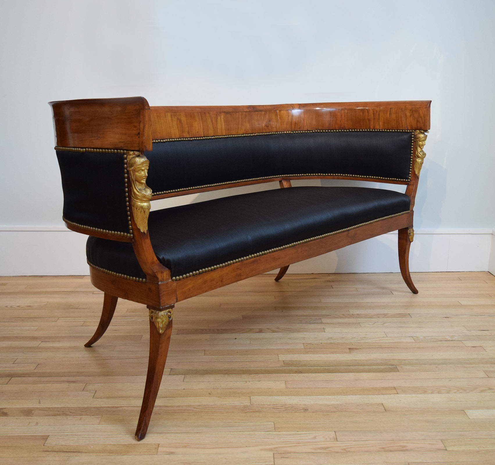
Austrian, 19th century. Biedermeier sofa, circa 1820. Walnut, horsehair, brass nailheads. H: 34″ Length 61″. Sold
Millicent Rogers, a Standard Oil heiress and a passionate skier, was living in St. Anton, Austria, when Harper’s Bazaar ran a story in the March 1938 issue [below] on her “peasant chalet with huge Austrian stoves, Biedermeier furniture…jade, and blanc de chine.” That very month the Germans marched into Austria, prompting Rogers, then Mrs. Ronald Balcom, and a fierce Nazi opponent, to return to the States, after having packed up her goods, chattels, and eight dachshunds. Among the hoard was this lean-limbed, walnut Biedermeier sofa, which, over two centuries, managed to retain its durable, original horsehair upholstery.
SET OF 8 LAJOS KOZMA CHAIRS
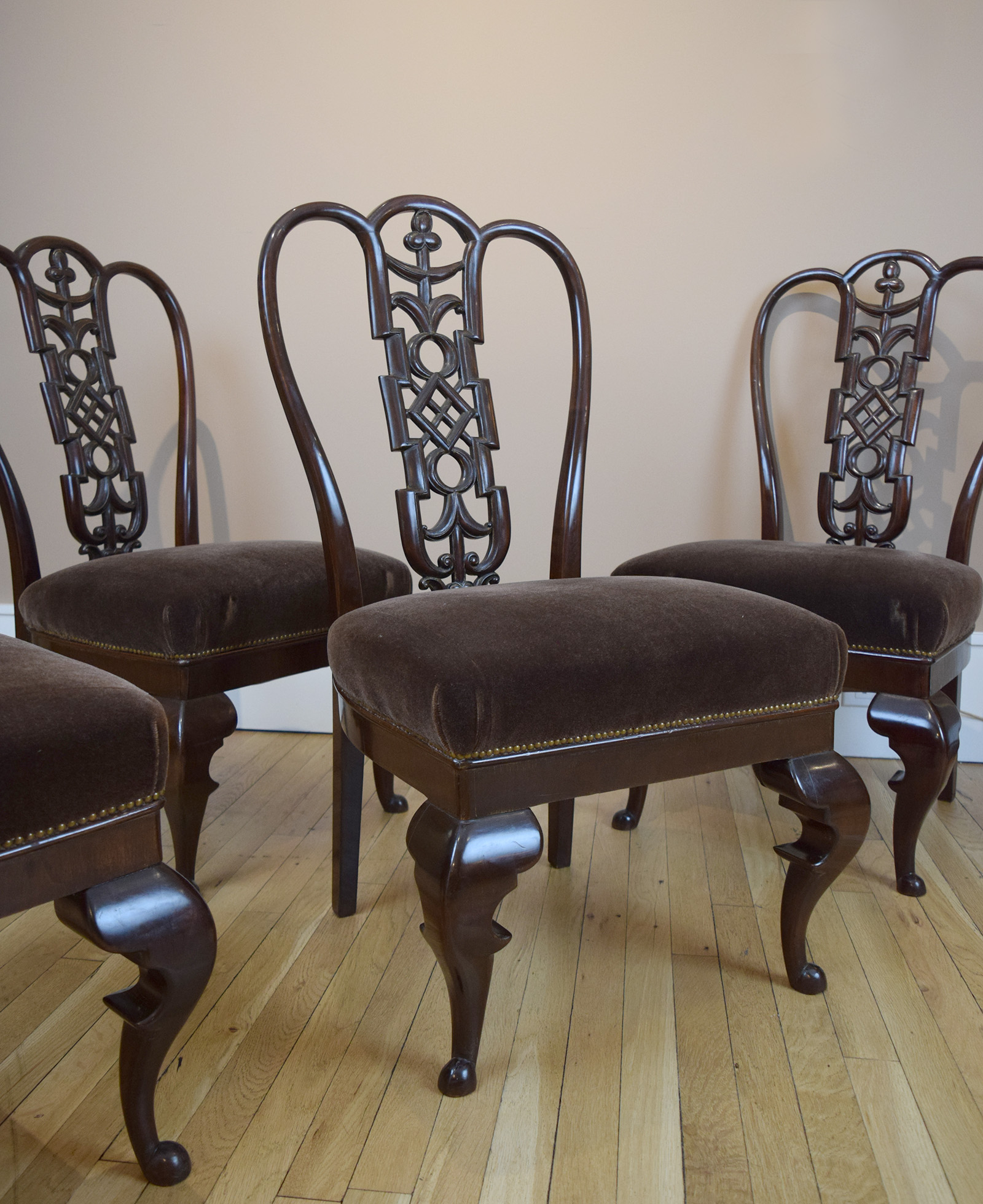
Lajos Kozma (1884-1948), Hungrian. Set of 8 chairs, circa 1925. Stained walnut, upholstered in velvet. Back height 38″. Sold
Like many aspiring artists, architects, and designers the world over, Lajos Kozma left Hungary in 1909 to study in Paris. There, he managed to land an apprenticeship under Henri Matisse. Surprisingly, neither that painter nor his milieu influenced Kozma in the least. Rather, on returning to Budapest the following year, he worked in a style inspired by the Vienna Sessession, and Hungarian folk art. Still young and impressionable, Kozma’s next inspiration was the local iteration of the Baroque. By 1930 he moved on to modernism, designing tubular furniture and glass-walled villas. At the outbreak of World War II, Kozma, a Jew, had much to fear, yet he stayed put, survived, and prospered when peace returned. Our eight walnut dining chairs date to his middle, neo-Baroque period. They are nearly identical to a 1925 chair in the Budapest Museum of Applied Art, and are close in spirit to a 1923 commode in the Wolfsonian in Miami.

THE LIVINGSTON-GRIGGS RESIDENCE IN ST. PAUL, MINNESOTA
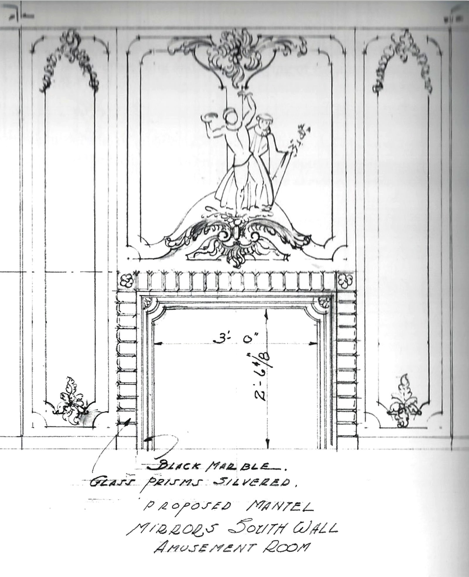
In 1925 Mrs. Theodore W. Griggs, a descendant of the Livingston family of Hudson Valley fame, inherited her parents’ mansion on Summit Avenue in St. Paul, and embarked on a decades-long renovation and decoration. Some years before her parents had persuaded Allen H. Stem, an important local architect who designed New York’s Grand Central Station with Whitney Warren, to take on the small job of reconfiguring the rooms, and installing an Elizabethan-style drawing room, while leaving the unfashionable yet handsome Victorian facade intact. Their daughter, in turn, came to hire the high-society New York decorator Mrs. Philips Brooks Robinson, wife of the son of the Metropolitan Museum of Art’s director Theodore Robinson, known professionally by her maiden name Miss Gheen. In landing the job she beat out Elsie de Wolfe, who, in her 1935 autobiography After All, trashed her decorating rival and Mrs. Griggs too, without naming names.
In the span of a few years, Mrs. Griggs and Mrs. Robinson acquired ten period rooms from Adolfo Loewy in Venice, and one from Jansen in Paris, in addition to a slew of 18th-century furniture from Jansen and the New York showroom of a still-smarting Elsie de Wolfe. Installing period rooms is a complicated business, so a young Edwin Lundie, who would later become the architect of choice to the local gentry, deserves a gold star in pulling it off. That, along with his charming manner and eye for detail, prompted Mrs. Griggs to commission him later to create an “amusement room” in the capacious basement, where her daughter Mary could entertain friends and suitors on her 1935 coming out. After her marriage, as Mary Burke of New York, she would come to assemble the most important collection of Japanese art outside of Japan, inspired she later said by her mother’s collecting. When Mary died at ninety-six in 2012, her collection was divided between the Minneapolis Institute of Arts, where she had passed many a happy hour in her youth, and the Metropolitan Museum across the street from her Fifth Avenue home. In 2016, both museums mounted major exhibitions to commemorate these bequests.
The amusement room was entered through an unprepossessing oak door in the foyer. It opened to an exquisite stairwell hewn from creamy marble, and swaged with a white silk-rope handrail [below left]. Guests descended to a silver-leafed room paved with mirrors, and grisaille reverse-painted-glass panels decorated with cavorting commedia dell’arte figures [below right]. Among the furnishings were a silvered banquettes, a mirrored Serge Roche cocktail table, a glass sunburst clock by one Laurence Colwell, a pair of Steuben glass-and-chrome andirons, and an embarrassment of glittering Steuben glass ornaments. On December 23rd of 1935, Mary was launched in society at a debutante ball in the Minnesota Club in St. Paul. And on December 29th she and her mother launched the amusement room with a party for the jeunesse dorée of Minneapolis and St. Paul. On that frigid night, guests sloughed off their furs and entered this frosty jewel-box of a room — the Art Deco equivalent, you might say, of Doctor Zhivago’s icicled dacha in the 1965 film.
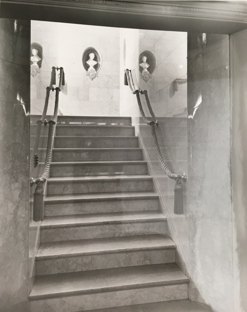
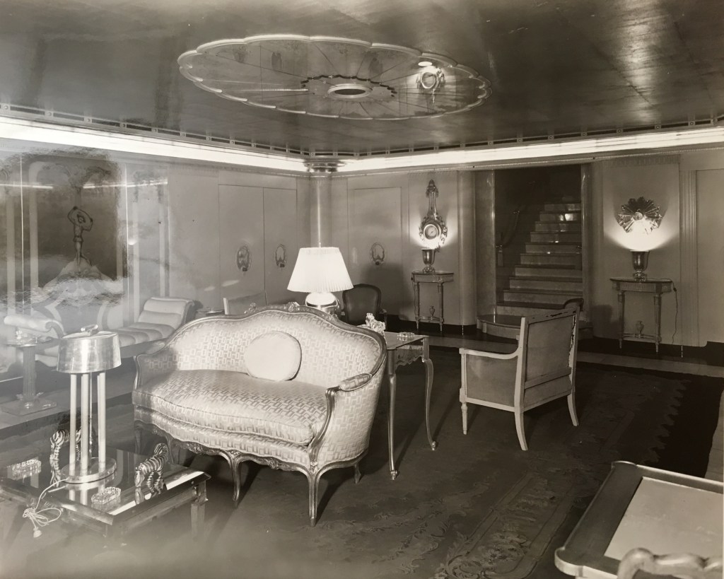
Steuben Glass was established by Frederick Carder in 1903 in the town that bears this name in upper New York state. When the Houghton family, owners of Corning Glass, purchased it in 1918 he stayed on as the artistic director. But by 1933, in the depths of the Great Depression, with sales decimated and their old-fashioned product line in yesterday’s colors gathering dust on the shelves, they turned over the firm to the young Arthur Houghton, Jr. for a revamp that made design history. He brought on prominent industrial designers and sculptors, including William Dorwin Teague and Sydney Waugh, to come up with streamlined designs made in a recently discovered and startlingly translucent glass. To showcase this line a modern glass-block building was erected on Fifth Avenue where, in a bright, white, double-height showroom, Mrs. Griggs and Mr. Lundie presumably purchased and commissioned the glass objects that were dispatched to Summit Avenue. And there they remained, along with the 18th-century furnishings upstairs, until the 1980s when, after a brief stint as a house museum, the mansion was sold, and the contents were warehoused, until they were dispersed recently in a Chicago auction room.
GLASS FURNISHINGS FROM THE GRIGGS AMUSEMENT ROOM
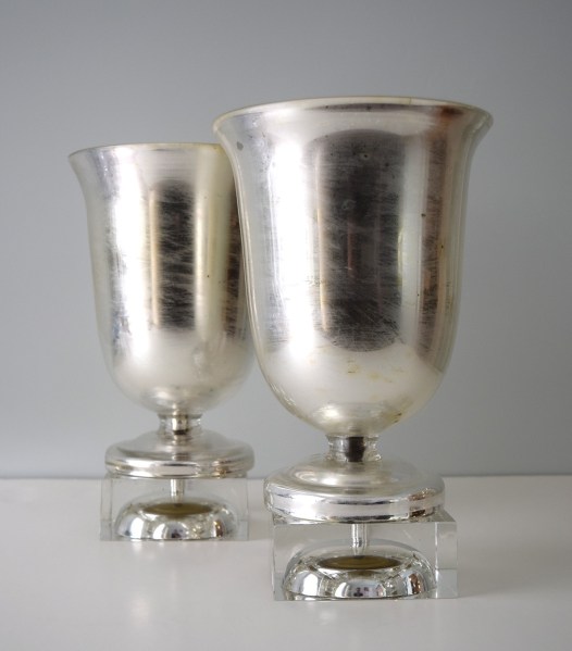
Pair of Steuben silvered and clear glass lamps, circa 1935, originally placed on Edwin Lundie designed mirrored pedestals as seen below. H: 14″. Sold
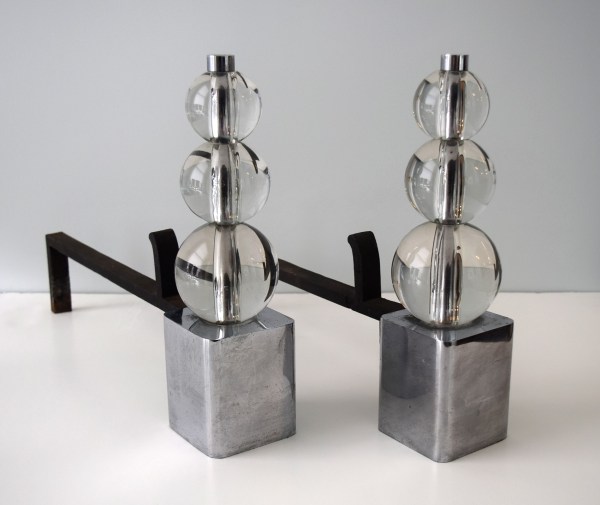
Pair of Steuben glass, chrome-plated metal, and wrought iron andirons, circa 1935, that can be seen in the fireplace below. H: 13″. Sold
Wall clock by Laurence Colwell with a molded glass frame, circa 1935 (the frame was also used for a sconce illustrated in Vogue, October 15th, 1937, page 83). Dia: 19 1/2″ Sold
Pair of Steuben horse sculptures in cast glass (one with diamond-point signature), circa 1935. H: 7: L: 10 1/2″. Sold
Pair of Steuben silvered-glass ashtrays, one with a Steuben adhesive label, circa 1935 (illustrated in Vogue, 1934, page 78). L: 7 1/4″ D: 4 3/4″ H: 1 1/4″ Sold
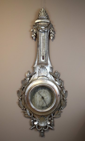
American or French, 20th century. Barometer, 1930s. Silvered wood, paint, metal fittings. H: 45″ Sold
MINIATURE PAINTINGS BY FULCO DI VERDURA
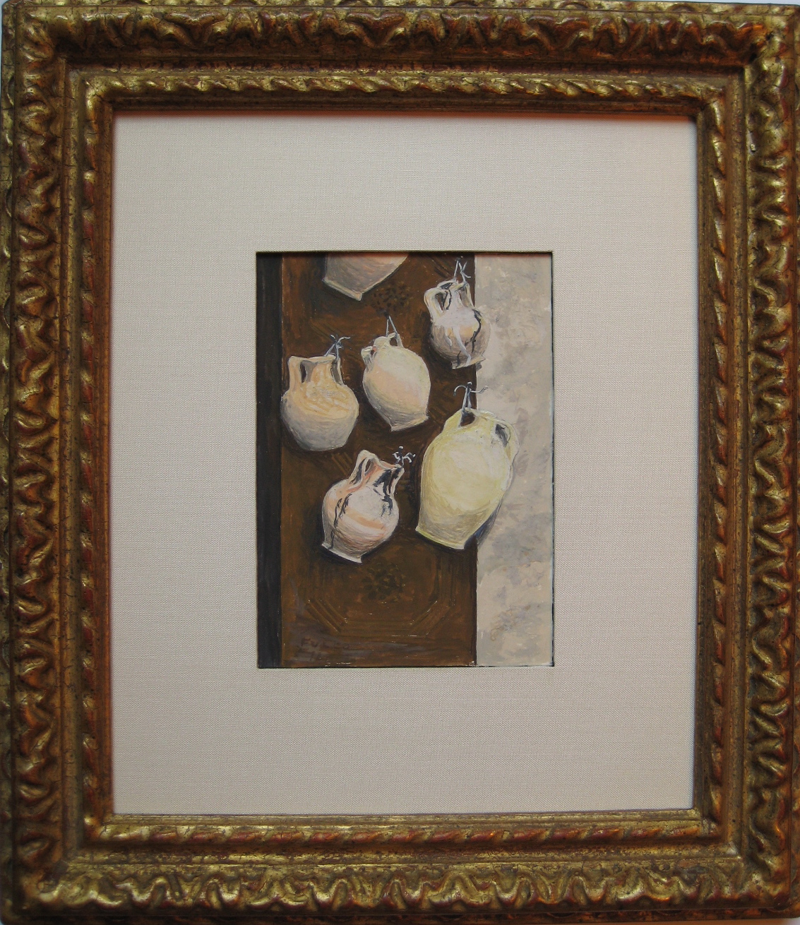
Fulco di Verdura (1898-1978) painting of amphorae hanging on a door, dated August 1972. Gouache on paper. 10″ x 8″ framed. Provenance: Mr. & Mrs. Douglas Fairbanks, Jr. Sold
He knew everyone who was anyone, but in his 1976 memoir Fulco, Duke of Vedura, didn’t drop names. Nor did he mention his adventures in the Great War, or his brilliant career as a jewelry designer. Instead, he wrote of his idyllic Sicilian childhood. Verdura was then in his seventies, by which time he had retired from the jewelry trade that brought him fame and fortune (which came in handy after having squandering his inheritance as a youth). But family and home had never been far from his mind. And so, over the years, he would return to Sicily often, with his glamorous friends in tow.


Our small painting is dated August 1972 on the back of the frame, and inscribed Forza d’Agro, which is the name of a Sicilian seaside town, where Francis Ford Coppola filmed scenes for The Godfather shortly thereafter. It shows an old paneled wood door hung with amphorae [below left], the ceramic pots the Greeks introduced to Sicily in antiquity. It’s impossible to say if these pots are antique ones that were dregged from the sea, or newly made ones, since their tried-and-true form didn’t change over millennia. In any case, Verdura must have come across this still life, just waiting to be painted, when on an excursion to the town on that day.


Verdura often gave his paintings away as gifts. This one was owned by the film star Douglas Fairbanks, Jr. and his second wife Mary [above right]. Perhaps they were with him on that excursion to Forza d’Agro, and given it as a souvenir. This is speculation, but their friendship is fact. In the 1930s, when married to Joan Crawford, Fairbanks would have crossed paths with Verdura who was then living in Hollywood, and designing jewelry for Paul Flato, jeweler to the stars. Fast forward to the 1970s when Verdura was living in London and painting in his retirement. There, Fairbanks found himself leaving a gallery opening of Verdura’s paintings empty handed, because they sold out while he dithered over which one to buy. Shortly thereafter, he wrote magnanimously to the artist, “it is always so wonderful to have friends who grow in value through the years. It is even nicer to have those friends enjoy great gifts – and it is even more agreeable when those gifted friends blossom out into still another avenue of talent.”
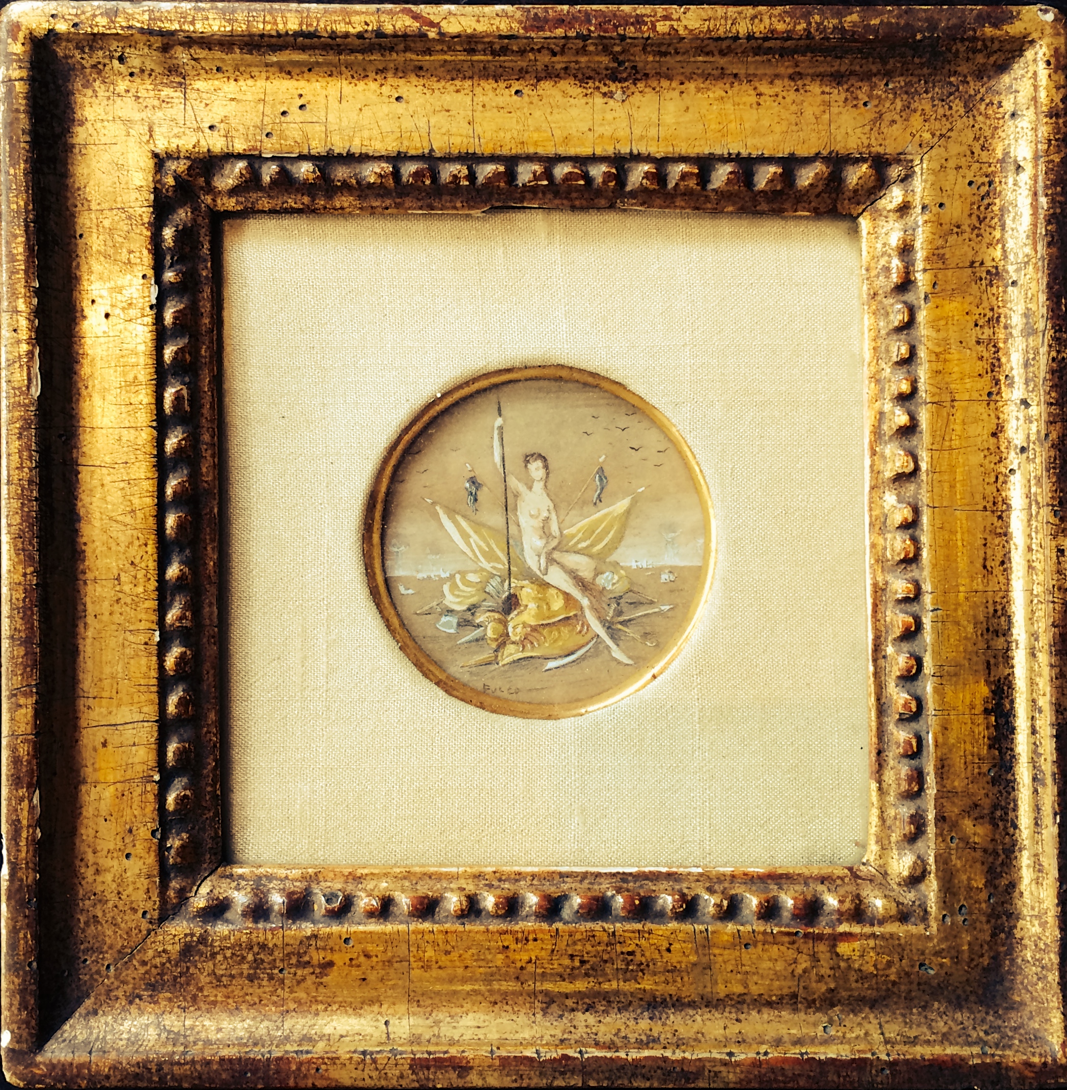
Fulco di Verdura (1898-1978) miniature painting of Bellona, goddess of war, from the 1960s. Gouache on paper. 6 1/4″ x 6 1/4″ framed. Provenance: Mrs. (Rosita?) Winston; Kenneth Batelle. Sold
Around 1960, at the height of the Cold War, the high-society jeweler Fulco di Verdura painted this tongue-in-cheek miniature Allegory of War. In it he depicted Bellona, the Roman goddess of war, seated on a pile of gilded armor, and bristling with spears and standards. For centuries military trophies, commemorating battles won, were assembled from actual arms and armor, and carved in stone, like the acient marble sculpture etched in the 18th century by Giovanni-Battista Piranesi [below left]. Verdura updated the tradition. He presented Bellona — as soigné as Babe Paley, his client and friend — on just such a trophy, with nuclear mushroom clouds detonating on the horizon.
The painting retains its original silk mat, and giltwood frame, selected by the artist himself. It bears the label of Robert Kulicke, the premier framer in New York at the time, who happened to be a talented painter himself. It comes from the collection of Kenneth Battelle [below right], better known as Mr. Kenneth, hair stylist to the jet set.

Verdura gave his paintings away as gifts, and sold them in exhibitions at prestigious galleries, like Wildenstein and Knoedler. On the back of this painting is inscribed the name of a Mrs. Winston. This suggests it belonged to the real estate tycoon Norman Winston’s wife Rosita, who was then cutting a bejeweled swath through international high society.
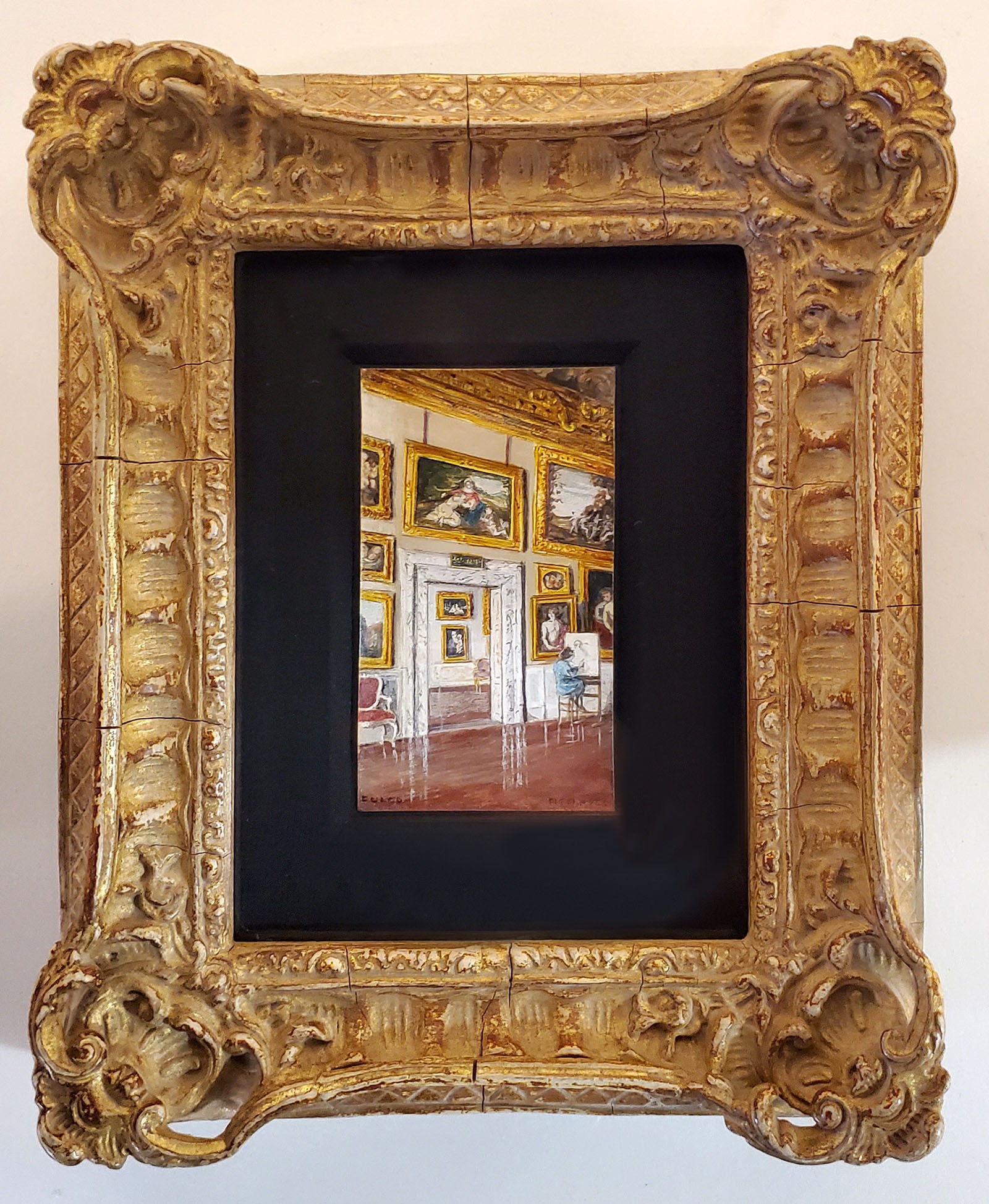
Fulco di Verdura (1898-1978) miniature painting of the Sala di Giove in the Pitti Palace, 1966. Gouache on paper sealed with nail polish. Signed and dated. Original frame 8 1/2“ x 7, image 3 ½” x 2 ¼” Sold
In 1929, Duke Fulco di Verdura threw a lavish costume ball in his family’s Palermo palazzo. It wiped out his inheritance. Following that grand gesture, he moved to Paris, and went to work for Coco Chanel, who had attended his ball. She would discover his gift for jewelry design. A decade later, following the outbreak of war, he moved to Hollywood, where he designed expensive baubles for Paul Flato, jeweler to Tinseltown’s crowned heads. Relocating to Manhattan after the war, Verdura established a studio on Fifth Avenue, where Linda and Cole Porter, Bill and Babe Paley, and Gianni and Marella Agnelli, spent lavishly.
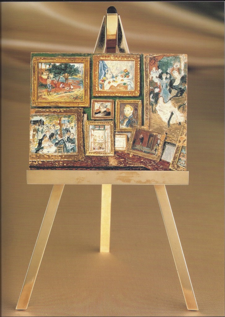
In 1973, Verdura retired, moved to London, and resumed in a serious way his hobby of painting in miniature, with the aid of a magnifying glass [above left]. Occasionally, he would apply a coat of clear nail polish to bring out the colors. He had a few selling exhibitions at tony galleries, but mainly he painted for his own pleasure, and that of his friends. For Betsey and Jock Whitney he depicted a group of paintings from their collection (including a Cezanne, a Van Gogh, and a Gauguin), and had a gold easel made for its display [above right]. Along that line, he painted, and varnished like a manicurist, a view of the Sala di Giove [below left] in a gallery at the Pitti Palace. There, he painted an an art student copying Andrea del Sarto’s St. John the Baptist. If that painting appears slightly askew, it’s because it was hinged to the wall, allowing for pivoting to minimize glare. In an old photograph taken in the very same gallery, while a student copyist was on break, one sees a Raphael similarly hinged [below right]. No detail, no matter how small, escaped Verdura’s eagle eye.
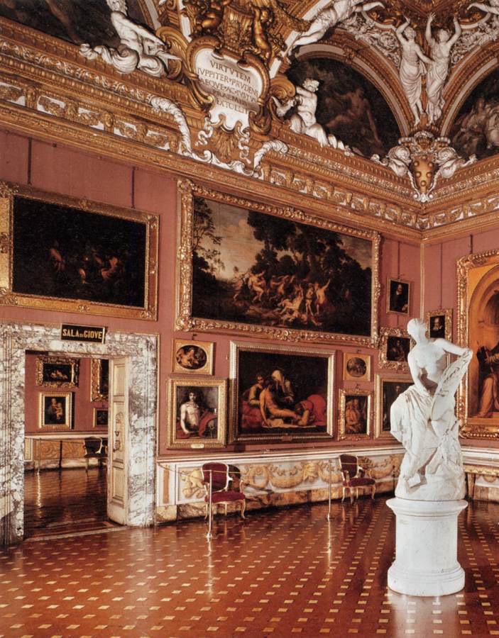
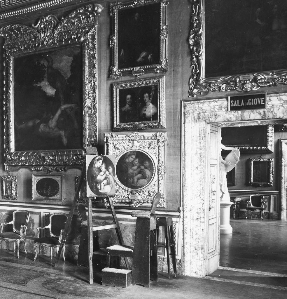
WORKS BY VENINI
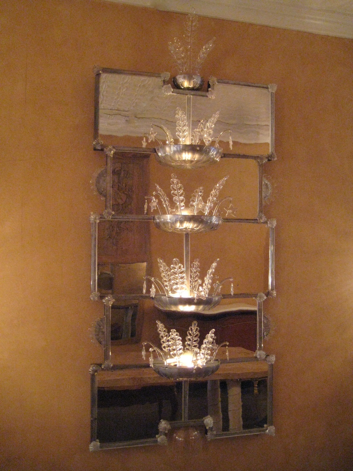
Gio Ponti (1891-1979) for Venini, Italian, 20th century. Mirror with four integral light fixtures for the 1928 Venice Biennale. Blown-glass mirror plate, blown-and-cast glass elements, some iridized, aluminum, and wood. H: 77” W: 34”. Sold
When Gio Ponti sat down in 1928 to draft a mirror with light fixtures for the rotunda of the Venice Biennale, he wasn’t yet the towering figure of 20th-century Italian architecture and design that he would soon become. Then, the century was still young, and at thirty-seven so too was Ponti [below left], who had established his architecture practice the year before. That’s why he had only two buildings to his credit when the rotunda was unveiled — his own house in Milan, and a villa on the outskirts of Paris for the owner of Christofle, the silver manufacturer. Ponti, however, had been hard at work since the early 1920s, designing household furnishings, like the now iconic light fixture that his French client put into production in 1927 [below right].
Ponti was on the fast track from the get go, and there he remained until drawing his last breath and floor plan at the age of eighty-eight. His red-letter dates began to accrue in 1923 when he became the art director for Richard-Ginori porcelain. In 1925 he won the Grand Prix for those porcelains at the Exposition Internationale des Arts Decoratifs in Paris. In 1927 he brought together a group of designers to form the association Il Labirinto (“because our ideas are labyrinthine”), dedicated to improving the quality of furnishings in the modern Italian home. That same year he launched the furniture line Domus Nova (New House in Latin) for La Rinascente, Milan’s largest department store. And in 1928 he published the first issue of Domus, Italy’s preeminent architecture and design magazine, which is still published today.
The 1920s also saw Ponti enter the field of exhibition design. In 1925 he designed the Richard-Ginori stand where his award-winning porcelains were showcased at the Paris exposition. In 1927 he masterminded the setting of the Monza Triennale. And in 1928, in addition to sending a fully-furnished room to New York for a modern design exhibition at Macy’s, he designed the Venice Biennale rotunda and its furnishings [below}
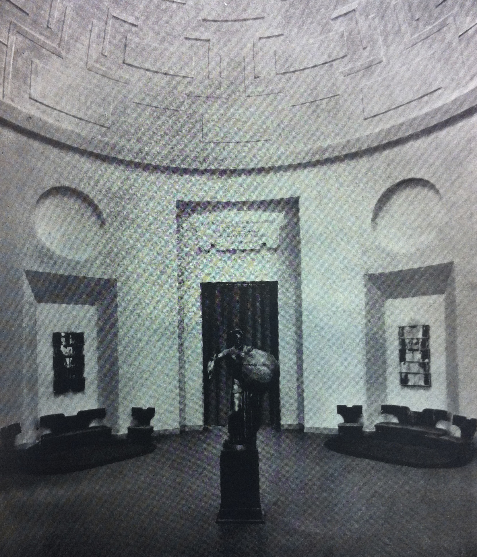
Change is the name of the game at the Biennale, the celebrated contemporary art venue that debuted in a purpose-built structure in 1895. That’s why the rotunda was altered in 1907, and again in 1919, before Ponti redid it in 1928. When he entered the picture it had an octagonal plan, a sectional dome, and was elaborately painted and gilded. When he finished it had a circular plan, a semi-spherical dome, and was painted flat white. This austere backdrop offset the dramatic silhouettes of his chairs and sofas that were made in the workshop of Melchiorre Bega, and his four ravishing mirrors with light fixtures that were made by the Venini glassworks. We’re proud to have rediscovered one of these mirrors — the only one that is known to have survived.
Ponti’s preliminary sketch for the rotunda [above left] shows the architecture largely as executed, and a furnishing scheme that wasn’t realized. He would change the seating arrangement and eliminate the center table, cabinets, and vases. As for the mirrors, he roughed in an idea for one with three light bulbs, seen to the left of the portal [above right]. But since it overlaps with the cabinet, one or the other had to go. In the end, the mirror won out, grew from three to eight mirror plates, acquired bowls to hide the bulbs, and multiplied into a set of four.
They were made by Venini on the island of Murano, just a few vaporetto stops from the Giardini, the public gardens where the Biennale was, and is still held. The Venini family had been in the glassmaking business since the 18th century, but in 1921 Paolo, their twenty-six-year-old descendant [below left], who had been trained as a lawyer, established his own glassworks in Venice at Ponti’s suggestion. Then, Venice was teeming with rich tourists and talented glassblowers, and the financial boom that would make the 1920s roar was just beginning to gather steam.

Venini’s success, however, can’t be chalked up merely to his being in the right place at the right time. He was, after all, a shrewd businessman, and a champion of modern design. One of the seven members of Ponti’s Il Labirinto group, Venini mounted exhibitions of their work in his Milan showroom, for which Ponti drew an ad [above right] that he published in his magazine Domus. For his part, Venini saw to it that his own glass was featured prominently in every Biennale since he established his glassworks. In 1926, for example, he supplied the old rotunda with a showstopper of a chandelier [below left]. And so, when the next Biennale was being planned, Venini no doubt wielded his considerable influence to land Ponti the rotunda commission, and then on Ponti himself to design something spectacular for it that Venini would make.
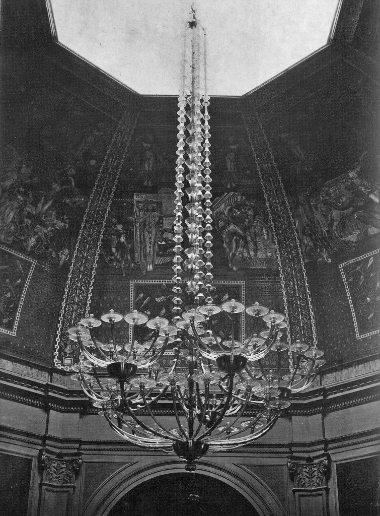
The Venini glassworks, under the artistic direction of the sculptor Napoleone Martinuzzi, was running full tilt in 1928. That year, in addition to developing the product line, he designed and oversaw the fabrication of an over-life-size sculpture of Josephine Baker [above right], the African-American dancer and chanteuse who was then all the rage in Europe. It stole the show at the large Murano glass exhibition, which was held in the exclusive Excelsior Hotel on the Lido during the run of the Biennale. But Venini’s most ambitious project that year was the fabrication of the four Biennale mirrors. To our knowledge they were the first mirrors Venini made, the largest ones they’d ever make, and the first of their many collaborations with Ponti.
The Biennale mirrors weren’t designed as functional mirrors or light fixtures, since the embellishments interrupt the reflections, and the sconces emit little light. Rather, they were presented as works of art in their own right, and their purpose was to demonstrate Venini’s mastery to the crowds that gathered beneath their glimmer. The mirrors may have been sold during the run of the exhibition — or, if not, placed in Venini’s storage that was destroyed in a 1973 fire, or sent on the road like the Josephine Baker that was shown in Paris and London before vanishing without a trace. In any case, the mirrors were also considered lost until this one resurfaced in a New York auction, unidentified, and without a provenance.

The fabled city of Venice, where the mirrors were made and first exhibited, inspired Ponti’s design. The arrangement of interlocking mirror-plates replicate the pattern of masonry construction, as seen in the 16th-century arcade by Jacopo Sansovino on the Grand Canal [above left]. The undulating hand-made mirror plates reflect light and image like the lagoon’s rippling surface [above right]. A rainbow iridescence was applied to some glass elements (achieved through an ancient tin-fuming process rediscovered by Martinuzzi), which mimics the phenomenon of marine phosphorescence. Four half-disks “splashes” artiulate the outer edges. The joints of the bars that define each mirror plate are hidden by seashells. And the starfish and seaweed fronds that spring from the bowls are found in the sea, from which Venice had derived her wealth and power centuries before.

Transparency, reflection, evanescence – characteristics of glass, mirror, and water – are recurring themes in Ponti’s work. Some thirty years after the Biennale mirrors were made, Ponti would design the Pirelli Tower in Milan [above right], a graceful thirty-two-story fin of glass that is his architectural masterpiece. Germano Celant, a curator at the Guggenheim Museum in New York, who organized the 2004 Venice Biennale, described the skyscraper in a foreword to Lisa Licitra Ponti’s book on her father’s work as “aqueous…a vertical jet of solid lightness that can be identified with water itself.” One could well describe our mirror with those very words.
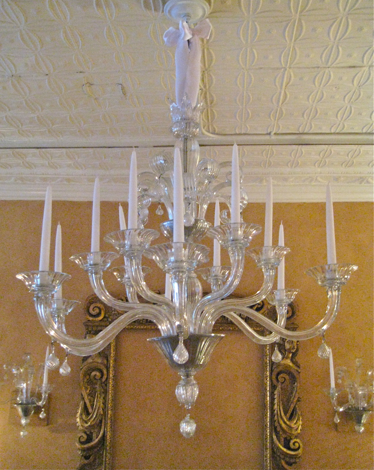
Venini, Italian 20th century. Chandelier and pair of sconces, designed by Napoleone Martinuzzi, late 1940s. Glass, aluminum. Provenance: Mr. & Mrs. Giorgio Diaz de Santillana, gift from Paolo Venini. Chandelier H: 35″ Dia: 33″; sconces H: 18″ W: 17″. Sold
A Venini dressing-table mirror, in colored and clear glass mounted on wood with a brass support, and matching lamp, both circa 1950, from the collection of Mrs. Stanley Hancock Hillyer, née Laura Venini. Lamp SOLD, 16″ x 13″ mirror Sold
In 1921, a recent law-school graduate from Milan named Paolo Venini arrived in Venice to take possession of a glassworks he purchased on the island of Murano. Venini [below right] was the scion of a family that had been in the glassmaking trade since the 18th century. Back then, they were in Como, and there they would have remained in obscurity had it not been for their descendant who saw the potential of relocating to Venice, where talented glassblowers abounded, and the free-spending beau monde forgathered.
Fabled since the Middle Ages, the prestige of Venetian glass had diminished by the time Venini [below right] entered the picture. Then, the charming but retardataire production of Venice had long since been overshadowed by the innovative work of Tiffany in America, Loetz in Austria, and Lalique in France. But by Venini’s death in 1959, Murano had undergone a renaissance, thanks to this newcomer who raised the creative bar in the process of achieving international preeminence for his firm.
Venini’s savvy selection of artists and architects as in-house designers was essential to his success. Among their number was Napoleone Martinuzzi, the sculptor who designed our chandelier and sconces around 1930. Martinuzzi had been inspired by 18th-century examples, like the chandelier in the Palazzo Rezzonico, which had been made by stringing glass elements on metal armatures [below left]. Martinuzzi, however, blew the dust off tradition by simplifying form, stripping away excess embellishments, eliminating color contrasts, and utilizing aluminum rather than brass fittings. The effect, stylistically speaking, is more café society elegance than ancien régime nostalgia.
In the early 1950s, our chandelier and sconces were shipped from Venice to Boston, along with a few spare parts, including one that still bears a Venini label [below left]. They were a gift from Paolo Venini to his old friend Giorgio de Santillana [above right)] an Italian philosopher who landed a professorship at MIT, and his wife Dorothy, a book editor who steered Julia Child through writing her magisterial cookbook Mastering the Art of French Cooking (as seen in Nora Ephron’s film Julie & Julia). Both Giorgio and Dorothy had sons by previous marriages, and both, as fate would have it, came to marry Venini’s two daughters. Giorgio’s son Ludovico married Anna Venini, and Dorothy’s son Stanley married Laura Venini [below right].

Anna, who remained in Venice, became Venini’s unofficial historian, and her husband Ludovico would take over the glassworks in 1959 when his father-in-law died. Laura, who owned our Venini dressing-table mirror and matching lamp [below], was no slouch herself. She studied languages at Oxford and the Sorbonne, and served as her father’s translator on a business trip to the United States in 1952. There, he met with department store buyers and museum curators, and Laura met her future husband, Stanley Hancock Hillyer, a businessman who was a descendant of John Hancock, a signer of the Declaration of Independence.
Two years later, Laura and Stanley married in Venice and settled in Milan, where they furnished their home with an embarrassment of Veninis. In 1958 they packed up these modern treasures, as well as a few antique ones, and moved to Boston. Widowed relatively young, Laura pulled up stakes yet again to settle in Manhattan, where she became the vice president of Vignelli Associates, the celebrated design firm established by Massimo and Lella Vignelli, who, in the past, had designed lighting fixtures for her father. And so, over the years, and on two continents, this lovely dressing-table mirror captured Laura’s elegant visage, lit by a matching lamp, as she applied her maquillage for a hard day at the office, and a glamorous night on the town.
PAIR OF ENGLISH 18th-CENTURY TONDI
English, 18th-century. Pair of tondi depicting Jupiter and Diana. Oil on canvas, ebonized-and-gilded wood frames supplied by Mark Hampton. Diameter 41 ½” framed. Provenance: Mr. & Mrs. Carter Burden, New York. Sold
You can be forgiven for thinking the old saw “see Naples and die” warns the tourist against visiting a place that’s reputedly run by the Mafia. But when Goethe penned these words in his travel diary in 1787, what he meant was that one could go to the grave satisfied after experiencing the pleasures — aesthetic and illicit — that this city offered in abundance. Had that not been the case, English lords wouldn’t have considered Naples the highlight of the Grand Tour.
Those milordi, as the Italians called them, returned home with crates of paintings, statuary, and the occasional artist in tow. Among them was the Neapolitan painter Antonio Verrio seen brush in hand [below left], who arrived in the Duke of Montagu’s entourage. Verrio’s mastery of illusionistic painting, then a novelty in England if a commonplace in Italy, lofted him to the pinnacle of success and the patronage of kings.

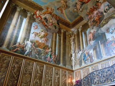
For King William III, Verrio frescoed the grand staircase at Hampton Court Palace with a swirl of gods descending from Mount Olympus [above right]. Below this scenographic tour de force are illusionistically painted military trophies, which bear comparison to our tondi, as art historians (following the Italian) call round paintings. Both depict sculpted stone busts casting shadows on colored backgrounds, and were painted with the slapdash vivacity characteristic of Italian artists. Our tondi represent Jupiter in all his bearded majesty, and Diana, the moon goddess with a lunar crescent in her hair. Painted di sotto in sù (“as seen from below”), they would originally have been positioned high in a room, like the pair of busts in niches at Bellamont Forest, an 18th-century Irish country house [below left].
No one had a keener appreciation for the Anglo-Saxon country house than the great Italian decorator Renzo Mongiardino, who did up more than few himself in the 1970s and 80s. Overseeing his jobs in England and America (and doing some on his own, too) was Gaser Tabakoglu, a Turkish-born cosmopolite, who had purchased these tondi from Carlton Hobbs, the eminent English dealer. This is where I enter the picture, laying eyes on them for the first time over a glass of scotch in Gaser’s lacquered sitting room on Sloane Street in London. The next sighting came a few years after that, when spending a weekend at Brick House, Gasser’s 19th-century retreat in upstate New York. There, they hung on the candy-striped-fabric walls of the master bedroom [above right].
Back then I was a contemporary art dealer, but in 1994 I switched to dealing in antiques from a townhouse apartment. The first person to sound the buzzer and mount the stairs was none other than Mark Hampton, America’s preeminent decorator (now there was a class act). He, in turn, sent over Mrs. Carter Burden, who leveled her discerning gaze on the tondi that I had since acquired from Gaser. She and her husband (now there was a collector) found them irresistible, so off they went to be hung above the doors of their double-height drawing room (now that is what I call decorating) on Fifth Avenue [below}. A room and a collection that would have done any of those 18th-century English milordi proud.

NEO-GOTHIC CHEVAL MIRROR
Continental. 19th-century. Cheval mirror. Mahogany, gilt gesso,gilt-metal hardware. 85 ½” high, 50” wide, 22” deep. Sold.
Viscount François-René de Chateaubriand is remembered today for the steak receipe named for him by his chef, but in Napoleonic France he was a celebrated writer, diplomat, and world traveler. In 1802 he published a defense of the Catholic church, then under a cloud for having supported the monarchy during the Revolution. But Chateaubriand praised the Church as the defender of the faith, patron of the arts, and singled out for special mention its role in the development of the Gothic style. That style was then unfashionable and deemed barbaric. But, by the time he sat down to write his memoirs some forty years later, Gothic had become all the rage. And so, when fashionable parisiennes wore Gothic-inspired jewelry [below left], and bought objects in le style troubadour [below right], Chateaubriand staked a claimed for having “linked the current taste to the edifices of the Middle Ages — it was I who brought back a young century’s admiration for the old temples.”
History contradicts his boast. In the mid 18th century, long before Chateaubriand entered the picture, a small but influential group of tastemakers in England and France were discovering Gothic charms. In the 1750s, the writer Sir Horace Walpole built Strawberry Hill, his “gothick” castle [below left]. And in the 1780s the painter Hubert Robert designed a picturesque Gothic ruin for the garden of the Princess of Monaco [below right]. And in the furniture trade, Chippendale’s Neo-Gothic designs were the talk of London, just as the pointy chair backs of Jacob were in Paris.
The aristocratic delicacy of the Rococo and Neo-Classical styles didn’t expire with ancien régime France, or Georgian England. Rather, it flourished well into the 19th century, and left its mark on the early Gothic revival. This can be be seen in the 1823 armchair by Auguste-Charles Pugin [below left], a refugee who escaped the turmoil of the French Revolution by settling in London. By the middle of the 19th century, however, when his son A.W.N. Pugin, architect of the Houses of Parliament, designed this 1864 side chair [below right], the Gothic style had come to assume a sober mien, in keeping with the zeitgeist of the Industrial Revolution.
The graceful elegance of our cheval mirror inclines us to date it to the 1840s. As difficult as it is to say exactly when it was made, pinpointing the where isn’t easier. That’s because the Neo-Gothic style spread from Paris and London to Moscow and New York by the 1850s, and by 1900 reached every continent except Antarctica. So while the mirror’s defining characteristics – openwork double-helix finials [below right], ribbed-serpentine columns [below left[, florid central crocket – are nothing if not distinctive, they don’t suggest a place of origin to us.
With the triumph of eclecticism in the late 19th century, Gothic was just one of many historical styles from which to choose. Then, it was stereotyped as masculine, and suited to men, just as the Louis XV style was feminine, and suited to women. And so it follows that William Randolph Hearst, the rough-and-tumble press baron, went Gothic all the way in the stupefyingly grand hall of his quintuplex Manhattan penthouse on Riverside Drive. An obsessive accumulator of antique art and furnishings, Hearst would no doubt have sided with Chateaubriand who had written in his celebrated memoirs, “the greater part of genius is composed of memories.”
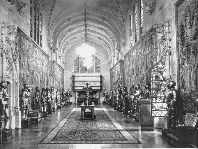
PAIR OF JANSEN TELEPHONE TABLES OWNED BY BROOKE ASTOR
Jansen, French 20th century. Pair of white-lacquered telephone tables with brass castors. Provenance: Mrs. Vincent (Brooke) Astor. The pair H: 11” L: 11” W: 7 ½”. The single H: 11” L: 12 ½” W: 8 ½”. Sold
“I can never ever thank you enough for twisting Boudin’s arm and making that enchanting, brilliant man come to Washington,” wrote a grateful Jackie Kennedy to Jayne Wrightsman, the wife of an oil tycoon, and an eminent collector of 18th-century French furniture. Stéphane Boudin, the director of Jansen, the great Paris decorating firm, had just given the young senator’s wife some free decorating advice. The big payoff for him would come a few years later, when Mrs. Kennedy, now the First Lady, asked Boudin to redecorate the White House.


Landing this prestigious job would have pleased Boudin, whose impressive client list included not only the Wrightsmans, but also Babe and Bill Paley, Marella and Gianni Agnelli, and scores of other millionaires. But it wouldn’t have fazed him either, having decorated for royals like Leopold III of Belgium, royals in exile like the Duke of Windsor, and self-proclaimed royals, like the Shah of Iran. Still, for a man in his seventies on the verge of retirement, it was a suitable grand finale.
Some years earlier, Jansen had opened a boutique at 9 rue Royale on the ground floor of the Paris headquarters. There, the firm’s clients and well-heeled passersby could breeze in and buy a vintage bergère, a modern dining table, a charming picture, or a precious bibelot. With the success of this boutique, and rave reviews coming in for the White House decor, the time had come to open a Jansen boutique stateside.
Enter Pamela Hayward, an English thoroughbred who was then married to Leland Hayward, the producer of countless musical hits on Broadway, including South Pacific, Gypsy, and The Sound of Music. Mrs. Hayward was a daughter of Lord Digby, an ex-wife of Winston Churchill’s son Randolph, and a future wife of Averell Harriman, the American railroad heir who was the ambassador to the Court of St. James’s (she would be appointed ambassador to France herself, some years hence, by President Clinton). If a stint as a New York shopkeeper in the midst of all this sounds like a comedown, keep in mind that the Jansen boutique in Paris was run by the beautiful Neapolitan princess Cora Caetani.

And so it came to pass, in 1963, that Mrs. Hayward opened, managed, and stocked the a Jansen boutique at 32 East 57th Street. There, she received her high-society friends, including Brooke Astor, who was so taken with these charming telephone tables (which had been designed in the firm’s Paris studio) that she bought several. And no wonder, since their brass wheels spared the busy socialite from having to lug hither and yon the large wired telephones of that day. And in our own day of small, cordless ones, the tabletops can comfortably accommodate the modern socialite’s mobile phone, not to mention a glass of Chardonnay.
GEORGE PLATT LYNES PHOTOGRAPH OF MILLICENT ROGERS
George Platt Lynes (1907-1955). Millicent Rogers in an Adrian dress, 1947. 10″ x 8 1/4″ (unframed). Sold
Millicent Rogers’ beauty and style were often mentioned in the press, but her intelligence (she was fluent in many languages, including Latin and ancient Greek), and her creativity (she designed and cast her own jewelry) was often passed over. If her beauty was a man magnet, her intelligence could intimidate them, and it certainly presented a challenge to her three husbands, and many lovers, who included a ski champion in the Tyrol, a Navajo Indian in Taos, and Clark Gable in Hollywood. It was in Tinseltown that George Platt Lynes captured her wistful side in this 1947 photograph, with the aid of a soft-focus lens, props reminiscent of 19th-century daguerreotypes, and a Victorian-revival ballgown by Adrian, fashion designer to the stars. The photograph was published in a September 1947 issue of Harper’s Bazaar.
JAPANESE ALTAR TABLE
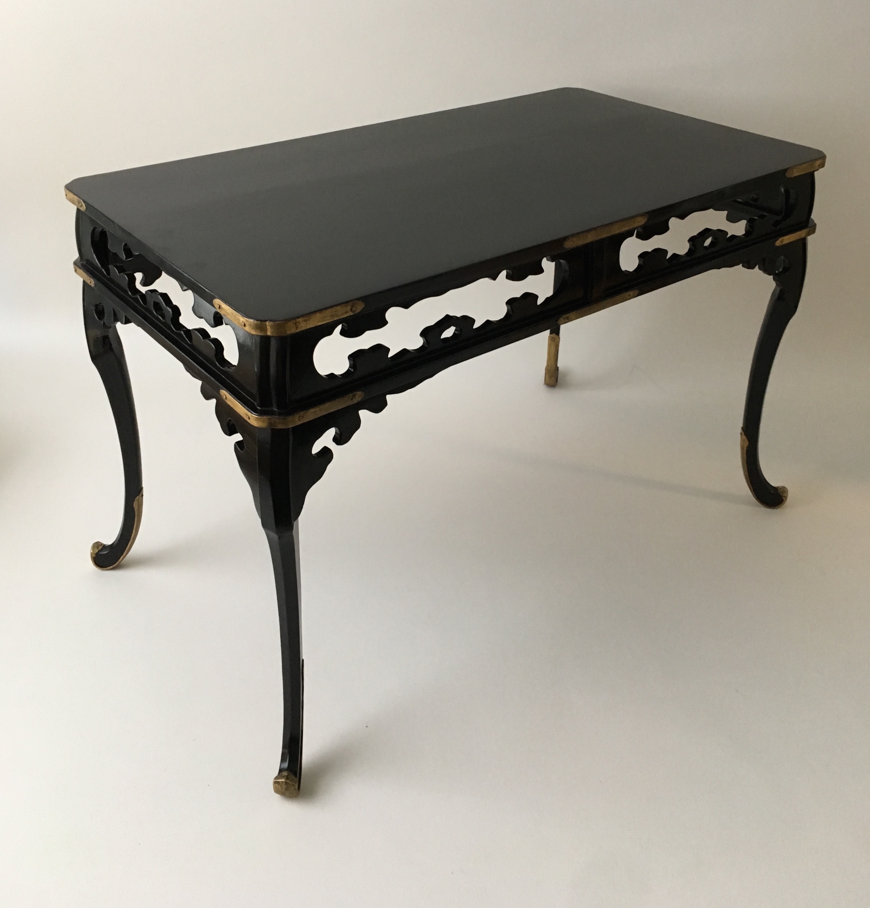
Japanese altar table, early 20th century. Lacquered wood with gilt-brass mounts. H: 16″ L: 24″ D: 13 3/4″ deep. Sold
Take a close look at a black-lacquered Asian object and you’ll find the suggestion of a color. That’s because true lacquer is a natural substance, one that’s built up layer on layer, each laboriously polished before the next can be applied. This creates richness and depth, in contrast to the artificial lacquered surface of a Steinway grand, which, by comparison, is more like the paint job of an automobile. Our small, exquisite early 20th-century Japanese table, with its delicate fretwork rails, and gilded brass mounts, was lacquered in a rich black that has an undertone of plum.
PAIR OF 18th-CENTURY PILLEMENT DRAWINGS IN PERIOD FRAMES FROM THE COLLECTION OF ARMAND RATEAU
Jean-Baptiste Pillement (1728-1808), French 18th century. Pair of drawings. 12 1/2″ x 15 1/2″ framed each. Provenance Armand Rateau; KK Auchinchloss. Sold
When making the rounds of the Paris antiquaires, Mrs. James D. Auchincloss, who was known as KK, acquired this ravishing pair of red-and-black chalk drawings of fantastical flowers by Jean Pillement, the inventive Rococo artist. The provenance confirms their worthiness, for they bear the collection label of Armand Rateau, the great Art Deco designer, who was also a connoisseur of 18th-century French drawings. They remain in the French mats and giltwood frames that he had made for them.
IMPORTANT LARGE ITALIAN RENAISSANCE FRAME
Venetian, 16th century. Sansovino frame, circa 1580. Giltwood, probably walnut, with red bole, mounted on cypress. 53 1/2“ x 49 1/2. Sold
In the 20th century, a modernist room was a white-painted envelope of space, and the frames of the paintings that hung in them were mere strips of wood [below left]. In the 16th century, however, a Renaissance room was sumptuously decorated, and frames were anything but wallflowers. Then they were sculpted, painted, and gilded, and when arranged symmetrically (as they nearly always were) they reinforced the architectonic integrity of the room they were hung in.
Francesco de’ Medici’s studiolo in Florence is an exemplar of the seamless union of frame and decor [above right]. Ironically, that unity made frames vulnerable to shifting taste, for when a room was redecorated the paintings were reframed to suit, leaving the frames themselves out of the picture, if not in the dustbin.
So when Modernists decreed frames should be unobtrusive, they were taking a position that artists and collectors would have found risible in previous centuries. It certainly would have seemed so to Rosso Fiorentino, and King Francis I of France, who summoned him to the chateau of Fontainebleau in 1530. On arrival, Rosso set about decorating a gallery built for strolling during inclement weather, rather than displaying pictures from the king’s collection. There, Rosso executed a series of allegorical frescoes in plaster frames that were as impressive as the paintings themselves [below left].
Art historians separate the Renaissance into three chronological periods: Early, High, and Late, when the Mannerist style prevailed. It was during that last, mannered phase that frames like ours became showstoppers bristling with scrolls, swags, boughs, cherubs, and the humanoid supports called caryatids. These frames are referred to as Sansovino frames, after the Venetian architect Jacopo Sansovino, whose interiors were articulated by elaborate enframements that were the work of a sculptor, Alessandro Vittoria [seen in a portrait by Veronese above right].
Fast forward to the 1960s when the New York financier Robert Lehman left his vast art collection to the Metropolitan Museum. Among the treasures were nearly four hundred frames, many dating to the Renaissance. Initially, he bought them to put his paintings in, but over time he seems to have come around to buying them for their own sake. In so doing, Lehman embarked on a path that was obscure but not untrodden. In 1928, when he was making a name for himself on Wall Street, an extraordinary collection of 18th-century French giltwood frames came up for auction in Paris [catalog below left]. They were consigned by the widow of Paul-César Helleu, the fashionable society portraitist [seen below right in a John Singer Sargent watercolor portrait], who was celebrated for his exquisite taste in art, furniture, and women. Helleu used them to frame his Watteau, Boucher, and Fragonard drawings, but he also hung them empty on the walls, which is to say, he displayed them as works of art in their own right.
Antique frames have seduced more than a few artists and collectors with the confidence to stray from the beaten track. Picasso, for example, liked to see his paintings in 17th-century frames, both period and reproduction, as does George Condo today. And then there’s Tobias Meyer, former head of Sotheby’s contemporary art worldwide, and his partner Mark Fletcher, a contemporary art dealer. Together they selected an early 18th-century Italian giltwood frame for a prized John Curran painting, knowing the contrast would bring out the best of both.
18th-CENTURY ITALIAN ARMCHAIR FROM THE COLLECTION OF COUNTESS CONSUELO CRESPI

Italian, 18th century. Armchair, circa 1780. Painted and gilded wood. Provenance: Count and Countess Rodolfo Crespi, Rome. 43” high. Sold
In Italy, cutting a bella figura — putting one’s best foot forward is the English equivalent — is a matter of self respect. To succeed at doing so isn’t easy, since it involves being a bit showy without being vulgar. In the case of this over-scaled, and almost over-embellished armchair, nearly every neo-classical motif – swag, rosette, volute, ribbon, and bow – is thrown in and somehow pulled off.
No couple in 1960s Rome cut more of a bella figura than Count Rodolfo Crespi and his wife Consuelo [below left], who placed this large armchair behind a modern steel desk by John Vesey in their Palazzo Odescalchi residence [below right]. The countess, who hailed from New York, was one of the beautiful O’Connor twins, the jet set’s answer to café society’s Cushing sisters a generation before. Her sense of style so impressed Diana Vreeland of Vogue that she hired the countess as the editor of the magazine’s Italian edition.
PAIR OF 18th-CENTURY SMALL FRENCH CHAIRS FROM THE COLLECTION OF ANTENOR PATINO

Jean Avisse, French 18th century. Pair of small chairs. Giltwood upholstered in silk satin. Provenance: Antenor Patiño; Countess Crespi. H: 20” Sold
If the best Italian furniture is swashbuckling, 18th-century fine French furniture — referred to by insiders as FFF — is nothing short of Apollonian in perfection. No wonder connoisseurs for the last two centuries have considered it the apogee of the art of furniture making.
A celebrated menuisier of that refined time and place was Jean Avisse, who proudly stamped each of these exquisite, diminutive Louis XVI giltwood chairs with his name three times [below left]. In the last century they were acquired by Antenor Patiño [below right], a great collector of FFF, and the son of the Bolivian mining magnate who was known as the Tin King. The family mines were nationalized in the 1950s, but that didn’t prevent Antenor from living splendidly in a hôtel particulier in Paris, and an enormous quinta in Portugal, both decorated by Jansen. Later, he and his wife Beatriz acquired an apartment at 834 Fifth Avenue, but when widowed, Mrs. Patiño downsized to one on Park Avenue, and consigned these chairs to auction. There, they caught the eye of Countess Crespi (see the post above) who had recently returned stateside as a widow herself. Placing the winning bid, she whisked them off to her own Park Avenue apartment.


PORTRAIT OF QUEEN VICTORIA’S WHIPPET FANNY
John Edward Jones (1806-1862), Irish/English, 19th century. Portrait of Fanny, Queen Victoria’s whippet, 1846. Chalk on paper, in the original giltwood and painted frame. 15“ x 15 1/4 “. Sold
“We are not amused” is the oft-quoted line of Queen Victoria. It buttonholed her for all time as the dour woman who ruled an empire so vast that when the sun set on one of her territories it rose on another. Victoria was a proponent of what we call family values. A homebody with many palatial homes, she was devoted to her husband, Prince Albert, their many children, and innumerable dogs. Albert’s favorite was Eos, a greyhound given equal billing in Sir Edwin Landseer’s portrait of the couple’s firstborn child, the Princess Royal [below left]. Among the Queen’s favorites was Fanny, the whippet pictured here, identified by the name on her collar.
The likeness was made by John Edward Jones, who first made his name as an engineer designing bridges and viaducts in Dublin, and a sewage system in London. But then, in 1840, he threw caution to the winds and became an artist. As luck would have it his gamble paid off. He would soon be celebrated for his painted and sculpted portraits of European royals. They were shown at the Louvre in Paris and the Royal Academy in London. There, the Victoria and Albert Museum bought a pair of portrait busts from him [above right]. And in 1851, at the Great Exhibition, which had been organized by Prince Albert himself, Jones showed, to much acclaim, a group of portrait drawings of children and dogs.
The drawing of Fanny is dated December 25th, 1846 (interestingly, if not coincidentally, on the verso is a rough sketch of the royal family itself). It may well have been the artist’s Christmas gift to the royal couple, as he spent considerable time in their company. And no wonder, since he had all the attributes of a successful courtier, according to a contemporary, who praised his “kind, courteous and generous disposition,” noting that “in wit, humor and vivacity, he was a thorough Irishman.”
ARABELLA HUNTINGTON’S BELLE EPOQUE SCREEN

French, 19th/20th century. Belle Époque screen, circa 1890. Painted-and-gilded wood, beveled glass, silk panels. Provenance: Mr. and Mrs. Henry E. Huntington, Pasadena; The Huntington Library. 60” tall, panel width 19” and 17 ½”. Sold
High society San Francisco was scandalized in 1913 when Arabella Huntington [below left] married her deceased husband’s recently divorced nephew Henry Huntington. You might say they were just keeping it in the family — and there was an awful lot to keep, what with the railroads, oilfields, hotels, and streetcar lines that they owned. All that’s long gone, but what remains is their impressive manse in Pasadena [below right], its garden, art collection, furniture, and library, which opened to the public in 1928 as The Huntington Library. There, in her day, Mrs. Huntington hung the Vermeer, positioned the Jacob chairs, and shelved the Gutenberg Bible. Among the treasures were a few newly made ones, like this screen of superlative quality that probably graced her boudoir. While inspired by the rococo period, its Art Nouveau curves and beveled-glass panels are pure Belle Époque. One can imagine Mrs. Huntington, known to her intimates as Belle, stepping behind it to slip on something more comfortable, transforming the screen into a gilt-edged vitrine for that formidable woman’s considerable charms.
PAIR OF MAISON CHARLES LAMPS

Maison Charles, Paris. Pair of lamps, 1960s. Bronze, plastic resin, steel shades. 34” high. Sold
In 1908 the Paris bronzier Ernest Charles founded Maison Charles, and set about casting reproductions of the 18th-century sconces, candelabra, and andirons, that were then fashionable. Taste, however, had changed by the time his sons Jean and Jacques entered the picture, who gave the firm’s traditional lighting fixtures an up-to-date twist.
These stylish lamps were inspired by the sheet-metal ornaments made in France around 1800. Then, exotic flora was arriving from the French colonies in the West Indies. But if the wit of these 1960s pineapple lamps is their modish take on an antique type, the chic of them is the unexpected juxtaposition of traditional bronze with modern industrial steel and plastic. To make sure their clientele saw these lamps in a modern light, the model was introduced in a new Maison Charles line, christened Inox, from the French acier inoxydable, or, as we say in English, stainless steel.
PAIR OF CALDWELL GOLD SCONCES

Caldwell & Co., Philadelphia. Pair of sconces. Cut glass mounted on brass, with cast-brass arms. 17” high. Sold
By the end of the 19th century the Victorian style was out, and historical revivalism was in. But the makers of lighting fixtures didn’t seem to notice. That made it difficult for architects and decorators to find sconces, chandeliers, and lamps appropriate for the Renaissance, Georgian, and Colonial revival interiors they were then furnishing. But in 1895 the portrait painter Edward F. Caldwell, egged on by his architect friend Stanford White of McKim Mead & White, put down his paintbrush and went into the lighting trade.
While Caldwell’s handsome fixtures filled the historicist bill, his reproductions of period models weren’t exactly exciting from a design point of view. But when Caldwell died in 1914, Victor von Lossberg, his formerly behind-the-scenes partner, took over and gave the company’s product line a modern spin. This glamorous pair of 1920s sconces, for example, may be 18th-century-English in form, but their golden glisten makes them no more jazz baby than Queen Anne drudge.
SET OF 6 LACQUERED CIGARETTE TABLES

Chinese/French, 20th century. Attributed to C. T. Loo, Paris. Set of six brown-lacquered-and-gilded cigarette tables, circa 1970. 5“ high, 12 3/4“ wide and deep. Sold
In the 18th century, demand for Asian luxury goods in the West so exceeded the supply that craftsmen set about making things chinoiserie. Then, the scarcity of lacquered imports, and the inability to produce true lacquer in the West, prompted the making of imitation lacquer with glossy paints and varnishes. History repeated itself two hundred years later when the flow of luxury goods from China came to a dead stop, thanks to Chairman Mao’s Cultural Revolution, which demonized craftsmen as mini capitalists. Meanwhile in Paris, a team of Chinese artisans lacquered away in a building that was done up au chinois [below left] for the art dealer C. T. Loo [below right]. In addition to offering Western museums and collectors ancient Chinese treasures, he supplied a more style-conscious and less scholarly clientele with smart lacquered furnishings. Among them were these politically incorrect cigarette and telephone tables, which decorators like Henri Samuel and Michael Taylor placed within reaching distance of low-slung banquettes in faux-lacquered rooms.
MODERNIST TURKISH ANGORA RUG

Turkish, 20th century. Angora rug, circa 1950. Provenance: Vedat Durusel (Istanbul dealer). 53” x 80”. Sold
“Persian” and “Oriental” rugs were prized in the West long before modernist designers took notice of a simpler kind, which was also loomed in the Islamic world. The rugs that appealed to them came from remote tribal regions, and were made for local use, rather than a regional elite, or far flung markets. Boldly patterned, long haired, and making minimal use of color, they held their own in the spare white rooms that Le Corbusier called “machines for living.” Within a few short years, however, these humble rugs were being purchased by the chi-chi decorators whom modernists scorned, like Frances Elkins, who put them in fancy rooms to add a bit of pizzazz [below left].
It was the Kurdish women of central Anatolia in modern Turkey who loomed the black and white stripes of this graphic rug. The wool they used was undyed angora, so its two-color scheme reflects actual coloration of the goats that were sheared to make it [below right].

SET OF 6 FORNASETTI ASHTRAYS

Piero Fornasetti (1914-1988). Set of 8 gilt-porcelain ashtrays, circa 1960, in the original cardboard box. Dia: 4 ½ ” each. Sold
The Latin term horror vacui was coined by art historians to identify the visual busyness, which reflects a neurotic aversion to the undecorated surface, found in profusely decorated manuscript illuminations by medieval monks, and the edge-to-edge paint drippings of Jackson Pollock. It can also to be found in the decorative objects of Piero Fornasetti [below right].
Fornasetti turned to design after being expelled for insubordination from the Brera Academy of Art in Milan. But that didn’t prevent his patterned-silk scarves from being a hit at the 1943 Milan Triennale, where his work caught the eye of Gio Ponti, the greatest Italian architect and designer of the 20th century. They would collaborate on a number of projects, among them the first-class staterooms [below left] on the luxury liner Andrea Doria, which sank en route to New York in 1956. In them, Fornasetti spangled every surface, hard and soft, with signs of the zodiac taken from old prints.
Fornasetti’s decorative genius was brought to bear on the most unlikely and humble of objects, like this set of amusing ashtrays sold under the name “Musicalia.” Embellished with archaic musical instruments taken from an antique sources, they come in their original faux-malachite box, which is appliquéd with a lyre of silver foil.
PAIR OF 1930s STEUBEN GLASS ANCHORS FROM THE GROLIER CLUB
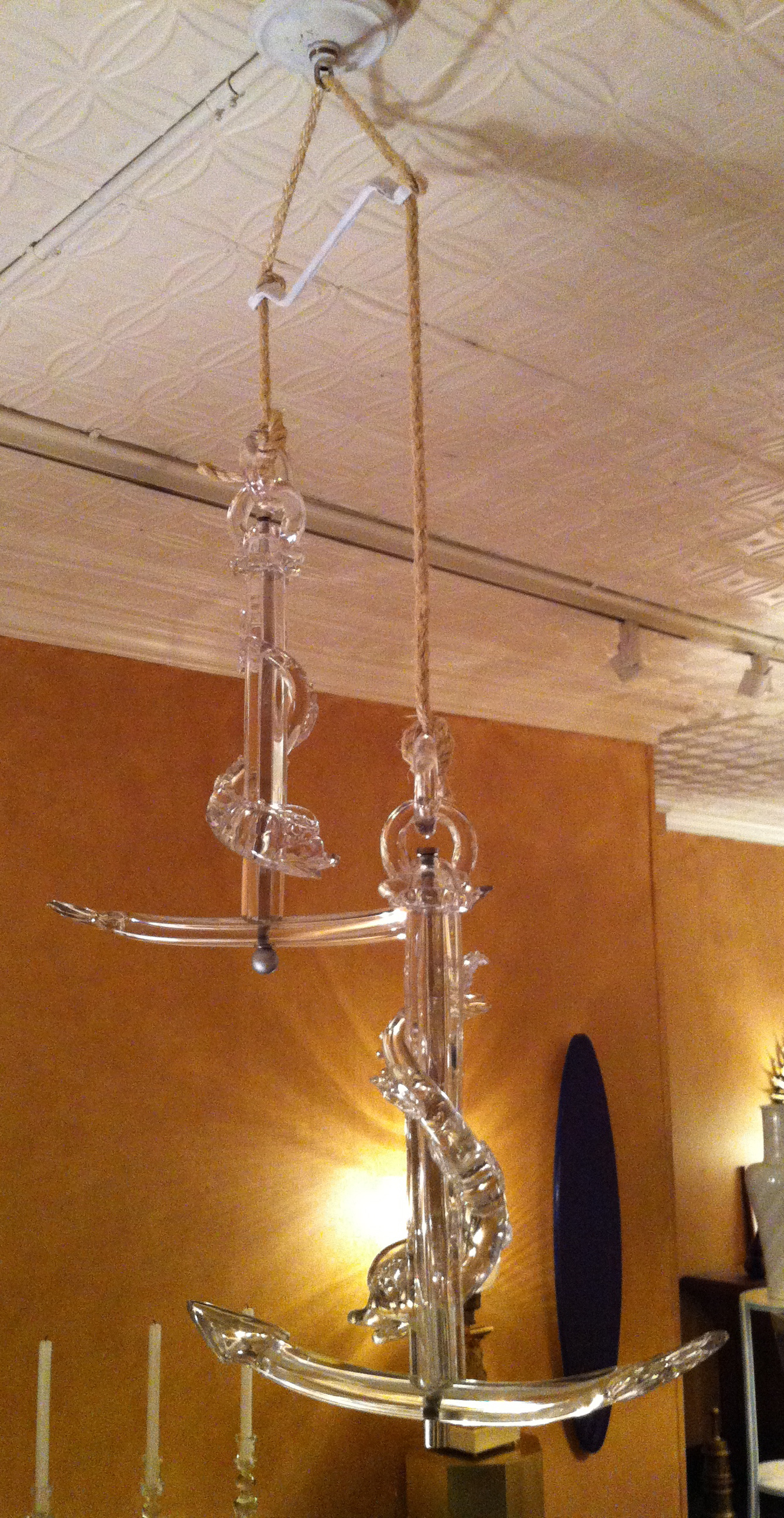
Steuben, American 20th century. Pair of sculptures, 1930s, commissioned by the Grolier Club of New York. 21” high, 17” wide. Sold
Italics, the semicolon, and pocket edition books, are so omnipresent today that it’s difficult to imagine they weren’t always around. Yet they were invented in the late 1400s by Aldus Manutius, a publisher in Venice. Title pages of his books were emblazoned with a dolphin curling around an anchor [below left], a device that paid homage to the city of seafarers where he lived. This being the Renaissance, his best-seller was Aristotle, and his biggest sign up was Erasmus. With a distinguished backlist like that, it’s not surprising the Grolier Club in New York [below right], the society of bibliophiles, commissioned these unique glass sculptures from Steuben Glass. They were probably modeled by Sidney Waugh, a sculptor who was the firm’s in-house designer. As shown here, suspended from simple rope, these striking sculptures would add an erudite sparkle to any interior.
BROOKE ASTOR’S ALBRIZZI COCKTAIL TABLE

Alessandro Albrizzi (1934-1994). Cocktail table. Steel, acrylic, glass. Provenance: Mrs. Vincent (Brooke) Astor. 15 1/4″ high and 48″ in diameter. Sold
Fortune smiled on Alessandro Abrizzi at birth, when he opened his eyes for the first time and took in the gilded splendor of his family’s ancestral palace. Even in Venice, a city famous for an abundance of them, the Palazzo Albrizzi stood out for its beauty and the magnificence [below left]. All this he would one day inherit, but the title of baron was his from the get go. In hindsight, one is tempted to say this scion of a proud line was fated to have “an eye.”
Albrizzi [below right] had an industriousness not often encountered among aristocrats. Initially he made a name for himself as a photographer. He then went on to achieve fame, and a bit of a fortune too, as a designer of furniture, which can best be described stylistically as “mod.” Appropriately enough, he opened his first shop in swinging ’60s London, where he sold his line of geometric carpets by the yard, steel director’s chairs upholstered in suede, objects cut from acrylic — known as Perspex in England — and acrylic and glass tables mounted in steel or brass.
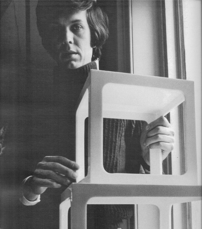
A snob, Albrizzi couldn’t abide anything shoddy. His fastidiousness lead him to have his modern designs made by hand, rather than mass production by machine. No wonder his “Perspex was cut like diamonds — so expensive,” according to Mary Jane Pool, a magazine editor and a friend of the designer. And since anything expensive in a capitalist society is exclusive, his elegant furniture attracted “the beautiful people,” like Egon and Diane von Fürstenberg, the Agnellis, Princess Margaret, and fashionable decorators like David Hicks, Billy Baldwin, and Jansen of Paris, among others.
With shops in London, Rome, and Paris, in 1968 Albrizzi moved to New York and opened another one at 989 Madison Avenue, in the Carlyle Hotel. There, Mrs. Vincent Astor found this elegant cocktail table with curved sheets of transparent acrylic, mounted in steel, which was crafted like jewelry. In her sixties at the time, and a grand dame in training, giltwood and marble was more her thing than steel, glass, and acrylic. But her younger jet-set friends were buying it — and who doesn’t want to be in the swim? Besides, the baron was so charming. So a sale was made, and another bold-face name was added to Albrizzi’s distinguished client roster.
PAIR OF SYRIE MAUGHTAM SIDE CHAIRS

Syrie Maugham (1879-1955), English, 20th century. A pair of painted-and-gilded chairs, 1930s. 36” high. Sold
The English decorator Syrie Maugham [below left] is remembered for two things: a failed marriage to the famous novelist Somerset Maugham, and creating a vogue for the all-white interior. Known as the “white queen,” her affinity for royalty extended to decorating for King Edward VIII, thanks to a referral from another client, Mrs. Wallis Warfield Simpson, for whom the king famously abdicated. When Maugham wasn’t stripping original finishes off antique pieces and painting them white, she was having white-painted furniture made to her specifications. Since she wasn’t the type to sit at a drafting board, her designs were mostly stylized versions of favorite antique pieces. For example, this graceful chair model, which turns up in many of the rooms she decorated, like the sitting room of her daughter Liza Paravicini inLondon [below right], appears to be Maugham’s own streamlined take on a Swedish rococo model.
R. LOUIS BOFFERDING FINE & DECORATIVE ART
141 EAST 62nd STREET NYC 1065
TELEPHONE 917.572.5041 LOUIS.BOFFERDING@VERIZON.NET
