FEATURED INVENTORY
by Louis Bofferding
VISIT “JUST IN” TO SEE OUR LATEST ARRIVALS
![]()
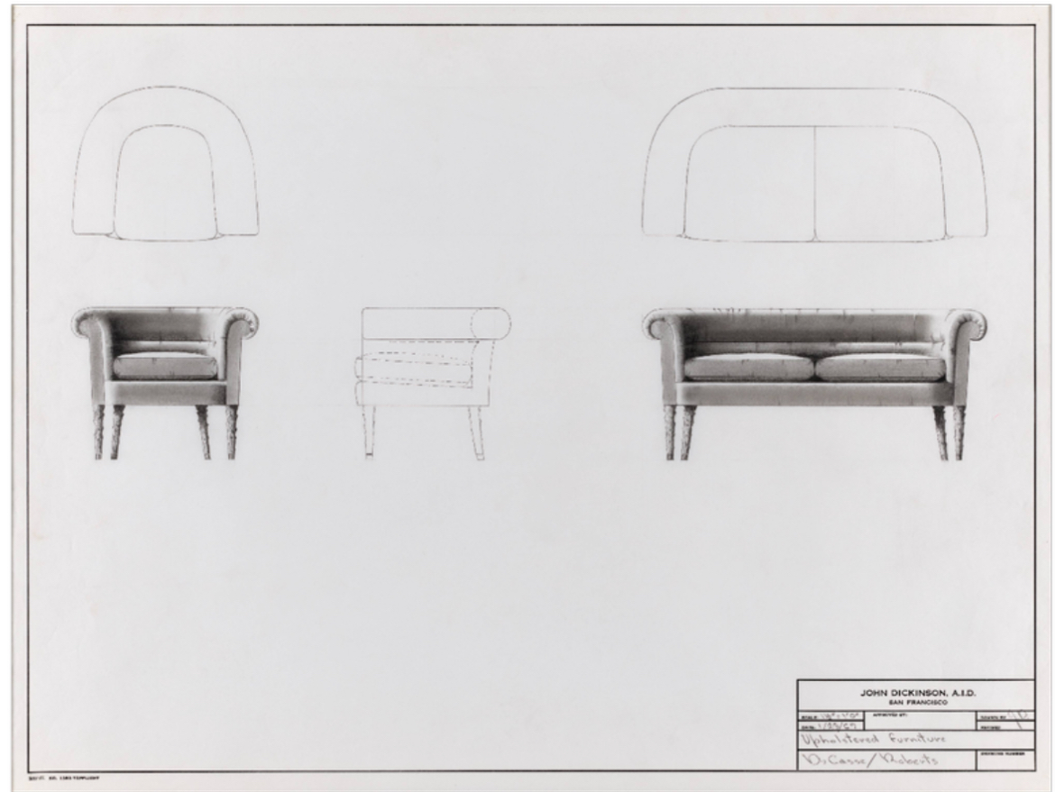
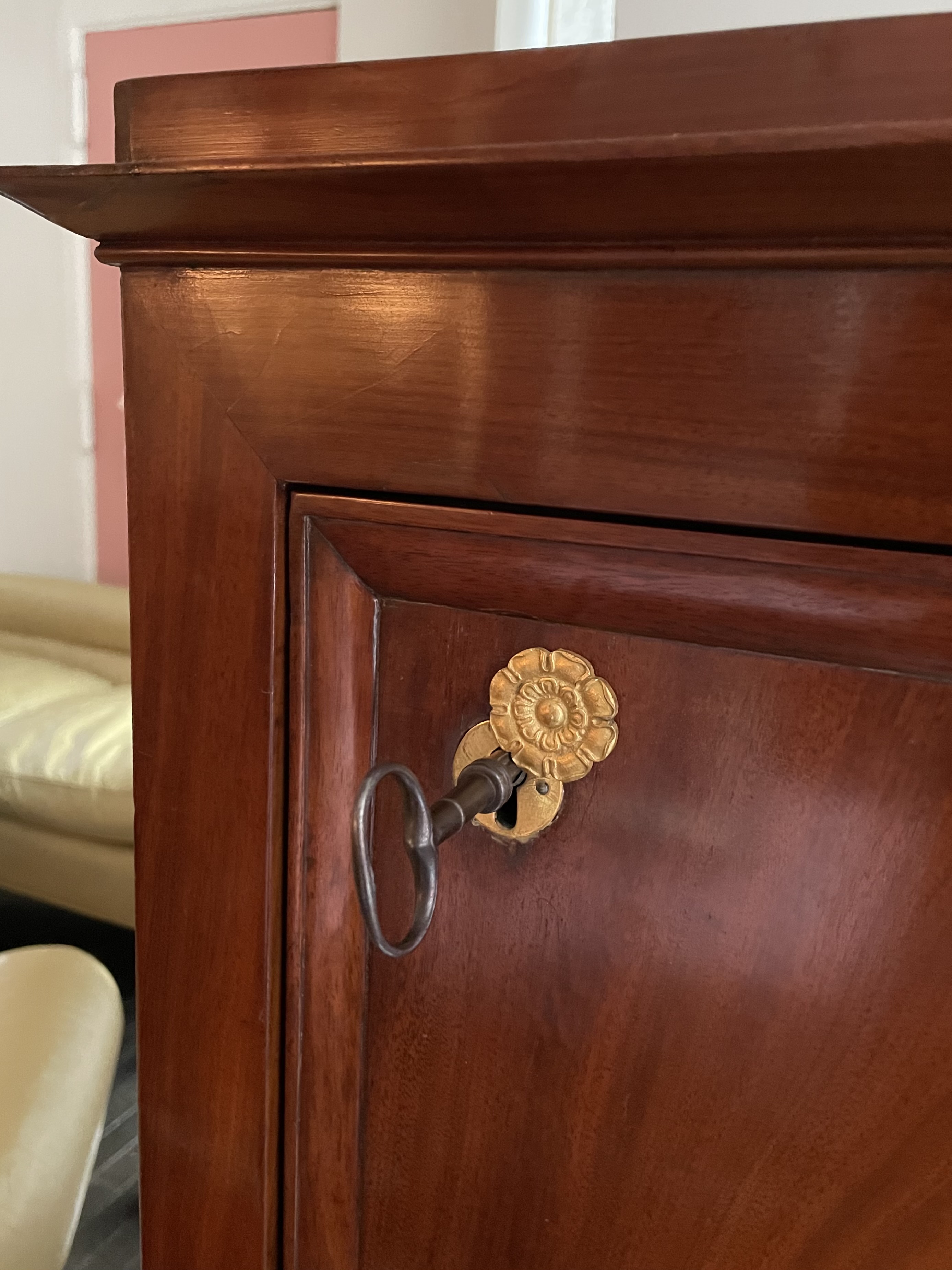
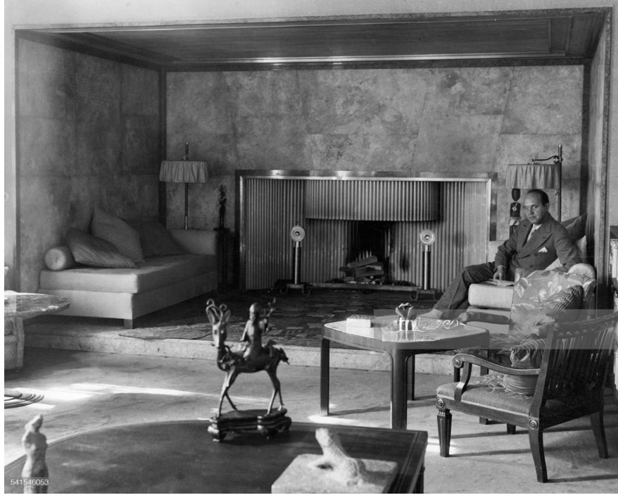
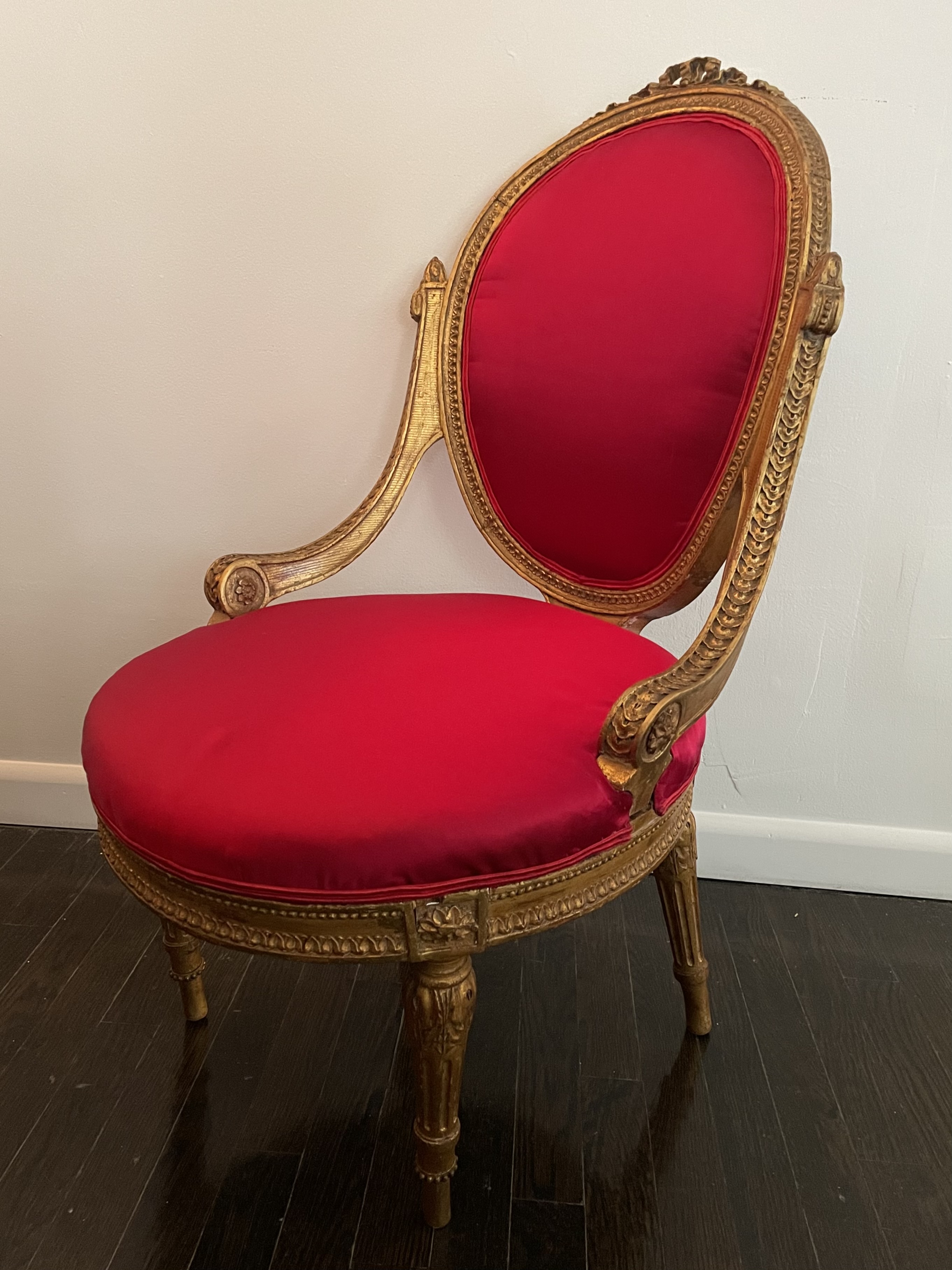
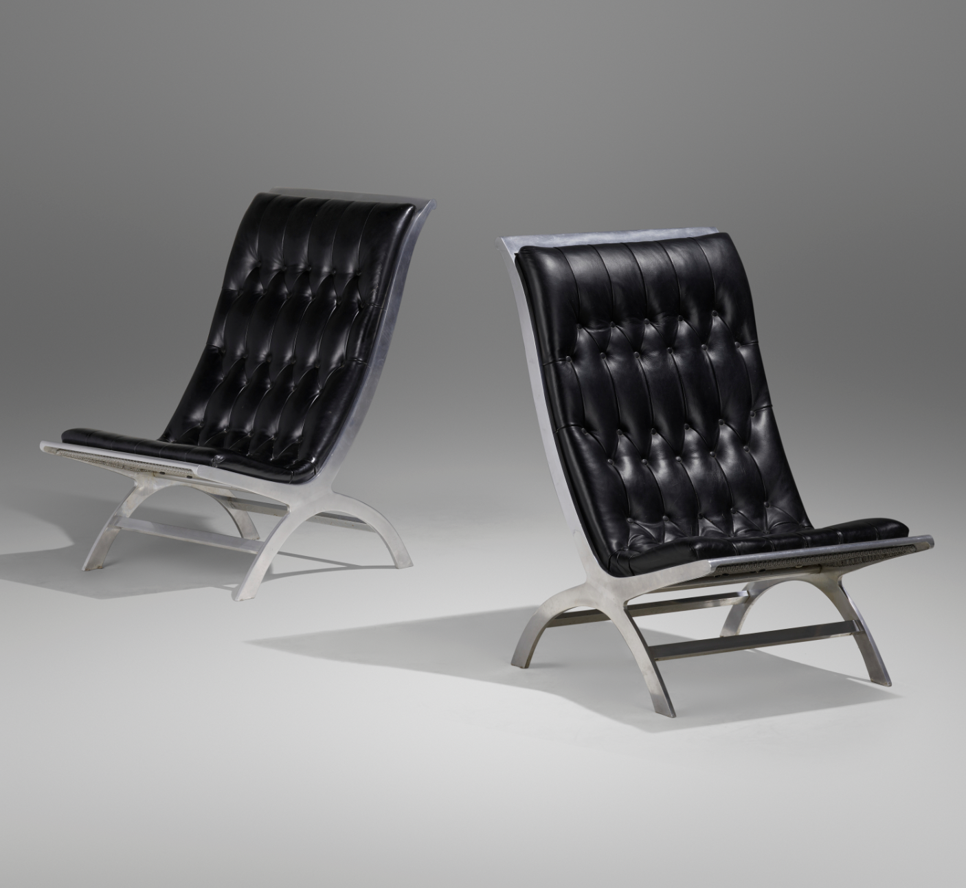
JOHN DICKINSON SEATING SUITE
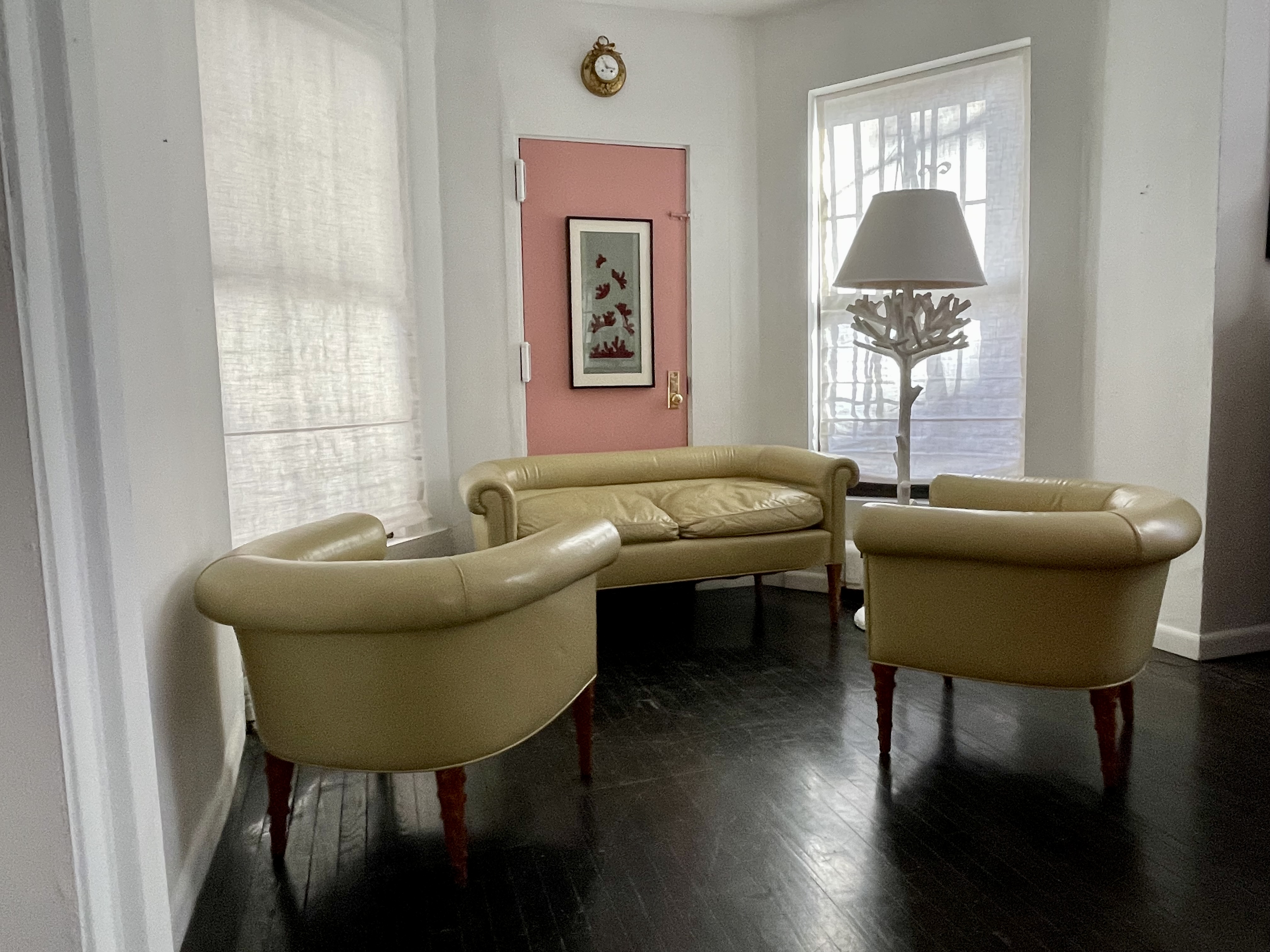
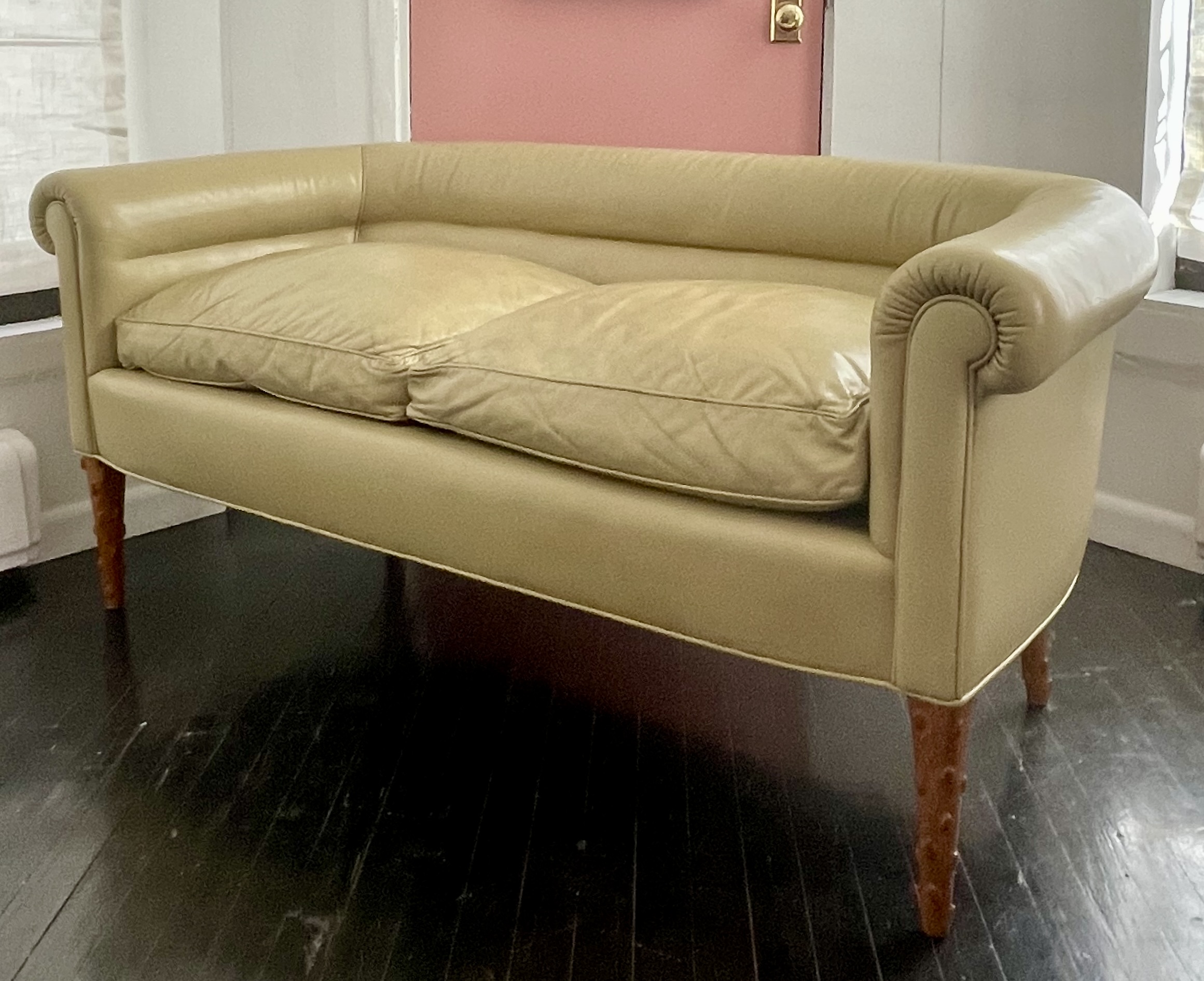
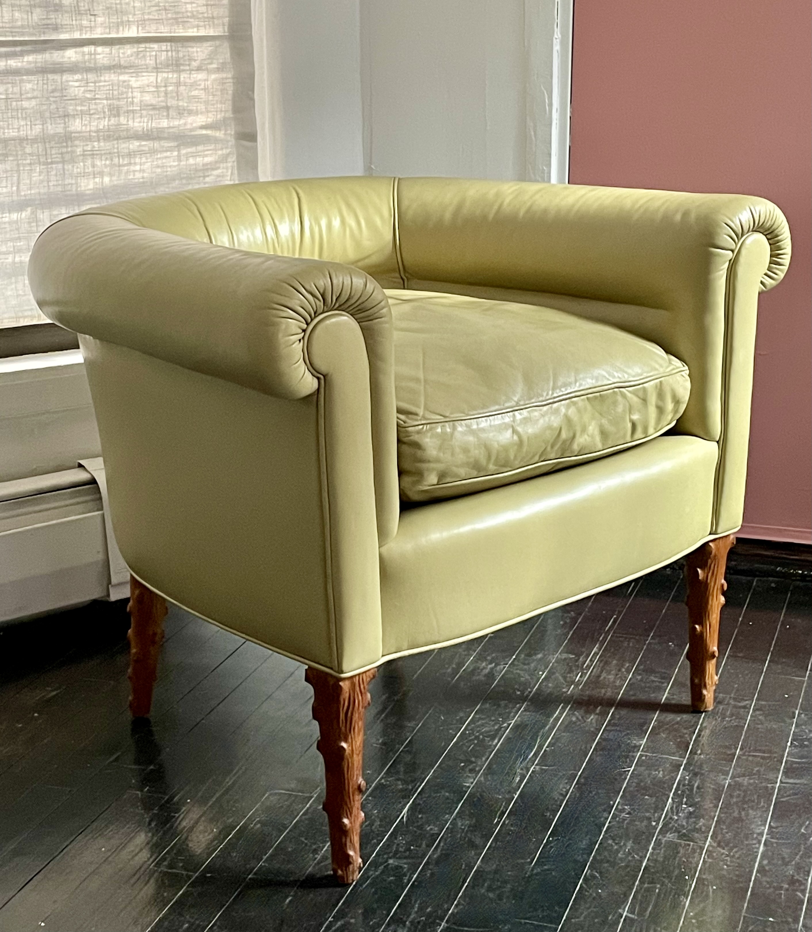
John Dickinson (1920-1982) sofa and pair of armchairs, circa 1967. Carved wood, leather upholstery (each mounted with Dickinson’s silk fabric label). Sofa H: 26” L: 61” D: 29”; armchairs H: 26” L: D: 33” 29” each. Provenance: John Dickinson, San Francisco; Carlene Safdie. $50,000
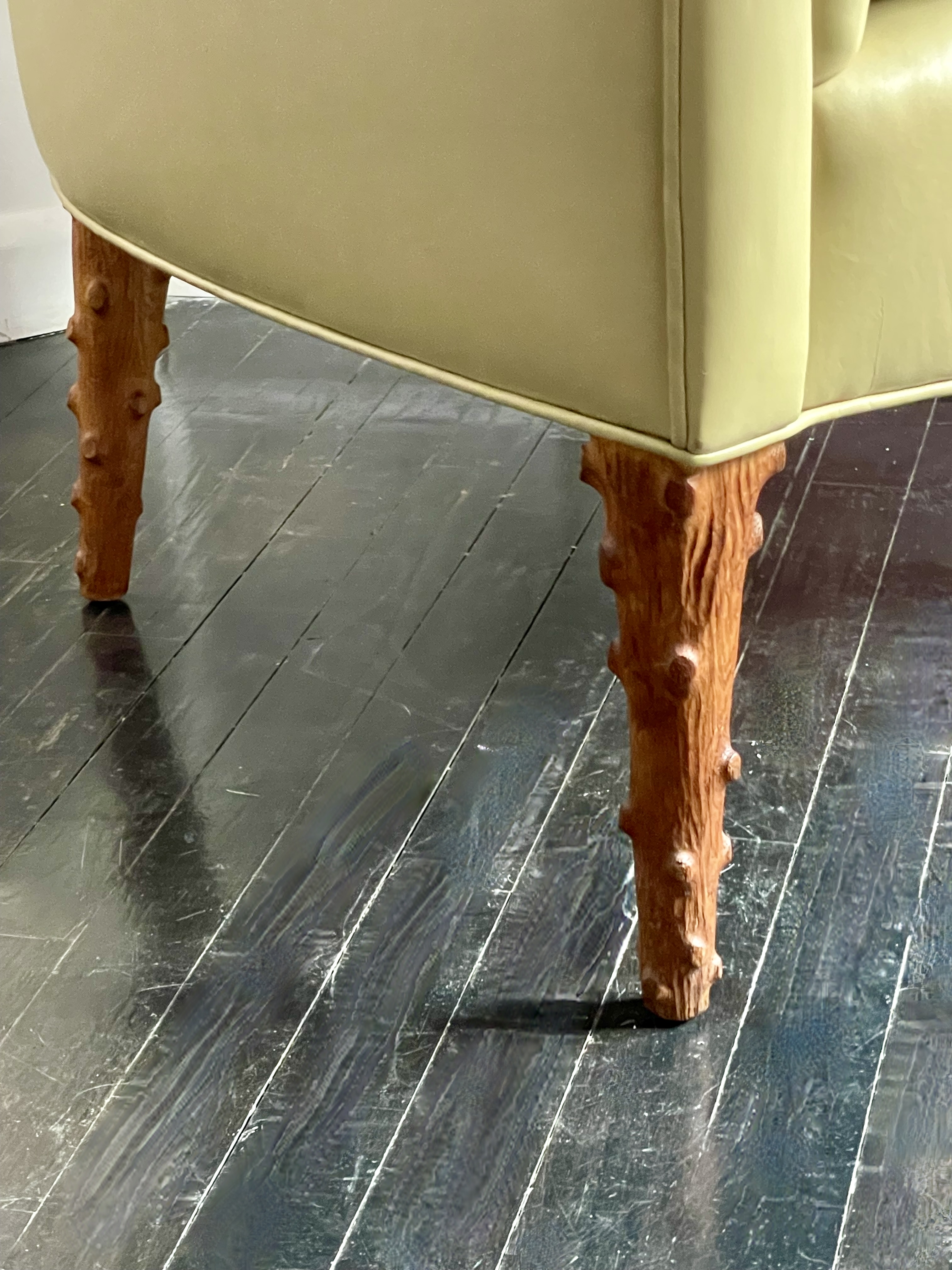
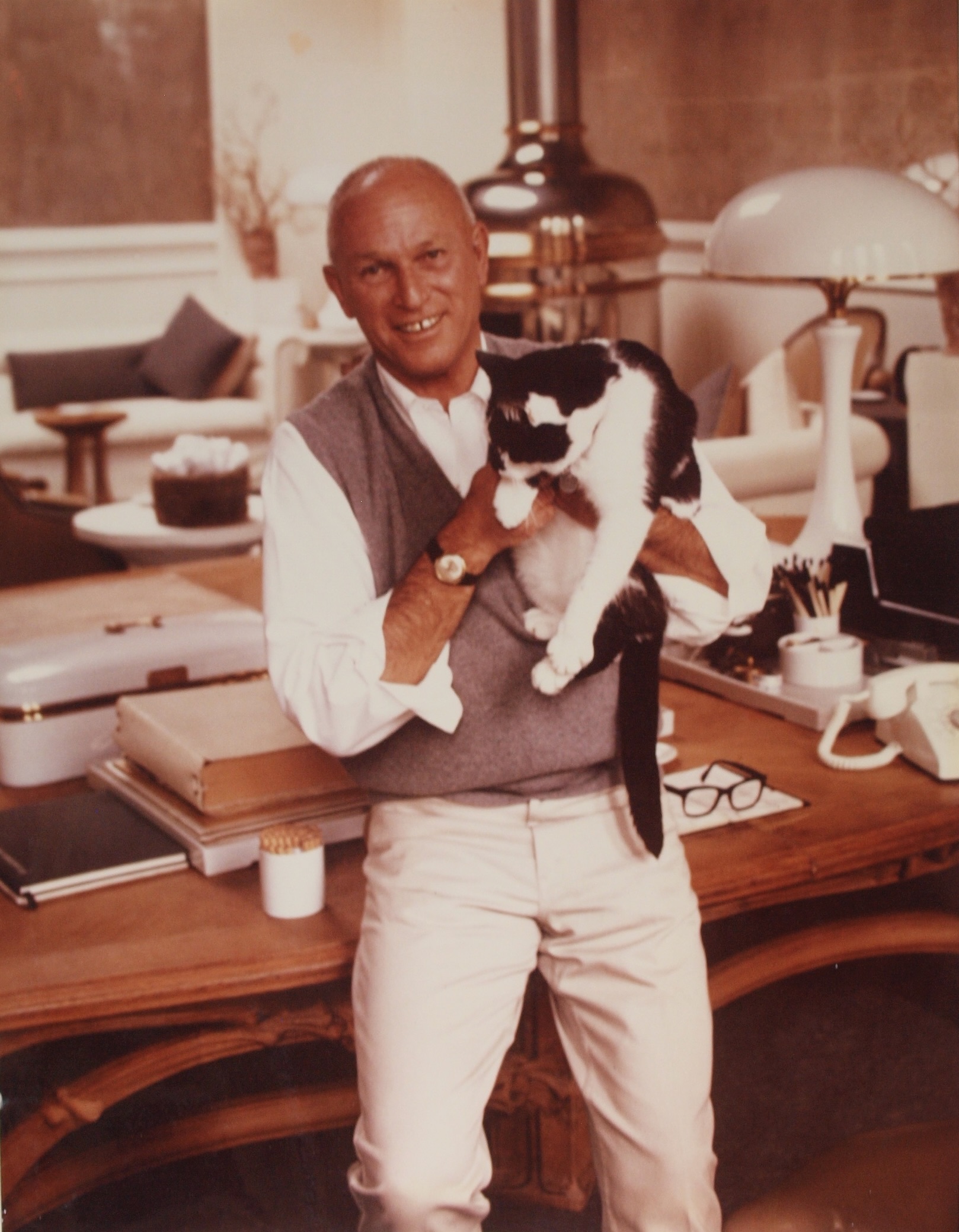
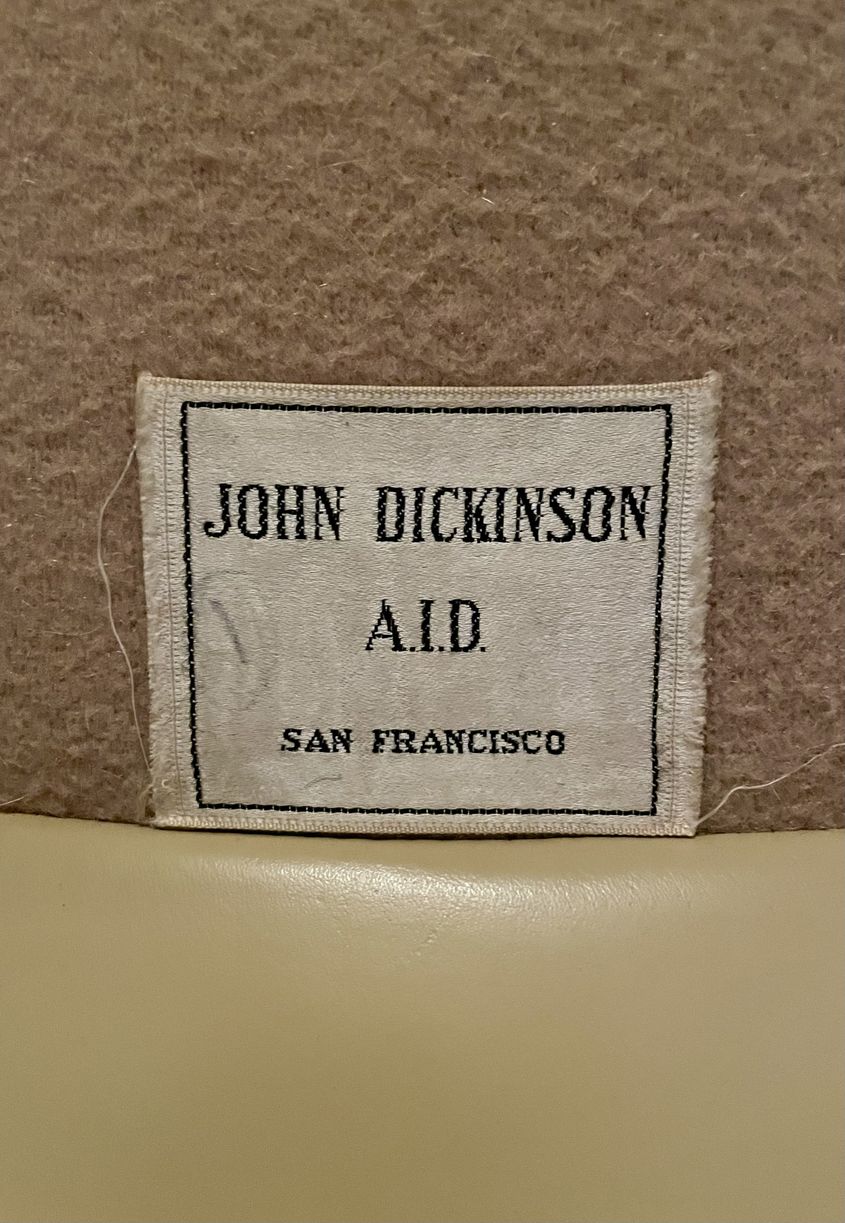
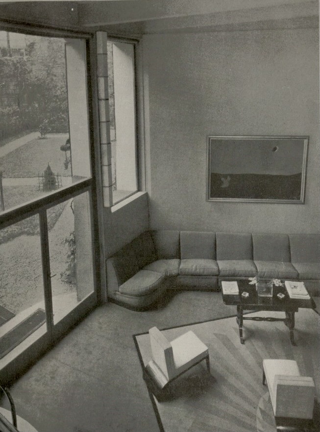
John Dickinson designed this low-slung sofa and matching pair of armchairs for his own home, an 1893 San Francisco firehouse that miraculously survived the 1906 earthquake and fire. The legs were hand-carved to resemble tree branches, and the original butterscotch-colored-leather upholstery remains, specked with tiny claw marks from Dickinson’s cats (his favorite, Bertie, short for Bertrand Russell, is seen in his arms in the photo). Discretely sewn to the frames beneath the cushions are labels that bear the designer’s name, location, and membership in the American Institute of Decorators, the precursor to the ASID. This clever conceit was inspired by fashion-brand labels — Dickinson himself favored Saville Row suits, Missoni, and Brooks Brothers – blurring the distinction between the design and fashion worlds, which wasn’t common then as it is today.
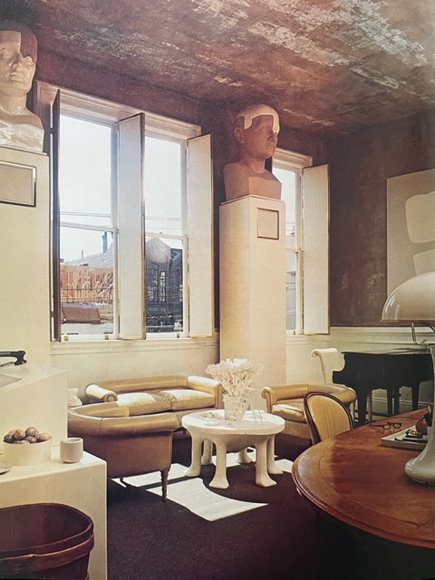
One other nearly identical seating group was made for his friend and client Ralph DuCasse, an abstract painter who created the two minimalist white-on-white canvases that Dickinson hung opposite each other in the firehouse, adjacent to our seating group [below right]. The DuCasse suite differs in having brass-capped feet, and puce-colored-leather upholstery. Ours were inherited, along with the rest of his estate, by his client, friend, and muse Carlene Safdie, from whom we acquired them.
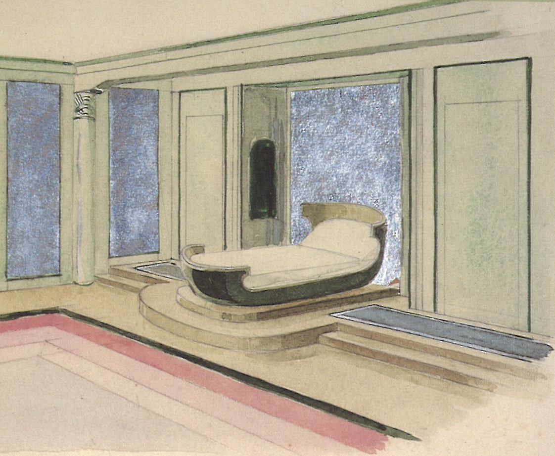
Dickinson’s beautifully rendered design for both sofa and chairs [below], along with all of his working drawings, were donated to the San Francisco Museum of Modern Art by Ms Safdie. As they make clear, when designing, he took inspiration from diverse art-historical styles and cultures, including the ancient world, 18th-century France, Art, Deco, and African art. In so doing he faced head on the post-modernist dilemma that, as he said in a 1978 interview, “somehow, somewhere, it’s all been done before.” And yet, he continued, with “so many ways to say the same familiar things, originality is paramount.” Our suite is a synthesis of the tree-branch motif, which is as old as time itself, and the 1930s Streamline Moderne. That he was able to combine such disparate sources so artfully and seamlessly is just one reason we consider Dickinson to be America’s preeminent designer of his generation.
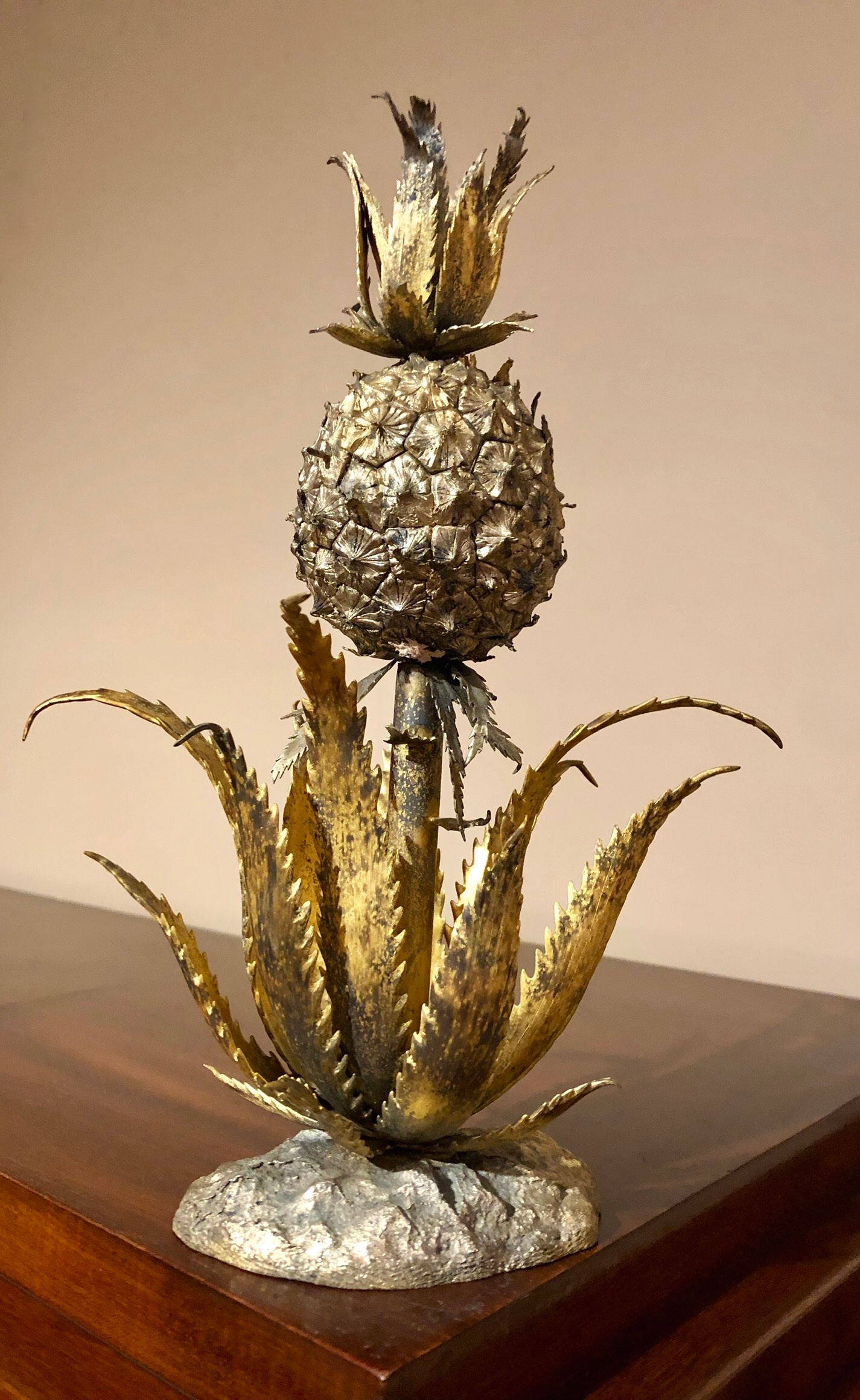
JOHN DICKINSON UNIQUE STANDING LAMP
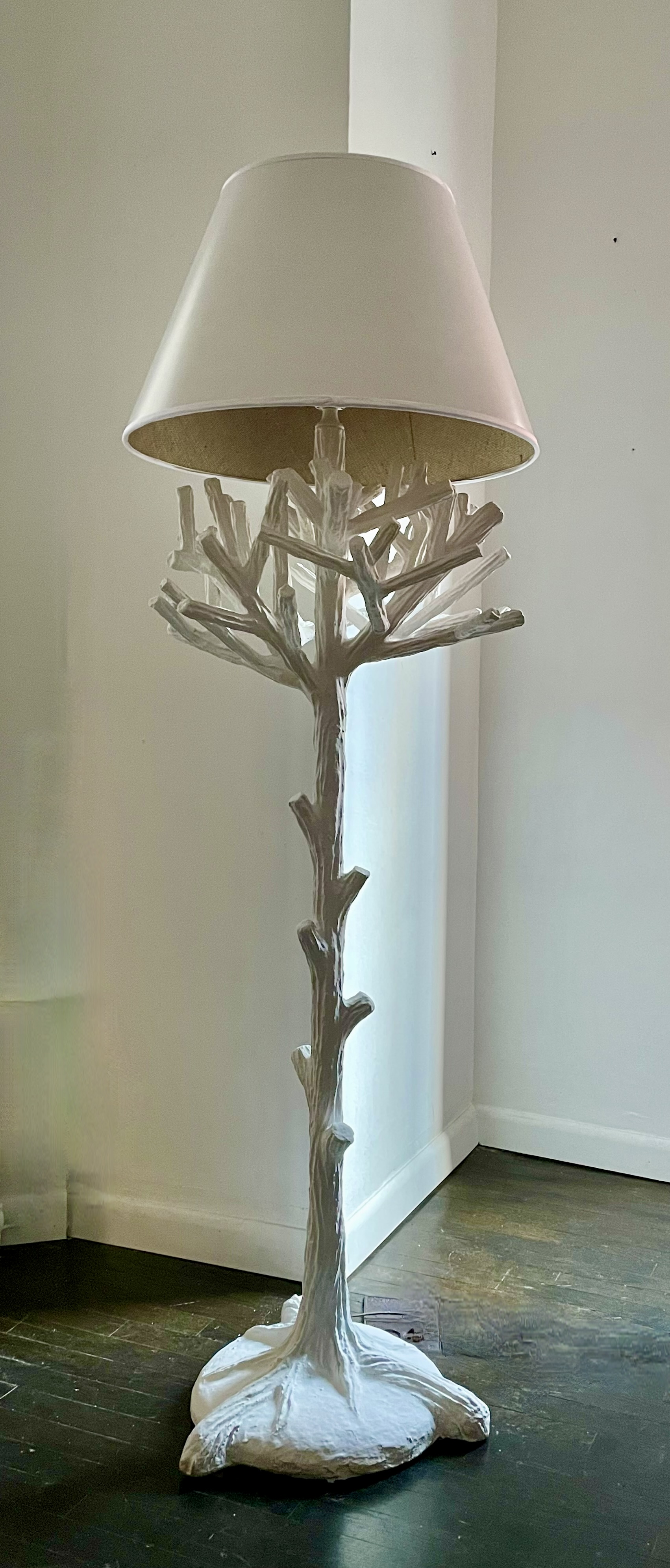
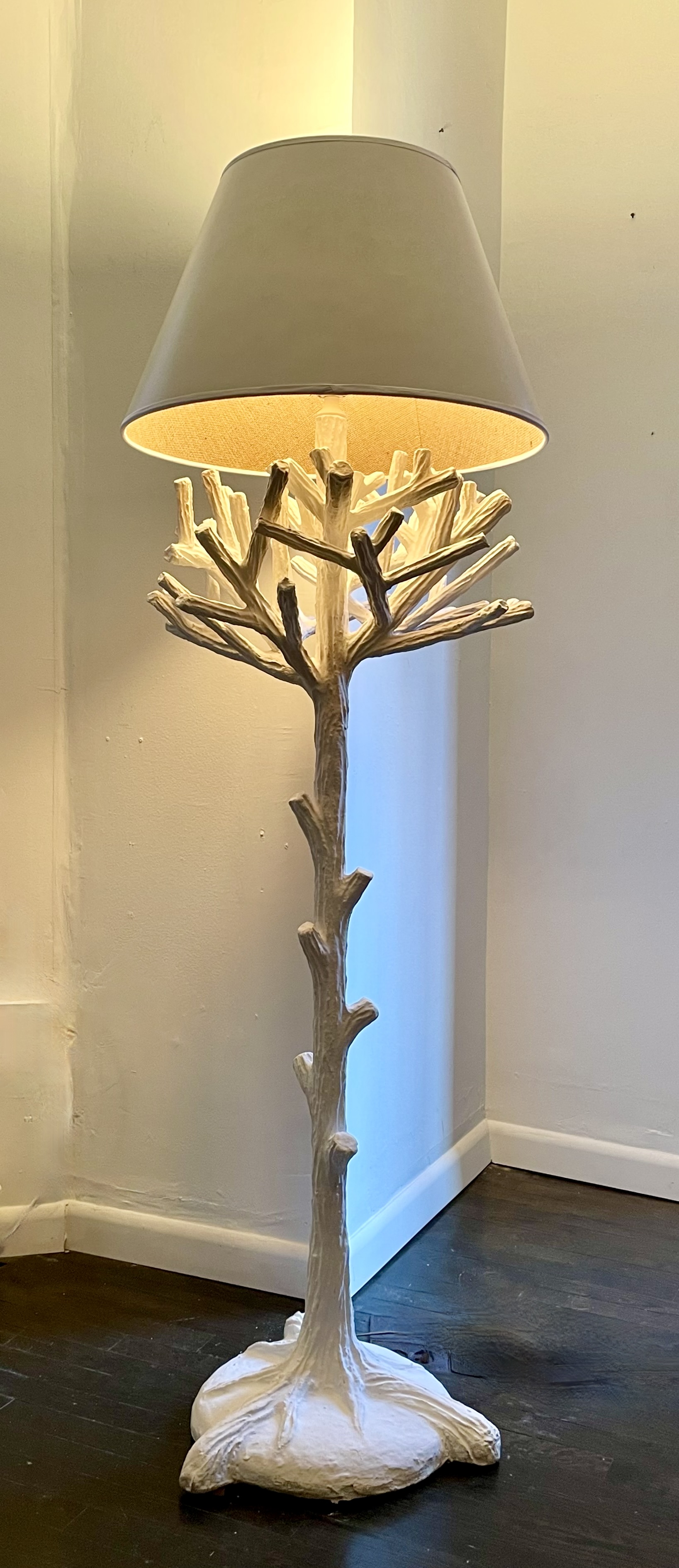
John Dickinson (1920-1982) standing lamp, circa 1970. Plaster over metal armature. H: 64” Dia: 19” (22” with shade). Provenance: John Dickinson, San Francisco; Carlene Safdie. $25,000
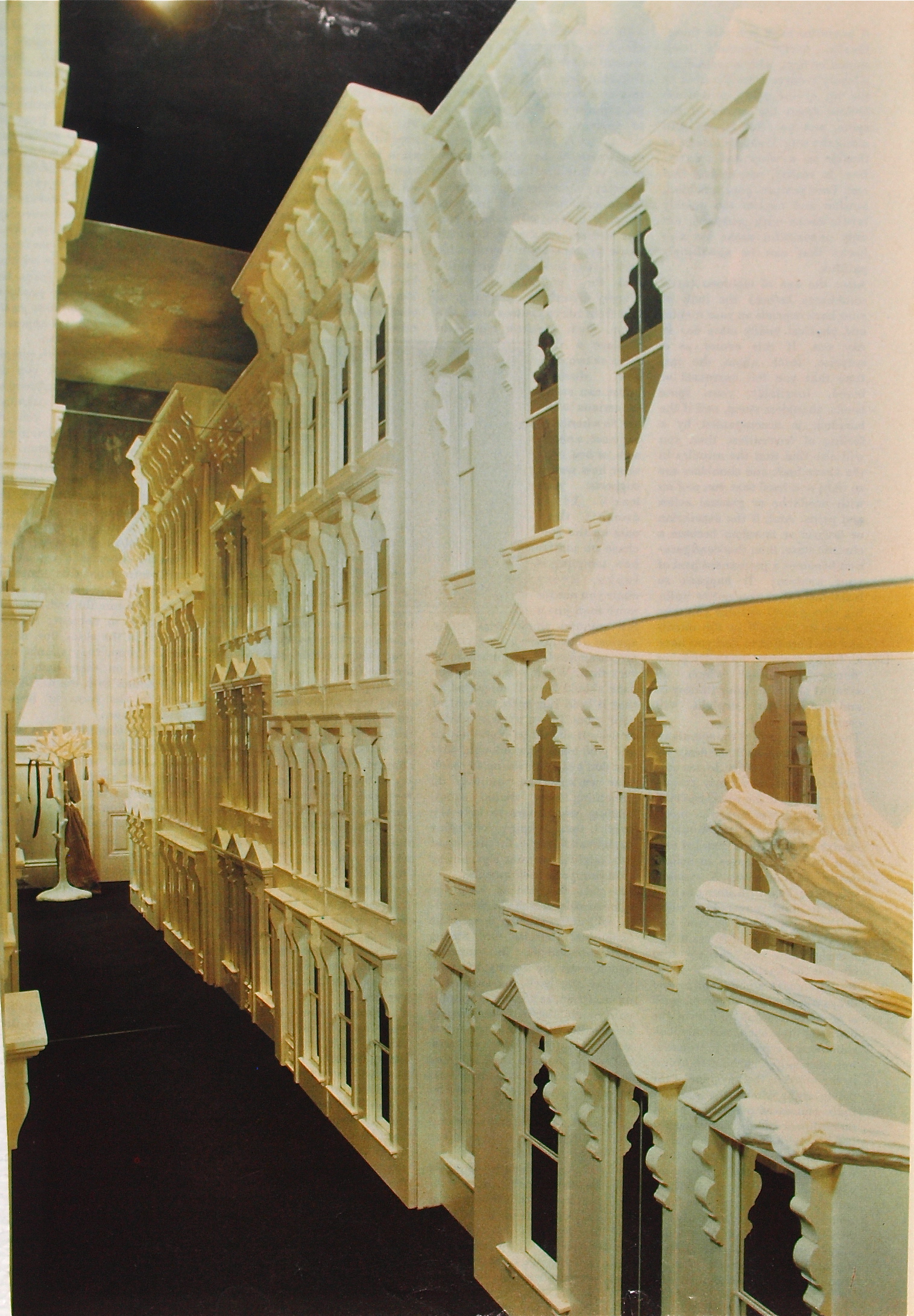
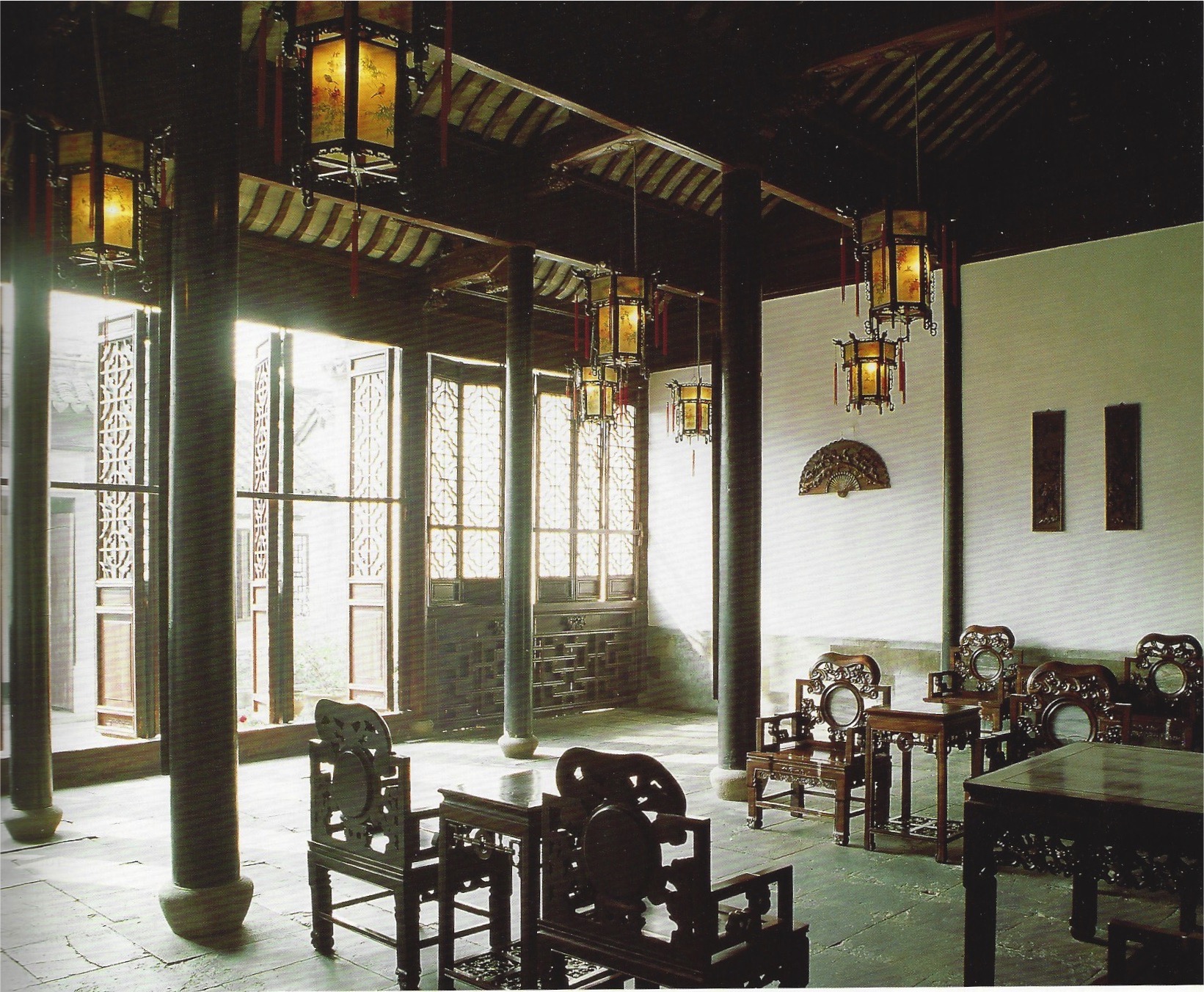
John Dickinson designed this standing lamp in the form of a tree, and modeled the plaster to replicate roots, bark, branches and twigs. Witty and idiosyncratic, only two of these lamps were made — both for the San Francisco firehouse that he called home. They anchored the ends of a long corridor that was lined with closet doors, which were encrusted with millwork and mirrors [below left] to mimic the Victorian gingerbread townhouse facades he saw from his windows.
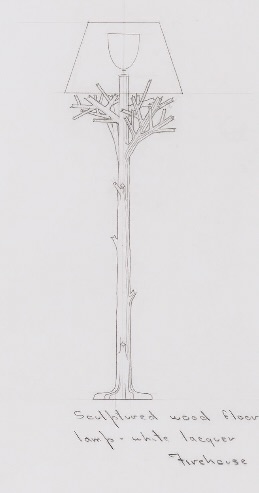
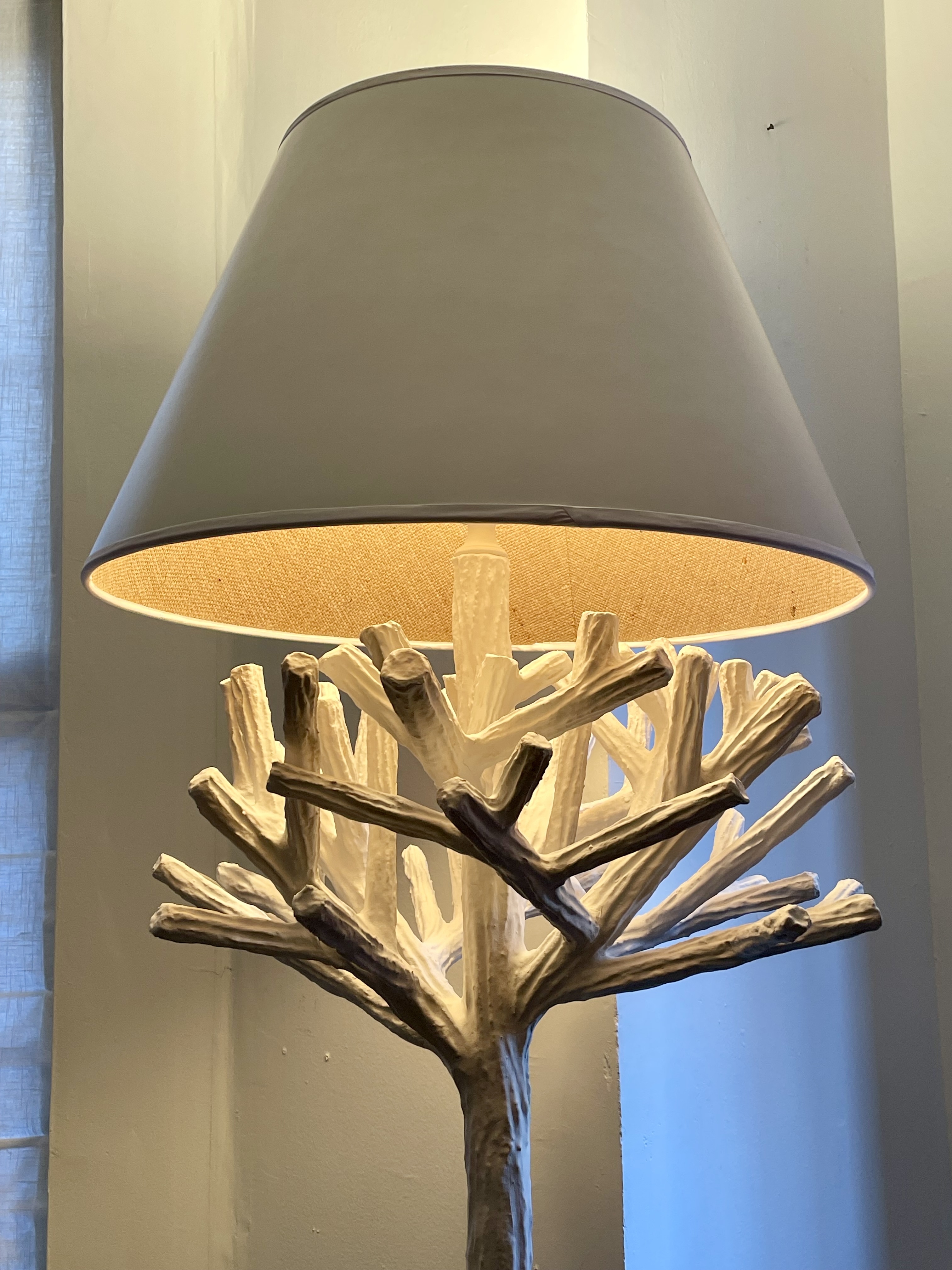
Dickinson’s working drawing for the lamp is in the collection of The San Francisco Museum of Modern Art [above middle]. When designing it, he took into account how it would look when switched on [above right]. If this sounds like par for the course, it isn’t. Most designers come up with a base that’s more or less sculptural, or has surface decoration, or both, with the result looking pretty much the same when turned on and off. This lamp, however, is transformed when it’s switched on, because the branches catch and fracture light, forming a spiky halo. As for the lampshade, since the original had long since disappeared, we had one made that replicates the original. It’s lined with the tan hopsacking Dickinson often used for this purpose, in addition to colored felt and pink Oxford cloth matching his Brooks Brothers shirts. On occasion he also had shades made from galvanized tin.
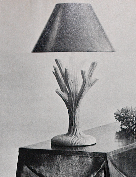
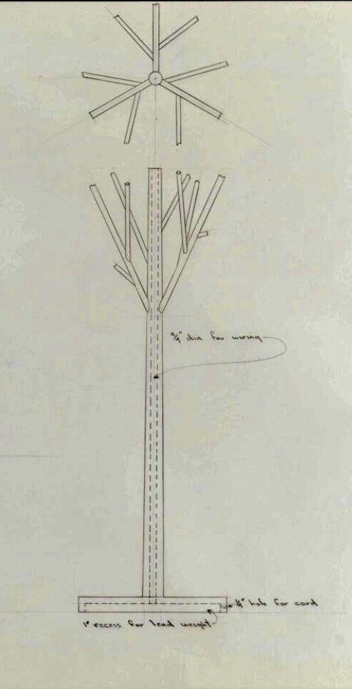
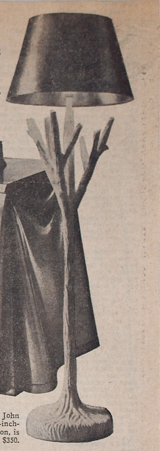
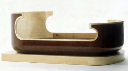
The branch motif was one of Dickinson’s. favorites. It can be seen in the legs of our sofa and chairs, and some of his other lighting fixture designs. Other examples are a plaster table lamp that’s a truncated version of our standing one [above left], and two standing lamps [above center and right] that are skinnier, pruned versions of our bushier and more substantial one. Dickinson intended our lamp and its mate to be carved from wood, but he came to think better of it, and had a multi-pronged, metal-frame core made that was covered in plaster. The reason is that the branches had to be strong enough to hang his clothes on. One of the lamps can be seen put to this use in that photograph showing them in situ. And so, Dickinson saw to it that his design did double duty as a lamp and “silent valet” – or, rather, triple duty, since it also functions as a sculpture, pure and simple.
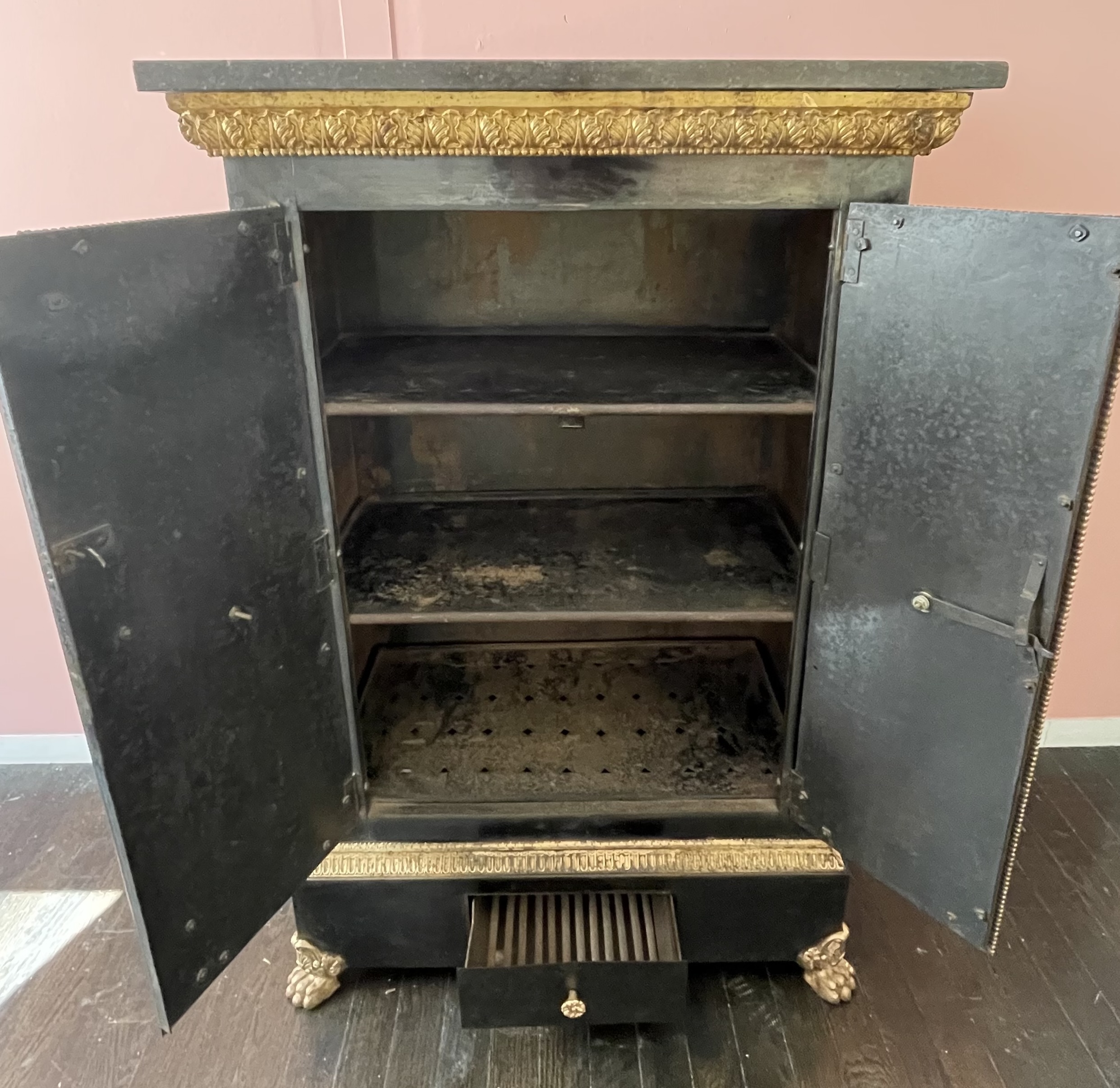
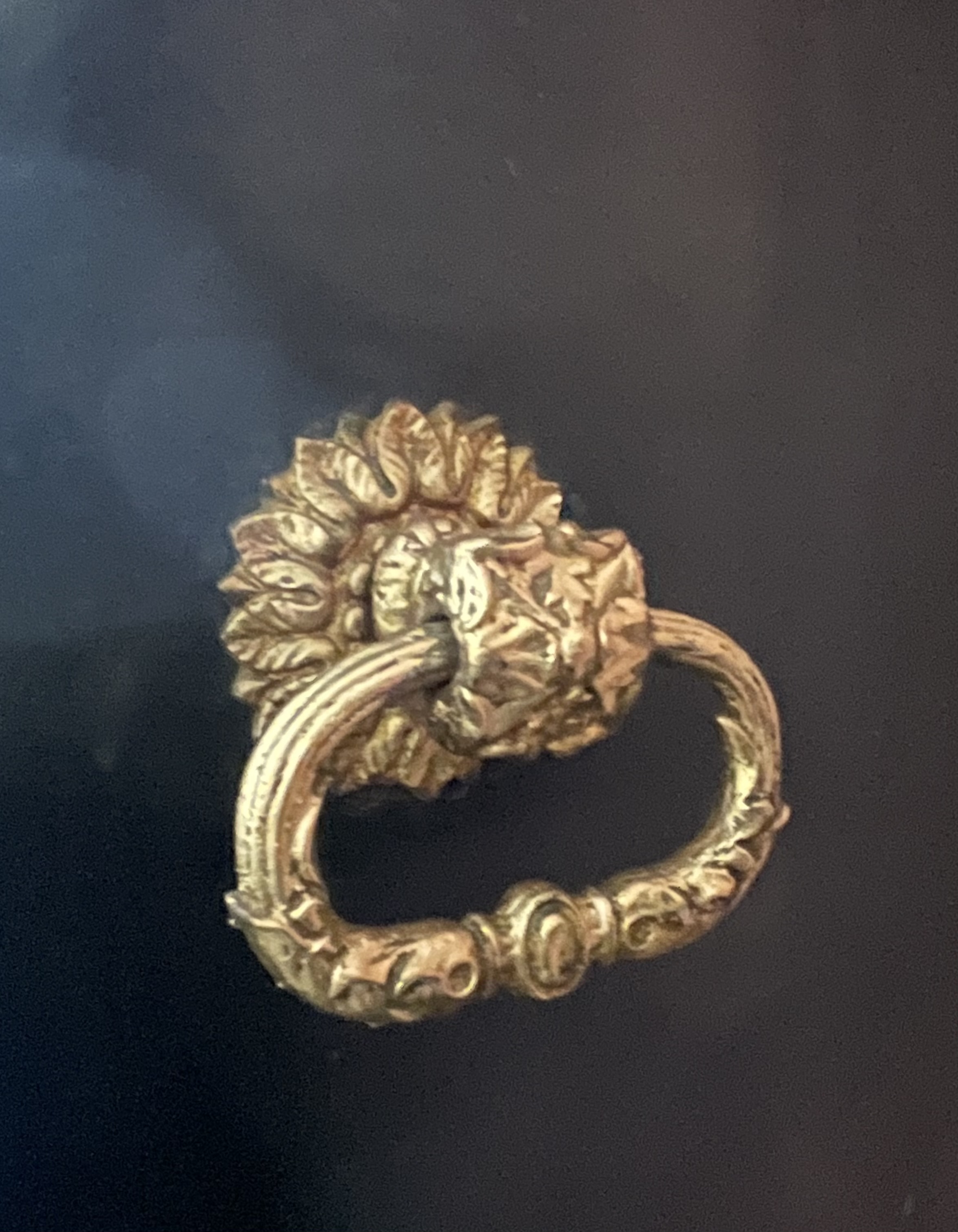
LOUIS-PHILIPPE METAL CABINET
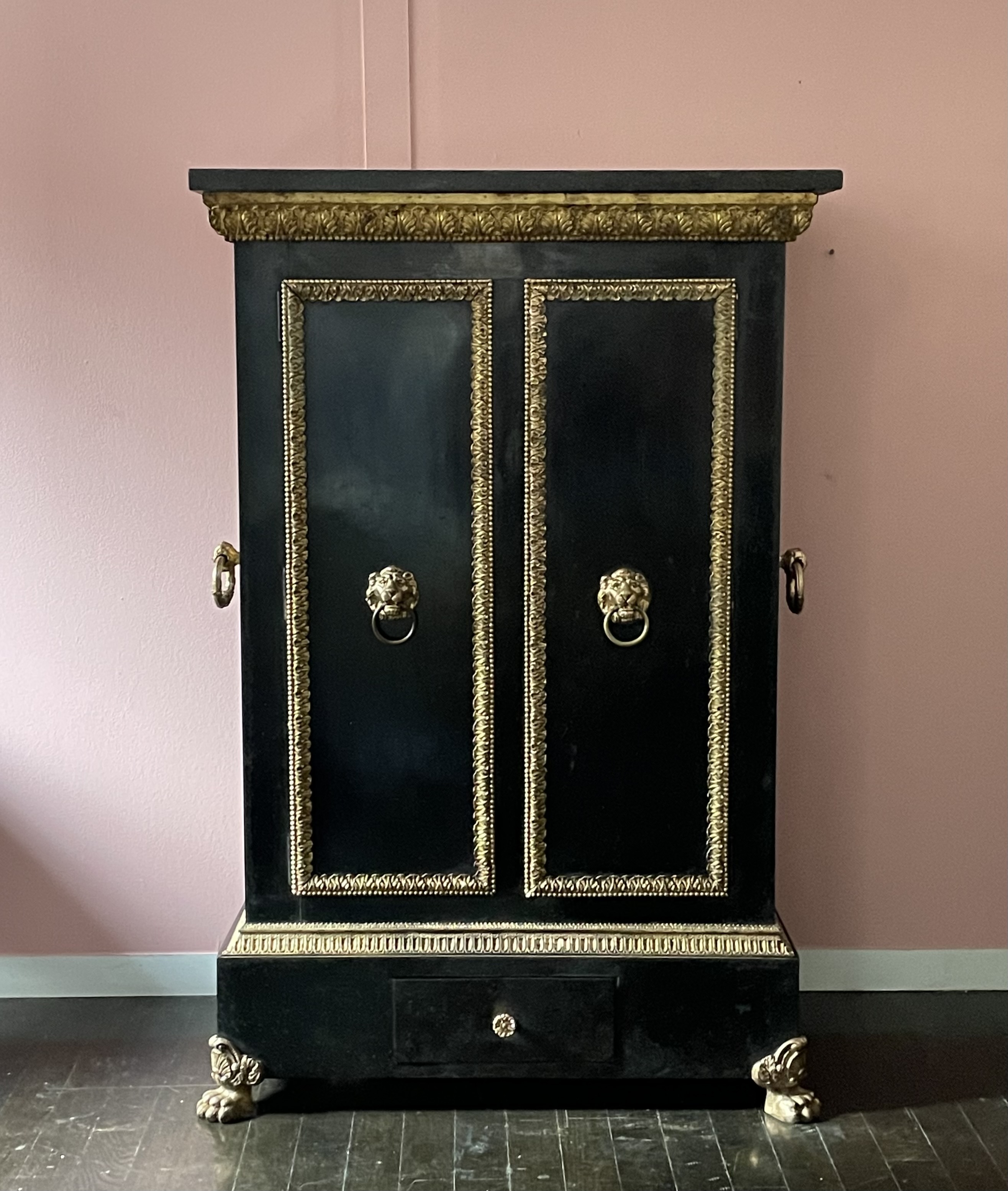
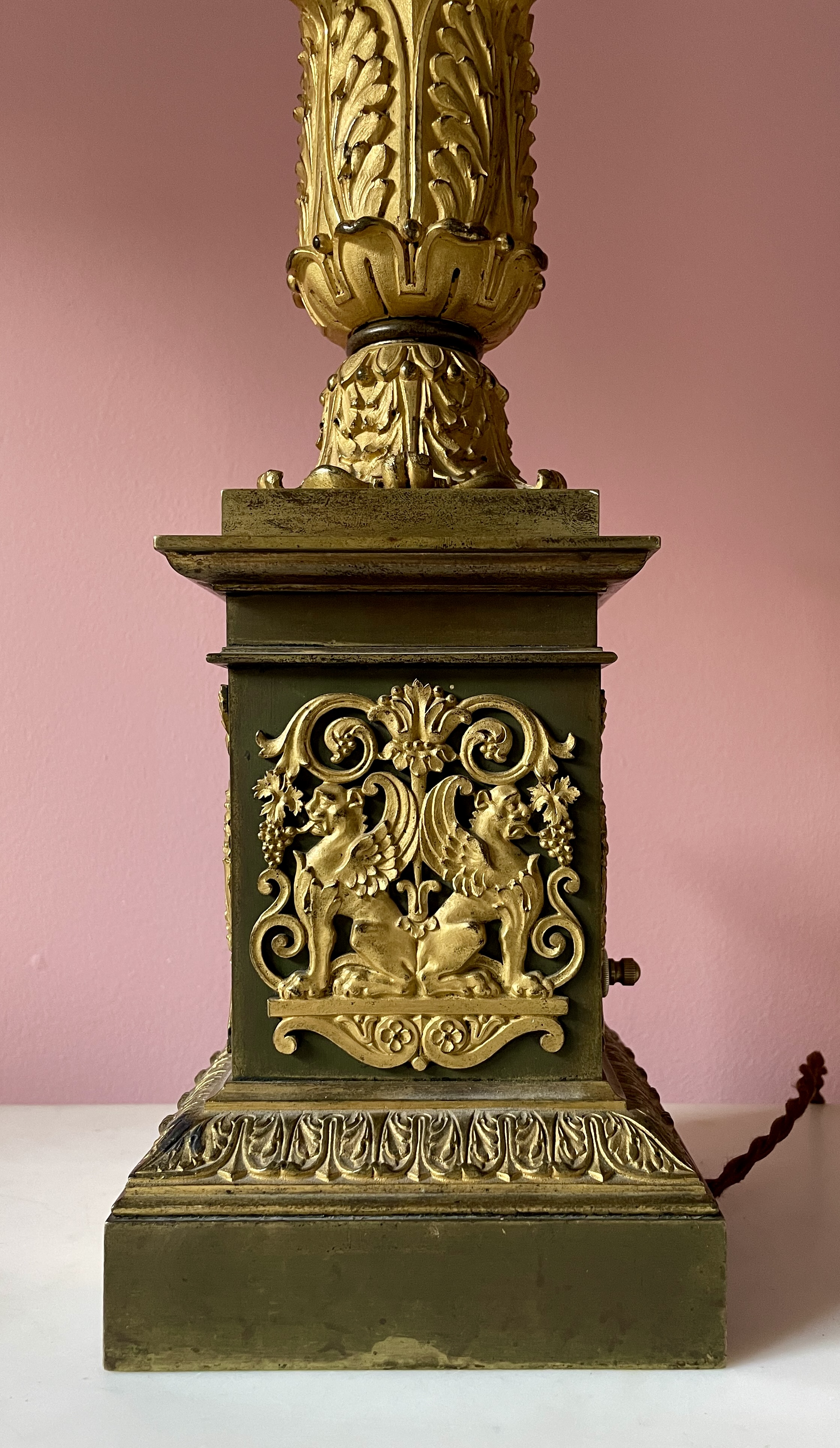
Louis-Philippe cabinet (chauffe plaque, or plate warmer), circa 1840. Cast iron & sheet metal, painted & gilded, fossilized-marble top. H: 41″ W: 27 1/4″ D: 15″. $8,500
This cabinet is made entirely of metal, and topped with a fossilized black-marble top. It’s a chauffe-plaque, and as such was designed to keep plates and food from going cold during the course of a meal. That’s why there’s a drawer at the bottom for hot coals, and perforated shelves inside to permit the circulation of hot air within. The two handles on either side are for moving the cabinet hither and yon, depending on where the meal was to be served, since, in early 19th century France dining was an ambulatory affair (at the time, the English “dining room” was just beginning to gain ground across the Channel). That said, the heavy marble top, well-suited for dishing out food, would make one think twice about moving it. And so, it probably remained stationary in a home or office, with handles that were little more than a design holdover from the typical brass chauffe-plaques that were carried from campfires to officers’ tents on military campaigns. This domestic type, however, which is lavishly mounted with Neo-Classical gilt ornaments, is more of a rarity.
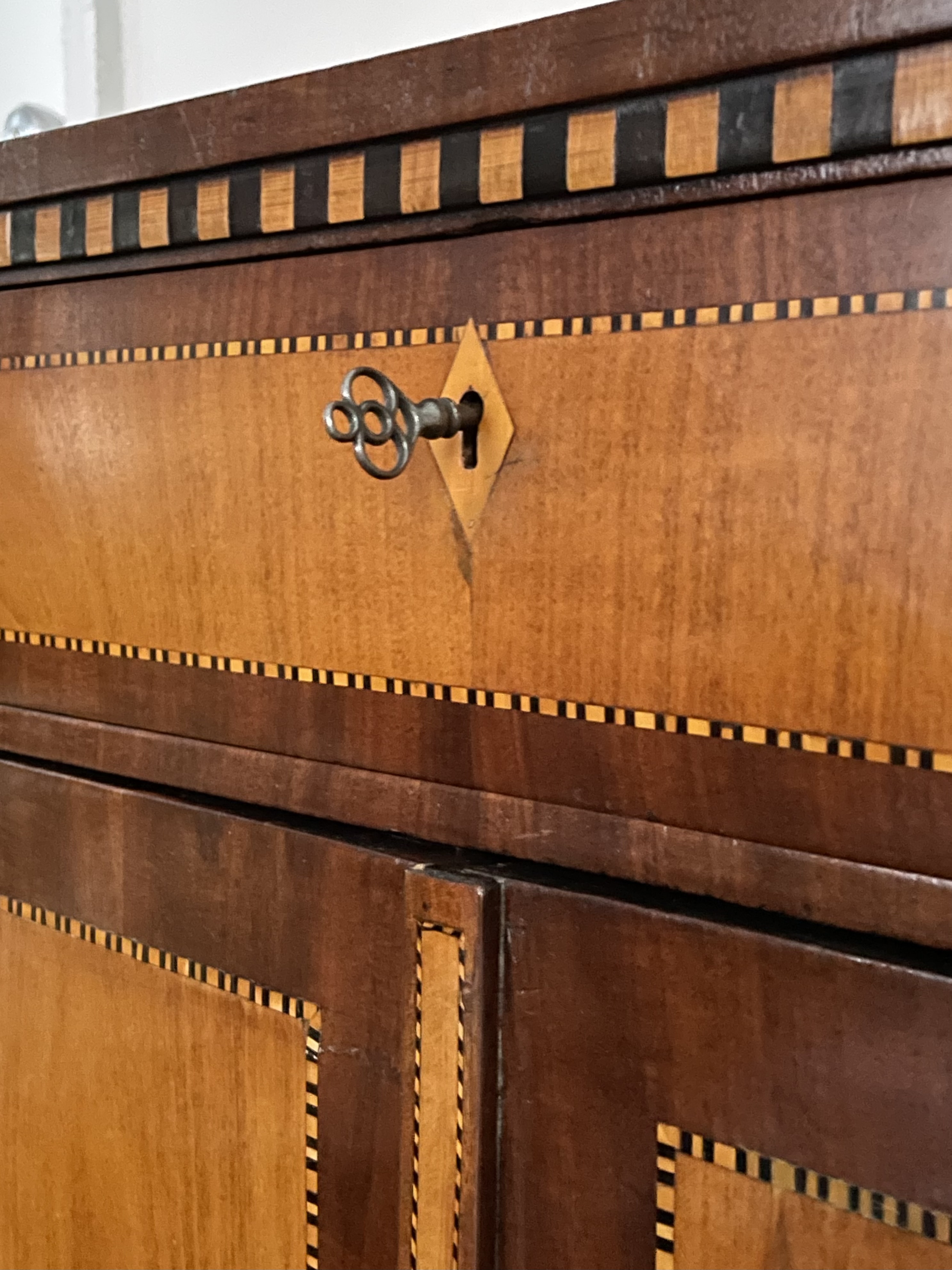
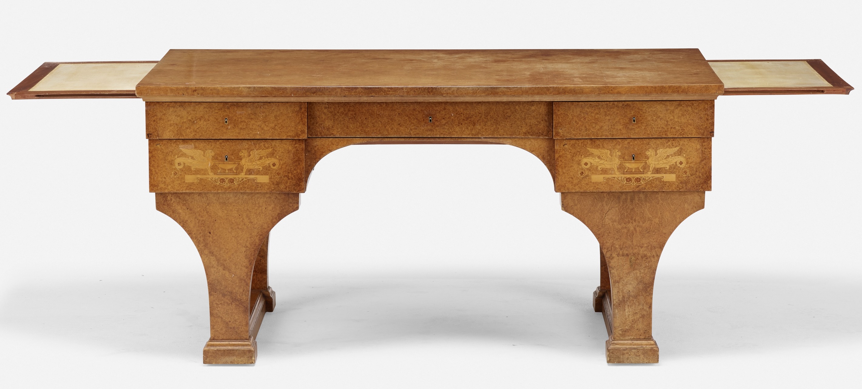
GEORGES JACOB SECRETAIRE
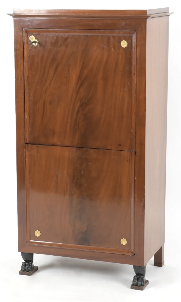
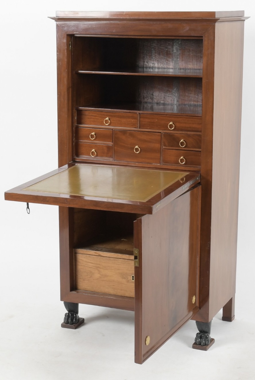
Georges Jacob (1739-1814) drop-front secrétaire, 1796 or just before. Solid & veneered mahogany, gold-tooled leather, paint, brass & steel fittings. H: 51 W: 27 ¼ D: 15 ¾. Provenance: Richard A. Lee, Ardmore PA, acquired at Sotheby’s New York. Sold
Georges Jacob is perhaps the most celebrated 18th-century French furniture designer and maker. He had a long career that began during the reign of Louis XV, continued under Louis XVI, the Directory following the Revolution, the Counsulate, and concluded when Napoleon Bonaparte was emperor. Our secrétaire was made in 1796, which is to say during the Directory, and it has, stylistically speaking, both the refined delicacy of that style, and, in spite of its small scale, the severe monumentality of Napoleonic furniture.
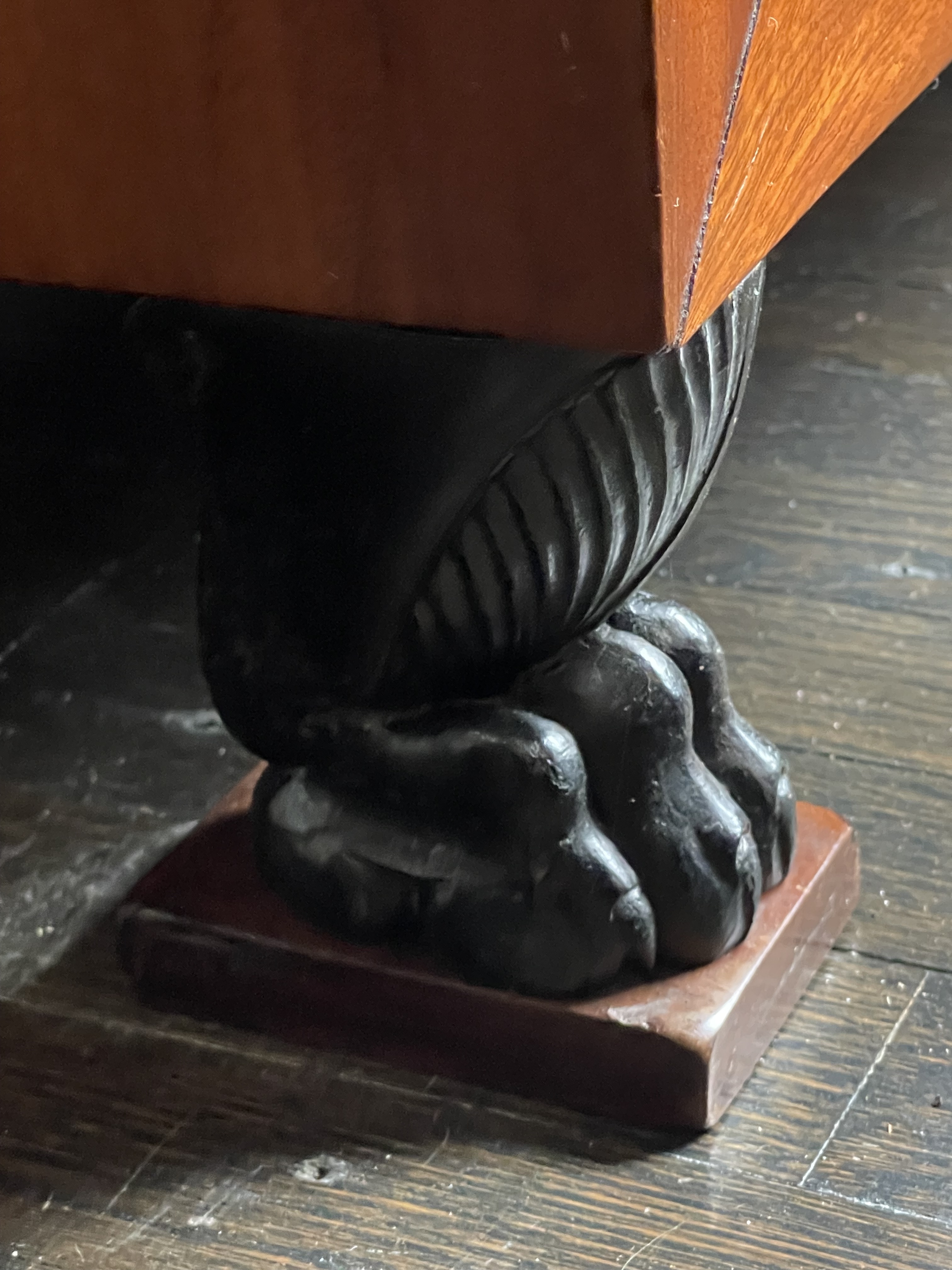
Jacob kept the ornamentation of the secrétaire to a luxurious minimum. Four gilt-bronze rosettes articulate each corner of the front, and the pair of feet below were carved in the form of animal-paws, and blackened to simulate bronze. Such restraint emphasizes the three large mahogany veneers that surface the front and sides. This timber, then imported from the French West Indies, was rare and expensive at the time. Surprisingly, the carcass beneath is of mahogany too — an indication that no expense was spared in its making.
The rosette at the top left of the front pivots to reveal a keyhole. When unlocked, a panel drops to form the working surface paved with gold-tooled olive-green leather, and to access seven drawers and two open shelves. Press an inobtrusive button on the left side, and the front door below the panel swings out, allowing access to a storage drawer and open shelf.
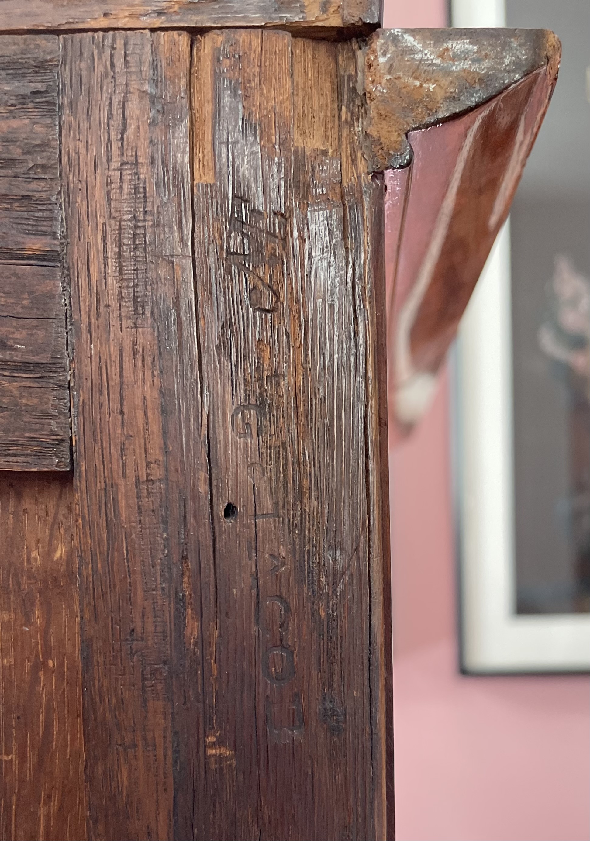
In 1765 Jacob was admitted to the Corporation des Ebénistes-Menuisiers – Guild of Cabinetmakers and Carpenters. This guild enforced exacting standards of craftsmanship, and required members to work in one field or the other. Jacob, who was admitted as a carpenter, came to be celebrated by the nobility for his chairs, sofas, and console tables. Following the 1789 Revolution, which sent many of his clients to the scaffold, those guild restrictions loosened, and he began working as an ébéniste as well. That the guild officials deemed him to be up to both tasks is indicated by the JME stamp on the back of the secrétaire, next to the G. JACOB stamp that confirms his authorship. Those three initials stand for Jurand des Menuisiers-Ebénistes, or Jury of Joiners and Cabinetmakers. To ensure its members maintained high standards, they paid four visits to members’ workshops each year, and applied this stamp to every finished piece that was there and made their grade. Those that didn’t were confiscated. Ours, evidently, passed muster.
18th-CENTURY DUTCH COMMODE
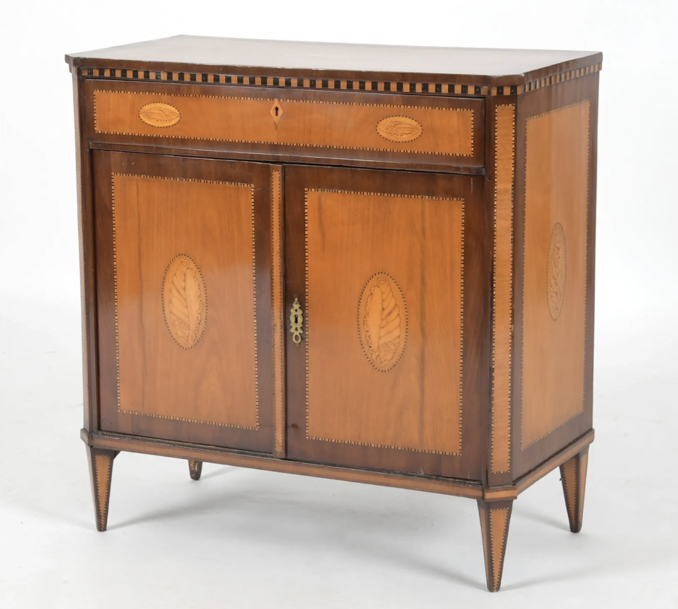
Dutch 18th century commode, circa 1800. Satinwood with inlays of mahogany, tulipwood, and other woods, brass hardware. H: 32 ½” W: 32 ¼” D:15 ½. $10,000
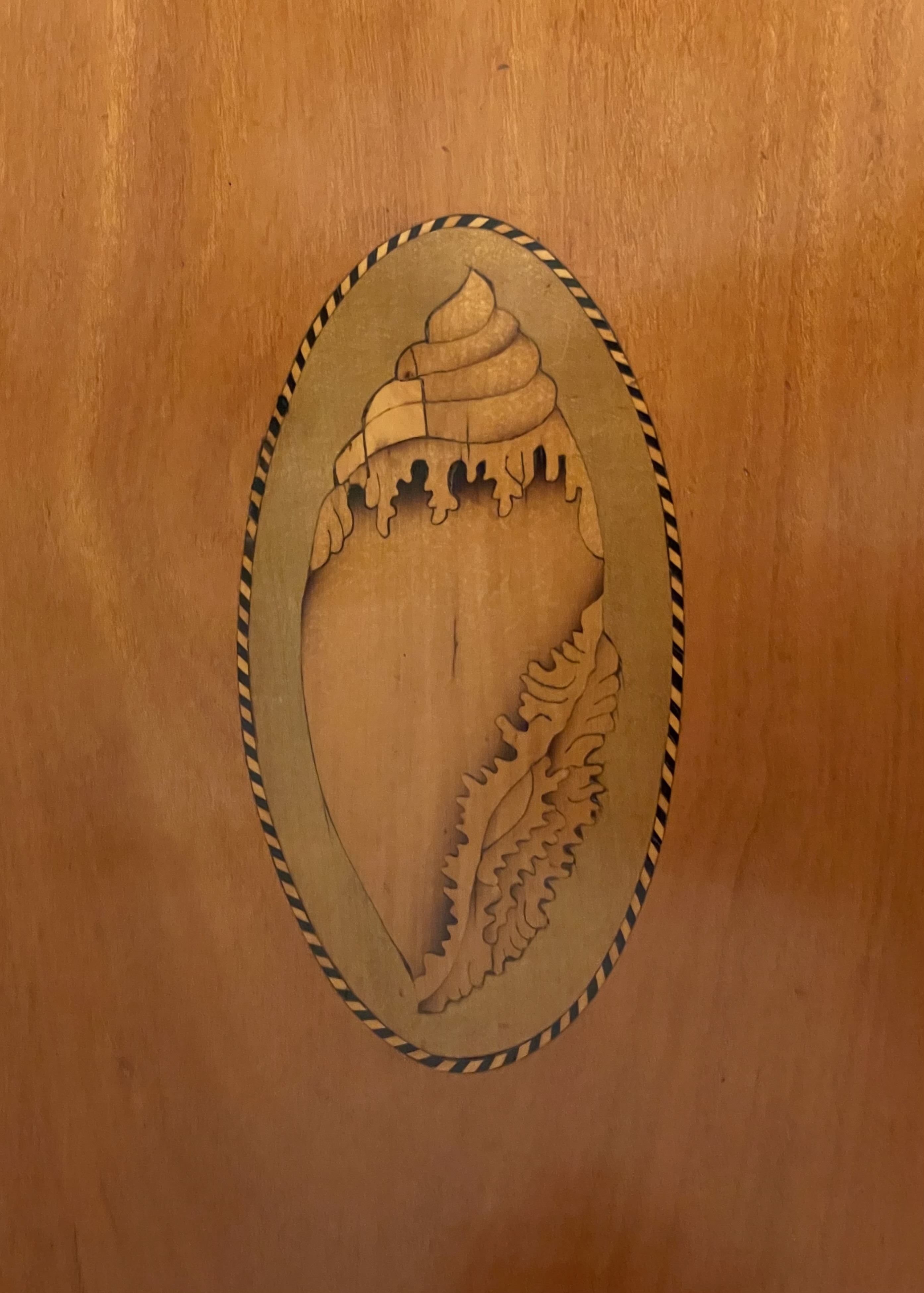
Holland’s Golden Age was the 17th century. Then, this small but industrious and beleaguered nation was a political and artistic player. Holland’s halcyon days, however, date to the 18th century when it continued to flourish financially, and was at relative peace with its neighbors. By this time the boisterous Baroque had given way to the graceful Rococo, and the subsequent Neo-Classical style. Our small but exquisite commode embodies the latter. It’s entirely veneered with satinwood, mahogany, and a variety of rare woods. Most notable, however, are the seven realistic inlays of conch shells set in beaded boarders. The largest is on the top, and the others – all different – appear in symmetrical pairs on the sides, doors, and drawer. In contrast, architectonic alternating light-and-dark squares are inlaid around, and appear to support the top, mimicking the metopes and triglyphs of a classical building’s entablature.
The commode’s delicacy of form, high-contrast wood inlays, and chamfered corners, are typically Dutch. But those high contrasts, and the inlaid shell motif, suggest the influence of the fashionable contemporary London cabinetmaker Thomas Sheraton. At the time his work was well known throughout northern Europe, due to the wide distribution of his 1786 pattern book The Cabinet Maker and Upholsters Guide. The anonymous craftsman who fashioned our commode, however, made it very much his own through the enchantingly idiosyncratic proliferation of shells, the beaded enframements, and staccato-like inlay just under the top.
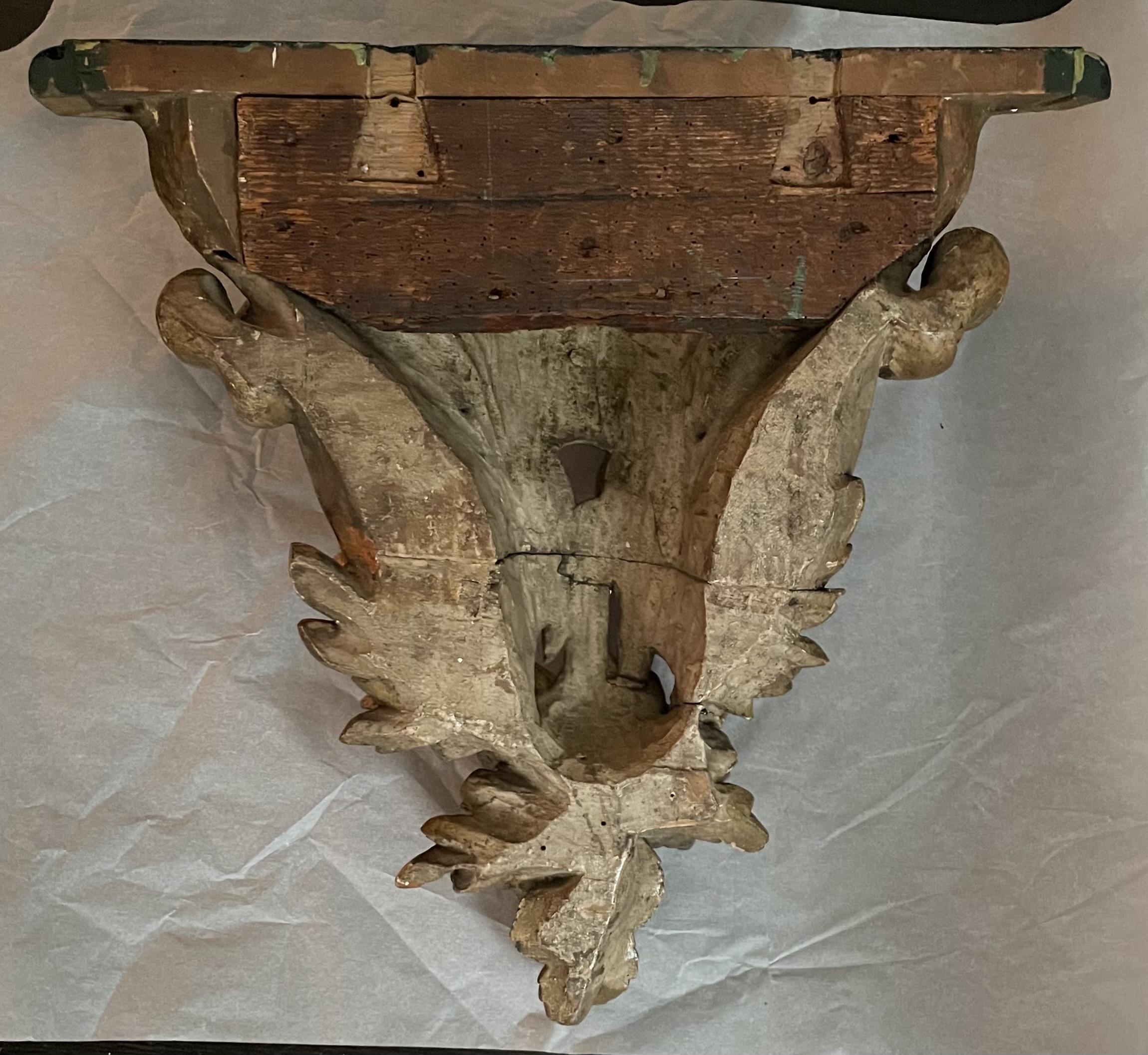
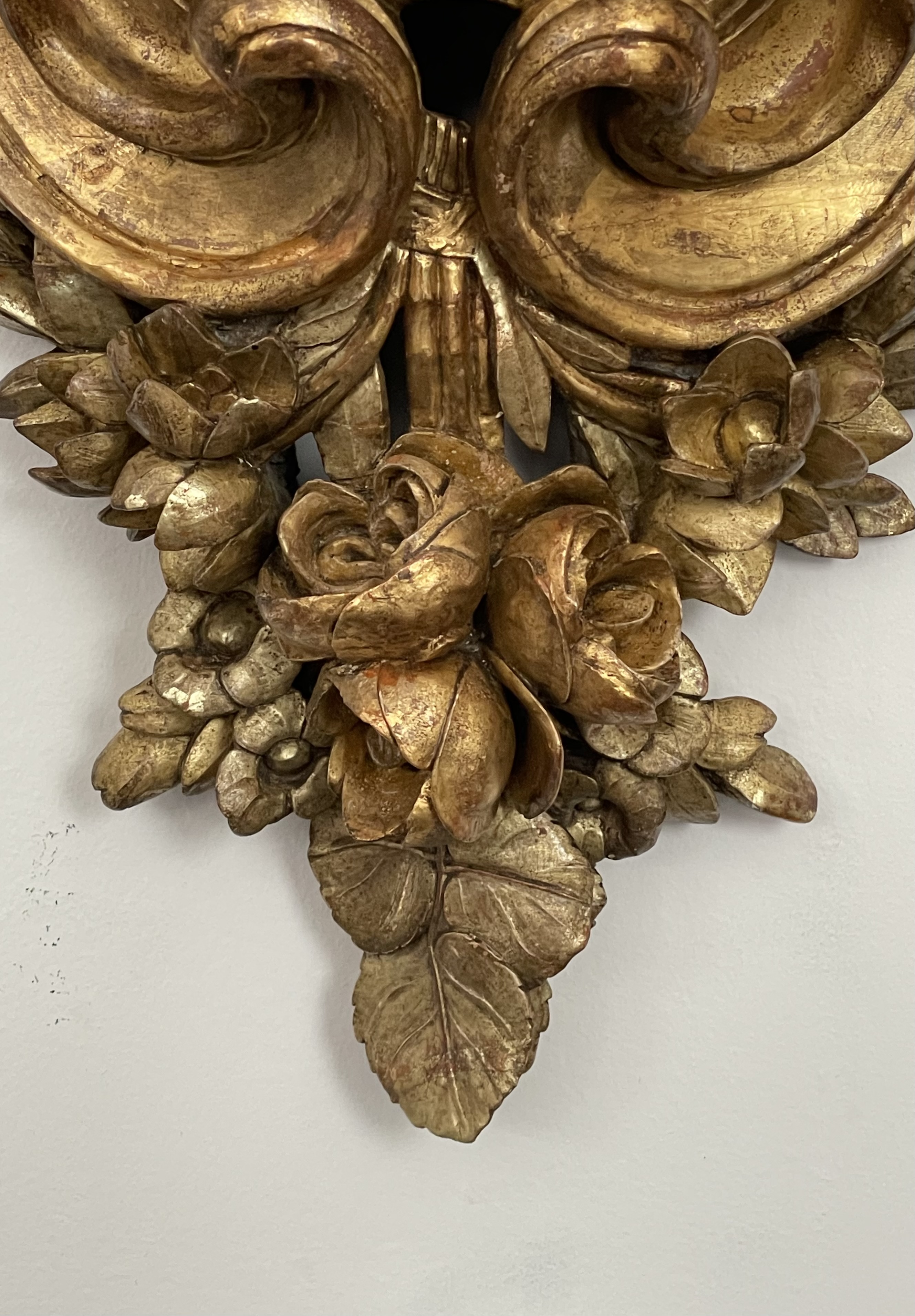
SMALL CONSOLE TABLE
Small Italian 18th century console or bracket, circa 1770. Carved wood, gilded in yellow- and white-gold leaf, painted top. H: 16 ½ W: 19 D: 9. $6,000
This large wall bracket, perhaps intended to support a large porcelain, would serve equally well as a small console table. While somewhat indebted to the French in design, the bold cartouche, the exuberant carving of the flowers, and the piercings exposing glimpses of the wall behind, suggest that it was made in Italy, possibly Turin or Genoa, where the French influence was strong. It’s unusual in having been gilded with both white- and yellow-gold leaf — white-gold for the petaled flowers and leaves, yellow-gold for the full-blown roses and the cartouche, which may have once featured the owner’s initials or coat of arms.
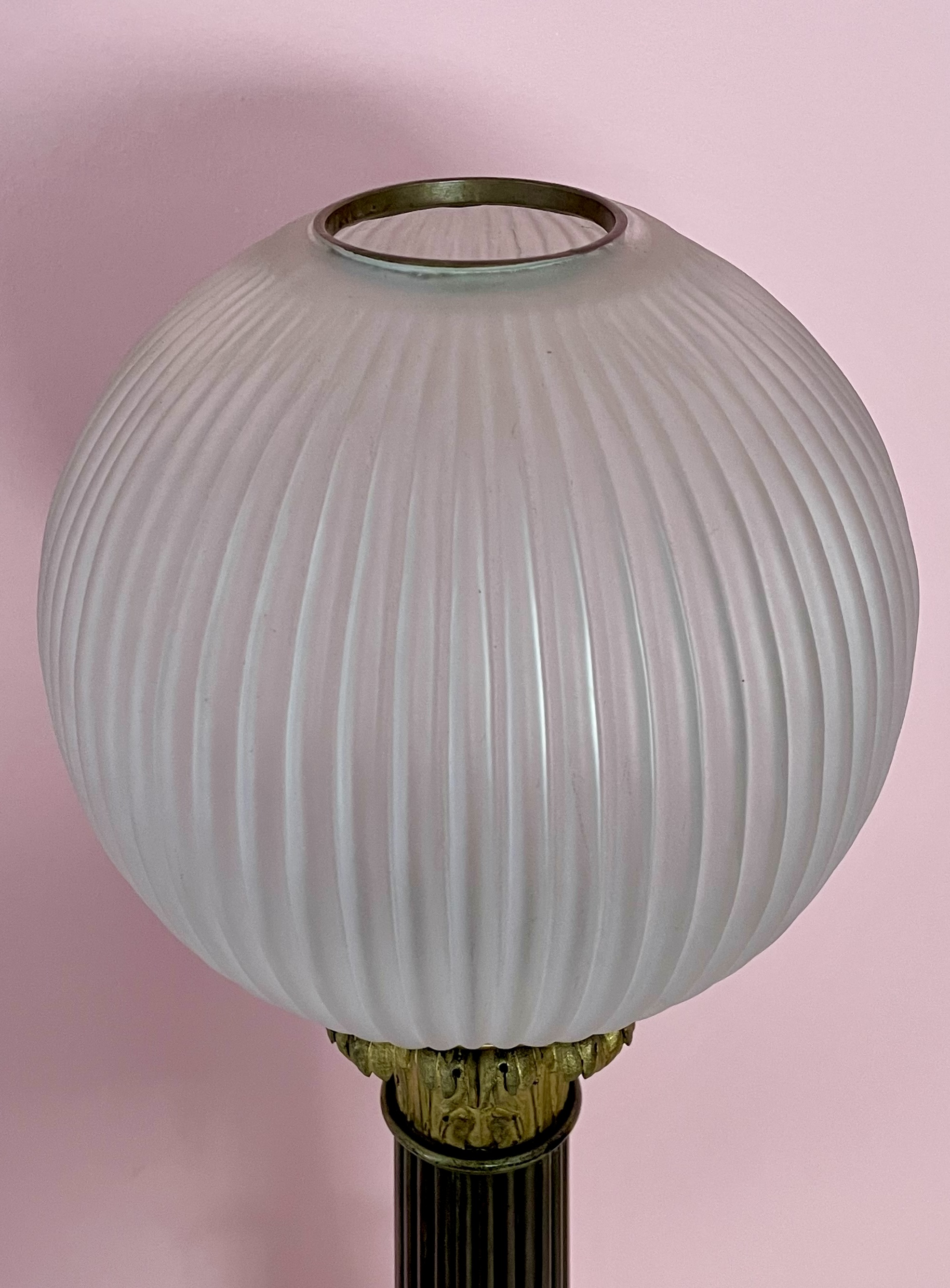
LOUIS-PHILIPPE LAMP
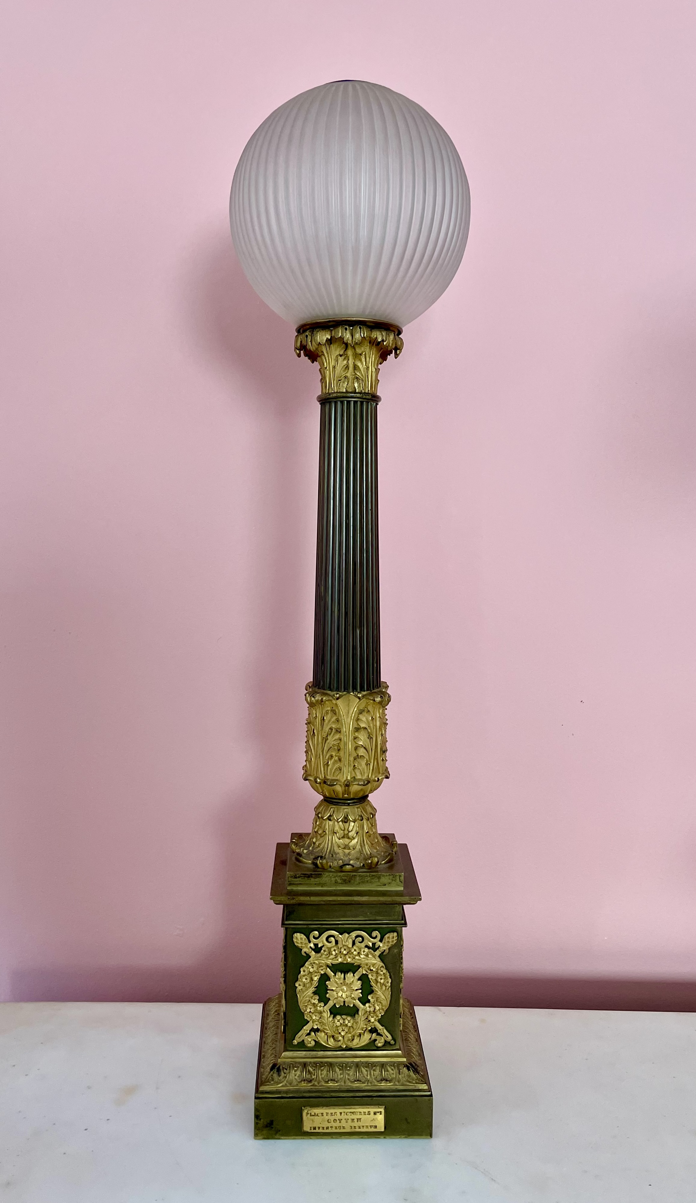
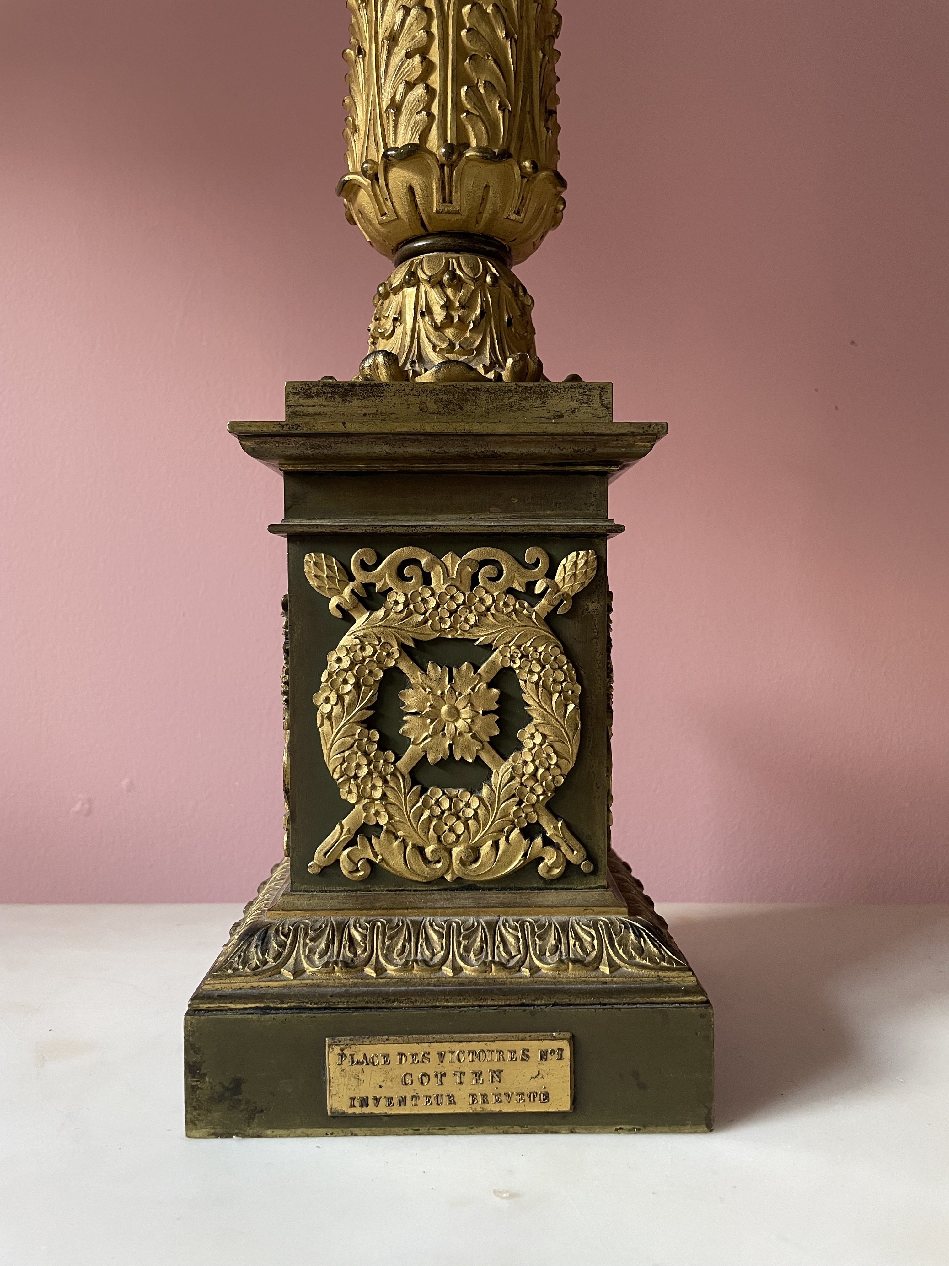
Louis-Philippe carcel lamp by Gotten of Paris (marked “Place des Victoires No 1 / Gotten / Inventeur Brevete”), circa 1840. Bronze, gilding, acid-etched cast glass with brass trim. H: 30 ½ Dia: 7. Provenance: Richard A. Lee, Ardmore PA. $4,000
According to an attached metal plate, this imposing gilt-bronze lamp was made in Paris by Gotton, Inventeur Brevete (inventor and patent holder), and sold from his retail premises at 1 Place des Victoires. Gotton was Jean-Cristophe Gotten, who received a patent in 1821, which was renewed in 1825, for a type of oil-burning lamp with a reservoir at the base, and a pump to carry it to the top, where it emitted light when ignited. Our lamp has since been wired for electricity, but, fortunately, when that happened the original brass-trimmed glass globe wasn’t replaced by a lampshade. Also of note are the lamp’s finely chiseled gilt-bronze Neo-Classical decorations. On the reeded column shaft they consist of a foliate capital and base, and on the lamp’s base of flower wreathes overlaying crossed thyrsi (the pine-cone-topped staffs of Bacchus), alternating with pairs of griffons.
VAN DAY TRUEX DRAWING
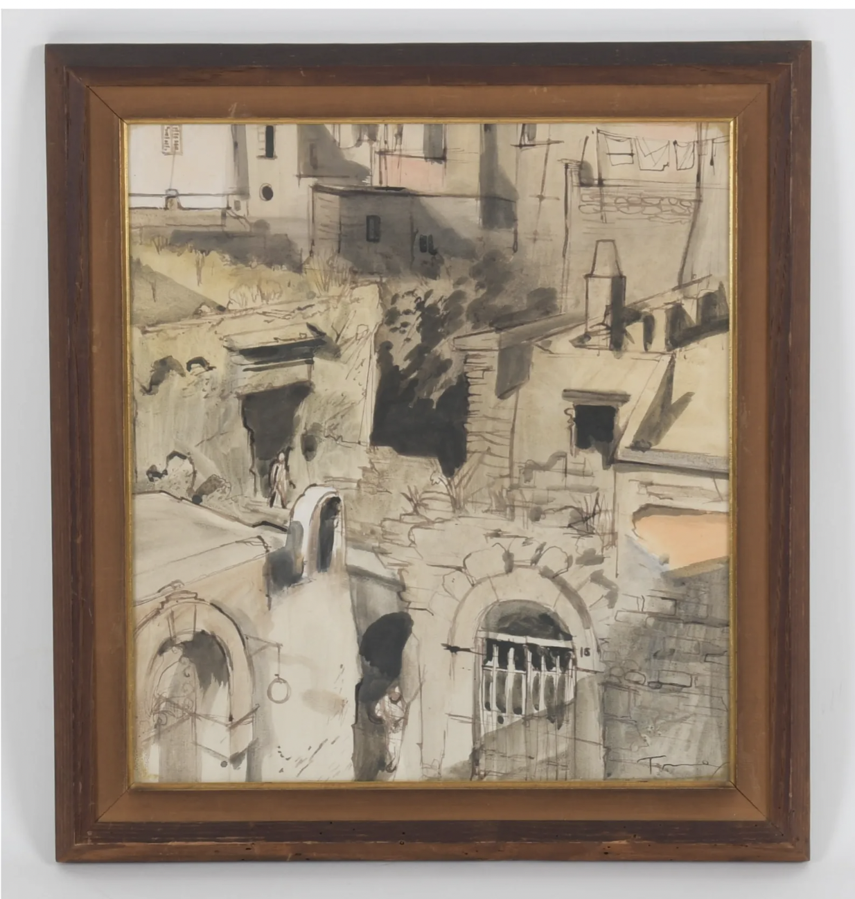
Van Day Truex (American,1904-1979). Forio, Ischia, circa 1950. Watercolor wash on paper, original wood frame. 15 ¾ x 14 ¼ sight; 19 ¾ x 18 framed. Provenance: Natalia Platonova Boleslavski; by descent. $6,500.
Smart, talented, charming, and handsome, Van Day Truex was destined for a brilliant career. Born in rural Kansas in 1904, he left to attend what would become the Parsons School of Design in New York. He soon became the protégé of its founder Frank Alva Parsons, and then, when studying at the school’s Paris branch, its director William Odom, who was known as “Mr. Taste.” On graduating in 1926, Truex was appointed director of the Paris branch when Parsons summoned Odom back to New York to assume his duties. In gay Paree, Truex became a fixture in the creative and social firmament, befriending the American ex-patriot Elsie de Wolfe, Jean-Michel Frank, Elsa Schiaparelli, Horst, Cole and Linda Porter, and Vicomte Charles de Noailles and his wife Marie-Laure, among others. The outbreak of war in 1939 found Truex summering on Capri as a houseguest of Mona Williams (later Countess Mona von Bismarck), prompting a first-class dash across the Atlantic aboard the Rex. Shortly after disembarking, Odom, who inherited the school on Parsons’ demise, was now ailing himself, prompting him to turn its management over to Truex. And there Truex taught, inspired, and dazzled the student body until he was sidelined in a 1954 academic coup. Truex took it on the chin, and one year later was appointed artistic director of Tiffany & Company. In that capacity, over the course of two decades, he divided his time between New York and Europe, designing and commissioning the products that would put the venerable firm, which had become stodgy by then, back on the map. This, in turn, prompted Truman Capote to make it the nexus of Holly Golightly’s fantasies in Breakfast at Tiffany’s.
From the 1930s until his death in 1979, Truex took considerable pleasure from an unofficial parallel career as a painter of grisaille watercolors. In the 1930s he exhibited his drawings twice at the Wildenstein Gallery, and once in the 1940s at Knoedler, prompting an Art News critic to opine, “One would like for the museums of this country to get to know Truex’s work, and see him take his place as a serious painter in the annals of American art where he belongs.” The National Gallery in Washington did, in fact, buy two of his drawings, and in 1955 the California Palace of the Legion of Honor gave him a one-man show. Burnishing his reputation further, during that one-year hiatus between Parsons and Tiffany’s, he was an artist in residence at the American Academy in Rome.
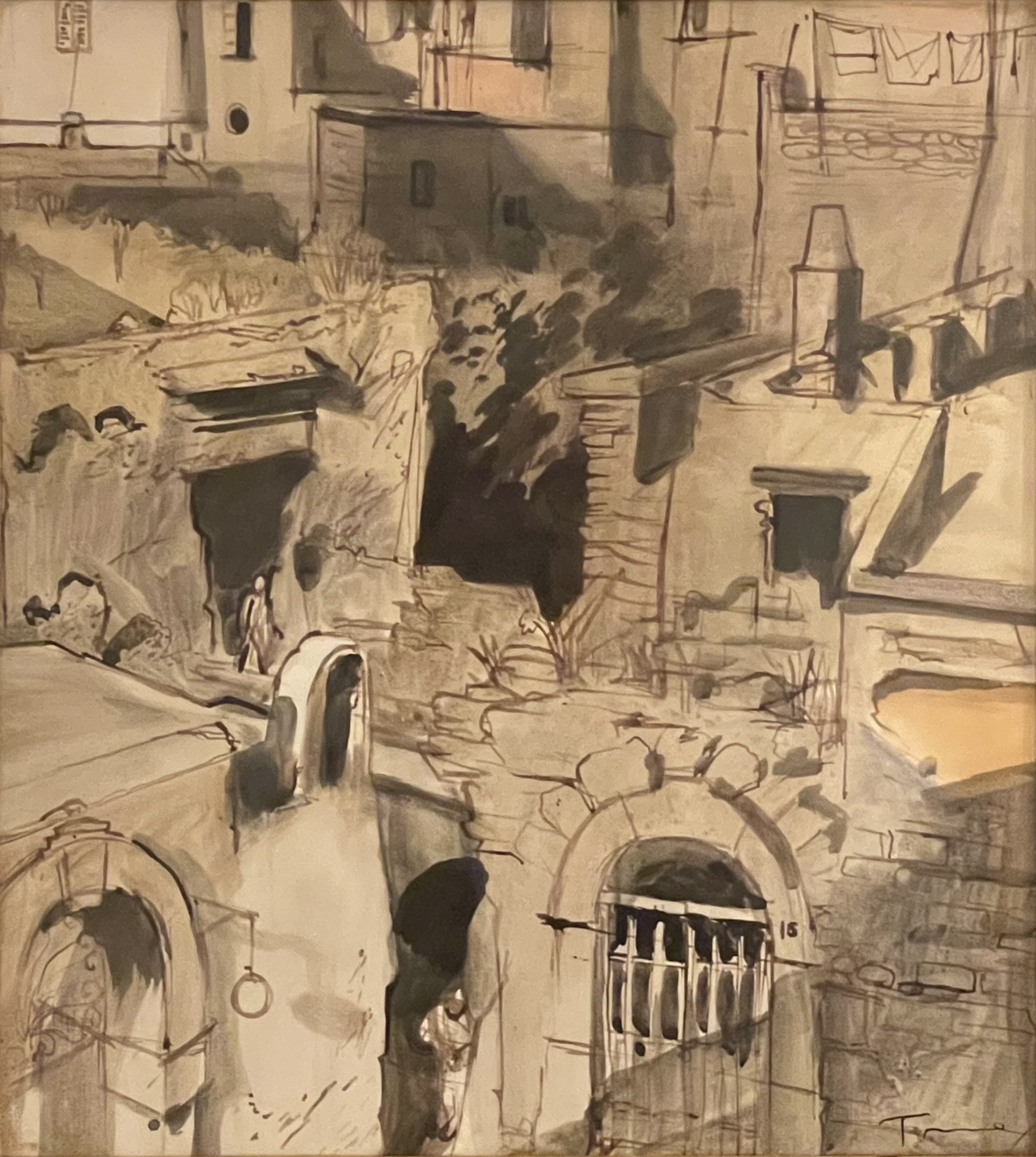
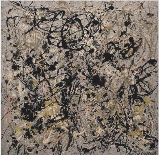
As a designer Truex approached the cutting edge, but as an artist he pursued the beautiful — a quality that the art world came to regard as a bit old fashioned as the 20th century progressed. Not that he was oblivious to the latest art trends, specifically Abstract Expressionism. At first glance our representational drawing of an Italian village appears to be an abstract composition with edge-to-edge marks and blobs of wash. This highlights Truex’s awareness of Jackson Pollock’s trailblazing abstract work, done around the same time as oue drawing, characterized by energetic gestures, drips, and webs of paint that create an “all-over” image to emphasize the two-dimensionality of the picture plane.
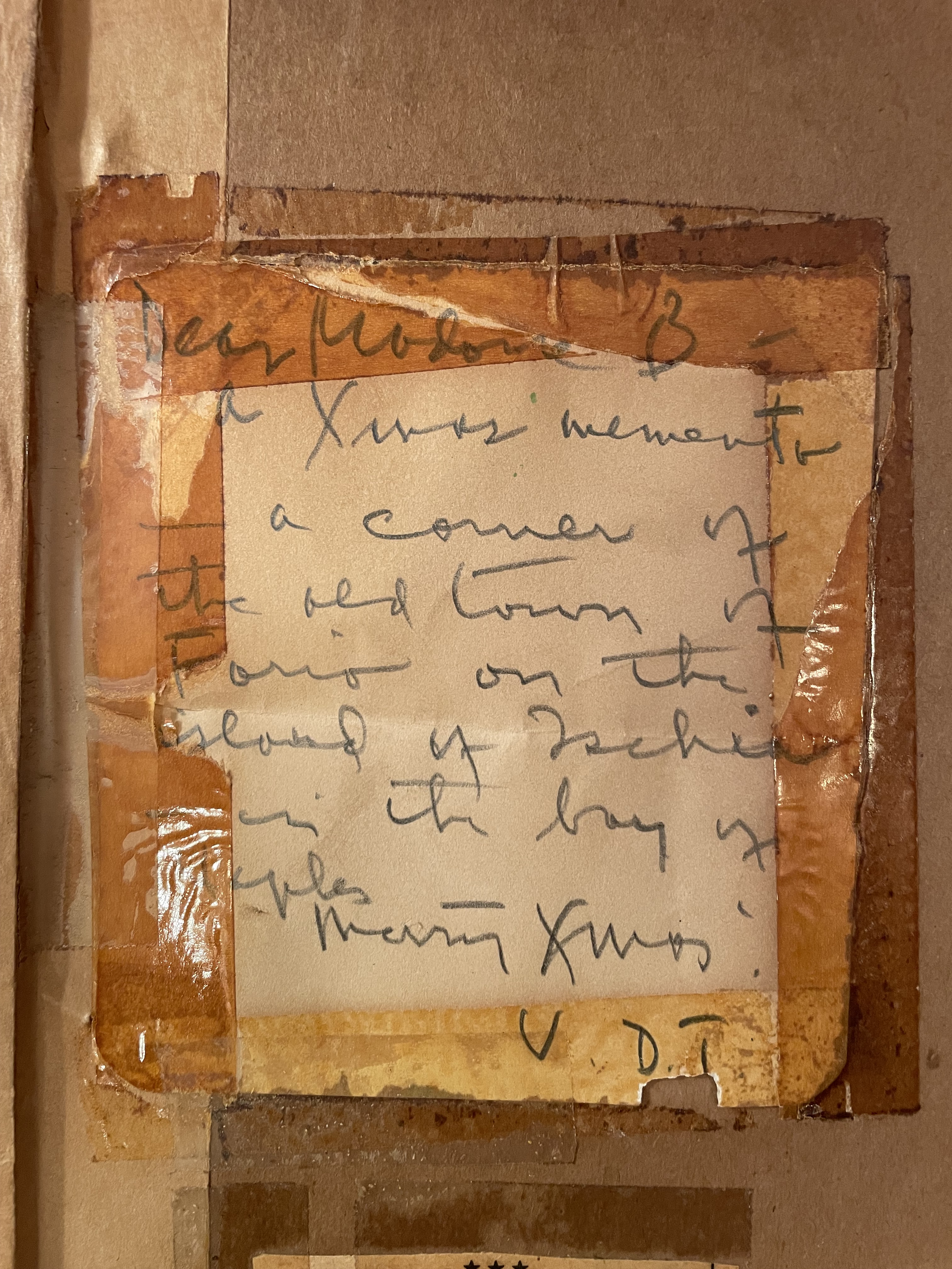
An inscription on the verso our drawing reads as follows: “Madame B – a Xmas memento – a corner of the old town of Forio on the island of Ischia – in the Bay of Naples – Merry Xmas! V. D. T.” Truex frequently gave his works to friends, and this particular friend was Natasha Platonova Boleslavski, a white Russian émigré who had been married to the Hollywood director Richard Boleslavski. At the time she lived in Manhattan, and kept a house in Bridgewater, Connecticut, where Truex often stayed with her. At first glance, this aerial view of that Italian seaside town may seem like an appropriate gift, but it appears to be less so on closer inspection, for it depicts the town in ruins. As such, the drawing may document its appearance in the years that followed a 1943 Allied bombing, or after one of the many earthquakes that rocked the island. Either way, unless the drawing commemorates an Ischian holiday Truex took with Mrs. Boleslavski, or an insider’s joke that they shared, it’s a decidedly odd subject for a present.
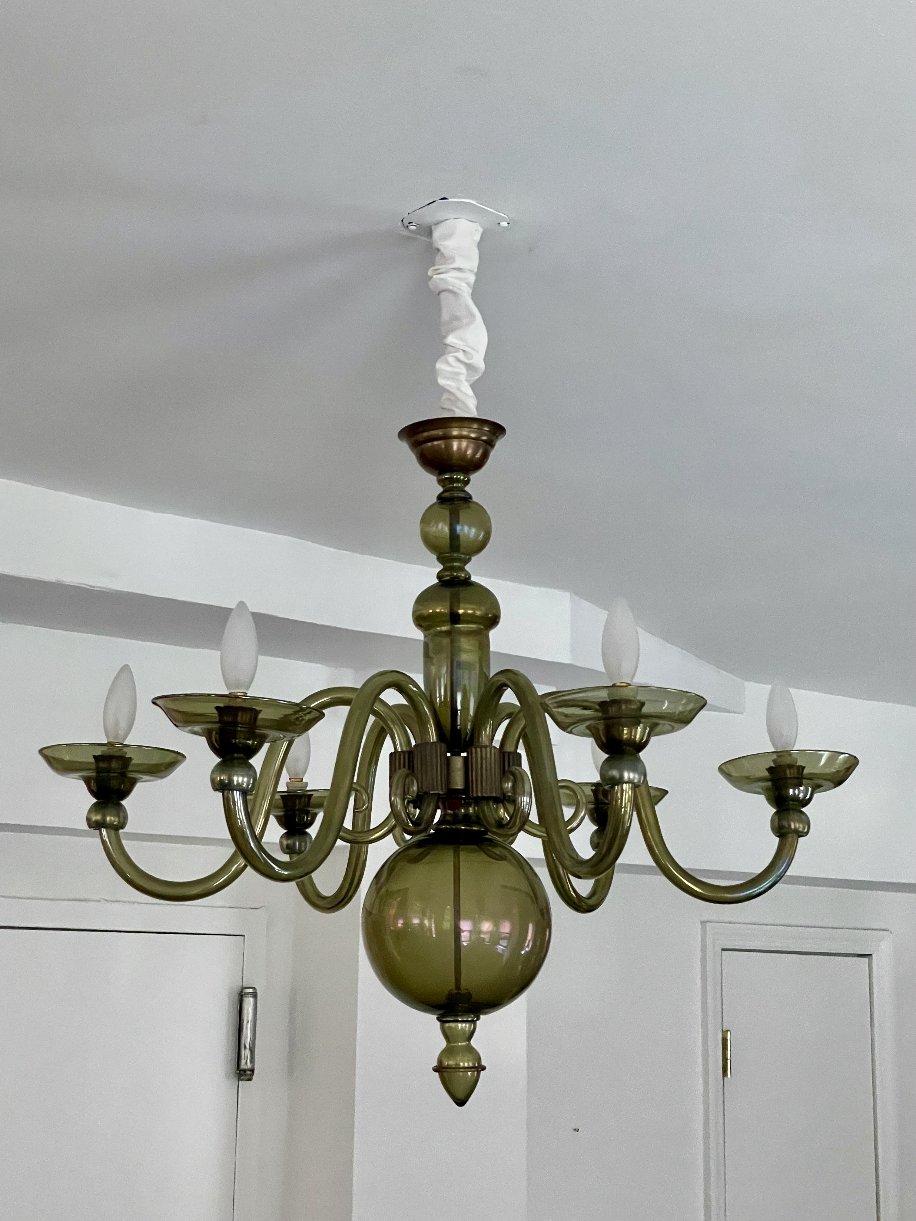
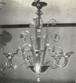
LATE 1930s VENINI CHANDELIER


Venini chandelier, late 1930s. Aventurine glass (with gold-leaf), brass. H: 24” Dia: 30” Sold
This late 1930s Venini chandelier has two open rings of curved-glass elements suspended from a brass frame. It glows magically from within because the glass is infused with gold leaf. Tiny glass chips are fused on the inner surface of each element to diffuse light, and make them translucent rather than transparent. They were made by pouring molten glass into squared-off molds, and then, after hardening when cool, cut into wedge-like shapes. They were used as modules in an artisanal take on the interchangeable parts introduced by the Industrial Revolution more than a century before. But it took the modernist architect and designer Carlo Scarpa to introduce the concept to glassmakers on Murano, that bastion of the artisanal, where centuries-old techniques were still being employed to beautiful effect.

Born in 1905, Scarpa was a native Venetian who studied architecture before becoming a designer in 1926 at the glassworks M. V. M. Cappellin. There he began exploring the possibilities of artisanally-made interchangeable glass parts for lighting fixtures. When the Depression closed that firm down in 1932, the savvy Paolo Venini lured him to his own. And there, with greater resources, Scarpa designed glass modules that were configured to form his own lighting designs, and reconfigured by others at Venini to form variants suited to the rooms where they were destined to hang. Scarpa’s system allowed the modules to be lined up as cove lighting and pendants, as at the 1931 Palermo post office, or fanned into concentric rings, as with the 1937 monumental chandelier for the Venice Biennale rotunda. These round chandeliers are rare because they were difficult to make, with modules that were chamfered at various angles according to the diameter of the fixture — a tricky proposition relying on the sure eye and hand of the craftsman. Our chandelier may have been designed by Scarpa himself, or another designer at Venini working with his modules. In either case, it doesn’t correspond to any of their standard models so it may well be unique.
1930s SEGUSO CHANDELIER
Archimede Seguso (Italian, 1909-1999). Chandelier. Blown & cast glass, purple iridized, bronze fittings. H: 24″ Dia: 33″. Sold
This late 1930s Archimede Seguso chandelier is of purple-iridized olive-green glass set in finely machined bronze. The scion of a family that had been in the glassmaking trade since the 15th century, Archimede’s father Antonio established the firm Seguso Vetri d’Arte in 1933. The Great Depression was then raging, so it wasn’t a propitious moment, but, thanks to his four sons pitching in, the firm prospered. The star, however, was Archimede who was born in 1909, began training at eleven, became a maestro at twenty, and exhibited in nearly every Venice Biennale after 1934. Over the course of a seven-decade-long career he embraced traditional glassmaking skills, technical innovation, and both traditional and modern design. This chandelier represents Archimede’s modern take on a traditional 18th-century form. After the war, with his skill, eye, and knowledge of the marketplace and design trends, his work came to the attention of Van Day Truex, the legendary art director of Tiffany & Co. In the years that followed Tiffany carried a line of Suguso glass, including obelisks in a variety of shapes, sizes and colors. Archimede continued to work his magic until the age of 90, when, on his deathbed, and in the presence of his family, he announced his intention to create chandeliers for heaven.
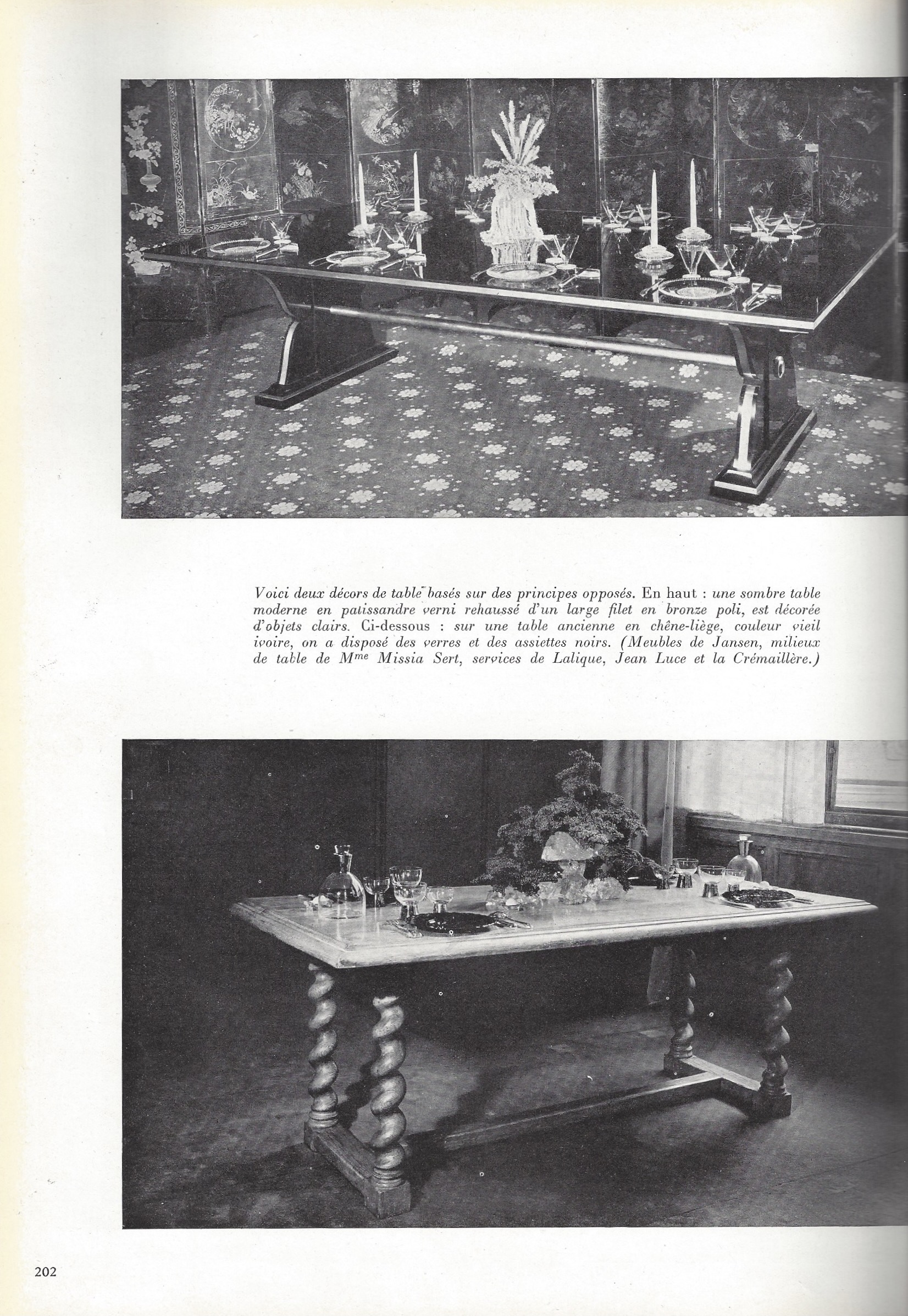
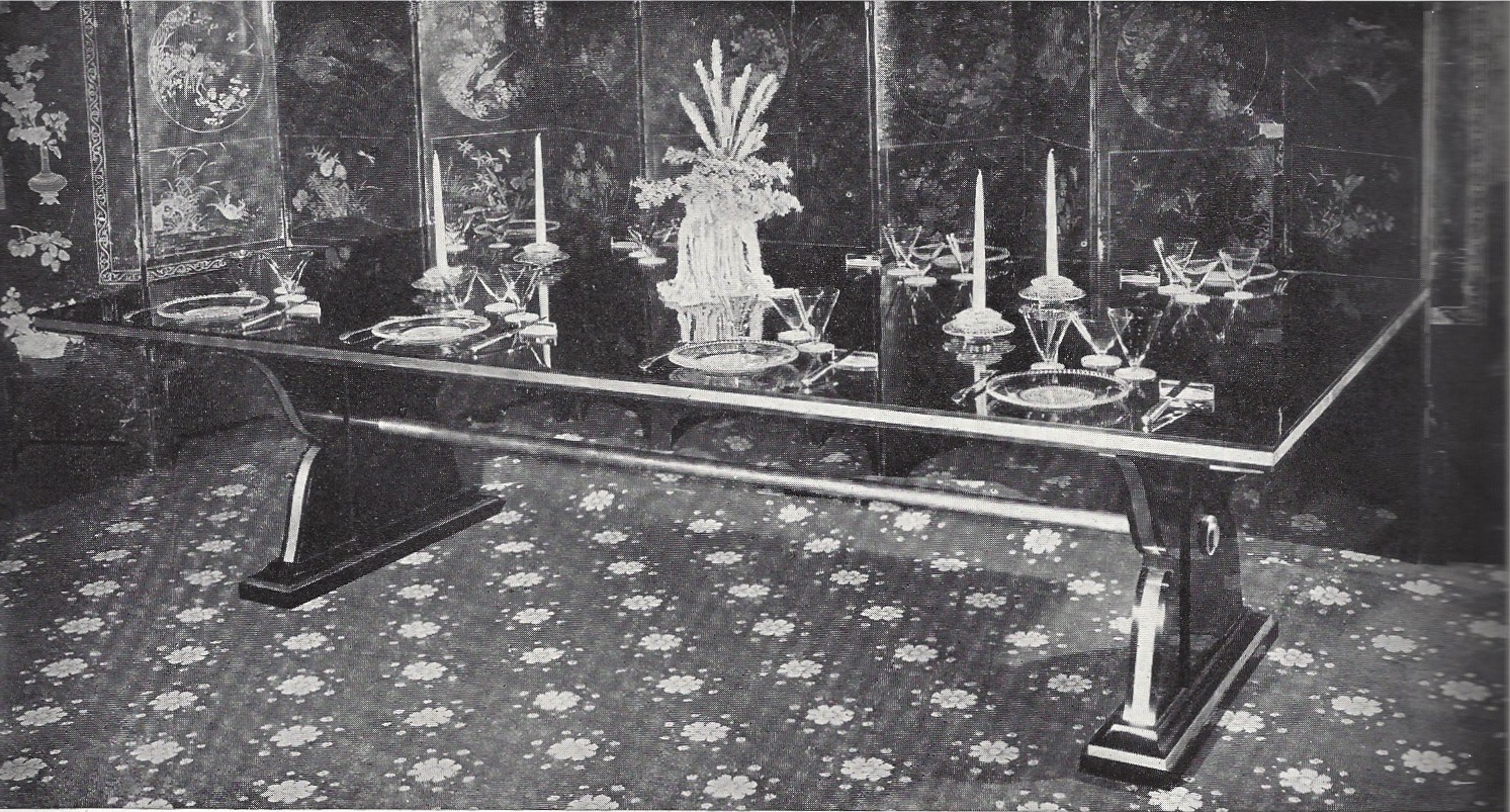
1935 JANSEN DINING TABLE
Jansen dining table designed by Gaston Schwartz (1879-1938), 1935. Amboyna-veneered mahogany, silvered bronze, black glass. H:31”L:9’ 9”D:47. Provenance: Susan Webber, New York. $60,000
The January 1935 issue of Plaisir de France published two dining tables by Jansen [below left], the eminent Paris decorating firm that designed furniture and had it made it made in their own workshops. Years later, the editors presented the same photograph of one of them yet again [below right] in Decoration de France, a 1949 book that was a compilation of images and articles previously published in the magazine. The photograph presents the table set extravagantly with Lalique glass and a Misia Sert centerpiece in the form of a sheaf of wheat. The table was described as made of palisander, or rosewood, with bronze mounts. Our table is amboyna, an exotic burlwood, and has silvered-bronze-mounts. Since Misia was misspelled as Missia, and the glass base of her centerpiece misidentified as rock crystal, they could have gotten the wood wrong too, and overlooked the silvering. Therefore, the table is quite likely the same one, although it’s possible that our table is a different version of the same design, since more than one could have been made, and if so it was unlikely that any two were made exactly the same. After all, a Jansen client wouldn’t have been pleased to come across a table identical to their own in someone else’s dining room, any more than a Chanel client, when out on the town, would have been pleased to come across another woman wearing the very same dress that she was wearing. As the French would say, quelle horreur.
The designer of the table was Gaston Schwartz. In 1920 he was one of three men that Henri Jansen brought into his firm Maison Jansen as partners, as he eased his own way into retirement. The other two were Stéphane Boudin, the now celebrated designer, and Jean-Jules Vandries, who remains unknown, and probably worked in management rather than design. If Boudin swung traditional Schwartz swung modern, as seen in his work at the Château Solveig, an Art Deco love nest on the shores of Lac Leman. It was built for the improbably named Francis Francis, an English Standard Oil heir, an amateur aviator, and a member of the King’s Royal Horse Guard — or rather, he had been until he married the no less improbably named Sunshine (“Sunny”) Jarmann, an American showgirl. In royal circles this created a scandal that sent them packing, and into a luxurious exile in Switzerland, where they built a modern residence. There Sunny’s blond pulchritude was reflected (until they divorced) in the sheen of mirror, glass, metal, lacquer, polished marble, and gold-and-silver gilt. This shininess is seen in the hall [below left], and the dining room [below right] with a table of plate-glass resting on green-lacquered-metal supports.

Schwartz designed this table around the same time as our own, yet ours looks less like the Francis table than one designed a few years earlier for the 1925 Paris Exposition by Jacques-Emile Ruhlmann [below right], the great Art Deco furniture and interior designer. This table was veneered in palisander and had silvered-bronze mounts, but, like the Francis table and unlike ours own, it had open-arc supports. In the years that followed, Ruhlmann produced another version in amboyna and silvered bronze, like ours, for the dining room of Count Vizela in Porto, Portugal [below left]. Then, around 1930, Ruhlmann produced yet another iteration for the Paris dining room of François Ducharne, the Lyon silk magnate. And finally, in 1931, he rejiggered the design as a desk for the Paris Exposition Coloniale, and executed it in Macassar ebony with a top of ivory-inlaid shagreen. What Ruhlmann’s tables and desk, and our Schwartz table and its published counterpart, if they’re not the same table, go to show is that Ruhlmann and Schwartz, like others in the luxury trades at the time, including the couturière Chanel, produced in series, kept iterations to a minimum, and customized each to maintain the exclusivity demanded by their well-heeled clientele.

We don’t know much about Gaston Schwartz, the designer of our table, except that he was born in 1879 in Sens, married Rachel Frank in 1910, and was Jewish (his comings and goings were chronicled in the newspaper L’Universe Israelite). Professionally, he joined Jansen as a partner in 1920, was made director in 1928, became a Chevalier of the Legion d’Honneur in 1930 (as did Henri Jansen earlier, and Boudin later on), and left before he died in 1938, by which time Boudin had become the firm’s director. Surprisingly, Schwartz swung to the left politically, judging from his occasionally being mentioned in the Socialist party newspaper Le Travailleur Socialiste where he published his wedding banns. Needless to say, this wasn’t par for the course when it came to decorators who catered to le gratin as he did.
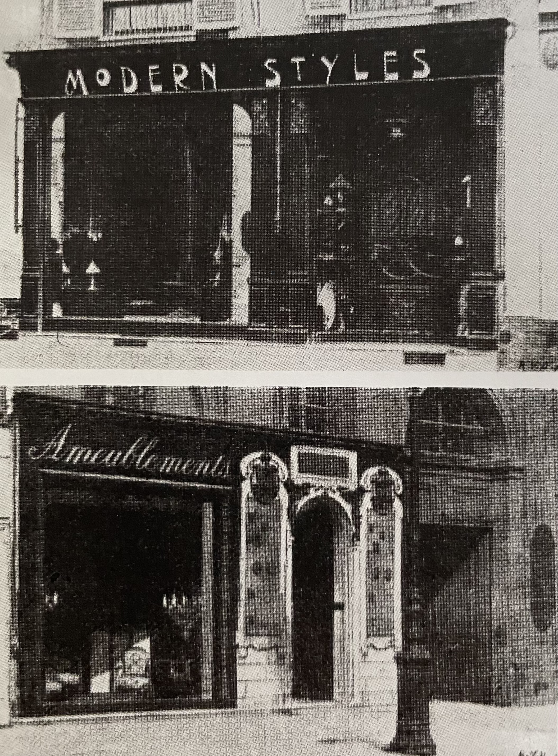
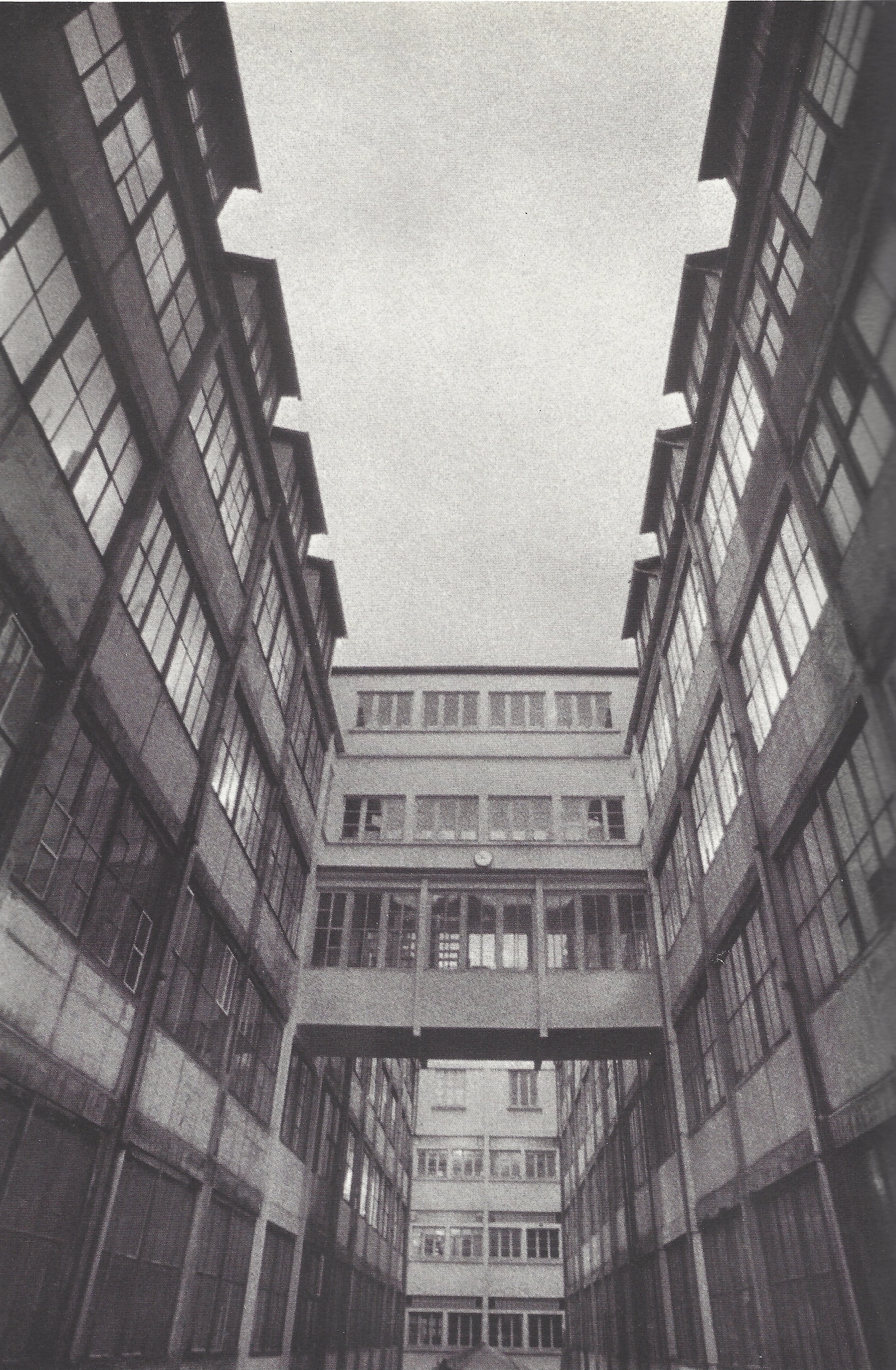
Schwartz has remained in the shadows thanks to the disappearance of the Jansen archive, their policy of publicizing the brand rather than individual designers, and his having died childless. Boudin was more fortunate in having a longer career that ended much later, and an adoring daughter, Brigitte, who made herself available to researchers (including me). And so, many of Boudin’s admirers today will be surprised to learn that he was passed over for the directorship of Jansen in favor of Schwartz. Since both men were masters of design, this would have been a business decision — and we can surmise why, but to explain we must backtrack. Shortly after 1880, when Henri Jansen, scion of an Amsterdam family in the decorating trade, launched Jansen in Paris, he opened a showroom, Jansen Ameublement, on the Rue Royale — and then, in 1897, Jansen Moderne next door [both above left]. The former sold antiques, and Jansen designs made in traditional styles, and the later sold original Jansen designs made in the modern styles. The two showrooms presumably attracted different clienteles, thus increasing Jansen’s market share. And when one of those clients chose modern, Jansen made everything from scratch in their vast workshops [above right], where they would also have made reproductions of historical designs. Later, during the giddy 1920s, when many fell for what’s now known as the Art Deco style (after the 1925 fair where Ruhlmann unveiled his table), its wild success seemed to point the way forward commercially. Hence, at Jansen in the late 1920s and early 1930s, Schwartz was the man of the hour.
Earlier in the century, however, a fault line began to appear in the modern design movement, separating designers for the rich who favored one-of-a-kind goods handcrafted from expensive materials, from designers for the masses who favored manufactured goods from inexpensive materials. If Schwartz fell into the latter camp politically, he fell into the former camp stylistically. But when the Great Depression set in after the 1929 stock market crash, earlier styles nostalgically associated with a more secure past began to regained their appeal. And so the planets realigned in favor of Boudin, who installed in 1935 the Neo-Rococo dining room [below left] in the London house of the right-wing politician and plutocrat Henry (“Chips”) Channon. Inspired by the decor of the Amalienburg Palace outside Munich, Boudin’s painted, silver-leafed, and mirror-topped table [below right], was, nevertheless, of a form that no 18th-century German aristocrat would have recognized. Surprisingly, this table and our own were made in the same Jansen workshops around the same time.

The waxing and waning of modernism and historicism define 20th-century design. Both camps have had success on the battlefield, but, as Postmodernism proves, neither won the war. Well placed to attest to this is the former owner of our table, Susan Webber Soros, founder and director of the Bard Graduate Center for Studies in the Decorative Arts in New York. She acquired it for her own dining room, along with a set of made-to-measure Ruhlmannesque dining chairs that she commissioned, and bought a 1950s Max Ingrand for Fontana Arte chandelier, and a pair of 1930s Ferro Toso Barovier glass vases. But it is the Jansen dining table that most succinctly posits the perhaps unanswerable question of just what makes something “modern” or “historicist.”
PAIR OF 18TH-CENTURY ITALIAN CONSOLE TABLES
Pair of Italian console tables, circa 1780. Painted-and-gilded wood, Carrara marble. H: 36 3/4″ L” 57 1/2″ D: 26″ Provenance: Loyd-Paxton, Dallas. $50,000
This pair of Italian Neo-Classical console tables were carved, painted battleship-grey, gilded, and topped with slabs of Carrara marble. Each has a carved cartouche — one with a pair of billy goats and the other with a lion and lioness — flanked by birds and morning glories. Engraved brass plaques mounted on the back rails identify the tables as having once been in the inventory of Loyd Paton, an important Dallas dealership that was established by Loyd Taylor and Paxton Gremillion in the 1960s, and flourished until the 1990s.
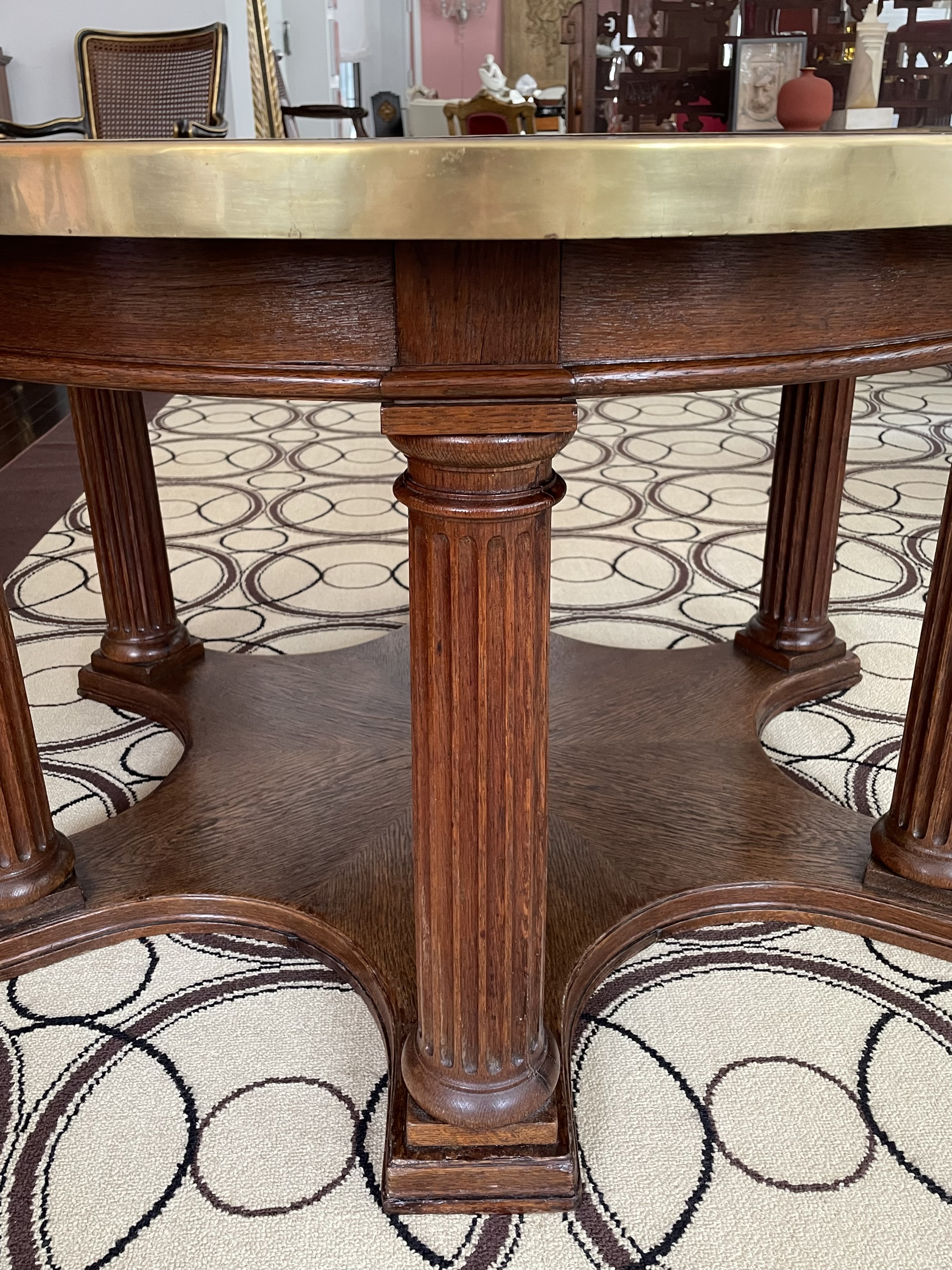
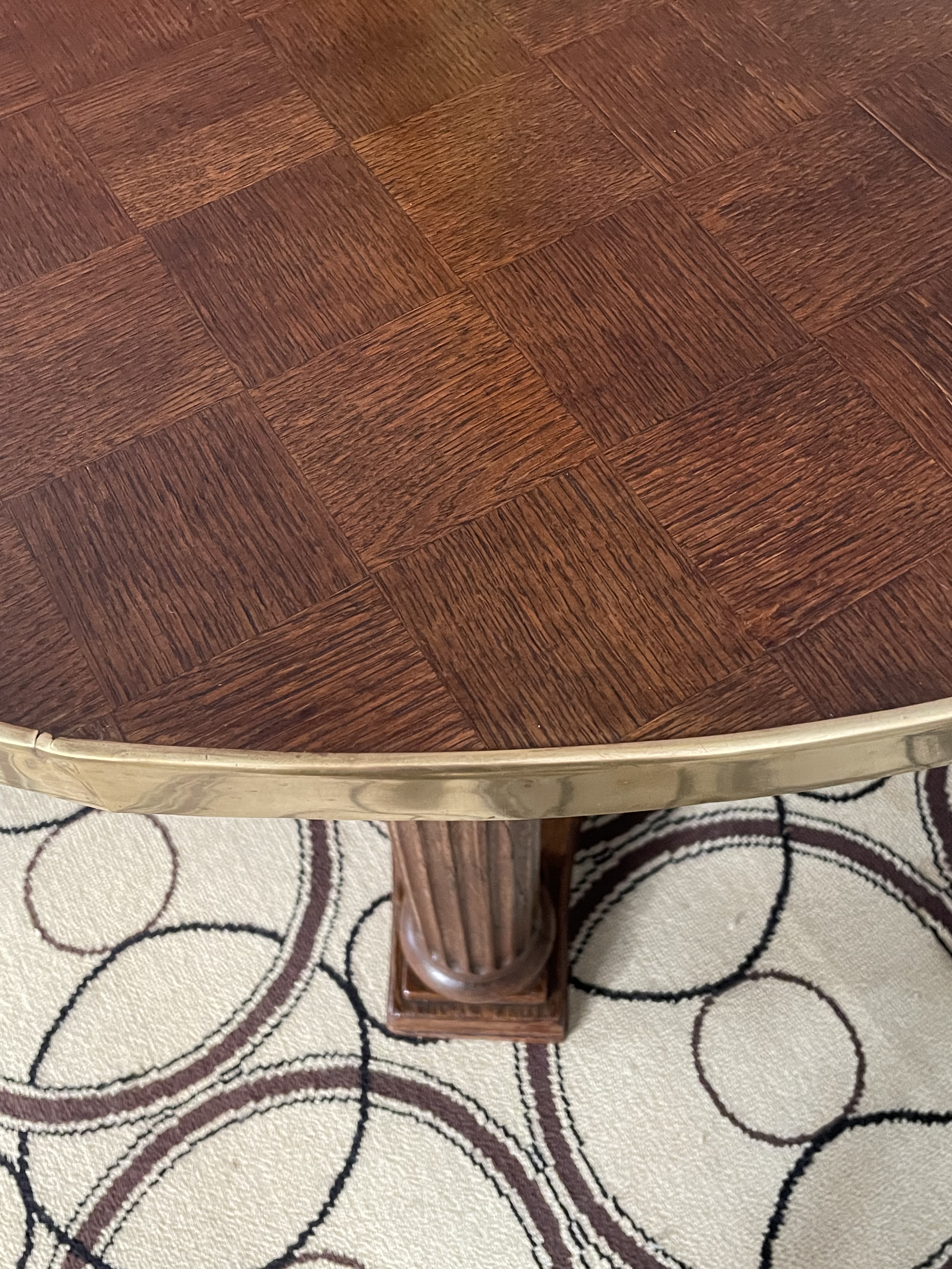
1900s NEO-CLASSICAL GERMAN TABLE
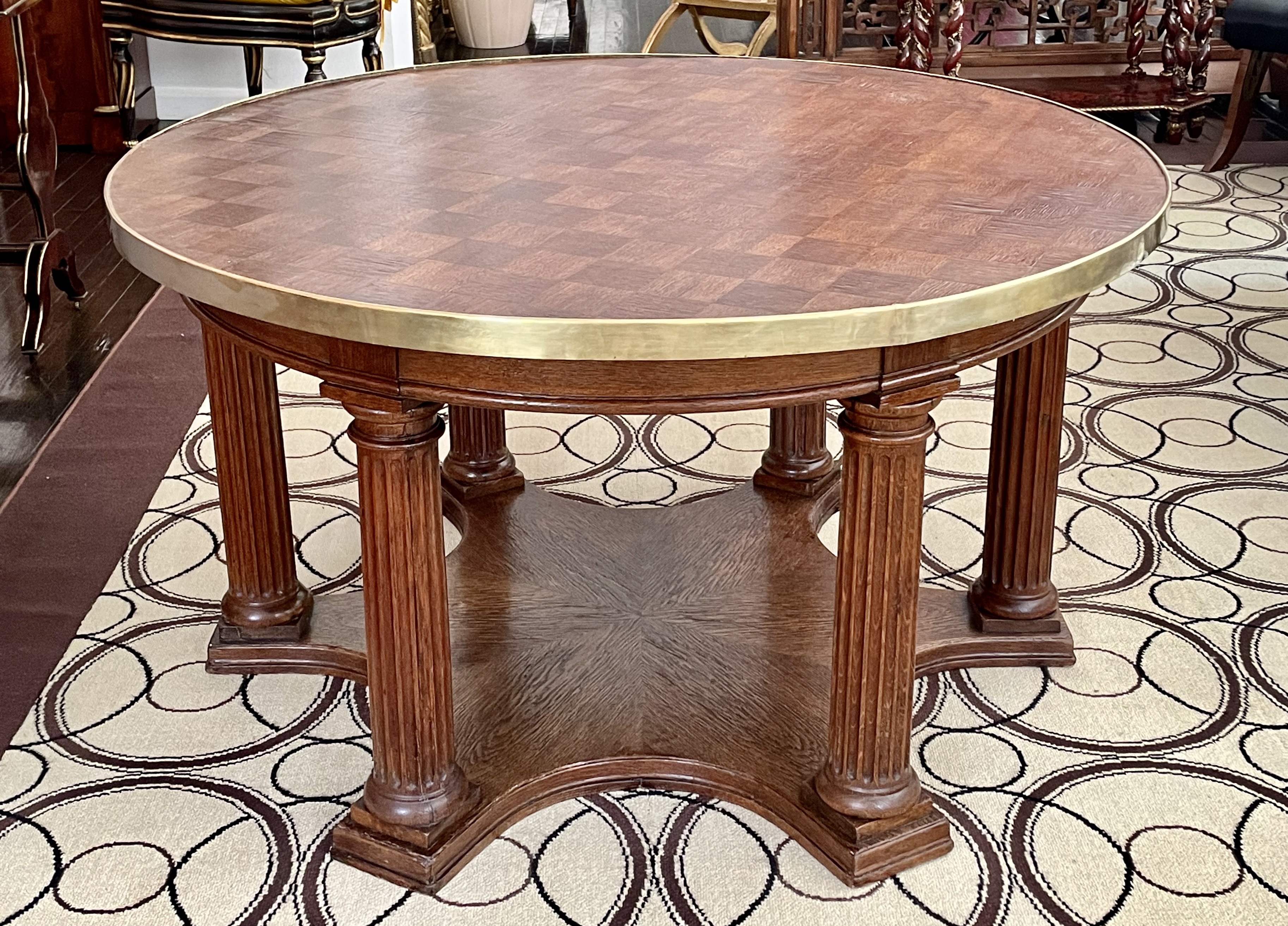
German (Hannover), 20th century. Cocktail table, circa 1910. Oak, both solid & veneered, brass. H: 24″ Dia: 43 1/2″. $12,500
This large coffee or cocktail table is so architectonic it resembles a tempietto awaiting its dome. It was made in Germany around or just before 1910, most likely in Hannover where it recently appeared on the market. The designer’s identity is unknown, but he was clearly influenced by the Biedermeier style that prevailed in Germany and Austria a century before, which was hallmarked by geometry, minimal decoration, and an appreciation of wood. The simplicity of this style appealed to early 20th-century German designers like Peter Behrens and Bruno Paul, who were then attempting to formulate a modern design vocabulary.
Our table’s designer seems to have taken his inspiration from an earlier Hannoverian furniture designer, decorator, architect, and city planner, Georg Ludwig Friedrich Laves (1788-1864). He designed what appears to be a planter, and a table that was realized for Count Georg Wangenheim, which was destroyed in the last war. However simple in form, the table was finely made from expensive mahogany mounted with bronzes, and topped with marble. Our table was no less finely made from humble oak mounted with brass, painstakingly veneered with a checkerboard top and a sunburst base, and laboriously hand-carved with fluting. Its simplicity of form is typical of the pre-war Wilhelmine German avant-garde that evolved into the Bauhaus modernism of the Weimar Republic twenty years later.
FRANZ FRANCK 1920s TABLE

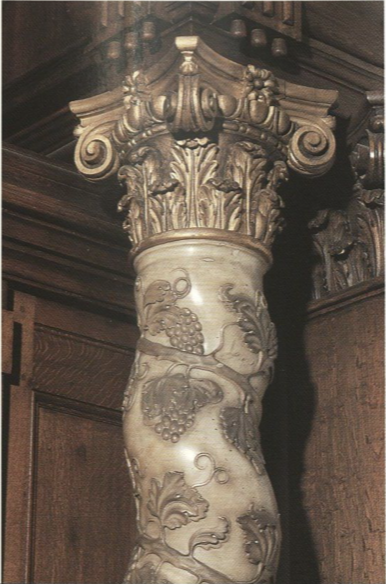
Frans Franck (Belgian 1872-1932) side table, circa 1920. Tortoiseshell veneer, painted & gilded wood. H: 24” L: 33” D: 21” $15,000
Franz Franck was the inspired offspring of an Antwerp family in the wallpaper trade that expanded into furniture and interior design. After studying at the Royal Art Academy of Fine Arts, Franck left for Paris, and then London, where he fell under the spell of the English Arts and Crafts movement. In the 1910s, after joining the family business, he began designing his own line of furniture that was lavishly veneered with tortoiseshell, a specialty of local craftsmen since the 17th century. Franck’s line would earn the firm prestige, but it was so expensive to produce that it never turned a profit. In any case, his work bears the influence of the Baroque style, as seen in our circa 1920 table with serpentine columns intertwined with carved and gilded grape vines, topped by the grotesque masks known as mascarons, a favorite motif of Franck.
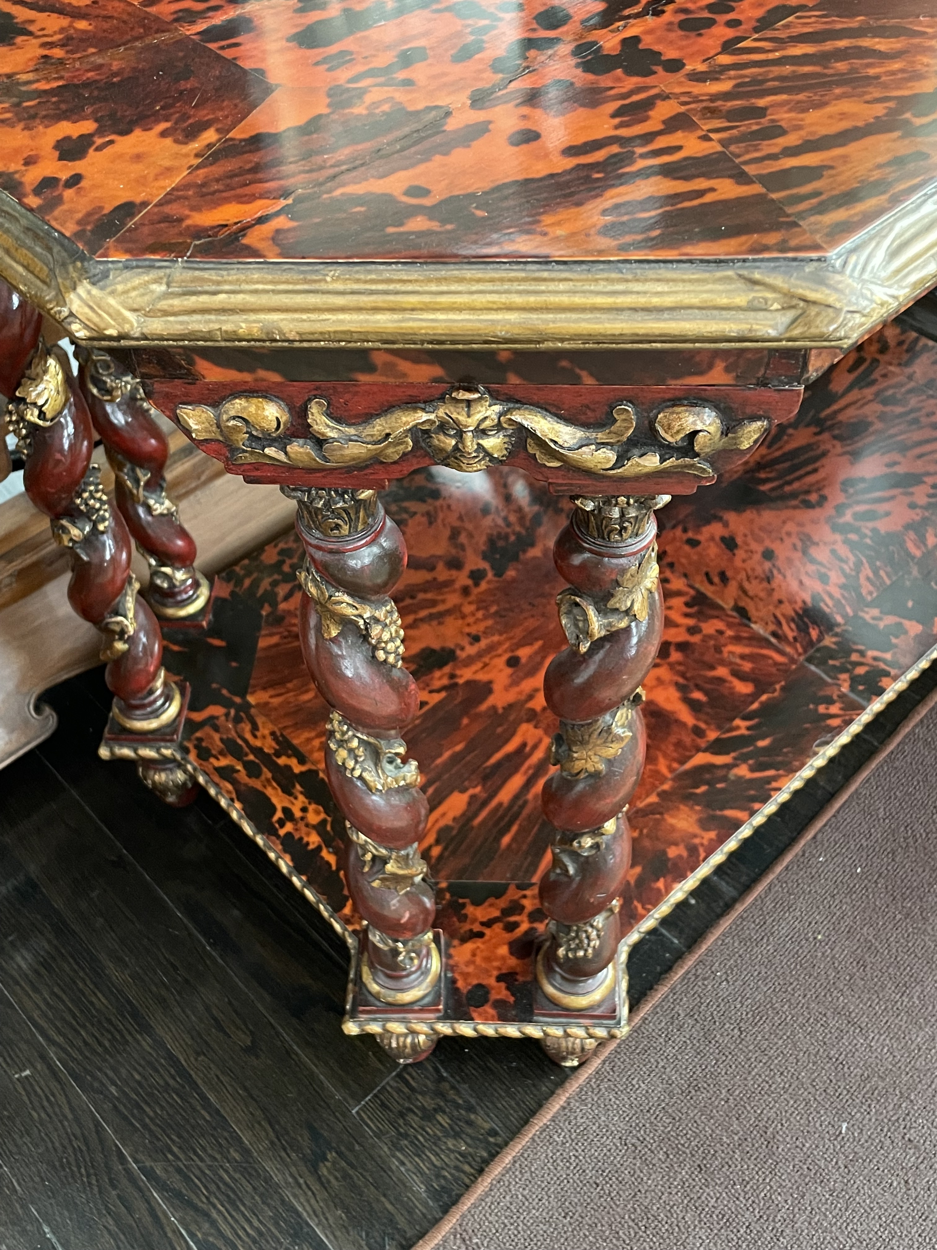
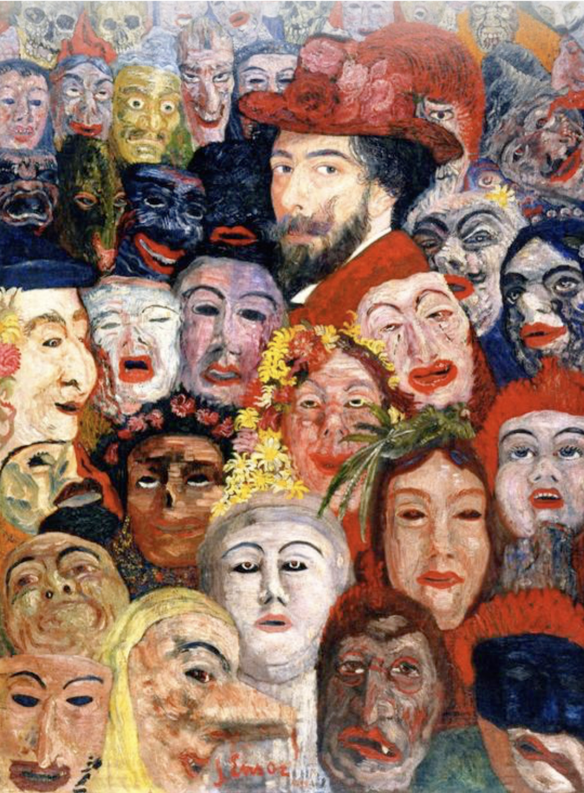
The great painter Peter Paul Rubens was the exemplar of the Baroque in Antwerp, where he remains a local hero today. He was very much in the news when Franck was 25 because a replica of his house was built and furnished on the fairgrounds of the 1897 Antwerp International Exposition. He was in the news again just prior to Franck’s death in 1932, when Rubens’s actual house opened as a museum. An old inventory of his furnishings indicated he was partial to tortoiseshell-veneering, but since his had all long since been dispersed, similar period furnishings were acquired, including a serpentine column intertwined with gilded grapevines. Franck’s serious interest in the Baroque fostered his own inventive take on that style. His appreciation for the old, however, didn’t preclude a deep affinity for the modern. In fact, he assembled an important collection of the proto-Surrealist paintings by his friend James Ensor, another Belgian original. Ensor was even more obsessed by masks than Franck was himself, as seen in a haunting self-portrait where he’s surrounded by them, and wears a 17th-century-style hat à la Rubens.
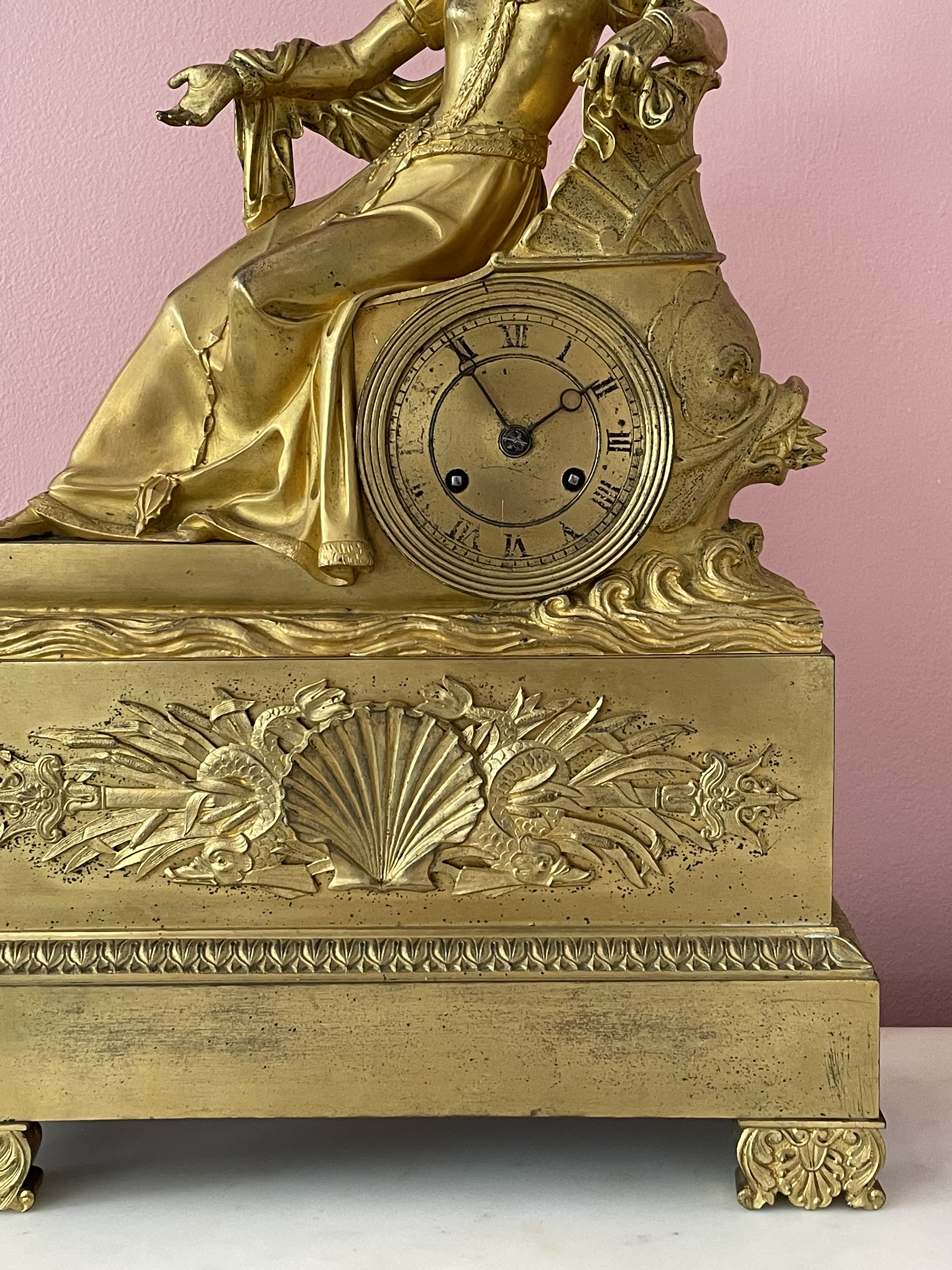
LOUIS-PHILIPPE PERIOD DEPICTING THE DUCHESSE DE BERRY IN DISTRESS
French, 19th century clock representing the Duchesse de Berry, circa 1835. Gilt bronze, enameled metal, with original movement. H: 16 1/4″ L: 11 1/4″ D: 4 1/4″ $5,000
Made in Paris in the 1830s, this charming gilt-bronze clock has its original movement, and presents one of the more romantic figures in French history, Marie-Caroline, Duchess de Berry. Her father was the King of the Two Sicilies, and her husband was Charles-Ferdinand, son of King Charles X of France, and thus heir to the throne. In 1820, as she and her husband were leaving the opera, he was assassinated by an anti-monarchist. At the time she was pregnant with their son, who at birth became Henri, Comte de Chambord, and was popularly known as “the miracle child.” When his grandfather Charles was overthrown in 1830, the young Henri would reign for a mere eight days before Louis-Philippe, Duc d’Orleans, seized power. In 1832, with her young son sidelined, Marie-Caroline staged a coup that failed, resulting in a harrowing escape by boat to a luxurious exile in London, and in Edinburgh at Holyrood Palace.
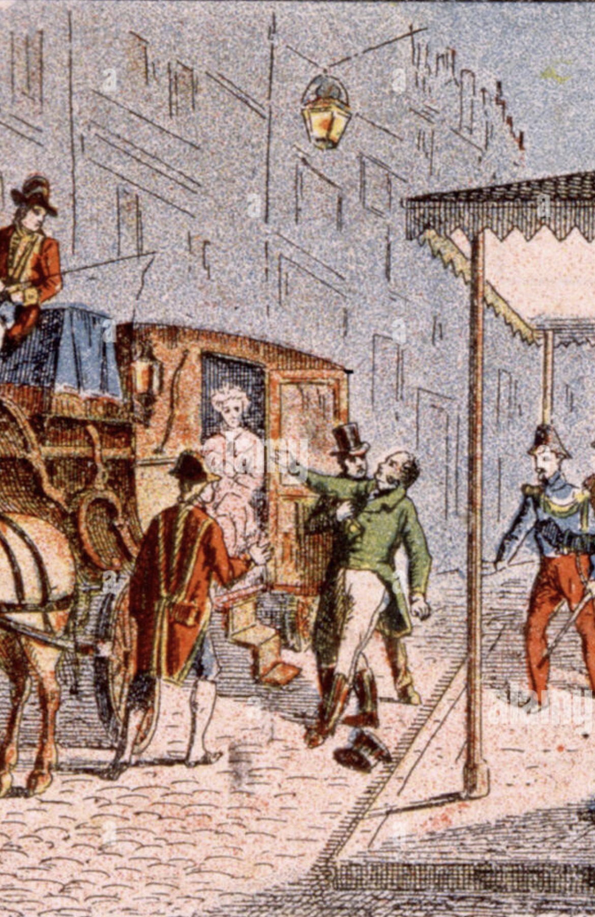
The duchess is seen on our clock in a state of distress during her escape, gazing heavenward as she raises a gloved hand imploring God’s mercy. She’s dressed in le style troubadour, a revival of medievalist fashion, seen in her upturned collar, slashed-puff sleeves, and with a jewelled chatelaine at her waist. The getaway boat, incongruously, is an ancient Roman barge with a dolphin prow. The aquatic theme continues on the clock’s base that’s embellished with a trophy of a scallop shell, bullrushes, fish, and Poseidon’s trident.
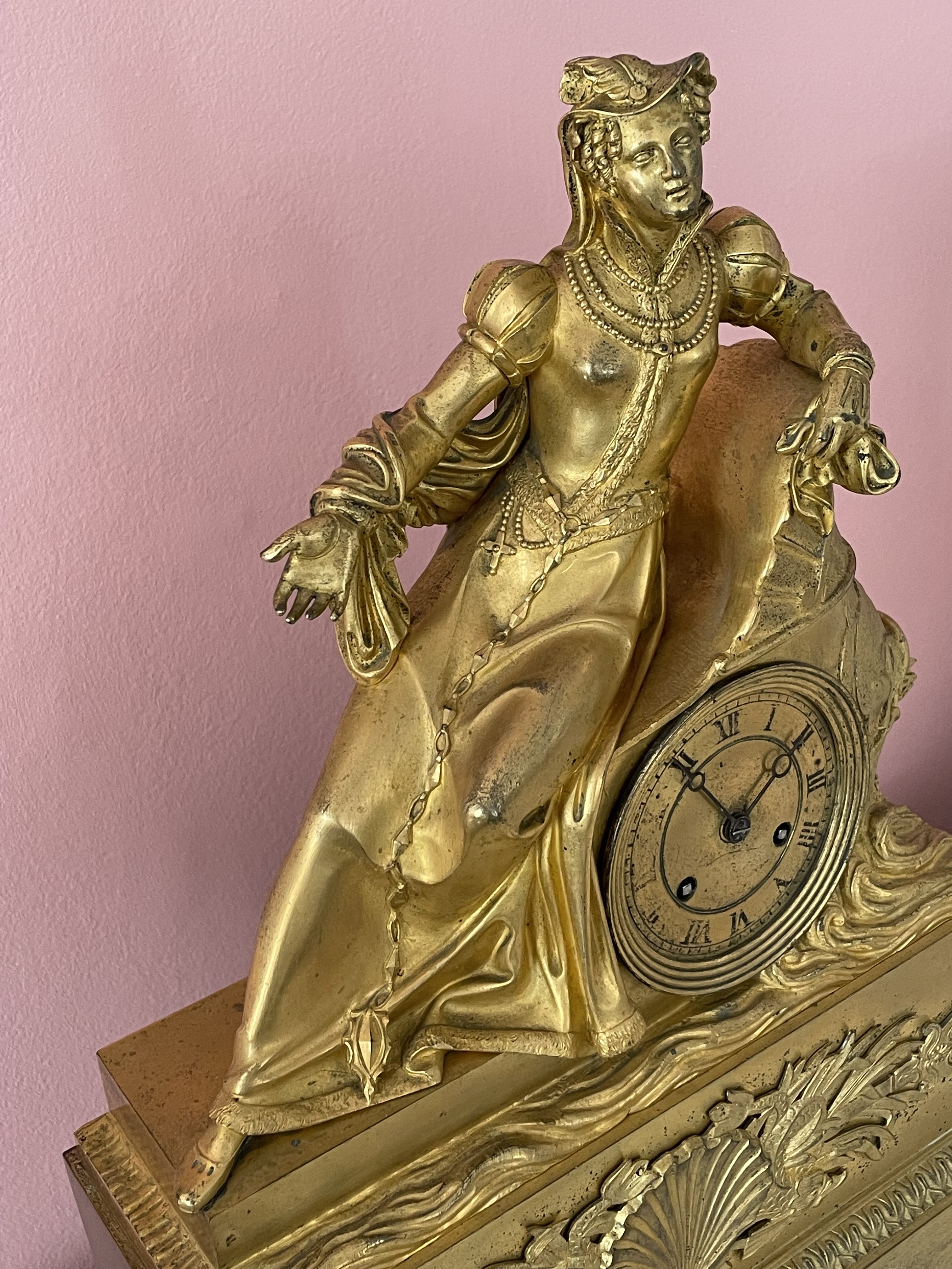
Like Jackie Kennedy over a century later, the well-born, well-married, attractive, stylish, and mediagenic Marie-Caroline played the front woman for a political dynasty, and bravely faced tragedy. No wonder the Bourbon legitimist party in France continued to hope that she and her son would return to power. This did not come to pass. The duchess retired to a Venetian palazzo on the Grand Canal, as did Henri to an Austrian baroque schloss. A come down for them both to be sure — but still, it could have been worse.
1930s BREUHAUS DE GROOT SIDE TABLE
German, 20th century, attribute to Fritz August Breuhaus de Groot (1883-1960). Side table, circa 1928. Solid and veneered stained birch, Bohemian breccia marble. H: 23″ D: 25″ $6,000
Don’t be fooled by the no-nonsense Teutonic appearance of this German side table that’s more about style that it lets on at first sight. There’s no reason for the top to be raised on a drum, the legs to extend beyond the circumference of the top, or a continuous trim to connect the legs and top rail. These elegant touches add visual interest, but they required skill and man hours to realize, increasing fabrication cost. As such, the table turns modernism on its head — form doesn’t follow function, and chic rather than God is in the details.
Our table was made of birch, solid and veneered and stained a rich brown, and topped off with a slab of Bohemian breccia marble. We date it to around 1928, and attribute the design to Fritz August Breuhaus de Groot, [seen on a 1929 magazine cover below left], who coined the term Kultivierte Sachlichkeit (Cultured Objectivity) to describe his work, and distinguish it from the Neue Sachlichkeit (New Objectivity) practiced by his contemporaries Walter Gropius, Mies van der Rohe, and Lily Reich. The table bears a passing resemblance to a considerably simplified, marble-topped, ovoid one that he designed for his 1934 Berlin living room [seen middle ground below right, with Breuhaus in the background].
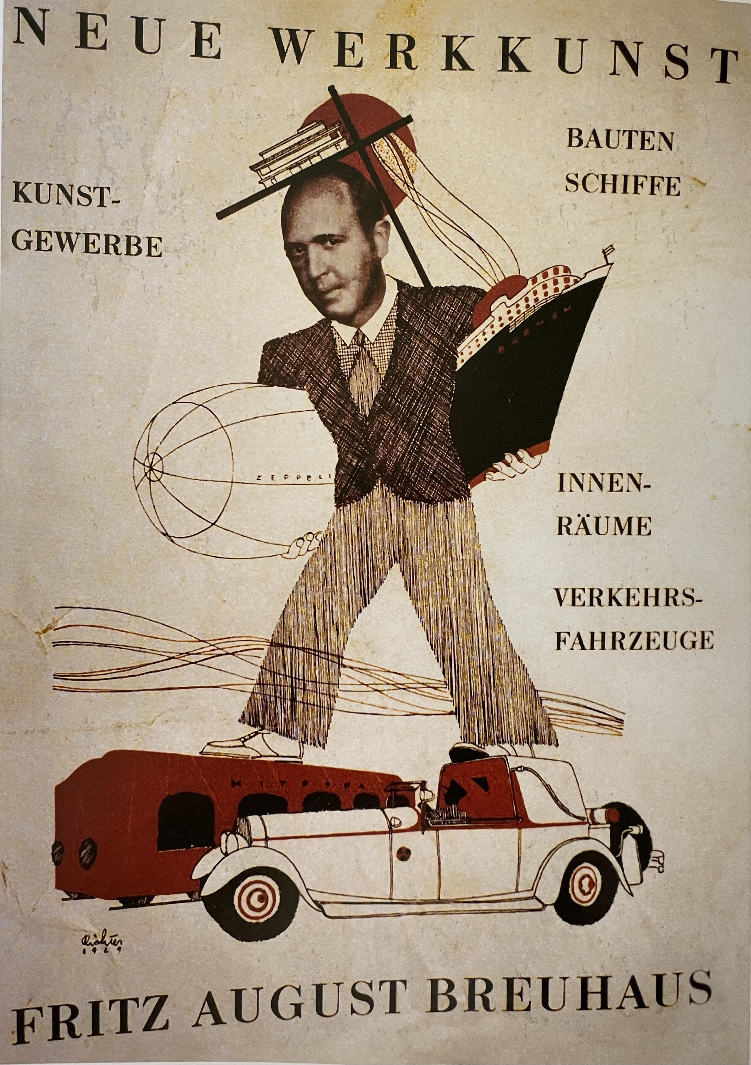
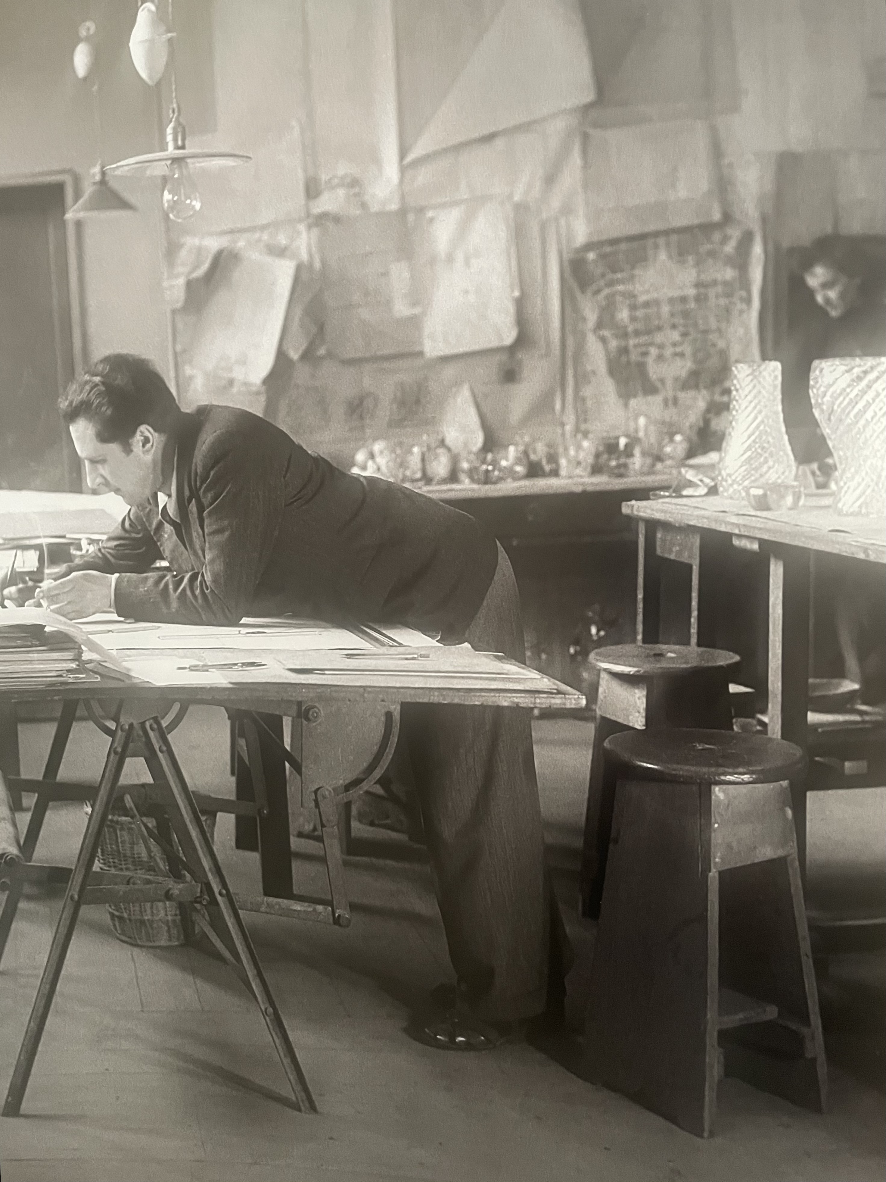
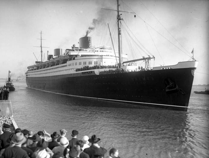
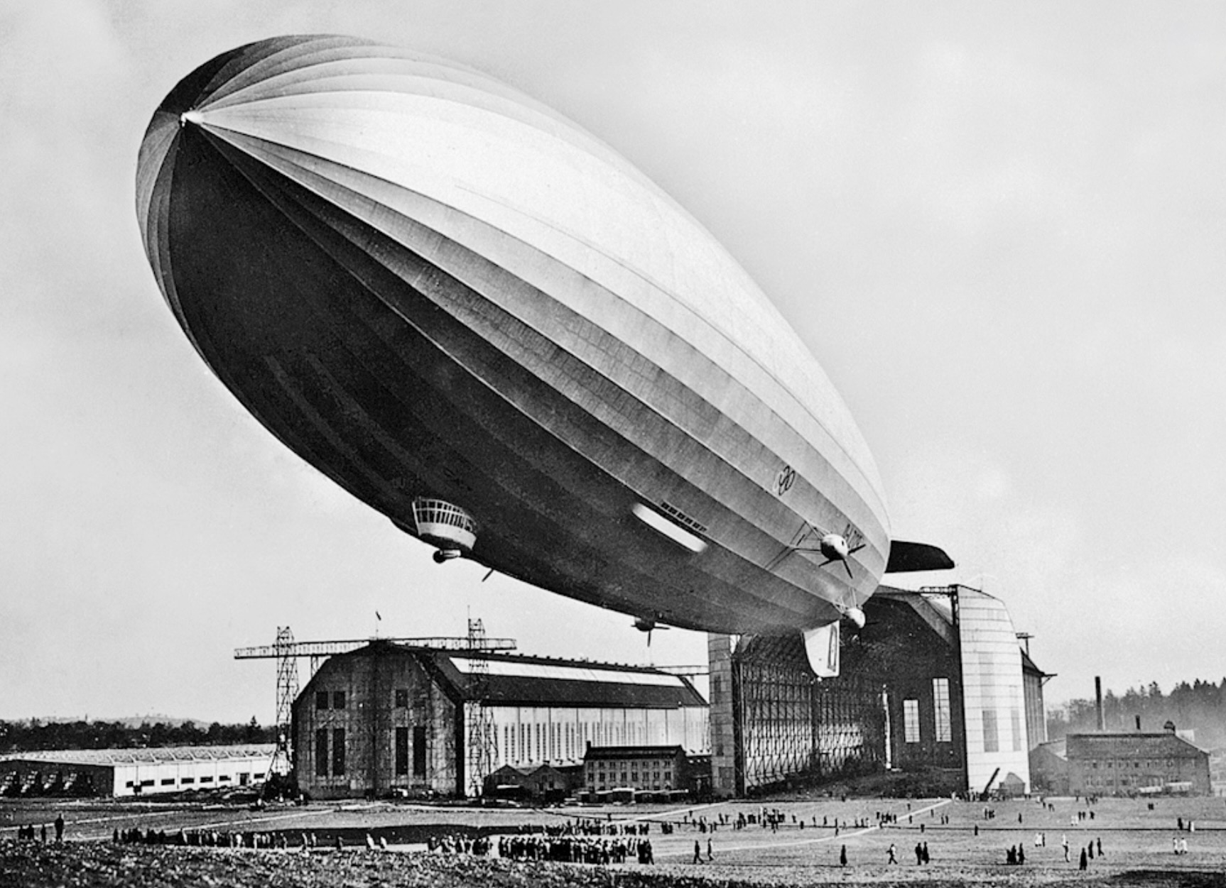
Breuhaus was a man on the make. The first of his three marriages was to the daughter of an industrialist, who financed the building of luxury villas and workers’ housing designed by his son-in-law. In 1929, Breuhaus, the son of a dentist, added “de Groot” to his name, falsely linking himself to a distinguished family of painters. By then, he’d been fudging his academic record for years. That didn’t prevent a teaching appointment at the State University of Bavaria, which allowed him to add the prestigious “Herr Professor” prefix to his name. Yet he never followed through on the teaching — he was far too busy designing more luxury villas (commissions he accepted only if he could furnish them too), and products for his own company, which included furniture, textiles, wallpapers, lighting, and fine silver. In addition to designing aircraft interiors for Lufthansa, and pullman cars, he landed plum commissions for the first-class interiors of the Bremen, the fastest and most technologically advanced ship in the world on entering service in 1929 [liner and library below left], and the Hindenburg, the dirigible that met a famously fiery end at Lakehurst, New Jersey [airship and lounge below right].
ART DECO DESK BY ERNEST BOICEAU
Ernest Boiceau (Swiss/French, 1881-1950). Desk with sliding side shelves, circa 1928. Amboyna-veneered mahogany inlaid with boxwood and purplewood, blind-tooled leather. H: 29” W: 59” D: 33 ¾” Provenance: Galerie Eric Philippe, Paris; Private collection, New York. Bibliography: Eric Philippe, Collection Numero Huit, 1999, pages 33-34.
Among the Art Deco furniture and interior designers who worked in Paris between the wars, Ernest Boiceau was an anomaly. By birth he was Swiss rather than French, Protestant rather than Catholic, a couturier before becoming a furniture and interior designer, and influenced by German as well as French design. This helps to account for the singularity of his work, and his being less well known than the other Art Deco masters, both in his own day as well as our own. And so, when E-J Ruhlmann, Süe et Mare, Armand Rateau and André Groult, were rediscovered in the 1960s and 70s, Boiceau was overlooked until he was reintroduced by Eric Philippe in an exhibition at his Paris gallery in 1982. It came as a revelation. Other exhibitions were subsequently presented in the galleries of Barry Friedman in New York and Willy Hubrechts in Paris. Articles followed, including “Le Mobilier au ‘Top’” published in Connaissance des Arts, in 2007, which placed him among the top ten French designers of the twentieth-century. Yet even today Boiceau’s prices aren’t commensurate with those of his contemporaries. Theirs soar into the seven figures at auction while his rarely exceed six. In the 1920s and 30s, however, there wasn’t this discrepancy. Then, according to Mr. Philippe, the highest priced furniture was made by Ruhlmann, followed by Boiceau, and then Eugene Printz. In spite of Boiceau’s high prices, however, he kept a low profile, and never lacked for clients, even in the darkest days of the Depression.
Born in Lausanne in 1881, Boiceau descended from French Huguenots who settled in Switzerland. Prominent as bankers, lawyers, businessmen and diplomats, the Boiceaus were a cosmopolitan lot. A family member was a pastor of the French Church in London, and another a New York department store executive, who eventually returned home with an American wife. As for Ernest, he studied painting in Munich and in Paris at the École des Beaux-Arts. In 1900 he set out on a decade-long tour of Europe, pursuing landscape and portrait painting all the while. In 1910 he settled in Paris and established an embroidery studio that catered to haute couture and the stage. Among his clients were Worth, Molyneux, the Folies Bergères, the Comédie-Française, and the Paris Opéra. He also made embroidered table linens, wall hangings, and upholstery fabrics. In a 1913 Paris embroidery exhibition at the Musée Galliera, now a costume museum, he presented a boudoir with John Jacobson, another foreign embroidery designer in Paris, that had curtains, wall panels, and upholstery fabrics embroidered with abstract patterns. In 1920 he relocated to the Avenue de l’Opéra, then teeming with the salons of the world’s top couturiers. The proximity prompted him to launch a couture salon of his own in 1925. His collections featured simple shapes sumptuously embroidered, often in the Cornely stitch [above], a channeled-applique technique that was invented and named for the Scotsman who invented and patented it.
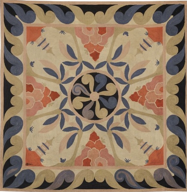
In 1924 Boiceau branched out to design finely crafted objects and furniture from rare woods, shagreen, and ivory. Shortly thereafter he began producing distinctive rugs [above] in both representational and abstract patterns. Each design was based on an image that was doubled or quadrupled, depending on the shape and proportions of the rug, making even representational ones appear abstract. Most were produced in an adaption of the Cornely embroidery stitch, which Boiceau patented for rug production. In 1927, after taking classes at the Ecole Boulle, he decorated his own Rue du Bac apartment with furniture made to his designs. This led to his opening a interior design studio and furniture showroom on the Rue Pierre-Charron [below left]. Then, in 1933, when the world economy was at its nadir, Boiceau closed his fashion house to concentrate on interior and furniture design, and moved that business to new quarters in the Avenue Matignon. On doing so he spun the embroidery workshop off to his employees, which would close in 1950, the year Boiceau died. This suggests he continued to back it, if only to ensure that he had access to the high-quality embroidery he continued to use in wall paneling and on upholstery as an interior designer. In any case, at the beginning of World War II, he closed his business and retired to a country house in the Chevreuse Valley.
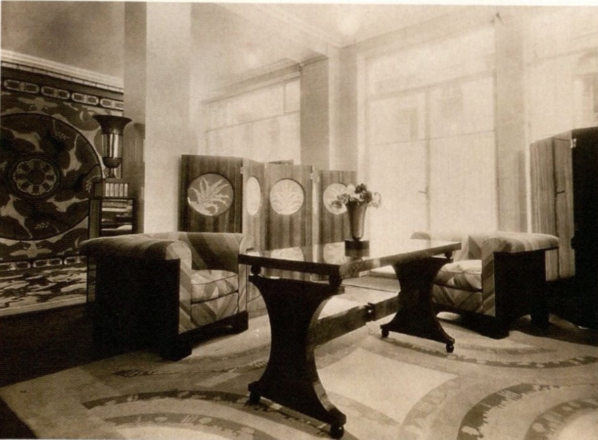

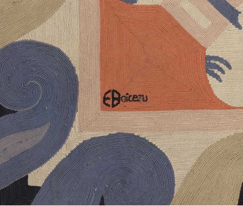
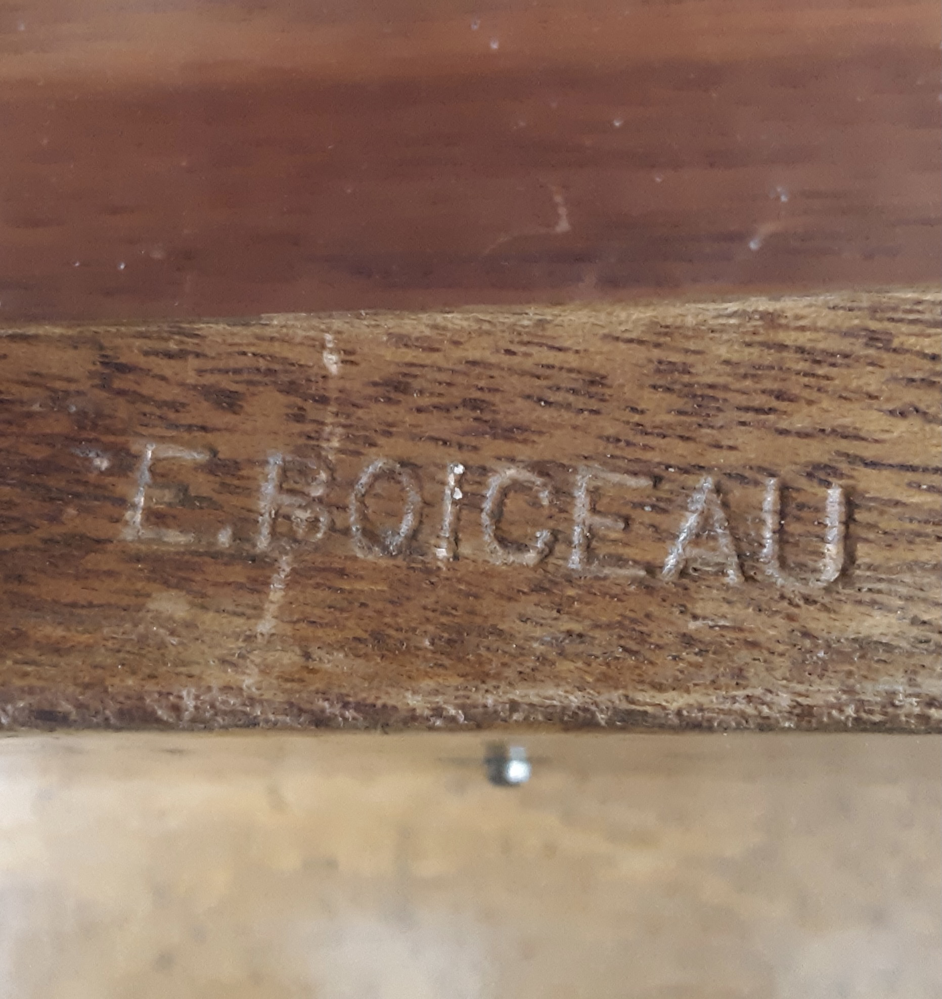
In the 1920s and 30s, the premier French furniture and interior designers exhibited regularly at the annual Paris design exhibitions that brought them publicity and clients. Boiceau, however, participated in only two of them. In 1928 he exhibited a room in the Salon d’Automne, and another there in 1929 [above right]. If his furniture, like that of the other Art Deco designers, was superbly crafted from rare materials, unlike them he seems never to have executed the same design twice. Our desk, which bears his stamp [below left], is unique. It was entirely veneered in amboyna, an exotic burlwood named for the Indonesian island where it was harvested. Its naturally squiggling patterning animates the desk’s form and constitutes its principal decoration. The top is veneered with sixty small book-matched squares of it – ten across and six deep – achieving a subtly kaleidoscopic effect. Keeping applied decoration to a minimum, it consists of four inlaid box-and-purplewood griffins facing off across braziers on the front and back [below right], and blind-tooled Greek keys trimming the edges of white-leather-topped shelves sliding out on either end. These decorations are flush with the surface, leaving the sculptural form sleek, and without drawer pulls, which necessitated keys for each drawer.
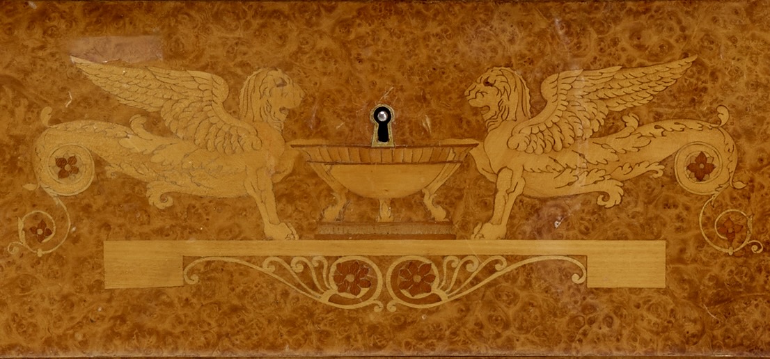
Most Art Deco designers took inspiration from the highly-decorated Louis-Louis and Empire styles of eighteenth- and nineteenth-century France. Boiceau, however took his from the boldly undecorated forms of the Biedermeier style of nineteenth-century Germany and Austria, and the early 20th century revival of it known as Zwischen (Second) Biedermeier. This prompted Gaston Varenne, a design critic for L’Amour de l’Art, to snidely note in his 1929 review of the Salon that Boiceau’s room “probably suits the Swiss taste which isn’t at all ours.” Since Swiss taste is an amalgam of French and German taste, this allusion, made between the wars when these nations competed for design-world preeminence, was a dog-whistle that associated Boiceau with the enemy. Varenne’s chauvinistic observation, however, is not incorrect. Witness our desk, with its weighty forms and drawers set in telescoping legs, characteristic of German furniture, as seen in a 1910s Zwischen Biedermeier dressing table by Edmund Korner [below left], who worked for the Grand Duke of Hesse in Darmstadt.
As a decorator, Boiceau’s rooms often incorporated antique furnishings augmented with his own designs. This is seen in one of the sitting rooms in the vast Paris apartment of Alexandre Mavrogordato, a rich Turkish collector. A 1930 photograph published in Art et Industrie [above right] shows it furnishedwith an antique Louis-Philippe table, a Boiceau carpet and pair of chairs, and an important modern painting by Joan Miró. Boiceau also created rooms from scratch, but surprisingly no photographs of them were published, or are known to have survived. Nevertheless, we can recreate a bedroom he designed for a Mme. Israel, an American then living in Paris, by juxtaposing his perspective watercolor of the paneled setting, showing his rug and bed, with photographs of the bed itself, and a cabinet and a chair made in pairs [all seen below]. This ensemble, unfortunately, has long since been dispersed.
Eric Philippe discovered our desk, and a pair of Boiceau urns, in a 1998 Paris auction. The following year he published them in his annual catalog of notable acquisitions. They came from an apartment overlooking the fashionable Esplanade des Invalides, according to the auctioneer who wouldn’t divulge the original owner’s identity — a pity since Boiceau’s clients are of some interest. Among those in Paris were the novelists Louise de Vilmorin (The Earrings of Mme d’O), and Princess Marthe Bibesco (The Green Parrot), the international society portraitist Bernard Boutet de Monvel, and Cécile Sorel, the legendary star of the Comédie-Française,. There were also fashion designers like Edward Molyneux and Jean-Charles Worth, and the jeweler Louis Cartier. In the United States, the aviator Caleb Bragg had Boiceau rugs and furniture in his Long Island retreat, as did the Manhattan financier William Goadby Loew (whose wife was the daughter of the banker George F. Baker, then one of America’s three richest men). In Chicago, Lucy Linn (née McCormick Blair), a socialite and equestrian who moonlighted as a decorator, bought Boiceaus straight off the floor of his 1929 Salon room. And speaking of decorators, Elsie de Wolfe was a client, as was Frances Elkins, Ruby Ross Wood, Elsie Cobb Wilson, Marian Hall of Tate & Hall, and Sybil Walker, who hung on the walls of her Southampton beach house a Boiceau mirror-framed watercolor of Josephine Baker dancing in the nude. An impressive client roster for a designer who presented his work in only three exhibtions, was rarely published, and didn’t advertise.
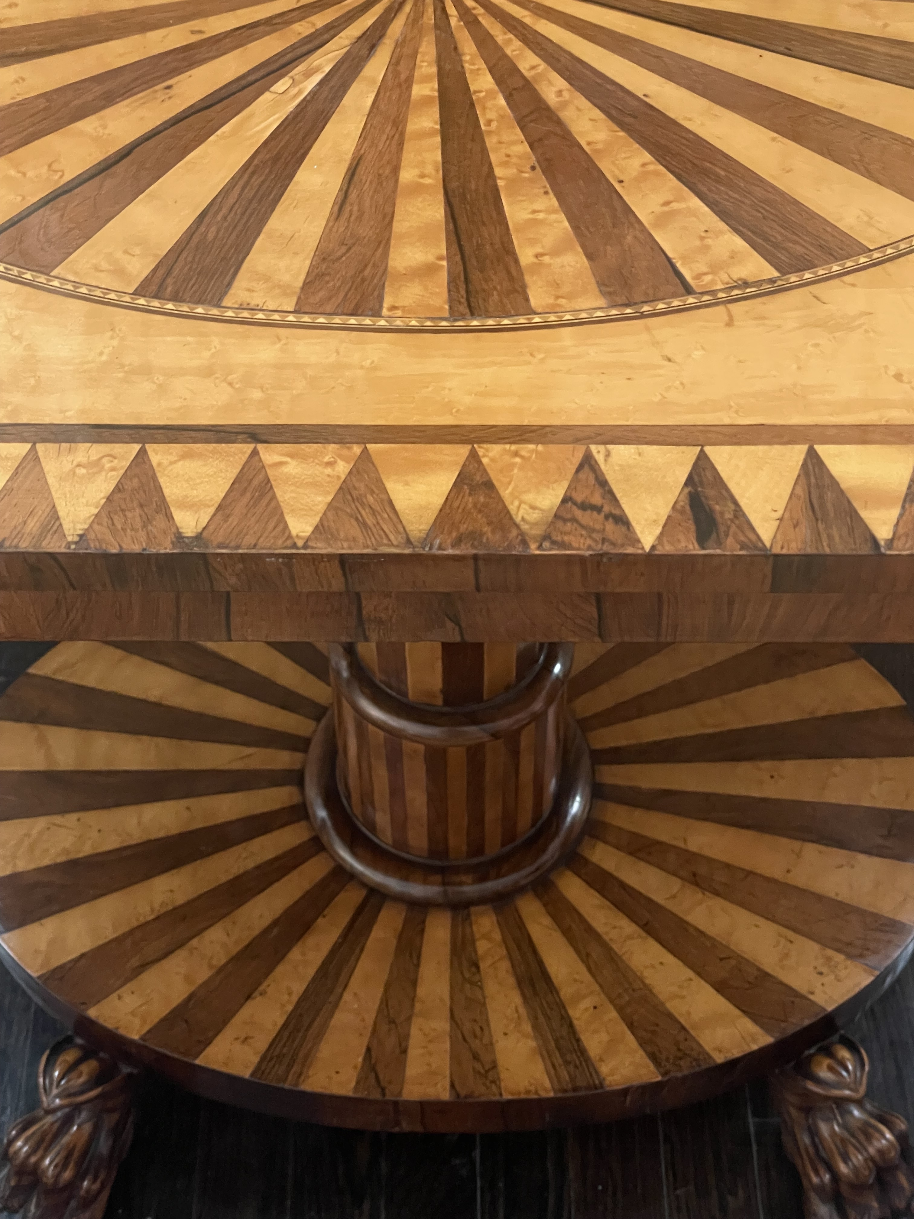
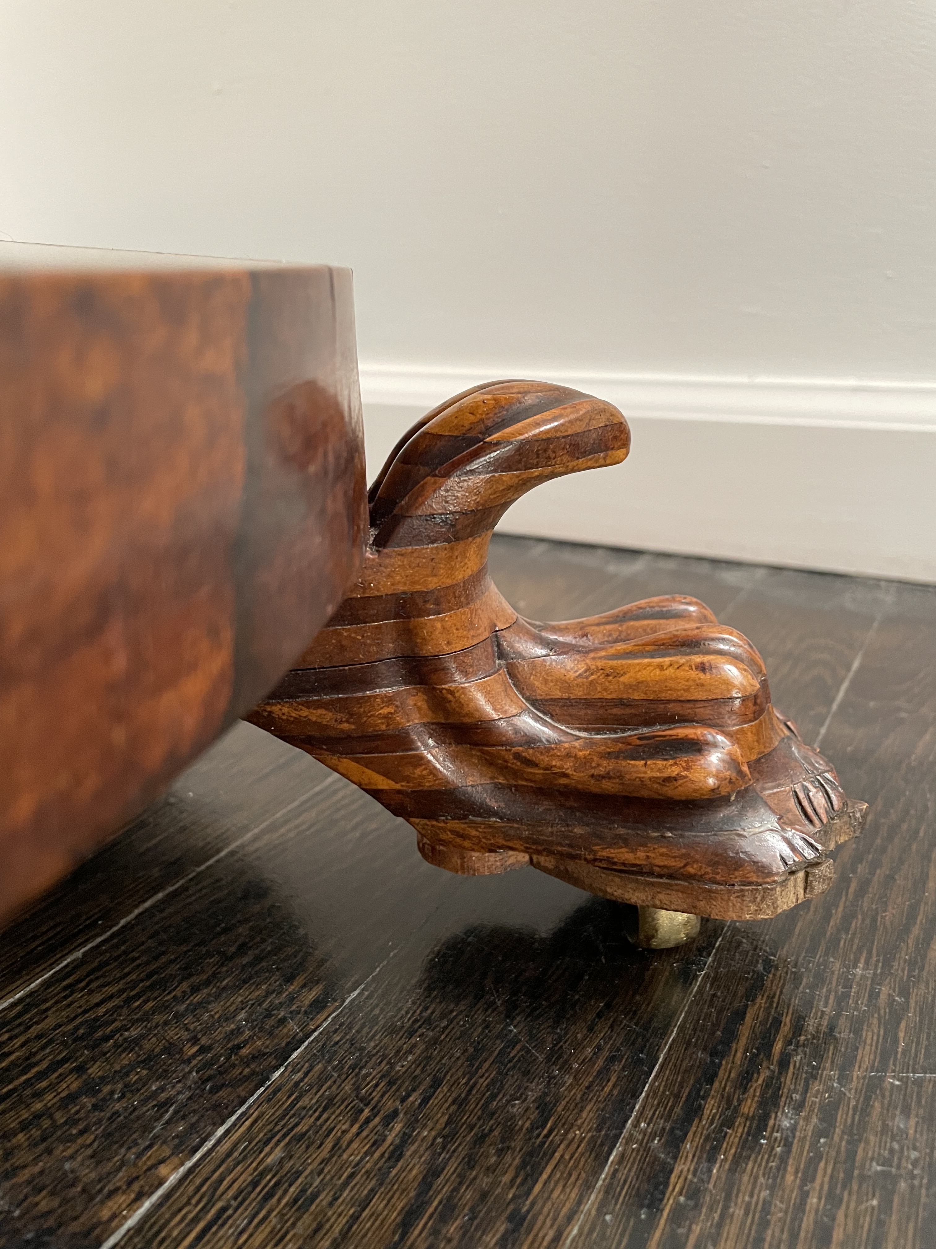
19th CENTURY EASTERN EUROPEAN TABLE
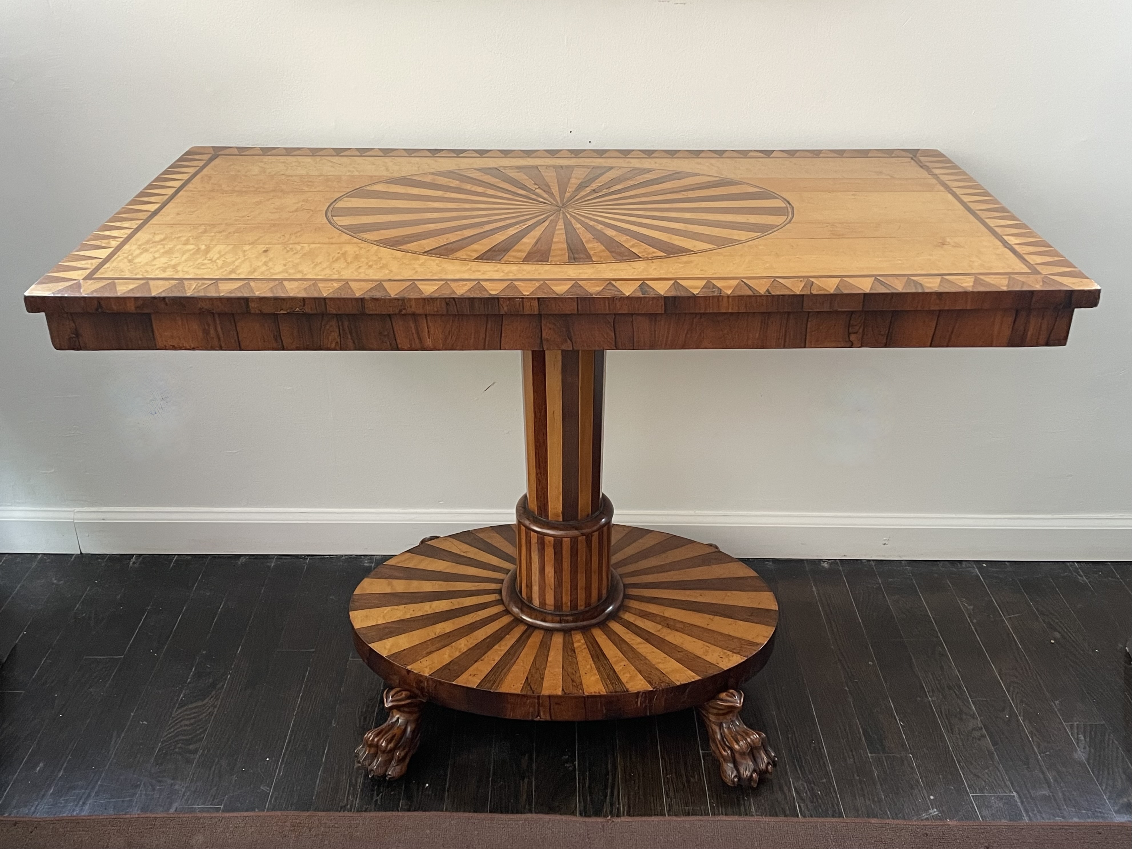
We have yet to determine where this table was made, but its appeal is due, in part, to the bold, graphic, geometrical satinwood-and-rosewood marquetry that recalls the 1960s Op Art paintings of Bridget Riley and others. This patterning even extends to the table’s lion-paw feet, mounted with wheels, that are carved from blocks of layered contrasting wood, as would have been more evident before they darkened with age and use. The table’s form, however, very much conforms to the sophisticated taste of the 1840s when it was made, which was then popular nearly everywhere from New England to Russia, and Scandinavia to Italy. That said, the table may have been made in Czechoslovakia, as it brings to mind a pair of marquetry chairs I had years ago that were said to be from there. Yet the table could also have been made nearby in western Austria, or to the south in the Italian region of Friuli.
PAIR OF ENGLISH VICTORIAN ETAGERES
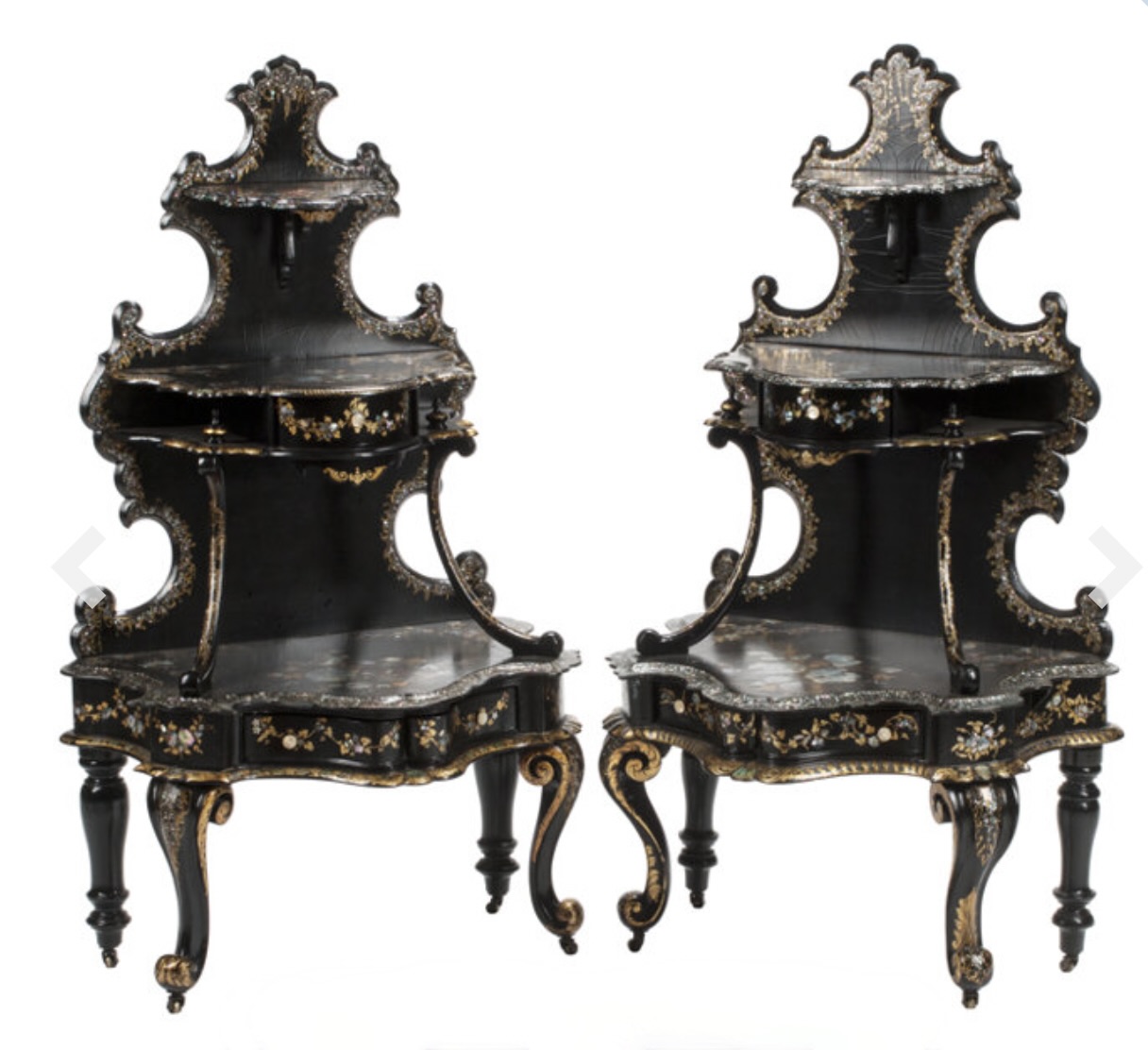
Pair of English etageres, circa 1850. Japanned wood and papier-maché inlaid with mother of pearl. H: 47 1/2″ W: 26 1/2″ D: 17″. $10,000
Wildly curvaceous, this pair of English Victorian etageres are decorated with black japanning, mother-of-pearl inlays, naturalistically painted flowers, and gold-filigree. Each etagere has three drawers — one beneath the middle shelf and two beneath the bottom one — with mother-of-pearl pulls. The drawers retain their original decorated-paper linings. These etageres, like the best examples of Victorian furniture, are charming as well as bizarre, and more than a little fetishistic.
19TH-CENTURY JAPANESE TILT-TOP TABLE
Japanese tilt-top table, circa 1870. Lacquered wood with mother-of-pearl inlay, brass fittings. H: 29″ , 40″ with top vertical, Dia: 21 1/2″. $9,000
Made in Japan around 1870, this table is lacquered, inlaid with mother-of pearl, and takes the form of a European tilt-top table. It was probably intended for the export market — or not, since at the time Emperor Meiji pivoted Japan from an isolated feudal state to an industrial world power, and encouraged the production of Western-style goods for local consumption. Like many Western tables made in the 19th century, this one has a tilt-top and an openwork support. The top is decorated with the three yin-yang-like lobes known to Buddhists as the “wheel of joy.” Each lobe presents a picture. In one ducks cavort among chrysanthemums, in another swallows do the same among cherry blossoms, and in the third they flit about a vase filled with flowers on a cart. In Japan, it should be noted, ducks symbolize fertility, swallows ancestral spirits, cherry blossoms renewal, and chrysanthemums long life, which is why the Chrysanthemum Throne is the seat of imperial power.
JAPANESE ALTAR TABLE
Japanese 18th century altar table. Edo period. Lacquered wood, gilt-brass mounts. H: 12” L: 24 ½” D: 10 ½” Provenance: Pierre Le-Tan, Paris. $15,000
This lacquered 18th-century altar table was probably made for the private shrine of an aristocratic home. There, it would have been placed before a deity, and ritual objects — an incense burner, candle stands, and offerings of fresh flowers — would have been placed on it. A similar, longer table was once in the important Asian art collection of Mr. & Mrs. Michel Beurdeley of Paris [below left]. In Japan and China, as in the West, lacquerware is coveted for its beauty, durability, and the skill of the artisans who are trained to make it. To lacquer an object properly requires dozens of coats, and each must dry and be sanded down before the next can be applied. And since lacquer is toxic when wet, the artisans who mastered the art suffer skin rashes, and risk early death.

Our table was first lacquered black, and then a color we know as “Chinese red.” Over time, and with use, the surface was worn down randomly, revealing the layers underneath. This mottled effect was so prized that the process was sometimes rushed by rubbing, reflecting an appreciation of age and use that is intrinsically Asian. In addition to lacquerware, this can be seen in Japanese kintsukuroi – gold-repair ceramics –- that were mended with gold lacquer to emphasize, rather than disguise, breaks and chips occurred over time [above right a 17th-century example in The Smithsonian]. These techniques of aging and repair reveal an essential difference between the East where age is venerated, and the West where youth is prized above all else.
VICTORIAN INVALID’S TABLE
Leveson & Sons (London maker). Invalid’s table or reading table, circa 1870. Mahogany, brass hardware. H; 31″ up to 44″ L: 31″ D: 16″. $4,000
So-called invalid tables were bought not only by invalids and the elderly, but also by those who enjoyed rude health. And no wonder, since these multi-purpose tables could be used for writing, reading, and dining, while seated in an armchair or lolling in bed. This one bears the label of Leveson & Sons, a London-based firm with outlets in the prosperous industrial cities of Manchester, Liverpool, and Leeds. Established in 1849 by Alexander Leveson, the firm made furniture that was adjustable, collapsible, and wheeled, for both domestic and military use. Under his sons, grandsons, and great grandsons, Leveson flourished until 1915. This circa 1870 invalid’s table is hewn from mahogany, equipped with sturdy brass hardware, and a ratcheted top that can be raised or lowered. The top can also be pivoted — when parallel to the floor a small book can rest on the ratcheted lectern, and when tilted a hefty one can rest on the slats. Mounted to the table’s base are brass wheels that allow it to be slid aside when getting in or out of a chair or bed.
ITALIAN RENAISSANCE CHAIR
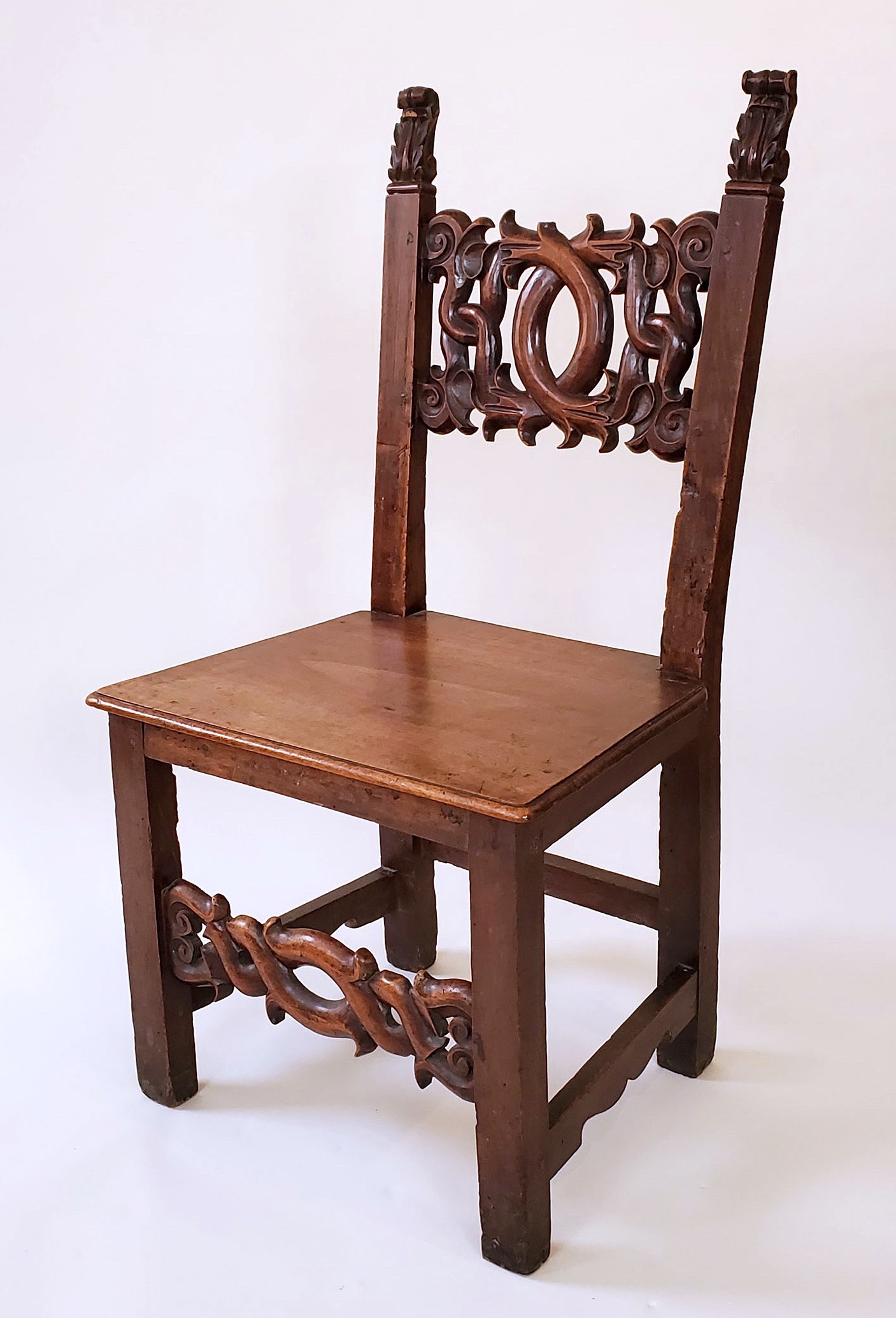
Renaissance chair, Italian, probably Florence, circa 1575. Carved walnut. H: 40 ¾” W: 21 ¼” D: 18 ¾” (seat height 17 ¾”). Provenance: Pierre Le-Tan, Paris. Sold
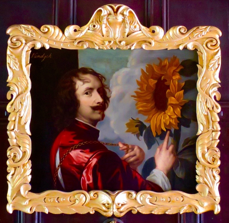
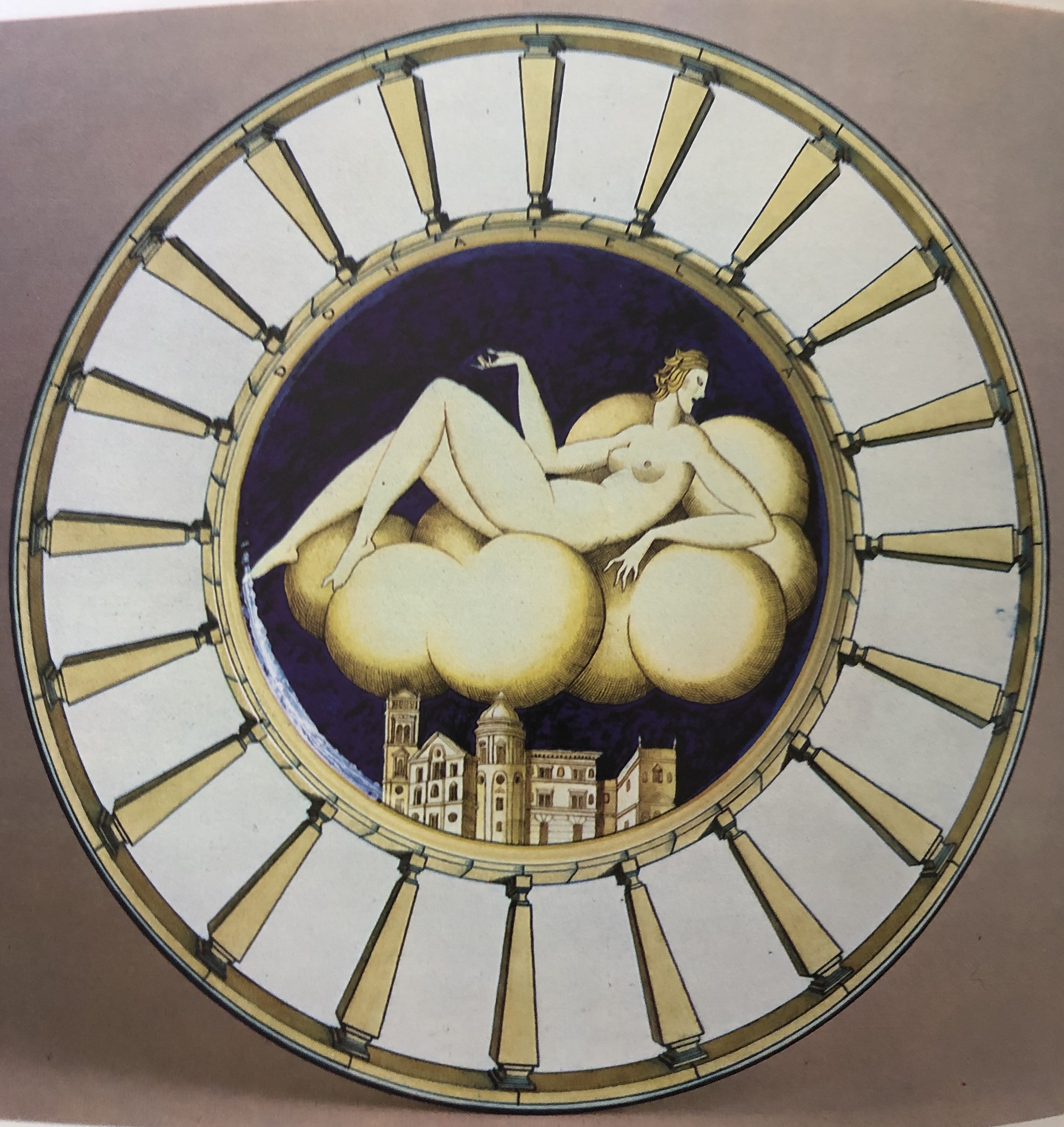
Over the course of five centuries of use, this Italian Renaissance walnut chair has acquired a rich patina. Its form is characterised by austerity, which is relieved by a sensuously carved back splat and stretcher. Their vaguely vegetal forms are in the Auricular style that was named for the human-ear cartilage its forms resemble. Too bizarre to be widely popular, the style originated in late 16th-century Renaissance Italy, and found its fullest expression during the Baroque in 17th century Holland, where it was known as Kwab, which is Dutch for earlobe. There, an Auricular giltwood frame came to overpower a self-portrait of Sir Anthony van Dyke facing off with a sunflower [below left], which is now at Ham House in England. Centuries later, back in Italy, when decorating a platter in 1927, Gio Ponti channeled both the Auricular style in the form of a nude on a puffy cloud, and the High Renaissance style in the form of the city she hovers over, as well as in the balustrade that enframes her.
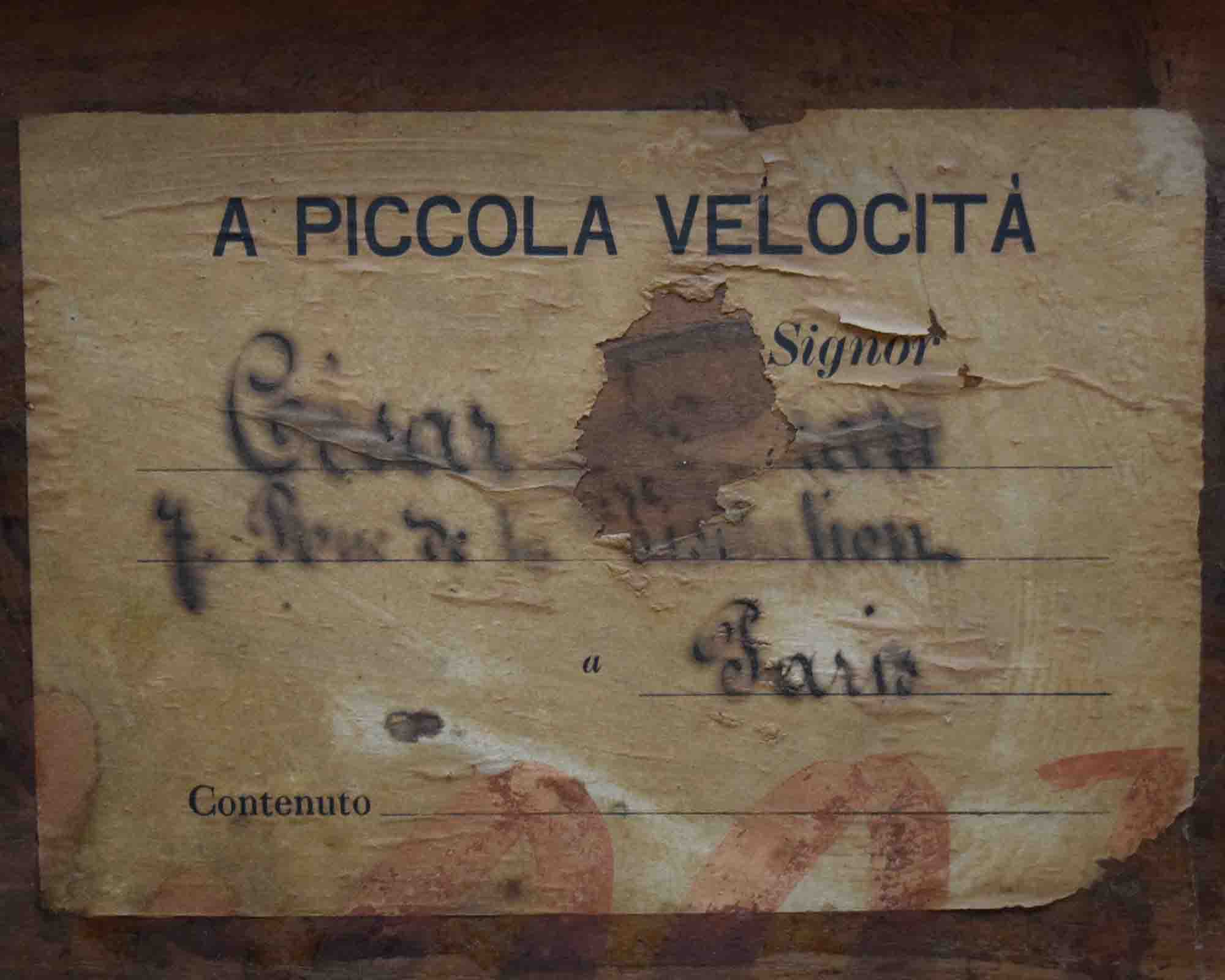
We purchased this chair in Paris from Pierre Le-Tan, the celebrated artist and collector, who was photographed sitting on it in 2018 for The World of Interiors [below left]. Its earlier provenance, however, remains a mystery despite two tantalizing clues: a large “F. R.” painted on the rear legs in a 16th or 17th-century script, and a turn-of-the-20th-century Italian shipping label affixed to the underside of the seat, indicating the chair was to be shipped “with no great speed” to a gentleman in Paris named César something-or-other, who lived at number 7 rue de la something. How infuriating that the information we most want to know – the collector’s surname — is now illegible.

NAPOLEON III CHAUFFEUSE
French, 19th century. Napoleon III chauffeuse, circa 1860. Giltwood, silk-satin upholstery. H: 35″ W: 20″ D: 21″. $9,000
This elegant yet eccentric little chair conforms to a type known as a chauffeuse, from the French verb chauffer, “to warm.” It would have been placed by a fireplace where one took a seat on coming in from the cold. Ours was made in France during the reign of Emperor Napoleon III. There, the prevailing eclectic style now referred to as “le style Rothschild” was the French equivalent of the Victorian style, which prevailed in England under Queen Victoria. This chauffeuse is an over-the-top take on the earlier Louis XVI style, as seen in the plethora of neoclassical rosettes, ribbon cresting, moldings, and the acanthus-topped fluted legs that splay out with abandon at the back.
PAIR OF SAMUEL MARX STOOLS
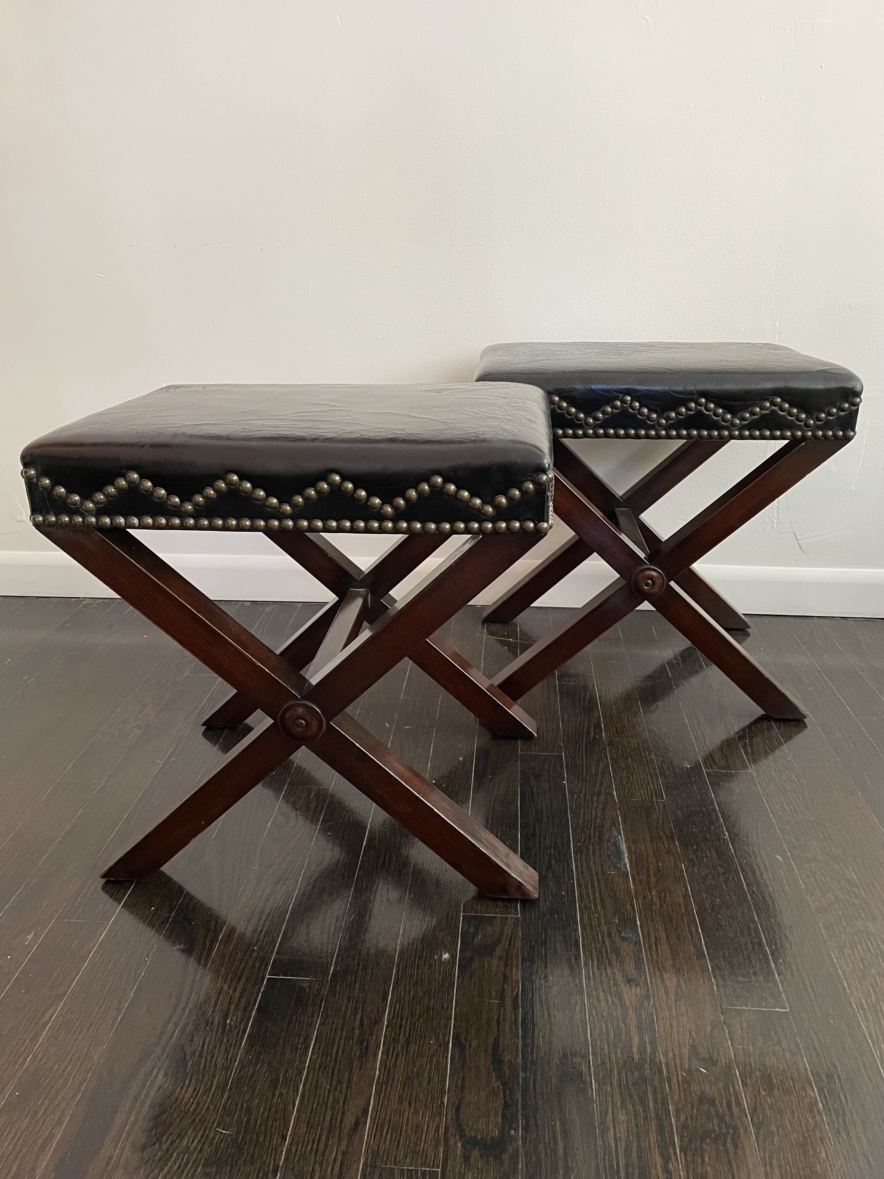
Samuel Marx (American, 1885-1964) pair of stools, 1933. Ebonized wood, leather, brass nailheads. H: 19″ W: 18 1/2″ D: 14 1/2″ Provenance: Mr. & Mrs. Edward Sonnenschein, Glencoe, Illinois; The Art Institute of Chicago. $12,500
This handsome pair of stools were designed by Samuel Marx to go with the tables made for the “jade room” of Edward and Louise Sonnenschein in Glencoe, Illinois (see above). The leather upholstery is studded with decorative nailheads set in a zigzag pattern.
1030s FELIX DAVIN CHAIRS
Félix Davin (French, 1902-1976). Pair of chairs, circa 1937. Limed oak, Aubusson tapestry upholstery. H: 46 1/2″ W: 19 1/2″ D: 21″. Bibliography: Mobilier & Décoration, Jan 1, 1937, p. 182. Provenance: Reed & Delphine Krakoff, New York. Sold
Félix Davin practiced architecture before he came to specialize in domestic interiors and furniture design in the 1930s. His work was clean-lined and modern looking, yet informed by an historical knowledge worn lightly. This is seen in our pair of chairs in a vaguely Louis XIII style. They retain their original Aubusson tapestry coverings. The same chair model, upholstered in a different Aubusson pattern, appeared in an article on Davin in a 1937 issue of Mobilier & Décoration.
1930s WALTER KNOLL TUBULAR STEEL ARMCHAIRS
Pair of armchairs designed and upholstered by Walter Knoll (German 1878 – 1971), with frames by Thonet (model no. K411). Chromed-steel, leather. H: 32″ W: 30″ D: 28″. Bibliography: Jan van Geest & Otakar Macel, Stuhl aus Stahl, Metallmobel 1925-2940, fig. 4. Provenance: Galerie Ambiente, Vienna. $12,500
These Walter Knoll armchairs have frames of chrome-plated tubular steel made by Thonet, and retain their original leather upholstery by Knoll. The Knoll family furniture dynasty began in 1864 when Walter’s grandfather set up a tannery in Stuttgart specializing in leather-upholstered furniture. At loggerheads with his father and elder brother, who was then being groomed to take over the family firm, Walter left in a huff for New York where he worked in the leather-glove trade. Returning for a death-bed rapprochement with his father, he stayed on, married up, and established a rival furniture company in 1925 that was financed by his father-in-law. A modernist, Walter sold furniture to Ludwig Mies van der Rohe, and supplied chairs for the first-class lounge of the Bremen, the fastest and most innovative luxury liner of the day. Our 1932 armchairs unite avant-garde tubular-steel frames with traditional gemutlich upholstery. In the years that followed, history repeated itself when Walter’s son Hans, bristling under the paternal thumb, left in a huff for New York, where he established his own furniture firm and also married up, for it was his talented wife Florence who made Knoll International the ne plus ultra of midcentury-modern American design.
JOHN VESEY ‘MAXIMILIAN LOUNGE CHAIRS’
The “Maximilian Lounge Chair” was John Vesey’s finest and most celebrated chair design — it was also the most expensive to produce. The aluminum frame was wrought rather than cast, solid rather than assembled, and polished to a seamless satiny sheen. An industrial-aluminum screen supports the black-leather upholstery tufted in a pattern that harks back to the 19th century. So too does the chair’s form that’s based on low-slung Latin American planters’ chairs. One that belonged to the ill-fated Emperor Maximilian of Mexico inspired both Vesey’s design and the chair’s name. Although humbly born, Vesey attended Harvard, wore Saville Row suits, and became a high-society fixture. Among his clients were the Duke and Duchess of Windsor, Babe Paley, Cecil Beaton, Hubert de Givenchy, and “Baby” Jane Holzer. He began as an antiques dealer, and then had the brilliant idea of replicating his antique inventory in aluminum, steel, brass, glass, and black leather. The stunning results prompted him to sell his antique inventory in a 1955 auction and use the proceeds to produce a furniture line of his own designs.
LARGE BARLEY-TWIST CANDLESTICK
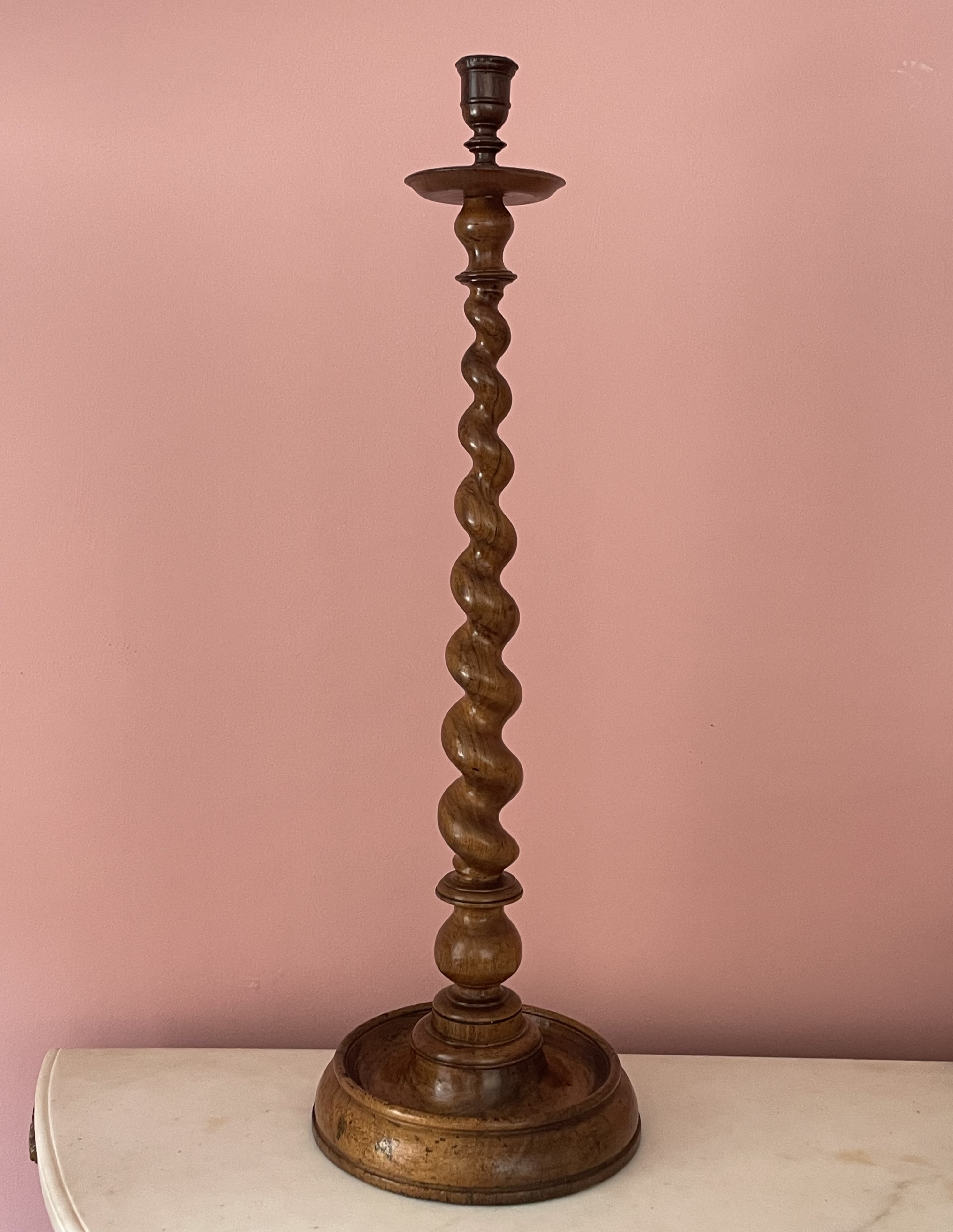
English, 18th century. Barley-twist candlestick, circa 1750. Walnut, brass nozzle insert. H: 32 1/2″; Dia: 10 1/2″. $3,750
Candlesticks of barley-twist form were popular in 18th-century England, but it’s rare to find one on such a large scale. The twisted form was derived from the barley-twist-candy sticks that were made in England from sugar imported from the West Indies colonies. The candy’s other ingredient was barley water, which was made by boiling barley with water. When these ingredients were combined to make candy, their amber color resembled the walnut from which this candlestick was hewn.
ROCOCO CANDELABRA
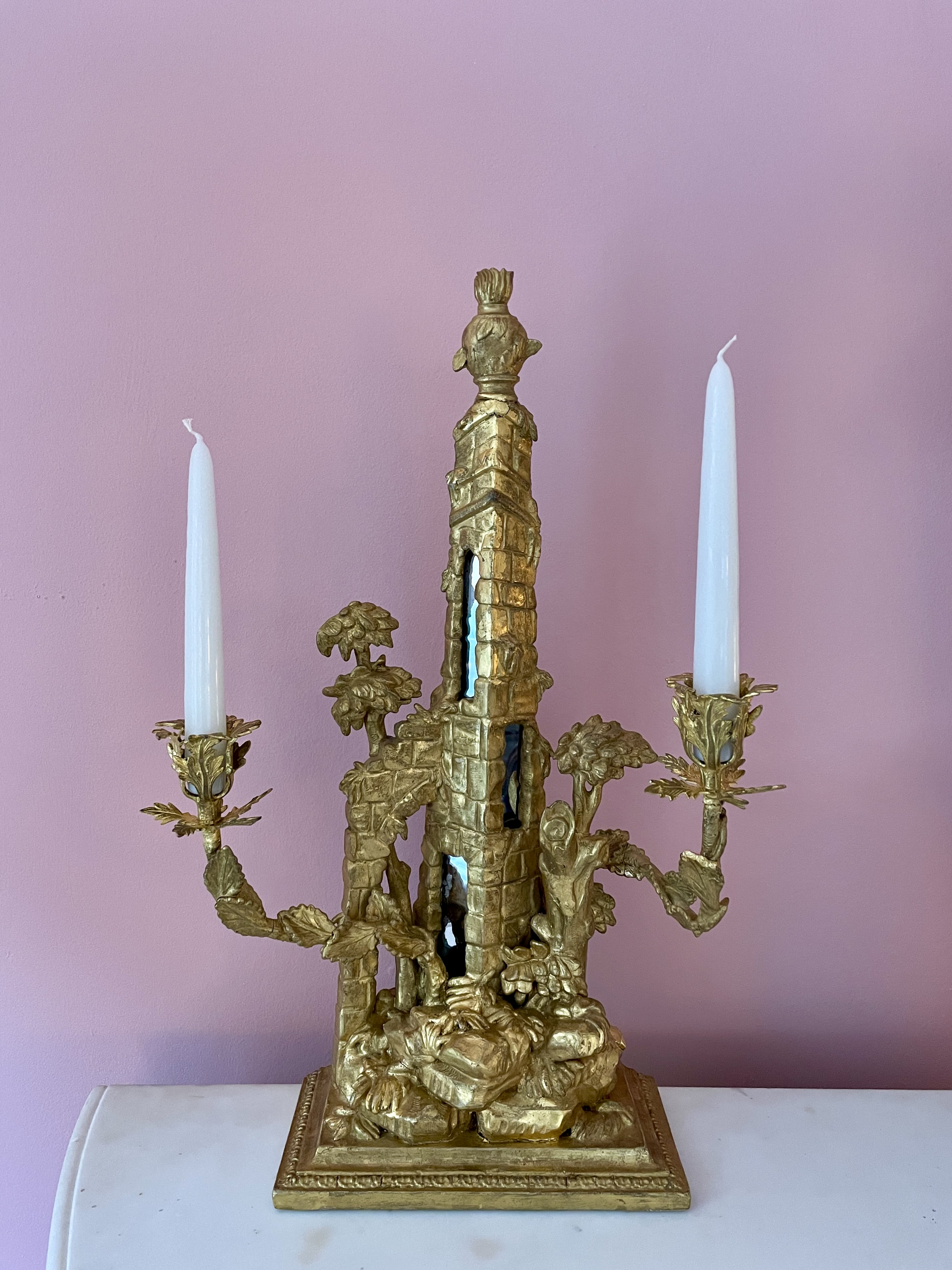
French, 18th century. Candelabra, circa 1770. Giltwood, gilt metal, mirror. H: 19 1/2″ W: 13 1/4″ D: 7 1/4″. $8,000
This candelabra with leaf-sheathed arms takes the form of a ruin consisting of an urn-topped tower with mirror-embedded windows, which is improbably supported by a Gothic flying buttress. All this is rooted on rockwork that rests on a stepped Neo-Classical base. The mirrors are a later addition, but they ramp up the charm quotient and reflect the object’s history — not to mention day- and candlelight. Such wild imaginings are typical of the Rococo style that prevailed in the mid 18th-century, when artists painted whimsical landscapes with ruins overgrown by nature. This is also seen in the contemporary prints and tole de Jouy fabrics that were then widely disseminated, prompting a craze for the picturesque but useless garden structures known as follies.
SMALL BAGUES CHANDELIER
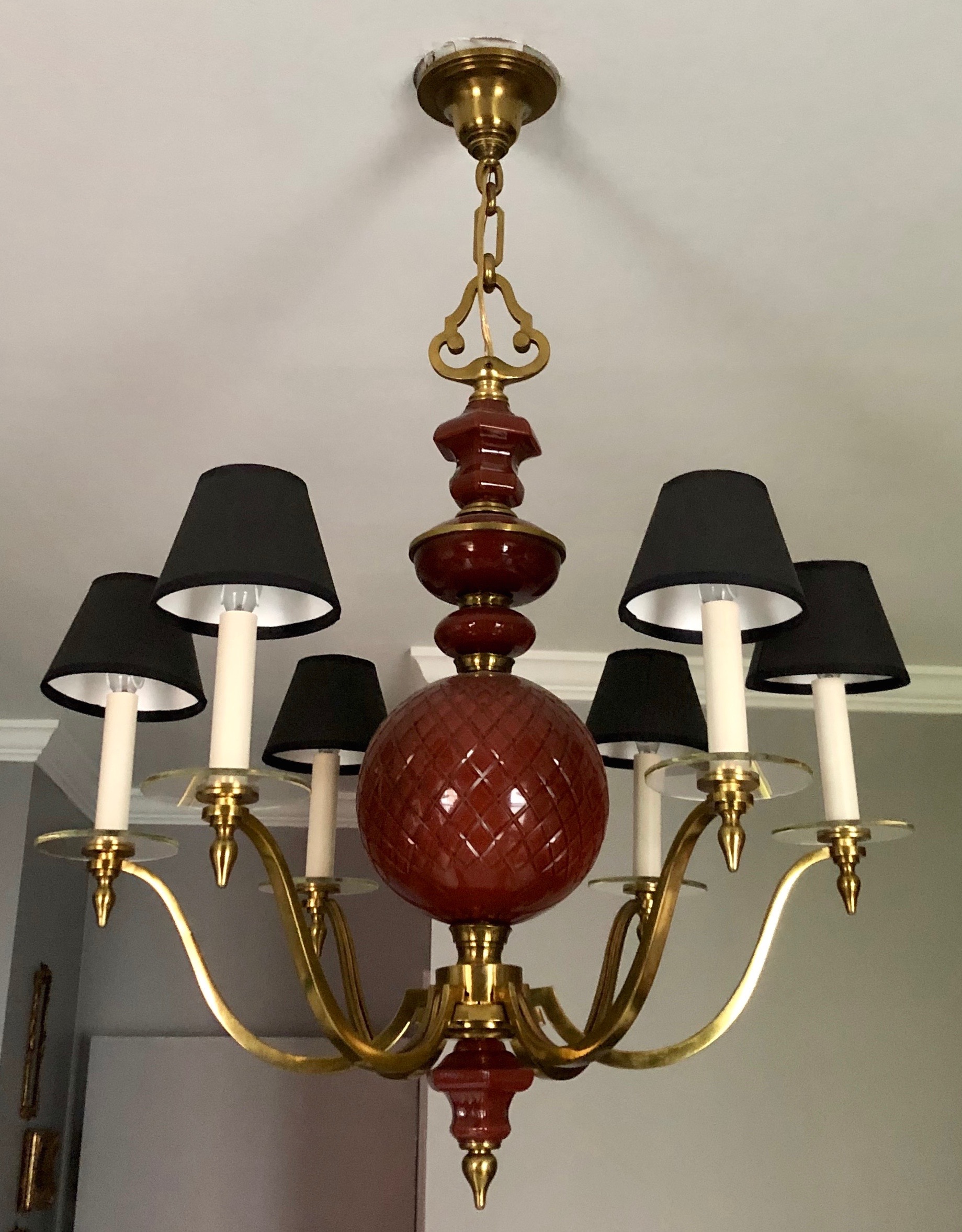
Baguès (Paris maker). Chandelier, circa 1950. Bronze, glass, and interior-painted glass. Fixture H: 36” Dia: 24” (with original 12”chain not seen here) $15,000
The Paris bronzier Noël Baguès established his eponymous firm in 1860. Initially he cast reproductions of 18th-century andirons, candlesticks, and chandeliers. But before the century was out, his firm, under the direction of his two sons, transitioned from candle- and oil-powered lighting fixtures to those powered by electricity and the newly invented light bulb. They also began rolling out more original designs in historicist and modern styles. Those smart designs, and their superior craftsmanship, won Baguès press accolades, and landed them overseas clients, resulting in showrooms being opened in New York, London, Rome, and even Cairo.
PAIR OF 1920s SCONCES ATTRIBUTED TO ARMAND RATEAU
Baguès (Paris maker), design attributed to Armand Rateau. Pair of sconces, 1920s. Silvered bronze, rock crystal, amethyst. H: 13 ¾ W: 11 ½ D: 5 ½ $15,000
In 1920s Paris, the smartest cut-crystal lighting fixtures were to be found at Baguès. There, well-heeled clients and high-end decorators placed custom orders, and bought chandeliers, sconces, and lamps off the floor. Among the American decorators who did so were Rose Cummings and Frances Elkins, and, closer to home, the now-legendary decorating firm of Jansen.
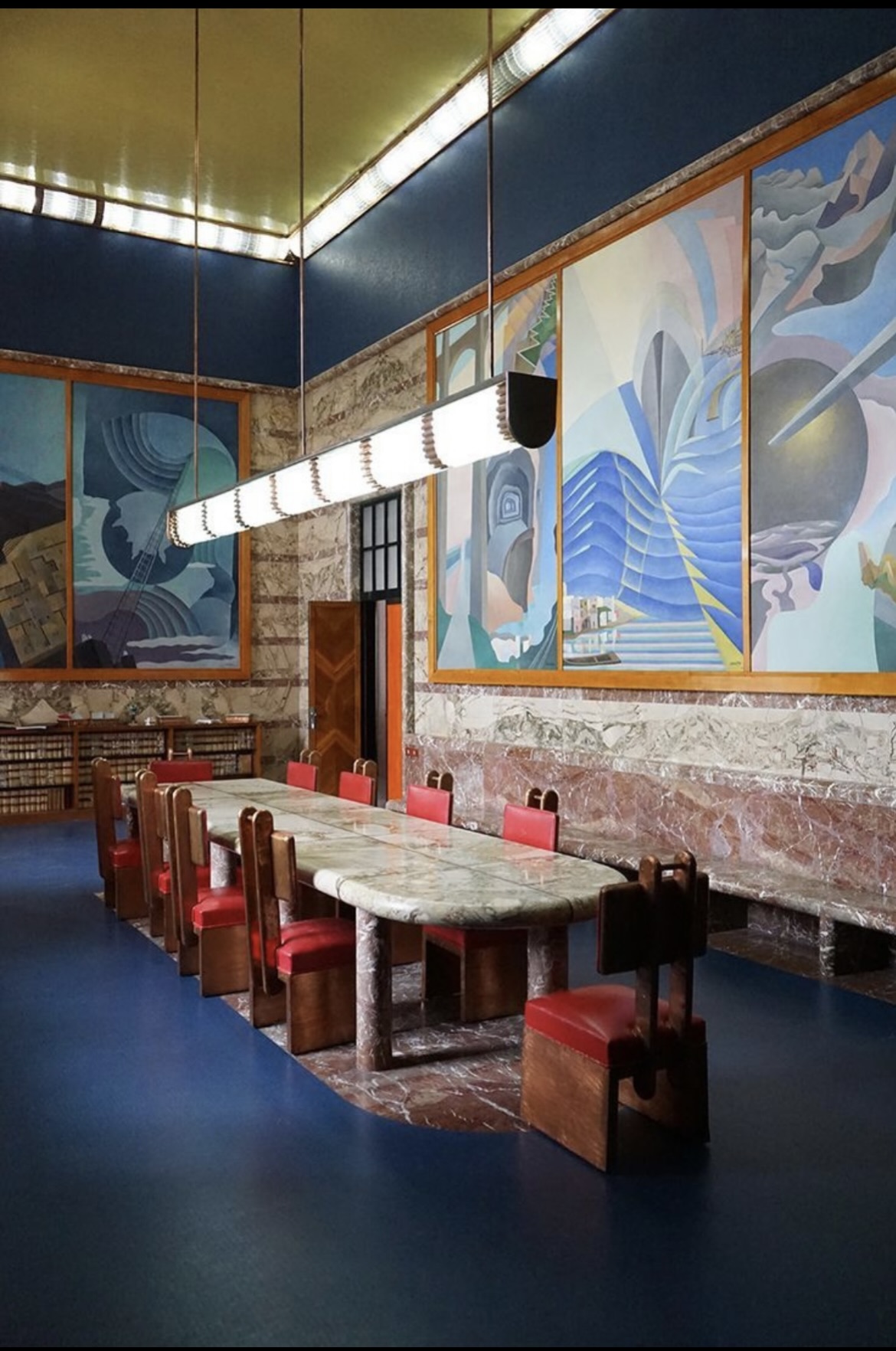
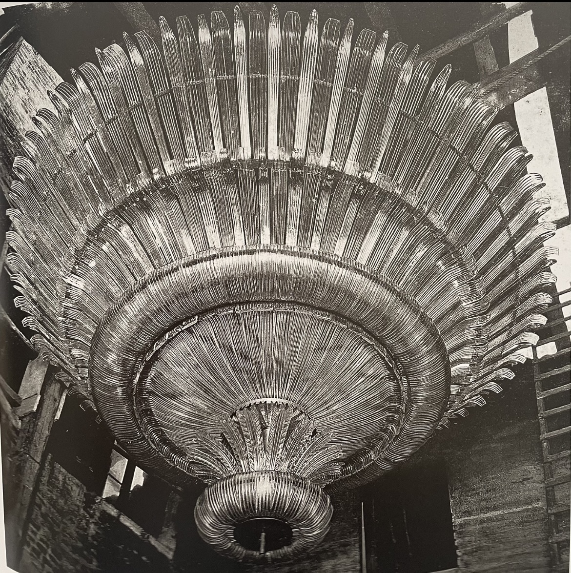
Baguès’ main claim to decorative-arts fame, however, is their collaboration, which began in 1919, with the designer, decorator, and sometime architect Armand Rateau. Today he’s identified with the Art Deco style, and celebrated for his beautiful yet idiosyncratic interiors, and the furnishings that he designed for them, as seen in the Paris dining room [above left] of couturiere Jeanne Lanvin, and the madcap cut-glass, rock-crystal, and amethyst chandelier that Baguès made for her sitting room after Rateau’s design [above right].
Less well known today, but equally well known in his own day, are his interiors and furniture designs inspired by historical styles, and made for clients who collected antique furniture and old master paintings, like the Comtesse de Beaurepaire in Paris, Lady Baillie in Kent, England, and the George Blumenthals in New York, Paris, and Grasse. But much of his Art Deco work was also inspired by the Louis XV and XVI antiques that he collected himself. A photo of him at the office [above left] shows some of his trophies, including a group of master drawings and a pair of antique sconces. Yet when working in this idiom he never failed to give it a personal spin, as seen in the Louis XVI-style chair he designed [above right], and a Louis XV-style dining room he exhibited at the 1934 Salon des Arts Menagers [below left]. Neither the chair, with it’s stark black-and-gold decoration, nor the woodsy interior, mixing humble Provincial furniture and paneling with a fancy chandelier, centerpiece, and clock, would have made sense to a pair of 18th century eyes.
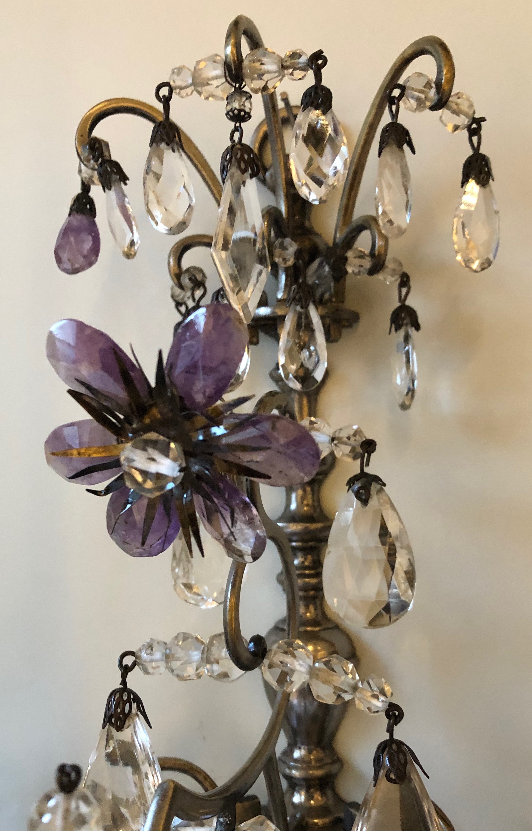
We attribute the design of our Louis-Louis sconces to Rateau, and their fabrication to Baguès. Typically, Rateau stamped his furniture but not his lighting fixtures. Baguès also stamped their fixtures, but not as a rule, if there was a flat surface to apply it, as there wouldn’t have been on these wisps of glinting rock crystal and amethyst that appear to hang in mid air. Yet these sconces reflect both Rateau’s sensibility and Baguès’ ability. That said, we’ve never before seen a sconce or a chandelier by Rateau, Baguès, or anyone else for that matter, that employ openwork “nets” to secure prisms [above right]. This is a jeweler’s technique for setting gemstones in chandelier earrings, and the sort of subtle, amusing, extravagant detail that we expect of Rateau and Baguès at their best.
PAIR OF VERONESE GLASS SCONCES
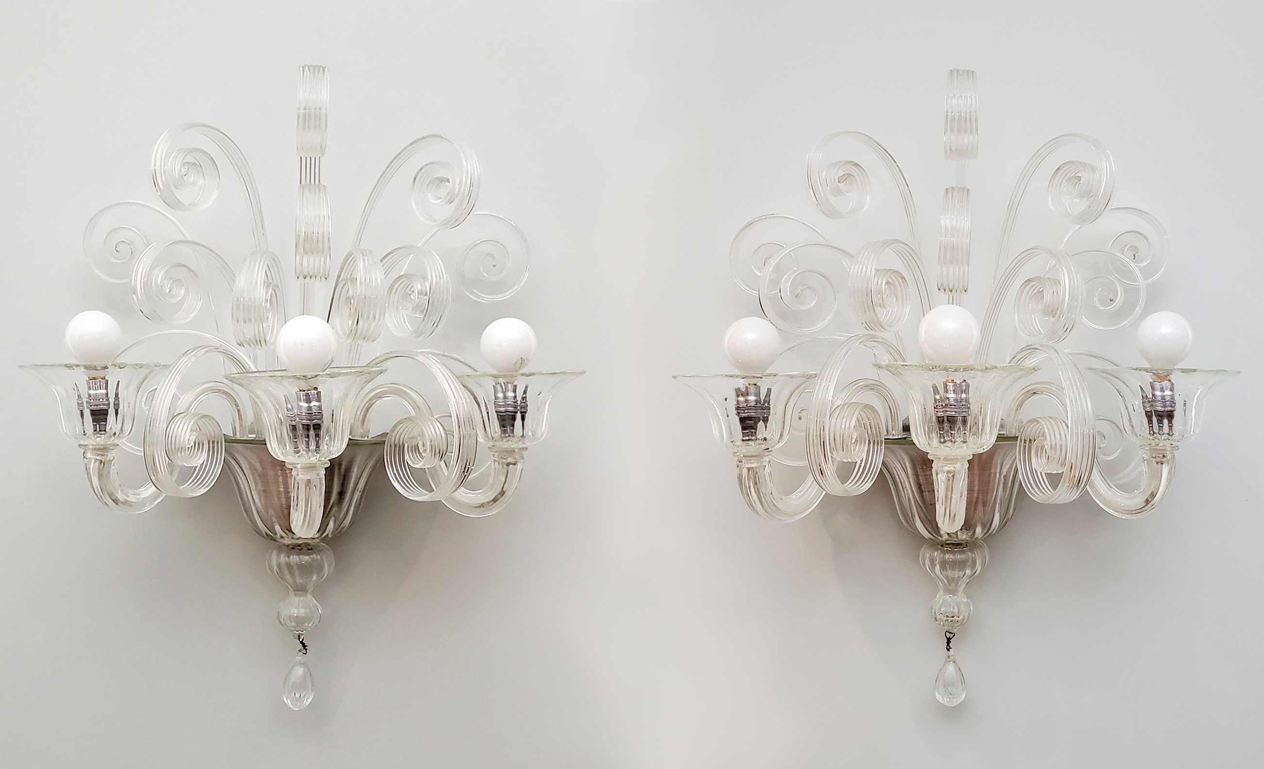
Attributed to Jean Gabriel Domergue (1889-1962), made by Véronese (Paris and Murano firm). Pair of sconces, 1930s. Glass and aluminum. H: 24” W: 19” D: 12 ½” $20,000
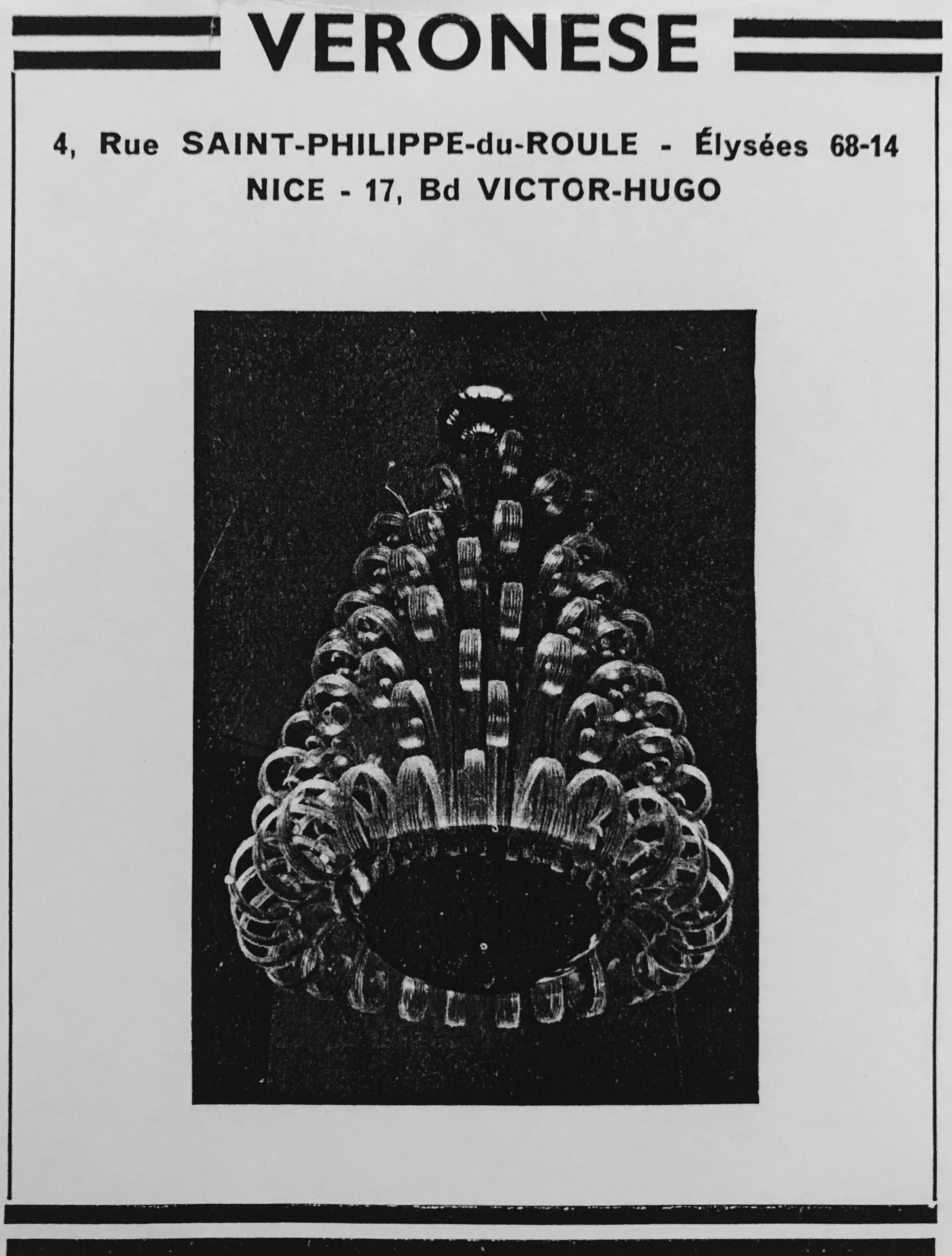
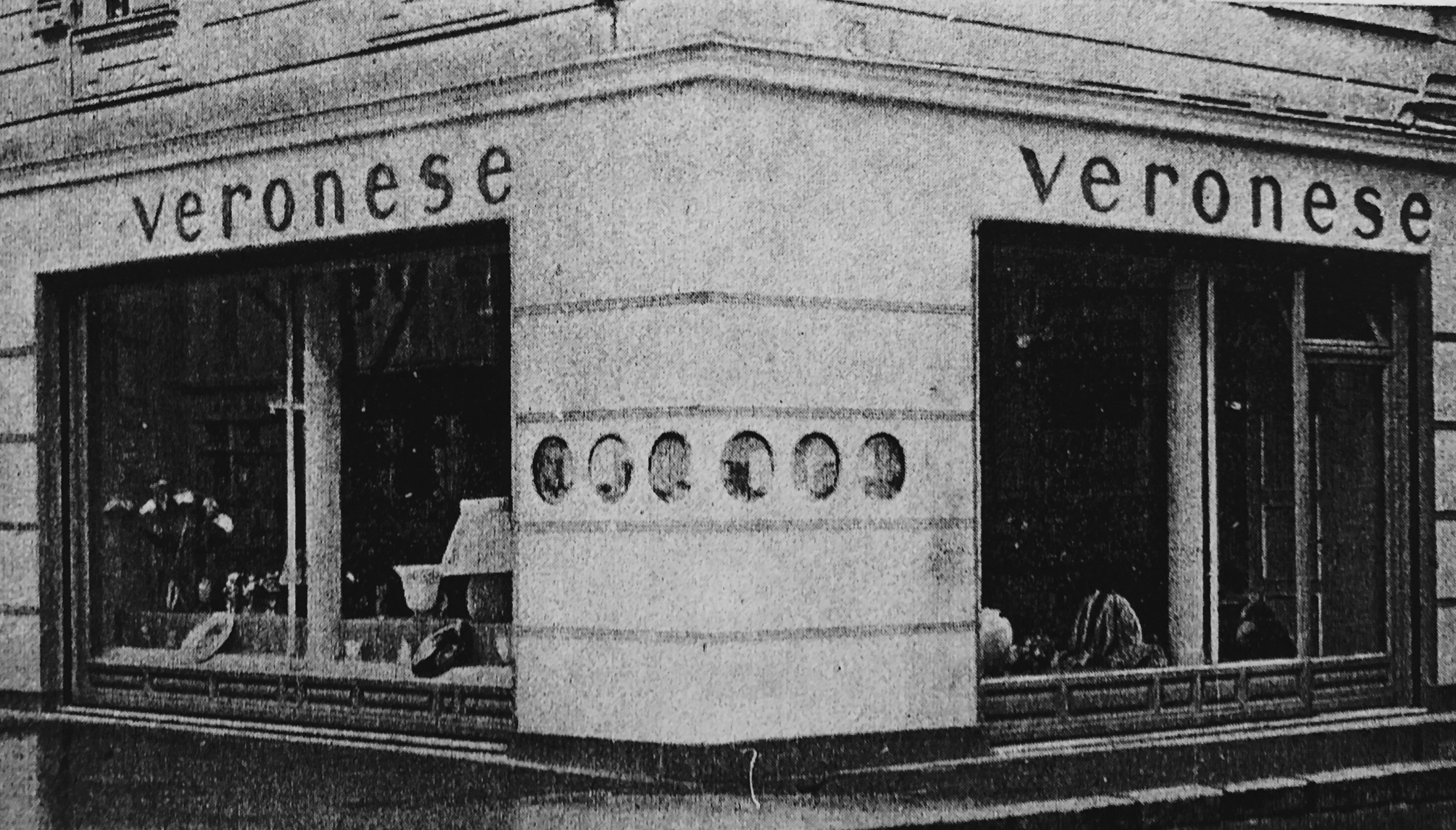
In 1930s Paris, the smartest blown-glass lighting fixtures were to be found at Véronese. The firm was established in 1931 by Marcel Barbier, most likely the furniture designer of that name who was cited in a 1928 article. Regardless, Véronese was unique in having a design office in Paris (vortex of fashion), and a glassworks on Murano (vortex of glassmaking). Under Barbier, Véronese developed a product line of clear translucent glass, which was promoted through extensive advertising [below left], and sold from striking showrooms in Paris and Nice [below right]. As for the name itself, their master glassblower was Giovanni Veronese, but to christen a company for an artisan who didn’t work exclusively for their firm, and was unknown beyond Murano, seems odd to say the least. In any case, Barbier was also attempting, presumably, to tap into the fame of Paolo Veronese, the 16th-century Venetian painter who frequently depicted glassware and other luxury goods in his work. Around the same time, if a bit earlier, Paolo Venini also tapped into the painter’s fame on issuing a vase modeled on one that Veronese had painted. Appropriately christened “the Veronese Vase,” it became a modern design classic, Venini’s signature product, and the firm’s emblem, which appeared on the adhesive labels they applied to all of their glass products.
Launched early in the Depression, Véronese devised a lean business model. Instead of employing a salaried in-house art director, they commissioned designs from independent architects, like Marcel Roux-Spitz and Jean Courtois (who designed the Nice showroom), decorator Andre Arbus, and society painter Jean-Gabriel Domergue [below left], among others. Not incidentally, these men were in a position to propose the products they designed for Véronese to their own clients. Additionally, Véronese avoided the expense of maintaining a glassworks. Instead, they bought furnace time from Archimede Seguso, the descendant of a family that had been in the glassmaking trade since the 14th century. Then, Suguso’s art director was Flavio Poli, who also created designs for Véronese. At the time, Poli’s glassblower was the aforementioned Giovanni Veronese who worked for Véronese. If all this seems a bit incestuous, it was, but it isn’t atypical of the glassmaking world that is Murano.
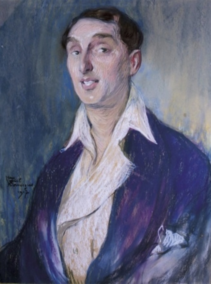
Véronese’s clear glass, creative marketing, and shrewd business practices, masked their essentially conservative approach to design. Most of their models were based on 18th-century prototypes. This can be seen in our pair of sconces, as well as a chandelier [above right] designed for them by Domergue, according to a caption in the 1937 article on the firm in Art et Industrie. Since our sconces and that chandelier share a design sensibility, and incorporate identical glass elements, they were quite likely made en suite. And that accounts for our attribution of the sconces to Domergue himself.
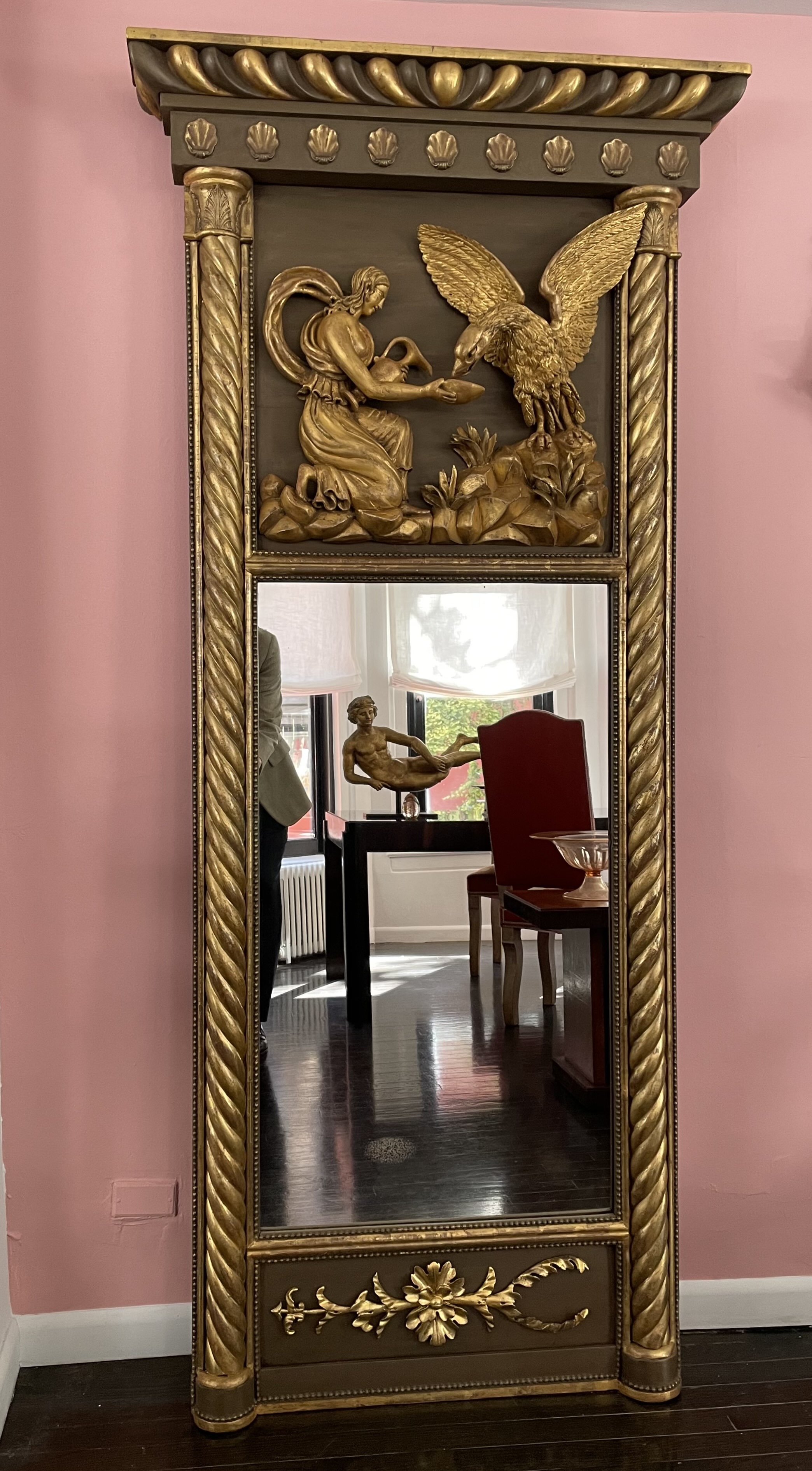
SWEDISH TRUMEAU MIRROR
Probably Swedish, 19th century. Trumeau mirror, circa 1830. Giltwood, bronze-colored paint, mirror plate. H: 81″ W: 36 3/4″ D: 5 1/4″ Provenance: The Metropolitan Museum, New York. $20,000
This grandly-scaled Neoclassical mirror was probably made in Sweden around 1830. It was recently deaccessioned by the Metropolitan Museum. The richness of its carving and gilding are remarkable. On the upper panel the figure’s arm and cup, the eagle’s head and wings, and the foliage and rockwork, are so deeply carved they’re nearly freestanding. These carved areas are water-gilded, and contrast subtly with the oil-gilding in alternate bands of the serpentine columns. The flat backgrounds, and alternating gadroons in the entablature, are painted a greenish-brown to imitate bronze. The bottom panel is unusual as well in having a single arrow, rather than a pair or a group of them. The upper panel depicts Hebe, who was the cupbearer to the gods and the daughter of Zeus, who often assumed the form of an eagle. She bends to pour him a cup of ambrosia. When she married Hercules and retired from her duties, Zeus sought a replacement. And so, much to the chagrin of his wife Hera, after espying the beautiful youth Ganymede, he swept down to earth and carried him off to Mount Olympus, thus filling the vacant position.
CHINESE FRETWORK SCREEN
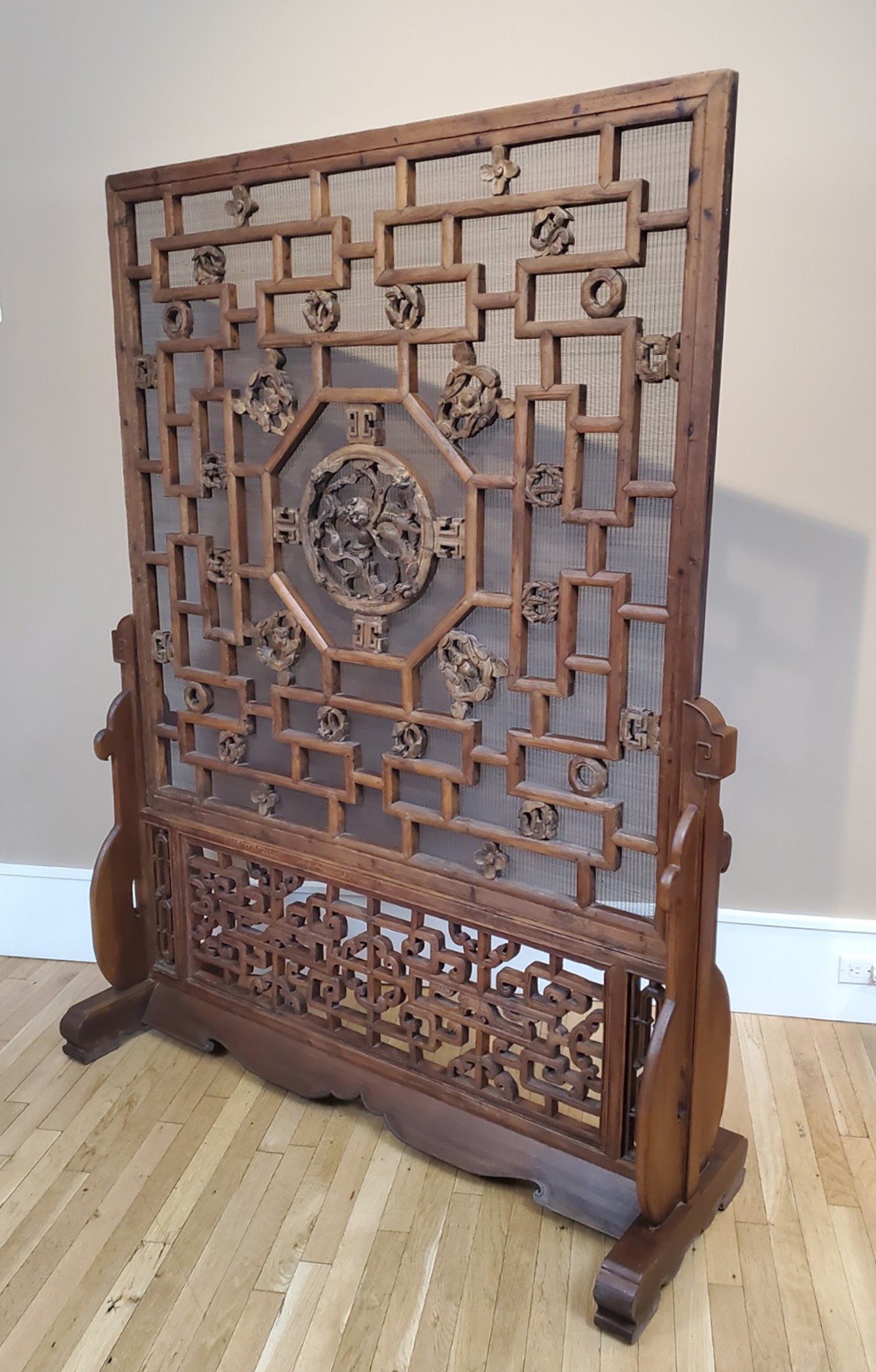
Chinese, 18th/19th century. Quing dynasty screen panel, circa 1800, on later base, circa 1920. Wood, plant fiber inset screen. H: 73 ½” W: 56” D: 19”. $9,000
The large 19th-century fretwork panel of this Chinese standing screen was originally the window of a house. In the early 20th century it was salvaged and mounted in a matching hardwood stand, along with the horizontal panel and two small vertical ones below, in order to create a freestanding indoor screen to function as a room divider. Only that large panel, however, was intricately carved on one side, or fitted with a fine mesh-reed screen, which would have kept buzzing insects and flying birds from getting inside. Presumably, that house, like most, incorporated several panels of identical design [below left]. It can only be hoped that they also survived.
A qilin, the mythological hoofed creature that could fly, appears dead center in that large panel [above right]. Since they spouted flames from their mouths at the approach of malefactors, they protected the houses of wise and benevolent men — appearing when needed, and disappearing when not. As such, their placement at any point of entry to a house is appropriate.
This qilin is set in a circle carved with four winged bats seen head on. And beyond that circle is an octagon, beyond which are four more bats shown from above. In China, bats are symbols of prosperity since the word for them is pronounced fook, as is the word for wealth itself. In the fretwork beyond, in radiating tiers going outward, are pairs of pine boughs in circular form, symbolizing steadfastness and longevity. Beyond them on each side in the final tier are what appear to be lotus flowers symbolizing purity of heart and mind, since they rise pure, white, and unbesmirched from the muck of ponds. And at the top and bottom are what appear to be plum blossoms symbolizing perseverance and hope. Auspicious symbols all, which are suited to the geomancy of the home known as feng shui.
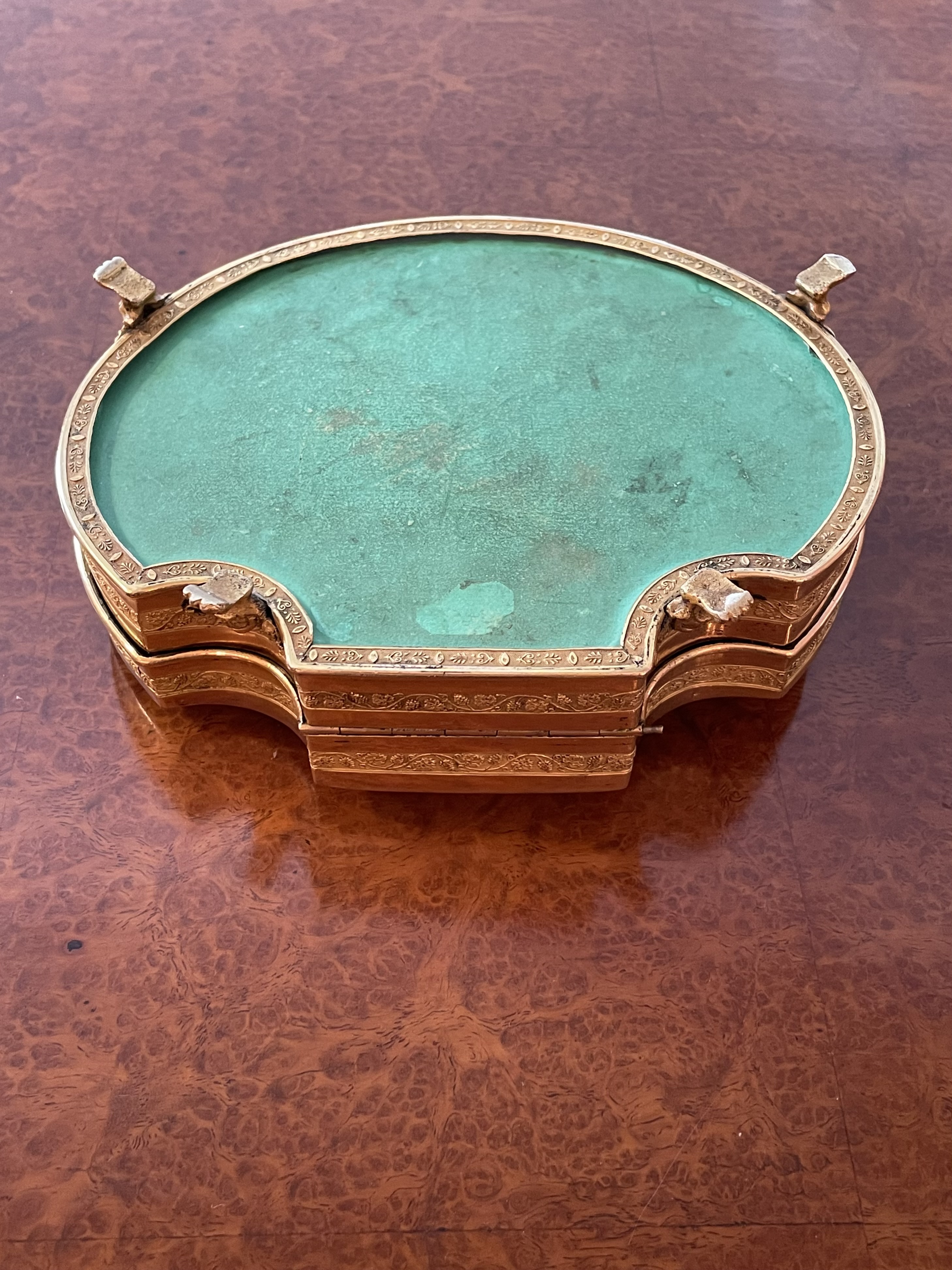
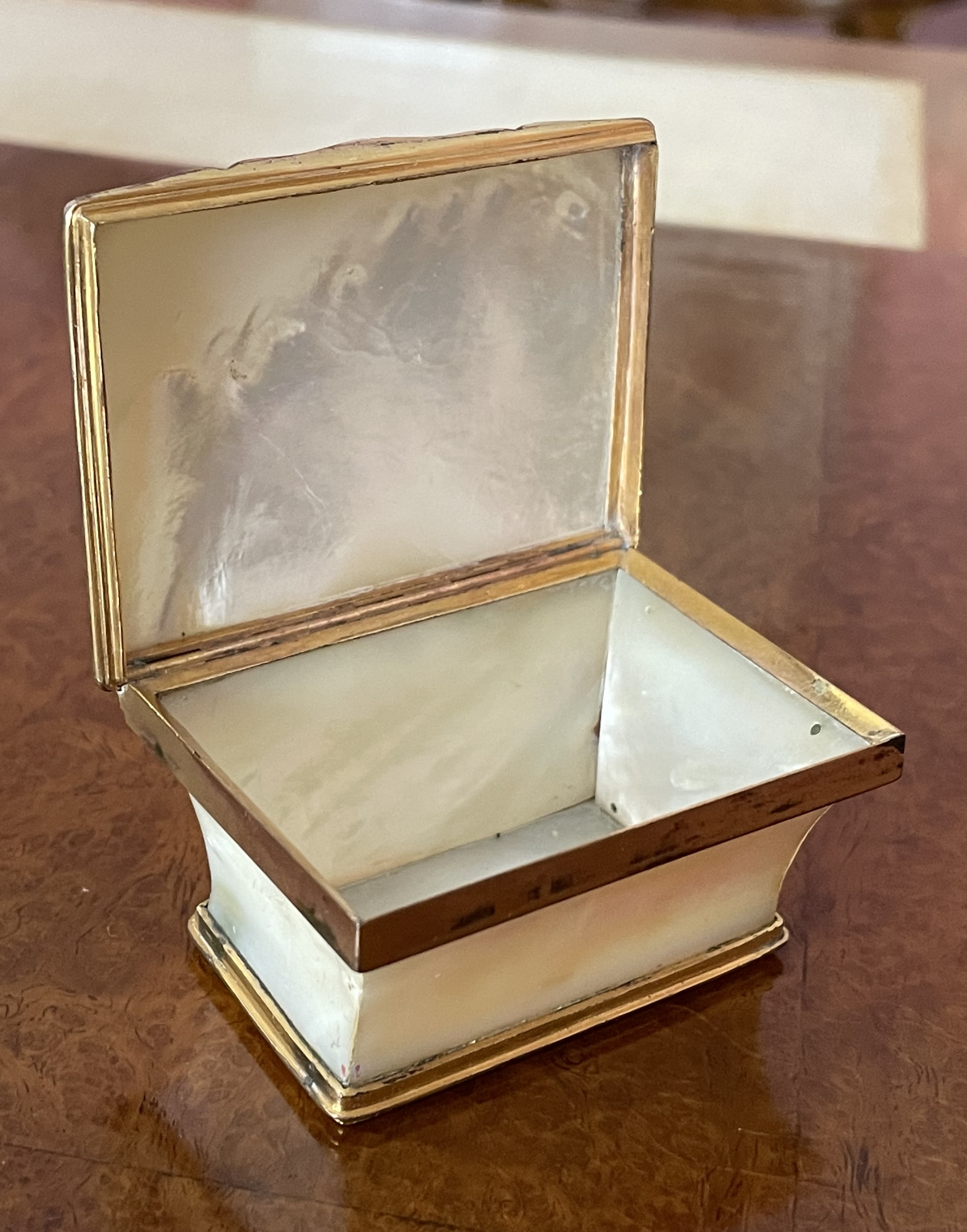
PALAIS ROYAL NECESSAIRE

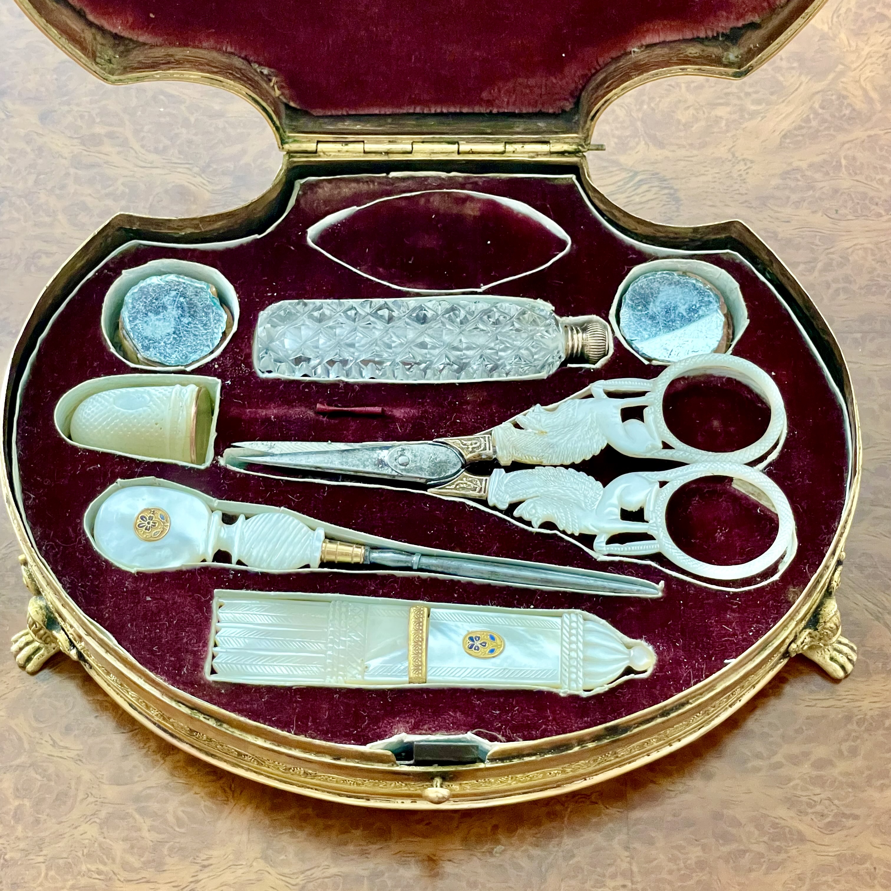
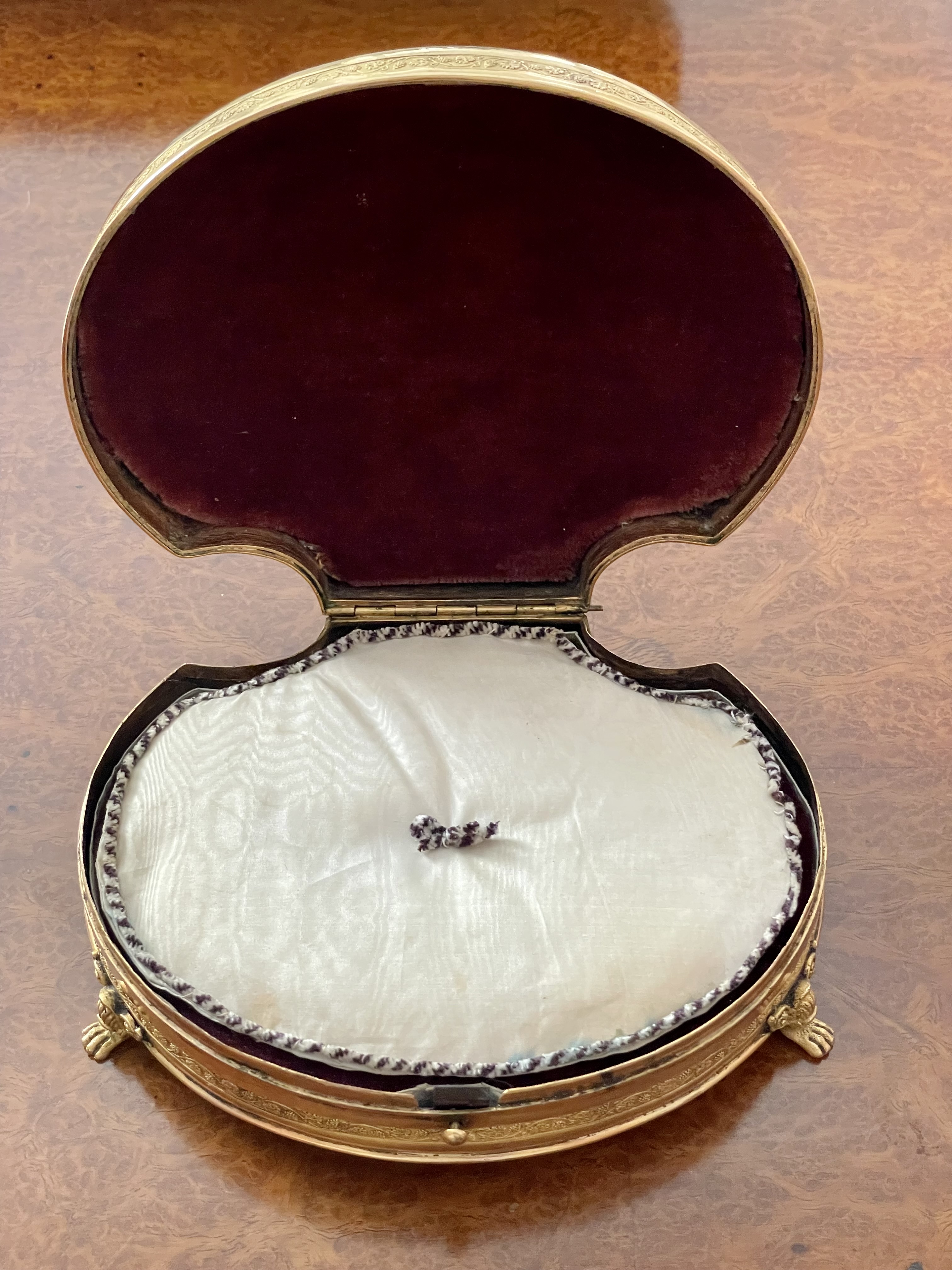
French, 19th century Palais Royal “necessaire” (containing scissors, needle case, stiletto, thimble, perfume flask, 2 tambours), circa 1810. Mother-of-pearl, gilt & enameled brass, silk velvet, silk-moire-cover pad, leather. Sold with a small mother-of-pearl & gilt-brass coffer. $ 8,500
This 1830s box of mother-of-pearl mounted in gilt metal is what’s known as a “Palais Royal’ necessaire — Palais Royal because it would have been sold in one of the shops on the ground floor of that Paris palace where the Prince d’Orleans lived. And necessaire because it contained the necessary implements for sewing, then one of the few arts that a woman of gentle birth was allowed to practice. A luxury item, this one was exquisitely made. The top consists of a single shell secured with enamelled bosses, and carved with classical motifs, including a vase on a sphinx-supported stand, ram’s heads, garlands, and serpents. The bottom is sheathed with acid-green leather. And inside, beneath a white silk-moire-pad, nestled on a bed of crimson silk-velvet, are the implements themselves, also made with mother-of-pearl, which consists of steel scissors with griffon handles, a thimble, a pin holder in the form of Cupid’s quiver and arrows, a stiletto for piercing, two mirror-topped corks (for a purpose unknown to us), and a tiny cut-glass perfume flask, just in case a gentleman caller appears unexpectedly.
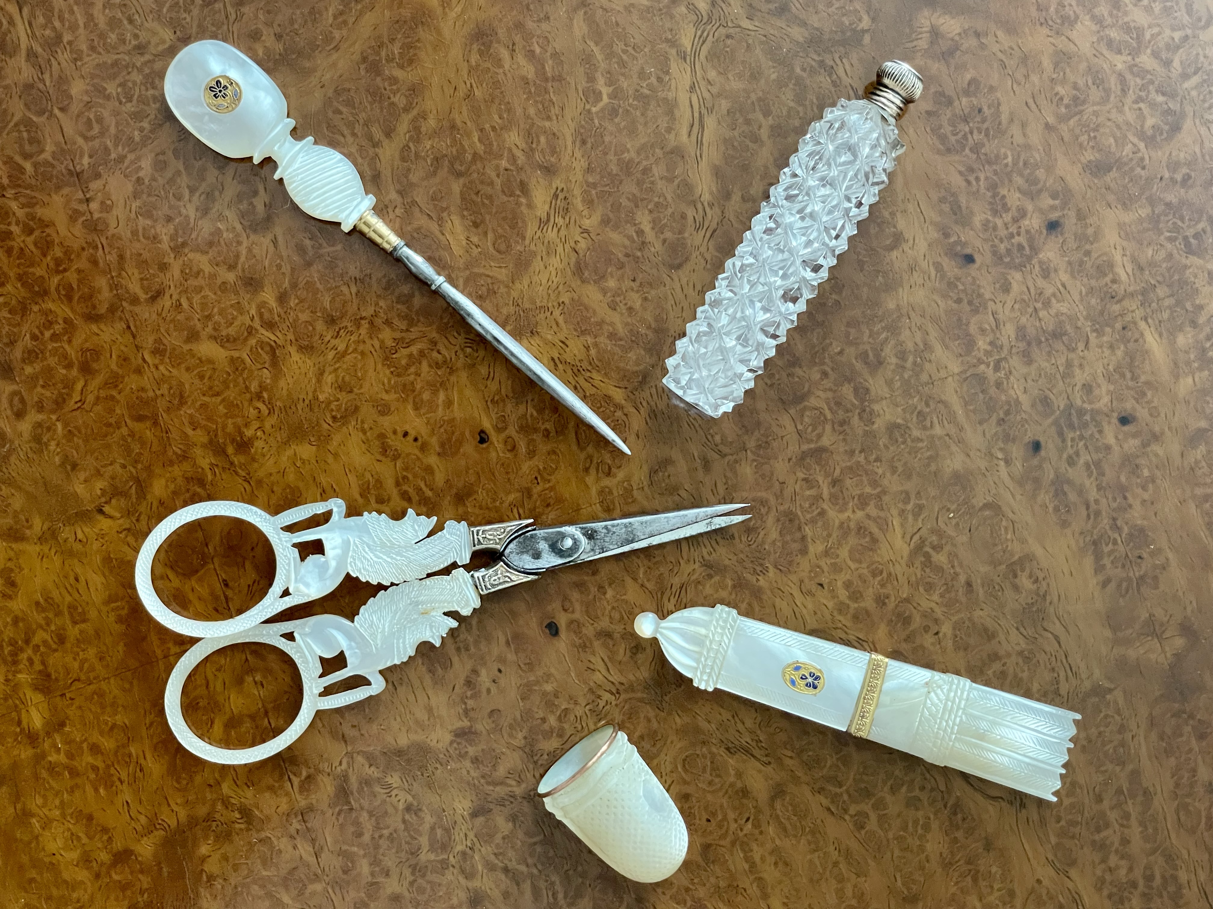
As for the Palais Royal, it then had kiosks in the courtyard and shops behind the arcades that sold expensive trifles. There, high society and the demi-monde disported themselves in their over-the-top finery, which is why the women were known as merveilleuses — ‘the marvelous ones’ — and the men as incroyables — ‘the unbelievables.’ And so, if the one-percent of that day pursued their pleasures with an obliviousness to the recent Terror, the impending defeat of Napoleon’s Empire, and the ongoing rise and fall of interim governments, at least they did so with taste and aplomb.
SMALL ASSOCIATED COFFER
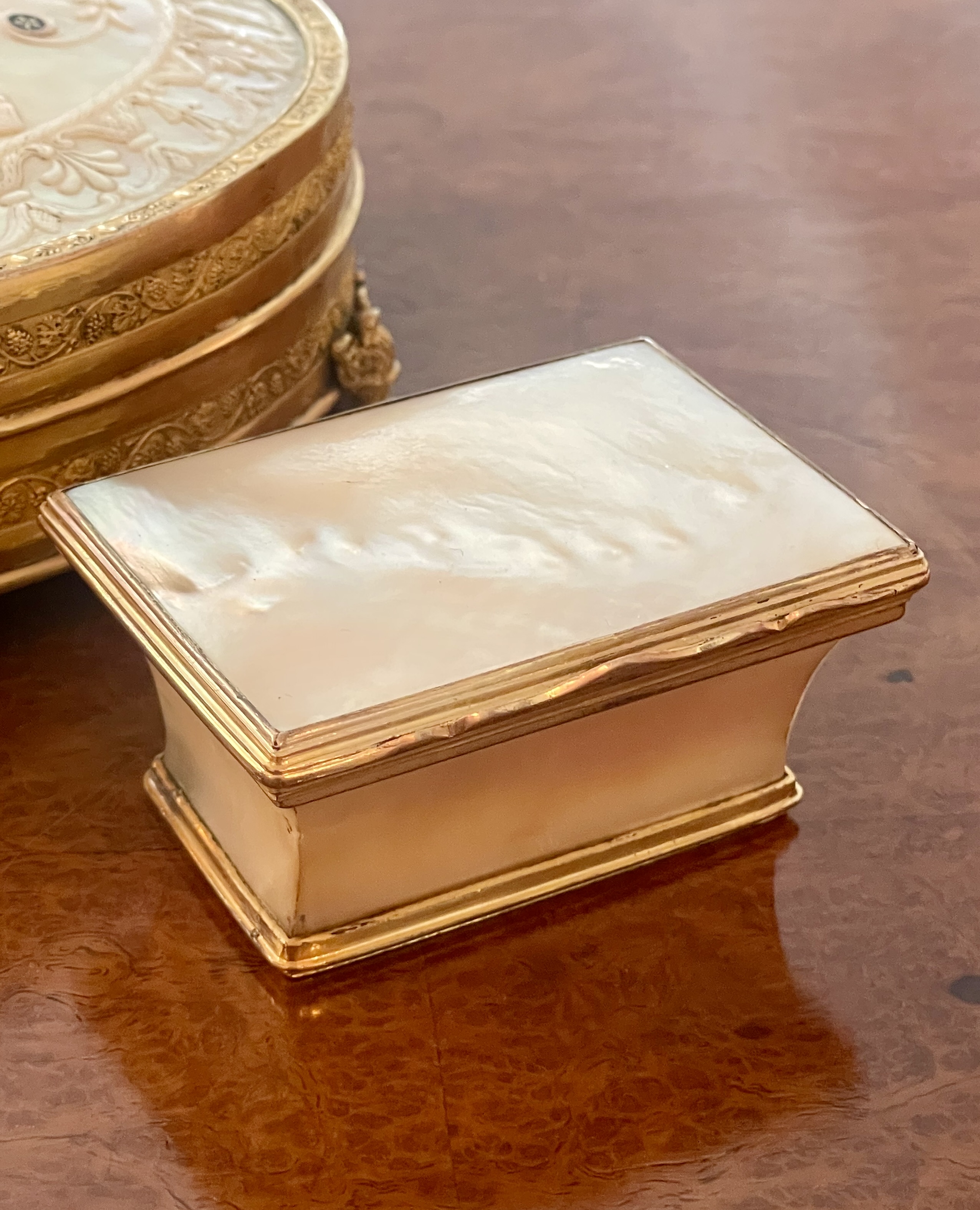
French or Austrian, 19th century. Small coffer, circa 1810. Mother-of-pearl & gilt brass. H: 1 1/4″ L: 2 5/8″ D: 2″. $1,250
ENGLISH BRASS TELESCOPE
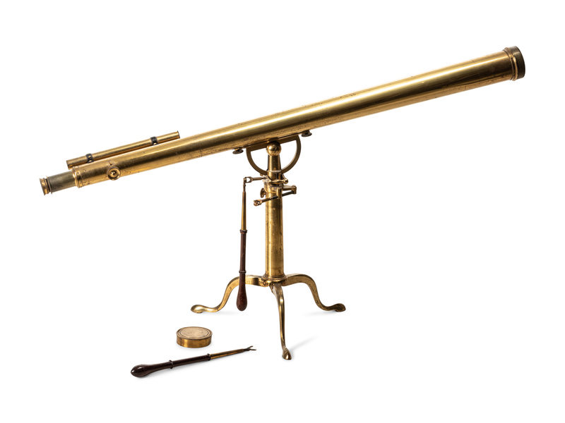
English, 19th century. Telescope, circa 1900. Brass, glass lenses, brass and mahogany implements. Telescope length: 44″ stand height: 18″. $5,000
This circa 1900 English brass telescope is in working condition, and has a sculptural form that makes it an arresting table-top display object. It comes with its original screw-on cap to protect the lens, and two mahogany-handled brass instruments to adjust the gears.
SOUTHEAST ASIAN BIRDCAGE
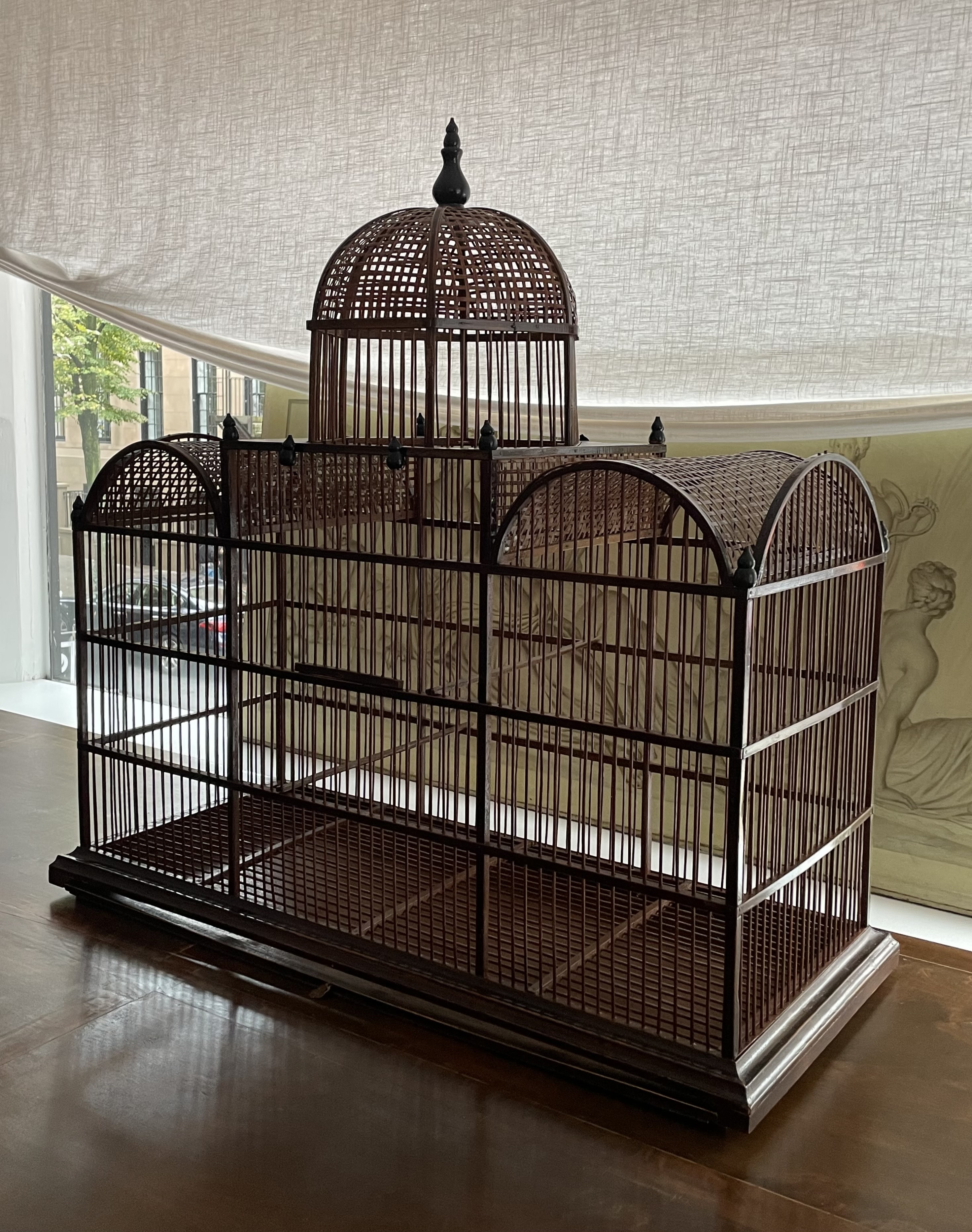
Southeast Asian, 19th/20th century. Birdcage, circa 1900. Stained wood, brass. H: 37 1/2″ W: 38″ D: 14 1/2″ Provenance: Michael Clancy, New York. $8,000
This large birdcage was made in Southeast Asia — most likely India or China — for the Western market. It takes the form of the European greenhouses that were built to house the “exotic” plants native to the place it was made. Ironically, it’s maker would have found those plants commonplace, unlike the greenhouses themselves, which would have seemed exotic. Compounding the irony, the “exotic” birds the Western buyer would have put in it — parakeets, parrots, macaws — also came from Southeast Asia, and would also have struck the birdhouse maker as being commonplace. But perhaps we overanalyze. In any case, pull out four metal pins at the top by their wood-finial mounts, and off lifts the dome to free or entrap third-world birds. And pull the brass tab at the bottom of the cage, and out slides a tray for first-world servants to clean.
1930s DUNHILL HUMIDOR
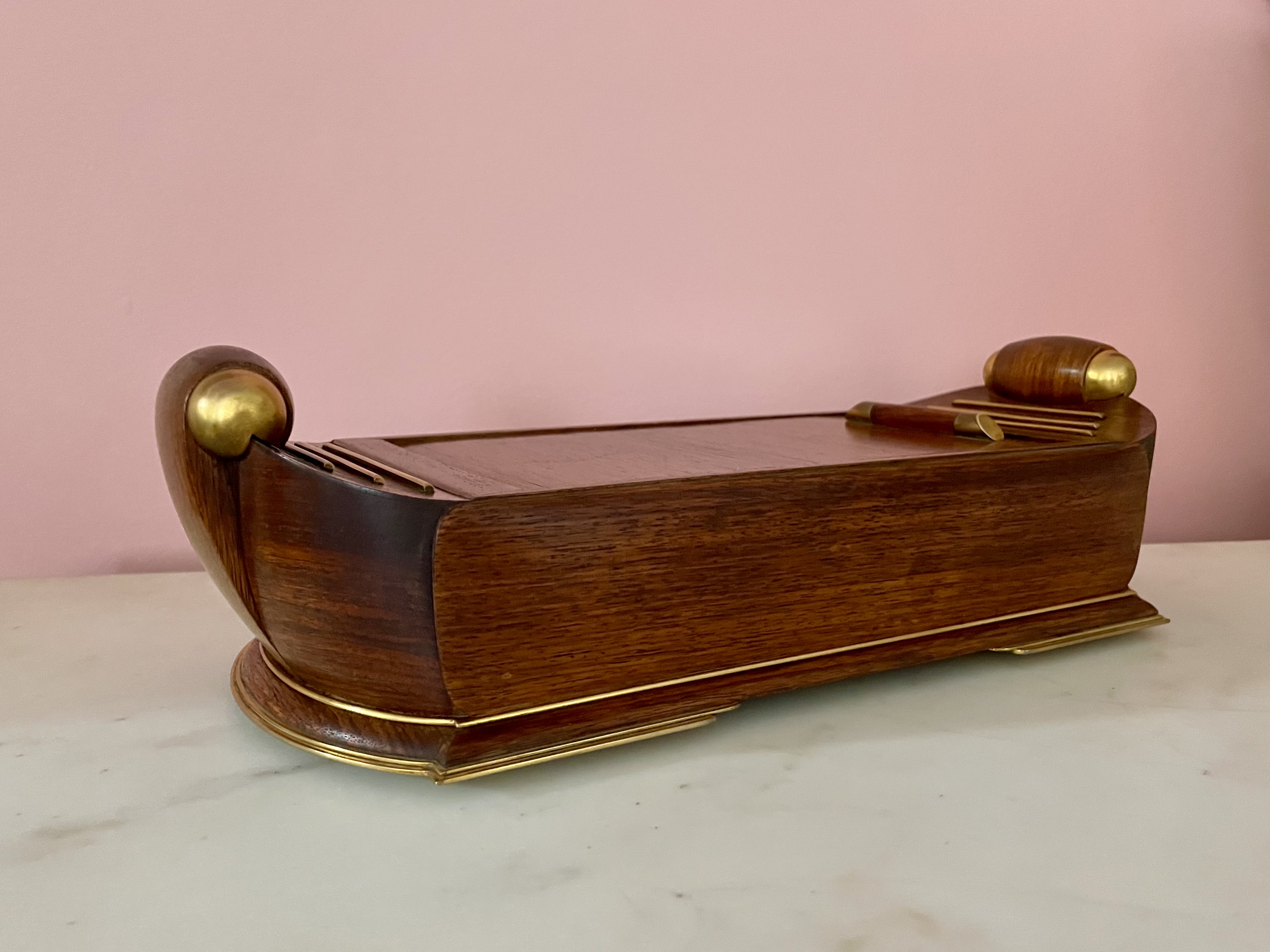
Dunhill of London (English maker). Humidor, circa 1935. Mahogany, burled walnut, gilt brass. H: 4″ L: 15 1/2″ D: 6 1/2″. $6,000
This Art Deco mahogany and gilt-bronze humidor has a tambour hatch that slides open to reveal a burled-walnut compartment for cigars and cigarettes. Its form is based on ancient Roman barges. But the humidor also bears comparison with the bull-nosed Art Deco interiors of the ocean liner Queen Mary, dubbed “the ship of beautiful woods.” Dunhill of London was a luxury-goods firm founded in 1893 by Alfred Dunhill, a descendant of saddle makers. Originally they specialized in leather goods, but they soon became tobacconists too, opening branches in Paris and New York in the 1920s. By the 30s they had expanded into perfumes, housewares — notably humidors — and men’s and women’s clothing, which was featured in the pages Esquire, Vogue, and Harper’s Bazaar. In the 1930s Dunhill received a Royal Warrant from King Edward VIII, the future Duke of Windsor, and, in spite of the Great Depression, opened a large and stylish emporium on Fifth Avenue in a brand-new Rockefeller Center.
15 ELIZABETH COBBOLD CIRCA 1800 CUT-PAPER SILHOUETTES
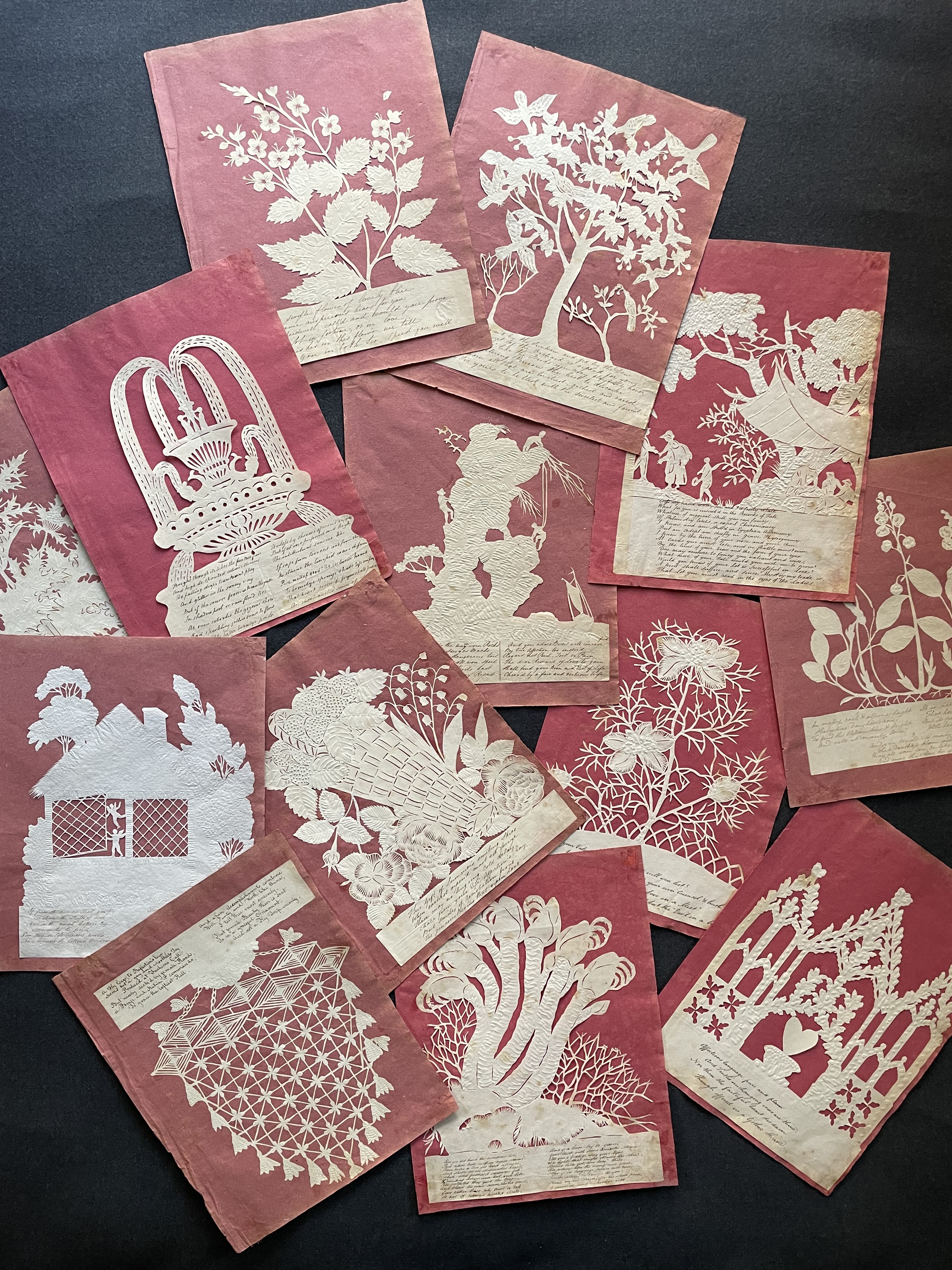
Elizabeth Cobbold (1867-1824). Set of 15 cut-paper silhouettes mounted to “papier Buvard,” circa 1800. Cut paper with ink verses, on original pink-paper mounts. Approx.10 ½ ” x 8 ¼” each. Provenance: Alistair Sampson Antiques, London. $20,000 framed.
English artist, writer, and sometime paleontologist Elizabeth Cobbold was already traveling in London’s intellectual circles when, at the age of twenty-three, she married anelderly but prosperous Ipswich customs official. Within the year she was a widow and a published novelist. The following year she tied the knot with another older man, John Cobbold, a local landowner and widower with fifteen children. She gave him seven more, continued to write, threw herself into charity work, studied fossils, and had the bivalve “nucula cobboldiae” named for her.
In 1806 Cobbold and her husband began throwing St. Valentine’s Day balls that became an annual event by 1814, when they purchased a country estate called The Cliffs. The balls were essentially singles mixers. As party favors she cut out, and sometimes embossed, these paper silhouettes in pairs, inscribed them with verses about love, which weren’t necessarily optimistic, and placed one of each in two baskets from which the unwed of both sexes drew one before seeking out the person who drew its twin. This mating game introduced chance to Darwin’s theory of natural selection, and, presumably, resulted in nothing sometimes, and courtship and marriage in others. In any case, Cobbold published some of her verses in an unillustrated book entitled Cliff Valentines. If they strike us now as charmingly antiquated, they came to inspire the Pre-Raphaelite poetry of Christina Rosetti, and feminist literary historians today. As for our 15 silhouettes, they are as enchanting as they ever were in the modern acrylic-box frames that we found for them.
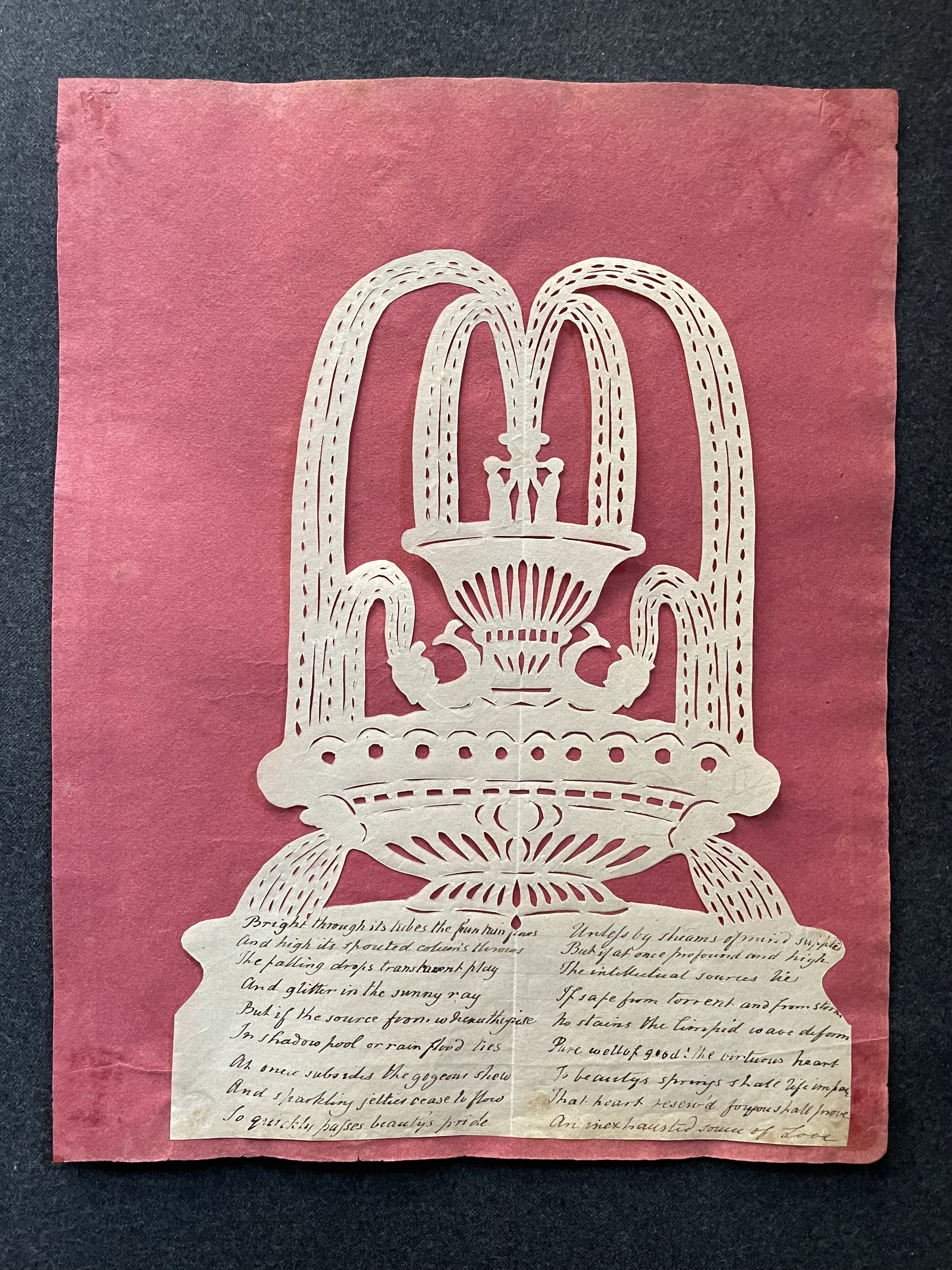
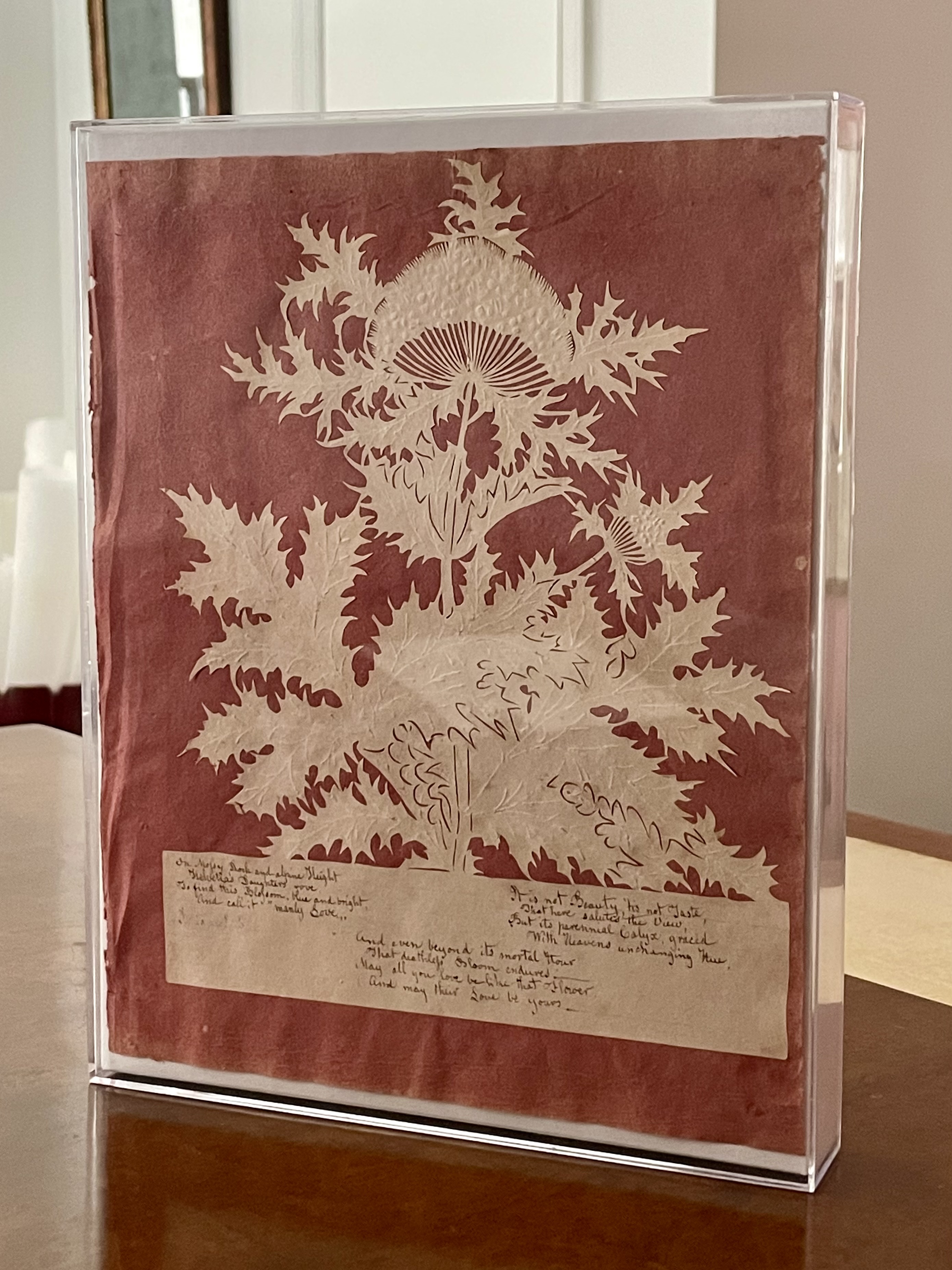
AUSTRIAN NEO-CLASSICAL PORTRAIT MEDALLION IN PORCELAIN
Probably Viennese, circa 1810. Portrait of Katarina Koblitz (nee Kurz, died 1823). Porcelain-bisque plaque, original giltwood frame and glazing. H: 15″ W: 13 1/4″ D: 2 1/2″. $7,500
This exquisite bas-relief porcelain bisque plaque is in its original and no-less-exquisite giltwood frame, and secured under glass. Unmarked, the porcelain both seduces the experts — one pronounced it “divine” — and stumps them as well. The superlative quality signals an important maker they strain to identify, since no other porcelain with a scagliola-like background is known to exist. Its light-blue coloration suggests Wedgwood, but their blue was monotoned, and their modeling less fine. A German expert thinks it’s Viennese, and an Austrian one thinks it is too — unless it was made in Berlin. Both, however, link it to the Royal Vienna Porcelain Manufactory when under the direction of Konrad von Sorgenthal. His marbleized backgrounds, however, were painted in trompe l’oeil rather than “kneaded” in porcelain paste. In any case, this apparently unique piece was probably an experiment that proved to be too difficult and costly to produce. The sitter, however, is identifiable, thanks to an old inscription on the verso. She’s Katarina Koblitz, nee Kurtz, who died in 1823. Yet, on conducting a genealogical search, she too eludes the experts and us.
STAINED GLASS WINDOW OF 16th AND 17th CENTURY FRAGMENTS
Flemish 17th century stained-glass window, made from fragments dating to the late 16th and early 17th centuries, in a 20th-century frame. Painted & fired glass, lead, wood. H: 29″ W: 23 1/2″ D: 2 3/8″ $9,000
This arresting stained-glass window was cobbled together from fragments that date to the late Renaissance and early Baroque periods. The nonsensical juxtapositions of unrelated images, words, a monogram, a paragraph, and coat of arms, bring to mind the American crazy quilts of the 19th and 20th centuries, and the Surrealist “exquisite corpse” collaborative drawings of the 1920s and 30s. The Surrealist aspect is reinforced by the interplay of spidery lines, which are the lead solderings that hold the glass pieces together.
What unifies the window aesthetically is the monochromatic color palate of yellows and oranges that was achieved by firing with silver nitrate, which was fashionable in the late Renaissance and early Baroque. This, other stylistic characteristics, and the German and Old Dutch languages of the words themselves, indicate the glass was made in the Low Countries between 1550 and 1625. And it was there, presumably in the 20th-century, that the craftsman who assembled our window worked as well. We can’t identify him by name, or the glass painter who’s initials appear in one piece, or for that matter the coat of arms, but the biblical inscription is Luke 2:21, and reads, “On the eighth day, when it was time to circumcise the Child, he was named Jesus, the name that the angel had given him before he was conceived.” This is an indication that the glass piece, and most if not all of the others, came from church windows that were sold off, possibly due to war damage or civil unrest. These events led to stained-glass diasporas that prompted antique dealers, loathe to throw a nice old thing away, to assemble surviving fragments into something saleable. No wonder the results came to be known as vitraux d’antiquaires, or “antiques dealers’ windows.”
COPENHAGEN PORCELAIN SCULPTURE
Arno Malinowski (1899 – 1976) for Royal Copenhagen (maker). Diana with a Hound, 1927. Porcelain, with a later ebonized-wood base (not shown). H: 15 1/4″ W: 7 1/2 D: 7 1/2″ (with base H: 18 1/4″ W: 16 1/2″ D: 12″). Provenance: Michael Clancy, New York. $12,500
This 1927 Royal Copenhagen porcelain sculpture is exceptionally large in scale, and appears to represent an Amazon with her hound. It is remarkable for the juxtaposition of the simplified forms of her limbs and base, seen in the carefully detailed flowers of her crown and the laurel-leaf trim. Her swoop of drapery is almost free-standing, and a technical tour de force. The classical subject of an idealized nude, imbued with a cool eroticism, harks back to the white marble sculptures of Bertel Thorvaldsen, a Dane himself, which were sculpted a century earlier. This porcelain was modeled by Arno Malinowski who trained as a sculptor at the Royal Danish Academy in Copenhagen. From 1921 to 1935 he created models for Royal Copenhagen, and won a silver medal for them at the Paris 1925 Exposition. From 1934 to 1939 he taught at the Royal Danish Academy of Fine Arts. And from 1936 to 1965 he designed for the silversmithing firm of George Jensen. Among the pieces he created for them was a 1940 medal celebrating the 70th birthday of King Christian X. Minted just after the Germany conquered Denmark, it was worn by Danish citizens as a sign of resistance.
TONY DUQUETTE BAS-RELIEF OF A GIRL IN A PICTURE HAT
Tony Duquette (1914-1999) bas-relief of a Woman in a Hat, circa 1955. Mixed media including plaster & paint, original frame, now boxed behind glass. 8 3/8″ x 7 1/2″. $3,750
Tony Duquette, the California artist, designer, decorator, jeweler, costume and set designer, created this circa 1950 small bas-relief in a shadowbox frame of a pretty girl wearing a picture hat. And she is pretty, despite her improbably long neck and exaggerated bust. Duquette, after all, was less concerned with anatomical correctness than abstractly pleasing forms. Our bas-relief, like most of his work, is no less eccentric and charming than the artist was himself. Initially, one might find his work a bit tinselly, but thoughtful consideration reveals other dimensions. For one thing, he was “green” long before “sustainability” became the fashion An obsessive collector of antiques (by definition recycled), he made art, furniture, interiors, and even buildings, with what others sent to the dump. A case in point is the painted egg-crate frieze in a bathroom at Dawnridge, his Los Angeles estate.
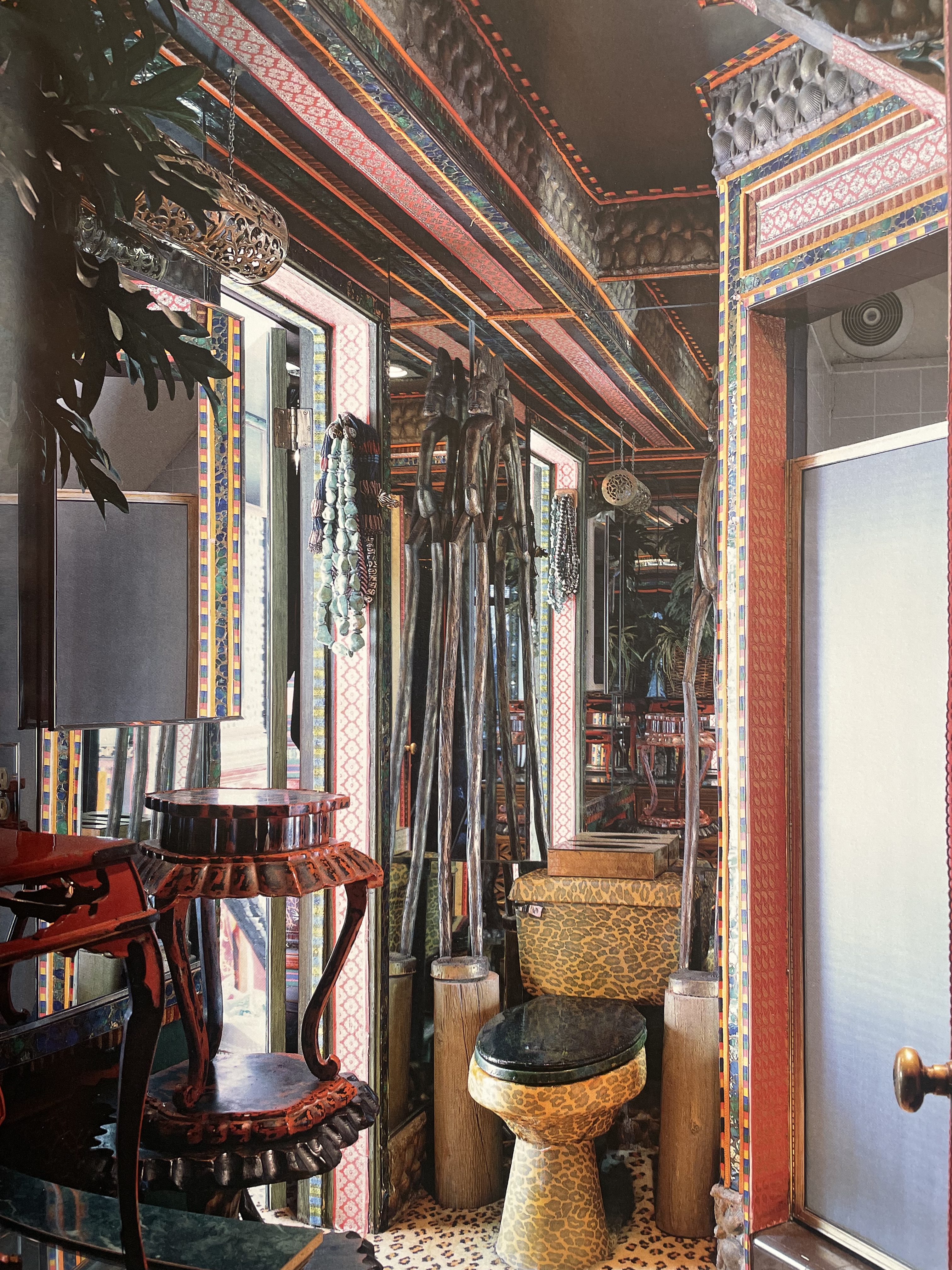
Typically, Duquette created by assembling, altering, and improving upon found objects. Our relief was made from scraps and a bit of lace, washed with tinted plaster, and set within a stray frame that he painted. Just as such whimsicality masked purpose, his charm masked shrewdness. He practically minted money. No doubt he learned more than a few tricks from his mentor Elsie de Wolfe, that one-woman empire builder who cooled her heels in Hollywood during the war. She put Tony on the map with a commission for what she called “a meuble,” Franglais for a piece of furniture. That meuble was so delightful, and inexpensive thanks to his working methods, that she instantly became a client, a fan, and his promoter. It was she who arranged for him to have a 1951 one-man exhibition in Paris at the Musee des Art Decoratifs — in the Louvre palace, no less.
ALBRIZZI SNAKE SCULPTURE
Alessandro Albrizzi (Italian, 1934-1994). Snake sculpture. Lucite and brass on glass block. H: 7 1/4″ W: 4 1/4″ D: 5 1/4″. $4,000
Baron Alessandro Albrizzi made this rare brass-headed-and-tailed Lucite snake sculpture in the 1960s. Later in the 70s he produced a larger number of “nest of snakes” sculptures, each unique and consisting of Lucite tubes, hand-knotted by craftsmen (we have two in our inventory), that we’re mounted with silver-metal heads and tails. Albrizzi grew up in his family’s Venetian palazzo, and, as a child, he played on the terrazzo floors of the ballroom, where French doors opening to the garden were secured by hardware embellished with bronze snakes. Decades later, when a designer in London, the memory inspired the snake sculptures. He sold them, along with other designs, from his Sloane Square store where jet-setting clients — David Hicks, Diana Vreeland, the Agnellis, the Windsors, and others — descended in droves.
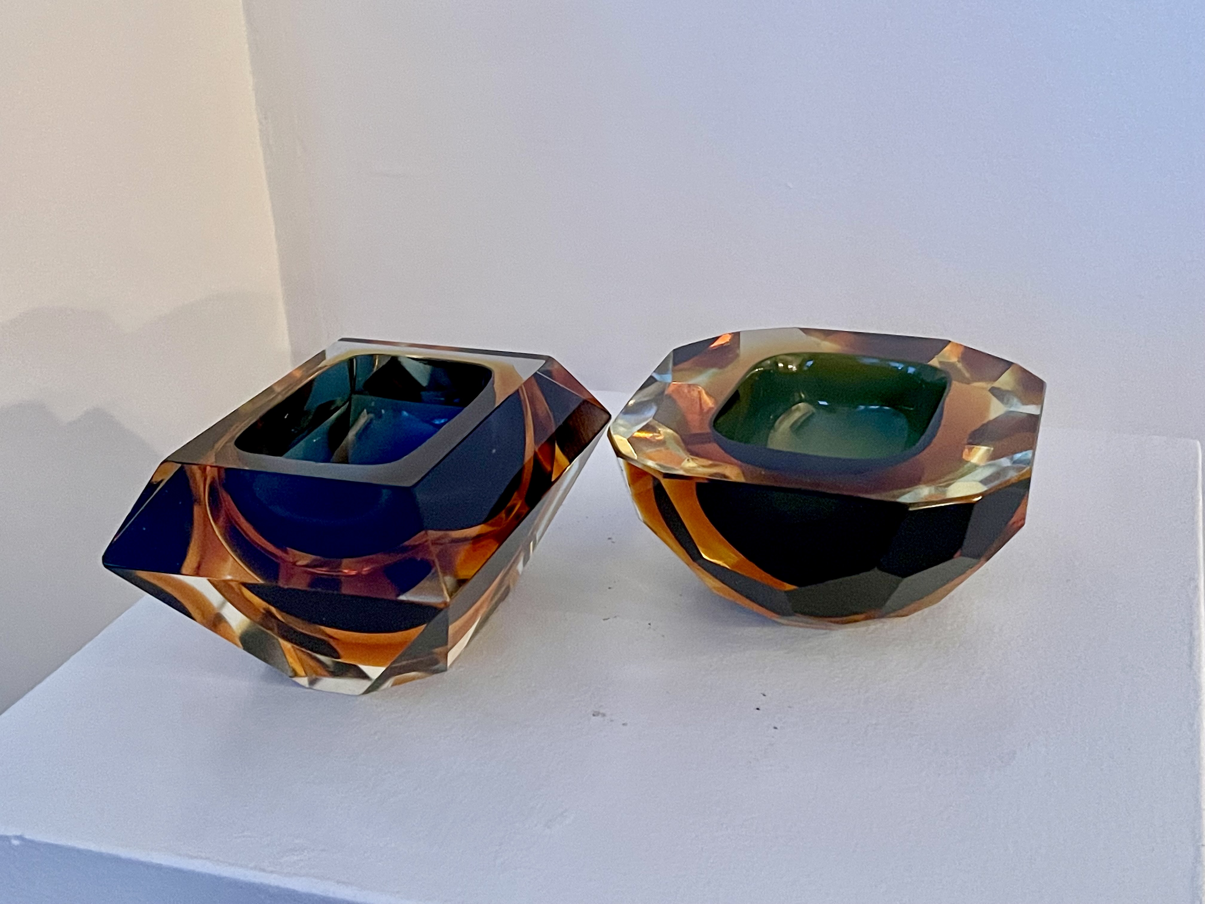
Allessandro Mandruzzato (Italian, 20th century). Pair of faceted sommerso-glass objects, circa 1970. H: 2 1/4″ W: 4 3/4″ D: 4 1/2″ and H: 4″ W: 5″ D: 5″. Provenance: Michael Clancy, New York. $3,000
One might think that these two faceted sommerso-glass objects, and the one below, were made as ashtrays since they date to around 1970 when everyone smoked. But unless it’s placed with great care, their rims aren’t quite thick enough to balance a smoldering cigarette. This might lead one to think they were made as vide poches for spare change and keys, were it not that the cavities aren’t large enough for that. And so, like many seemingly functional Venetian glass vases, bowls, and trays, they were probably made to be objects of beauty to seduce the eye and the hand. This they most certainly do, with their arresting colors, and bold faceting that catch and refract light.
Allessandro Mandruzzato (Italian, 20th century). Faceted sommerso-glass object, circa 1970. H: 4 1/4″ D: 5 1/2. Provenance: Michael Clancy, New York. $2,000
SCHOOL OF FONTAINEBLEAU PRINT
Master F. G., French (Fontainebleau), circa 1550. Wounded Paris Carried Beneath the Walls of Troy. Etching on laid paper, framed. Sheet 10 “ x15 “, framed 12 ½” x 17 ½” $4,000
“Sing goddess, of Achilles’ rage, black and murderous, that cost the Greeks incalculable pain, pitched countless souls of heroes into dark Hades, and left their bodies to rot as feasts for dogs and birds.” That opening line of Homer’s Iliad, and the thousands that follow, rang in the ears of the ancient Greeks, burned through the page in the Roman world, and, after a centuries-long hibernation in the Dark Ages, resurfaced to enthrall the Renaissance. Homer’s tale of the Trojan War, along with his sequel the Odyssey, continue to resonate among American veterans squaring trauma with duty after deployments in Afghanistan, if less so among academics retooling the Western cannon.
This engraving illustrates an episode in the war that was overlooked by Homer. Paris, the scapegrace Trojan princeling, who initiated the war by abducting Achilles’ wife Helen, is being carried to safety behind city walls as bugles and horns sound the retreat. The scene is archly presented, which is typical of late Renaissance, or Mannerist, compositions. The nude Paris gazes directly at the viewer with bedroom eyes through tumbling locks. Though not dead yet, his dead weight is shouldered by a warrior with a balletic lift of leg, which should send them both tumbling to the ground. The scene is also improbably theatrical. It is presented on a trompe l’oeil stage, and bears the engraver’s initials “GR.F”, and the inscription “a Fontana.Bleo. Bol.”, which a contemporary viewer would read as “At Fontainebleau” after the “Bolognese” painter Francesco Primaticcio, then a famous artist who hailed had from Bologna.
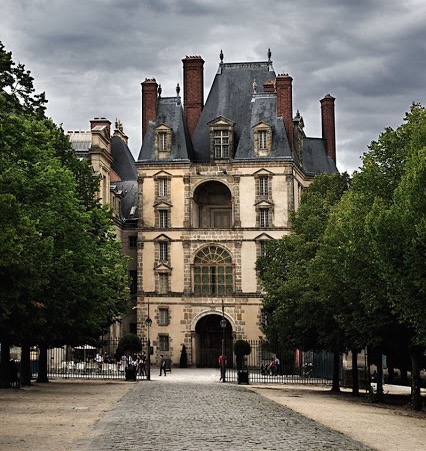
In 1534, King Francis I of France summoned Primaticcio [above left] to the palace of Fontainebleau, which then functioned as the capitol of France. Between 1541 and 1544 Primaticcio frescoed the barrel-vaulted ceiling of the Porte Dorée [above right], a courtyard entrance. There, he painted this scene of the wounded Paris [below left], along with four others, including Hercules being dressed as a woman (Fontainebleau taste was nothing if not kinky). All conformed to an obscure iconographic program that promoted the king and celebrating his reign. Not incidentally, at that time, a legend gained traction that Frankus, a mythological warrior, had established the French kingdom after fleeing Troy when it fell.
Concerning our print, there are two mysteries we can’t explain. One is the name of the artist who engraved it. In the 19th century, a group of stylistically related prints bearing the initials R G F were identified as the work one engraver, who was then christened Master F. G. It was posited that he might have been Francois Gentil, a Frenchman who worked at Fontainebleau, and to whom no other works could be attributed. Then it was pointed out that the F isn’t an initial, but an abbreviation of fecit, which is Latin for “he made it.” That would mean his initials were G R. Then it was posited that he was Guido Ruggieri, another artist, Italian this time, who had worked at Fontainebleau, and to whom, like Gentil, no other works could be attributed. The jury remains out.
The other mystery is that the composition has the same orientation as Primaticcio’s painting [above left] and preparatory drawing, which is in the Louvre [above right]. Typically, that isn’t the case since a print is an impression taken from an inked matrix, and therefore appears as the inverse of the image that was copied. In any case, before photography, prints were the only effective means of disseminating images widely. And so King Francis sang his own praises, as it were, by commissioning artists to paint fresco cycles that had iconographic programs that were propogandistic. He also financed a print studio at Fontainebleau to disseminate those cycles, image by image. It was all the printmakers could do to keep up. And it should be noted that many of the painters also made prints. In any case, the general rush accounts for printing flaws – note the poor inking of our impression – and editions so small that some are known by just one impression.
Striking a pose even when dying, risqué content, a thirst for fame, and slapdash production values, as embodied in this print, are hallmarks of what has come to be known as the School of Fontainebleau. They are also hallmarks of our Instagram age. Yet the Fontainebleau that flourished five hundred years ago — not all that distant relative to the fall of Troy in the 12th-century BC — flashed with an erudition, a beauty, and a glamor that is at odds with what passes for those qualities today.
ROSA DI TIVOLI PAINTING ON SLATE
A glowering ram lowers its horns in a face off with a barking dog rising on its haunches. An imperturbable ox turns its massive head to watch the row. Annoyed, a recumbent ewe to the left glances over its shoulder, but the two behind her don’t deign to give the combatants the satisfaction of looking on. And then, lastly, a pair of blissfully oblivious sheep grazes at a safe distance to the right. Nothing could be more ordinary than a dog corralling a herd before heading home for the night, but what is extraordinary is the painter’s ability to portray an animal-kingdom drama. You might say the scene is the barnyard equivalent of a modern-day subway altercation – more posturing than fight – which suggests, intentionally or not, the restiveness of animals and humans alike.
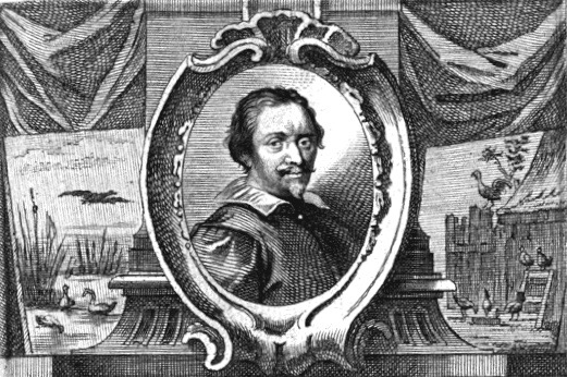

Philip Peter Roos, known as Rosa di Tivoli (German/Italian, 1655-1706). Night scene of animals in a landscape, circa 1685. Oil on slate, fraamed. 6 1/2″ x 11 1/4″ (sight), 8 3/4″ x 13 1/2″ framed. $12,500
The painter was Philipp Peter Roos, better known as Rosa di Tivoli [above right]. He was born in Germany, to a multigenerational family of painters who specialized in landscapes and animals. Early on, he worked in Frankfurt am Main under the protection of Charles I, Landgrave of Hesse-Kassel. Knowing talent when he saw it, that beneficent ruler sent the young Roos to Rome to perfect his art in 1677. There, his skill was honed in the studio of Giacinto Brandi, a painter of religious scenes, of all things. And in Rome he would remain after falling in love with his master’s daughter, Maria Isabella. In 1681, Roos, a Lutheran, converted to Catholicism to marry her. Three years later, they purchased a house in nearby Tivoli, where they raised seven children, two of whom became painters. During those years his surname was Latinized to Rosa, and, following that change of address, he became known to the locals, and to posterity alike, as Rosa di Tivoli.

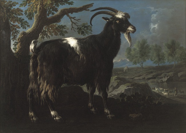
Tivoli is celebrated for a landscape of rolling hills garnished with ancient Roman ruins. Among them are the surviving arches of the famous aqueduct [above left], which can be discerned, if just barely, through the evening gloom to the left in our painting. Rosa’s acreage in Tivoli allowed him to keep a menagerie of animals that served as models [above right his “portrait” of a ram], which is why his home was known as Noah’s Ark. Not that Rosa cut a figure of biblical propriety. He was one of many Northern painters then living in Rome who was notorious for carousing. He joined the Bentvueghels (Dutch for “birds of a feather”), a confraternity of German and Dutch painters who met in a room of the Pantheon. That 2nd-century temple, originally dedicated to all the pagan gods as its name would suggest, had since been rededicated to St. Mary and the Martyrs. The painters’ meetings there invariably turned into drinking binges, sending members hopscotching from tavern to tavern for weeks at a time. If many contemporary Romans looked down on the antics of these barbaric foreigns, aristocratic connoisseurs bestowed on them their patronage. This is why most of Rosa’s paintings are still to be found in the palazzi of the Colonna, Borghese, Ludovisi, and Doria Pamphilj families.
Connoisseurs were then partial to small jewel-like paintings on hardstones, which were selected for their suitability to the scene depicted. For example, precious blue lapis lazuli was matched to scenes unfolding against a daytime sky, just as satiny black slate was matched to scenes unfolding against a nighttime sky. Our rustic scene, painted on fine-grained slate, probably dates to the 1680s. In 1691, by which time dark Caravaggesque scenes like Rosa’s were less in vogue, he was forced to sell Noah’s Ark and return to Rome. He died there in poverty at the age of fifty-one (ale, women, and song, had taken a toll). We know this from Arnold Houbraken, his contemporary, who included Rosa in a book he wrote on German and Dutch painters. There, he records: “In the year 1698 to 99, the Landgrave of Hessen-Kassel, his first patron, came to Rome, and inquired after our Roos, whether he still lived, and after his conduct in life, and said, when he heard that he had changed his Religion, that I am still able to forgive him, but that he has never sent me a piece of his Art as proof of his gratitude I can never forget.” Reckless ingrates, take note.
AMERICAN 1830s CUT PAPER SILHOUETTES
American, 19th century. Framed silhouettes of William and Charles Livingston, 1838. Paper cut outs in the original giltwood frame. 20 ½” 24 ½” (framed). Provenance: Pierre Le-Tan, Paris; John Armbruster, Brussels; Frederick W. Hughes, New York $8,000
In the late 18th century, snipping someone’s profile from paper with scissors, and mounting the result to a contrasting sheet, was a popular diversion among the European elite. They were called silhouettes, after Etienne de Silhouette, a finance minister of King Louis XV. But lost in the mist of time is whether they were so named because he practiced the art (as has been said), or because he notoriously snipped away at taxpayers’ incomes. In any case, by 1829, August Edouart, another Frenchman, called himself a “silhouettist” as he snipped his way down the eastern seaboard of a newly established United States.
A few years later, an amateur snipped our silhouettes on a summer’s day in 1838. He or she identified the sitters, and dated their work to the very day, but they didn’t bother to sign their own name, or erase the pencil outlines they made when tracing the profiles to guide the scissors. But the fancy original giltwood frame, and the fancy sitters themselves — Charles and William Livingston, members, presumably, of the Hudson Valley landowning clan — adds a certain cachet.
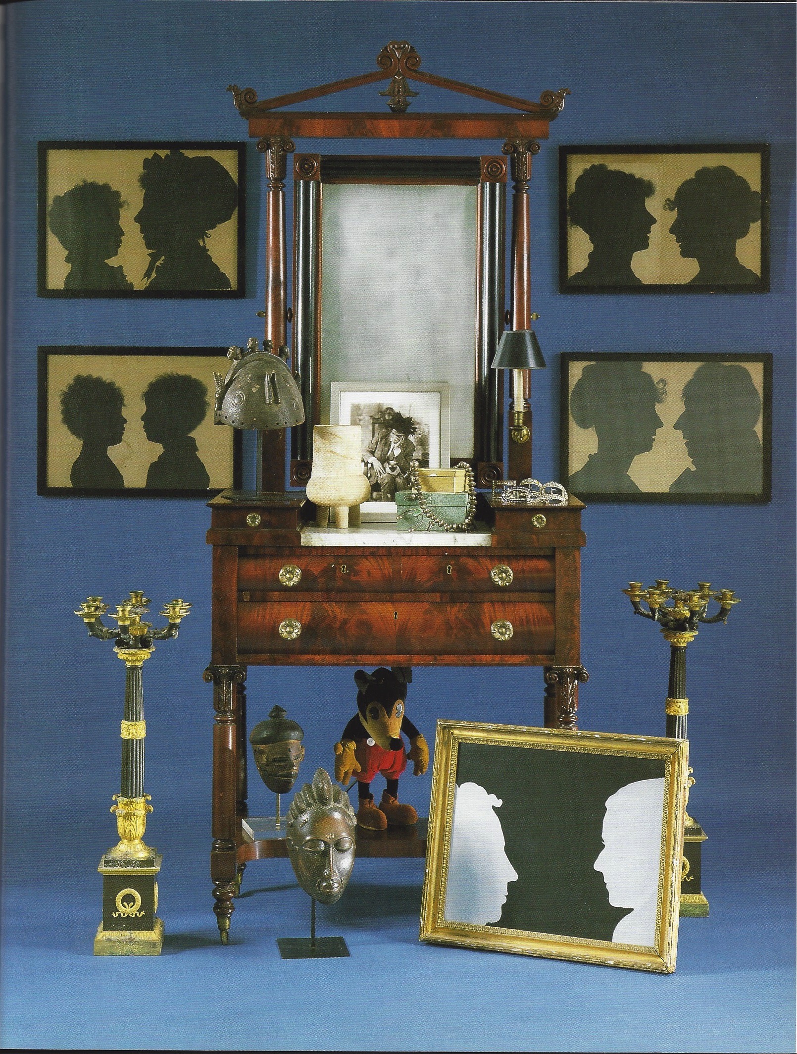
The allure of sitters and frame are equaled by the provenance. We bought the work from Pierre Le-Tan, the Paris artist. He bought it from one John Armbruster, a mysterious international private dealer, who has sold many fine if offbeat things that I’ve coveted over the years. He, in turn, bought it at the Sotheby’s estate sale of Frederick W. Hughes [above left with Loulou de la Falaise]. The right-hand man of Andy Warhol, it was Fred who persuaded the likes of Gianni and Marella Agnelli, Yves Saint-Laurent, and the Empress of Iran, among others, to commission portraits from Andy — the chicest and priciest to have been painted since Anthony Van Dyke.
And so we were amused to find our silhouettes of Early American patricians mistakenly identified in the Sotheby’s sale catalog as “A large free-cut portrait of Fred Hughes and a friend, American 20th Century.” Fred, who came from humble Texas stock, was a terrible snob, so he would have been delighted to be taken for a Livingston. But in defense of the auction house expert, we must concede that Fred’s profile resembles that of William Livingston, and that this nearly two-hundred-year-old work looks remarkably contemporary.
A close connection to a Pop master wasn’t Fred’s only claim to fame. He also possessed one of the best eyes of his generation, for both art-historical treasures and offbeat curiosities (our silhouettes falling somewhere in between). In addition, he could arrange a collection better than any museum curator or decorator we know. He demonstrated the skill in his enchanting Paris apartment on the rue de Cherche-Midi [above right], and his rather spooky Manhattan townhouse on Lexington Avenue [above left]. When he sold off the contents of the former, I punched above my weight, competing with a handful of major dealers, decorators, and the artist Cy Twombly. So when his New York hoard came under the hammer, posthumously, at Sotheby’s in 2001, I restrained myself, and walked away with mere dribs and drabs. Nineteen years later, I’m still making amends.
SWEDISH GRACE SCULPTURE
Swedish 20th century, possibly by Sidney Gibson. Abstract sculpture, circa 1925. Painted and gilded wood and plaster. H: 29 1/2:. Provenance: Folke Wickman, Stockholm; Daniel Katz, London. $10,000
This abstract 1920s Swedish sculpture, of painted-and-gilded plaster on a painted-wood base, is pleasing from all angles. At the time and place of its making, the Swedish Grace movement was in full swing. That style, characterized by a refined and delicate fluidity, updated the neoclassical style of the Gustavian period that prevailed around 1800. What’s unusual about this sculpture, however, is the union of Swedish Grace arabesques, recalling vegetation or windswept drapery, with stark Cubistic forms, suggesting the influence of French modernism. Nevertheless, we can identify the sculpture stylistically as Swedish, and because the previous owner, the important London sculpture dealer Daniel Katz, purchased it in Stockholm. As for the sculptor’s identity, when the research libraries reopen we’ll be looking into the work of Sidney Gibson. He was a sculptor who designed furniture, lighting fixtures, and furniture, for the Stockholm town hall, and his own beautifully appointed house on the grounds of the royal palace of Haga.

JAPANESE LACQUERED BOXES FROM THE COLLECTION OF
PIERRE LE-TAN
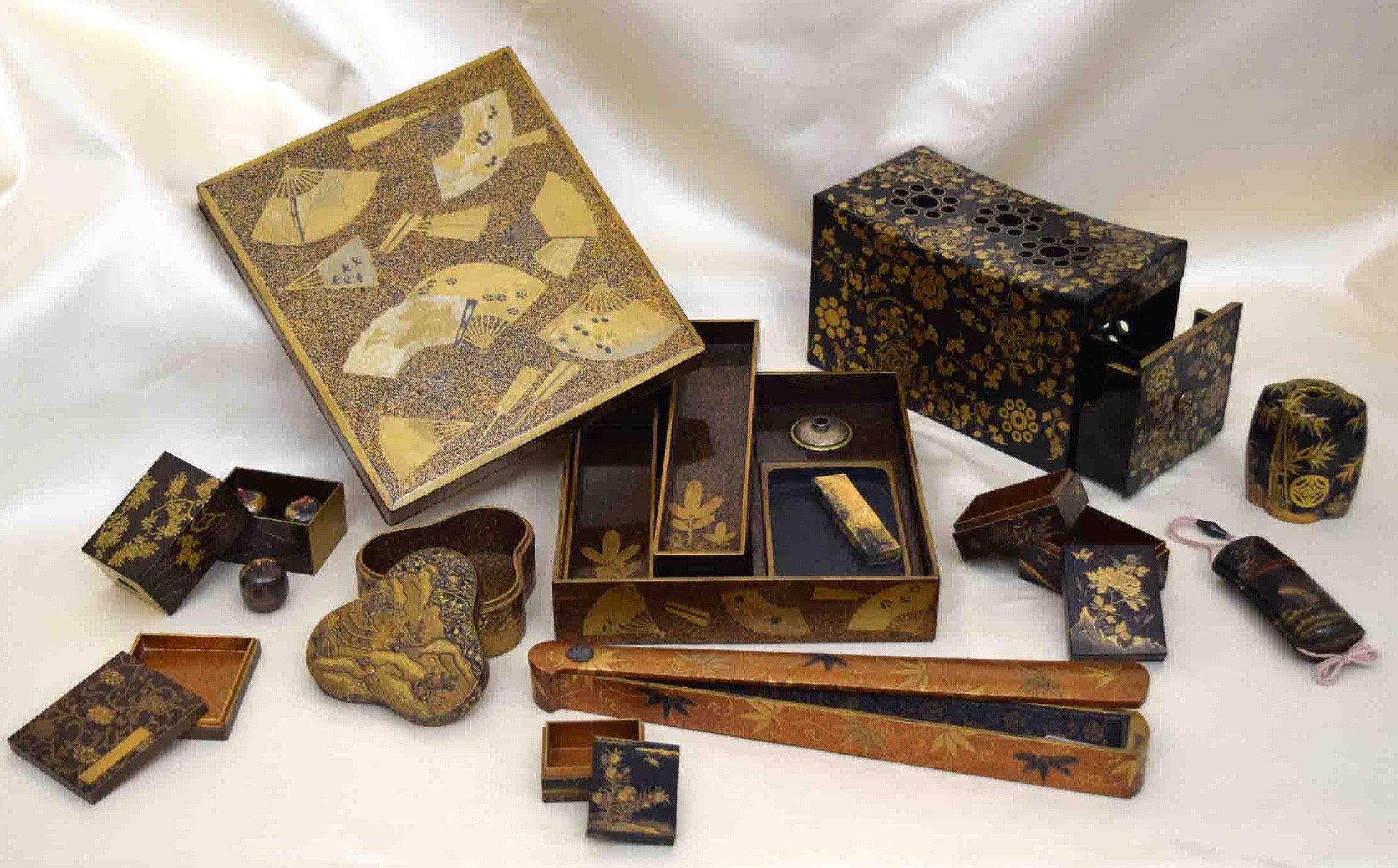
This remarkable collection of 18th-and 19th-century Japanese lacquered boxes was assembled by the Paris artist and collector Pierre Le-Tan (1950-2019). In recent years his work has been the subject of a museum retrospective at the Reina Sofia in Madrid, and solo gallery exhibitions at Paul Kasmin in New York, Emmanuel Perrotin in Paris, and Tristan Hoare in London. But it was as an illustrator that Pierre initially made a name for himself in 1969, at the tender age of nineteen, with the first of his many magazine covers for The New Yorker. He went on to illustrate the covers of books written by his friend Patrick Modiano (who won the 2014 Nobel Prize for Literature), with whom he co-authored several other books as well [below left]. In addition to writing and illustrating innumerable books of his own, Pierre also designed film and stage sets [below right], a Palais Royal fashion boutique for his daughter Olympia, and the interiors of a chateau — furniture included – for a Rothschild. A prolific jack of all artistic trades, Pierre somehow managed to find the time to make his daily rounds of the antiques shops and Hôtel Drouot auction rooms. The result was a shape-shifting collection, and acclaim among the cognoscenti for having “an eye.”
When it came to collecting – Japanese lacquerware, antiquities, Persian miniatures, 18th-century French furniture, Cecil Beaton photographs, Islamic tiles, Andy Warhol drawings — Pierre was insatiable. Yet he frequently left a find at the gallery where he had purchased it, sometimes for years, or sent a chair to an upholsterer without ever getting around to supplying the fabric. Pierre, you see, had to know that he possessed the object of his desire more than he needed to live with it. Yet his pursuit of the fine and the rare often left him short on cash, and his commodious apartment on the rue Saint-Augustin overflowing [below left]. And so, to relieve the pressure, he turned with some regularity to me, an New York antiques dealer. This could exasperate his then wife Plum, who would, on occasion, return home after running an errand to find that my shipper had made off with a comfortable armchair, a useful lamp, or a favorite picture. Not that I bought everything he came to part with — hence, a 1995 single-owner sale at Sotheby’s London [below right], and a large consignment twelve years later to Christie’s London.
To back track, Pierre and I met in the 1980s when I was dealing privately in modern and contemporary art. Then, I sold him the odd picture by Giorgio de Chirico, and bought from him the occasional Jean-Michel Frank chair. But in 1994, when I undertook to reinvent myself as a dedicated antiques dealer, and embarked on a crash course on the decorative arts, Pierre became a source, a mentor, and an inspiration. He took me to a cocktail party at the Maison de Verre, the 1932 Pierre Chareau masterpiece, then still fully furnished and owned by the family that had built it. He ushered me into the sky-lit studio of the now legendary Line Vautrin, maker of jewelry and miroirs sorcières, whom he had rediscovered, and told me to select a pair of cufflinks as his gift. He introduced me to antiquaires off the beaten track, and led me on treasure hunts through dust-furred apartments of recently deceased grandees. Before, in between, and after, we discussed pictures, furniture, and provenance, over lunches of foie gras and a bottle or two of Ladoucette at the Grill of the Plaza Athénée, aperitifs at Le Scarlett with Mr. Modiano, dinners at Davé where Pierre air-kissed Karl Lagerfeld, and nightcaps at Raspoutine, an improbably named haunt for elderly, superannuated White Russian emigrés.
After returning to New York I invariably received a drawing from Pierre that depicted one or two of my recent acquisitions. They were reproduced on the invitations to the evening openings of art and furnishings that I was then selling from home. And in 2002, on signing a Lexington Avenue shop lease, Pierre sent me a drawing of the storefront for my new business card [below left]. These drawings, I should note, were always his gifts.
On a buying trip to Paris last July I paid several visits to Pierre, and his second wife Toboré, at their home on the place du Palais-Bourbon [above right]. On the eve of my departure I returned for what would be our last meeting. It was then that we came to terms on the Japanese lacquerware boxes found below, and some other works of art and furnishings that I will be offering in the months to come. One item, however, that I will not offer for sale is a drawing by Pierre’s own hand. It was not by chance I selected one of an eye.
“Everything in the universe is depicted in lacquer. The dynamic and the static aspects of heaven, earth, and man — the shells and the fish, mountains and rivers, a thousand grasses and ten thousand trees, the materials of a house and its many utensils, tools, jewelry, the arts, incense, the tea ceremony, cooking, karma, and impressions of the mind.”
Kōami Nagasuki, 1718, from notes he wrote for his grandson. They belonged to a dynasty of lacquer artists that lasted for twelve generations.
WRITING BOX
Writing box (suzuri-bako), 18th century, depicting fans outside, and within young pine trees. Gold and silver lacquer on gold-sprinkled black ground, gilt-brass water dropper, ink stone, and gilded ink stick. Old Japanese paper label, and western inventory label on underside of cover. 2” x 8 5/8” x 9 ½” $8,750
PILLOW BOX
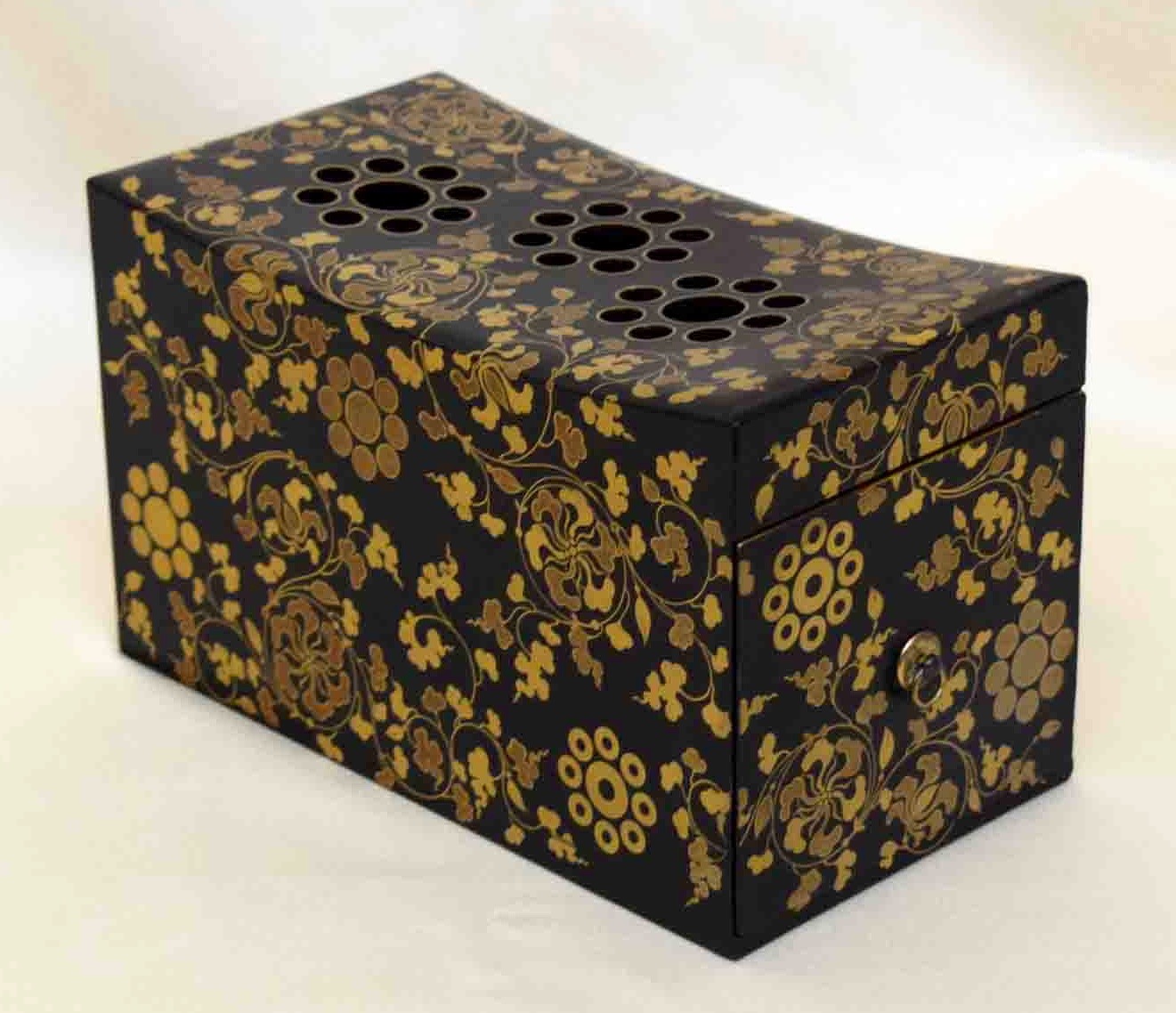
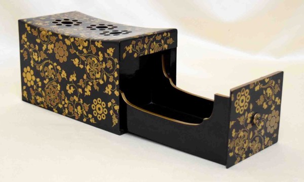
Pillow, 19th century, perforated in form of a family crest, with drawer for dried aromatic plants, depicting tendrils and two other family crests. Gold and black lacquer. 5” x 8 ½” x 4 ½” $5,500
FAN BOX
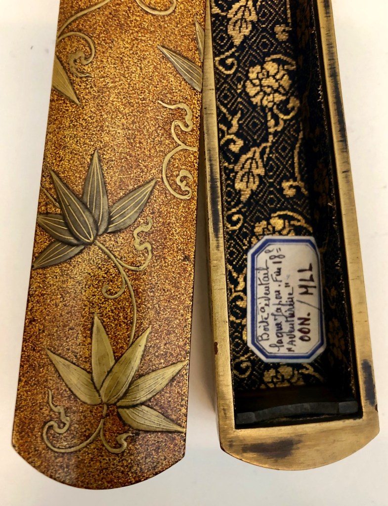
Fan case with pivoting lid, 18th century, depicting lotus blossoms in profile. Raised gold and silver lacquer on gold-sprinkled black ground, silk-brocade lining, brass fitting of butterfly form, with old French inventory label. 1 ½” x 12 ¾” x 1 3/8” $4,000
INRO
Inrō — which have multiple, uniformily-sized compartments — contained medicaments and personal seals. These finely-made decorative accessories were worn by both men and women from kimono shashes. Highly individualized, inrō signaled the owners’ refinement, and conveyed their personal sense of style.
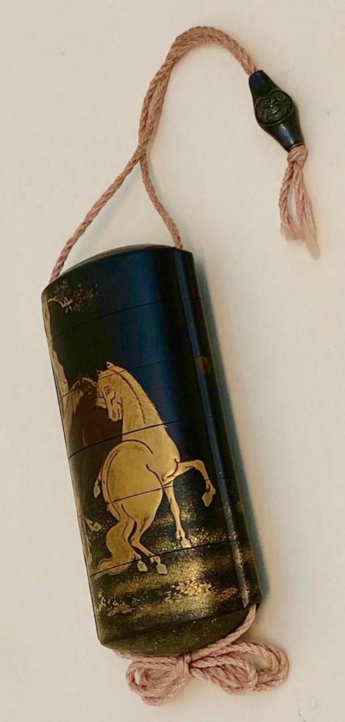
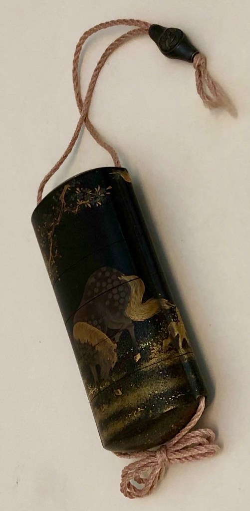
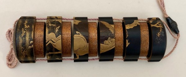
Five-tier inrō, 18th century, depicting horses in a landscape, signed Kajikawa Saku. Gold, brown, and silver lacquer on black, silk cord, bronze fitting. 3 ¾” x 1 ¾” x 1” $6,000
THE INCENSE GAME
This gentlemen’s game was played around a brazier, where incense, made of pulverized woods and herbs, were burned sequentially. Participants wrote down their identifications of each on slips of paper, called counters, that were inserted in a box. Finally, the host itentified the fragrences and named the winner. This game required several boxes for incense and paraphernalia.
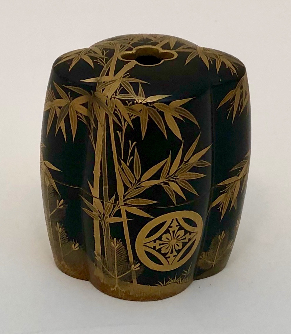
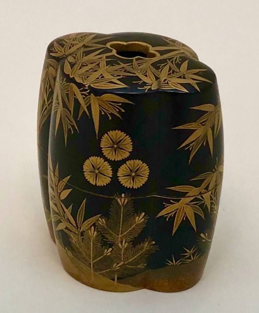
Incense game counter box (fuda-bako), 19th century, depicting two family crests and bamboo among young pine trees. Gold and black lacquer, gold sprinkled interior. 3” x 2 ¾” x 2 1/8” $4,000
Incense box (kō-bako), early 18th century, depicting two buildings in a landscape by the sea. Raised gold on black lacquer with gold and silver foil on exterior, gold sprinkled interior. 1 ¾” x 3 ¾” x 4” $6,500
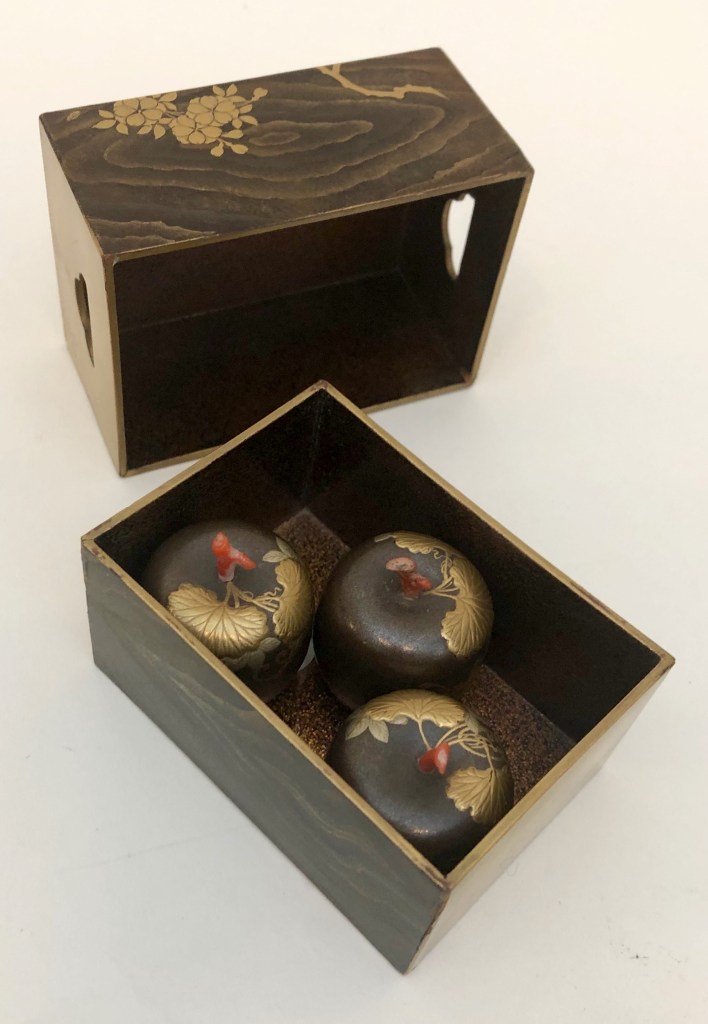
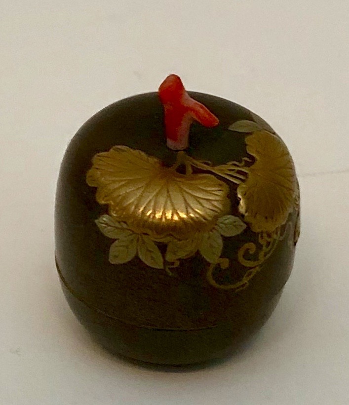
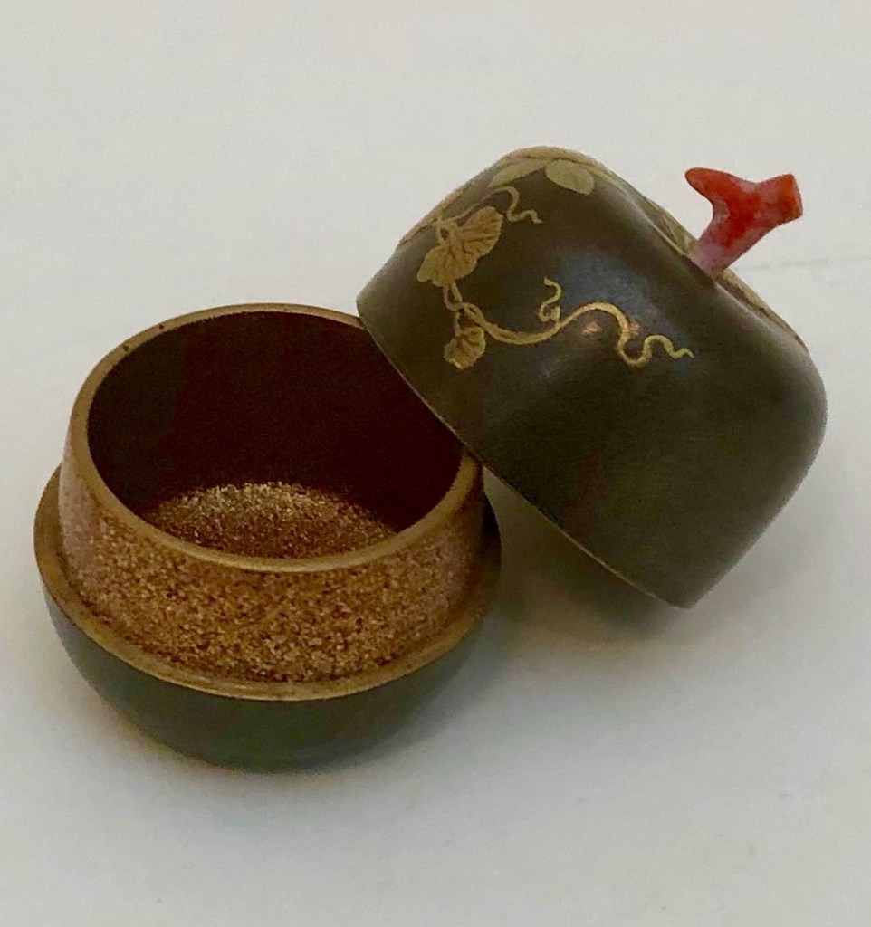
Incense box set, (kō-bako), 18th century, lid decorated with cherry blossoms against hanging blind, and wood grain alternating with gold panels on sides; containing three incense boxes (kōgō) of melon form, decorated with tendrils and leaves, with coral stems. Slightly raised gold on black lacquer, gold sprinkling on underside of lid, and inside melon boxes. 1 3/8” x 3 15/16 x 2 1/8” $6,500
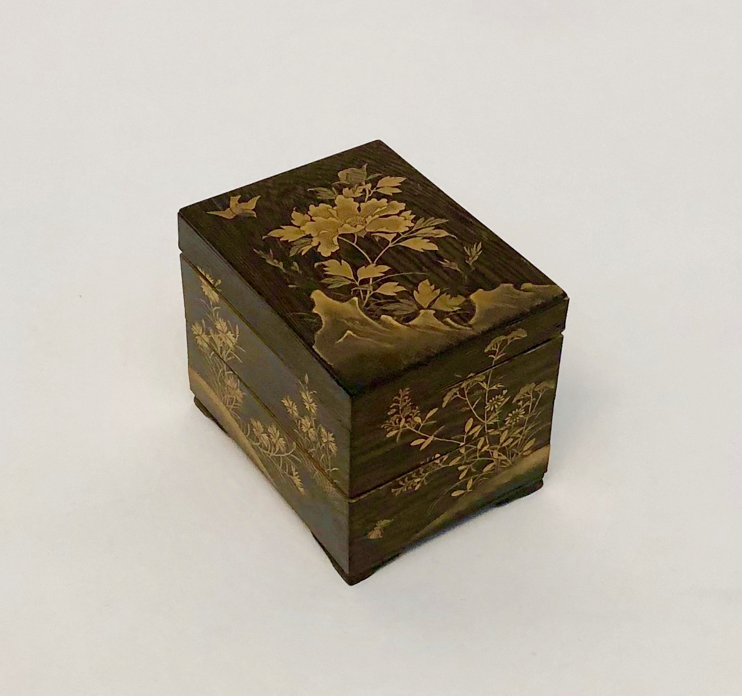
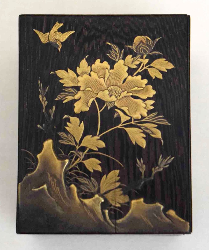
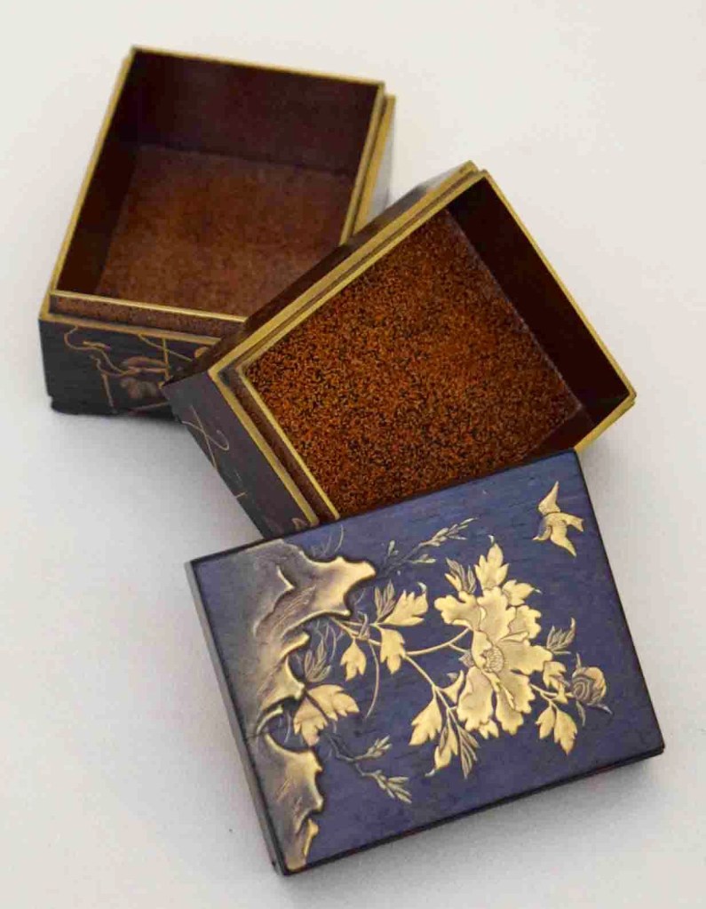
Two-tiered and footed incense box (kō-ju-bako), 18th century, depicting on the lid a peony with bird, and on the sides a dragonfly, butterflies, carnations, and morning glories. Raised gold decorations on black with gold sprinkled interior. 2 1/8” x 2 5/8” x 2” $4,000
Shallow incense box (kō-bo) in form of bound book, 18th/19th century, depicting title block and chrysanthemum pattern on lid, book spine and bound pages on sides. ¾ “ x 2 ¾“ x 3 1/8“ $3,000
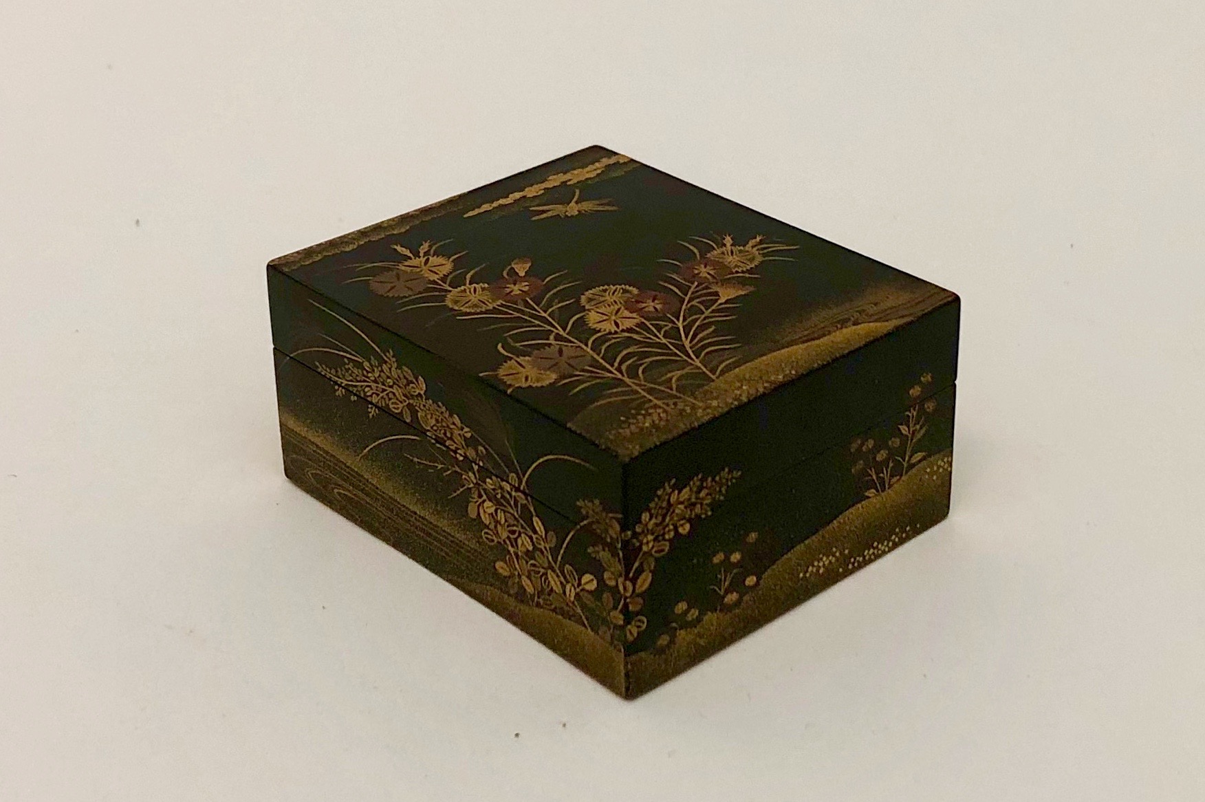
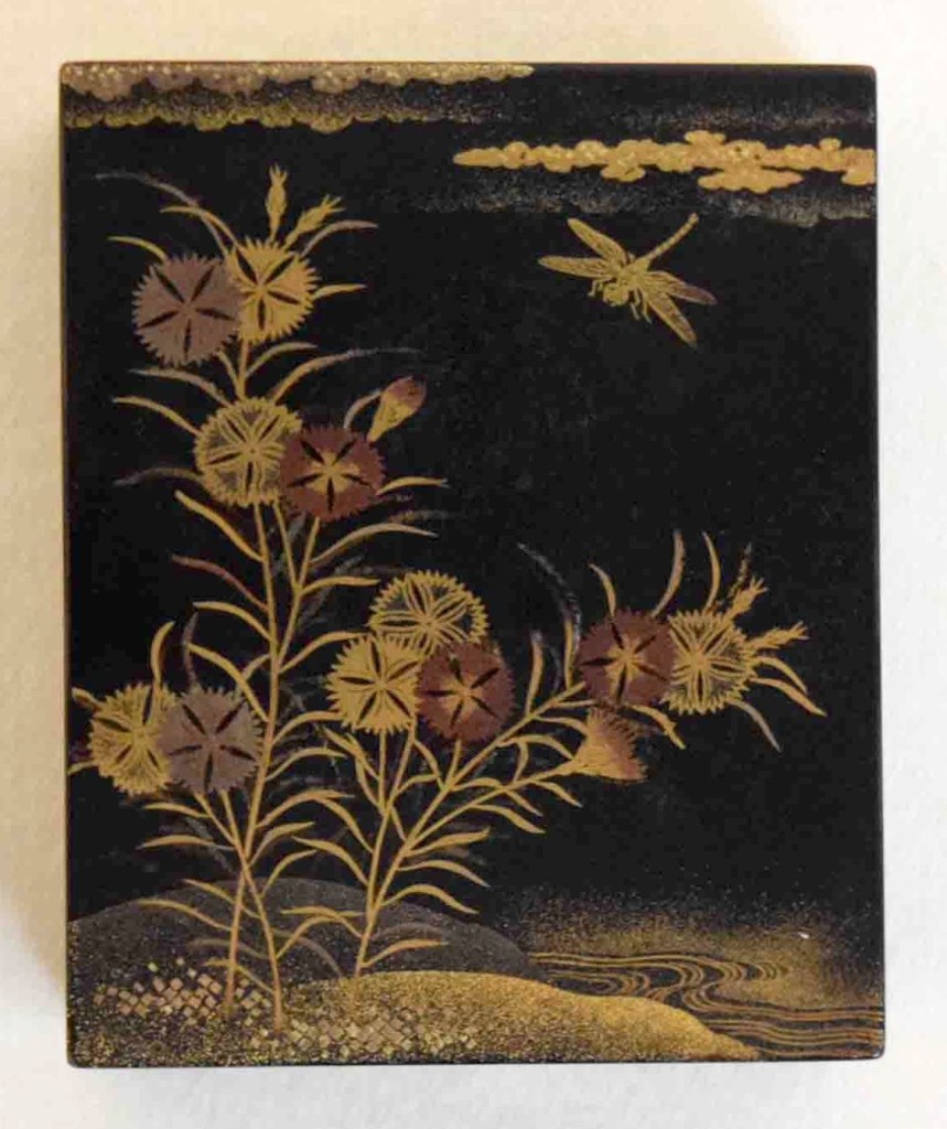
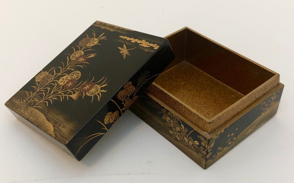
Small incense box (ko-bako), 18th/19th century, depicting carnations with a dragonfly and clouds on lid, plants by a stream on sides. Gold-sprinkled interior. 1” x 2” x 1 11/16” Sold
ITALIAN 19th-CENTURY MIRROR
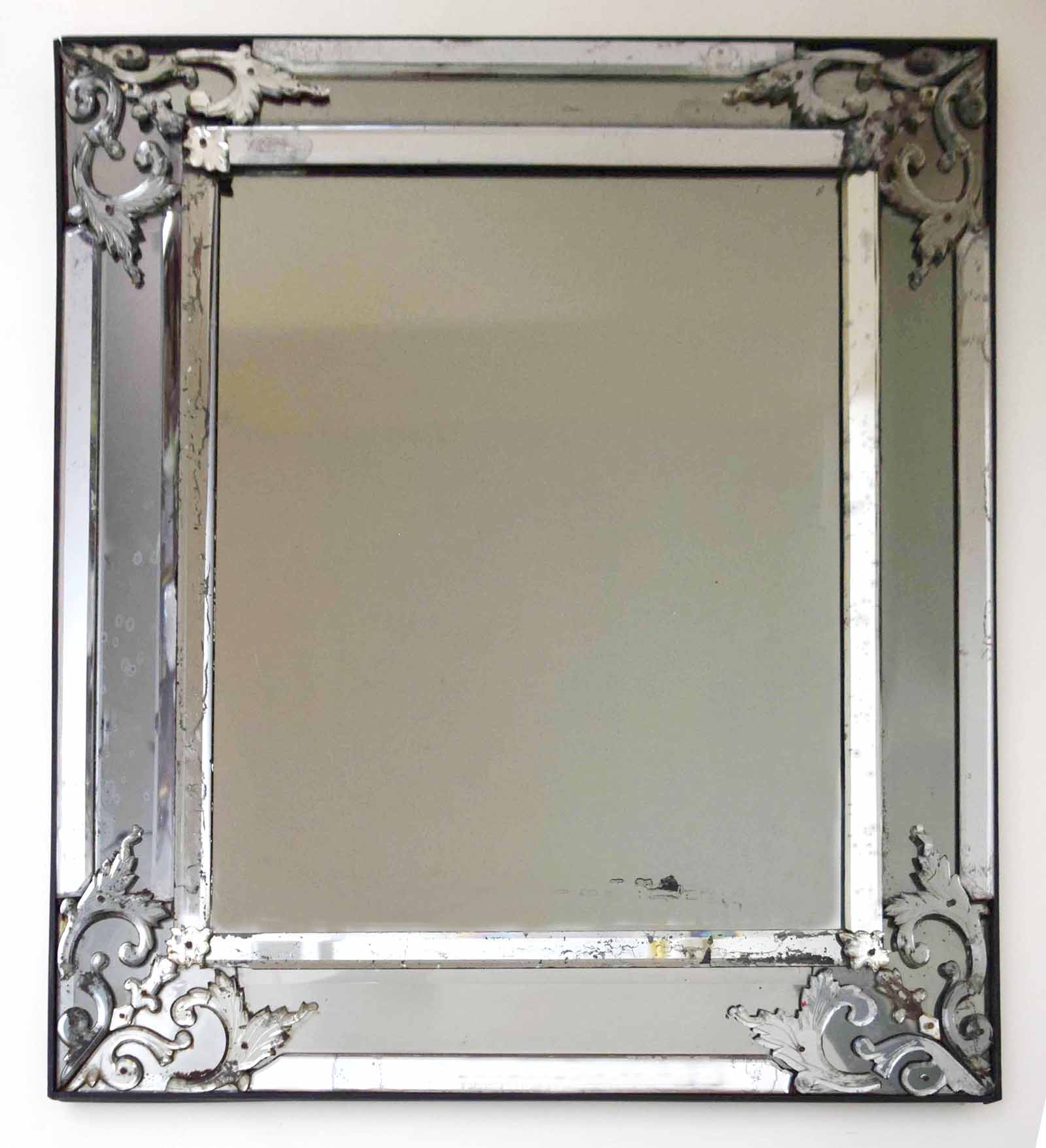
Italian 19th century. Mirror, circa 1850. Cut and beveled mirror on wood backing. 36 3/4“ x 31 1/2 “ Sold
The glassblowers of Venice had been making fine glassware and mirrors for the European aristocracy since the Middle Ages. Their technique, however, limited mirror-plate size to that of a modern sheet of legal-size paper. This changed in the 17th century when Louis XIV established the Manufacture Royale des Glaces. There, molten glass was poured onto a flat surface, and then silvered with toxic mercury. This technique produced the larger plates that could hold their own over fireplace mantles. And if those large mirrors were expensive to produce, the human cost was prohibitive, with craftsmen dropping like flies from mercury poisoning. Subsequent technical developments resulted in ever larger and clearer mirrors that were made under safer conditions. But their smokey, crystalline beauty was lost in the process.
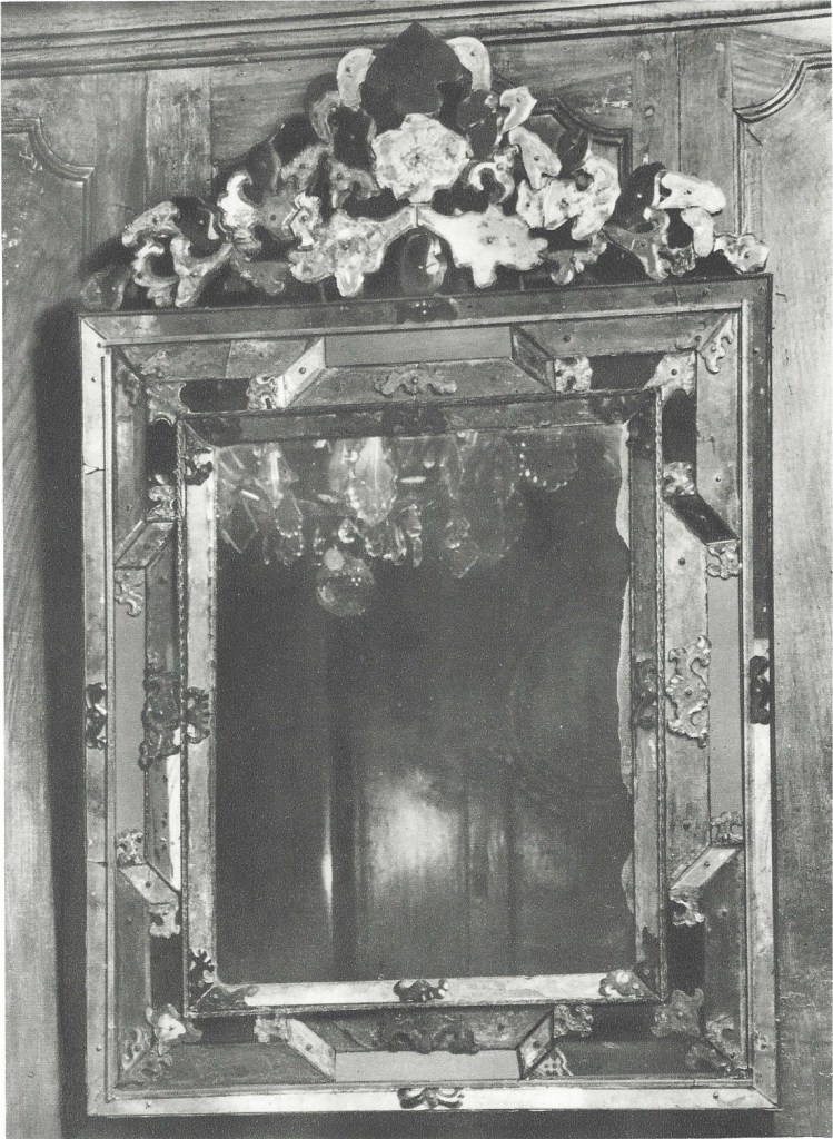
Our mercury-glass mirror, made in Italy in the 19th century, has a greyish tinge that endows a mystery to whatever happens to be reflected in it. The design harks back to the 17th-century craze for mirror-framed mirrors, with intricately cut pieces to cover the joints [above left, an 18th example]. These mirrors would become all the rage once again in the 1930s. Then, the Paris decorator and antiques dealer Serge Roche designed his own versions [seen in Vogue above right]. They were snapped up by fashionable decorators, like Elsie de Wolfe in Paris and Syrie Maugham in London, and inspired others that were made for Eleanor Brown of McMillen in New York.
BELLE EPOQUE ROCK-CRYSTAL CHANDELIER
French 19th/20th century. Attributed to Baguès Frerès (Paris maker). Belle Époque chandelier, circa 1900. Bronze and rock crystal. H: 31” (not including cap and chain), Dia: 21” $20,000
This chandelier was probably made by the Paris bronzier Baguès around 1900. The form of the cage, and the shape of the rock-crystal prisms, hark back to the 18th-century Rococo style, but the curves of the cast-bronze endow it with an Art Nouveau sinuosity. The soigné union of the two is a design hallmark of the Belle Époque that then flourished.
Then, designers faced the challenge of adapting the traditional candlelit chandelier to the electrical light bulb. The dilemma was that the bulbs’ brightness made it uncomfortable to look directly at the chandelier itself, and that the blazing light was unflattering when cast from above. That’s why the bulbs were often shielded with silk shades, or tucked inside the frame. Our chandelier had five sockets hidden behind glass-beaded trelliswork [below right], and another five on the arms. We found that overkill, so we retained the ones within, and, not wanting to burden the graceful form with cumbersome shades, refitted the arms for candles. Now, at the flick of a switch, the chandelier shimmers from within, and, at the strike of a match, emits flickering candleglow — or both, should it suit the occasion and the whim of the owner.
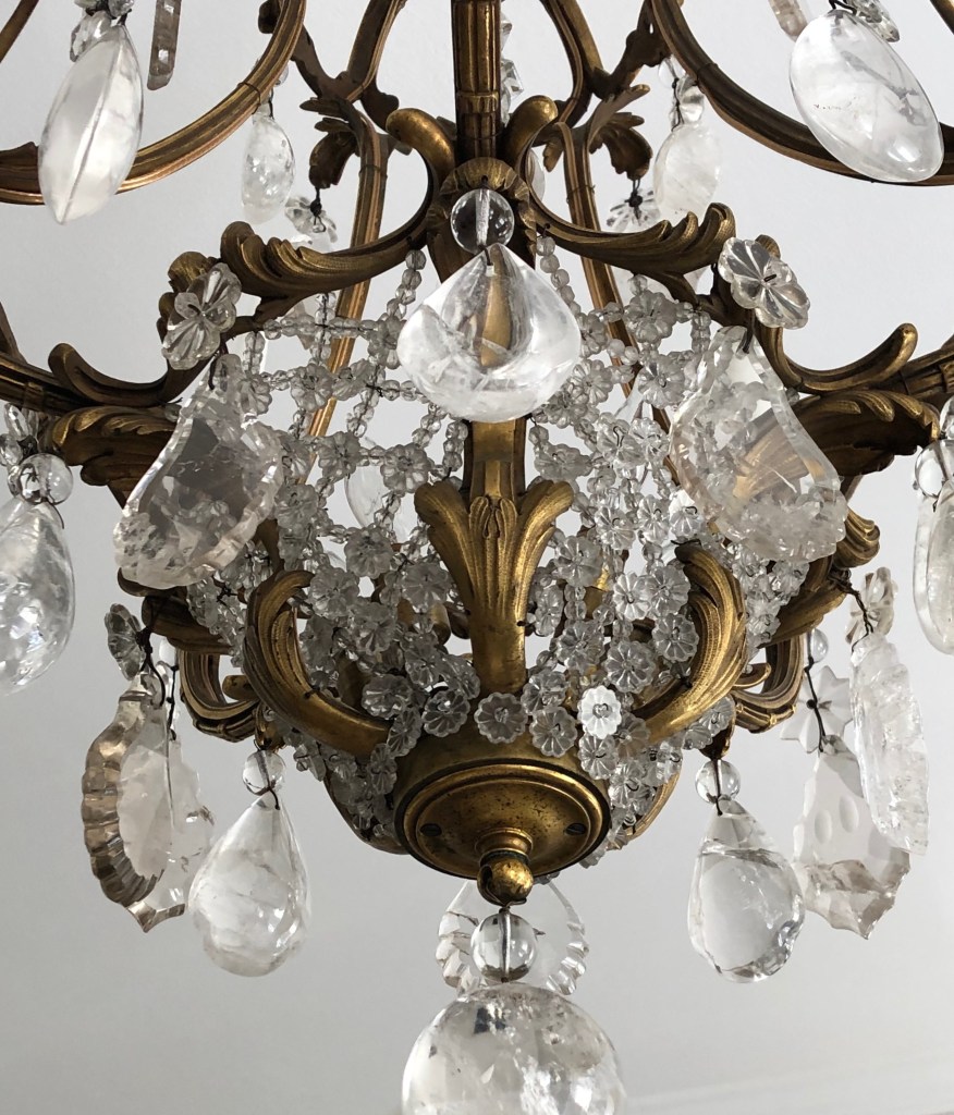
ALESSANDRO ALBRIZZI 1970s SNAKE SCULPTURE
Alessandro Albrizzi (Italian 1934-1994). “Nest of snakes sculpture,” circa 1970. Lucite and metal. 6” high, 14 ½” wide. $3,750
What the madeleine was to Marcel Proust, the snake was to Baron Alessandro Albrizzi [below left]. As a child he played on the terrazzo floors in the family palazzo in Venice [below right], where the French doors that opened onto the garden were secured by bronze hardware embellished with snakes. Decades later, as a London designer, the memory of them prompted the creation of Albrizzi’s “nest of snakes” sculptures. Their Lucite tubes were tied in knots by hand, making each unique. Yet some are better than others, and ours is as good as they get. They were among the last decorative objects to be made in a modern style. Since then we’ve had to make due with “amusing” flea market finds, and coffee-table books that are better left unread.
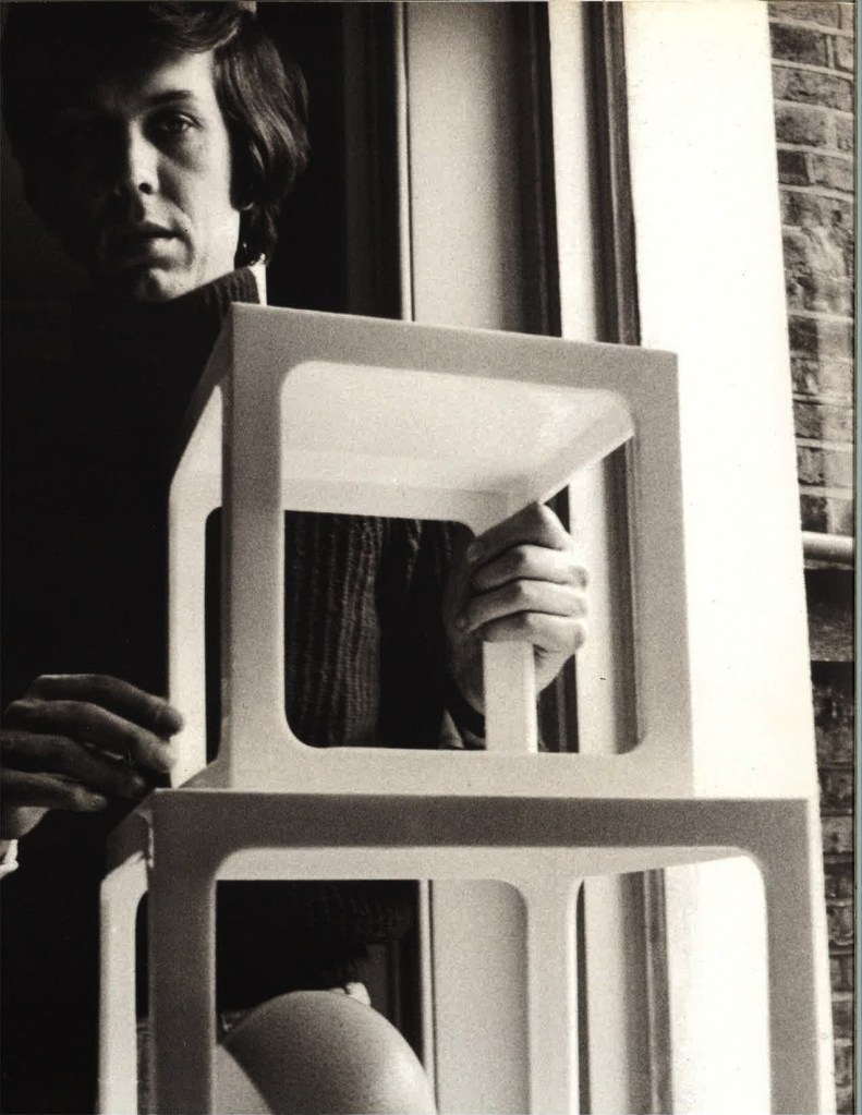
EMILIO TERRY DESIGN FOR A BED
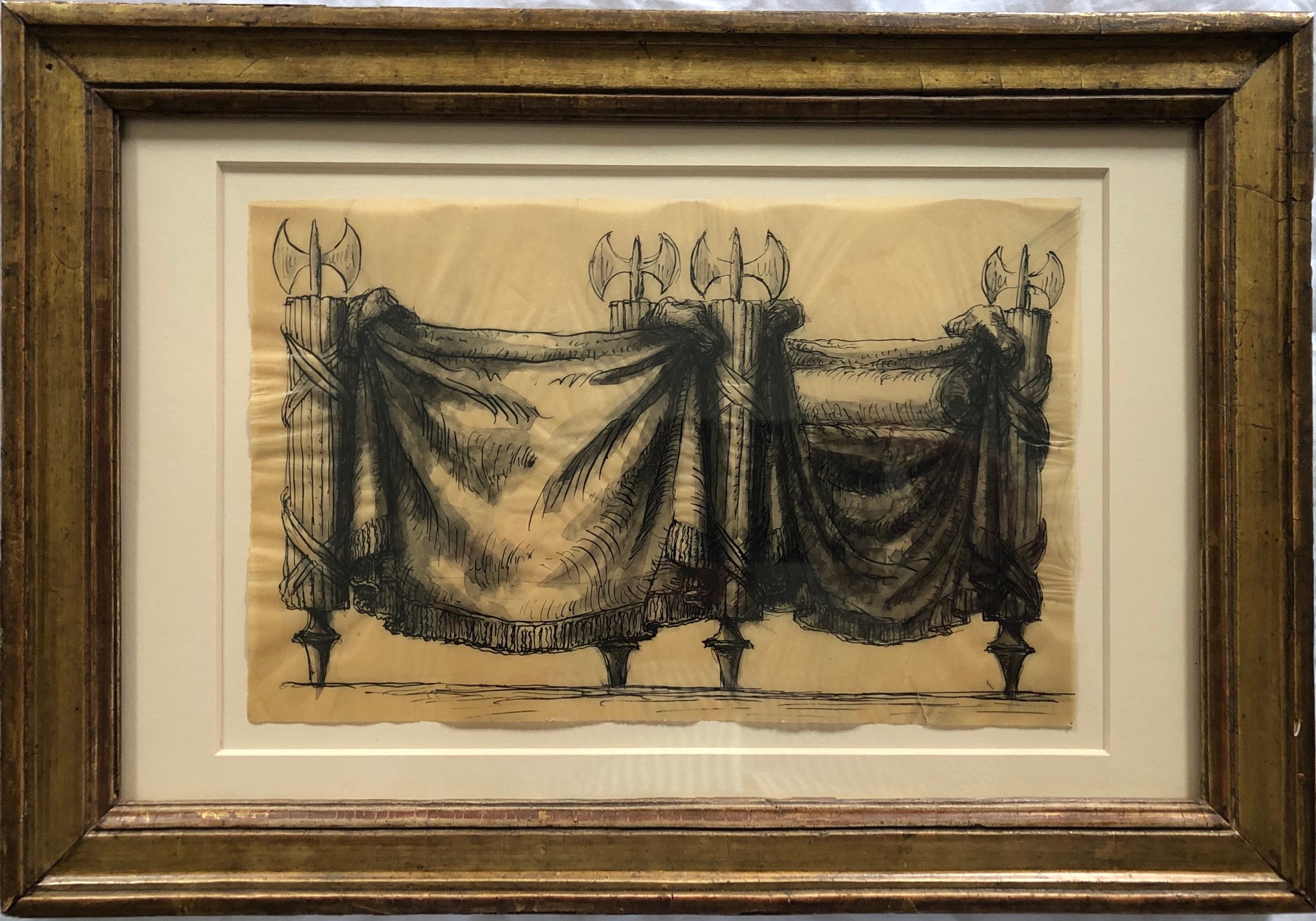
Emilio Terry (French 1890-1969). Design for a bed, circa 1935. Ink on architect’s tracing paper, in a circa 1800 giltwood frame. 8 ¾” x 12 ½” framed; 5 ¼” x 8” sheet. Provenance: Pierre Le-Tan. $6,500
Emilio Terry — draftsman, architect, interior designer, furniture designer — was the inventor and sole-practitioner of what was drolly referred to as his “Louis XVII style.” Thanks to the French Revolution, the Louis who would have been the seventeenth had died in prison, so no such style existed (and even if it did, it would have gone out of fashion long before Terry was born). Heir to a Cuban sugar fortune, Terry [below left] didn’t need to earn a living, or cater to prevailing taste. Yet he didn’t lack for commissions. His came from raffiné aristocrats like Vicomte Jean-Charles de Noailles, would-be aristocrats like Carlos de Beistegui, sophisticated nouveaux riches like Stavros Niarchos, and his chichi decorator friend Jean-Michel Frank, for whom Terry designed a furniture line. Among his more intellectual admirers was Alfred Barr, then director of the Museum of Modern Art, who included Terry’s offbeat work in the 1936 exhibition Fantastic Art, Dada, Surrealism.
This pen-and-ink sketch on architect’s tracing paper has a splendid agitation. Suffocating under bolts of draped fabric, the bed’s upright supports take the form of fasces, the bundles of rods surrounding an ax, which have symbolized the strength of a nation since the days of ancient Rome [above center]. Terry employs them less for political reasons than aesthetic effect. The result here is a severe, neo-classical bed. It is in stark contrast to the sensually disheveled Rococo one drawn by Jean-Honoré Fragonard in the 18th century [above right]. But if Fragonard’s suggests the hurried departure of furtive lovers, Terry’s embodies the fevered imagination of a celibate bachelor (albeit one who lived in luxurious grandeur).
PAIR OF VENINI TORQUED OBELISKS
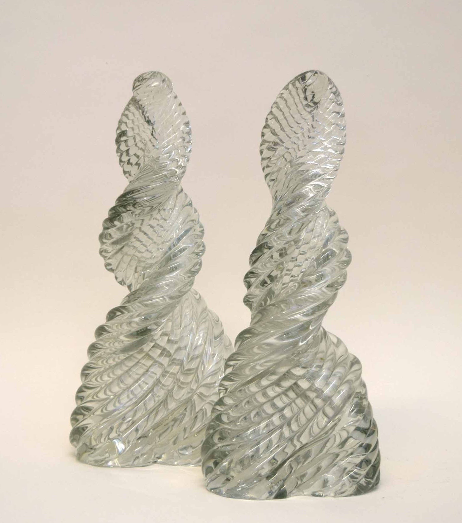
Venini (Italian, Venice). Pair of torqued obelisks, circa 1934. Diamante blown glass. H: 15” W: 7” $20,000
The obelisks of ancient Egypt inspired countless architects and designers over the course of millennia, including Robert Mills, who drew up plans for the Washington Monument. Nearly a century later, around 1930, Gio Ponti designed an obelisk or two for the glassworks of Paolo Venini. And shortly thereafter, Venini put into production Carlo Scarpa’s design for a torqued obelisk [below left]. His were made of diamante glass, so-named because, when transparent, their ropy diagonal striations crisscross to take on a diamond-like appearance. Scarpa and Venini would develop the diamante line that was launched at the Venice Biennale in 1934, and expanded for the 1936 Milan Triennale. Until then, Venini had been celebrated for colored glass, but now they were giving the makers who were known for their transparent glass — Steuben, Baccarat, and Lobemeyer — a run for their money. Soon, diamante obelisks came to take their places on mahogany tabletops in Lake Forest mansions, decorated by Frances Elkins, and on the floor as doorstops — yes, doorstops — of La Fiorentina [below right], the palatial Cote d’Azur villa of English tastemaker Rory Cameron.
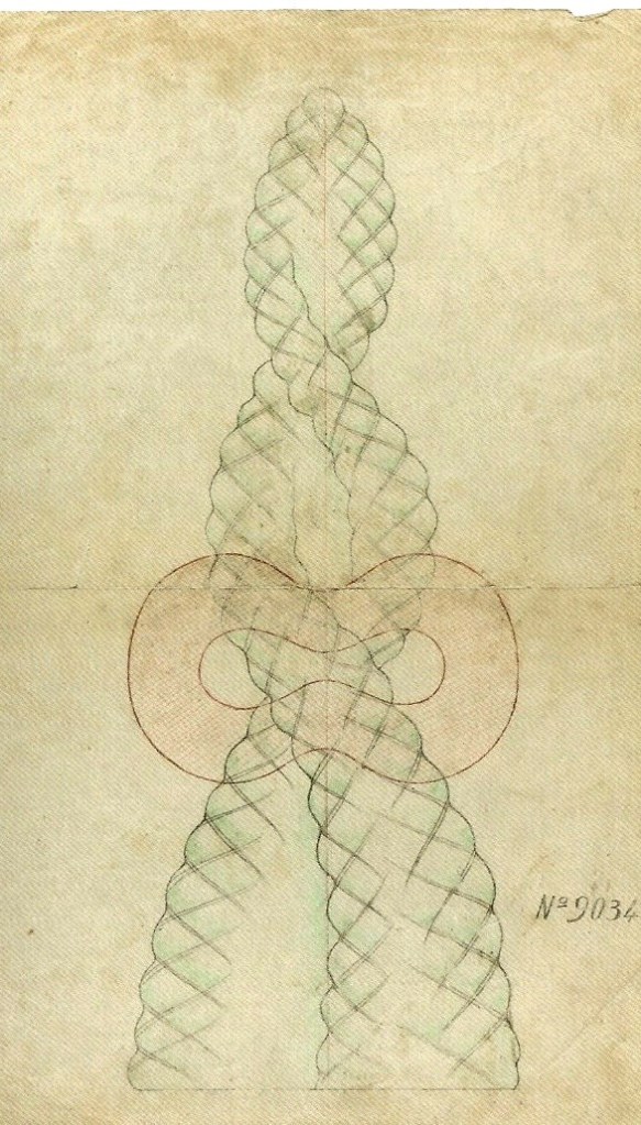
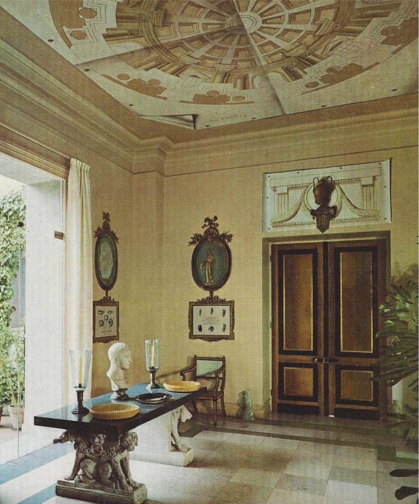
FRENCH EMPIRE ORMOLU MOUNT
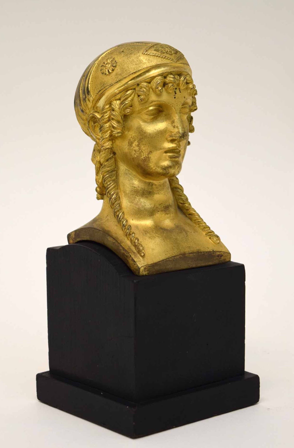
French 19th century. Empire furniture mount, circa 1810. Gilt bronze mounted on later painted-wood base. H: 9 ¾” including stand. $6,500
This ormolu head of a woman was made as a furniture mount in France around 1810. It quite likely adorned a bed, like the one designed by Charles Percier around the same time [below left]. In any case, closer to our own time, it was deemed worthy of mounting as a sculpture on a finely made base. Its neo-classical style, quality of casting, chiseling, and gilding, recall the work of the bronzier Pierre-Philippe Thomire. He was a supplier of candelabra, centerpieces, and furniture mounts to Percier, who was then Napoleon’s interior decorator. Among the many projects they collaborated on was Malmaison, the emperor’s retreat outside Paris. There, one can still see Napoleon’s own bed, designed by Percier, and mounted with a pair of heads by Thomire, which are similar to our own [below right].
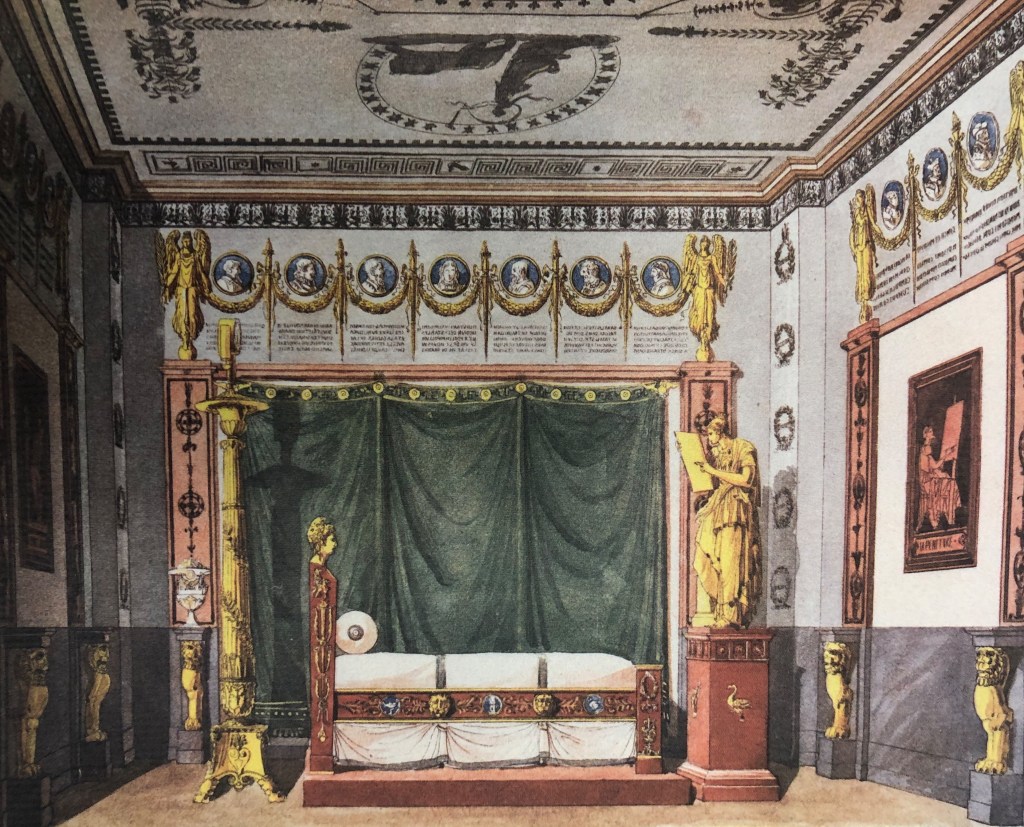
SET OF 12 GIOVANNI GARIBOLDI SHELL DISHES FROM THE 1930s
Giovanni Gariboldi (Italian 1908 – 1971). Set of 12 dishes, circa 1948 for Richard-Ginori. Glazed porcelain. 5” wide $5,000
In the 1920s, Gio Ponti, the definitive figure of 20th-century Italian design, was the art director at Richard-Ginori, a venerable porcelain company established in the 18th century. When Ponti left in 1930, the vacant position was filled by his protégé Giovanni Gariboldi, who, like Ponti himself, designed furniture and interiors. One might assume that Gariboldi found his model for these shell-shaped dishes on the seashore, but, in fact, no such shell exists. Rather, he channeled the essence of “shellness,” to invoke Plato, when inventing the form, which he endowed with the faux verisimilitude of delicate ribbing on the scalloped edges. Taking yet another liberty, Gariboldi had the interiors glazed in candy-colored pastels of pink, yellow, and blue.
THREE DRAWINGS BY DRIAN
Etienne Drian (French, 1885-1961). Women in Wartime, circa 1915. Graphite and watercolor on paper, in giltwood frames. Each 24 1/4″ x 20 sight; framed 24 1/4″ x 20″. $6,000
These three masterful drawings are by the French artist Drian, who dispensed with his first name professionally, and became one of the most successful artists of his day. Sketched during World War I, they depict women going about their daily activities when the men were off fighting. As such, they’re atypical of his work since Drian was celebrated for his glamorous murals, and flattering portraits of high-society sitters like Elsie de Wolfe, the Duke and Duchess of Windsor, and Coco Chanel, among others. One of our drawings depicts a pregnant woman opening a letter from, presumably, her husband at the front, and two others of women doing the jobs of absent men — one dispensing change or selling tickets, the other hawking the Paris daily Le Figaro. As with their high-society counterparts, Drian presents them in multiple views that he crossed out if they displeased him. He captured their every gesture with an immediacy and realism that doesn’t preclude grace. Drian, who hailed from an obscure provincial family, was taken under the wing of a local grandee who introduced him to 18th-century refinements. Among those that influenced the artist throughout his career were the drawings of Antoine Watteau, who, like Drian much later, delineated aristocrats and commoners alike with psychological insight and respect.
ERTE GOUACHE OF AN INTERIOR
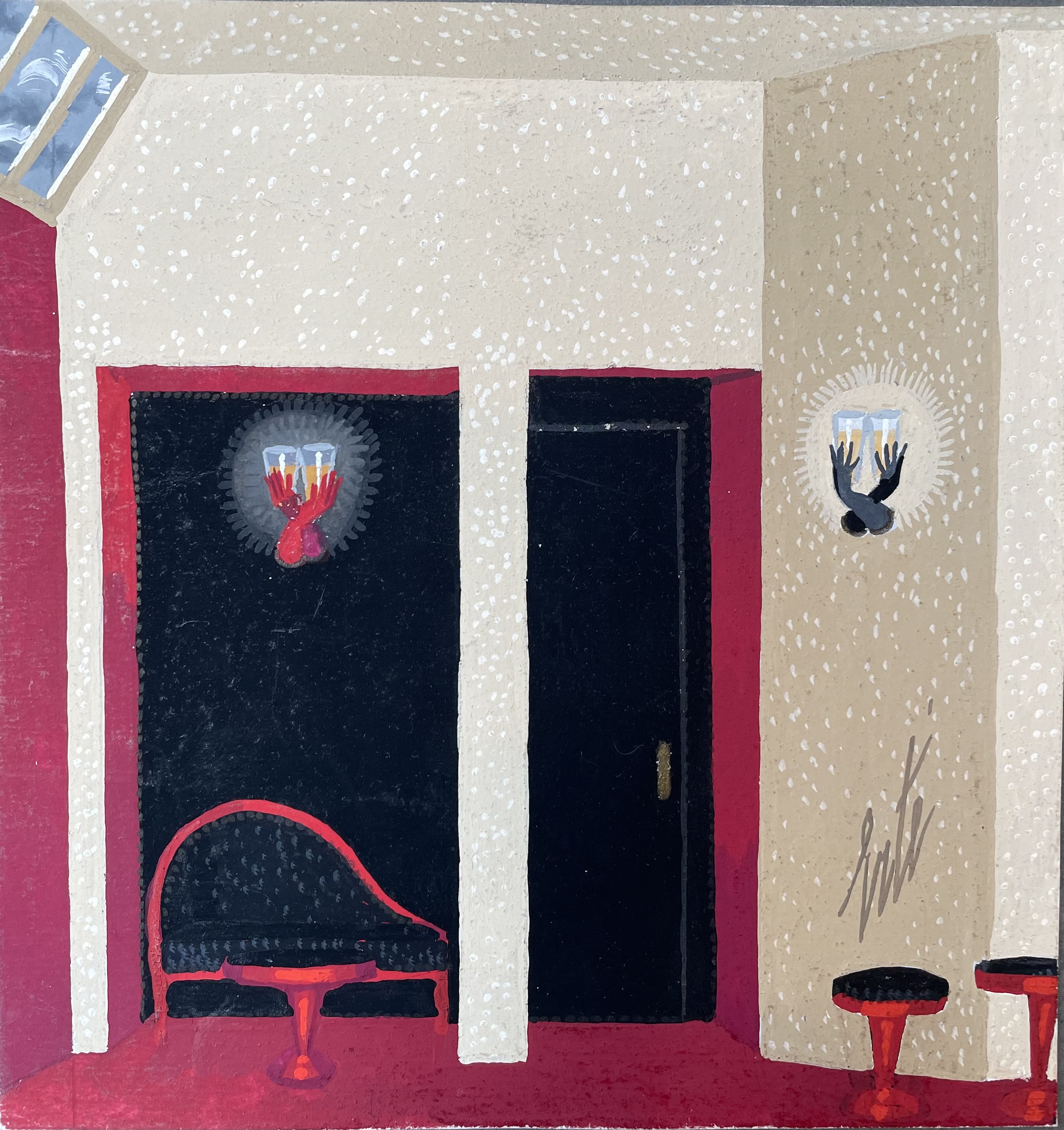
Erté, born Romain de Tirtoff (Russian/French 1892-1990). Design for an Interior, circa 1935. Gouache on paper, signed, mounted on a sheet bearing his stamp “ERTE/Romain de Tirtoff/Composition originale”. Image 6 1/4″ x 6″, backing sheet 10″ x 12 3/4″; frame 14″ x 11″. Provenance: Michael Clancy, New York. $7,000
Erté was both the incarnation of the Jazz Age, and the soigné embodiment of the ancien regime. Born into the Russian aristocracy, Romain de Tirtoff — Erté is the phonetic pronunciation of his initials in both French and Russian — left St. Petersburg in 1913 and landed a job in Paris with Paul Poiret. After going solo, Erté’s mid-bogglingly creative designs for dresses and theatrical costumes caught the eyes of New York fashion retailer Henri Bendel, publisher William Randolph Hearst who put him under contract for Harper’s Bazaar, and Louis B. Mayer who brought him to Tinseltown and MGM’s back lot. On returning to Paris in 1925, Erté designed revues for the Follies Bergères, the Lido, and the Café de Paris. The Depression brought the gravy train to a halt, yet Erté, who was savvy with money, continued to wear bespoke suits with pearls and furs (he was a pioneer of gender fluidity), and lived in a chateau he decorated with fine antiques and the offbeat furniture he designed. In 1935, when the Paris impresario Mitty Goldin acquired the Theatre ABC, Erté received a new round of commissions. In addition to costumes and sets for revues, Goldin may have asked for his help in revamping the theater’s decor. Since our gouache dates to this time, and appears to represent a waiting room, it may be a scheme for Goldin. Regardless, it shows Erté as a master of decor off-stage as well as on, judging from the dramatic color scheme, and his designs for a settee, cubist stools, and sconces in the form of human hands. The latter is a nice Surrealist touch — as are the skittering clouds beyond the clerestory windows
EUGENE BERMAN COLLAGE
Eugene Berman (Russian 1899-1972). Radiograph of a Heart, 1945. Paint on paper, collage, metal shavings. 24 3/4 x 21″ framed. $8,000
This haunting image by Eugene Berman was painted on a sheet of paper that was cut in the shape of a heart, mounted to a sheet of white-speckled black paper, encircled with metal shavings, and set in an antique frame selected by the artist. The title, Radiograph of a Heart, refers to the medical X-rays that doctors had only recently come to use. Berman, however, seems to suggest that while the heart may be scientifically monitored, the emotions that are traditionally ascribed to it lie beyond the grasp of medical science.
Russian by birth, Berman [below left] fled St. Petersburg for Paris after the Revolution, and then, as a Jew, fled Europe on the eve of World War II. Having taken a comfortable refuge in New York and Hollywood, his peace of mind was shattered once again by the suicide of his wife, actress Una Munson [below right], who had played Belle Watling in Gone With the Wind. This distressing event — “Don’t follow me” she admonished him in her suicide note — cast him adrift once more. He eventually came to settle in Rome, the Eternal City, where he would quietly live out his days.
Eugene Berman, his brother Leonid, Pavel Tchelitchew, and Christian Bérard, were the leading artists in the Neo-Romantic movement. In the 1930s and 40s their work was avidly collected and exhibited by, among others, Alfred Barr, the founding director of the Museum of Modern Art. Since then this movement has fallen from favor. But in an art world where fashion reigns, what’s in today is out tomorrow — until it’s revived. And so, in time, perhaps those Berman paintings in that museum’s collection will reemerge from storage, and resume their rightful places on those hallowed walls.
CUZCO SCHOOL 18th-CENTURYPORTRAIT OF A NOBLEWOMAN
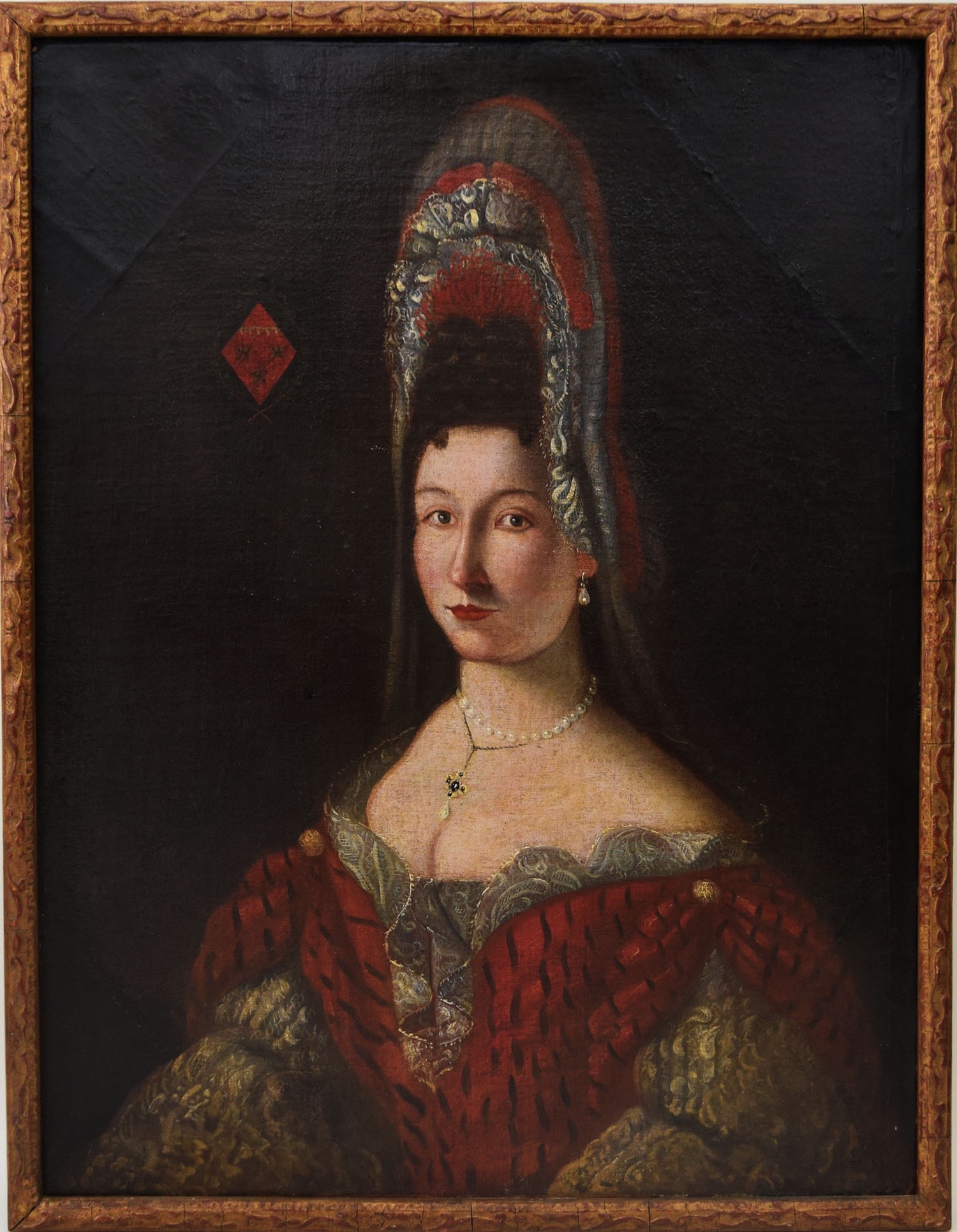
Peruvian, Cuzco school. Portrait of a Noblewoman, circa 1700. Oil on canvas, in a later giltwood frame. 37 “ x 28 ¾” $10,000
The sitter’s elaborate coiffure, sumptuous dress, pearl collar, and jeweled necklace, speak to her wealth, just as the coat of arms does to her exalted station. This painting was sold to us as Spanish, but we now know it’s the work of a South American artist of the Cuzco School, which takes its name from the Spanish Colonial city that had once been the capital of the Incas. Our sumptuously dressed European sitter would have been a member of, or in the circle of, the viceregal family. Originally octagonal in shape, the painting was later supplemented with corners and placed in a rectangular frame. That former decorative shape suggests it may once have been one in a series of portraits of distinguished sitters that encircled a room.
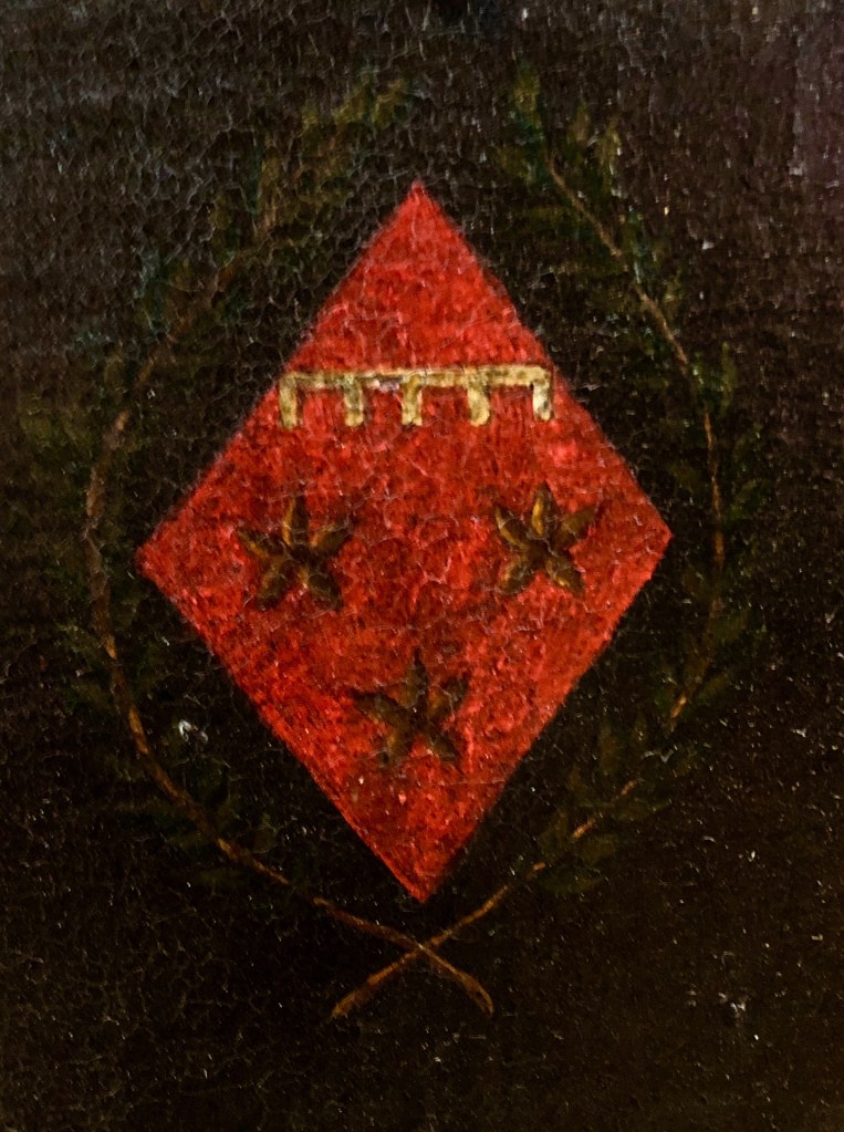
1920s ABSTRACT SCULPTURE BY HENRI HAMM
Henri Hamm (French, 1871-1961). Abstract sculpture, circa 1927. Plaster with inner metal strut. H: 13″ W: 5 1/2″ D: 7″. Sold
Henri Hamm was born in Bordeaux, studied at the Ecole des Beaux-Arts there, and moved to Paris in 1902. By then he was an accomplished sculptor. The following year he became a founder of the Salon d’Autumn, an annual art and design exhibition, with the painters Georges Rouault and Eugene Carrière, and the architect Frantz Jourdain. Initially inspired by the formalism of Cezanne and the Cubists, he frequented the Bateau-Lavoir studios of Picasso and Brancusi, and the garrets of the poets Apollinaire and Max Jacob. If the influence of Brancusi on our plaster is obvious, that of Alberto Giacometti in his Surrealist period is also in evidence. This accounts for our late 1920s dating. Then, just as Giacometti paid his bills by sculpting lamp and drawer-pull models for the decorator Jean-Michel Frank, Hamm did so by making one-of-a-kind luxury objects — boxes, combs, and hair ornaments — from silver, ivory, tortoiseshell, and mother-of-pearl. Teaching was an additional source of income that supplemented the sale of his sculptures by Pierre Loeb, the Paris dealer who also sold works by Picasso, Klee, Miro, and Arp. On occasion, Hamm made large sculptures, but he’s best known for small plasters of pure abstract forms that bear a kinship not only with Brancusi and Giacometti, but with Hans Arp as well.
MARTIN BATTERSBY TROMPE L’OEIL PAINTING
Martin Battersby (English 1884-1982). Garbo Sphinx, 1958. Oil on canvas, signed & dated. H: 23 3/4″ x 35 1/2″; framed 27 1/2″ x 39″. Provenance: Grosvenor Gallery, London, Michael Clancy, New York. $12,500
This 1958 trompe l’oeil painting titled “Garbo Sphinx” depicts the 1930s silver-screen goddess who enchanted movie goers. It was painted by Martin Battersby who had studied acting, designed jewelry, concocted stage sets with Cecil Beaton, and dealt in antiques, before picking up the brush without having had any formal training. In post-war Britain his talent, charm, and good looks won over high society, the intelligentsia, and politicos alike, landing him painting and mural commissions from Daisy Fellowes, Lady Diana Cooper, Evelyn Waugh, and John Profumo. In the States he received mural commissions for the lobby of the Westbury Hotel in New York and the house of Paul and Bunny Mellon in Virginia, among others. He also played a role in the revivals of the Art Nouveau and Art Deco styles as the author of The World of Art Nouveau (1966), The Decorative Twenties (1969), and The Decorative Thirties (1971). In addition, he wrote Trompe l’Oeil (1974), a book in which he brazenly, if justifiably, juxtaposed his own accomplishments with those of Van Eyck, Veronese, and Zubaran.
PAIR OF ART DECO CHINOISERIE CHAIRS
American or European. Pair of chinoiserie hall chairs, circa 1925. Lacquered wood, carved and gilt decorations. H: 37” D: 19” W: 17 ¾” Sold
When made in the 1920s, this glamorous pair of chairs, which merges Asian and Art Deco characteristics, would have evoked the orient for occidental buyers. The construction suggests Western manufacture, but the carved and gilded medallions appear to be the handiwork of native Asian artisans. Then, a number of them lived in western capitals, including Paris, London, and New York, where they worked for restorers, importers, retailers, and important dealers who specialized in Asian art, like C. T. Loo and Yamanaka.
RUSSIAN SIDE TABLE
Russian, circa 1840. Tray table with drawer. Mahogany, brass stringing and wheels. H: 26” L: 18 ¼” D: 11 ¾” $8,500
Every contour and plane of this exquisite mahogany table is outlined with glinting brass stringing — a hallmark of Russian cabinetry. The form, however, is derived from the furniture that was then being made in France during the reign of King Louis-Philippe. At that time Russians were besotted by all things French, even though a recent war with Napoleon had left Moscow in cinders.
PAIR OF CHIAVARI CHAIRS

Italian (Chiavari) 20th century. Figli Zunino & Rivarola (maker). Pair of Chiavari chairs, circa 1950. Painted wood with gold decorations, caning. H: 37 ¼” W: 16” D: 16” $7,000
The delicate, lightweight, Chiavari chair was first made in the Italian town of Chiavari in the early 19th century. Their elegance and grace would come to charm mid-century modernists, including the influential architect and furniture designer Gio Ponti. As he was the first to admit, it was the Chiavari chair that inspired his Superleggera chair, perhaps his most iconic design.
NEO-CLASSICAL PORCELAIN VASE WITH A SILVER GLAZE
English or continental, 18th century. Neo-classical vase. Painted and silver lusterware-glazed porcelain. H: 14 ½” $5,000
This elegant vase of attenuated proportions was given an unusual silver-luster glaze, and embellished with two medallions on a military theme. One depicts a young soldier with a sword and statuette of Athena, goddess of war. The other depicts an older bearded and helmeted warrior visiting a shrine. There’s no maker’s mark, but the classic Wedgwood-blue color, and antique-inspired medallions, suggests English manufacture around 1800, which aligns the vase with the refined taste of the London architect and designer Robert Adam. That said, since Wedgewood was also popular on the continent, our vase could have been made there too.
IBERIAN MIRROR CIRCA 1800
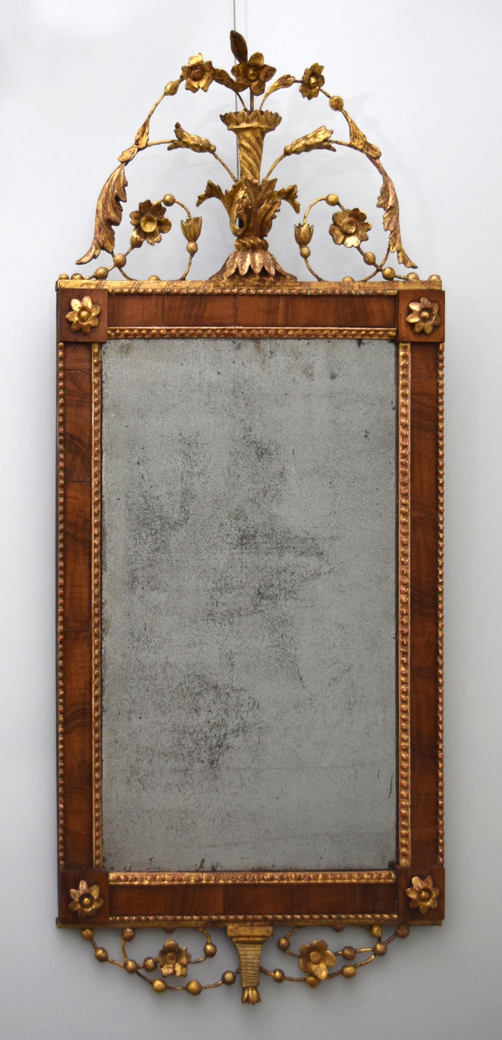
Iberian 18th/19th century. Bilbau mirror, circa 1800. Walnut veneer, gilded and gessoed wood, original mirror plate. H: 34 ¼” W: 15” $8,000
The so-called Bilbao mirrors, made around 1800 in Portugal and Spain, were named after the Spanish city of Bilbao, where many if not all were made. More recently, on our shores, they were mistakenly believed to have been made in America, for the simple reason that many were found in old New England houses. But they got there on clipper ships freighted with fortified wines, like port and madeira from Porto and Madiera, which were then very popular. Thus did Bilbao mirrors come to the new American Republic, and take their place on the walls of the Early American home.
MYSTERY EARTHENWARE PITCHER WITH A COPPER GLAZE
Possibly Spanish or Hispanic 19th century. Jug. Copper-luster-glazed earthenware. Height 10 ½“ $3,000
The origin of this jug, with its sculptural form and copper-luster glaze, is a mystery. The form is typical of Renaissance and Baroque metalwork [below left], and the copper glaze is found in Hispano-Moresque ceramics around that time [below right]. Those forms and glazes, however, also inspired Latin and South American artisians working in the Spanish colonies. But then, around 1900, in both places, these traditions were revived, and similar ceramics were made once again. Regardless of where and when our jug was made, however, it’s monumental form, and gutsy decoration, endow it with the boldness that bears witness to an unknown craftsman’s mastery.
TROMPE L’OEIL ALLEGORY OF SUMMER
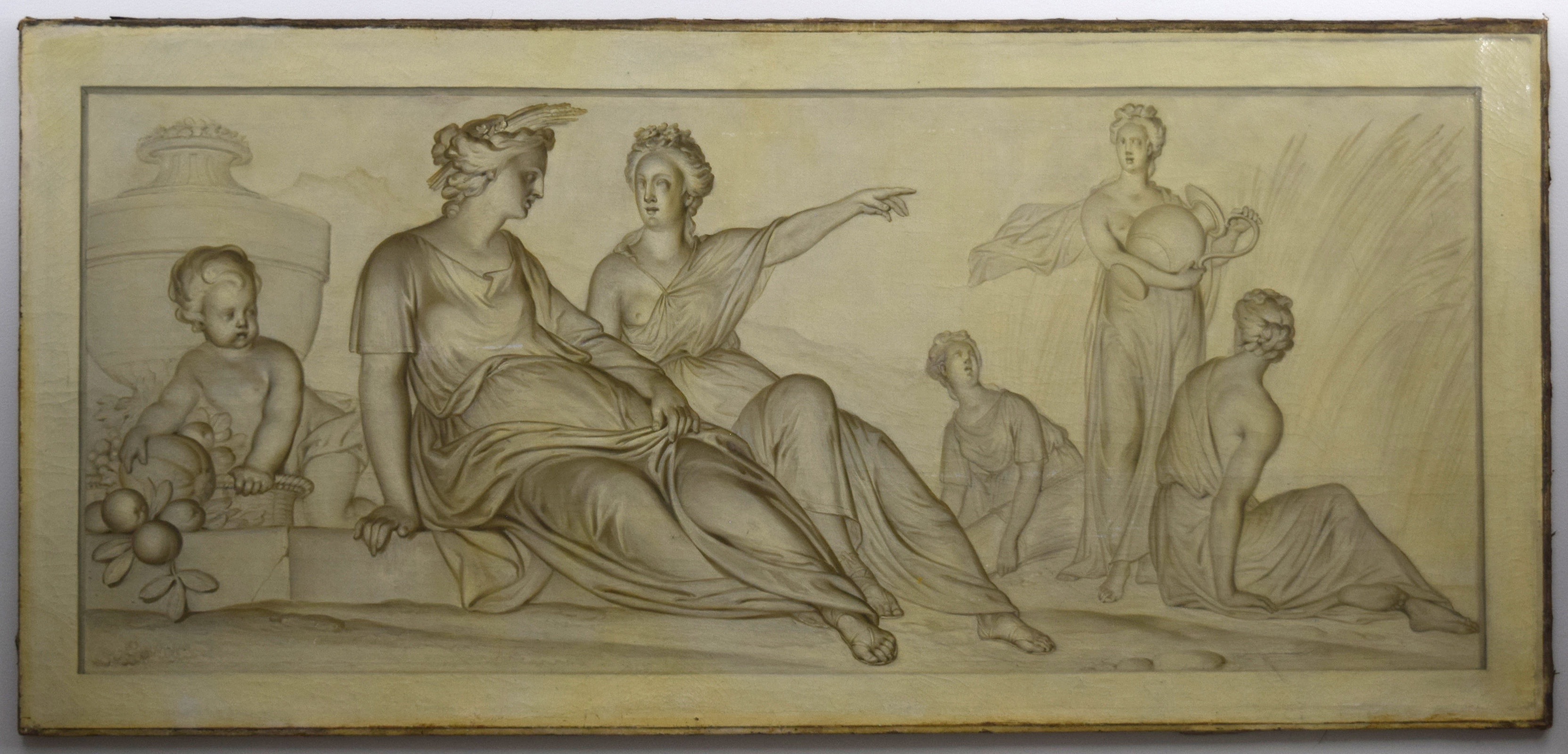
French 18th/19th century. Allegory of summer, circa 1800. Oil on canvas, unframed. H: 33“ L: 72“ $15,000
This Neo-Classical painting is an allegory of summer. It would have been hung over the doors of a salon [below left], along with representations of fall, winter, and spring over others. Here, the Roman goddess of agriculture, Ceres, wears a sheaf of wheat in her hair, and points to her handmaidens who are harvesting it. A child toys with succulent fruits in a basket. Wheat, the harvest, a child, and fruit, symbolize fertility and by extension summer itself. Our panel was painted in trompe l’oeil to imitate a carved stone bas-relief. The shadows were painted to conform with the up-cast light that would have emanated from the windows and candles below. Trompe l’oeil panels like ours were in vogue in late 18th century France, when the Belgian-born artist Piot-Joseph Sauvage, who specialized in painting them, was appointed Peintre du Roi by Louis XVI.
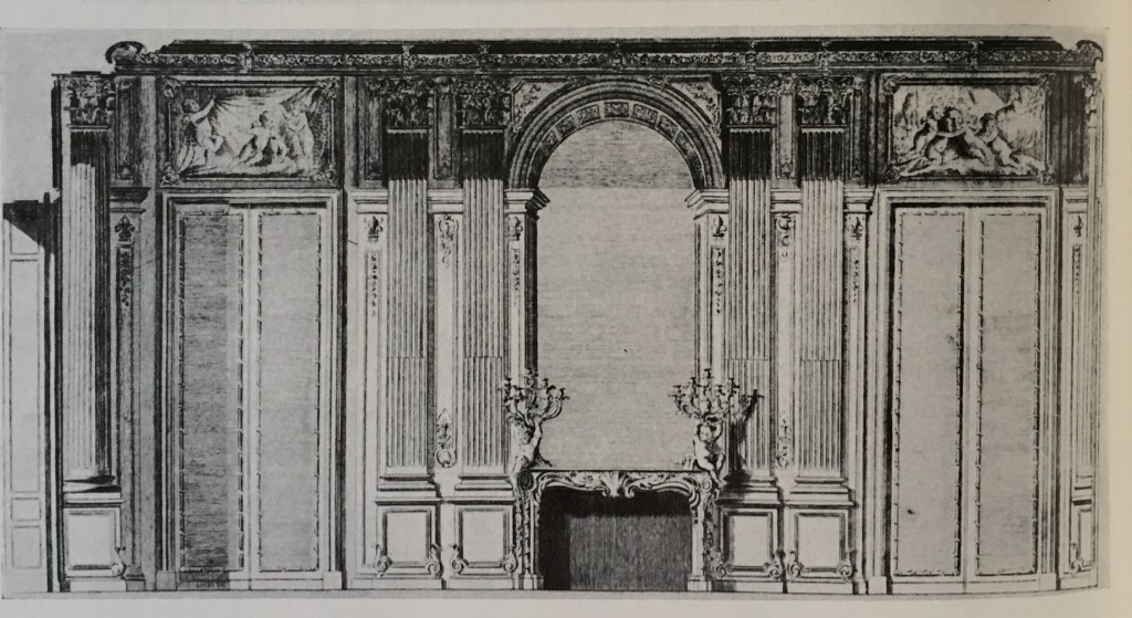
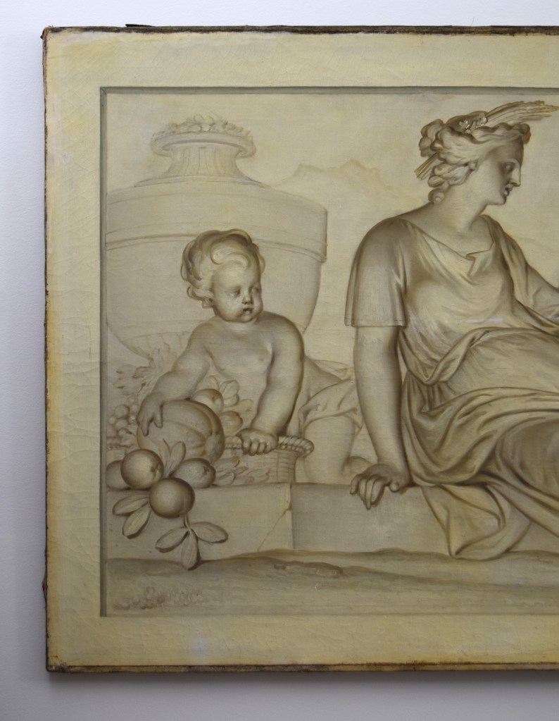
1937 ERWIN BLUMENFELD PHOTOGRAPH
Erwin Blumenfeld (German/American 1897-1969). Untitled (Faberge imperial Easter egg with hands), 1937. Image: 6 1/4″ x 8 1/4″; framed 12 1/4″ x 14″ Provenance: Diana Vreeland, New York; R. Louis Bofferding, New York; Pierre Le-Tan, Paris. Sold
In 1937 Erwin Blumenfeld shot this Surrealist photograph of a woman’s perfectly manicured hands, forming an aureole around an enameled and bejeweled imperial Russian Easter egg for Harper’s Bazaar. It presents Peter Carl Faberge’s “Peter the Great Egg,” which was commissioned in 1903 by Tsar Nicholas II as a gift for his wife, and commemorates the 200th anniversary of St. Petersburg’s founding by Peter. Each imperial egg packed a “surprise,” and on opening this one a miniature gold replica rises mechanically of “The Bronze Horseman,” the life-size equestrian portrait of Peter commissioned from Falconnet by Catherine the Great in the 18th century. Today the egg is in the Virginia Museum, but in the 1930s it belonged to Armand Hammer, the New York financier who did business with the Soviets, and bought art from them that had belonged to the tsars. The photographer Blumenfeld was born in Berlin in 1897. He became a poet and fell in with the Dadaists, until he moved to Paris in 1937 and fell in with the Surrealists. There he became a professional photographer and worked with Vogue. When war broke out he was sent to an internment camp as an undesirable alien. In 1941 he escaped to New York. There, he signed a contract with Harper’s Bazaar, worked with Diana Vreeland who owned this photograph, and lived more than comfortably in the toney Gainsborough Studios on Central Park South.
GEORGE PLATT LYNES PHOTOGRAPH OF MONA VON BISMARCK
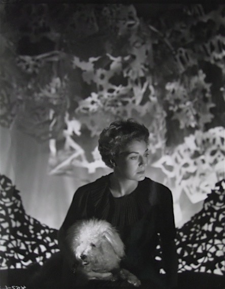
George Platt Lynes (American 1907-1955). Mrs. Harrison Willams, later Countess Mona von Bismarck, circa 1940. Photograph. 10″ x 8 1/4″, framed ” x ” $4,000
Known universally as Mona, Mrs. Harrison Williams was the beautiful wife of the world’s first billionaire, who was also the world’s richest man at the time. In 1933 she set her own record when a panel of experts, including Coco Chanel, voted her “Best Dressed Woman in the World.” She first American to be so honored, Mona also smashed records for the speed of her social ascent and her accumulation of luxury goods. The daughter of a Kentucky stableman, she first married her father’s employer, and then, as Williams’s widow, three other men, including Count Edzard von Bismarck, grandson of the Iron Chancellor. All this took effort, and left little time for self-reflection. Our 1940s photograph by George Platt Lynes [below right] captures her hard glamor, and suggests a lack of substance, by juxtaposing her airily coiffed head with that of her dog, and presenting both on a settee with openwork carving, against a backdrop of perforated paper. We lent this vintage print, the only known, to the exhibition Magnificent Mona Bismarck, at the Frazier Museum, in her hometown of Louisville, Kentucky [below left]. No catalog was published, but Scott Rogers, the curator, is writing her biography. Inevitably, it will involve that fugitive thing known as style. Hers was enthralling. So much so that it obsessed the fashion world in her day, as well as our own.
PAIR OF BAGUES DOUBLE-SIDED LAMPS
Baguès Frerès (Paris maker). Pair of table lamps, circa 1935. Silvered metal, cut and cast glass, glass beads and prisms. H: 24″ $10,000
During the first half of the 20th century, Baguès of Paris produced the world’s most fashionable lighting fixtures. The firm’s major commissions ranged from 18th-century-style chandeliers, laden with prisms, for a restoration of the Hall of Mirrors at Versailles, to the modern 1920s glass-beaded ones at the Palais de la Méditerranée in Nice, the pleasure dome built by the American tycoon Frank J. Gould. Like much of the work of Baguès, our madcap, tendril-sprouting, urn-form lamps can be situated, design wise, somewhere between Louis-Louis gentility and Art Deco flash.
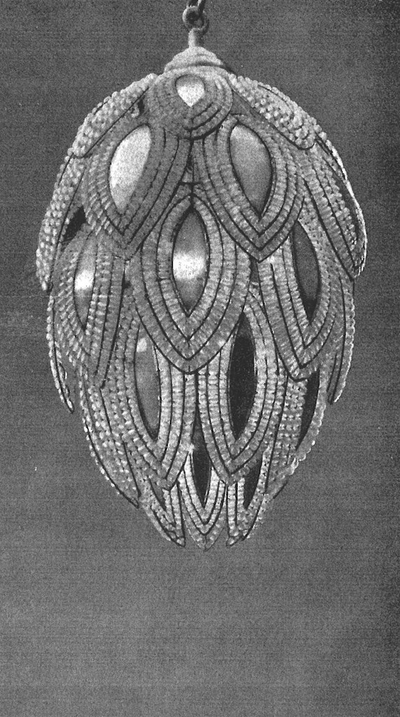
PIERRE BONNARD BOOKPLATE FOR MISIA SERT
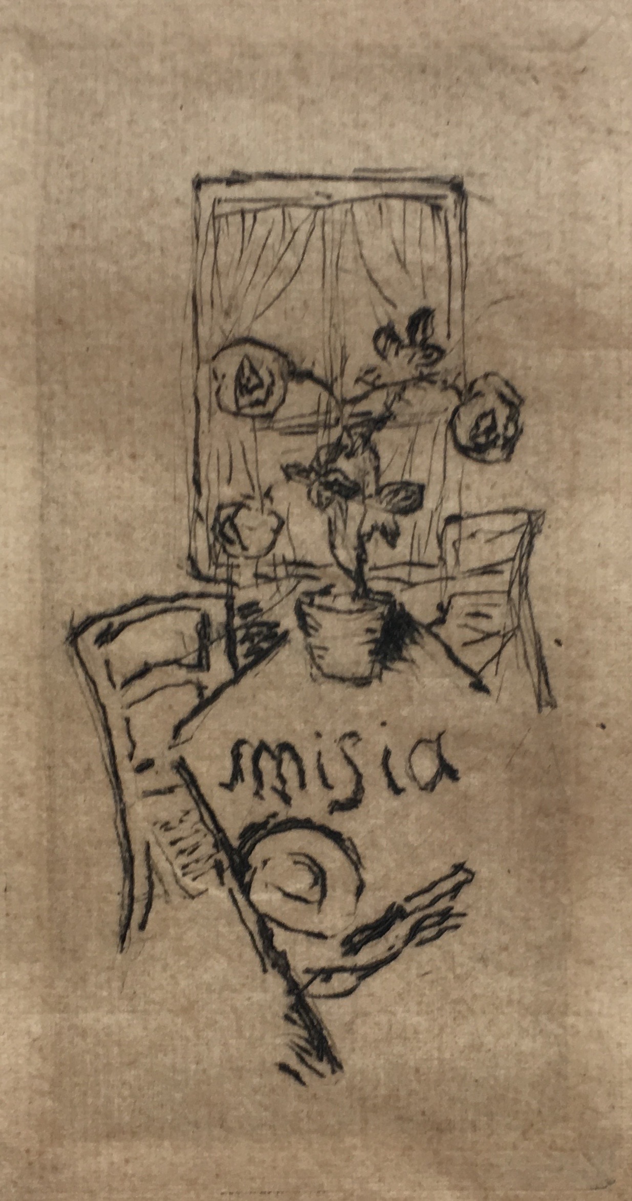
Pierre Bonnard (French 1867-1947). Bookplate for Misia Sert, circa 1920. Etching on laid paper. 4 3/8″ x 2 6/8″ in giltwood frame 12″ x 9 1/4″. $4,000
The very definition of haute bohème, Misia Sert, a musical prodigy who once played the piano on Franz List’s knee, married, successively, the publisher of La Revue Blanche, the important art and literary journal, a newspaper baron, and the high-society painter José-Maria Sert. A raving beauty when young, and the apogee of chic to the bitter end, she was also a divining rod for talent. With her affinity for the modern, she was a muse to artists like Renoir [see his portrait of her below left], writers like Cocteau, composers like Stravinsky, the ballet impressario Diaghilev, and even the fashion designer Coco Chanel, whom she introduced to opium (and, rumor had it, sapphism).
As one might expect of a muse to the intelligentsia, she read books, which, in that genteel day, meant having a bookplate. And so Pierre Bonnard, who had painted her often, etched one for her that depicts a flowering plant in a pot on a table in her country house, which is set for just one. The use of her first name only suggests their intimacy, and, in a world where there was only one Misia, her celebrity. A prolific graphic artist, Bonnard created just one other bookplate for Charles Terrasse, his son-in-law who was the expert on his work, and the father of Antoine who wrote the introduction to Bonnard’s print catalogue raisonné. In it one finds an etched study for our bookplate [below right], in which the artist experiments with plant motifs. The finished bookplate itself, however, doesn’t appear in the catalog, which was compiled long after Bonnard and Misia had died. Presumably, the author didn’t know of our it’s existence. Perhaps it was a trial proof for one that was never actually printed for her use. In any case, this impression, with it’s wide untrimmed margins, is a great rarity, and may be a unique impression, which testifies to a friendship that left its mark on art history.
ROBERTO BLOCK GUERIDON
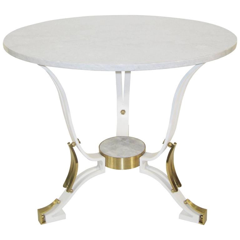
Roberto Block (French/Mexican, born Switzerland). Gueridon, circa 1945. Painted steel, brass, marble. H: 26 1/2″ Dia: 31 1/4″ $15,000
Robert Block was a well-known furniture and interior designer in 1930s Paris. But the outbreak of war left him, as a Jew, to a fate far worse than career disruption. And so he hightailed it to Mexico, of all places, and settled in Mexico City with his brother and design partner Mito Block. There, Robert achieved success yet again as Roberto Block. Until recently, Latin and South American designers didn’t figure on the map, but now they’re a focus of interest among curators and collectors worldwide. This positions Roberto Block for a revival. Our table is an inventive 1940s riff on the traditional French guéridon. It may be taken as a nostalgic, backward gaze at the place of his birth, and the culture that had nurtured him — until it didn’t.
BRAZILIAN BALANGADA
Brazilian, 19th century. A set of 31 amulets consisting of 29 fruits, 1 double gourd, and 1 gourd dipper. Silver, content 70 to 80%. Double gourd 8″, fruits approximately 5“ each, dipper 16″ $8,500
These 19th century Brazilian amulets, known as balangada, were hammered from silver in the form of pomegranates, guava, sugar apples, and other exotic fruits, and valued as symbols of fertility. Balangada were made by the descendants of slaves, brought from equatorial Africa, for themselves. They were used as decorations for the home, and worn as adornment at the wrist and waist by women. As such, balangada were the bling of their day, and represent the final efflorescence of the metalworking skills of the Benin people, the ancestors of the anonymous Brazilian makers. The Benin have been celebrated for their bronzes sine the 16th century. In the age of colonialism, those bronzes were plundered and entered aristocratic collections. They then entered European and American museums, and are now being repatriated. Today, balangada, like the jazz music that came into being much later on our own shores, testify to the persistence of the creative impulse under duress, and the inventiveness of Black culture in the New World.
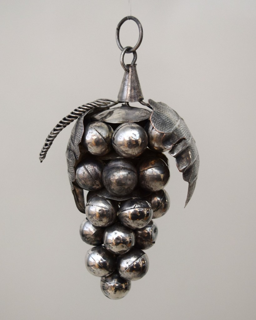
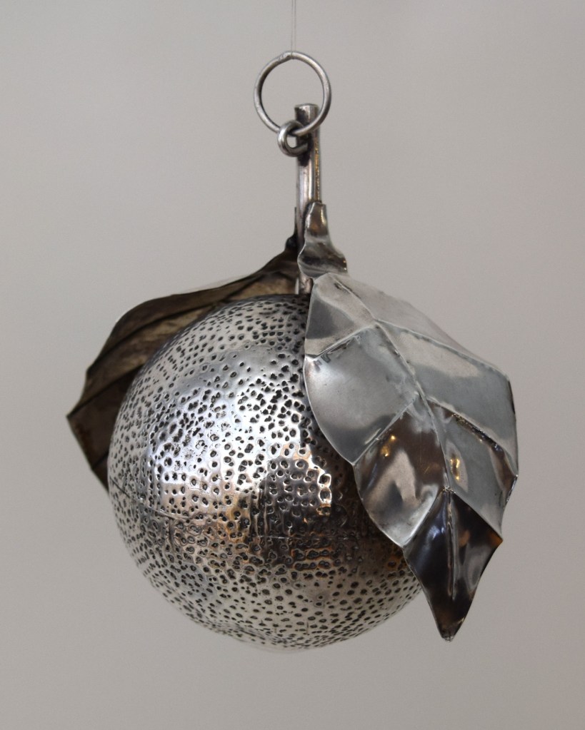
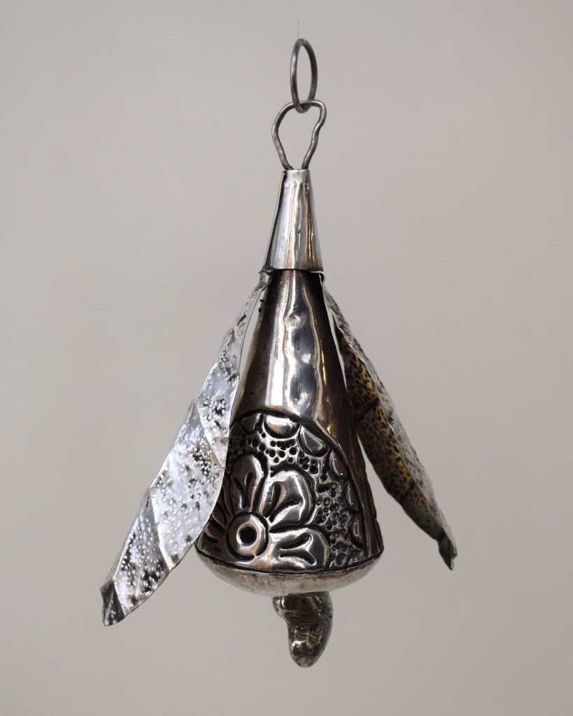
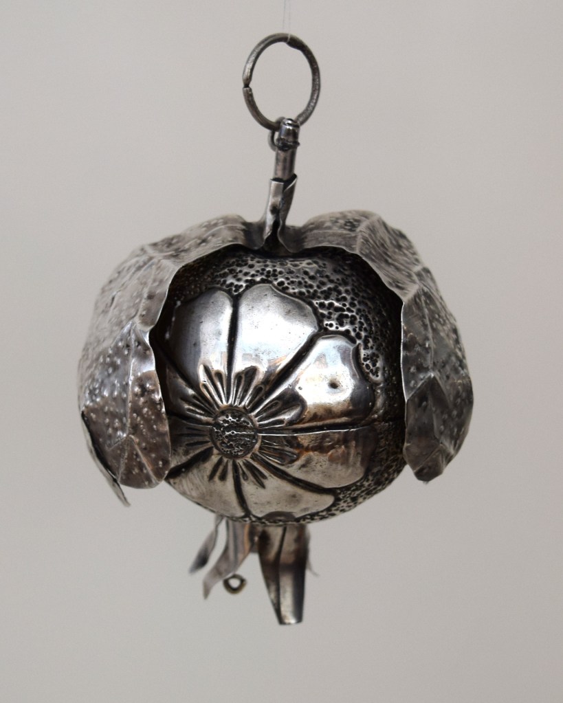
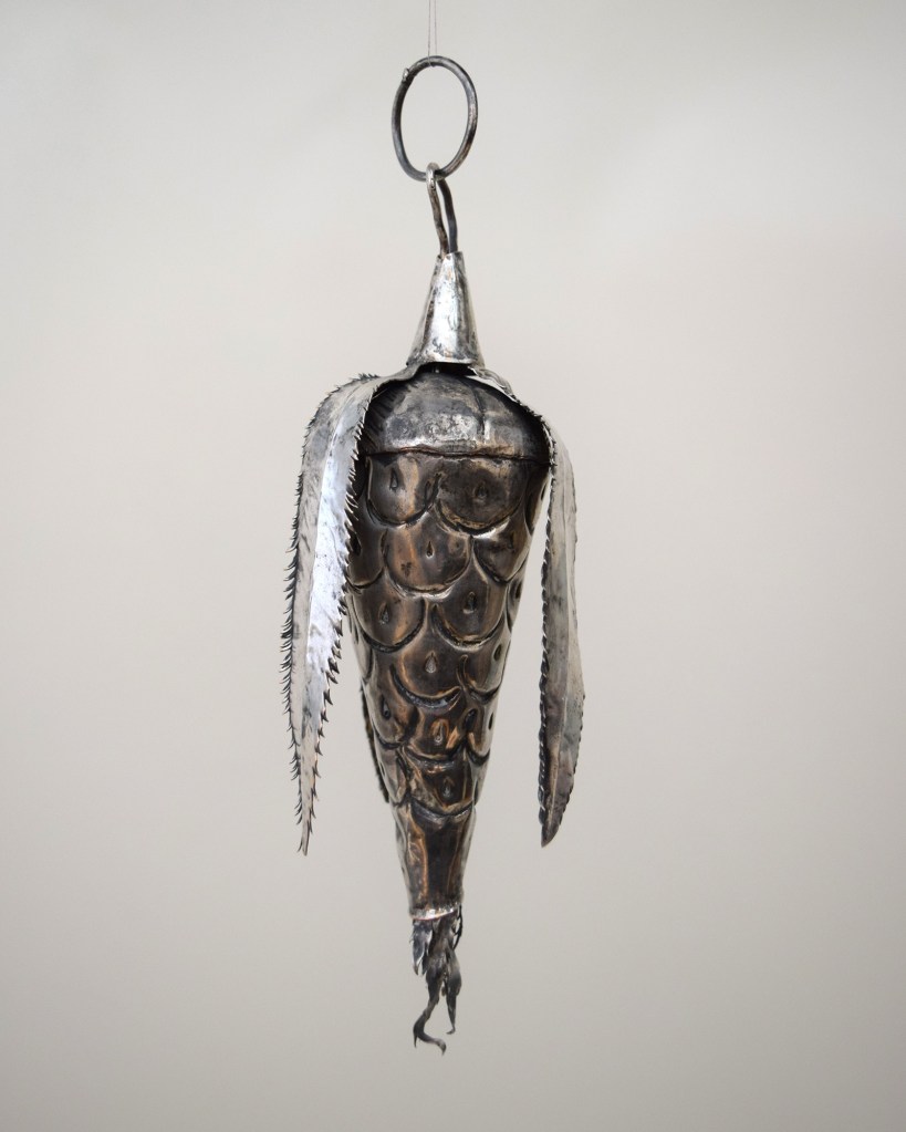
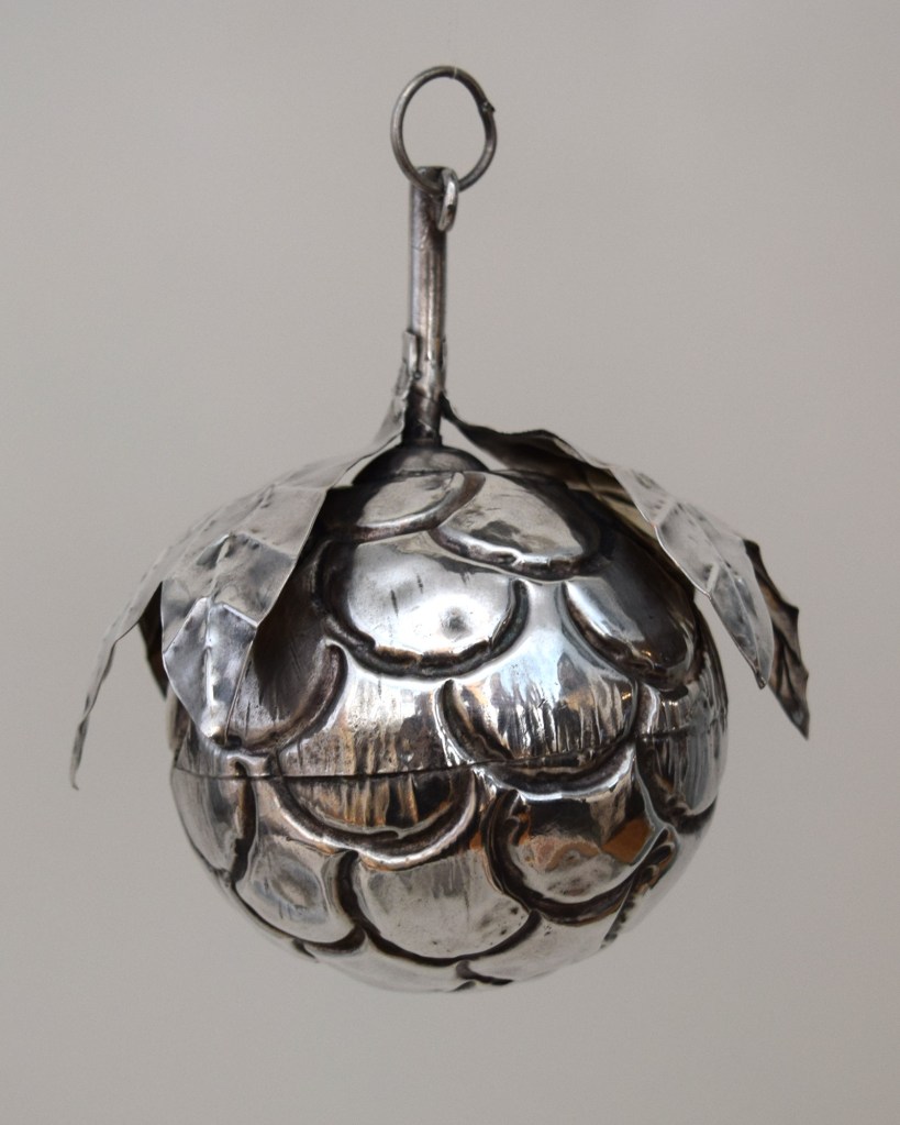
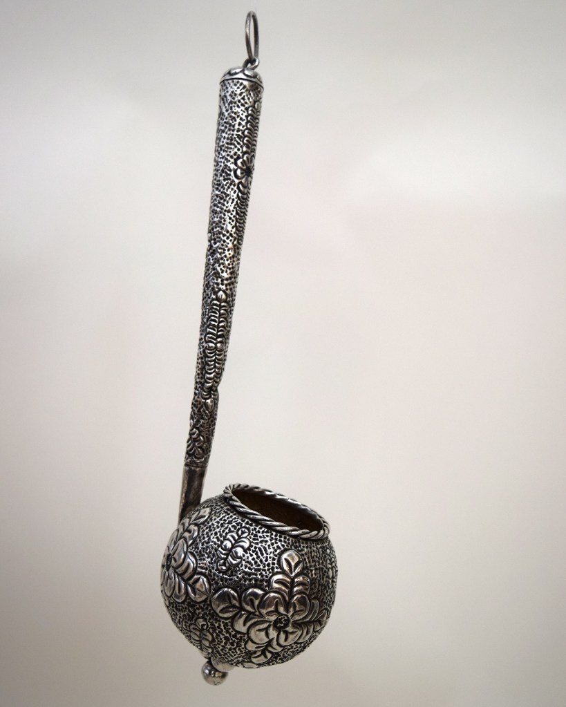
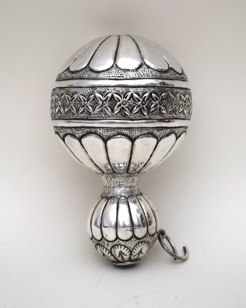
GERMAN JUGENDSTIL FLOWER BOWL
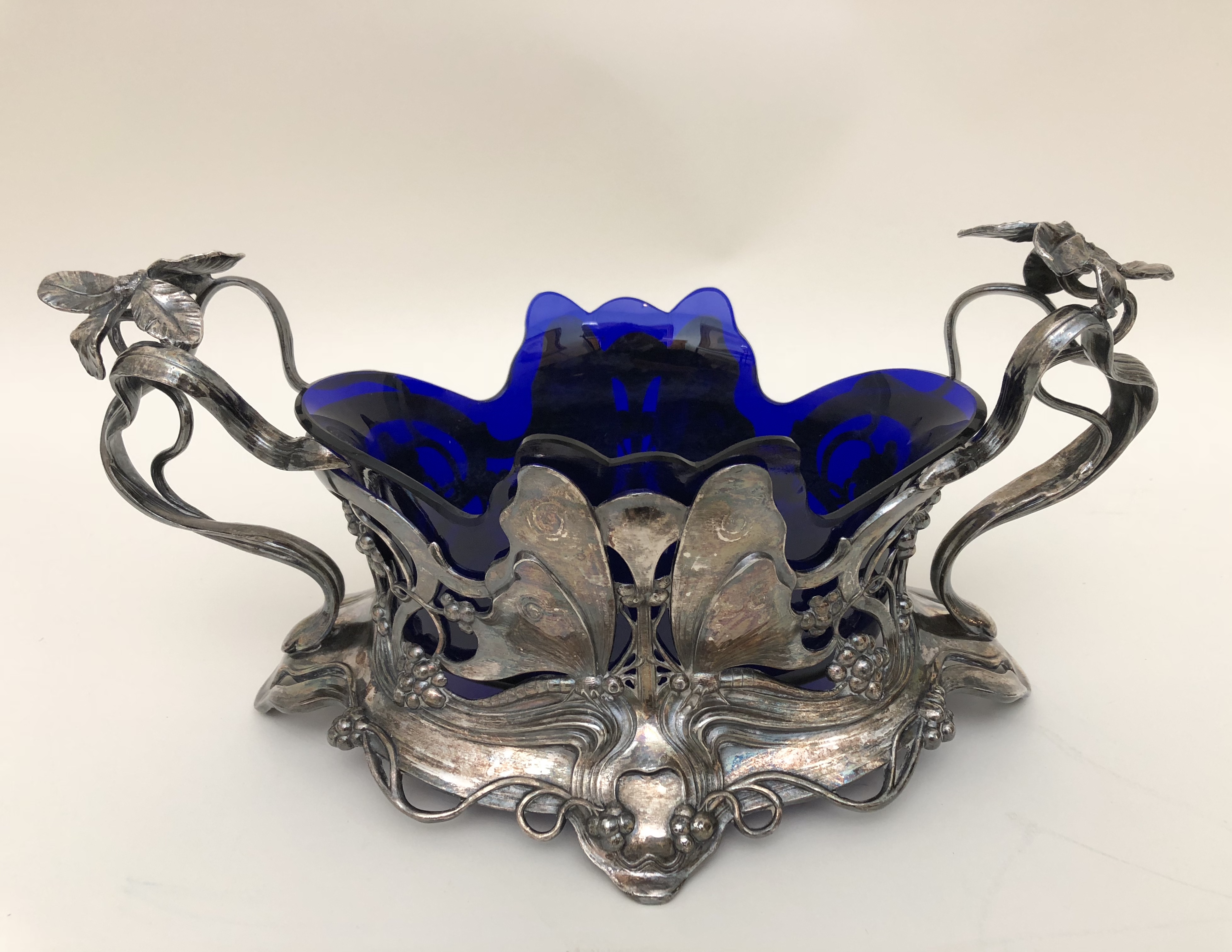
Designed by Albert Meyer (German 1867-1944), made by the Württembergerische Metallwarenfabrik. Flower bowl, circa 1905. Silver plate with a glass liner. H: 4 ½” L: 12″ D: 4 ½” $5,000
This ravishing Art Nouveau silver-plated centerpiece, decorated with butterflies, flowers, and budding tendrils, was designed by the German sculptor Albert Meyer. It retains the original applied patina, the cobalt-blue glass liner, and the stamp of its maker, the Württembergerische Metallwarenfabrik, which, one might say, was the Tiffany of Mitteleuropa. Celebrated internationally, the firm exhibited at every world’s fair, and maintained showrooms in Württemberg, Berlin, Vienna, and Warsaw. To capture the Anglo-Saxon market, they published an English-language catalog that featured this centerpiece, and built a six-story salesroom, office and studio in London, christened Wurtemberg House.
BRONZE BUST OF PRINCE ALBERT
Baron Carlo Marochetti (Italian/English 1805-1867). Bust of Prince Albert, circa 1850. Chased bronze. H: 14 ½” $8,000
In centuries past, it was a rare honor for an a artist to be ennobled for his artistry. But Carlo Marochetti, the scion of an aristocratic family, was a baron at birth, long before he proved his mettle as a sculptor. After studying in Rome, he moved to Paris where he was honored with the patronage, and eventually the friendship, of King Louis-Philippe. When that French king fled to England at the outbreak of the 1848 Revolution, he took his court sculptor with him. On arrival, Queen Victoria noted in her diary that Marochetti was “very agreeable, pleasant and gentlemanlike.” And when that famously laconic monarch pronounced the bust he modeled in clay of Prince Albert, her beloved husband and consort, “extremely successful,” the prince commissioned a marble version as a gift for his wife and queen. To profit on its overnight renown, Marochetti had smaller bronze versions cast and sold. Like the clay and marble busts, they celebrated the sitter’s good looks, and certified the artist’s mastery. They also delight the eye, with the madcap juxtaposition of Victorian facial hair with the toga redolent of ancient Rome.
PAIR OF LOUIS-PHILIPPE ARMCHAIRS OWNED BY KK AUCHINCLOSS
French, 19th century. Pair of Louis-Philippe armchairs, 1840s. Rosewood, upholstered. H: 37″ Provenance: KK Auchincloss. $15,000
In the 1940s KK Hannon, a Boston-born socialite in the making, moved to Manhattan, launched a clothing line, designed jewelry for Tiffany, and said yes to a marriage proposal from “Shipwreck” Kelly, the legendary football hero — and then yes again to Peter Larkin, an heir to the 825,000 acre King Ranch in Texas. She would come to say yes twice more before she breathed her last as Mrs. James D. Auchincloss at age 89. Over the span of those years she had come to call home not only Fifth Avenue in Manhattan, but also the North Shore of Long Island, Dark Harbor, Hobe Sound, the Albany in London, and the Place des Etats Unis in Paris. Among her stateside possessions was this superbly carved pair of Louis-Philippe rosewood armchairs.
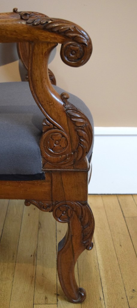
17th-CENTURY GATE-LEG TABLE
French 17th century. Gate-leg table, circa 1650. Oak with metal fittings. H: 28 ¼“ W: 54“ L: 20 ½“ / 41 ½“/ 62“ $20,000
This French Baroque, solid-oak table has two pivoting legs to prop up hinged leaves. When left hanging, the table is a compact rectangle; with one raised it’s a half circle; and with both raised it’s an oval that seats six. Between meals, with cutlery stashed in two long narrow drawers, it can do triple duty as a desk or a display table. Its versatility suits the small Manhattan apartment. And when fully extended, and heaped with books and objects, it makes the grand statement in a Hamptons manse.
PAIR OF NEO-GEORGIAN LEATHER-UPHOLSTERED CHAIRS
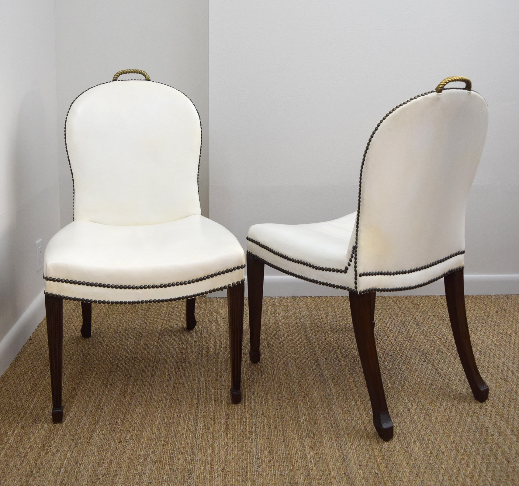
American 20th century. Attributed to William Quigley (Chicago). Pair of chairs, 1930s. Mahogany, brass, leather studded with nail heads. H: 38 ½“ W: 21 ½” $15,000
In the 1930s, gossip columnists christened the sophisticates who frequented swank restaurants, nightclubs, and lent their presence to opening nights, “Café Society.” When it came to furnishing their homes they favored streamlined versions of the classics over genuine antiques or modernist design. This pair of over-scaled chairs were said to have graced a Chicago interior decorated by Samuel Marx, the noted architect designer. Perhaps so, but they were probably designed and made by William Quigley, who, in addition to crafting furniture to Marx’s design, sold his own furniture from his stores in Chicago and Lake Forest [below left]. The sweeping lines of the back and seat, the white leather upholstery, and the fluted mahogany legs, are a sleek riff on the George III style. And the brass-rope handles, allowing the chairs to be dragged hither and yon, came in handy then, as they would today, at the cocktail hour on the servant’s night off.
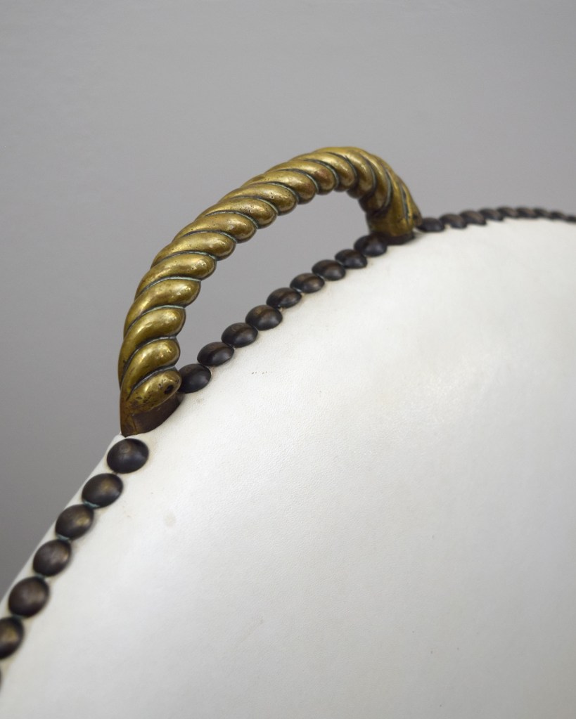
1930s TABLETOP MIRROR OR PHOTOGRAPH FRAME
English 20th century. Dressing table mirror, or frame, 1930s. Etched mirror and black-painted wood. H: 19 ½” W: 14 ½” D: 10″ Sold
In the 1920s, Edward, the young and handsome Prince of Wales — subsequently King Edward VIII and then the Duke of Windsor – made his first splash on the international social scene. Not surprisingly, his device of three plumes became a popular design motif. This mirror-framed dressing table mirror, which would also serve nicely as a photo frame, is acid-etched on the cresting with the prince’s device of three plumes. The mirror dates to the 1930s, the decade of his abdication and marriage to Wallis Warfield Simpson, the glamorous American divorcee.
18th-CENTURY TRUMEAU MIRROR REVAMPED IN THE 1930s

French 18th century. Louis XVI trumeau mirror, circa 1780. Oak, mirror, brass strings. 81″ x 36“ $20,000.
“Don’t forget, there were people with good taste in the 18th century as well,” said Eugenia Errázuriz in the late 1920s to Jean-Michel Frank in Paris. Coming from an avant-garde tastemaker like her, that admonition might have surprised the designer of modern furniture and interiors, who was then just coming into his own. After all, she was an intimate of Pablo Picasso, a patron of Igor Stravinsky, a backer of Serge Diaghilev’s Ballet Russe, and, on the cusp of seventy, a client of Coco Chanel’s still.
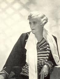

Fashionable Parisians were abuzz over the minimally-furnished home of Mme Errázuriz, where, following her dictum “elegance is elimination,” she hung on the chalk-white walls of her salon just one of her many Picassos. But if they looked closely, as Frank surely did, they would have seen her fine Louis XVI pieces, which would come to rub shoulders with the modern upholstered furniture, and Giacometti lamps, that Frank would supply [below left].
With her words ringing in his ears, and her 18th-century furniture before his very eyes, Frank set about designing the Louis XVI-style pieces that would round out his furniture line. His versions, however, were no mere copies, for he made the tried and true look decidedly new by eliminating superfluous ornament, emphasizing line and proportion, and substituting humble oak for giltwood and mahogany veneer.
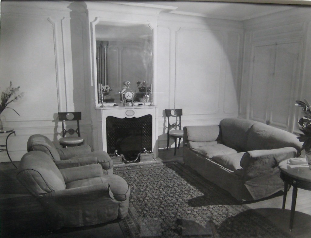
Meanwhile, across the English Channel, the decorator Syrie Maugham achieved a similar look by having antiques stripped of original paint and gilding. A sacrilege to be sure, but the abstract and modern-looking results became so fashionable that soon the only antiques that weren’t in danger of being stripped were those safely lodged in museum collections.
Fast forward to the present and our acquisition of this handsome Louis XVI trumeau mirror. It had been stripped to the oak decades ago, but we decided not to repaint and regild it since that would erase a chapter of its history, and in the history of taste. Besides, as Errázuriz and Frank knew, line and proportion trump surface decoration.
Those qualities, and the trophy of musical instruments – flute, horn, tambourine, triangle, violin — are what make our mirror sing. When carved in the 18th-century this trophy would have been recognized as an allegory of music, just as the laurel branch would have been associated with Apollo, god of music, who is always shown wearing a wreath of it in his hair.
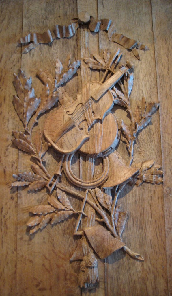
The charm of trophies representing the arts, the seasons, and the sciences, have lost none of their appeal since the reign of Louis XVI. That’s why, in 1970s, San Francisco designer John Dickinson gathered a group of actual farm implements, painted them white, and hung them on a wall at home to create an agricultural trophy. Thus did Dickinson, like Frank and Maugham before, make the 18th-century new for yet another age.
FOLK ART WIG STAND OWNED BY ELIE NADELMAN

Louis Danjard (French, active 1862 to 1880). Milliner’s head. Papier-maché, leather, fabric netting, iron, and wood. Provenance: Mr. & Mrs. A. Stewart Walker, Southampton; by descent. H: 19” under 23″ modern bell jar. Bibliography: New-York Historical Society, Making It Modern: The Folk Art Collection of Elie and Viola Nadelman, page 143. $12,500
Pioneers of modernism, like Picasso and Brancusi, took inspiration from the pure forms and direct expression of so-called primitive and folk art. Among them was the Polish-born, Paris-trained sculptor Elie Nadelman, who settled in New York in the 1910s after marrying Viola Flannery, an American heiress. Together they assembled an important collection of folk art, and built a private museum in Riverdale to house it.
Without the example of the Nadelmans, it is unlikely that this striking, almost surreal-looking milliner’s stand, would have found its way into the collection of Mr. and Mrs. A. Stewart Walker, a Social Register couple with worldly tastes. Mr. Walker was a prominent architect. He commissioned Nadelman to sculpt the monumental bas-relief that still presides over the 57th Street entrance of the Fuller Building, his celebrated Art Deco skyscraper [below center], on 57th Street in New York. His wife Sybil was a well-known decorator. She arranged their Nadelman sculptures among the old master paintings, 18th-century English furniture, and Jean Dunand lacquered vases, in their upper east side apartment, and Southampton beach house.
Folk art wasn’t really their thing, but the Walkers couldn’t have failed to appreciate the striking resemblance of this milliner’s head, or wig stand, to their friend’s sculptures [below left}. And that begs the question: how did the Walkers come to own it? They could have bought it on their own, inspired by the Nadelmans’ collecting, but since the two couples were known to exchange gifts, it could also have been a gift from them. Or the Walkers could have acquired it when the Nadelmans were forced to sell their collection during the Depression. Happily, most of what they sold was acquired by The New-York Historical Society in 1937, thanks in part to the good graces of Stuart Walker, who was at the time completing a museum addition. And there, in 2015, the Nadelman folk art collection was shown with the sculptor’s own work in the exhibition The Folk Art Collection of Elie Nadelman: Making it Modern. Our sculpture warranted mention in the catalog.

Italian, 20th century. Cooperativa Artieri Alabastro, Volterra, circa 1938. Pair of alabaster lamps. H: 12 ½” $10,000
Shortly after the invention of the light bulb, decorative urns, vases, and other types of vessels, were wired for electricity, and used as lighting fixtures. When illuminated from within, marble and alabaster emit a lovely, mysterious glow. And when light is cast upwards to illuminate indirectly, it flatters the room as well as the people who are in it. That’s why Louis Süe and Andre Mare, the Art Deco masters, set about designing lighting fixtures from scratch that were carved from translucent stones.
Our graceful Italian lamps were carved from alabaster in the form of cornucopia fastened to bases with ropes. They were made in the Volterra workshop of a firm that was promoted by Gio Ponti, the great 20th-century Italian architect. He published this very lamp model in the July 1938 issue of Domus, the magazine that he had founded in 1928 to promote modern design. And no wonder he admired these lamps. Not only are they functional lighting fixtures, they’re illuminated sculptures as well.
PAIR OF BAGUES ROCK-CRYSTAL LAMPS
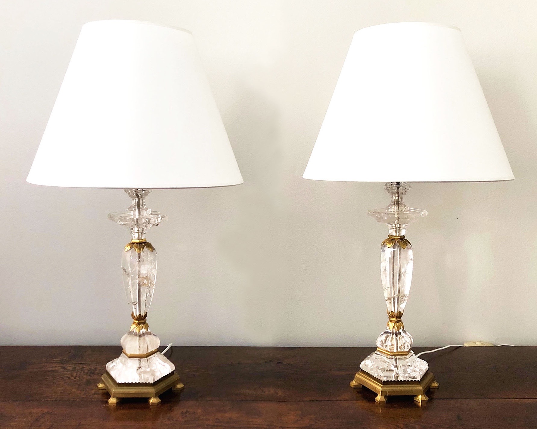
Baguès Frerès (Paris maker). Pair of candlesticks, 1950. Rock-crystal and gilt bronze. H 21″ with shades, base 13 1/2″ $18,000
We transformed this pair of rock-crystal-and-ormolu candlesticks into a pair of lamps. This wasn’t contrary to the maker’s intention, judging from an existing interior channel for electrical wires. Made by the Paris firm of Baguès, the candlestick model was published in a 1950 issue of the design magazine Plaisir de France. There, the capation states that the models reproduced could be purchased at Bonzano, then a stylish Paris purveyor of luxury goods.
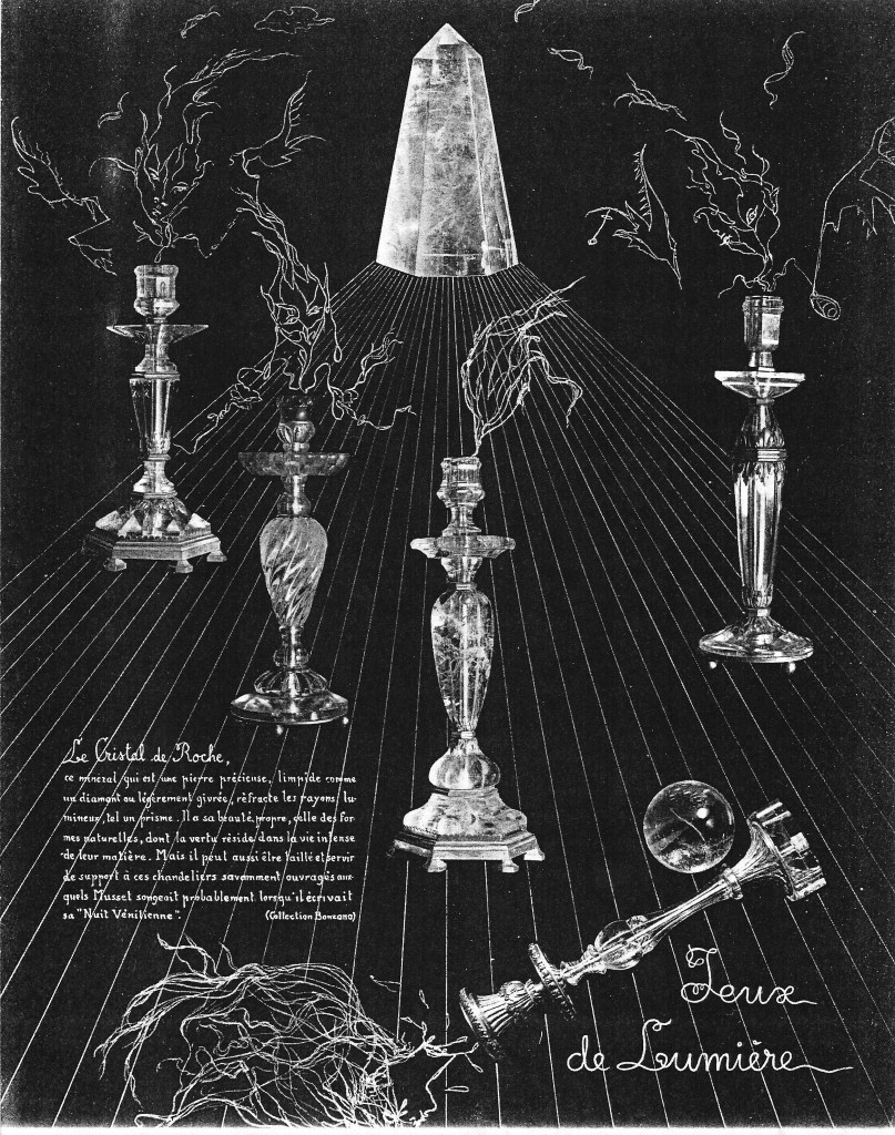
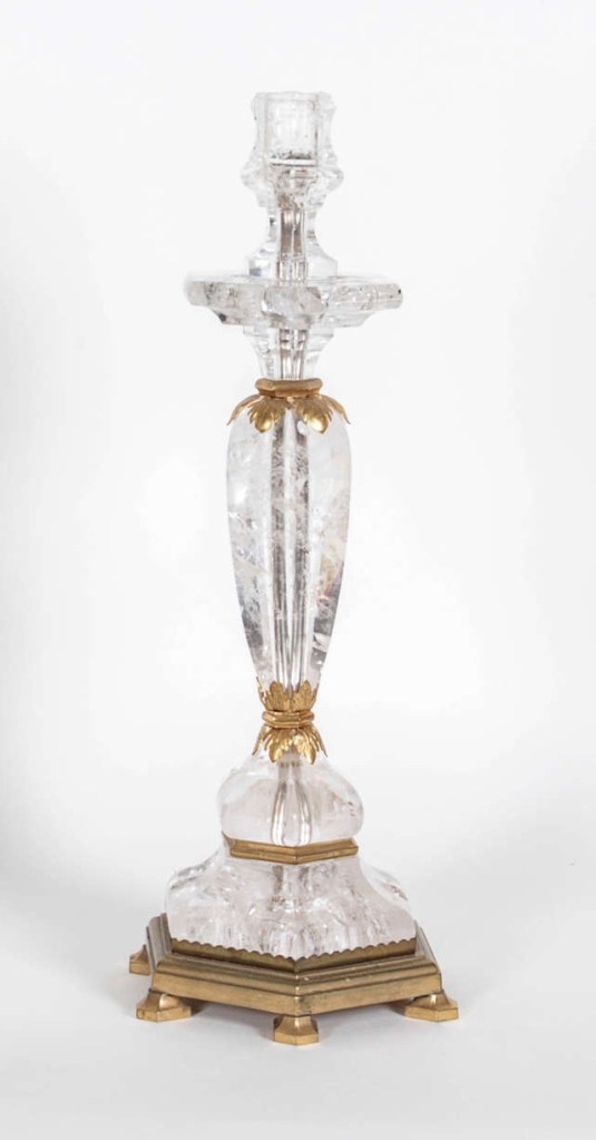
THIRTY-THREE ERNEST BOICEAU EMBROIDERED FABRIC PANELS
Ernest Boiceau (Swiss/French, 1881-1950). 33 embroidered fabric panels. Sizes range from 9 1/4″ to 46″ high, and 4 1/4″ to 24″ wide. 7 framed. Bibliography: “Sew Chic,” The World of Interiors, October 2022, pp. 296-299. Available individually, unframed from $750 to $6,500 framed.
Ernest Boiceau is known today as an Art Deco master, but he started out as an embroiderer in the 1910s, became a couturier in the 1920s, and came to dedicate himself to designing furniture and interiors in 1933. Yet embroidery never ceased to interest him. As a couturier he used it to embellish clothing, and as a decorator he set embroidered fabrics into wall paneling. Our 33 embroidered fabric panels, eight of which are shown here, were made as samples and never used, which is why they remain in pristine unfaded condition. Each is breathtaking in color, superb in workmanship, and inventive in design. Realized in the 1910s, 20s and 30s, they’re compositions rendered in multicolored sequins of many forms and finishes, paste jewels, faceted-glass beads, synthetic flossing, and even baroque pearls, on panels of silk, satin, velvet, cashmere, wool, felt, netting, and tweed. An article recently appeared on them in The World of Interiors. We have framed eight, which are on display in the gallery.
NINE ERNEST BOICEAU TASSELS
Ernest Boiceau (Swiss/French 1881-1950). 9 Tassels. Sizes range from 16″ to 32″ long, 4 are Framed. Bibliography: “Sew Chic,” The World of Interiors, October 2022, pp. 296-299. Available individually from $1,000, unframed to $6,000 framed.
These over-the-top tassels, of which four are shown here, are no less striking in design, craftsmanship, and materials, than the embroidered panels (see above). As a couturier, Boiceau used them to embellish dresses, jackets and coats — and as a furniture designer he inserted them into decoratively-cut openings in paneled screens. A selection of these tassels appears in a recent issue of The World of Interiors. We have framed four, which are on display in the gallery.
ALESSANDRO ALBRIZZI RUG
Alessandro Albrizzi (Italian, 1935-1994). Rug, circa 1965. Wool. 15′ 4″ x 10′ 6″ Provenance: Alessandro Albrizzi, London and New York. Sold
In the 1960s, Baron Alessandro Abrizzi moved to London, designed furniture and objects, and opened a fashionable store. Among his designs were a pattern for a rug that could be sold by the yard. He had this iteration, the only one known to have been made, woven for his store. In the 1970s, when he opened a second one in the Carlyle Hotel in New York, he moved into an apartment on East 66th Street, and sent the rug there, where it remained until we bought it.
TWO FILIKLI RUGS
Silken mohair rugs, called filiklis, have been woven for centuries by the nomadic peoples of Anatolia. And they are still being woven today by their descendants, in what is now modern Turkey. When on the road, they were worn as cloaks, and when encamped for the night, they were used as blankets, and in tents as rugs. During the winter, the soft mohair tufting was turned against the body, or laid face up on the ground for warmth. During the warmer summer months they were reversed.
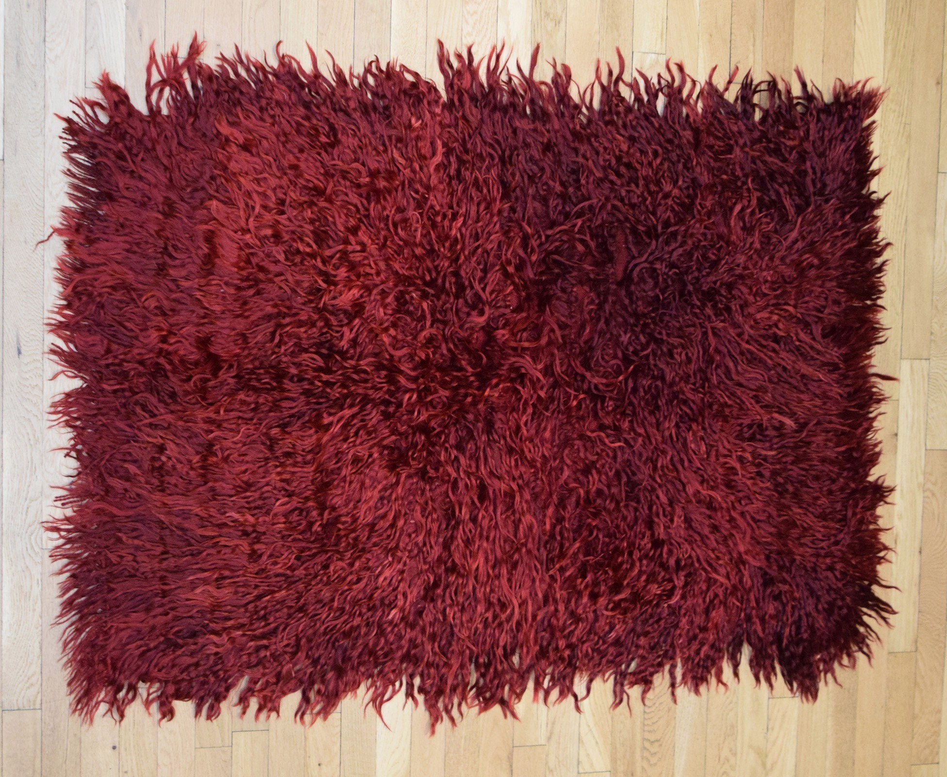
Violet “filikli tulu” rug. Mohair, wool backing. Approximately 54” x 41” $3,000
White “filikli tulu” rug. Mohair, wool backing. Approximately 65″ x 54″ $3,750
18th-CENTURY JAPANESE KITSUNE
Japanese, 18th-century Edo Period sculpture of a fox with its cub (kitsune). Lacquered carved cypress, painted eyes. H: 9 1/2″. Provenance: Miss. Lucy Truman Aldrich; by descent Mrs. John D. [Abby Aldrich] Rockefeller; by descent Mr. & Mrs. William Kelly Simpson. Sold
According to Japanese folklore the sly fox, or kitsune, assumed human form to protect as well as trick humble country folk. This fox protects its own pup, and dates to the 18th century. Carved and painted with a dull black lacquer finish called urushi, it’s pleasing from every angle, and is, in its way, a small masterpiece. The bold, sweeping curve of the snarling fox’s body is countered by the undulation of that of the playful pup. These generalized forms, in turn, are countered by finely carved details like the slit eyes (with the whites painted), sharp teeth and nails [below left], and tiny paws sinking into the luxuriant tail.
This sculpture belonged to Lucy Truman Aldrich [below right] of Providence, Rhode Island. She was an important collector who concentrated on Asian art. Many of her Japanese works were purchased from Yamanaka, then a four-hundred-year-old firm in Osaka, Japan, with branches in New York, Cleveland, Bar Harbor, and Newport (just a few miles from her country estate). Over the years, Yamanaka cataloged her burgeoning Asian collection, and they affixed a label to the underside of our sculpture with her initials and an inventory number.
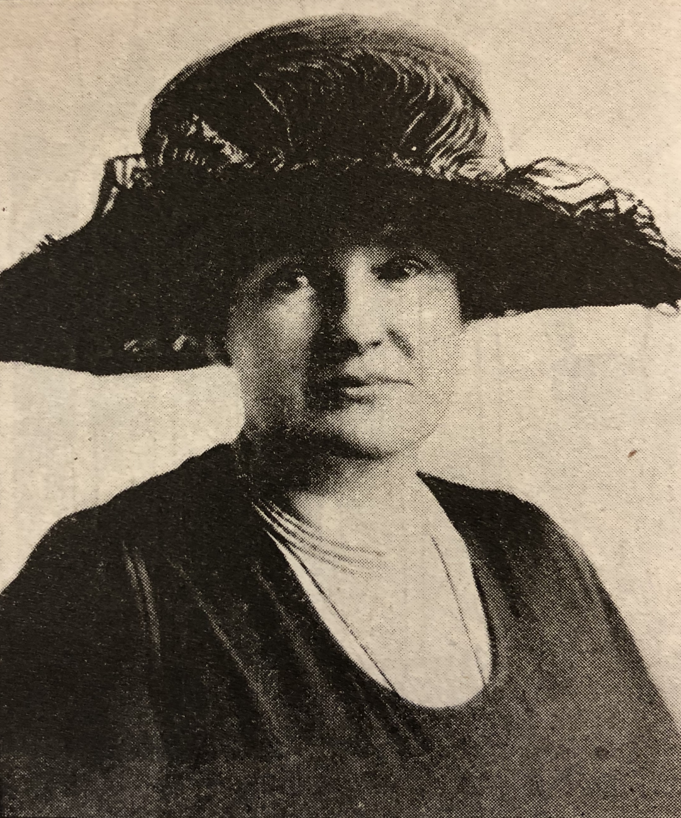
Aldrich was born, lived, and died in her family’s mansion on Benevolent Street in Providence. In the 1930s she gave her collections of Asian textiles and European porcelains to the Rhode Island School of Design Museum. Most of her remaining treasures, however, passed down through the family of her sister, Abby Aldrich Rockefeller, the modern art collector and a founder of the Museum of Modern Art.
Lucy was a spinster, a bluestocking, and deaf. But she was no drudge, traveling through Asia wearing Paris couture and Cartier jewelry. One night in 1923 on a Peking-bound train, she and her fellow passengers were kidnapped by bandits, marched off in bedclothes, and held for ransom. Two weeks later she managed to escape during a rainstorm, taking shelter and hiding out in a farmer’s doghouse. On returning to Providence it was assumed she’d learned her lesson that a woman’s place is in the home. But when the Chinese government made good on her losses, she received she booked passage to Asia on another buying trip. To the shocked local worthies, she explained, “I’d rather be a Buddhist than a Baptist.”
View our most recent arrivals at JUST IN
R. LOUIS BOFFERDING FINE & DECORATIVE ART
141 EAST 62nd STREET NYC 10065
TELEPHONE 917.572.5041 LOUIS.BOFFERDING@VERIZON.NET
