PAST WINDOW DISPLAYS
by Louis Bofferding

After fourteen years of tending shop here at street level, and eight before that dealing privately from a parlor-floor apartment around the corner, I’m now about to move up in the world — to five thousand, sun-drenched square feet on the 5th floor of 232 East 59th Street, the so-called Fine Arts Building. There, I’ll be joining up with my colleague and friend Pierre Durand, who, with the late connoisseur Khalil Rizk, established the universally celebrated Chinese Porcelain Company in 1984. Come May, you’ll find us both at the new location. Until the end of April, however, rest assured I’ll be conducting business here on Lexington Avenue as usual.

![Justen MB Round Mirror[1]](https://i0.wp.com/bofferdingnewyork.com/wp-content/uploads/2012/06/justen-mb-round-mirror1.jpg?w=251&h=241&ssl=1 "Justen MB Round Mirror[1]")
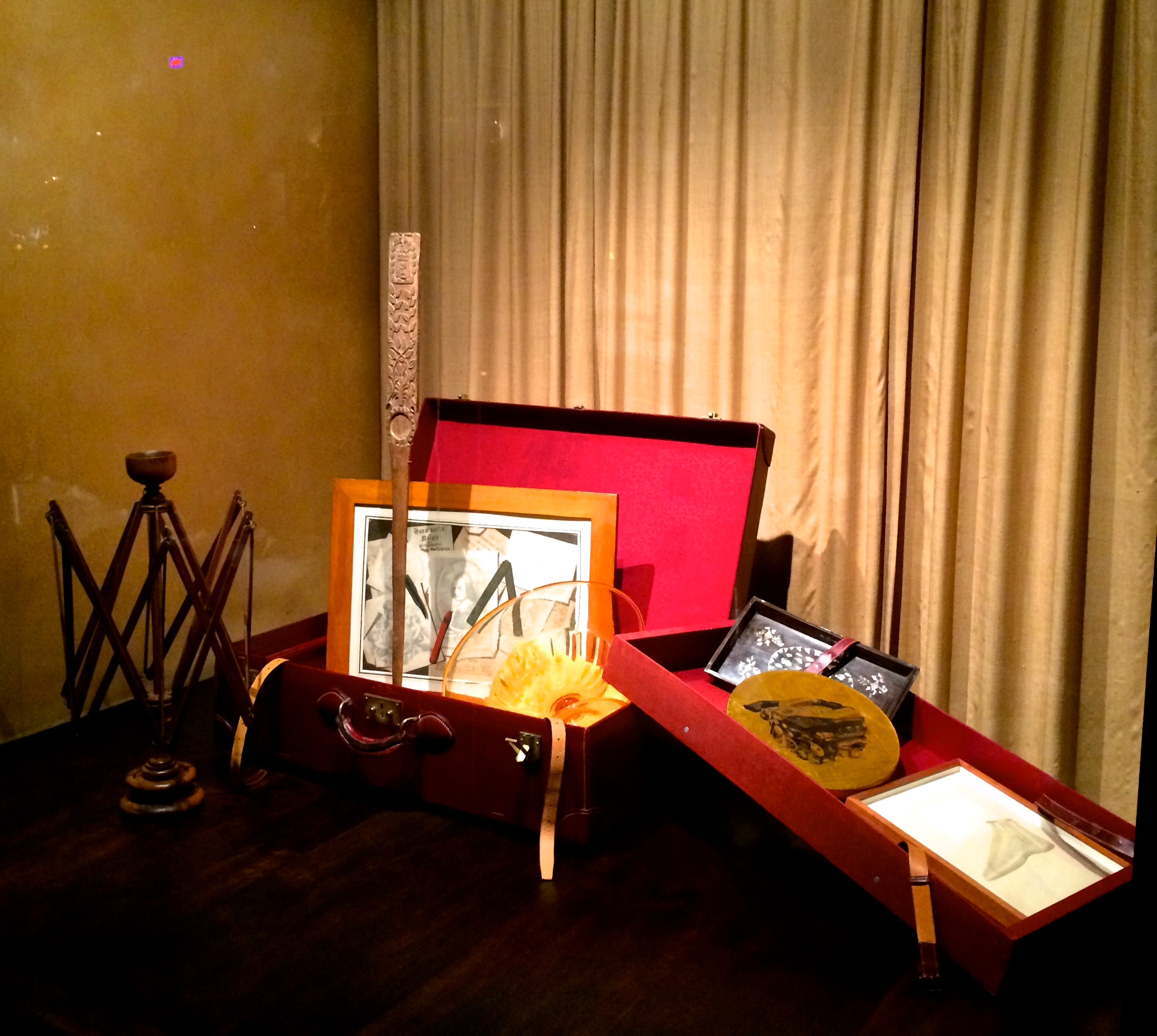
The thought of packing up for the eleven-block voyage south has inspired my latest — and last — window display, anchored with a vintage Hermès suitcase [above left]. I’ve filled it with my usual mix of unusual objects: a 1920s Venini glass bowl, a contemporary painting of a Mercedes-Benz engine by Justen Ladda [above right], a Vietnamese mother-of-pearl-encrusted tray, an Early American swift [below left], an 18th-century trompe l’oeil drawing [below right], a Victorian “switchblade” fan, a 19th-century French drawing of a lady’s shoe, and a harpoon-like Swedish folk-art carving. Should something catch your eye, do come in to take a look. And to say, I hope, not goodbye but au revoir.


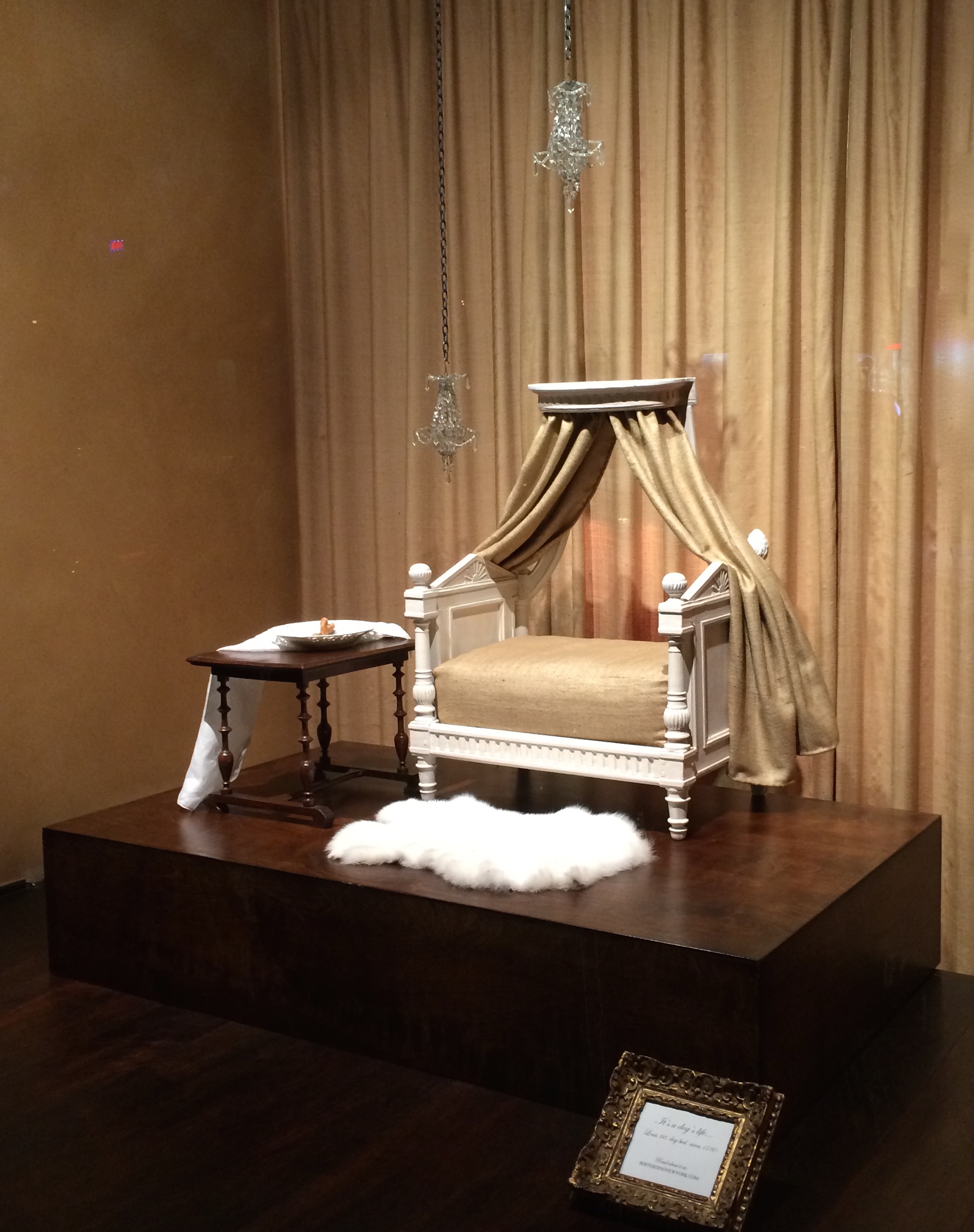
It may be a dog’s life, but for some lucky dogs that life is a cushy one. Take Fifi, for example. Back in the 1960s she was living on easy street, or, to be more precise, on Fifth Avenue. When her owner Mrs. X wasn’t cajoling her with baby talk, and spritzing her with French perfumes, she frolicked in Central Park under the watchful eye of a uniformed lady’s maid, dined on meals prepared by the chef (no Purina Dog Chow for her), wore Hermès leashes, and slept in an 18th-century dog bed. This window display features that very bed, which suited Fifi to a T, given her descent from a lap dog of Marie-Antoinette’s [below left and right], or so the breeder had claimed.


Mrs. X came across our bed in the window of Celine Briton’s Madison Avenue antiques shop, when walking to Côte Basque to meet Mrs. Charles Wrightsman for lunch [below left]. As tout New York then knew, Mrs. Wrightsman was the collector of fine French furniture, otherwise known as FFF. Over the quenelles, Mrs. Wrightsman mentioned the recent purchase of a Louis XVI dog bed — one she would eventually give to the Metropolitan Museum [below right]. And so, after coffee and petits fours, the competitive Mrs. X made a beeline back to Miss Briton’s shop and bought the bed (price be damned). A squalid cushion in a basket wasn’t, she reasoned, worthy of Fifi. And besides, one of her darling’s very own ancestors may have slept in it.


When delivered, Mrs. X positioned the bed in an alcove with a pair of tiny chandeliers, and a miniature 19th-century table (on which the chef would place a bone-shaped marzipan treat for her, as a midnight snack, on his way out at night). If the elegant decor matched Fifi’s impeccable pedigree, her unruly behavior most certainly did not. She yapped incessantly, gnawed through leashes, and, when taken to the park by the maid, she invariably scampered into the bushes for suspiciously long periods of time. Mrs. X wondered if these were atavistic impulses, stemming from an ancestor’s liaison with a lesser breed. But then, just as a lady in 18th-century France wouldn’t have thought twice about an encounter with a stable boy, why should her dog, or her dog’s progeny, be held to a higher standard?


Her reverie on ancien régime morality was interrupted by the maid’s return from the park without Fifi, but with her own tail between her legs, so to speak. She confessed that Fifi had darted into the bushes, as always when unleashed, but on venturing in to fetch her, Fifi shot out the other side with – sacre bleu! – a common mutt. And so it was revealed that the bushes had been a place of assignation all along. And that Fifi had cast aside for love — carnal love! — Mrs. X, a devoted maid, a Cordon bleu chef, expensive perfumes, designer leashes, and an exquisite 18th-century French bed.
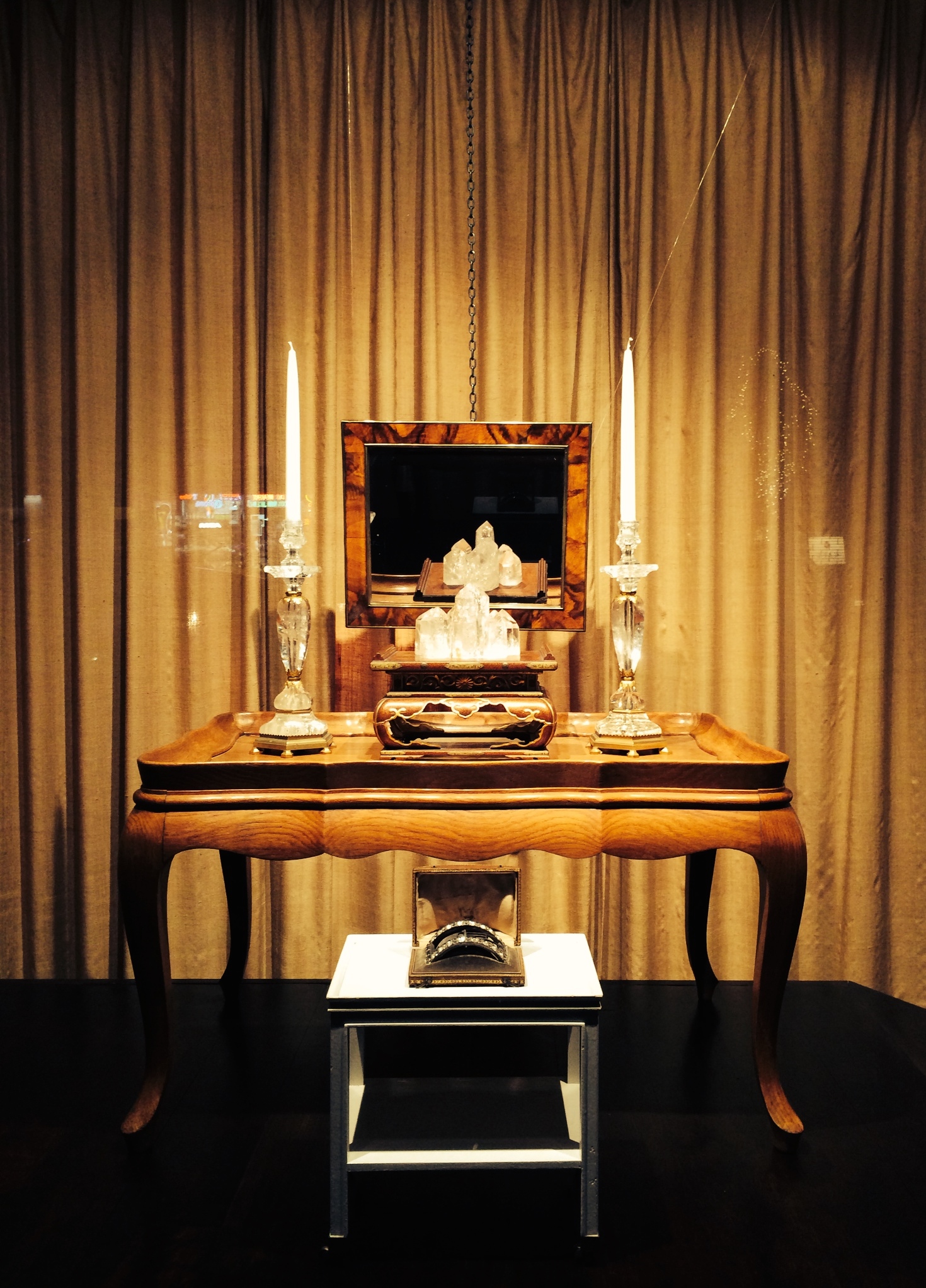
Some years back, when the antiques trade was in a lull, a friend suggested I put a crystal in my “prosperity corner.” I love rock crystal, but I wasn’t about to buy into crystal power or new-age philosophy. Yet I have to admit that my friend was on the same wavelength as popes and saints who endowed this mineral with mystical properties (if not blasé geologists who classify it as quartz).
The ancient Greeks thought rock crystal was ice congealed by intense cold over millennia. Their Roman successors made jewelry and luxury objects from it for patricians. And then, at the dawn of the Dark Ages, St. John of Patmos likened rock crystal to the purity of the water that flowed before the throne of God. No wonder subsequent popes arrayed their alters with liturgical objects made from it.
In the secular age of the Baroque, the stone was treasured for its rarity, beauty, and crystalline refraction of light. That’s why Louis XIV’s agents bought antique rock-crystal objects for the king’s pleasure, as well as newly unearthed hunks of it that were cut, polished, and mounted in ormolu to create the chandeliers and candlesticks that illuminated Versailles.
Fast forward to 1950s Paris, where Dior-clad divas trawled the rue du Faubourg Saint-Honoré, and gazed through the window of Bonzano, a purveyor of luxury goods for the home. Their rock-crystal candlesticks made by Bagues [below left], were so admired that Art et Industrie, a magazine covering the latest in high-style design and décor, devoted a page to them in 1951 [below right]. And there, front and center, on a Surrealist backdrop, is the model we feature in our window display. The caption rhapsodizes on “this mineral that’s a precious stone, clear as a diamond, slightly frosty, refracting light rays like a prism. Its beauty is in its natural form, and its virtue lies in the intense life of the material itself.”


And the other items in the window? Well, there’s a group of small rock crystals on a miniature Japanese altar that is on, in turn, a 1950s French cocktail table (which might have belonged to one of those aforementioned divas). Tucked beneath is a 1960s Jansen telephone table that belonged to Brooke Astor, which was painted a high-gloss white at the command of her decorator, the legendary Albert Hadley (who ended the aforementioned business lull when he dropped by with a free-spending billionairess). On it is an 18th-century silver shoe buckle set with paste diamonds that emit a smokey glimmer, which compliments the rock crystal’s authoritative flash.
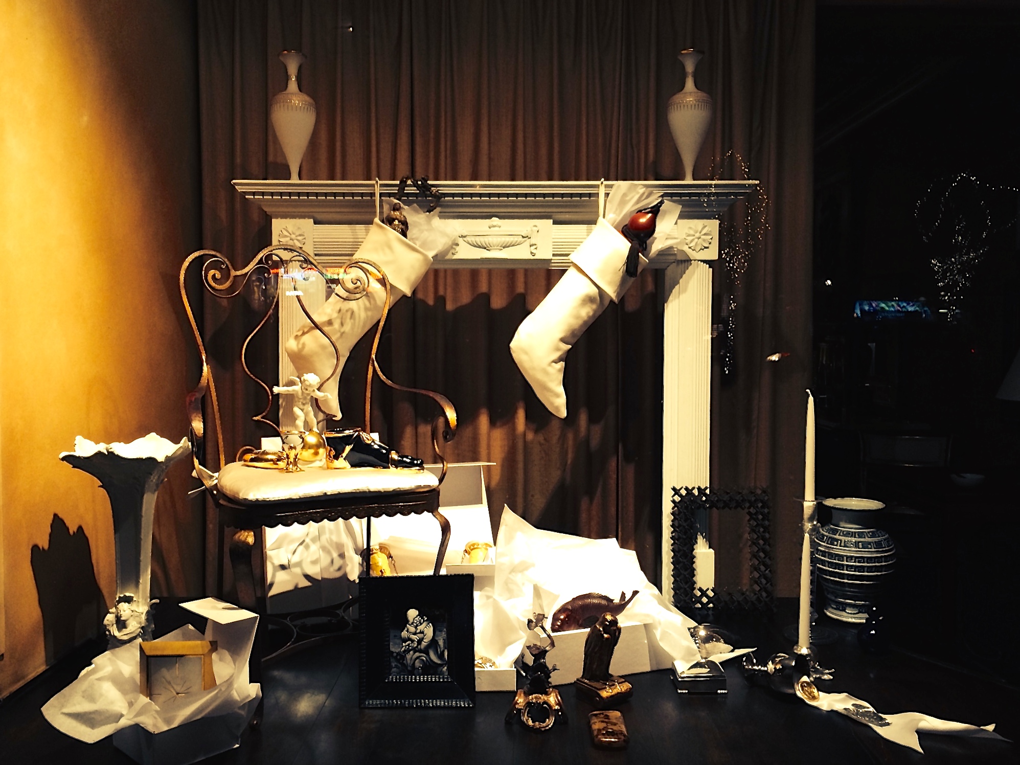
You don’t have to be a jaded New Yorker to be suspicious of a man who wears a fur-trimmed suit and comes down the chimney in the middle of the night (even if he is stuffing presents in the stockings hung by the chimney with care). Or to worry that in the process he’ll send the opaline-glass urns on the mantle crashing to the floor, and leave soot on the adjacent chair’s white-satin cushion. Imagine, then, our relief next morning to find nothing amiss — and our joy at the embarrassment of riches he’d left behind.
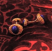
Among the stash was a trove of fine jewelry, like the 1970s silver pin in the form of a delicate leaf [below left]. There was a French 1960s gold brooch by Line Vautrin, no less, of boys and girls dancing with letters that spell out “tous les garçons et les filles,” the title of a 1962 hit song by Françoise Hardy [below center]. And we can’t not mention the pair of gold Tiffany cufflinks by Jean Schlumberger set with lapis lazuli [below right].
![photo[2]](https://bofferdingnewyork.com/wp-content/uploads/2012/06/photo2.jpg?w=132&h=180)
![photo[2] (1)](https://bofferdingnewyork.com/wp-content/uploads/2012/06/photo2-1.jpg?w=151&h=176)
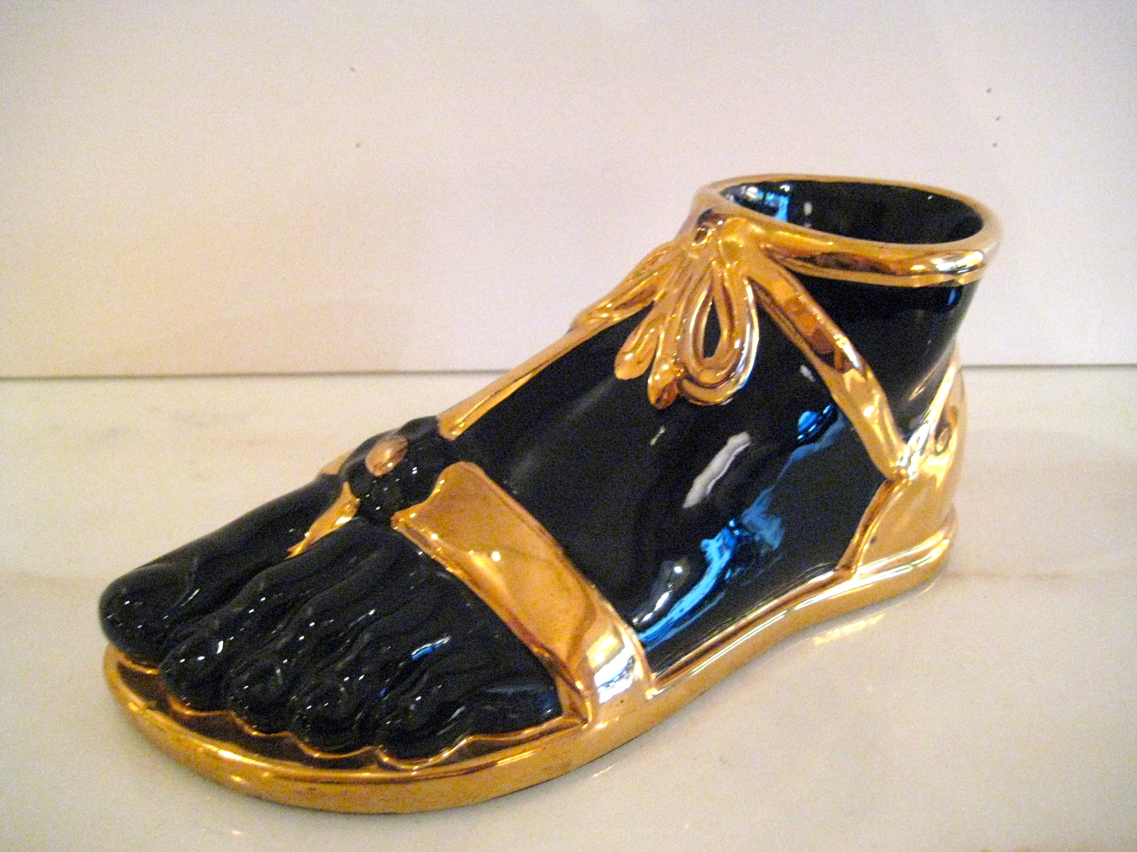
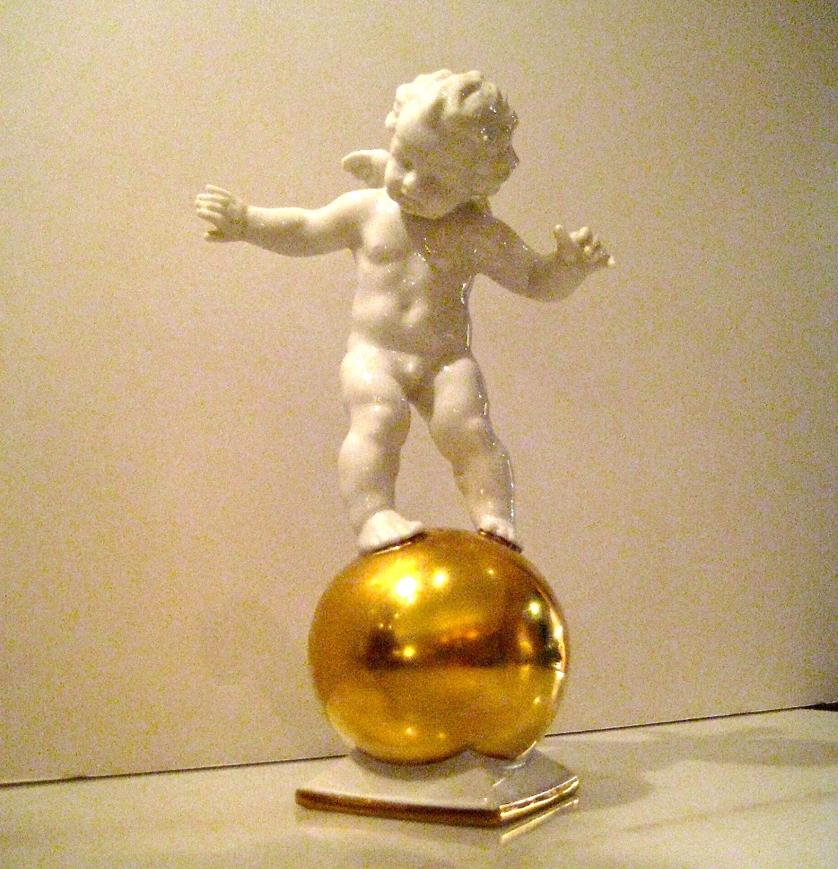
Among the porcelains were a gilded “pebble” [below left] and a sandaled-Roman foot [below center], by Piero Fornasetti from the 1960s. There was also a charming winged cupid balancing on a ball (fickle love!) that was modeled by Karl Tutter in 1920s Germany [below right].
Our eye was then caught by the shimmer of glass. And low and behold! There was a 1970s cobalt-blue perfume bottle by Seguso of Venice. Next to it was a 1930s Art Deco candle holder in the form of a star by Steuben. And best of all the 19th-century candlestick with a white-and-blue spiral in its stem, which had once belonged to the connoisseur Baron Max Fould-Springer.
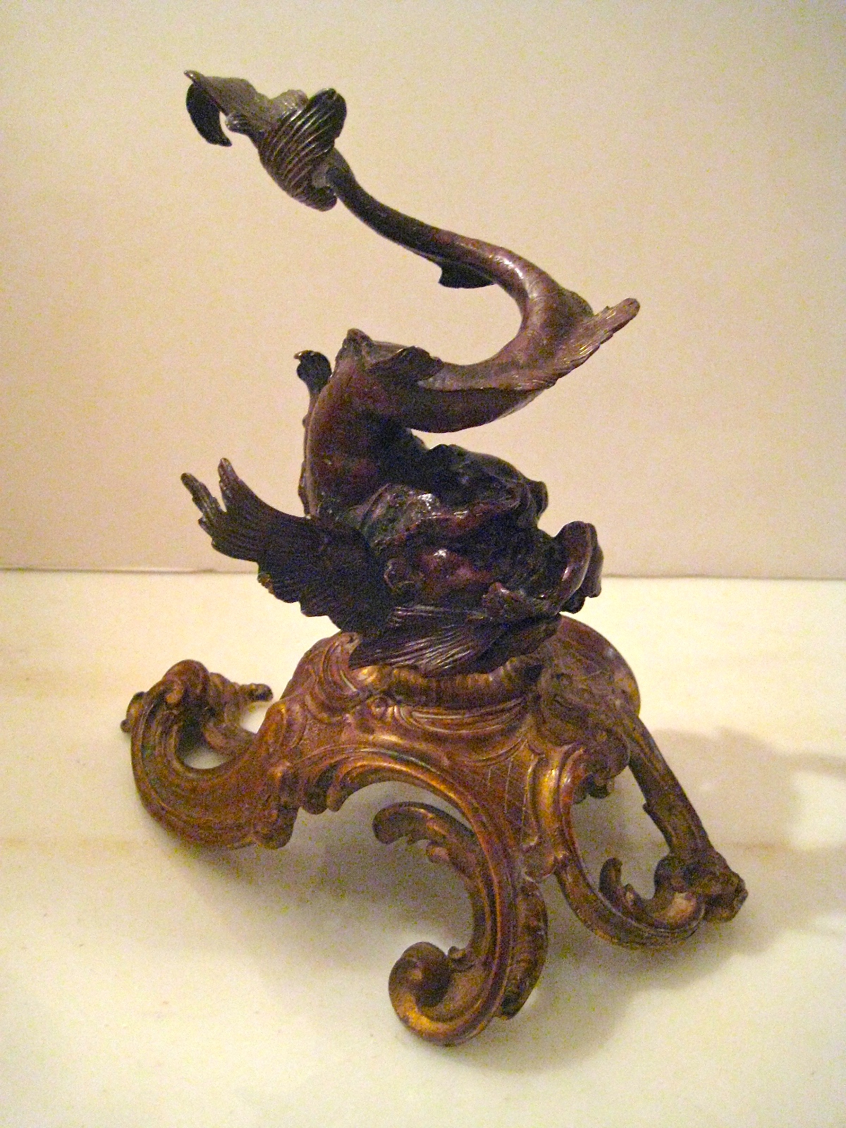
Filling us with wonder was a bestiary of sculptures made by artists and artisans on three continents. From Japan came the rosewood carp with ebony eyes [below left], from America an Arts-and-Crafts giltwood pelican [below center], and from France a Neo-Rococo bronze dolphin cavorting on a swirl of ormolu [below right].

![photo[4]](https://bofferdingnewyork.com/wp-content/uploads/2013/03/photo42.jpg)
We couldn’t possibly list everything that our nocturnal visitor left behind — so enormous was the haul, it overflowed into the shop itself. Which is why you should come inside rather than gawk through the window. If you do, you’ll understand our feeling sheepish about having left the intruder a measly glass of milk and a plate of cookies. Next year it will be a magnum of champagne and tin of caviar.

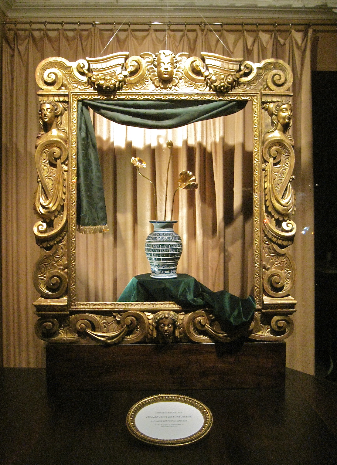
In the 17th century, when Chinese wares first landed on European shores, a buying frenzy ensued. This prompted Western artisans to cash in on the trend, and make their own version of those imported wares, which is called chinoiserie. And in the 19th century, when Japanese wares began to arrive in quantity, the descendants of those western artisans came up with japonisme. This window display features Chinese and Japanese wares, and the European ones that they came to inspire.
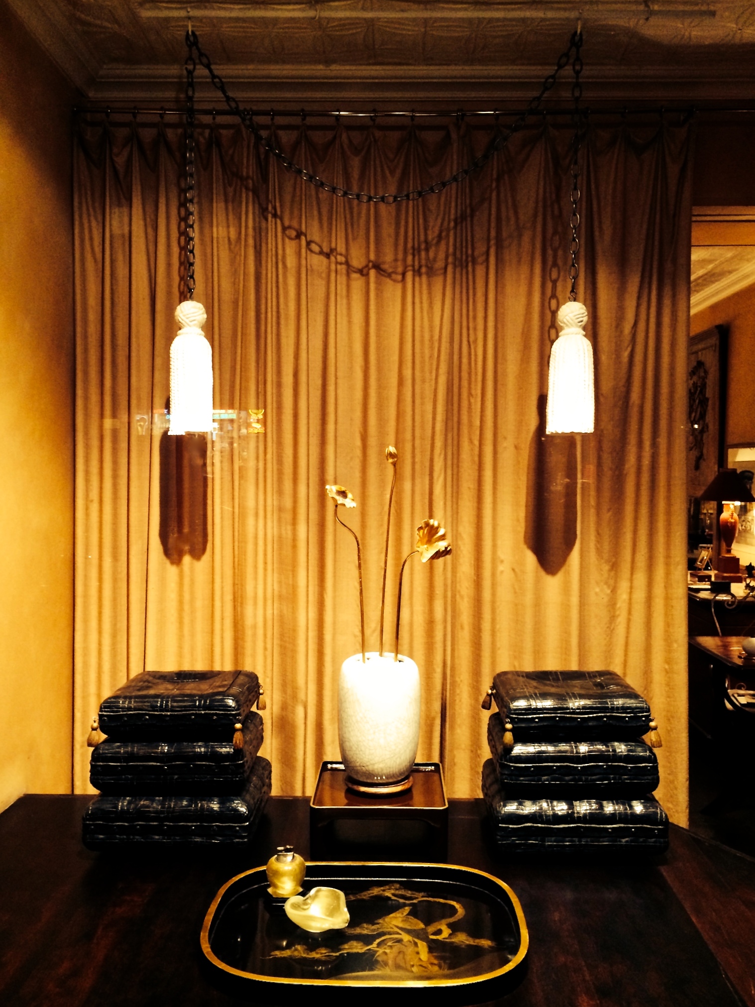
The remoteness of Asia, and a lack of knowledge about its cultures, resulted in some infelicities on the part of western craftsmen and designers. So while the Chinese had chairs, the 18th century French designer of the Empress of Tea tapestry, placed a Chinese empress on the ground following Japanese custom [below right]. In the west, this suggested lèse majesté, so a luxurious tasseled cushion was inserted between her posterior and the earth. This brings us to our pair of trompe l’oeil stools [below left], probably made in Venice in the late 19th century, which were carved from wood to look like stacked cushions. They were painted in faux-lacquer (since the real thing wasn’t available in the west), embellished with hanging giltwood tassels, and mounted on wheels, allowing them to be rolled across the terrazzo floor of a palazzo with ease.


Between the stools is a 1930s Japanese pot with a craqueleur glaze, in which we’ve inserted three giltwood Japanese lotuses [below left] that symbolize the different stages of enlightenment, according to Buddhist teaching. The pot rests on a lacquered stand from the 1970s, which was probably made in the Paris workshop of C. T. Loo, an important Chinese art dealer. He employed scores of Asian artisans to restore his antique pieces, and launched a line stylish modern furnishings based on traditional eastern ones.


In front is a black-and-gold lacquer Japanese tray that was painted with a fierce-looking hawk, perched in a tree [above right]. It’s difficult to date, but we suspect it was made for the western market, if not in the west itself, in the 1920s. Then as now, it would have come in handy when distributing cocktails before dinner. And the gold-infused glass astray and matching lighter? They were made in the 1940s by Seguso of Venice, and have nothing to do with Asian wares or their influence. They’re included because the chic of them would have appealed to the owner of the tray, whom we can just picture air-kissing an arriving guest, lighting up a Lucky Strike, and flicking an ash in the shimmering, golden ashtray with devil-may-care nonchalance.
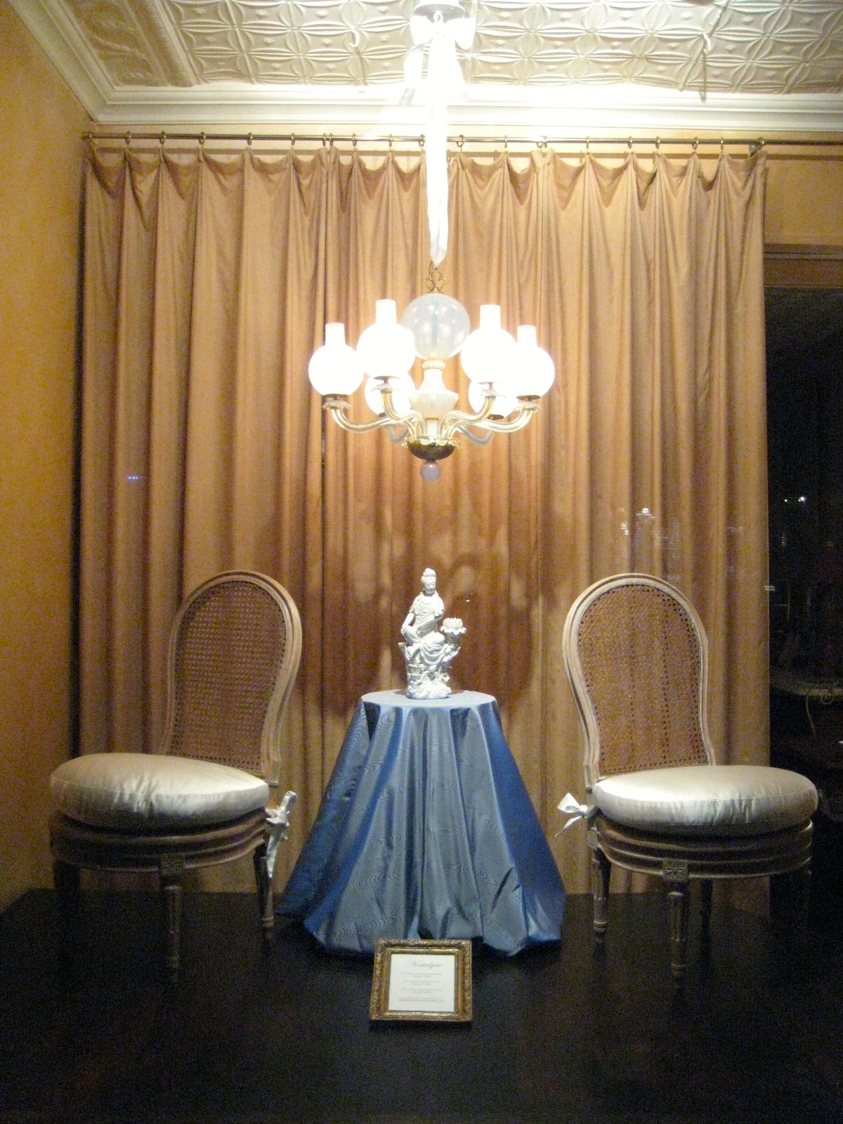
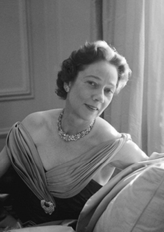
“I loathe nostalgia!” So said Diana Vreeland [below left], then a consultant at the Metropolitan Museum’s Costume Institute, and the former editor-in-chief at Vogue, before proceeding to rhapsodize about the past. The irony wasn’t lost on George Plimpton, who took the quote as the opening line of his 1984 biography that passes as her memoir. In so doing, he made the point that she adored nostalgia. As do we — which is why this window display is dedicated to the role it has played in 20th-century design.


Take, for example, the ravishing little Italian chandelier from the 1950s [above right]. It’s a streamlined take on 19th-century gas-burning ones, which were equipped with glass globes to prevent drafts from snuffing out the flames. Ours, however, was designed for electricity, so the globes are purely decorative. It was made in opalescent-blue glass, and held together with gold-metal fittings wrought as finely as jewelry. We attribute the design to Ercole Barovier, the direct descendant of a glassblower who had settled on Murano in the late 13th-century.
It hangs above a diminutive pair of Louis XVI-style chairs from the 1930s [below left]. Back then, the decorative arts were considered to have reached their apogee in 18th-century France. Collectors have since developed an immunity to the allure of that time and place, which has been supplanted by a vogue for midcentury modern. That style too will eventually fall from grace, for, as every fashionista knows, snob appeal dissipates with the public’s embrace.


And lastly, resting on a table draped with blue-silk moiré, is a blanc-de-chine porcelain figure [above right] that was made in China during the 1920s, but in the 18th-century Qing style. It represents Guanyin, the Buddhist goddess of mercy, swathed in pearls, and seated on a rockwork island rising from the sea. It was said that when the souls of the deceased grow weary on their journey to the “Land of Bliss,” she placed them in a lotus blossom where they could take their rest.
Anna Wintour, the current Vogue editor, famously urges fashion designers to “be modern.” And right she is to do so. But, in a post-modern world, what’s modern is open to interpretation. Karl Lagerfeld and Marc Jacobs, two of her favorites, pilfer history for inspiration, as do many 20th-century furniture designers. Which just goes to show, when it comes to true style, be it modern or nostalgic, as Mrs. Vreeland pointed out to Mr. Plimpton, “all who have it share one thing: originality.”

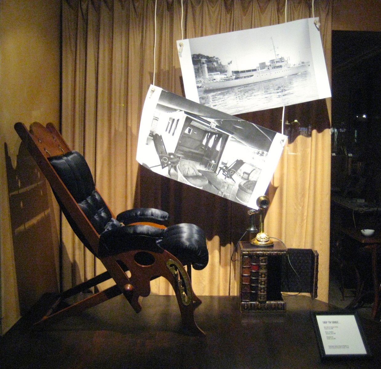
“Allô allô, Christian? C’est moi, Patricia — your costumes, they were all anyone talked about at the ball!” So might have begun a September 1951 ship-to-shore telephone call, placed from the Gaviota IV, the most luxurious yacht of the day, as she made for open sea. Christian was Christian Dior, who, when the phone rang, would have been in a state of exhaustion, having designed, fitted, and overseen the execution of a multitude of costumes for that ball. And Patricia? She and her husband Arturo Lopez-Willshaw, a Chilean whose family had made a fortune in fertilizer, were cutting a glamorous swath through international high society. At the ball they had made a spectacular entrance, stepping off a junk dressed as the emperor and empress of China [below left]. In their entourage was George Geffroy, their yacht’s decorator (to the right), and Baron Alexis de Redé (to the left), who was Arturo’s lover. Patricia’s lover, a playwright, apparently stayed home in Paris.


And the ball itself? It was thrown by Charles de Beistegui, heir to a Mexican silver-mining fortune, in his Venice residence, the Palazzo Labia [above right]. The subject of breathless press coverage at the time, the ball has since become legendary. The invitations were fought over, and guests squandered fortunes on costumes. As Redé noted in his memoirs, it occasioned “an extraordinary procession of chauffeur-driven Rolls-Royces that passed through the Simplon Pass in the direction of Venice, with large Dior boxes strapped onto their roofs.”


Having set the worldly scene, let’s return to the Lopez-Willshaw yacht [above left]. According to Vogue, “her passage into port never fails to create a sensation.” And no wonder, since the owners lived large, and the Gaviota’s appointments were lavish. She was filled with treasures ranging from a priceless 18th-century giltwood chair made for Marie-Antoinette, to a pair of made-to-order mahogany deckchairs [above right] that match the one in our window display. They were acquired from the Paris antiques dealer Jean-Pierre Hagnauer (he swam for France in the 1936 Berlin Olympics), who had them made after a 19th-century English pair that he sold to the handsome film star Jean Marais (the boyfriend of Jean Cocteau).
The yacht was featured in Realités, a French magazine that covered world politics and the arts. There, the writer marveled at how “radar and antiques live side by side.” She also mentioned a ship-to-shore telephone. Presumably, it was kept out of sight since its appearance would have clashed with the historicist decor. This supposition prompted us to add to the display a 1930s French telephone, and telephone box which was veneered with 18th-century book bindings to look like a traveling bookcase.


And now, let’s go back to where we began, eavesdropping on Madame Lopez-Willshaw’s conversation with Monsieur Dior, which is being brought to a hasty conclusion: “Christian, Arturo says we’ve talked on the phone long enough about clothes…he wants it to call an antiquaire about some chair that belonged to Marie-Antoinette…as if we don’t own plenty of things that were hers already! Au revoir cheri!”
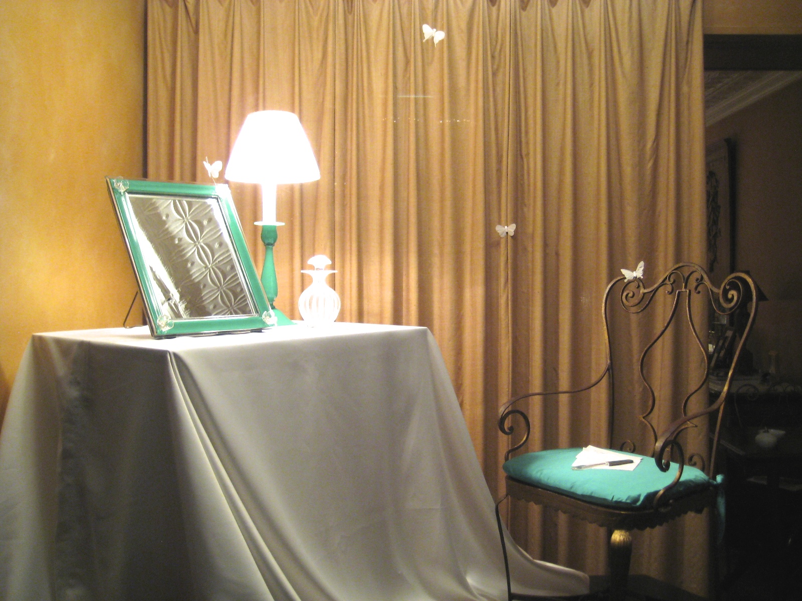
A green shoot peaking out of a snowdrift may be the first sign of spring, but spring can’t be said to have truly sprung until a woman sheds her winter woolens for something flou. This change in wardrobe will prompt her to take a seat at the dressing table and recalibrate her toilette. And if that table happens to be graced with a looking glass and matching lamp by Venini, the greatest Venetian glassworks of modern times, so much the better.
Not surprisingly, Paolo Venini gave just such a set to his daughter Laura [below right]. In fact, he gave her the very one we feature in our window display [below left]. It would follow her from her parents’ home in Venice, to the one she made as a bride in Milan, to those she shared with her husband and two daughters in and around Boston, and finally to the apartment in New York, where, as a widow, she worked for the celebrated product and graphic designers Lella and Massimo Vignelli (who had once designed some glass lamps for her father).


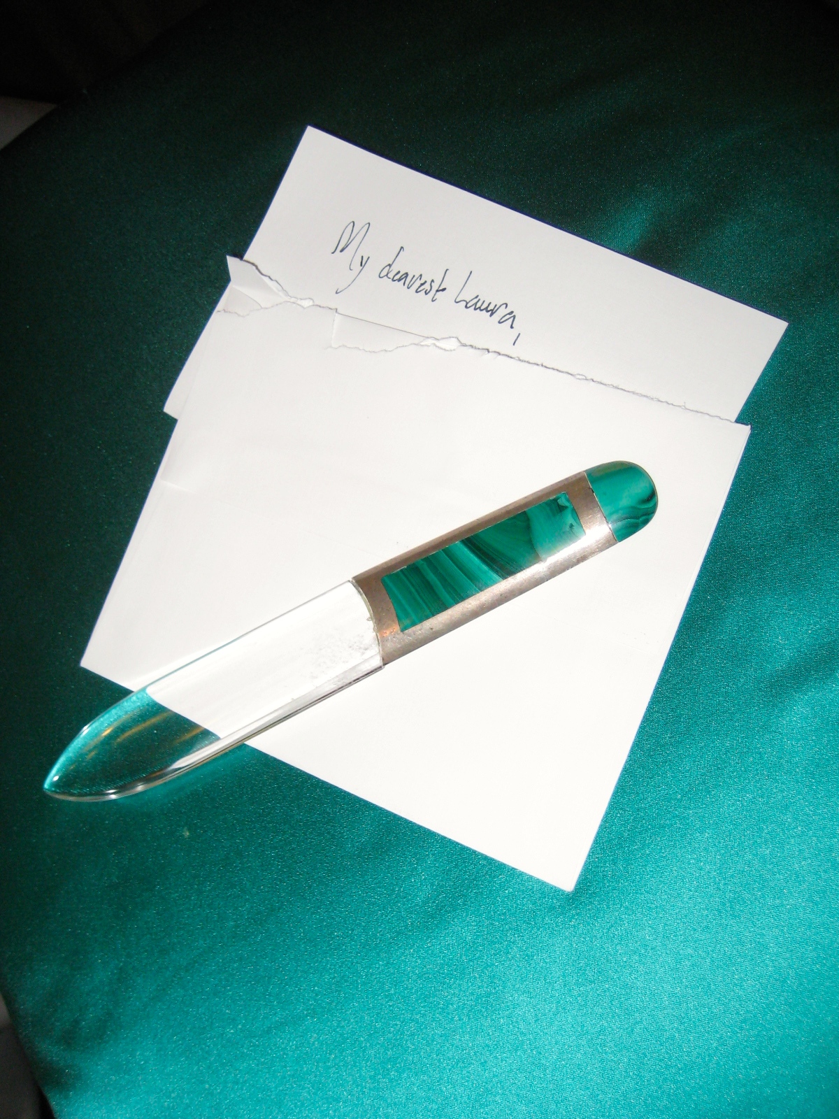
Humor us in our conceit: it’s Venice in the spring of 1954, and butterflies flutter through an open window as Laura sits in a gilded chair at her dressing table (to set the scene, we’ve cheated a bit by including a few things she never laid eyes on). A letter has just arrived in the morning post from her dashing American fiancé, Stanley Hancock Hillyer. With heart aflutter, she opens it in tearing haste, with a silver-mounted, malachite-and-rock-crystal letter opener, and reads of his immanent arrival for their wedding. In tearing haste she rushes out to tell her parents, leaving the letter behind in her excitement.
Taking into account the emotional symmetry of love, his heart was probably fluttering too when he wrote her letters, as he surely must have done in those pre-email days. This brings to mind a verse so famous it’s now a cliché: “In the spring a young man’s fancy lightly turns to thoughts of love.” It rings as true today as it did in 1834 when penned by Lord Alfred Tennyson. Presumably, Laura, who had studied English at Oxford and the Sorbonne, knew those lines well. And surely her betrothed, when setting off for Italy on an ocean liner, lived and breathed the sentiment expressed.
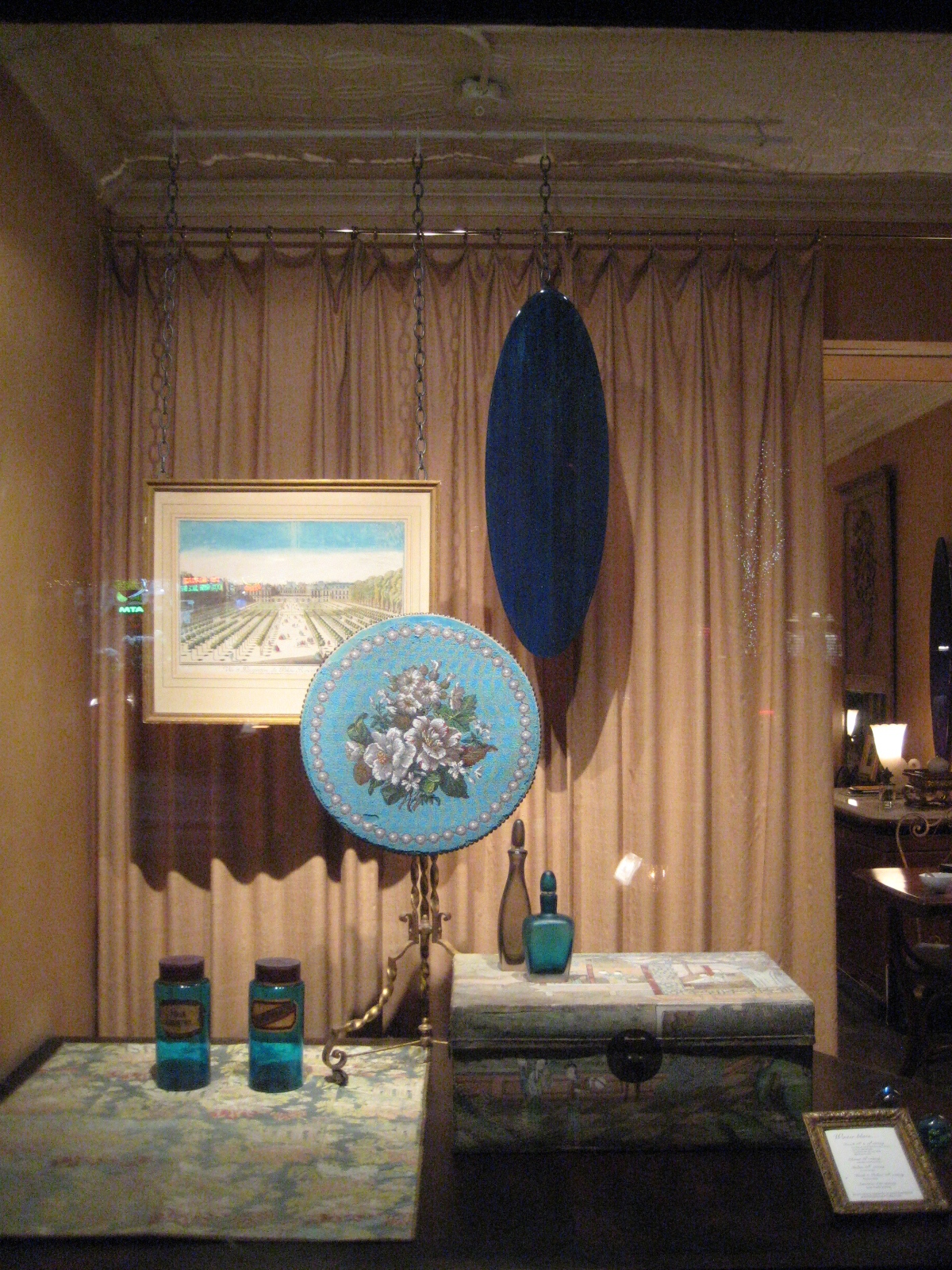
With freezing temperatures and blizzards buffeting the city, you may have come down with a severe case of the winter blues. But it’s the colors themselves — ultramarine, indigo, sapphire, turquoise, lapis, periwinkle, among others — that we celebrate in this window display.
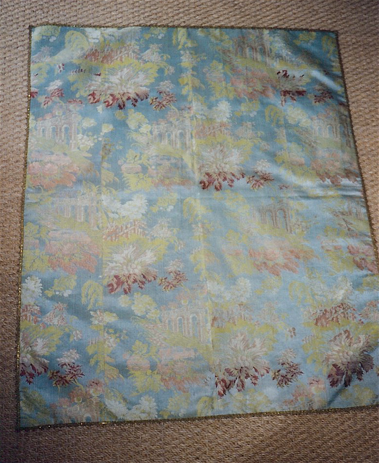
The deepest shade here is the midnight-blue of the elipse-shaped “mirror” painting by the contemporary artist Justen Ladda. It’s actually a combination of two shades of blue set asparkle with iron flecks that look like diamond dust. Next to it is an 18th-century hand-colored print of the Palais Royal in Paris (a much-treasured gift from a much-loved former employer, and therefore not for sale), with a vivid sky-blue sky. Also dating to that refined place and time is a silk-lampas panel [below left], with a pattern of picturesque ruins against a powder-blue background.
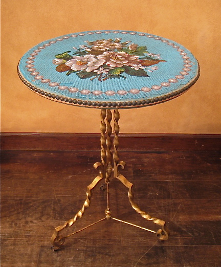
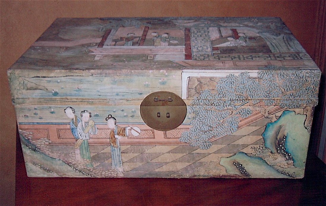
Over the silk panel we wheeled a gilded, wrought-iron Napoleon III table with a tilt-top depicting a bouquet of flowers on a cornflower-blue ground [above center]. Made from thousands of tiny glass beads, it hasn’t faded a bit since being stitched on in the 19th century. Next to it is a Chinese parchment box [above right], hand-painted in a symphony of blues and greens, which channels the cool elegance of Deeda Blair, it’s former owner, who placed it in her Washington, D.C. home with the aid of Billy Baldwin, her decorator.
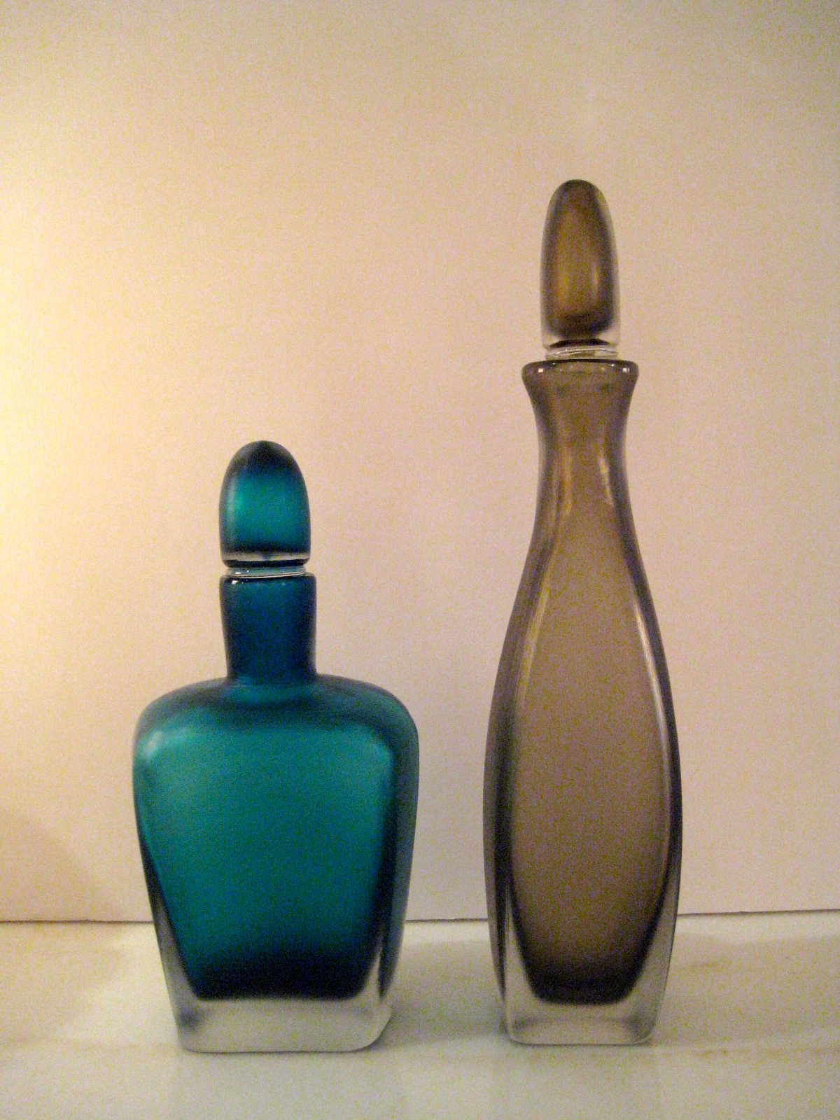
We fudged the theme by including a greyish-brown Venini glass bottle, but it goes so well with its cerulean-blue mate that we didn’t want to separate them [below center]. And before gazing on our two apothecary jars [below left]who would have thought Windex Blue a beautiful color? (Madame Bovary fans take note: one’s labeled arsenic.)
Winter blues? We get it — but don’t turn against the color itself. Just think of the warm, shimmering waters of the Cote d’Azur, which was itself named for a shade of blue. Or the sky, which isn’t really blue, except perhaps at the twilight hour known in France as l’heure bleue — the name of a classic Guerlain perfume that should be blue, but is actually, inexplicably, yellow, and comes in a box inappropriately gold. Go figure.


“Gariboldi? Do you mean the general who unified Italy in the 19th century?” No! That was Giuseppe Garibaldi — I’m talking about Giovanni Gariboldi, the 20th-century designer whose ceramics are now avidly collected by those in the know. Admittedly, he’s a less historic figure than the general — unless you’re passionate about Italian modern design.
In 1936, on graduating from the Brera Art Academy in Milan, our Gariboldi became a protégé of Gio Ponti, the great architect designer. Then, Ponti was the director of porcelain company Richard-Ginori. Ponti recruited Gariboldi to the firm, where he hand-painted a small group of flower-filled vases on ceramic-tiles [below left]. Each panel is unique, signed, and dated, as was ours in 1931. It reveals nature at its most robust. Butterflies flutter, dragonflies buzz, a snail creeps, a grasshopper rests between grand jetées, and the roots of a flowering plant bursts through the walls of its vase.


Gariboldi was inspired by 17th-century Dutch still-life paintings, like the one by Balthasar van der Ast [above right], which are allegories of the transience of life. The beautiful flowers symbolize beauty that will wither, butterflies human folly, and grasshoppers vainglory (referring as they did to the Old Testament plague of the locust that devastated Egypt). Gariboldi, however, shook off the anxiety that is seemingly inherent in a memento mori to revel like a pagan in the life force itself.
A few years later, in 1936, Gariboldi designed a small porcelain pot for Ginori [below left], which, truth be told, is better suited as an object d’art than for use as a vase, since the opening can barely accommodate the stem of a single flower. What makes the pot remarkable, however, is the perfection of its form, and the contrast of its velvety-red exterior with its shiny gold interior. You might say that the gold revealed by the curl of the lip is the ceramic equivalent of fashion’s fur-lined trench coat.


The other things that are in the window display happen to be French: the 1840s painted-and-gilded-metal lamp, the gilded-wrought-iron neo-rococo chair, and the lacquered cigarette table. But if you’re keen on modern Italian design, and Gariboldi in particular, look through the door and you’ll espy his oxblood-glazed ceramic umbrella stand [above right], and a white-glazed planter, both from the ’40s. But why stand outside and peer in, when you could can come in to see them? And if you do, we’ll show you a few other things by his Italian contemporaries, including Seguso, Bianconi, Venini, and Chiesa.
In Paris one hears this phrase – in translation “it’s madly chic!” – tripping off fashionable tongues. It might be melodiously uttered by the Countess de Ribes when describing a ball, in staccato by Karl Lagerfeld when steering a couture client to a cocktail dress, or with multiple exclamation points by Susan Gutfreund, the international society decorator, when coming across an antique treasure on the Quai Voltaire. The phrase, in other words, isn’t thrown away on just any old thing that’s pleasing, but rather on something that’s simply divine.
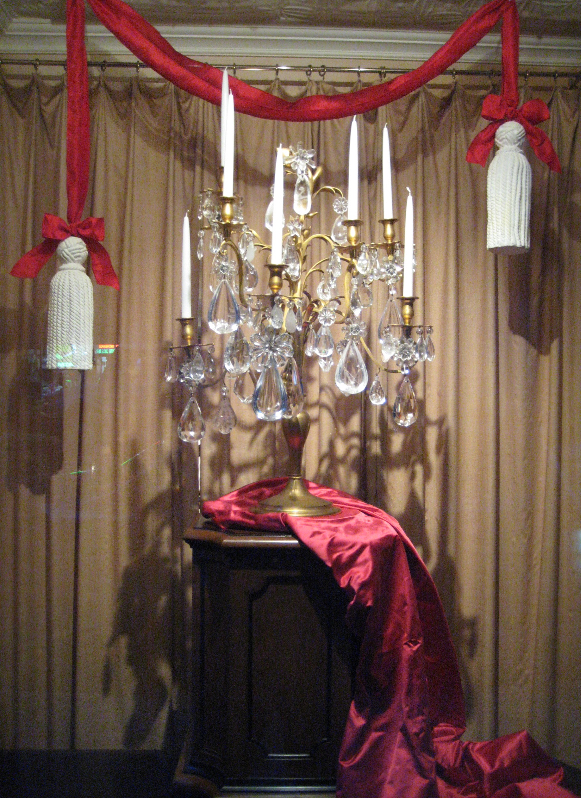
Which brings us to our window display, featuring a showstopper of a candelabrum, or girandole in French, from girandola, an Italian firework that was all the rage at Versailles in the 18th century [below]. This lighting fixture was so named because, when its candles were lit, the prisms flashed like fireworks. Many girandoles were made of glass and brass, but those in the palace were mostly made of rock crystal (a stone prized for its transparency), and gilded bronze, which looks like gold molded, or, as the French would say, or moulu.

Some two hundred years later, Baguès, the Paris bronze-casting firm, updated the girandole for the Roaring Twenties (which was known, to continue with our “madly chic” theme, as les annees folles, or “the mad years”). By then Baguès had been making light fixtures of superb quality for the better part of a century. They ran the gamut stylistically from historical reproductions [below left] to modernistic inventions [below right]. Fine materials, however, were as dear in the 20th as they were in the 18th century, so while a glass and brass girandole from Baguès was expensive, one in rock crystal and ormolu cost the earth.


Our monumental girondole of rock-crystal and ormolu stands a proud three feet, and weighs in at a hefty eighty-five pounds. More interesting than its statistics, however, is the design that’s a stylish riff on a traditional form. The ormolu frame, which begins symmetrically enough at the base, rises with a botanical fluidity to the top bud, and sprouts tendrils and other buds along the way. It drips with an embarrassment of asymetrically hung rock crystals, some as big as a fist, and others that are as small as flower petals, which are wired in clusters to form blowsy blossoms. The artful result is the madcap sumptuousness that would have left us uncharacteristically speechless, were it not for that apt aforementioned phrase, “c’est follement chic!”


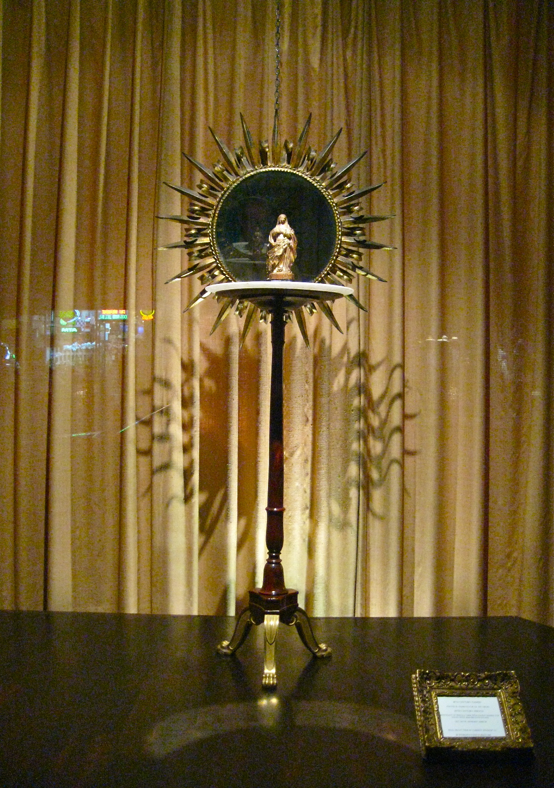
Ave Maria, gratia plena, Dominus tecum. So soothing to the ear is this vowel-laced Latin prayer that one could imagine its having been worn down to such soft sibilance by endless incantations of the faithful over centuries. According to the Gospel of St. Luke, these were the very words that were spoken to the Virgin Mary by the Archangel Gabriel — in translation, “Hail Mary, full of grace, the Lord is with thee” — revealing her destiny as the mother of Christ.
This diminutive sculpture of the Virgin was physically worn down by the hands of the faithful in prayer. The early 18th century sculptor who made it could have been Flemish or Spanish. It’s difficult to say for sure, since dynastic marriages kept the Low Countries within the Spanish and Austrian cultural orbit. Finely carved from a single piece of wood, this devotional sculpture lost some surface decoration through handling, yet traces of the gilding remain on her dress, along with patches of blue, red, and white paint on her cloak, face, and hands.
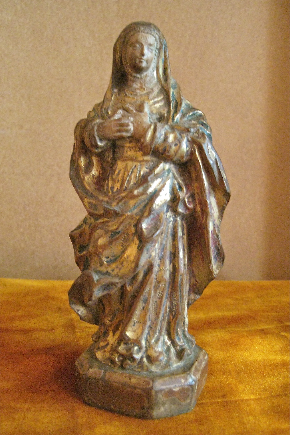
The sumptuousness of Mary’s dress might strike some today as jarring, for we live in an age that conflates the spiritual with the ascetic. But in the past, when richness evoked the divine, the opposite was the case. Back in the early 12th century, for example, Abbot Suger commissioned liturgical objects that were wrought in silver and gold, and carved in rare hardstones, for the monastic church of St. Denis outside Paris. That’s why it didn’t strike us as inappropriate to place this devotional statue on an ormolu-mounted table with an Indian alabaster top that’s inlaid with lapis lazuli, malachite, and other semi-precious stones.


And the mirror? For centuries their representation in paintings symbolized vanity, one of the seven cardinal sins. Yet our mirror’s halo-like shape and gilded rays make it a serviceable stand-in for a divine aureole. This just goes to show that when it comes to installing a window display, we have to make use of whatever we happen to have on hand. After all, the point is to please the eye of the passerby, and to make a statement — even if it results in an infelicity that may ruffle the feathers of an art historian, or a religious fanatic untutored in art history.
To hear Ave Maria in Latin set to music by the 16th-century composer Palestrina, click here:

“The waving line…how inelegant would the shapes of all our moveables be without it?” asked the English painter William Hogarth in The Analysis of Beauty, his 1753 treatise on the arts. What he called “moveables” we call furniture, and in writing on the subject he observed that “there is scarcely a room in any house whatever where one does not see the waving line employed in some way or other.” Hogarth was so taken by those waving lines that dozens of schematic drawings of them were included in his book [below]
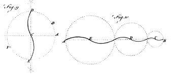 Hogarth lived in the Age of the Rococo, when the curve held sway, but in our own Age of the Right Angle, the curve is looked on askance. This is a legacy of the Modernists, who preferred the rudimentary straight lines that machines can turn out with precision. Yet even a quintessential modernist like Mies van der Rohe couldn’t resist the elegance of the curve, the defining characteristic of his iconic 1929 Barcelona chair. Back then, however, the machine wasn’t up to the task of shaping the chair’s steel arcs, and so, ironically, they were handcrafted by the hands of artisans.
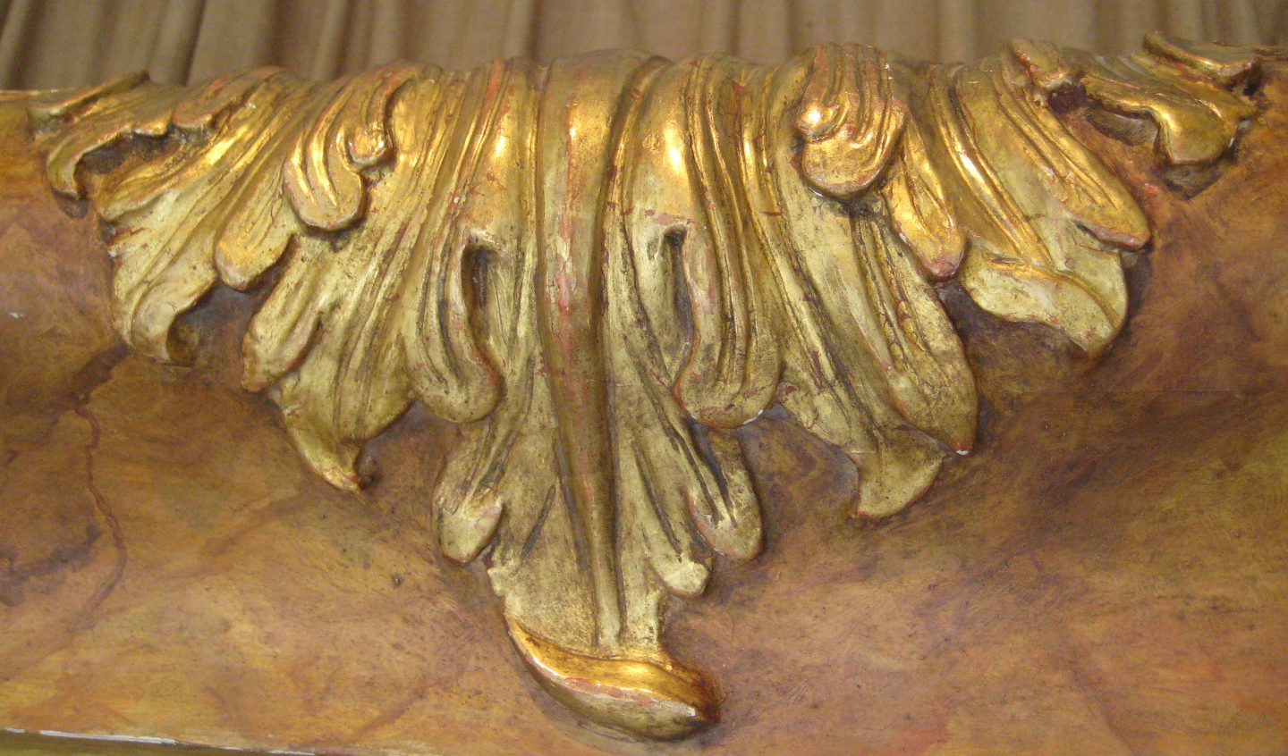
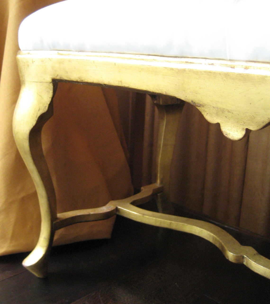
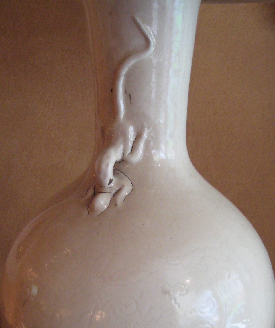
This window display is devoted to pre-modern curves — those that are wavy, which Hogarth called “the line of beauty,” and those that are serpentine, which he called “the line of grace.” By any name, they abound in the unfurling acanthus leaves of the 18th-century German mirror frame, the cabriole legs of the French bench made around the same time, and the undulating salamanders on the 11th-century Chinese vases that are now wired as lamps.
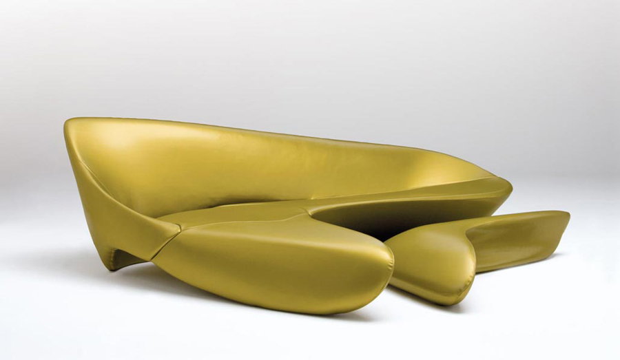
Since Mies designed his famous chair, technology mastered the curve. Yet to many consumers, and even to some professionals who should know better, the curve looks old-fashioned. Needless to say, that’s not the case among sophisticated collectors, decorators, and designers. Take, for example, the celebrated architect and furniture designer Zaha Hadid. Her 2007 sofa and ottoman of Polyurethane are proof positive that the curve has lost none of its allure since Hogarth sang its praises nearly three centuries ago.

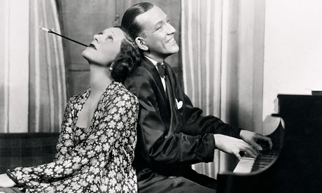
Noël Coward — composer, playwright, and sometime actor — wrote these lyrics for what would be the hit song of his 1938 musical comedy Operette. They’re a send up of the scions of grand English families who, during the Great Depression, struggled financially to keep up their family estates, without stinting on champagne at the Café Royal. So imagine their relief on finding the means of their salvation in the confines of their own country houses. Coward, seen below with Gertrude Lawrence in his play Private Lives, continued in wicked rhyme…
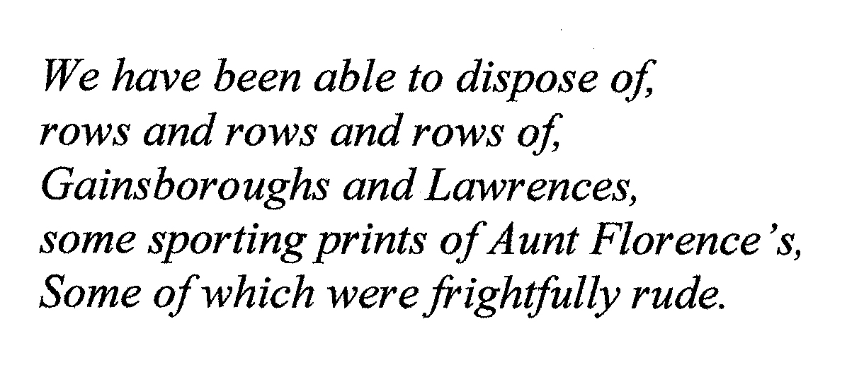
Aunt Florence’s taste not withstanding, those collections of old masters, assembled over generations, saved the day when knocked down at auction in one go. An eldest son, however, would have been embarrassed to let on that he was selling off his family legacy. That’s why the provenance would appear in the sales catalog as “Property of a Gentleman of Title” — a designation that ensured his anonymity, and tantalized bidders with its aristocratic ring.
The painting of the goddess Diana that’s featured in this window display, and its mate in the shop depicting Jupiter, may well have been commissioned by an ancestor of one of those impecunious, consigning gentlemen. While we don’t know his title or name, or that of his ancestral estate, we do know of two stately apartments in which they subsequently hung on both sides of the Atlantic [see SOLD INVENTORY].


Flanking the painting is a pair of faux bois-painted English pedestals that were made in the late 1960s for Johnny Galliher, an American man-about-town, who was then living in London. On them is a pair of French 19th-century, painted-and-gilded metal lamps that have retained their original matching metal shades.
You may well ask, what do a pair of French lamps have to do with the stately homes of England? Grasping at straws, we could say they’re just the kind of thing that a smart 1930s London decorator would have bought for for the country house of a client who, in spite of it all, was still in the money. To continue with this iffy line of reasoning, we could also say it was a mere accident of fate that our fine lamps didn’t turn up in one of them before ending up in our less than stately shop on Lexington Avenue.
To hear Noël Coward sing The Stately Homes of England click hear:

Bitter rivalries in the art world are nothing new. In the 5th century BC, according to the Roman historian Pliny the Elder, the artists Zeuxis and Parrhasius both claimed to paint more realistically than the other. To settle who actually did, they agreed to a competition in which they would present a painting for judgement. Zeuxis unveiled his of a cluster of grapes, which was so life-like that birds swooped down to peck at them in vain. Certain of triumph, he told his rival to unveil his painting. Parrhasius coolly replied there was no veil for him to draw back — his painting depicted a veil.


Almost 1,700 years later, we don’t know if those artists actually existed, if the competition ever took place, or, for that matter, if this was the beginning of trompe l’oeil painting (“fool the eye” in French), or merely the first recorded instance of it. But what we do know is that an illusionistic work of art is as engaging today as it was then, be it be a painting, sculpture, or building. After all, only a dullard wouldn’t experience a frisson on seeing Abraham Susenier’s 1650s painting of shells revealed by a drawn curtain [above left], Andy Warhol’s 1960s painted-wood object in the form of a Brillo box [above right], or Borromini’s 1635 false perspective in the courtyard of the Palazzo Spada in Rome [below].


So when it came to devising a window display to feature our 16th-century giltwood frame, we decided to go trompe l’oeil. But instead of putting in it a two-dimensional painting that looks three-dimensional, we filled it with actual things — a Chinese pot, Japanese giltwood flowers, swags of velvet — masquerading as a still-life painting. And to make it even more of a tease, we pulled a bit of velvet over the bottom of the frame.
Odds are slim that a passerby will be up for hanging an empty frame on their wall, or have, say, a 16th-century Bronzino portrait that just happens to fit (one that would, however, passed unsold at Christie’s recently, should you care to make an offer). So what, then, can we do with our frame? Well, antiques dealers often slip mirrors into them, although that tends to look better when they’re smaller than this one. But we do have a Plan B fallback — we’re going to insert a sheet of cobalt-blue glass. Not only will it have the visual heft to hold it’s own in this gutsy gold frame, but together they’ll make a dramatic statement.
The dictionary defines provenance as “the history of a valued object,” and since so many of the antiques in our inventory have distinguished histories, the eminent decorator Mario Buatta has rechristened our shop “The House of Provenance.” But we’re in on the joke — how could we not be when a list of the former owners of so many of the things that you’ll find here is a veritable send-up of snobbery? After all, among them are Queen Victoria, Andy Warhol, Pope Leo XIII, Vogue editor Diana Vreeland, African-American chanteuse Lena Horne, Metropolitan Museum benefactor Jayne Wrightsman, tobacco heiress Doris Duke, cosmetics tycooness Helena Rubinstein, the Maharaja of Jaipur, and couturier nonpareil Christian Dior. Need I go on?
Probably not – you get the picture. And while you may think it’s silly to care about who owned an object, when, let’s face it, it is what it is, whether it belonged to a somebody or a nobody. But it would make a difference to the museum curator, and the donor they’re hitting up to fund the purchase of a commode that belonged to Louis XIV, just as it did to the buyer of the $48,000 tape-measure that belonged to Jacqueline Kennedy Onassis, which sold in her 1996 estate auction. The fact is, you don’t have to be a romantic fool to fall under the spell of an illustrious provenance that burnishes an object’s luster.


So let’s review who owned what in this window display, and, in the process, drop a few names. We pulled the armchair out from under Pierre Le-Tan [above left], the Paris artist, who put up some resistance, since it was the most comfortable one he had. The Chinese end table belonged to Brooke Astor [above center], along with the bird-leg lamp, although it’s hard to picture something so bizarre in the home of someone so proper. Hollywood is represented by the small painting by Fulco Verdura, which was owned by Douglas Fairbanks, Jr. Two of the leather-bound books are from the library of the Duke of Windsor [above right], and while we don’t know who pored over the pages of the third, it’s the auction catalog of the Duke of Hamilton’s collection, so it does have some snob appeal.
One of the many things that came up in that 1882 sale is my favorite piece of furniture at the Metropolitan Museum: a Jean-Henri Riesener lacquered commode. These days, there’s hardly an auction that doesn’t include some treasure being deaccessioned by a museum, but if that commode were to resurface at auction, it’s not the institutional provenance that would prompt my reverie. I’ll be mooning over its previous provenance that began with Marie Antoinette, continued with the Dukes of Hamilton, and concluded with William Kissim Vanderbilt, who gave it to the museum.
![]()
Not that I want to sound like Scrooge, but all those store windows with plastic Christmas trees, twinkle lights, dustings of artificial snow, and mock ups of Santa’s workshop, put my teeth on edge. Still, ’tis the season that puts retailers get in the black, and even if that’s not the case for antiques dealers, at this time of year we typically arrange window displays of the “smalls” that are suitable gifts.
Some years, however, we throw caution and business sense to the wind, and install something that isn’t exactly a stocking-stuffer. Two years ago it was a large 18th-century giltwood sculpture of a nude woman [below left], and then a couple of years ago it was a glass-beaded sculpture in the form of the nose of Maria Callas [below right] by the New York artist Justen Ladda.


With Walmart and other big-box stores hawking Christmas merchandise before Thanksgiving, we decided to take a more genteel tack. We called Justen to ask if he’d lend Kimono, a 2004 sculpture he’d never exhibited before. We wanted to display it alongside his 2010 silver-leafed “mirror” painting that we had in our inventory.
In 1989, a decade after having moved to New York, this German-born artist (who’s represented in the collections of the Museum of Modern Art and the Israel Museum, among others) began his mirror painting series. Concurrently, between 1998 and 2008, he was engaged in making a series of welded-steel sculptures sheathed in cut-glass crystals. In Kimono he dispensed with the crystals, and explored the decorative potential of the steel carcass itself — going so far as to depict fabric patterns in welded tracery.
That he took the kimono as his subject reflects Justen’s love of Japanese art and culture. In 1985 he traveled to Tokyo to install a sculpture in an exhibition, and stayed on to study the temple gardens of Kyoto. When there, he admired the ineffable grace of the women whose ancestors had been depicted in the Ukiyo-e woodblock prints that had captured the imaginations of French Impressionist painters in the 19th century [below right]. Not incidentally, when Justen made the sculpture, he was in a relationship with a Japanese woman who worked in the fashion trade.


On installing the window we realized the juxtaposition of sculpture and painting added up to something more than the sum of its parts. They coalesced into a tableau of a woman walking in the moonlight, a subject sometimes found in those old Japanese prints. It also conveyed a sense of peace and well being aligned with the spirit of the holiday season, rather than it’s commercialization. Perhaps this is why it brought to our mind the poem that Henry Wadsworth Longfellow wrote on Christmas day in 1863, which closes with the immortal line: “a voice, a chime, a chant sublime, of peace on earth, goodwill to men.”


The conceit of this window display is that a gentleman in evening clothes is about to glance in the cheval mirror to adjust his tie, and make certain that’s nothing’s amiss in his appearance, before stepping out. Vanity satisfied, he’ll drape the silk scarf around his neck, slip on the gloves, and don the top hat at a slightly — but not too — rakish angle [below left]. He’ll then step into a horse-drawn carriage that will take him to the Bachelors’ Ball at the Metropolitan Opera House. It’s April 17th, 1884, and if you take a good look at the invitation tucked into the mirror frame [below right], you’ll find we’ve given our protagonist the name of Percy Pyne, who did attend the ball that night according to the next day’s social column in the New York Times. Then, Mr. Pyne was twenty-seven, and — who knows? — perhaps this was the night when he first danced with Miss Maud Howland who would become his wife five years later.


Or perhaps not. Perhaps he was keen on someone else then — someone with whom he danced through the night — or didn’t dance with at all, because she was playing hard-to-get. Or perhaps he played that game with her instead. In any case, who hasn’t, at least once in their life, sallied forth in hopeful high spirits to a place where that special someone would be, only to return home crestfallen, if not heartbroken?
Since all this is mere reverie, let’s not be sticklers about chronology. Instead, let’s pretend a song that was written by Charles K. Harris six years after the 1884 Bachelors’ Ball was played by the orchestra on that very night. After all, the lyrics fit our conceit so well. And so, to pick up where we had begun, click on the link below:


You may well ask how a grand Paris decorating firm, a jet-set Italian designer, a racy English decorator, and a New York socialite famous for her philanthropy, connect with blanc de chine porcelain. And the answer to that question would be that they don’t in any meaningful way. To be frank, the things you see here, which were designed or owned by that firm and these people, are shown with the porcelains simply because they happen to look good together.
That said, the glass and acrylic cocktail table with steel mounts, and the pair of lacquered-wood telephone tables with brass castors, while stylistically unrelated, share a provenance. Both were designed in the 1960s, and belonged to Brooke Astor [below left]. She bought the cocktail table from Alessandro Albrizzi, and the telephone tables from Jansen. At the time, Albrizzi’s furniture was so fashionable that Jansen, the ne plus ultra of the decorating world (and a maker of furniture as well), bought his designs for their clients.


As for blanc de chine porcelains, Mrs. Astor collected and placed them in her Park Avenue apartment, her Hudson River Valley house, and her Maine retreat in Northeast Harbor. However, none of the ones that you see here were in fact hers.
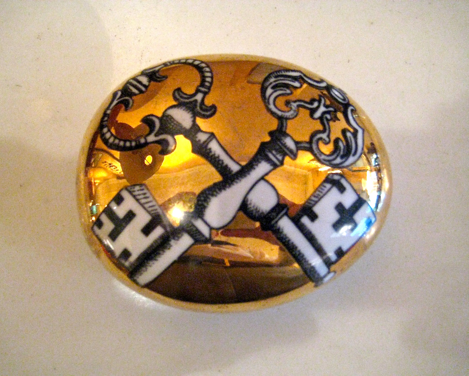
Technically, blanc de chine, French for “white from China,” is the white-glazed porcelain made from the Song to the Qing dynasty. By that definition, only the large pot from the late 19th century is the real deal. But the term is also used more generally to describe any all-white porcelain, and that permits us to include the early 20th-century boy on a dolphin by Paul Scheurich [above right], the 18th-century pistol [below left], and the mid-20th-century knives marked “Made in Sheffield England for Syrie Maugham” [below right], the celebrated decorator, whose marriage to Somerset Maugham went so wrong that they nearly came to knifes, if not smoking pistols.


And the birds? These 19th-century Capodimonte porcelains from Naples are not blanc de chine, since they’re naturalistically painted in colors. But they went so well with the display that we couldn’t resist putting them in. And if straying from the program isn’t bad enough, we’re also breaking a cardinal rule of shopkeeping by including something that isn’t even for sale. But we just can’t bear the prospect of parting with the Royal Copenhagen plates , which we use at lunch time, as did a previous owner, Elsie de Wolfe.


Pretty much any shiny paint surface is said to be lacquered these days, but odds are that what’s so identified is just painted with high gloss paint, or a synthetic lacquer like those sprayed on grand pianos. The truth is that lacquer, which is made from the sap of a tree found only in Asia, is too difficult to work with to be commonplace. Not only is it applied in multiple layers, but each one has to be sanded down before the next is applied. This requires skill, patience, and some courage since lacquer is highly toxic when wet. No wonder the search for substitutes has been going on for centuries.
You’ll have to lean in close to the window to get a good look at the 17th-century Chinese bowl. Its silvered-copper interior is set in guri lacquer of alternating black-and-red layers that are revealed through decorative carving [below left]. Back in the 1970s this bowl was owned by the jet-set decorator Valerian Rybar, seen here dressed for a costume ball given by the Rothschilds [below right]. Rybar is remembered today for his black-and-red rooms with silvery walls of stainless-steel — which is to say, rooms that look very much like this bowl.


Before taking leave of the ’70s, have a look at the cigarette table that was probably made by the Paris firm of C. T. Loo, where s team of Asian lacquerers restored antique pieces, and made stylish new furnishings. Moving back in time to the 19th-century (and to the right), is an exquisite Japanese lacquered box in the shape of a carp, sensitively carved, with golden scales, a silvered belly, and milk-glass eyes. It’s naturalism couldn’t be more different than the abstract decorations on the scroll box with a silk cord, or the miniature altar that’s glamorously spangled in gold. By contrast, there’s the discrete writing box sparingly decorated with lacquered tendrils that echo the swirling wood grain which was left exposed.


Fast forward to 1978 when Justen Ladda [below left], a German artist, arrived in New York where he was soon celebrated for his trompe l’oeil installation at an abandoned Bronx public school auditorium. He continued his exploration of illusionism in a series of “mirror” paintings that began with this very one from 2003 [below right]. To make it he cut an ellipse from a wood panel, painted it black, and poured on a metallic, green-tinted varnish before sealing it under a clear epoxy resin, which dried to a lacquer-like finish. Unlike a conventional mirror that reflects what we see, Ladda’s mirror reflects another world, which is mysteriously, if not disconcertingly, parallel to our own.


Let’s ease into the fall semester by subjecting ourselves to a little quiz: of the three items in this window display, which is 18th century, which is 19th, and which is both? (Don’t fret if you get it wrong because an art history major probably would too.)
The alabaster urns, which look like they could have been made around 1830 are actually 1930s Italian. The painted-and-gilded-wood panel with a carved swag could be taken for 1930s American Federal Revival, but it’s 1790s Italian Neo-Classical. And now, on to the bench, which is particularly tricky. For while its streamlined metallic undulations evoke the glamor of 1930s cafe society, it’s actually a 1750s French rococo piece, which was gilded in the 1930s to match a neo-rococo dressing table by Frances Elkins, the California decorator.
The intention of this display isn’t to confuse, but to show how ideas ricochet through history and across aesthetic and geographical frontiers. We’re not an antiques shop that specializes in any period or style (Art Deco, Neo-Classical, or Rococo), or country (Italy, France, or America). Since inspired craftsmen, designers, and artists can be found in every century and culture, we present works that range from the 1400s to the 2000s, and were made in Europe, America, Asia, and Africa. If they look just right together here, its because they reflect a point of view, which is probably what drew you to the display in the first place.

This window display could almost pass as a room, if you tucked a fireplace beneath the mirror, and slipped a pair of banquettes behind the cigarette tables on either side. If that’s too many ifs for you, then take the display as an abstract arrangement of verticals and horizontals, colors in the brown-to-red spectrum, and textures that include the sheen of lacquer, the sparkle of crystal, the tarnish of old mirror, and the grain of stripped wood. The pieces themselves are 18th century, 20th century inspired by the 18th century, and just plain 20th century.
You can read about the 18th-century mirror in our “Featured Inventory” post. In “Sold Inventory” you’ll find the 18th-century-style candlesticks that date, actually, to the 1930s, along with the matching lamp [below center]. The legendary decorator Frances Elkins liked the model so much she bought this set for her daughter and another one for herself. Also there you’ll also find the pair of cinnabar cigarette tables [below right] by Jean-Pierre Hagnauer, which once graced Jayne Wrightsman’s flat in London, and the set of six 1970s cigarette tables [below left].


At the court of Queen Victoria and her husband Prince Albert — and for that matter in all of England during the Victorian age — rank and majesty didn’t cancel out sentiment and feeling. In Franz Zavier Winterhalter’s painting of the royal family [below left], silk-moiré sashes, velvet swags, a diamond tiara, and giltwood thrones, share the picture with a toddler still unsure on her feet, and a boy (the future King Edward VII) clinging to his mother’s skirts. This balance of formality and intimacy is also found in the portrait by J. E. Jones of Victoria’s whippet Fanny [below right]. Shown in dignified profile like a Roman senator on a coin, and grandly framed in giltwood shot with black lacquer, Fanny’s sensitive, nervous disposition isn’t swept under the carpet.


Winterhalter also painted the family of Emperor Napoleon III, who ruled France during the Second Empire. If his depictions of that imperial family reflected the comme il faut formality of the French, when it came to the decorative arts, England and France were on the same lavish page. This can be seen in the domestic interiors that belonged to the English and French branches of the Rothschild family. Both Baron Mayer’s Mentmore outside London, and Baron James’s Ferrières outside Paris, were designed by Joseph Paxton, the English architect and engineer, who, thanks to Albert, designed the Crystal Palace for the 1851 Great Exhibition in London. And there J. E. Jones, who depicted Victoria’s whippet, exhibited a group of drawings of children and animals. But let’s go back to Ferrières. It had been decorated by the artist Eugène Lamy to reflect the status and wealth of the owner and his dynasty. As can be seen in this photo of the Blue Salon [below left], as restored in the 1960s by the decorator Henri Samuel, there was no stinting on gold leaf and red plush.


This is also the case with the French folding chair [above right] that was gilded and upholstered in crimson cut-silk velvet. It is very much in “le style Rothschild,” the term that described the sumptuous interiors and furnishings of that day, which also applies to the gilded and hand-painted opaline glass vase, which we’ve turned into a lamp.
While Queen Victoria and Baron James lived out their days in the splendor these objects evoke, Napoleon III, sadly, did not. When France was defeated in the Franco-Prussian War of 1870, he went into exile, with his consort Eugénie, to, of all places, the English countryside. There, they lived in a handsome Georgian manor called Camden Place, which, while comfortable enough, was nothing like the Louvre, their former Paris residence, or for that matter, Baron James’s spectacular chateau at Ferrières.

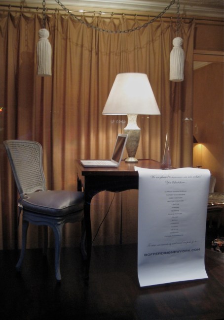
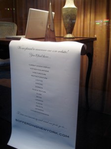
Every window display here is about something — a designer, a country, a century, a technique, a material, if not about all of these things. This one is about our new website, where you’ll find everything in our inventory with prices. That’s why we furnished the window like an office, with a desk, a lamp, a glass paperweight, and a computer terminal that will give you access to what’s in the shop itself.
So far the most popular post on the site is ‘Featured Inventory’ where you can read the back stories of recently acquired pieces – who designed, made, and owned them, and their places in the context of decorative arts history. If you check it regularly you’ll see things as they come in.
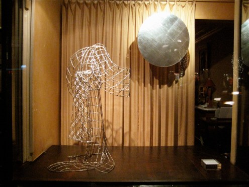
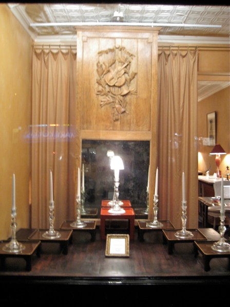
Next up is a portrait of Queen Victoria’s whippet, Fanny, and then an 18th-century neo-classical French trumeau mirror with a panel sculpted in bas-relief of musical instruments. And shortly after that a lavish 19th-century Neo-Gothic cheval mirror, which is eminently suited to a man’s dressing room.
And since we’re on the subject of mirrors, we just acquired a 20th-century one by Venini with six built-in glass sconces. Anna Venini published an archival photograph of it in the book she published on the family firm’s work, where she dates it to 1928, and notes that its present whereabouts is unknown. Come October, you’ll see it here.
![]()
R. LOUIS BOFFERDING FINE & DECORATIVE ART
232 EAST 59TH STREET NYC 10021
TELEPHONE 212.744.6725 LOUIS.BOFFERDING@VERIZON.NET
